The Designest may receive compensation from companies, products, and services featured in this publication. For more details, please refer to our Affiliate Disclosure page.
Understanding the color and knowing how to make a powerful color combination is a secret to good design. In fact, it matters as much as knowing the basics of typography and mastering the golden ratio. However, when we speak of color, theory isn’t enough, and there is always a huge emotional component in every palette.
The color can tell much more than you think, and a beautiful color combination may become as distinctive and memorable as the entire branding concept. Think of the refreshing and confident green-black-white of the Starbucks logo or Coca Cola’s white and red the makes you think of it even when seen outside the logo and merchandise. From the other side, color expresses the mood, and can fill the viewers with a rainbow of emotions once they see the well-balanced palette.
Expand Your Creative Skills With Domestika Classes
Explore thousands of creative classes in design, business, visual art and craft! Whatever skill you want to improve, Domestika has a course for it! Use the code THEDESIGNEST-10 to get an additional 10% off.
In fact, I’m sure you know yourself all the perks and powers of a good color combination. So here comes another question — how to make something totally fascinating and where to source inspiration from? The answer is simple: with the basics of color theory you can make billions of them and get something perfectly fitting you project in the end. Or you’ll have a hundred of ready-made beautiful color palettes imbued with natural, urban and floral vibes — which we’ve prepared for you. You’ll just have to transfer these color combinations to your project.
How to Make Color Combinations?
In color theory, colors are organized on a color wheel and grouped into 3 categories:
- Primary colors: the basic red, yellow and blue;
- Secondary colors: made from primary colors (orange, violet and green);
- Tertiary colors: made from primary and secondary colors (red-orange, yellow-orange, yellow-green, blue-green, blue-violet, and red-violet).
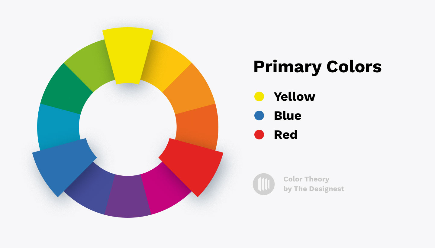
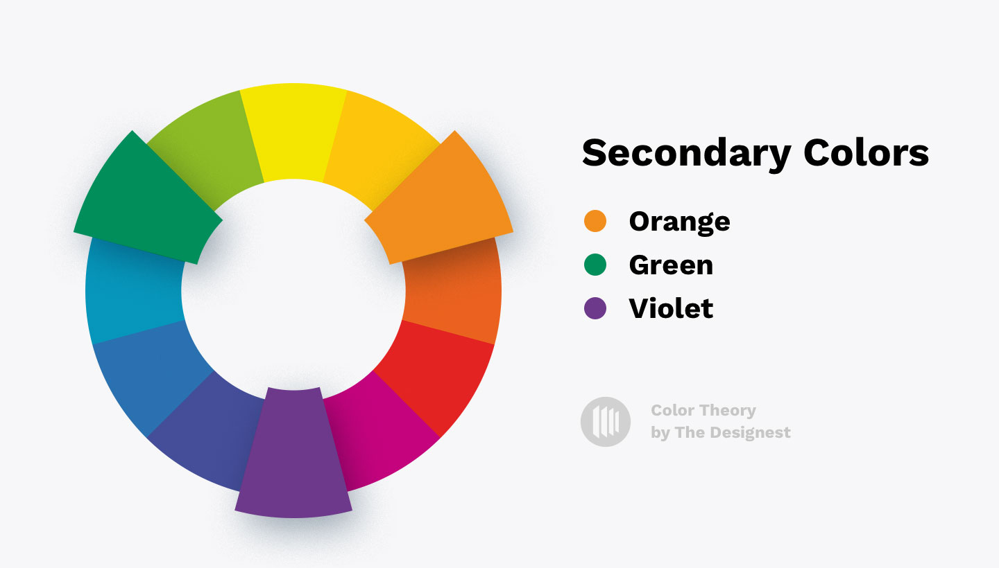
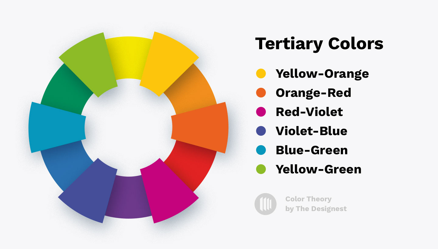
If you look at the color wheel and draw an imaginary vertical line, you’ll get warm colors from one side and cold from another. That the basics you should know before onboarding a custom color combination.
There are four types of color combinations:
- Complementary color combinations — made from colors that sit opposite each other on the color wheel.
- Triadic color combinations — made from colors placed on each vertex of an imaginary equilateral triangle (it’s a triange in which all three sides have the same length).
- Analogous color combinations — made of 2-5 colors that sit next to one another on the color wheel.
- Tetradic color combinations — made of 4 colors that are equidistant apart. There is one primary and two complementary colors, and also an additional color to highlight accents.
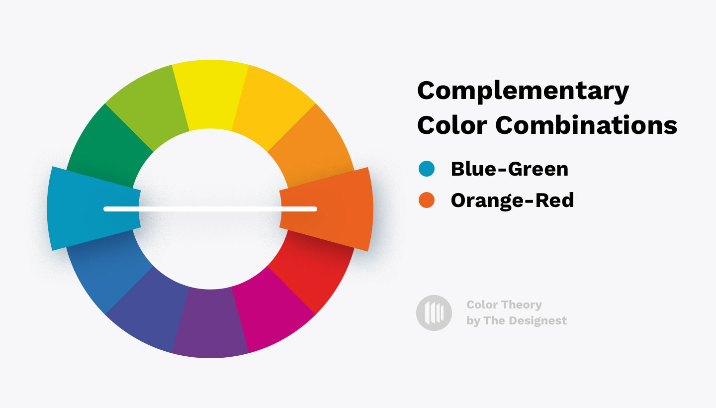
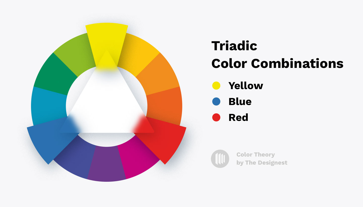
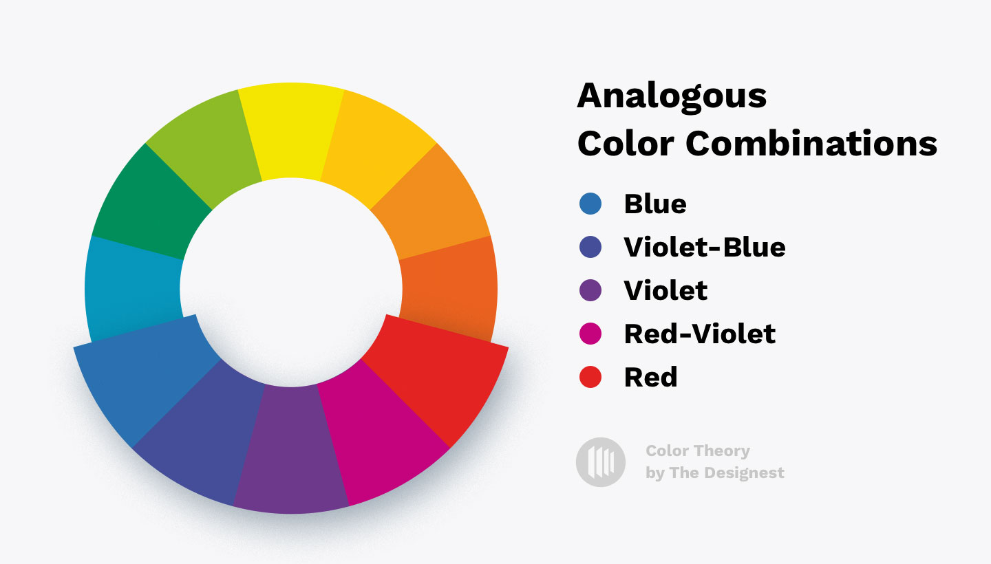
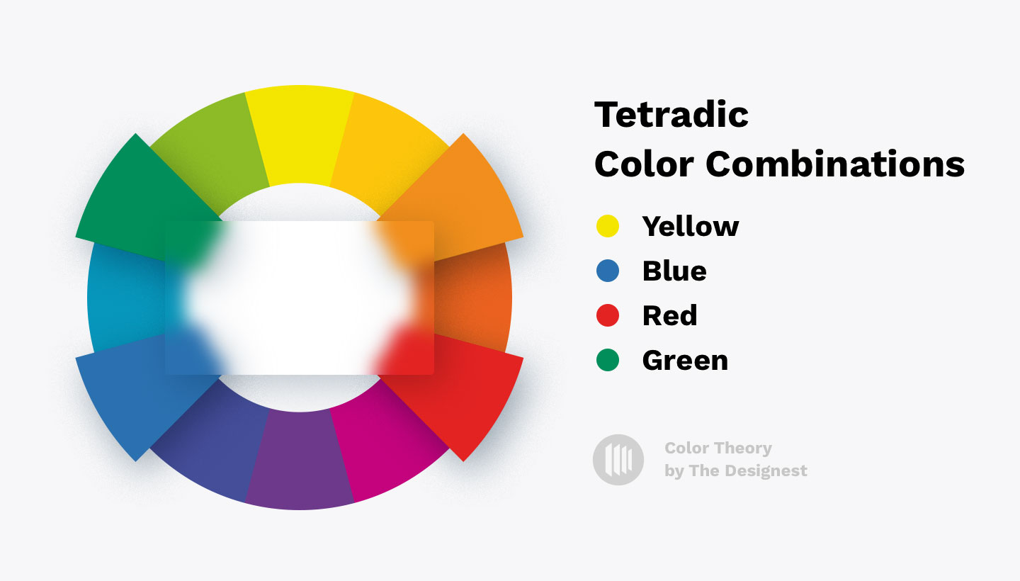
With this knowledge, you can try making a custom color palette and see if it works for your projects. However, an isolated understanding of what color combinations can be doesn’t always work. You may need time to gain some experience and start making color combinations that are not just technically correct but evoke necessary emotions and fit your project.
How to Use Color Combinations?
1. Use the Base-Nuance-Accent method
When working with colors, it is important to ensure that they work well with each other. To do this, the colors must differ not only in tone, brightness, and saturation but also in the area of color spots so that the pattern does not turn into a homogeneous mass. The amount of one primary color must not be equal to the amount of another primary color. It is best when this ratio fluctuates in the proportion of 70 to 30% or even 80 to 20%.
To meet all these requirements, the method that divides the palette into base, nuance, and accent was developed:
- The base is the main color, the one that occupies the largest area of the canvas. The rest of the colors are selected based on it by the artist.
- The nuance is an additional color, usually, the one that sits next to the base color on the color wheel.
- The accent is the color with the highest contrast to the base. It is the most visible color on the canvas, albeit it has less usage than the base and the nuance ones.

2. Arrange colors by their brightness level
It is easier to transfer the colors arranged by the brightness level to the sketch. If you follow this rule, you get the accents in the following order (from the lightest to the darkest): highlights, light, light mid-tone, mid-tone, dark mid-tone, shadow, and dark accent. That’s what we’ll focus on creating our color palettes.
3. Reduce the saturation of all colors except the accent
Too saturated colors create visual noise and draw attention to themselves. To get rid of this effect and focus the viewer’s attention, you need to reduce the saturation of colors and bring them closer to the center of the color wheel.
4. No need to unquestioningly follow the established schemes: use additional colors and shades
Color schemes aren’t the solution to all the problems the designer might face. They must be used wisely, as art isn’t a technical process, it’s about feelings. Common mistake newbies make when choosing colors is to meticulously follow these schemes and don’t differentiate between guidance and their own perspective.
Usually, the picture is not made up of the color of the scheme in its pure form but is combined with the help of desaturated intermediate shades. To work with a limited number of colors you choose based on a scheme, you will need to add some shades so the picture could become complete.
Natural Color Combinations
Landscapes and the natural environment are an inexhaustible source of color inspiration. Such palettes aren’t necessarily made of 50 shades of green. You’ll feast your eyes on fanciful combinations of dusty grey and the deep blue of the mountains, cyan of the beaches, and subtle pink of the sunrises. Most pictures of nature from your collection already contain a perfectly balanced color palette, so you should just develop the skill of seeing the beauty everywhere around you.
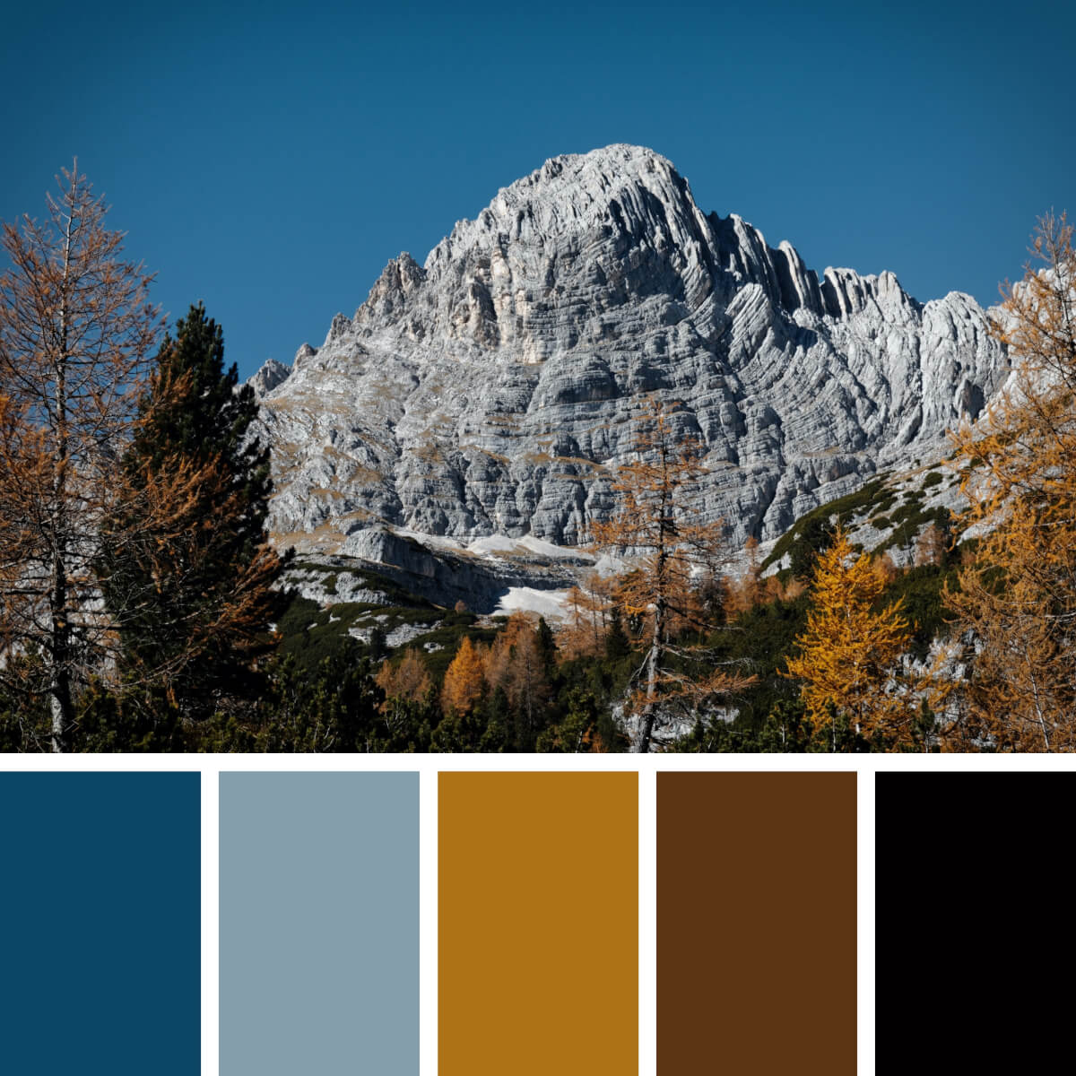
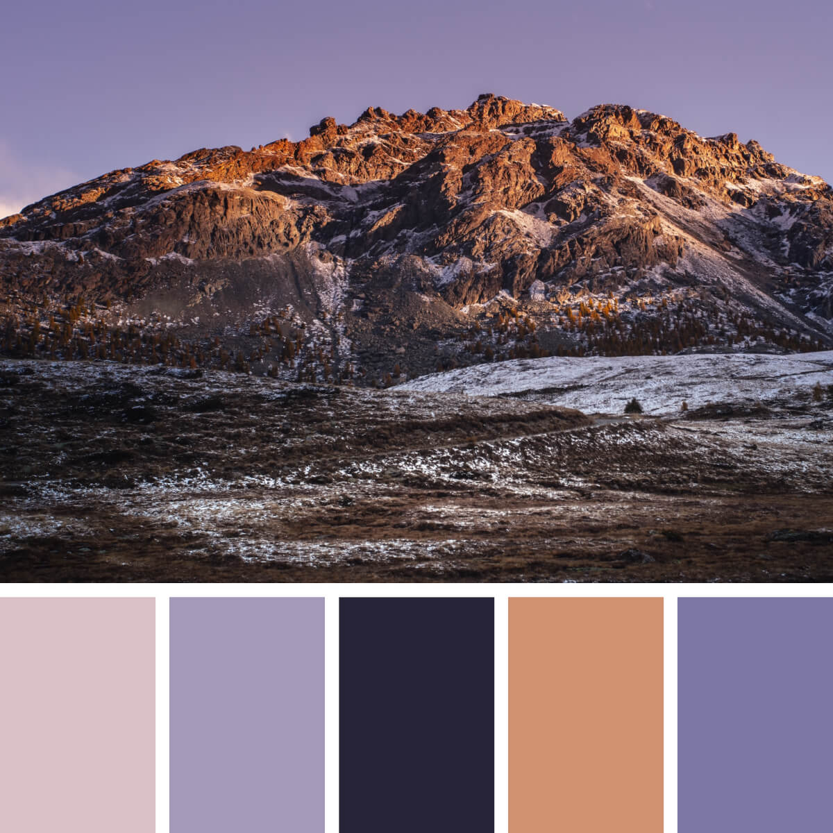
October Rocks & Blues
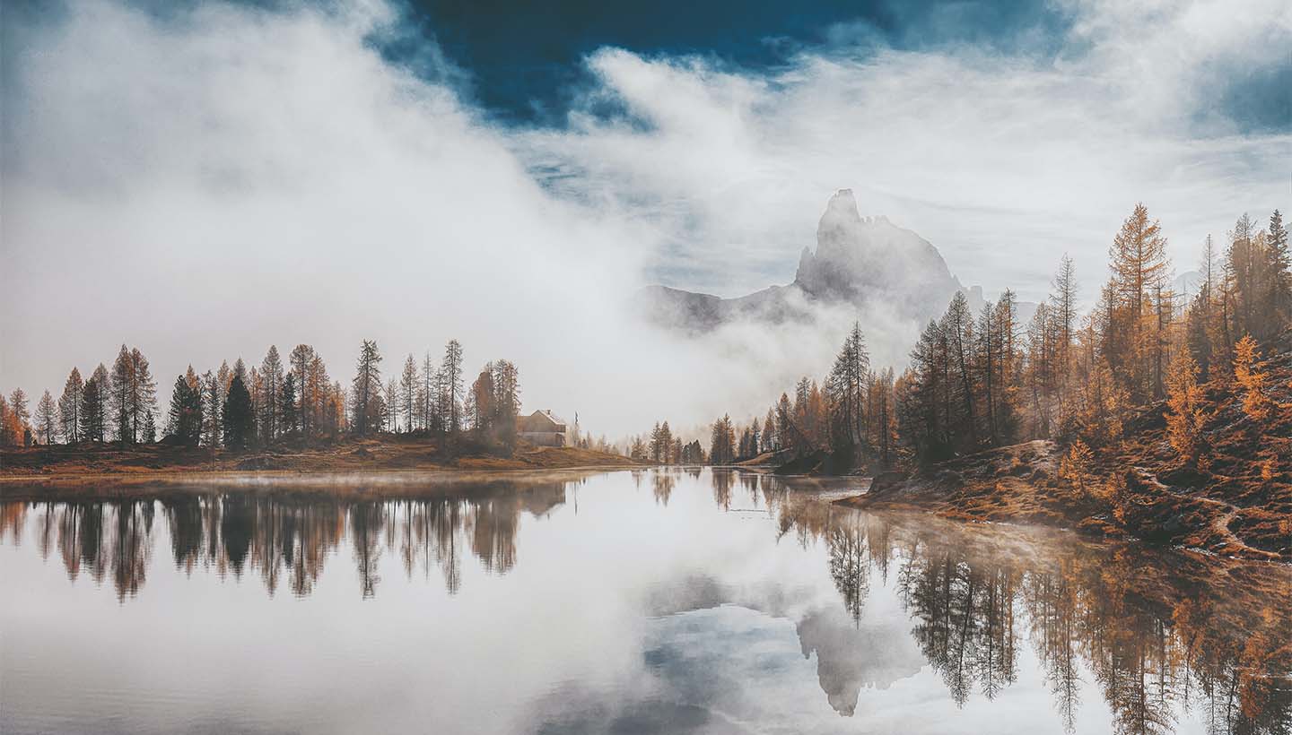
The beauty of the Italian Alps in mid-autumn comes with a perfect combination of cool blue sky, gray stone, and a whole spectre of brown, yellow, and orange trees. It’s a very calm and cozy palette making you reminisce of rural locations and feel like you need a mug of hot tea to complement the relaxed and adventurous image.
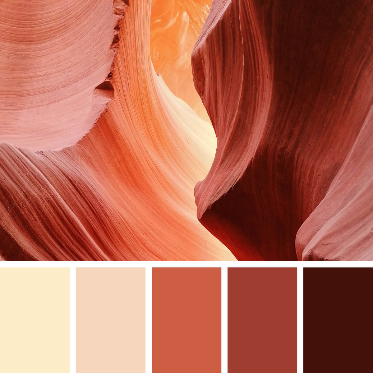
Sandy Beige & Copper
The play of light, color, contrast and texture transforms Antelope Canyon scenery (which is already fantastic by itself) into a spot created by an alien civilization. But while it seems so extraterrestrial, the palette brings beautiful shades of brown, red, pink, and orange. Combined, they can create nice monochrome and pseudo-monochrome combinations for brand concepts and various design aspirations.
Earthy & Lilac
The natural views can sometimes strike with absolutely unexpected colors. When you think of the mountain landscapes, you probably expect to see the icy white palette with lots of blues, so how about that? The play of light and textures create a fascinating image where the shades of violet and pink meet warm earthy palette for multiple color combinations.
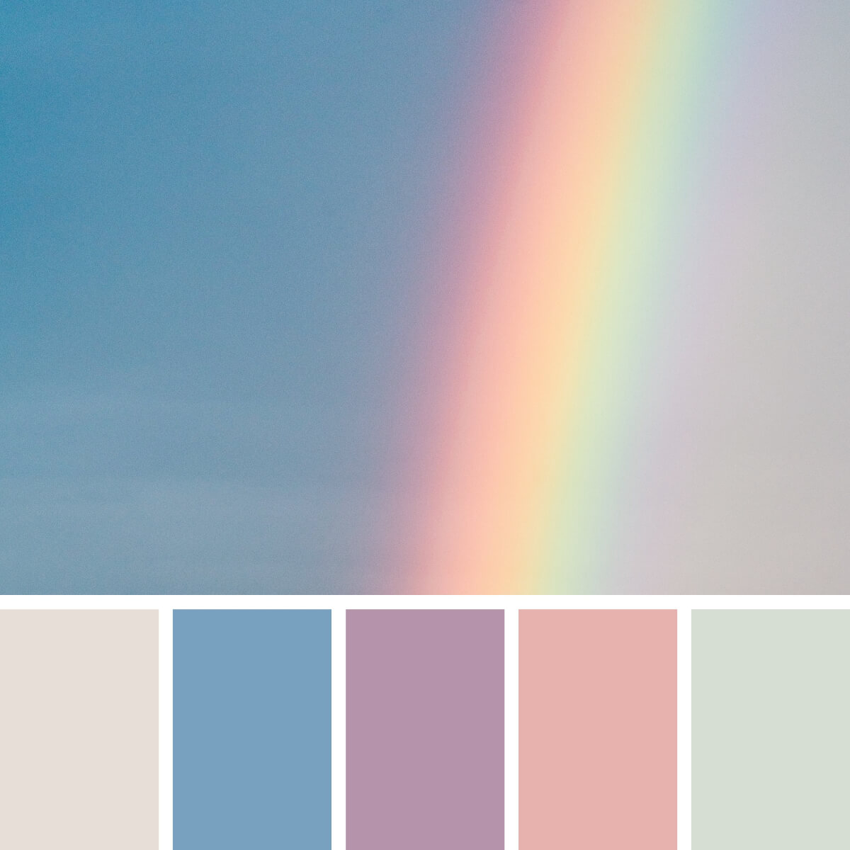
Rainbowy & Pastel
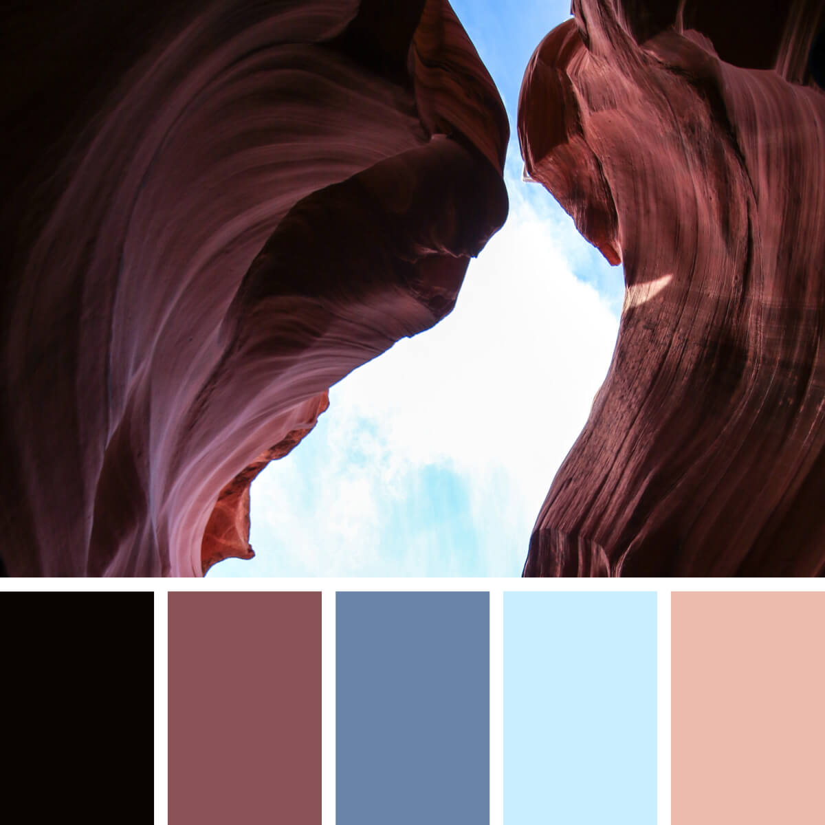
Arizona Brown & Blues
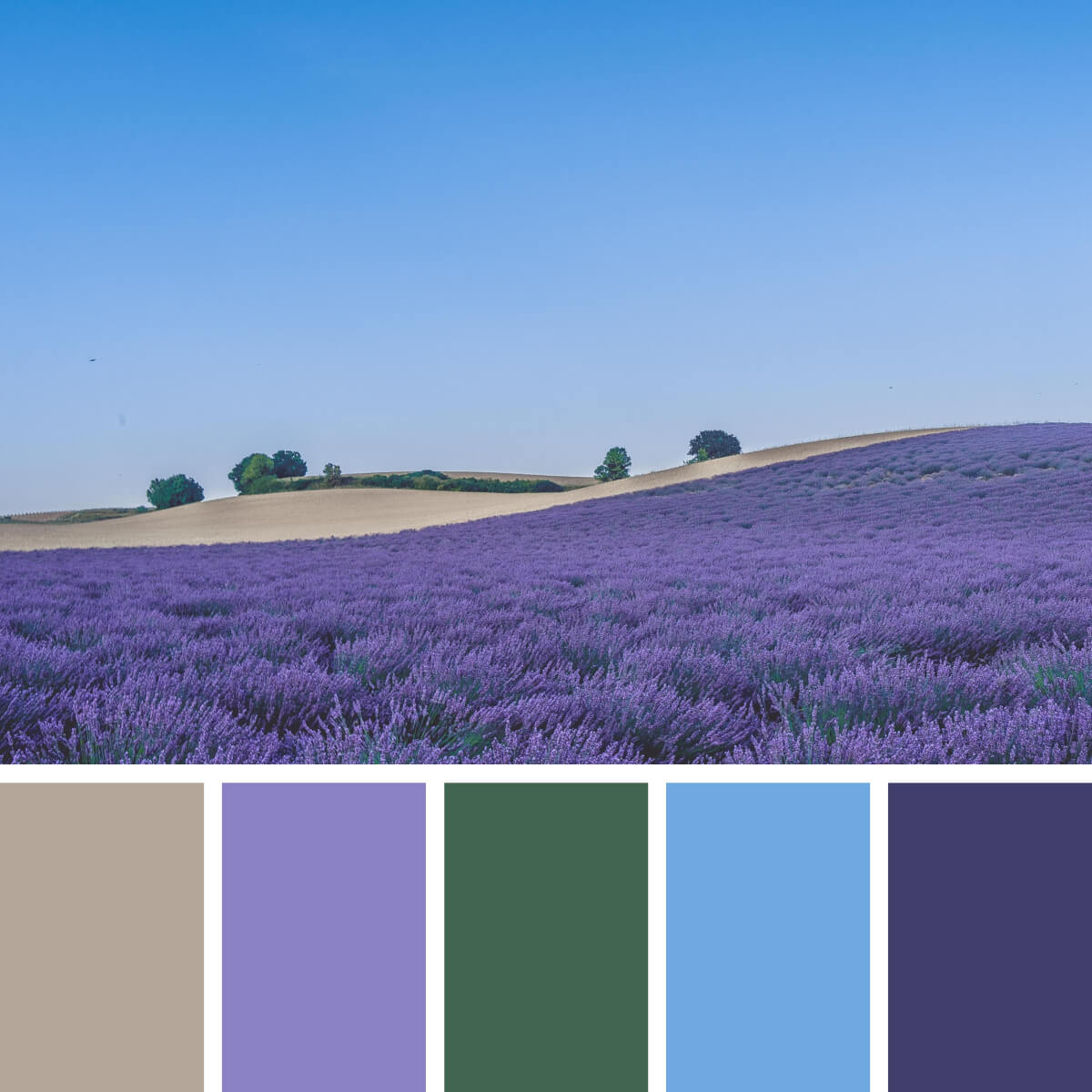
Provence Lavender & Blue
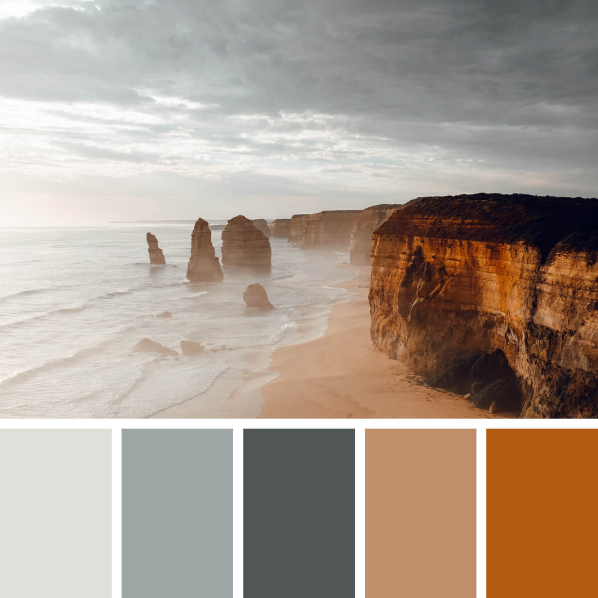
Sunny Gray & Sandy
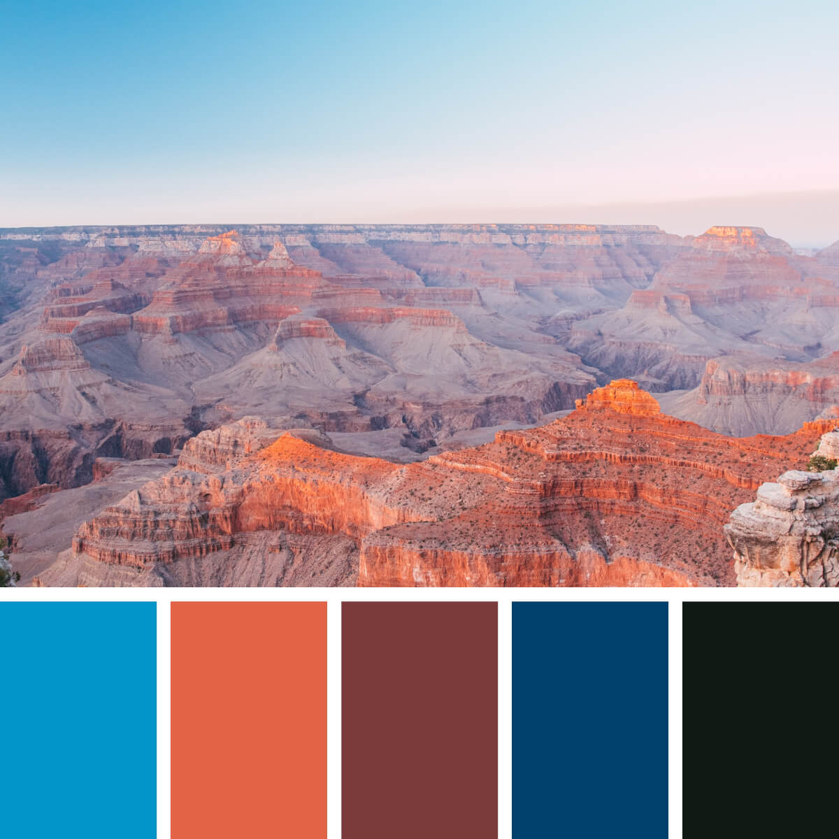
Desert Coral & Earthy
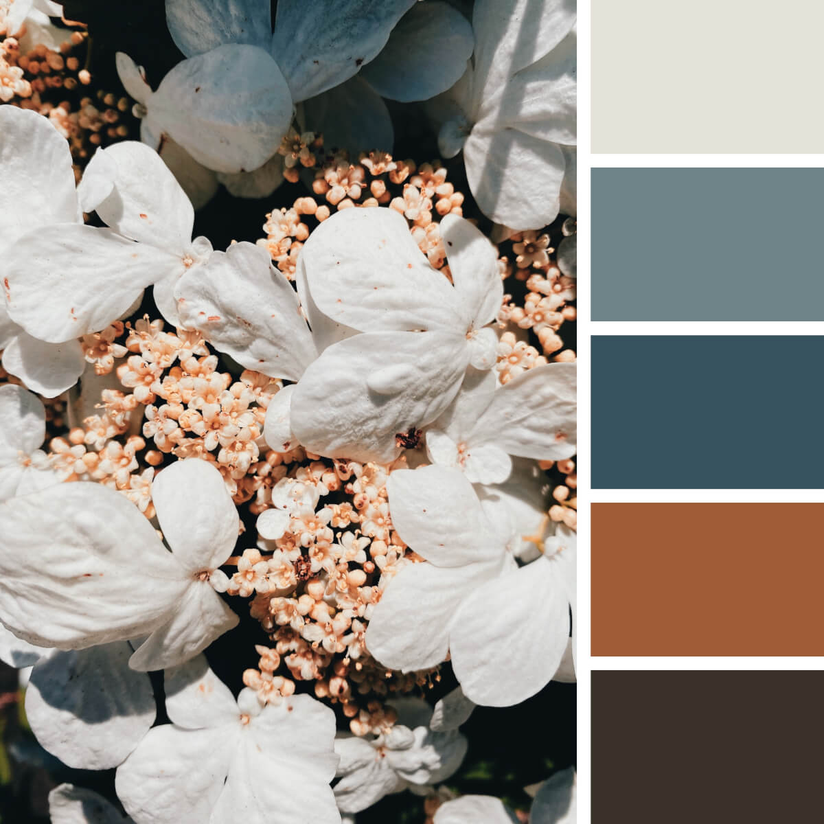
Pale Floral & Gray
Do you know this plant? It’s a Japanese snowball or Viburnum. Its inflorescence contains numerous flowerheads that start blooming consequently. So they carry you from milky white to yellowish and dark brown, and there are noble gray undertones to complement the palette and make it extremely versatile — so you can even use it for business and finance-related projects.
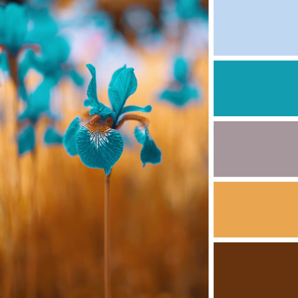
Gold & Turquoise
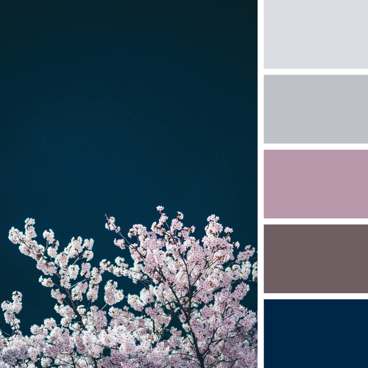
Sakura Pink & Navy
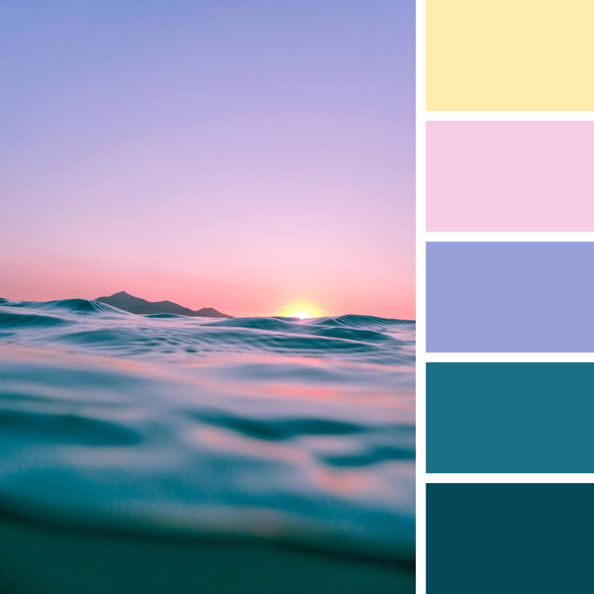
Marine & Subtle Pink
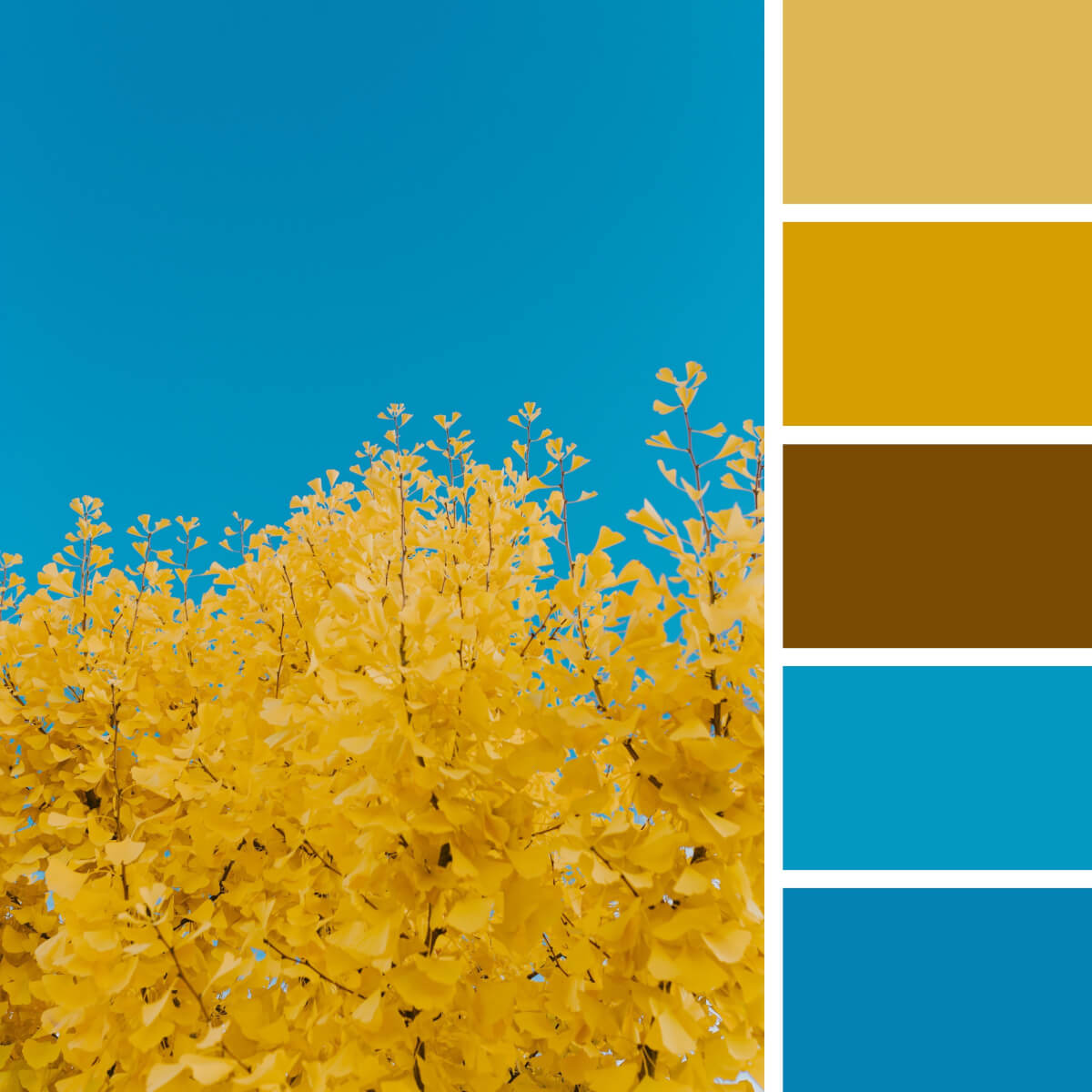
Autumn Gold & Blues
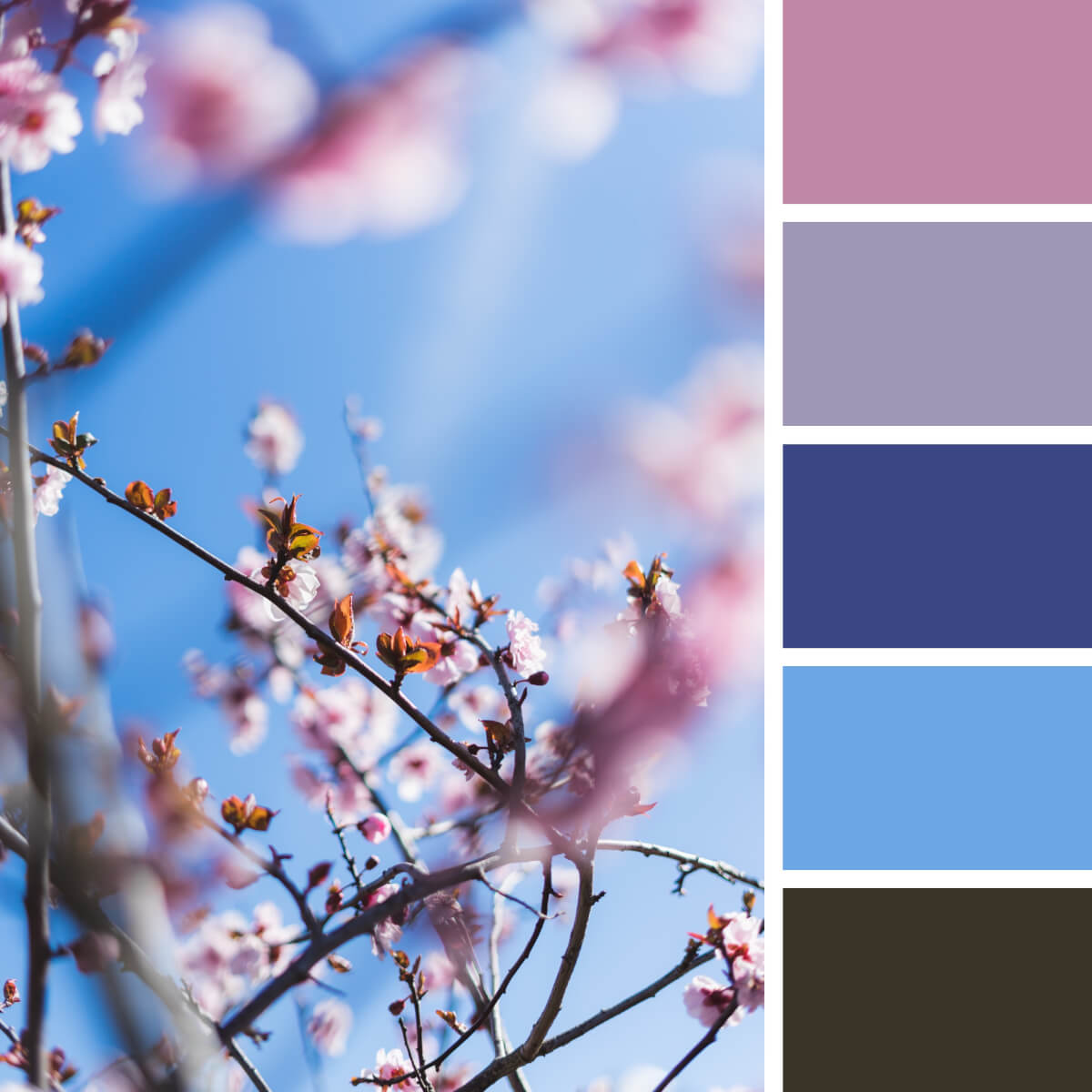
Classic Cherry & Blue
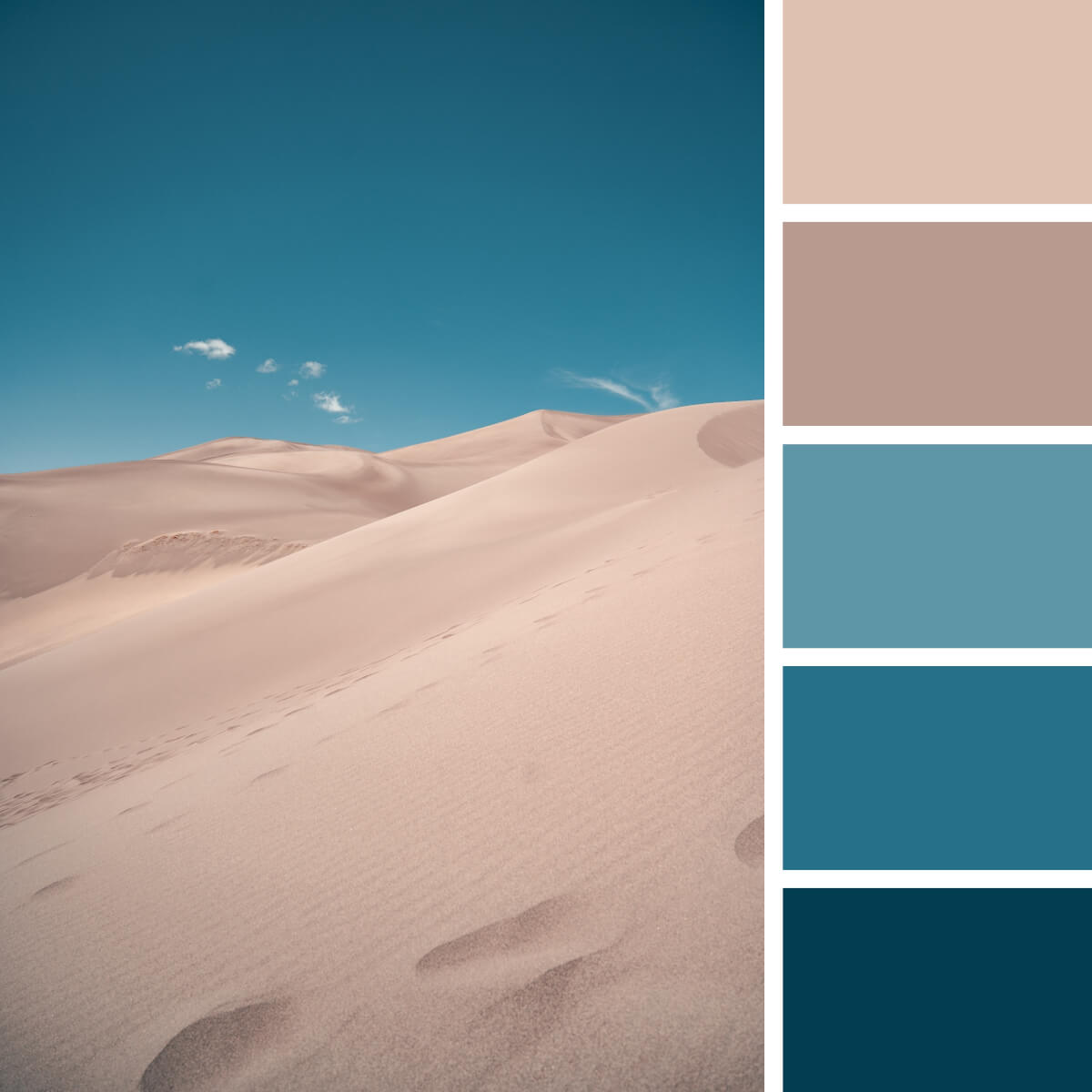
Sea Blue & Beige
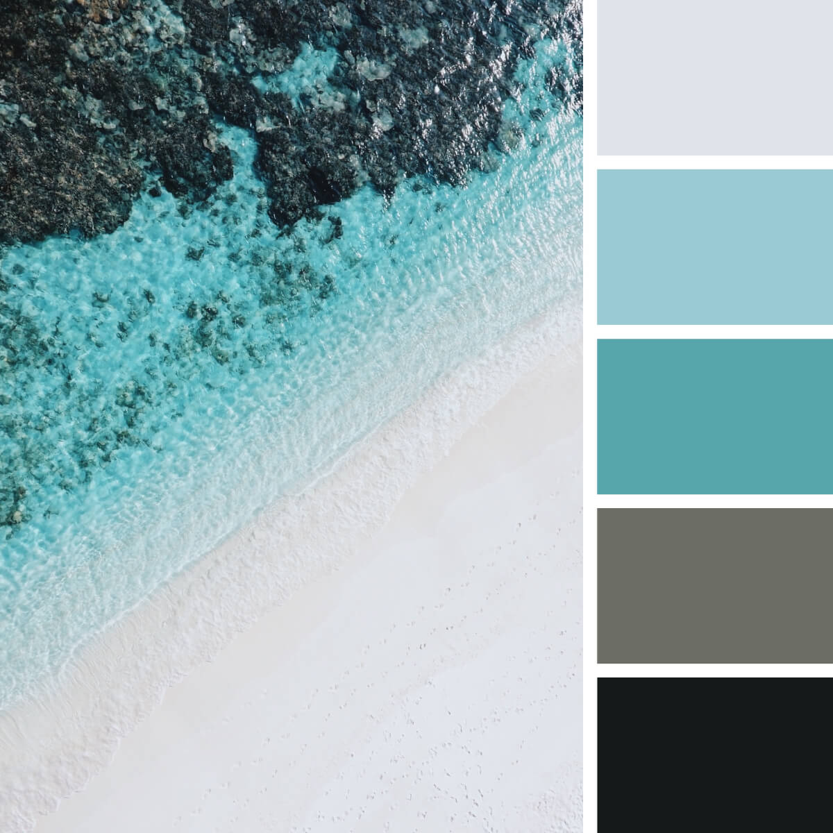
Marine & Refreshing Teal
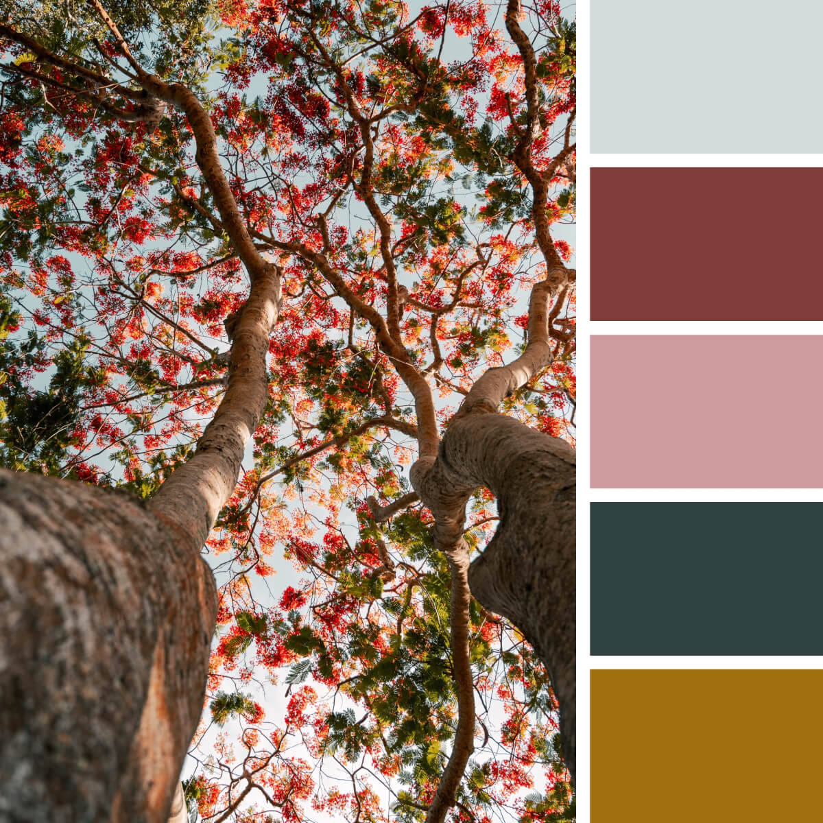
Leafy & Colorful
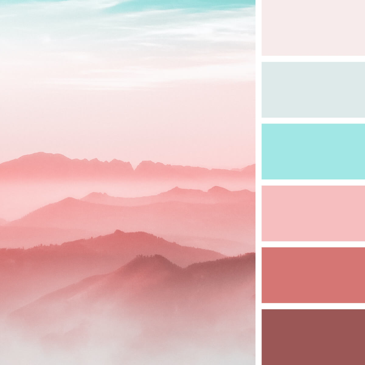
Pastel Pink & Cyan
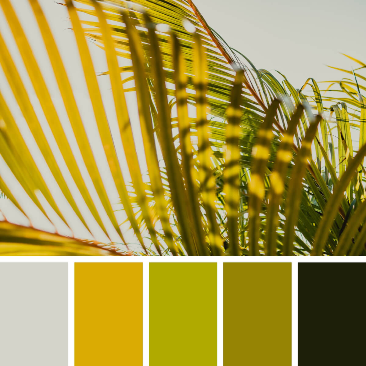
Leafy Gold & Green
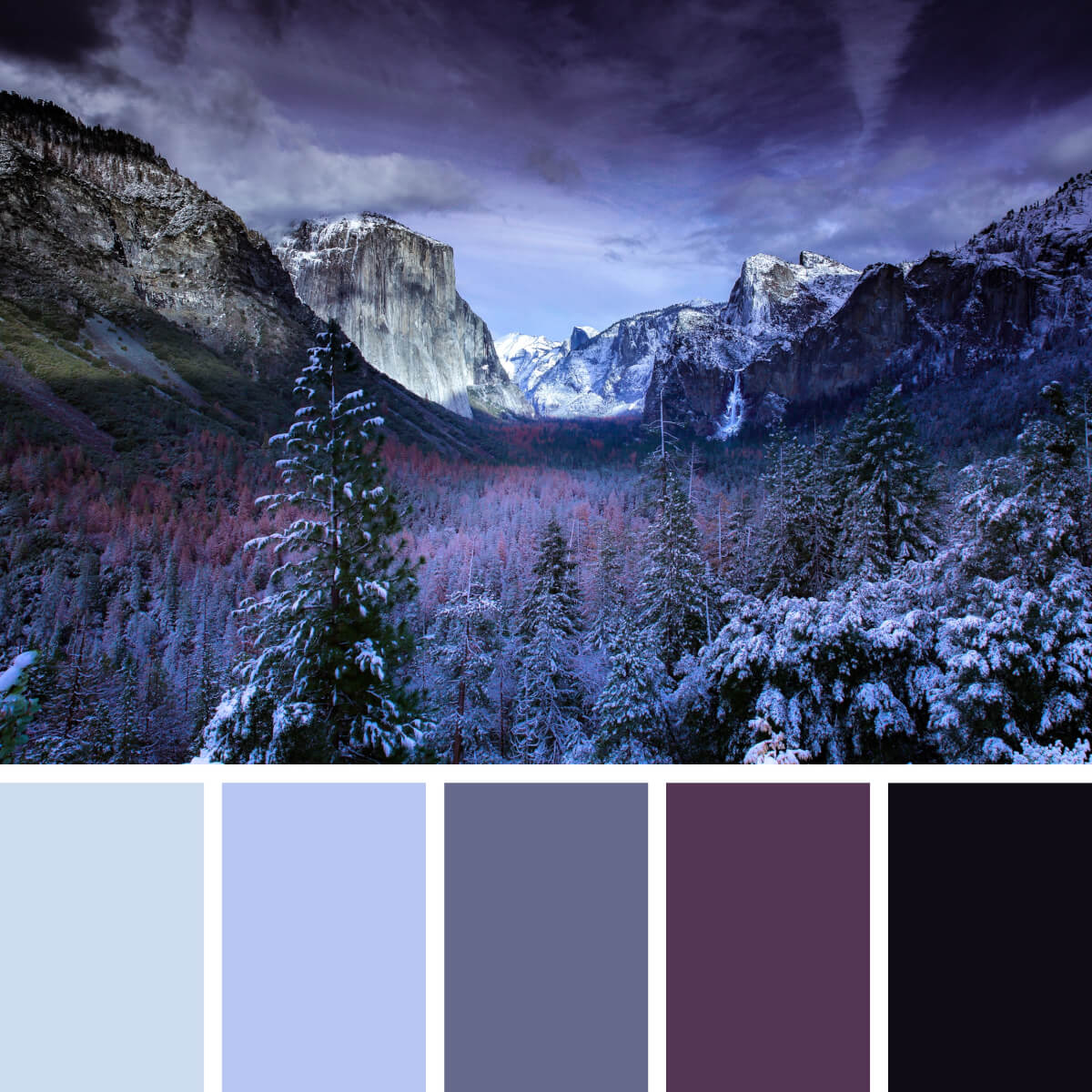
Freezing & Violet
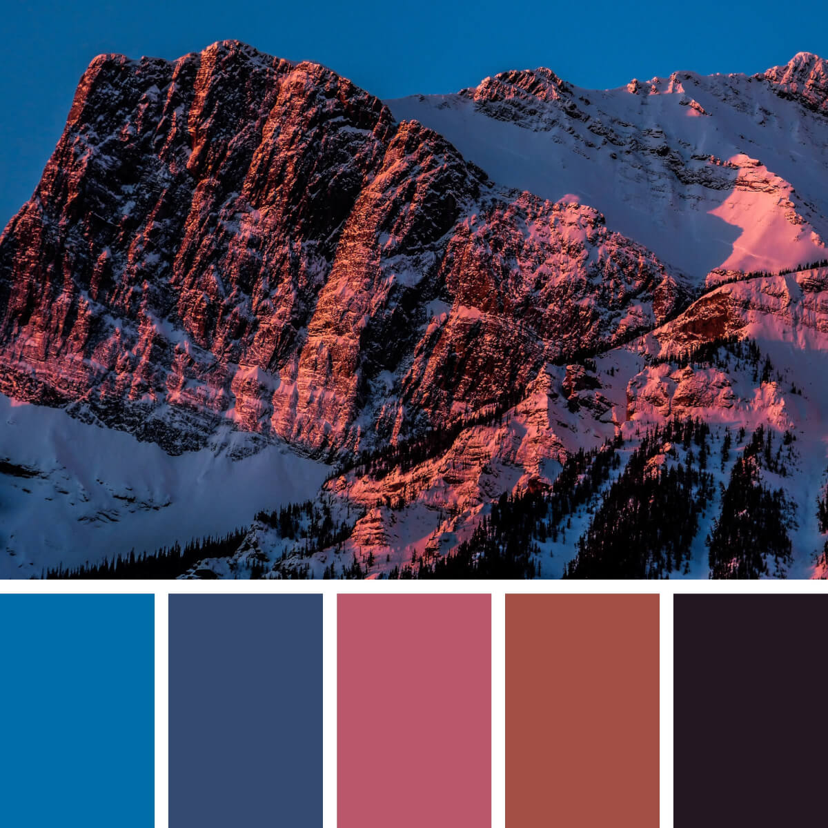
Cool Lilac & Pink
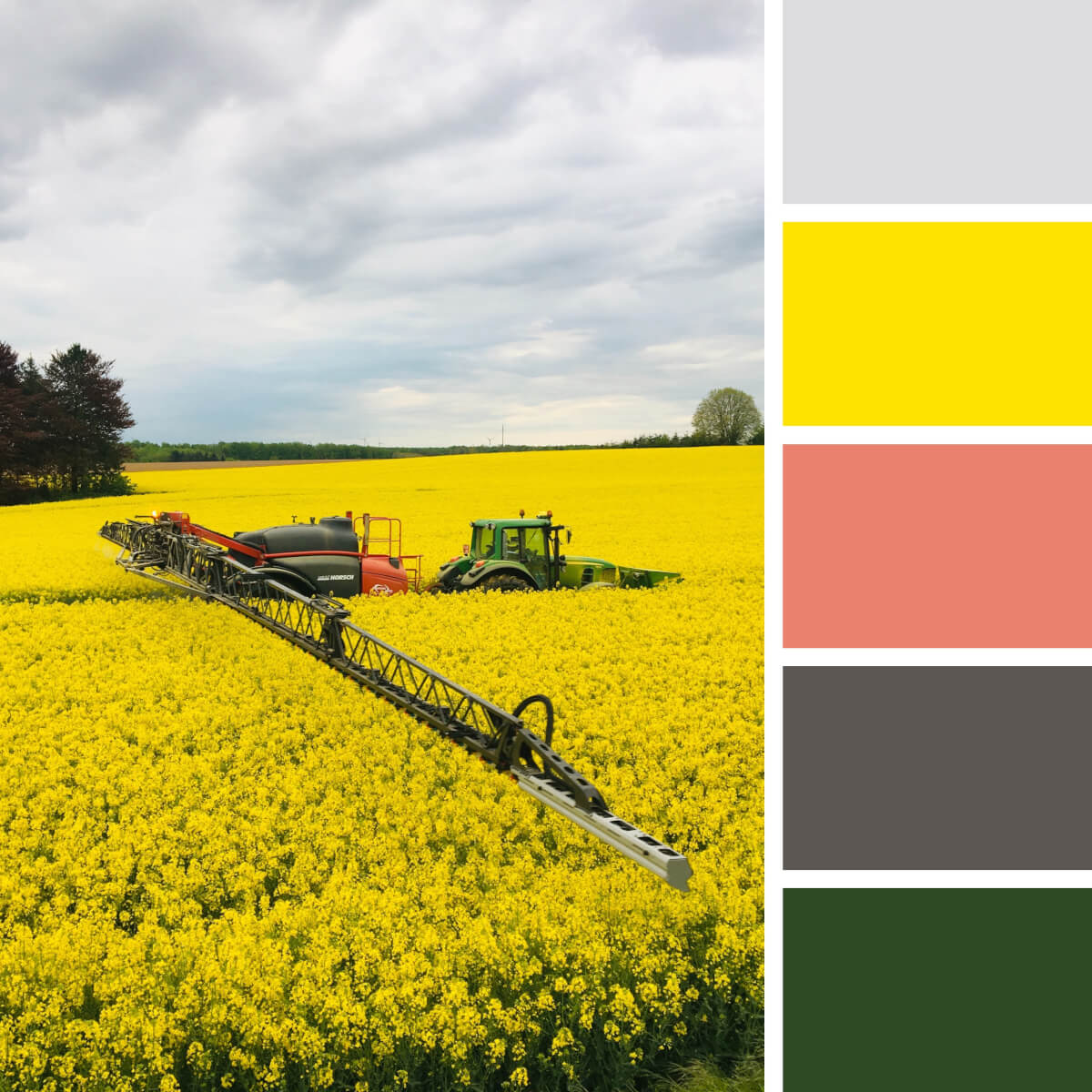
Spring Gold & Gray
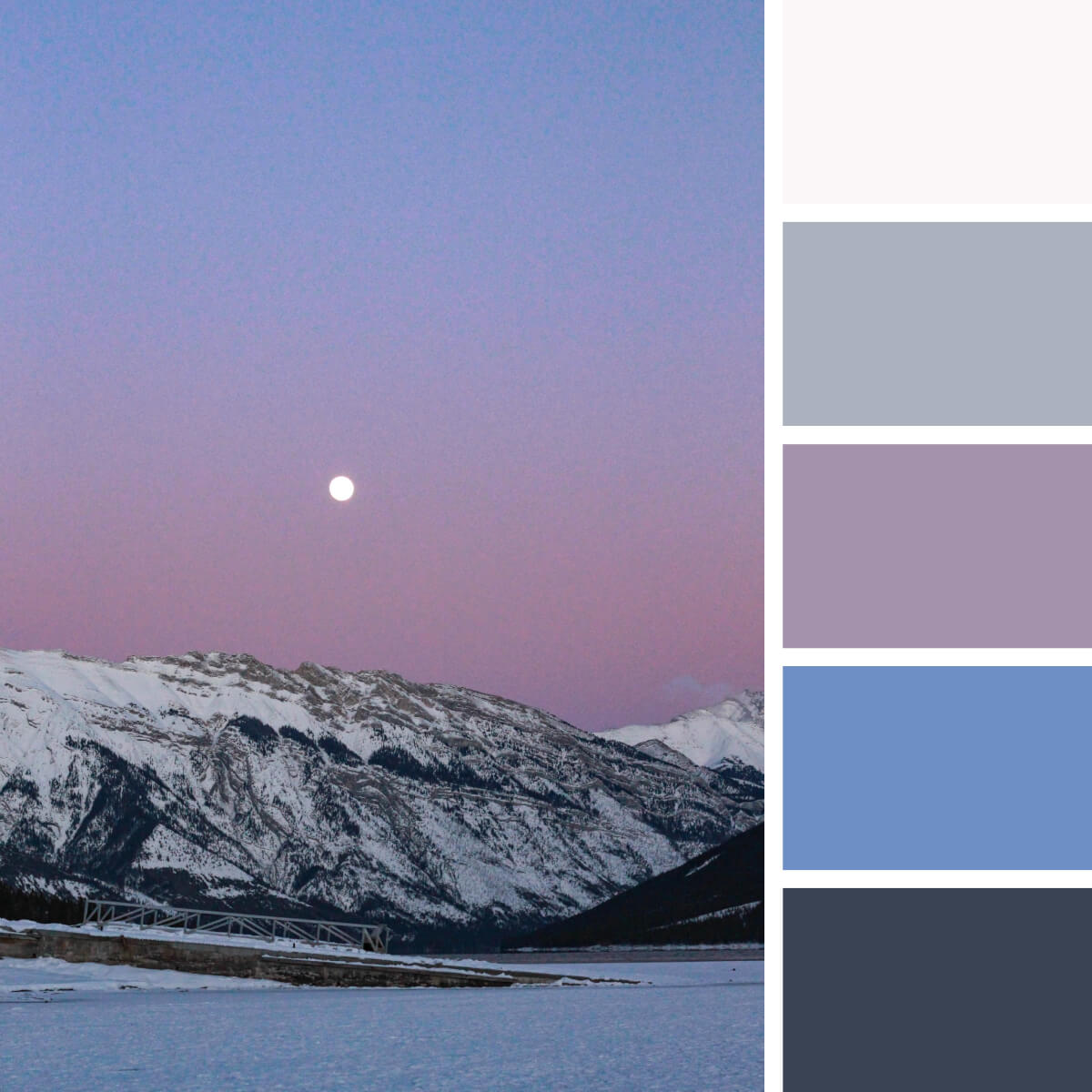
Moony & Violet
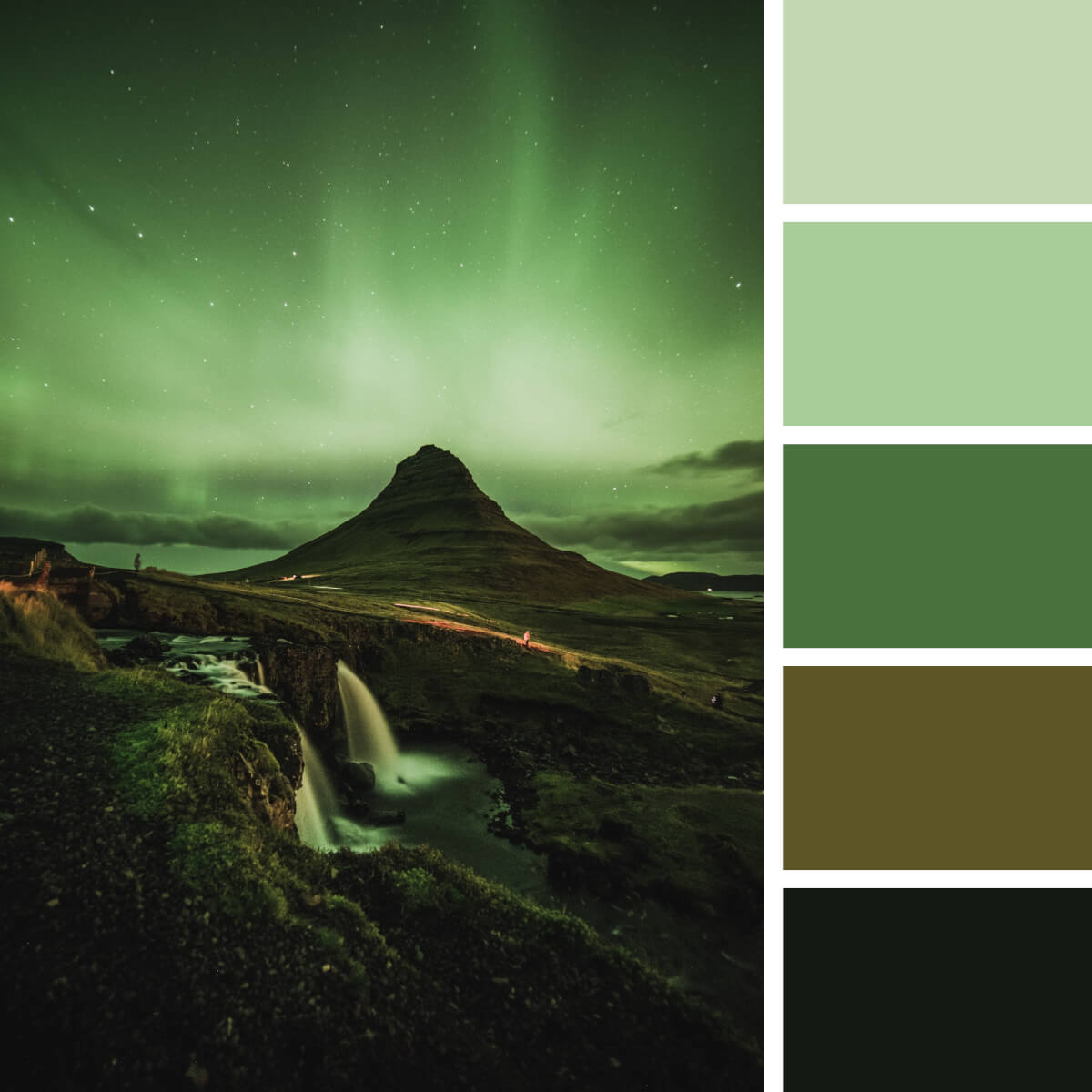
Monochrome Green & Black
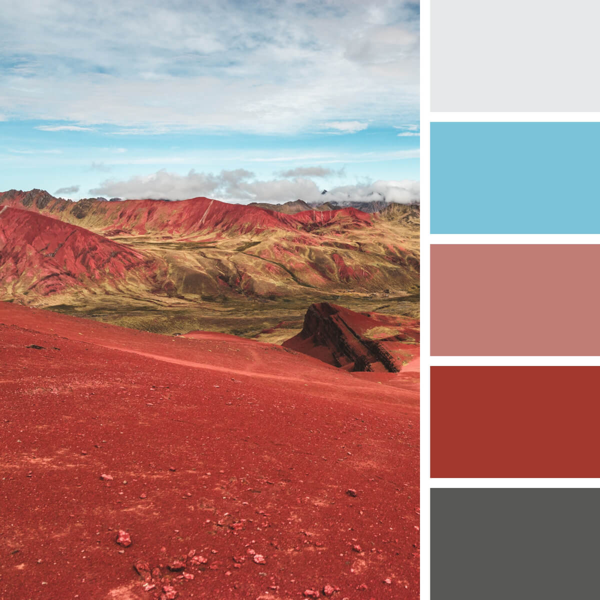
Earthy Red & Rocky
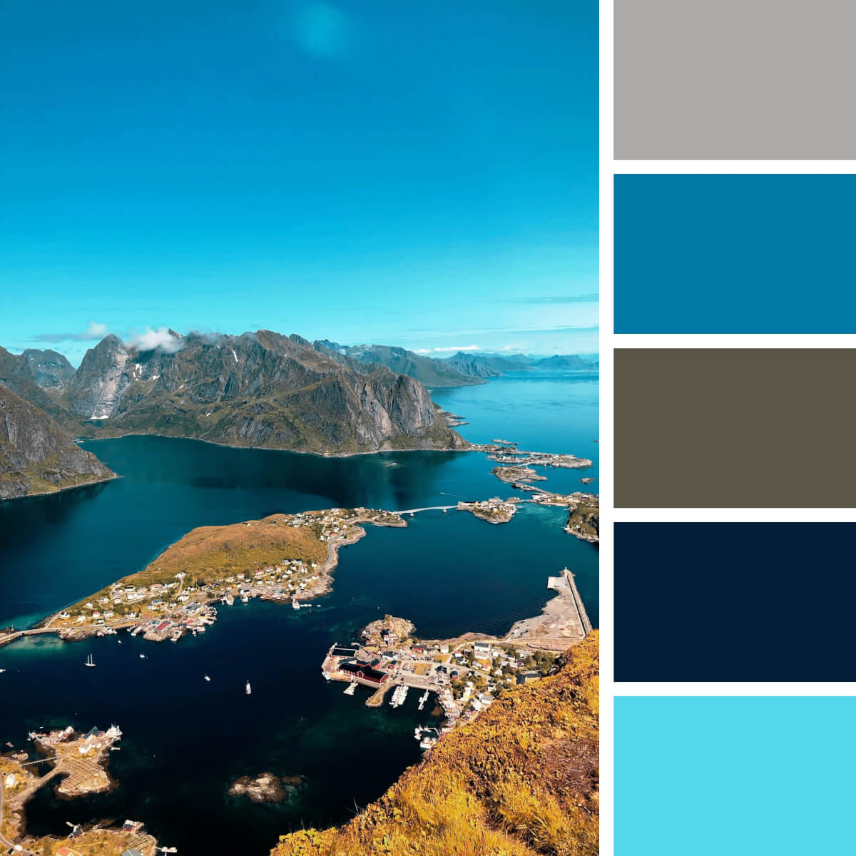
Sea Blue & Teal
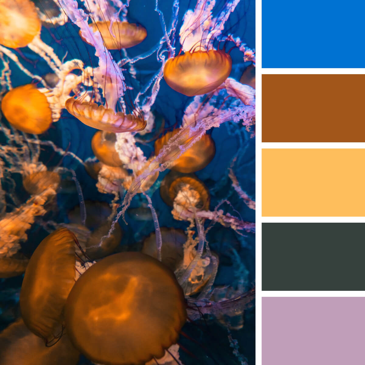
Jellyfish Yellow & Royal Blue
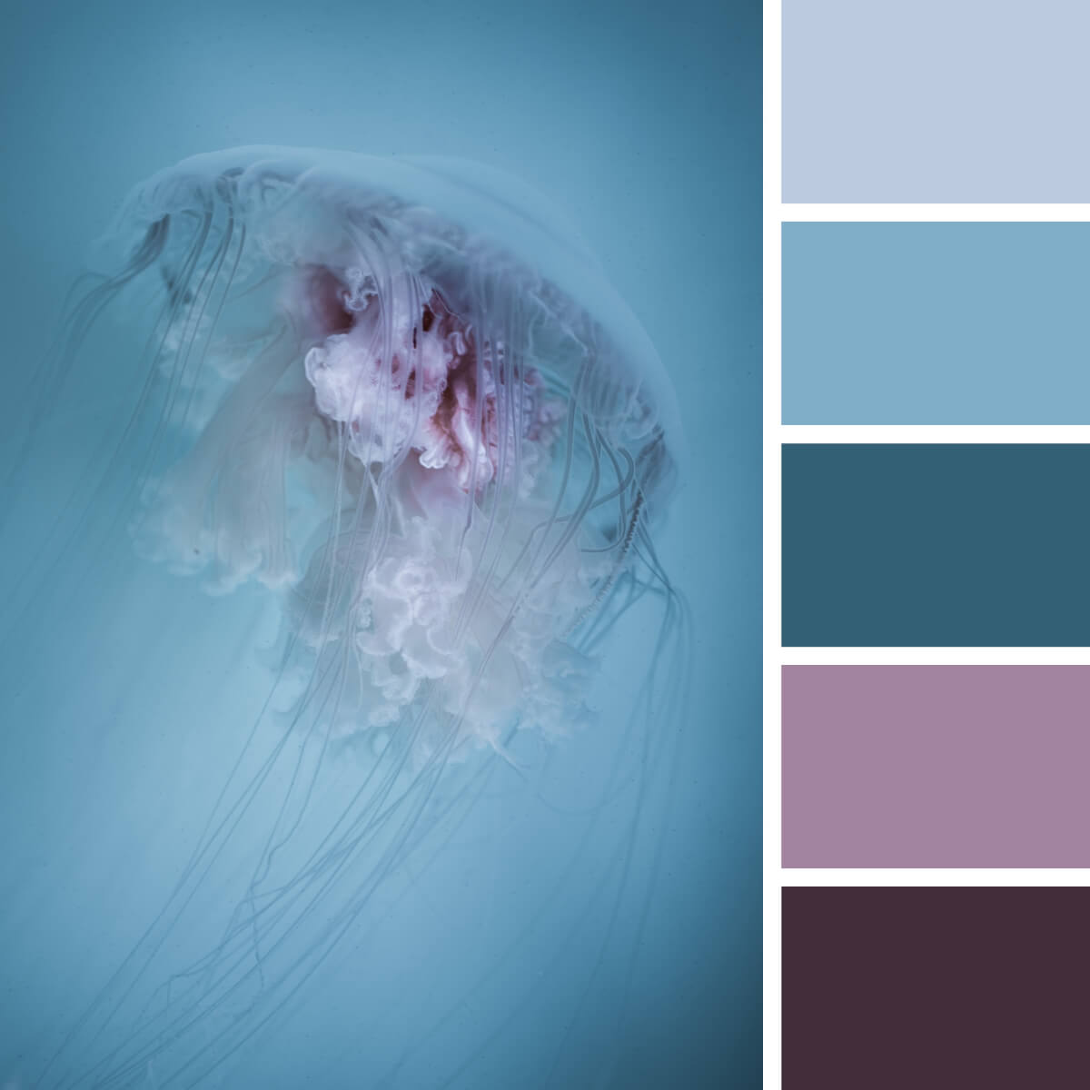
Faded Pink & Turquoise
Urban Color Combinations
Find yourself in the center of a busy megapolis, where the craziest color combinations are made— and where concrete and brick have millions of shades, so you’ll never see two similar ones. Similar to the natural theme, urban color palettes are incredibly multifaceted. Even though some focal elements dictate what the city is made of — like metro, taxi, glass skyscrapers, neon signages, or green zones — the abundance of engaging variations is endless!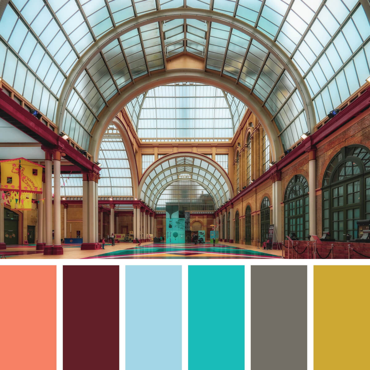
Royal Coral & Turquoise
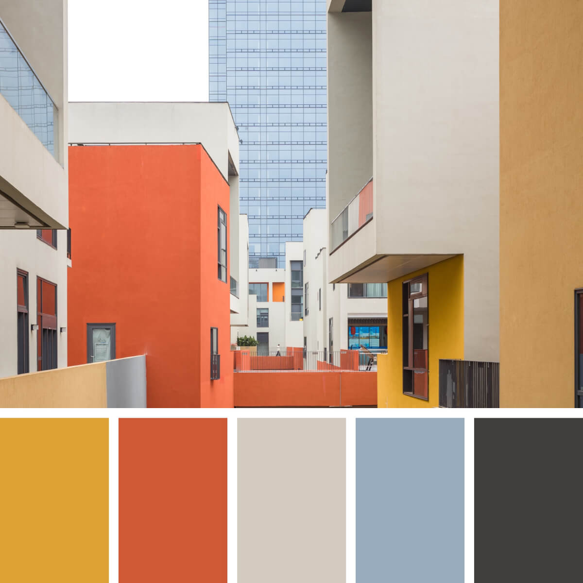
Bright Orange & Blue
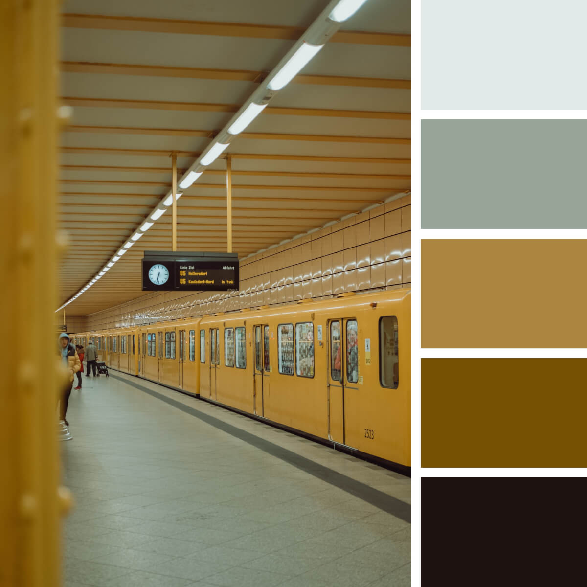
Neutral Yellow & Gray
Rise up your hand if you’re one of those who is constantly mesmerized by metro stations? Some great news for you: going underground is a great idea to source color inspiration! You can start with this warm palette enriched by the shades of grey and then travel from one spot to another, searching for another nice color combination for graphic design purposes.
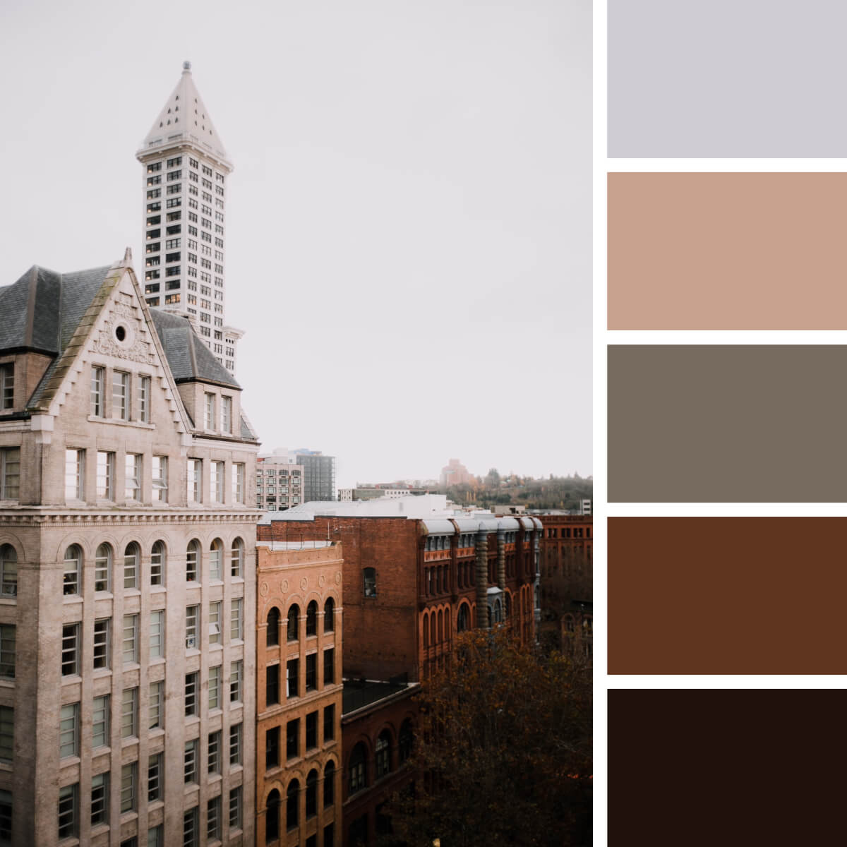
Retro Beige & Brown
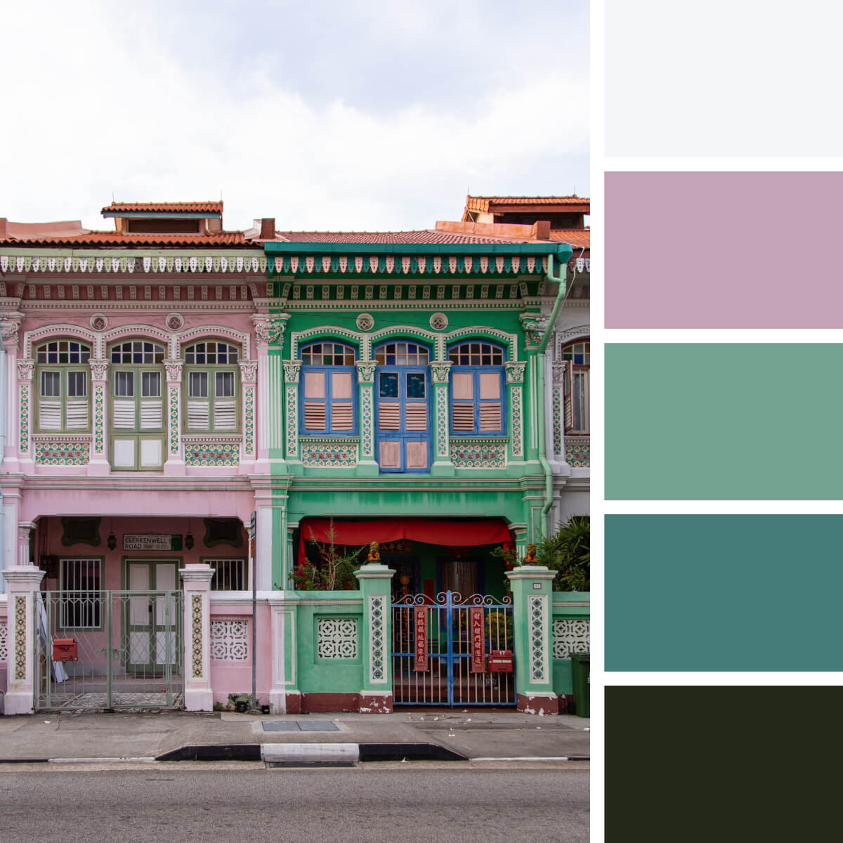
Joyful Pink & Green
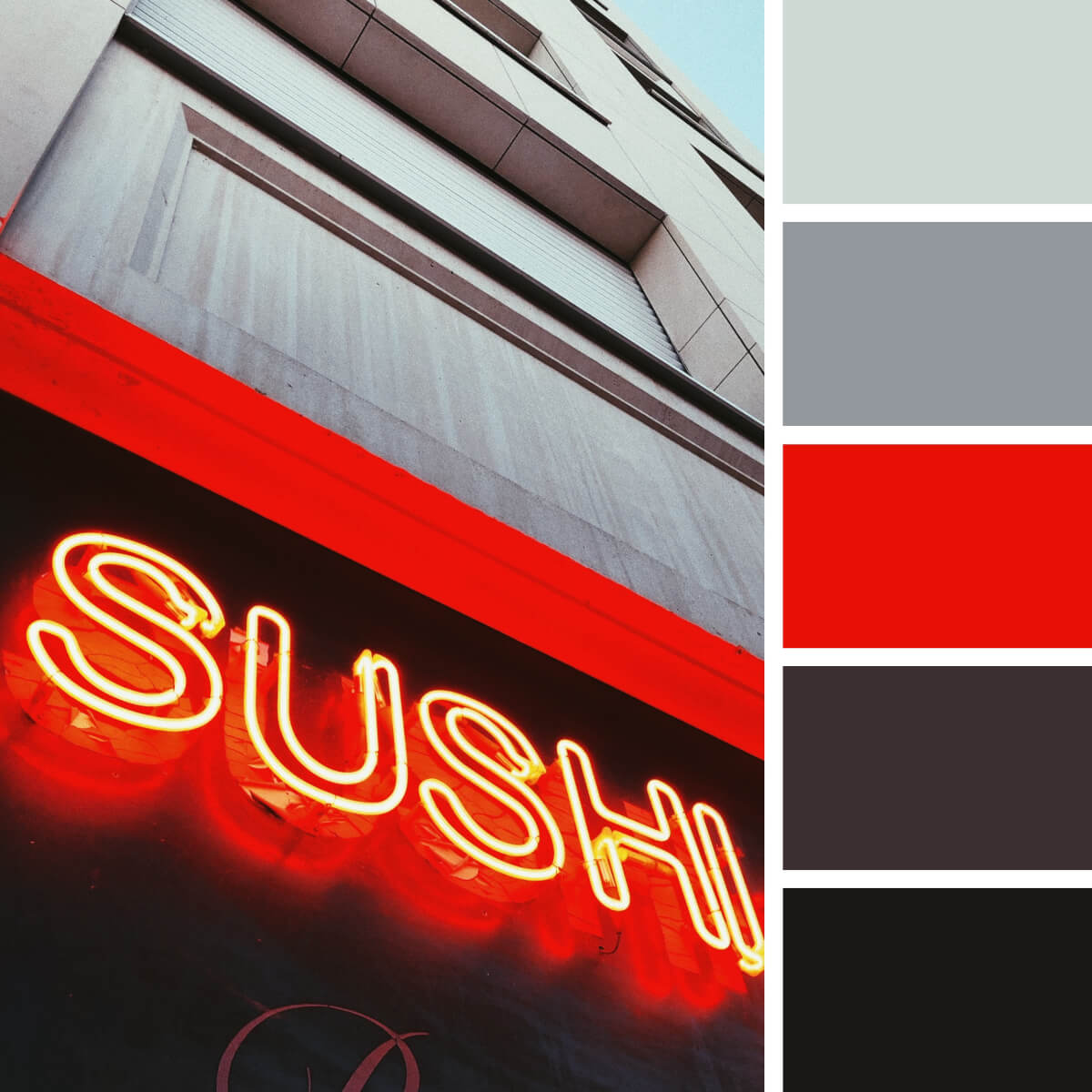
Megapolis Gray & Red
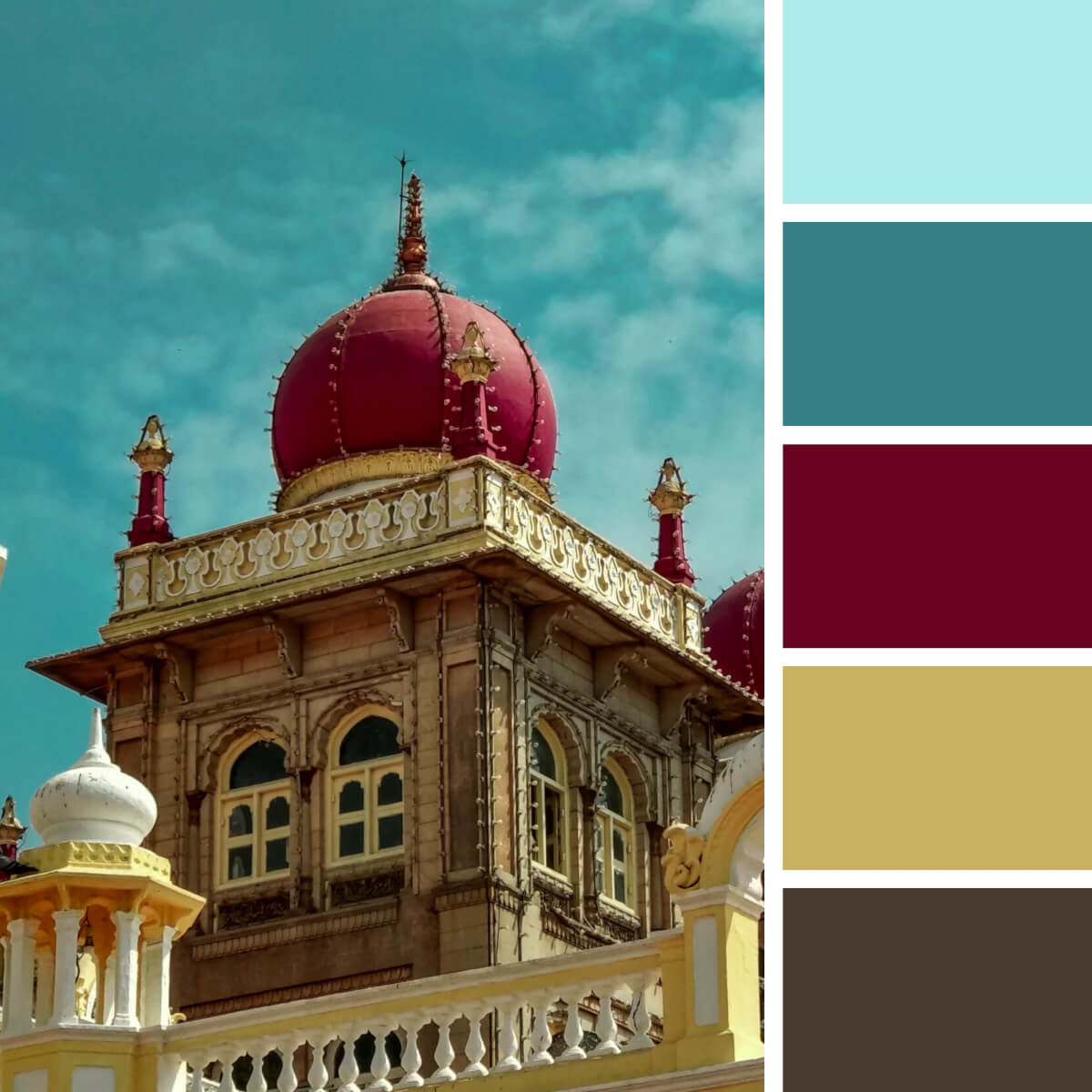
Majestic Gold & Burgundy
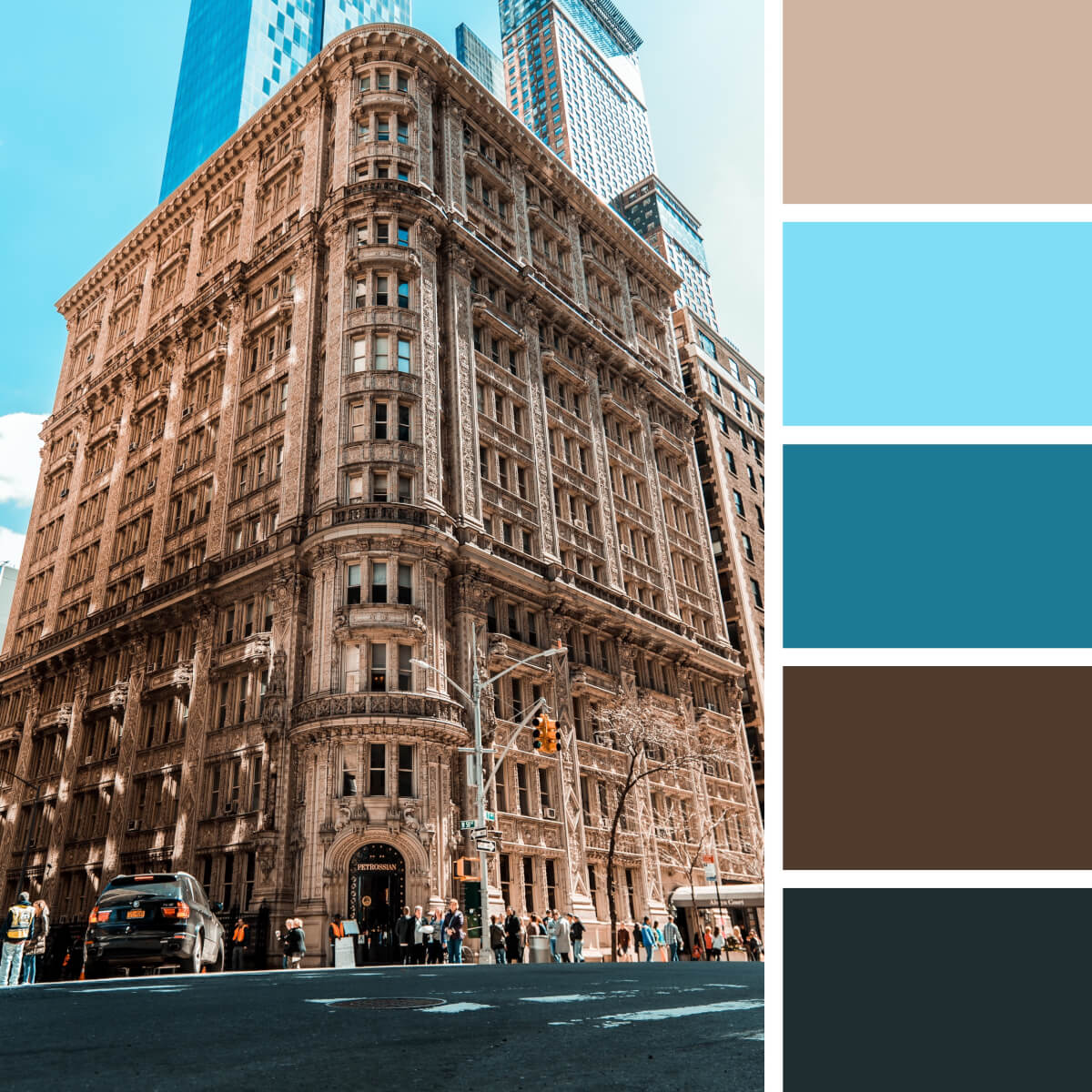
Classic Brown & Beige
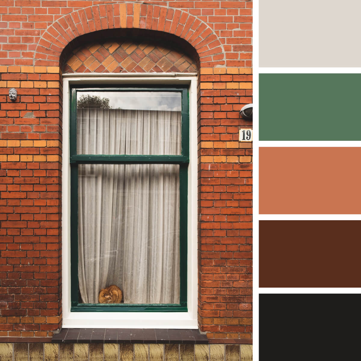
Brick Red & Green
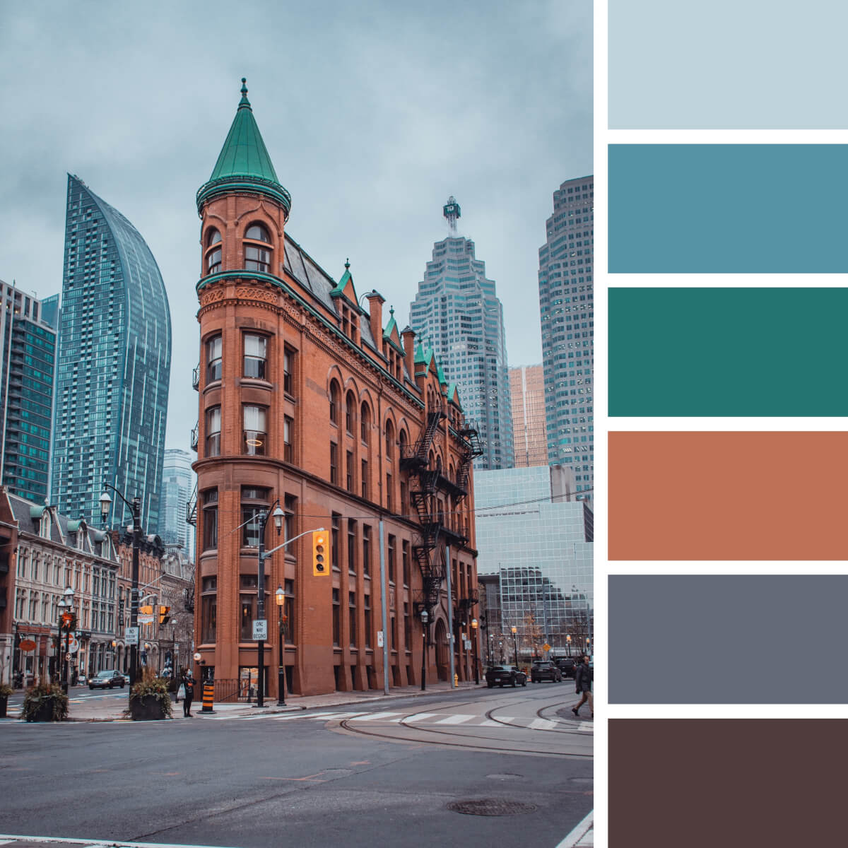
Urban Teal & Red
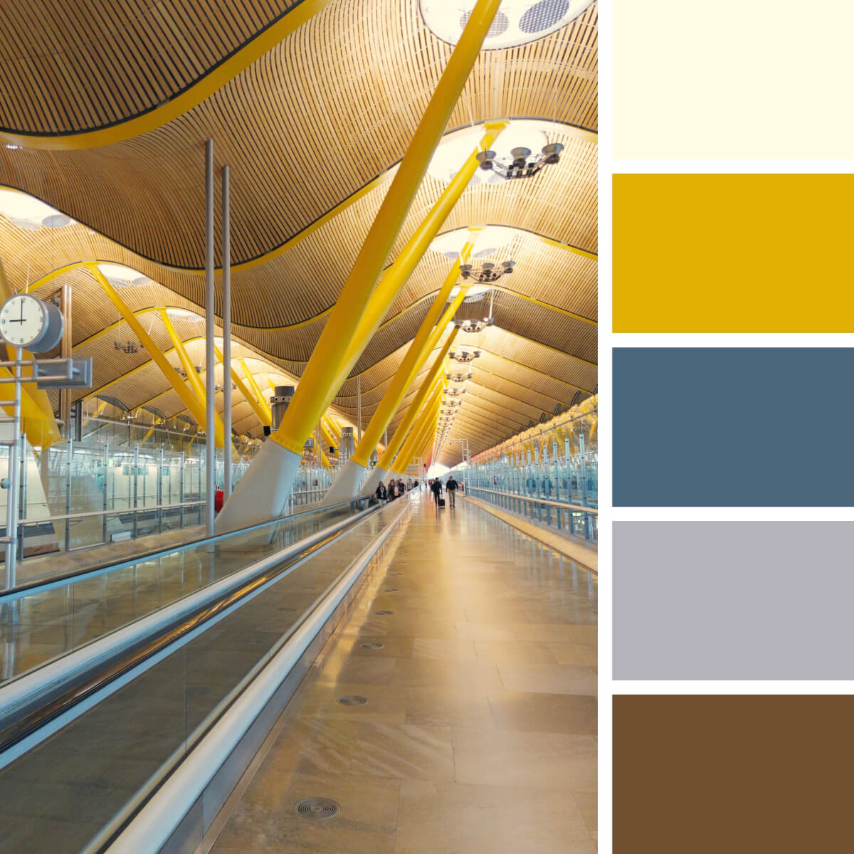
Gold Yellow & Gray
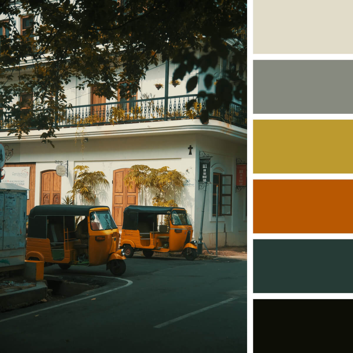
Pacific Orange & Ochre
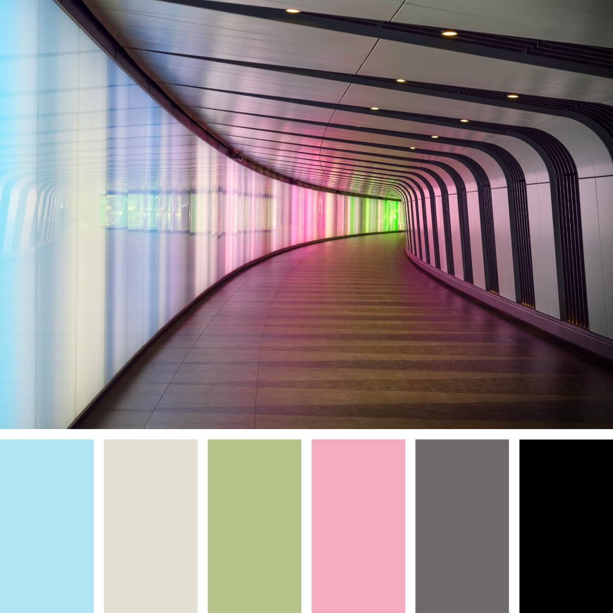
Colorful Neon & Candy
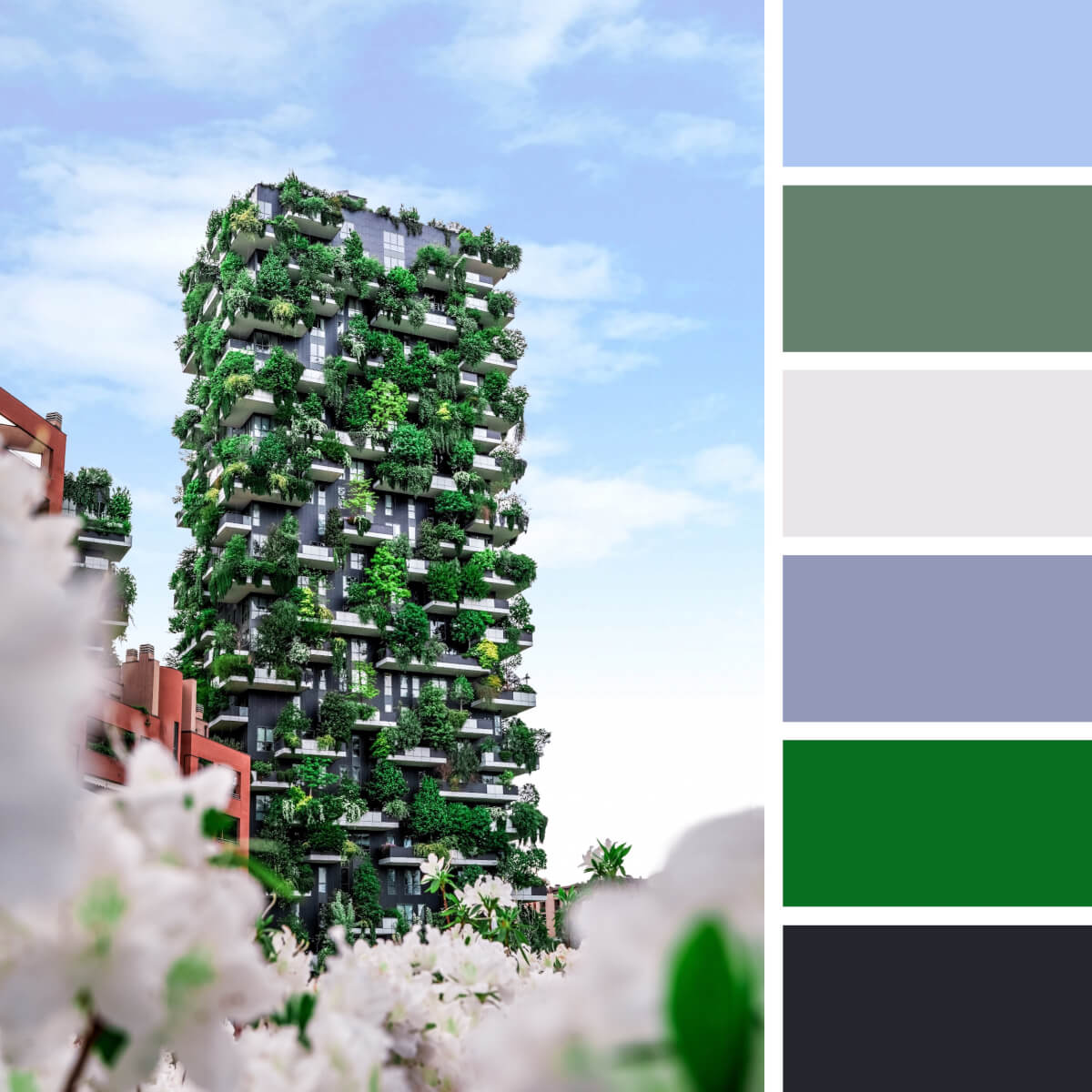
Juicy Greens & Beige
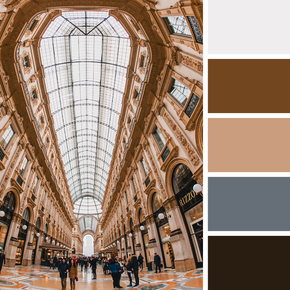
Monumental Beige & Brown
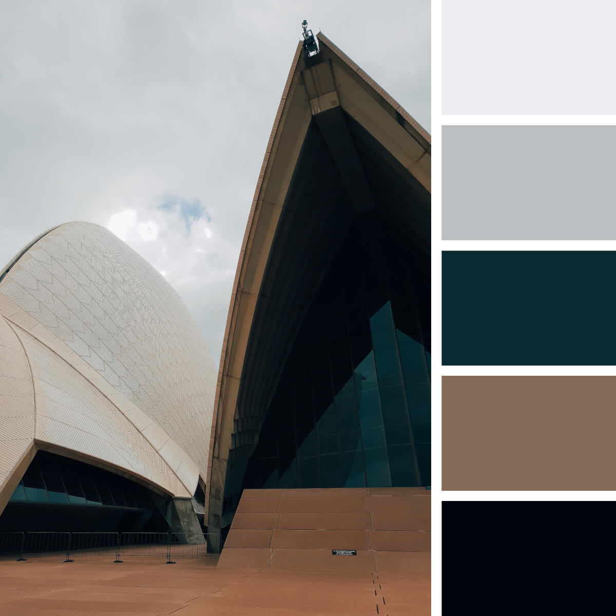
Neutral Gray & Beige
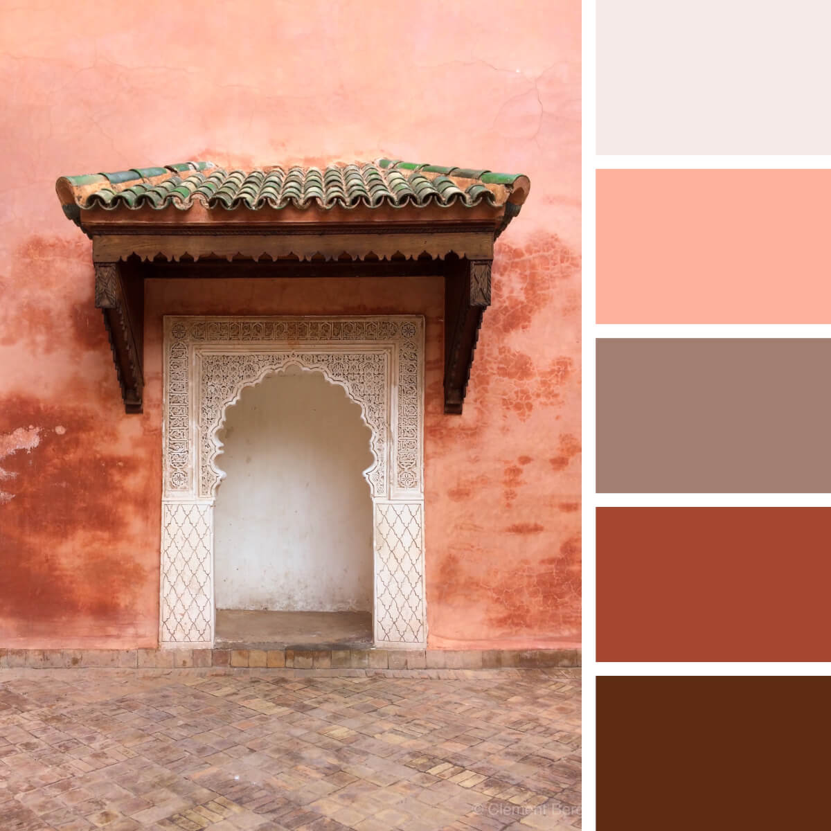
Ethnic Coral & Copper
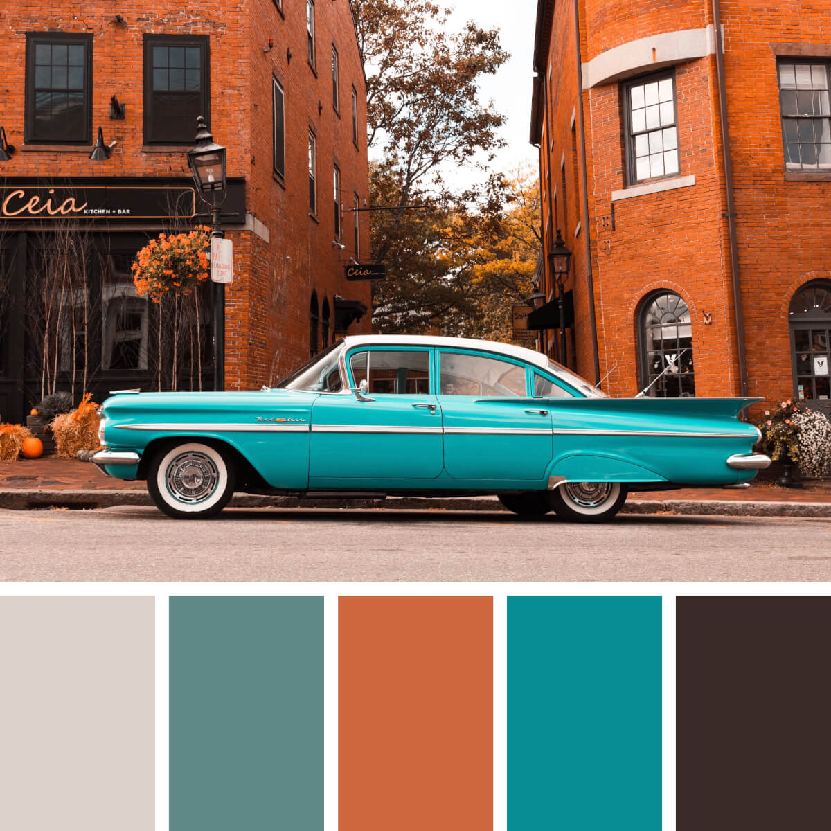
Vintage Red & Teal
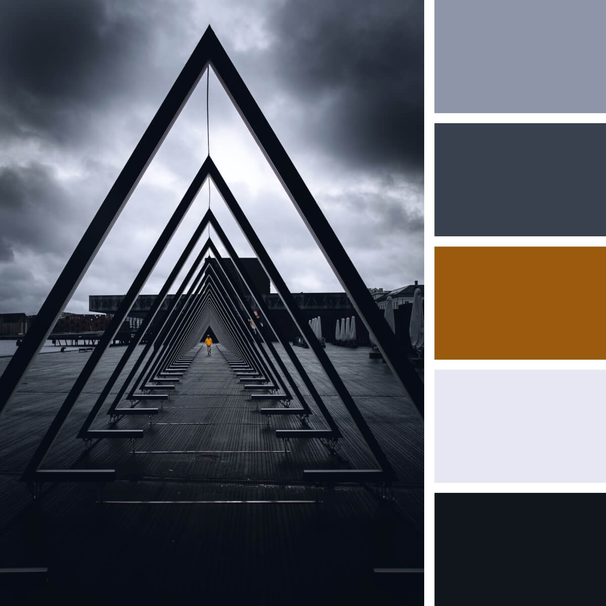
Cinematic Gray & Black
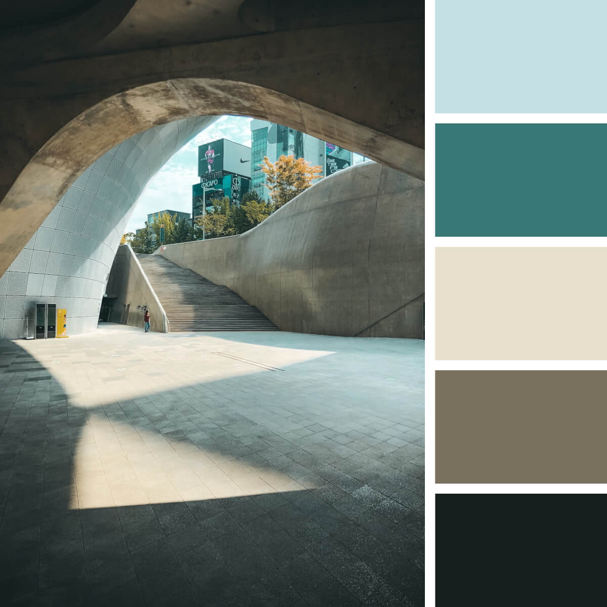
Brown Concrete & Glass
Food Color Combinations
Color can be delicious, and we’ll prove it! Juicy fruit and vegetables, drinks, desserts, and appetizers — they not just sound mouth-watering but can help you find perfect color combinations. There’re сold palettes featuring citrus fruit to warm ones with coffee drinks, chocolate, and bread, which are so engaging that you’ll be able to capture the crunchy texture only via the selected colors.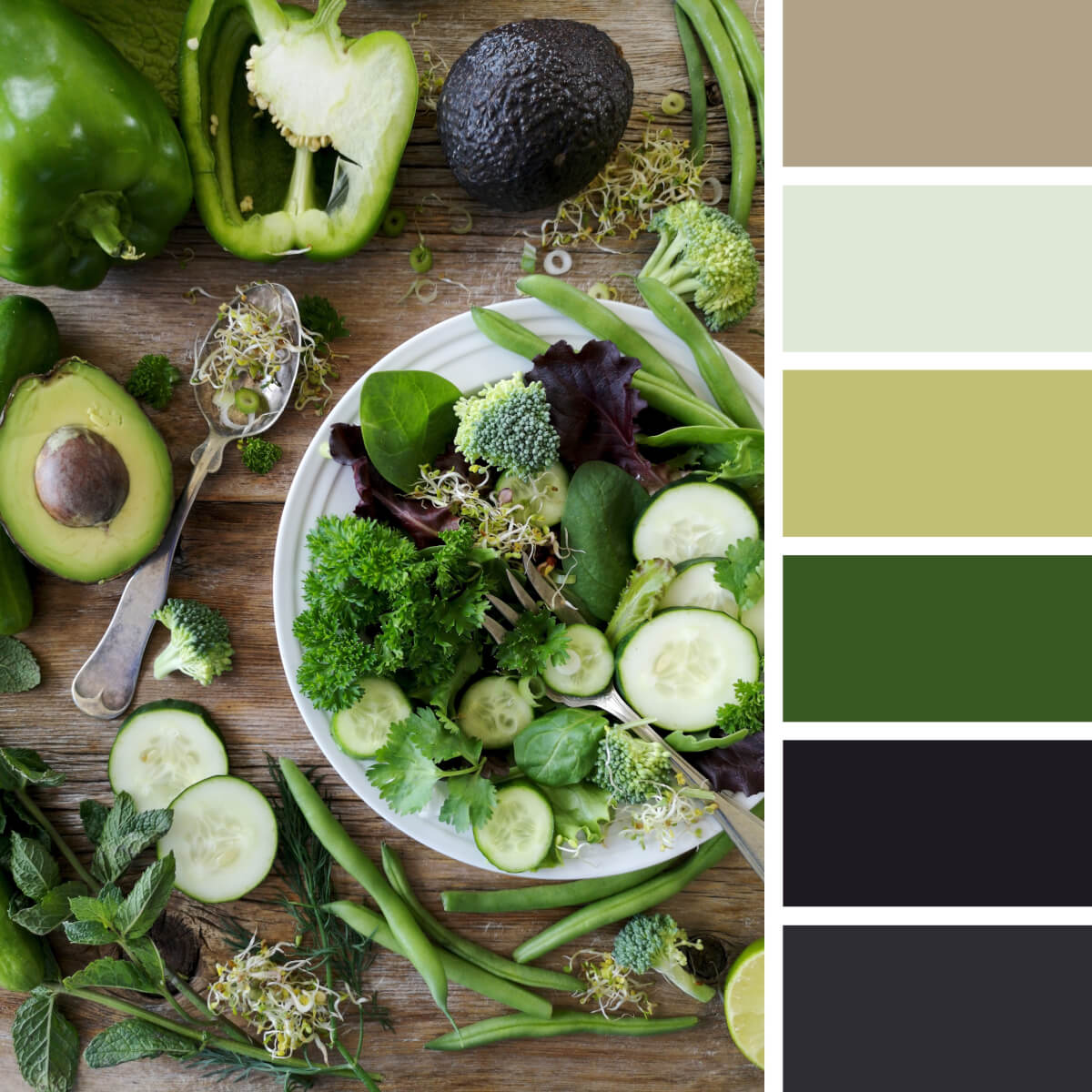
Vitamin Greens & Purple
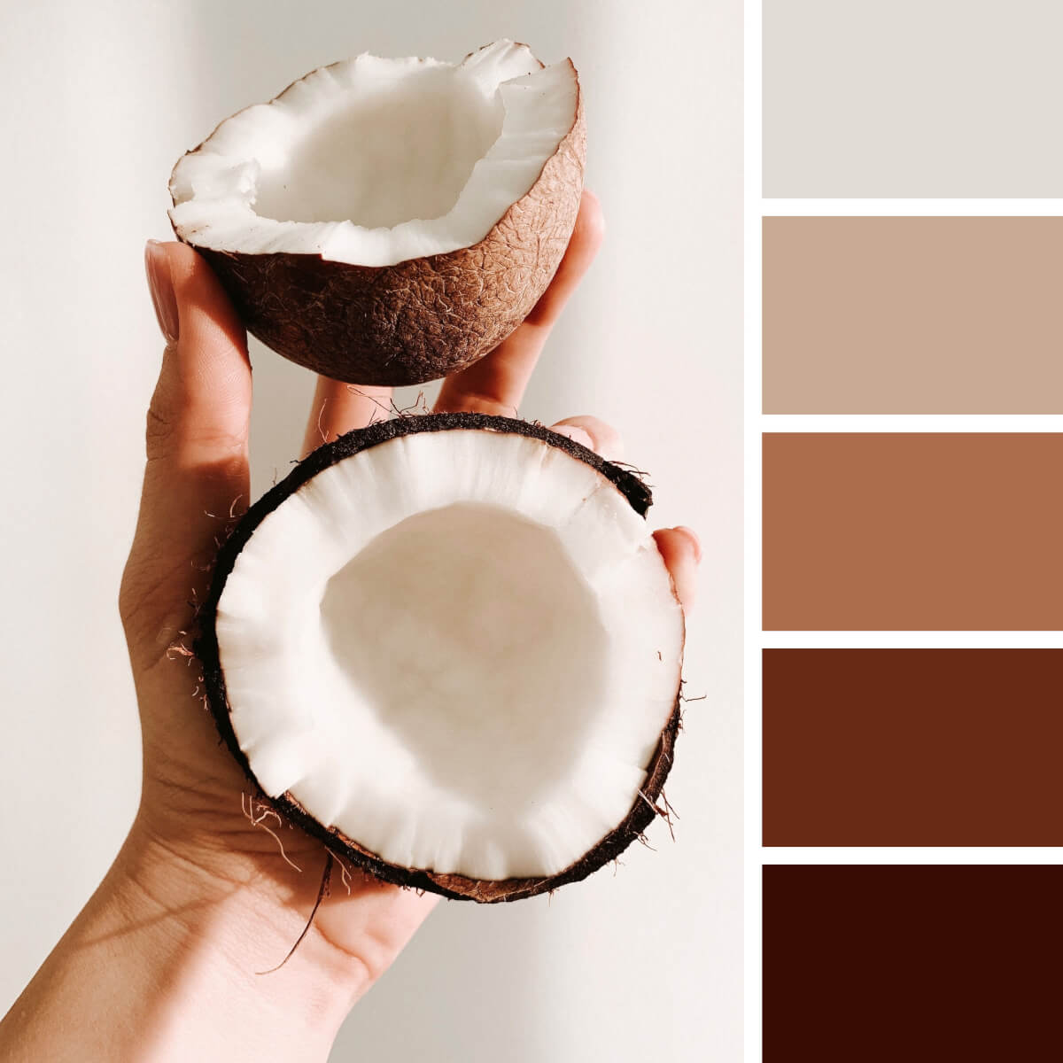
Coconut White & Brown
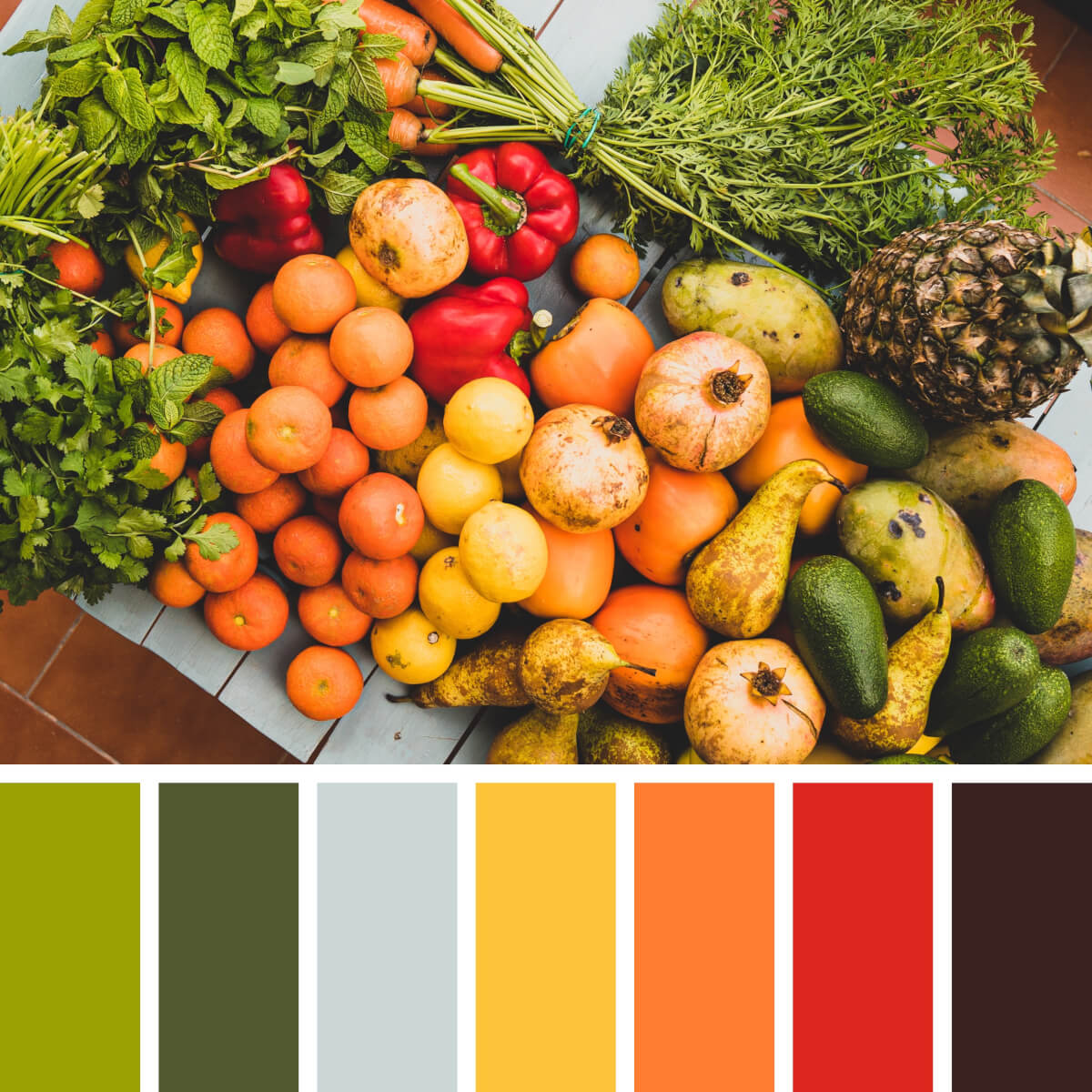
Juicy Orange & Green
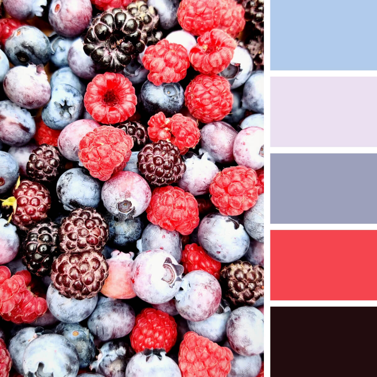
Icy Pink & Blue
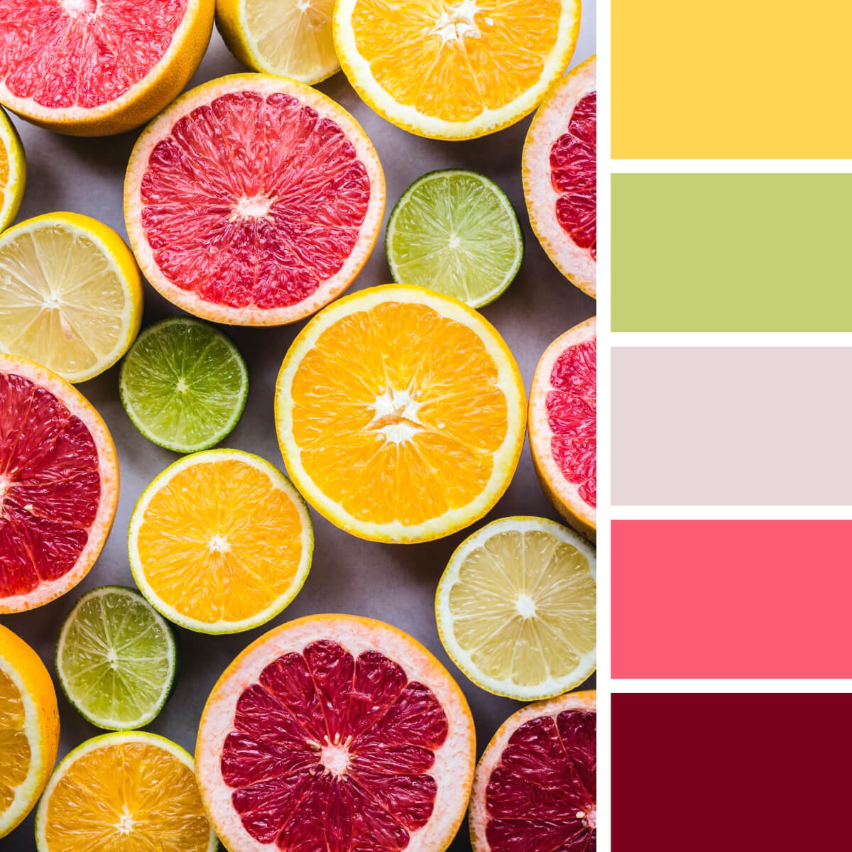
Citrus Yellow & Colorful
Fruit ninja alert! Hope you don’t have citrus allergy symptoms as the image is extremely juicy and bright. Morphing the photography into a color wheel for graphic design is a piece of cake: yellow, green and red slices juggle their brightness and contrast to make an unforgettable appearance in branding, fashion photography, social media posts.
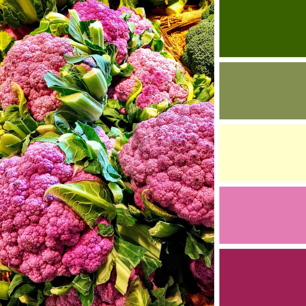
Veggie Green & Hot Pink
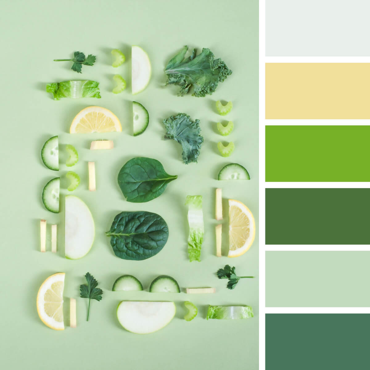
Crunchy Greens & Yellow
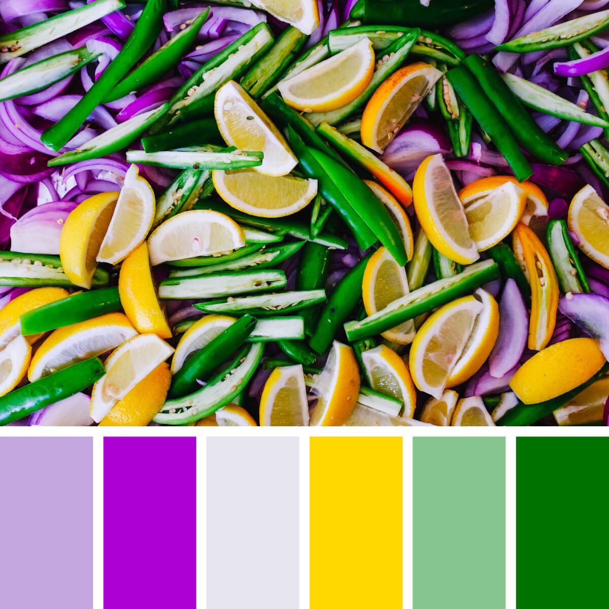
Pepper Green & Lemon
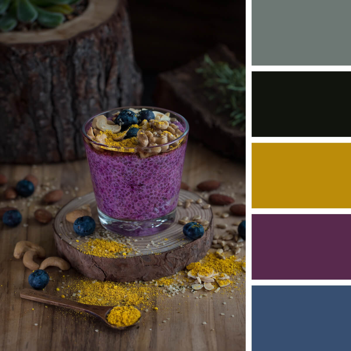
Noble Purple & Mustard
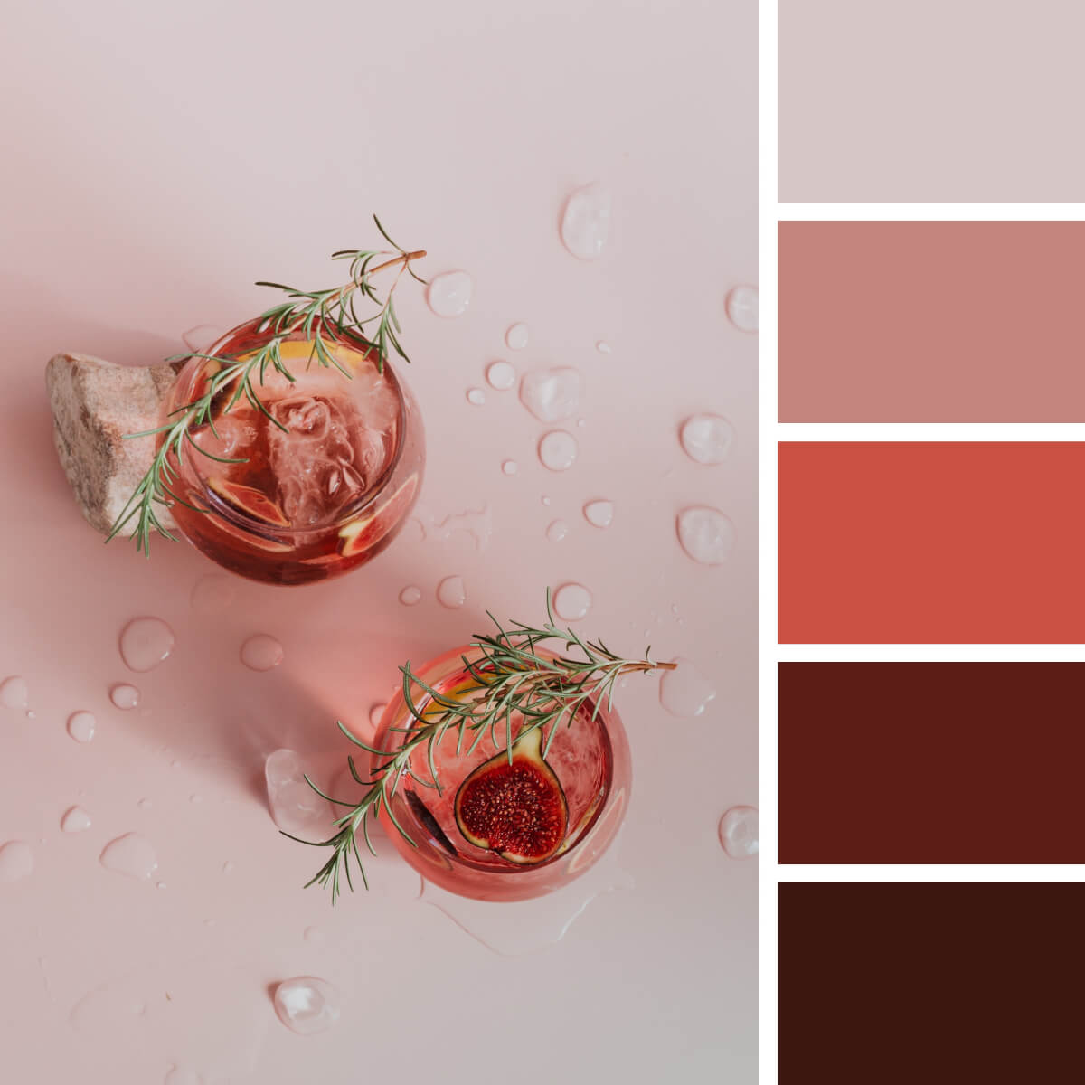
Refreshing Pink & Coral
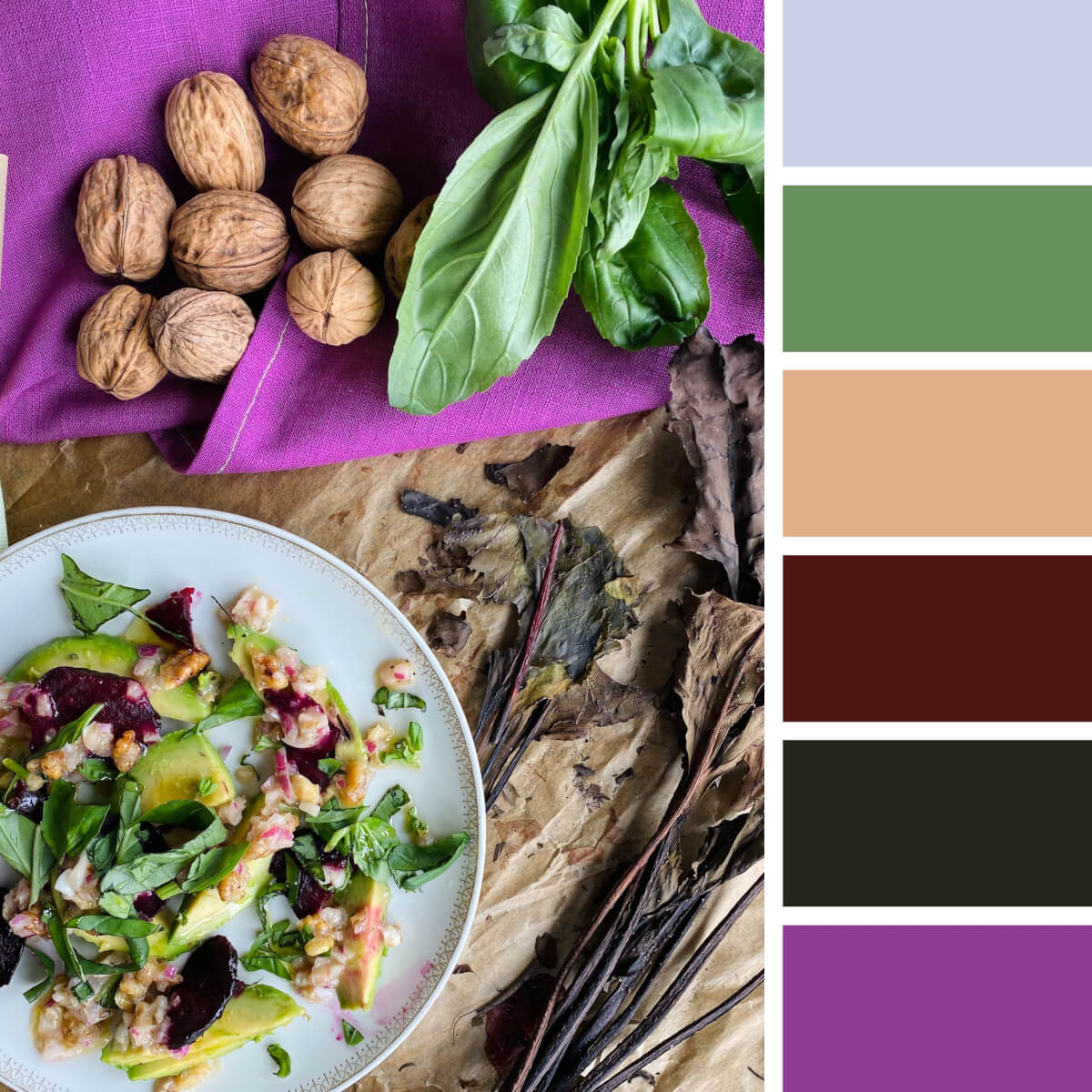
Gastronomic Purple & Green
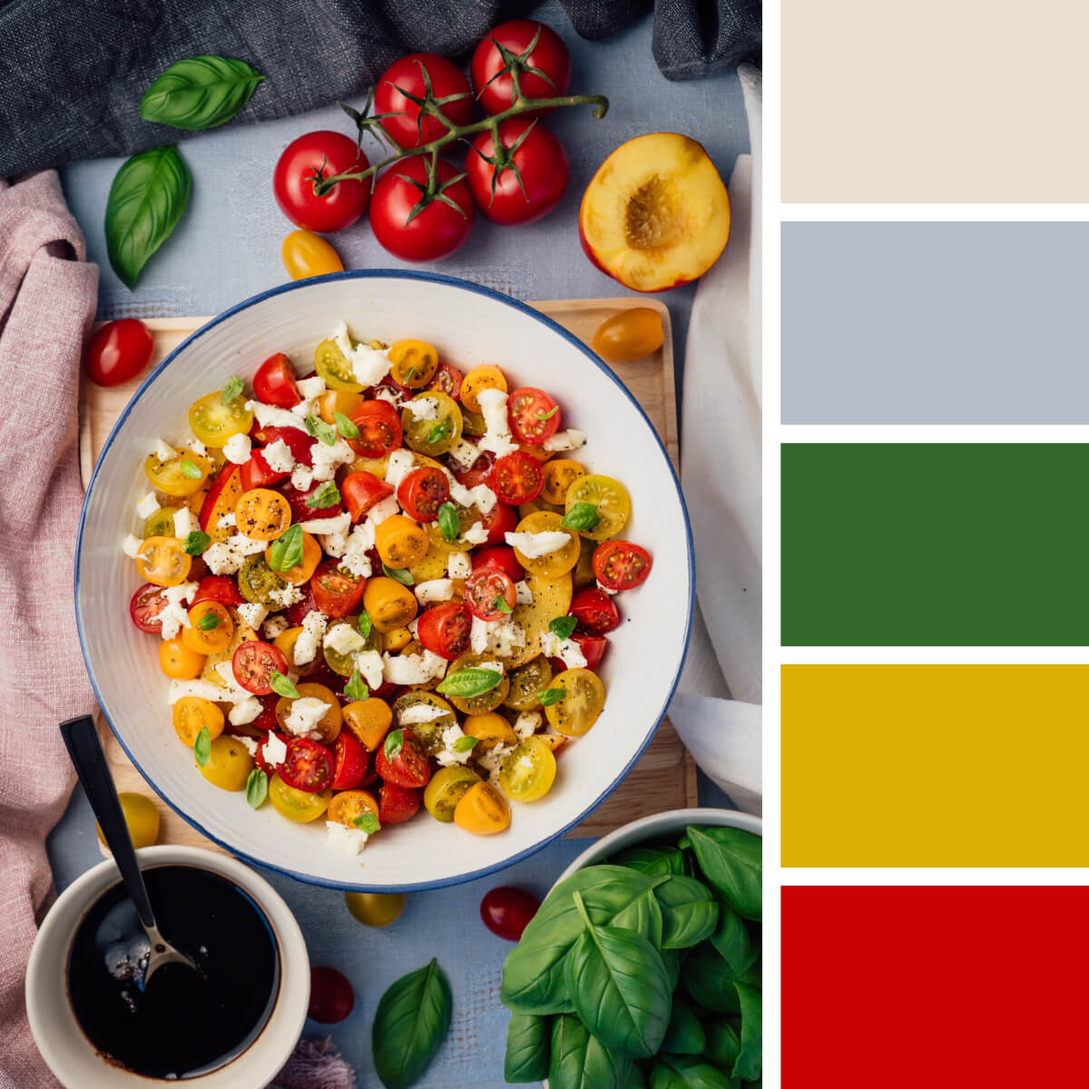
Italian Red & Yellow
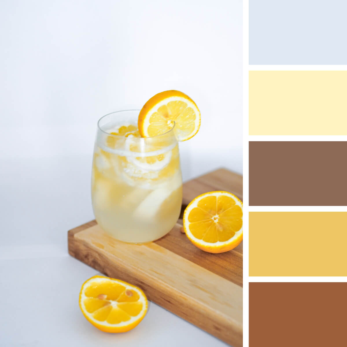
Wood & Lemon Yellow
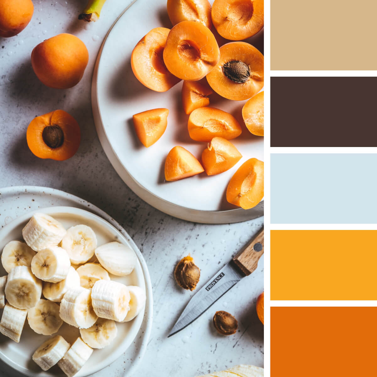
Apricot Orange & Neutral
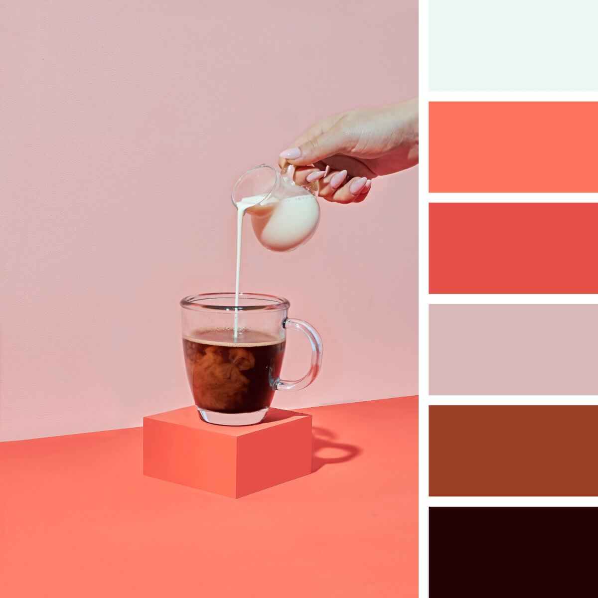
Coffee Brown & Coral
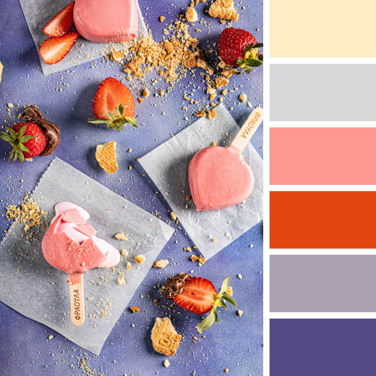
Sweet Pinks & Purples
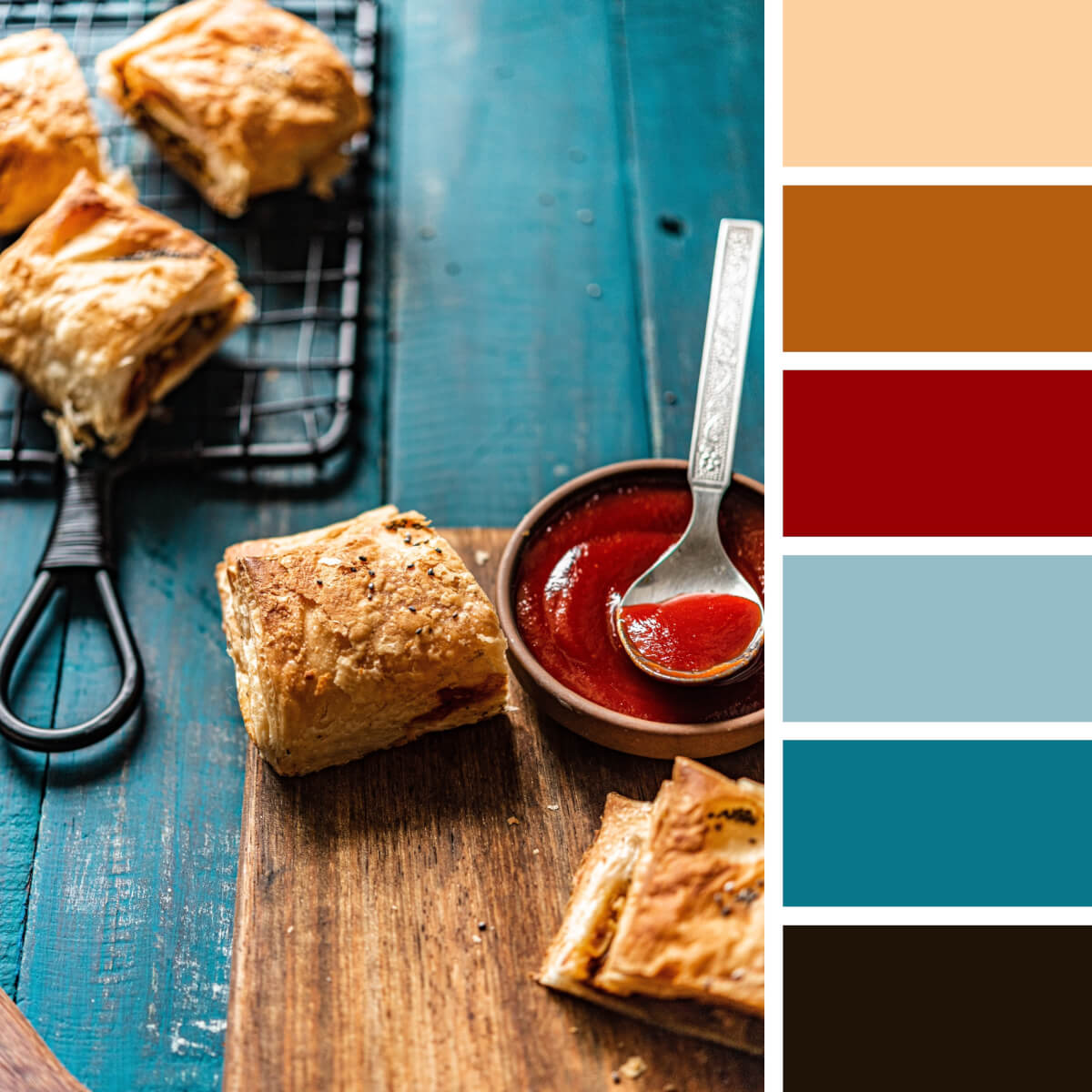
Pastry Beige & Teal
Floral Color Combinations
The embodiment of natural beauty and most appealing color combinations — that’s what flowers and flower compositions are. Many creators source inspiration from observing fancy petal shapes, blooms, and how different flowers peacefully coexist in the wild or the bouquets. And that’s not to mention the color palettes they create! The number of combinations you can make is endless, and so we’ve just completed the first batch to start with.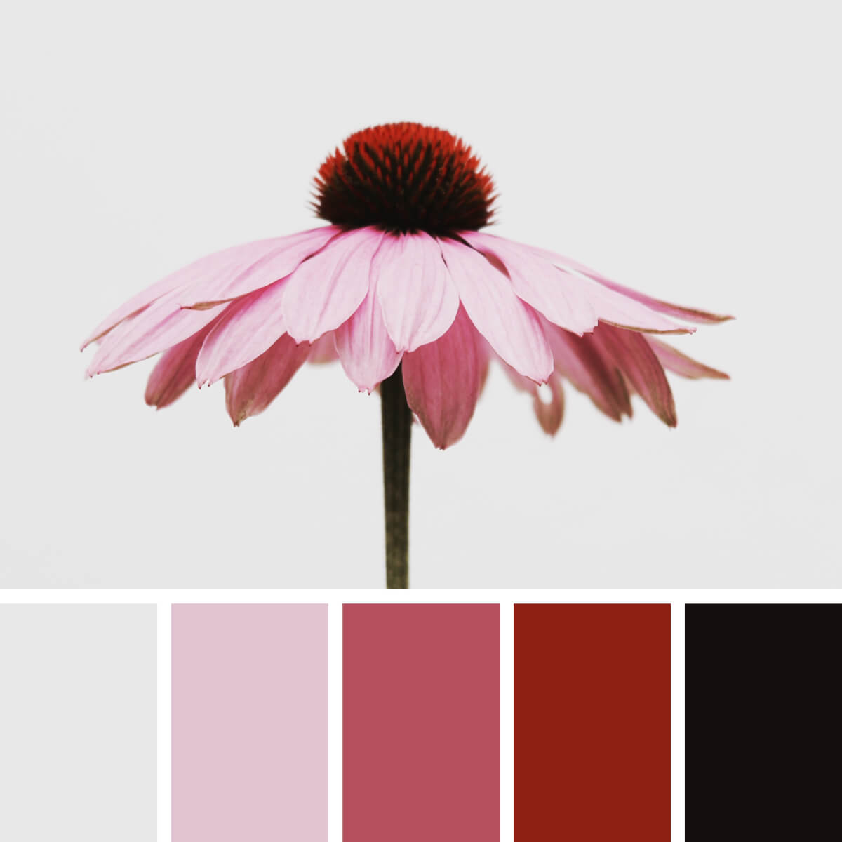
Floral Pink & Tender
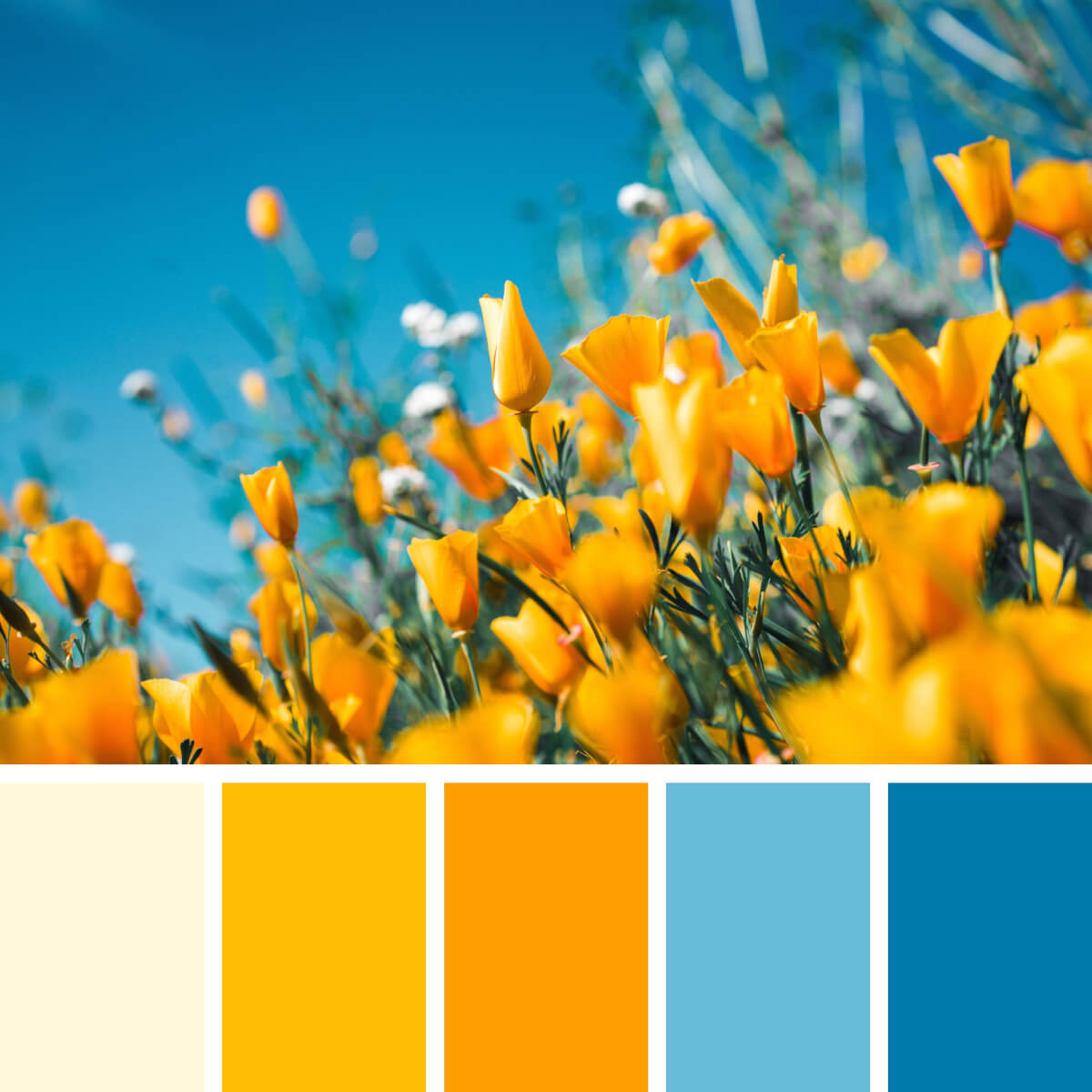
Blooming Yellow & Blues
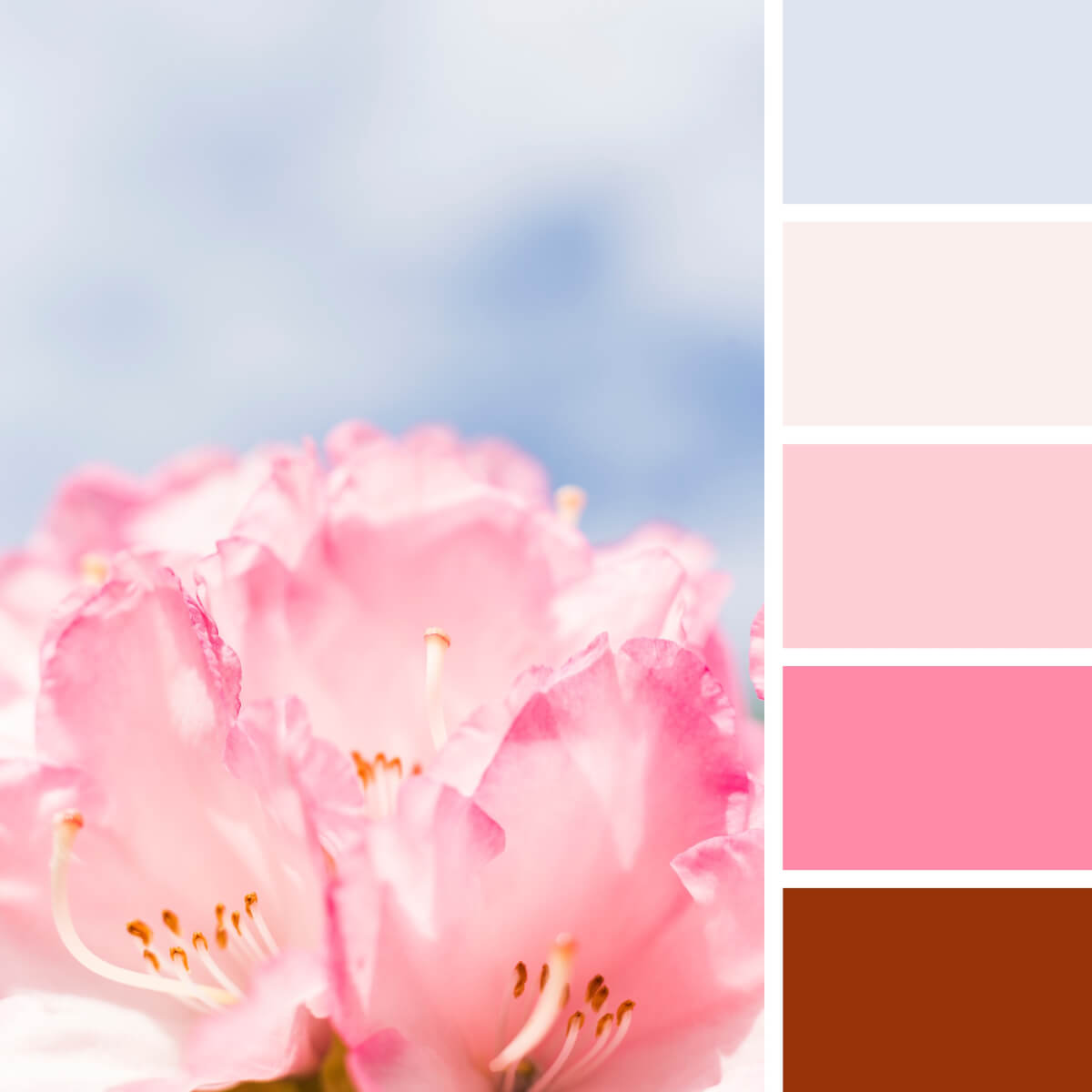
Subtle Blue & Pink
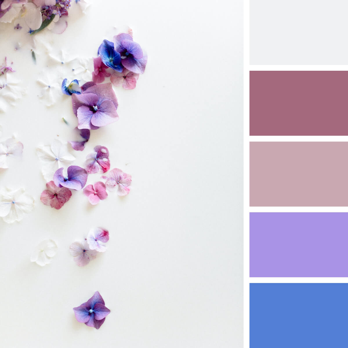
Milky White & Flowery
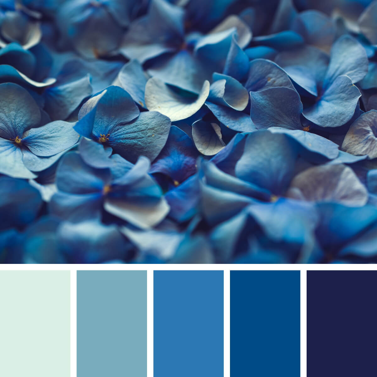
Hortensia Light & Royal Blues
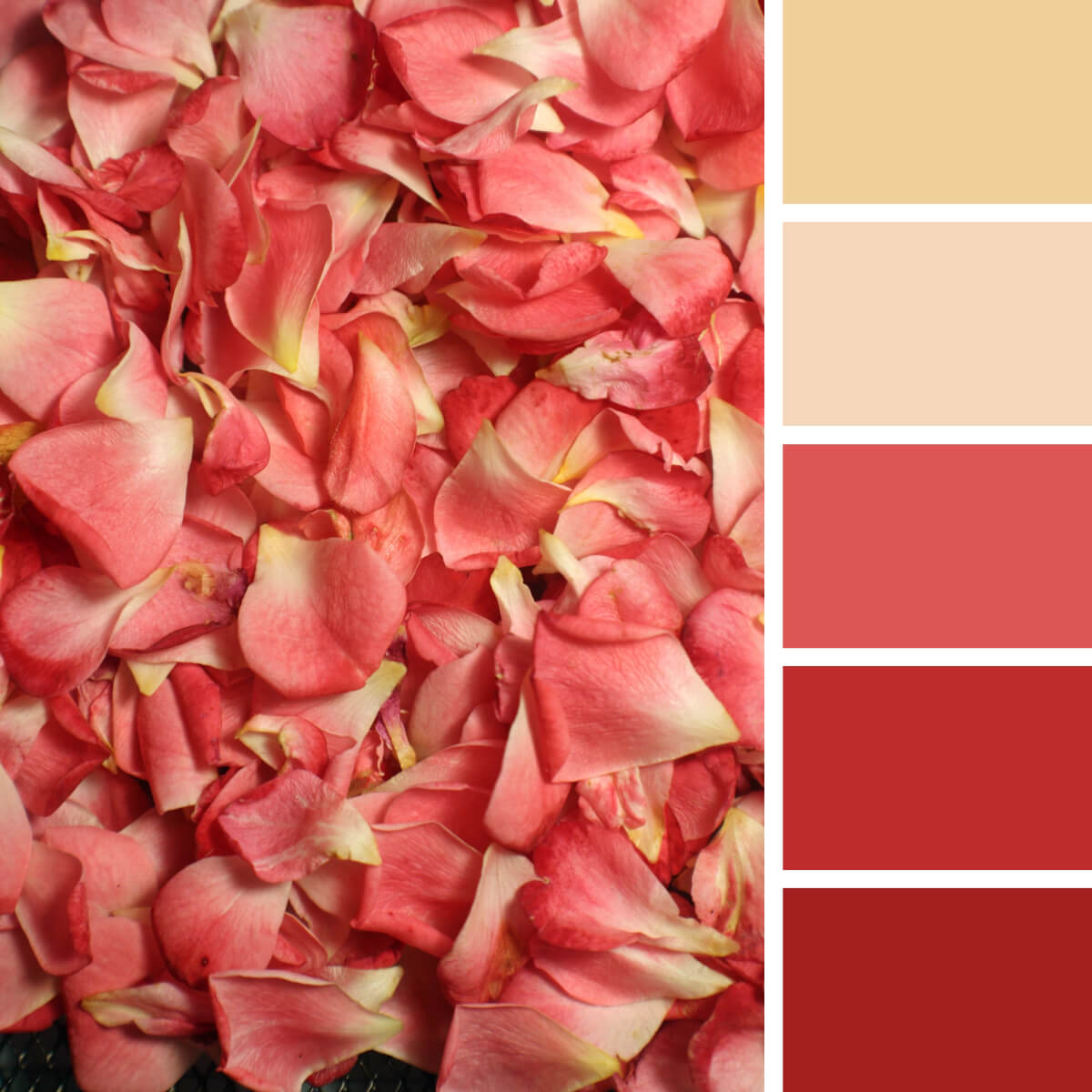
Geranium Red & Yellow
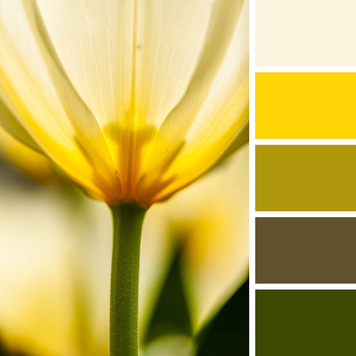
Sunny Yellow & Warm Green
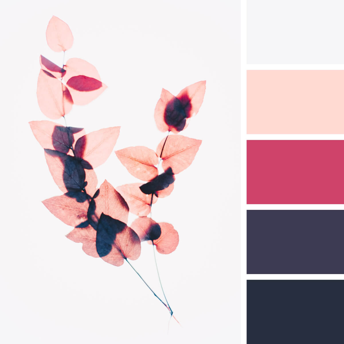
Dusty Pink & Deep Blue
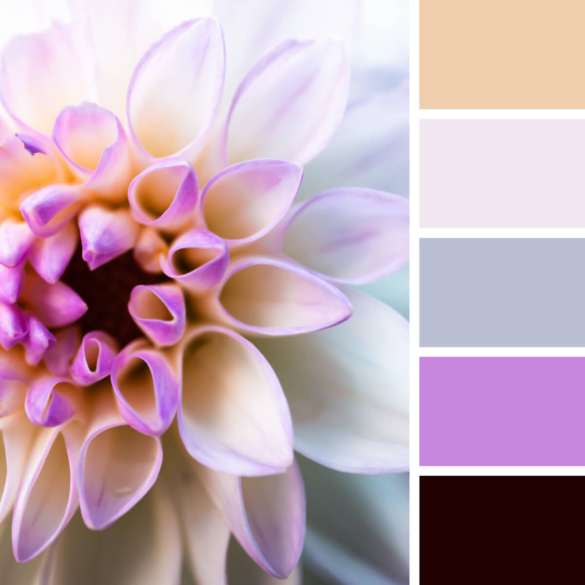
White & Lilac Dahlia
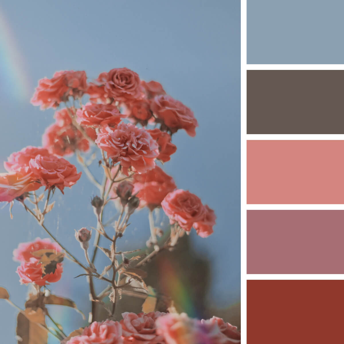
Burnt Rose & Sky Gray
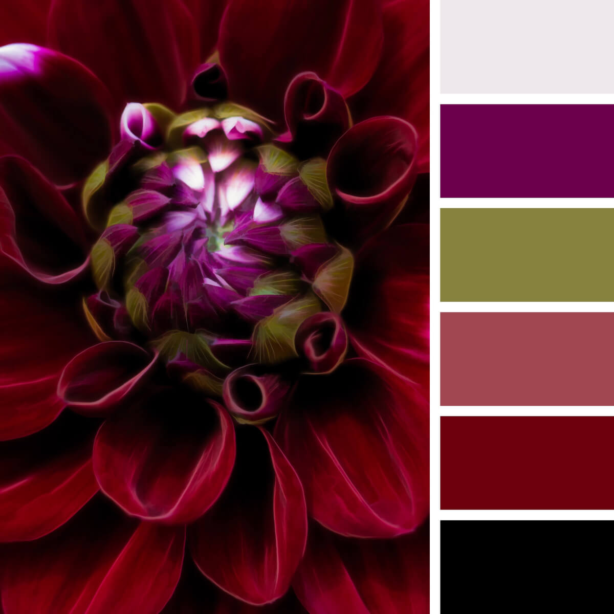
Velvet Red & Burgundy
That’s another dahlia in our collection and another fascinating color combination! We’re unsure if you ever thought of matching wine red, golden green, and purple, but that’s a natural story where these three colors and shades perfectly exist together. That’s how you can go beyond expectations and pick a color combination no one expects from you.
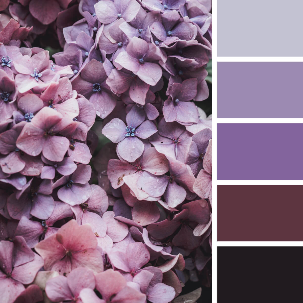
Sophisticated Pink & Purple
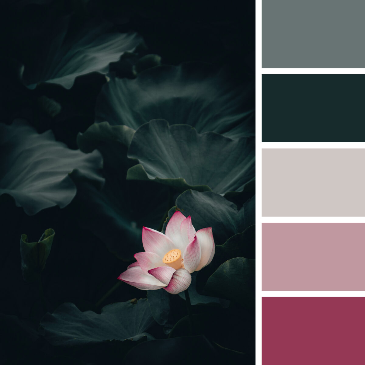
Shiny Pink & Green
Compared to a lantern or a lighthouse, this lotus shines in the dark leafy environment filling it with noble beauty and floral energy. Leaves in the background look strange and fancy, making the entire composition so peculiar. Should we also mention the colors, which are another breathtaking element of this story?
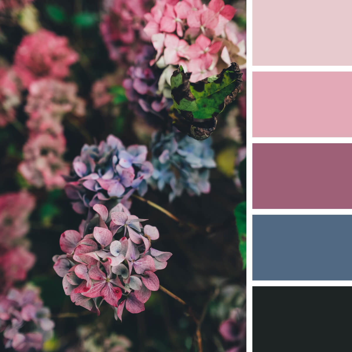
Noble Pink & Violet
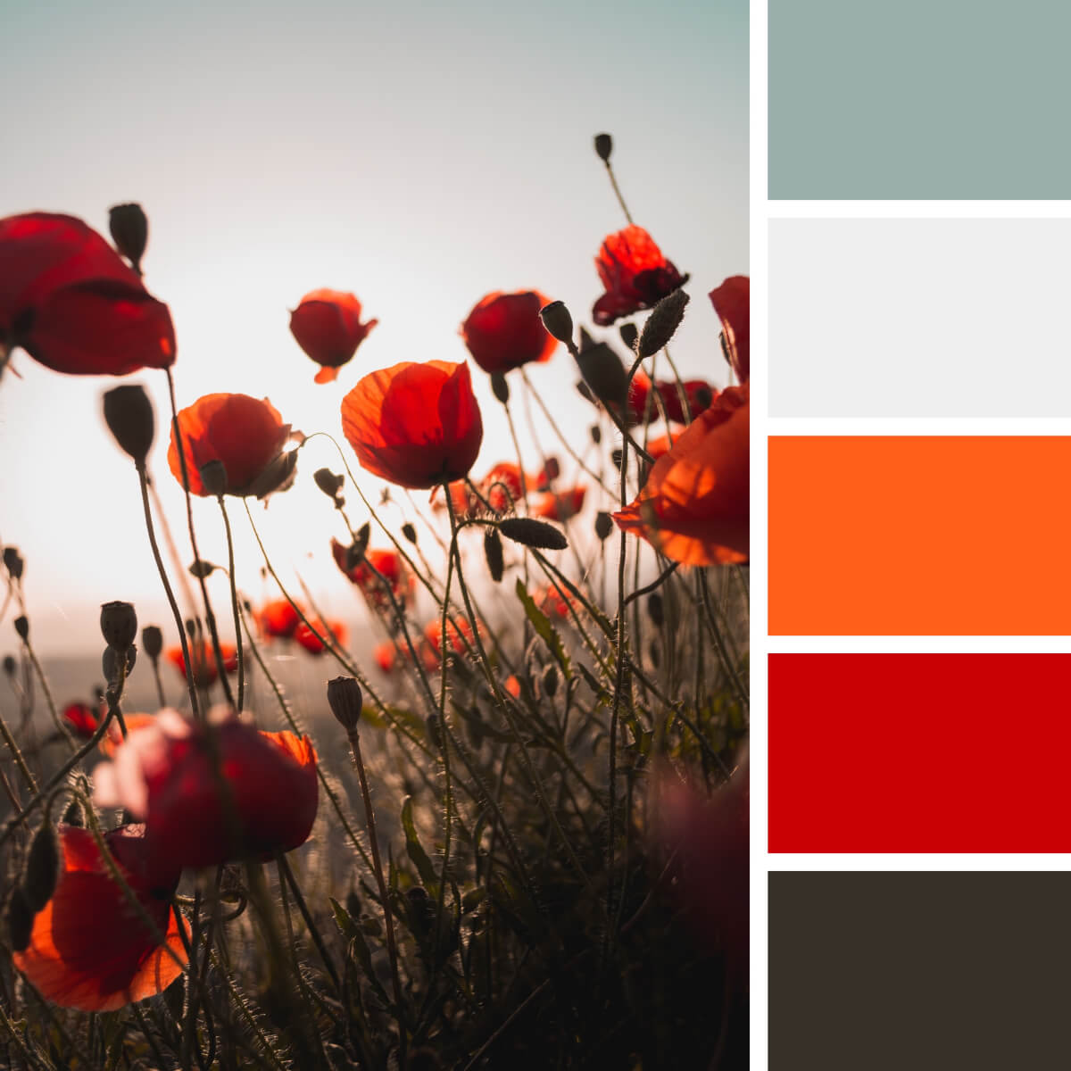
Poppy Red & Orange
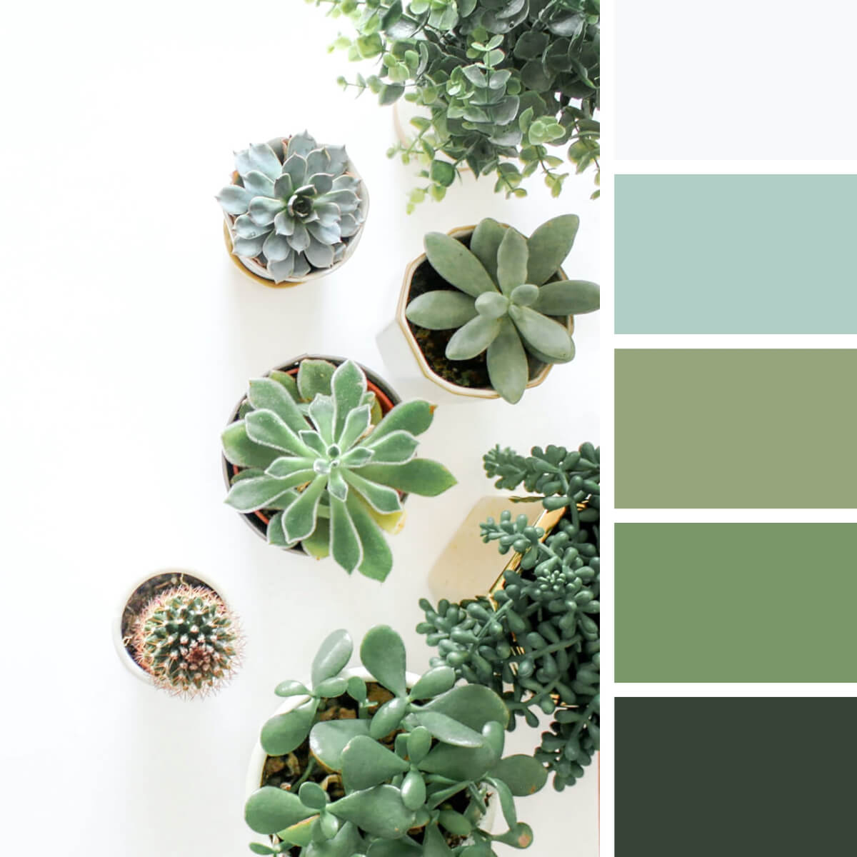
Cool Greens & Gray
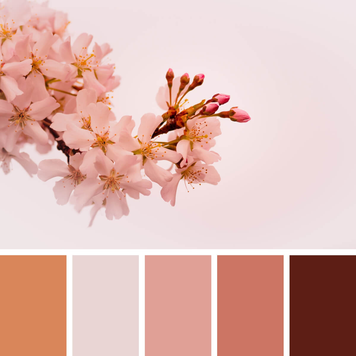
Spring Pink & Peach
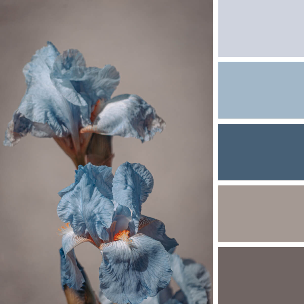
Iris Blue & Brown
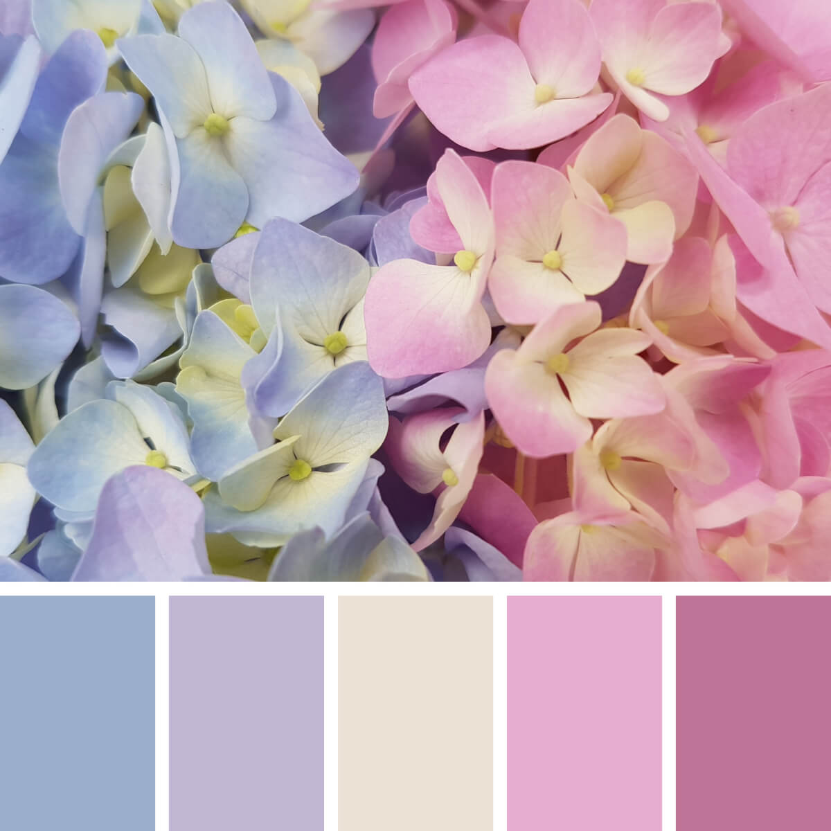
Hortensia Pinks & Blues
Do you remember what we said about hortensia? There are absolutely any colors for it, so these pink and purple-blue branches are here to introduce you another variation. United by a basic beige, they work well together in all sorts of design projects, especially in trending web design concepts.
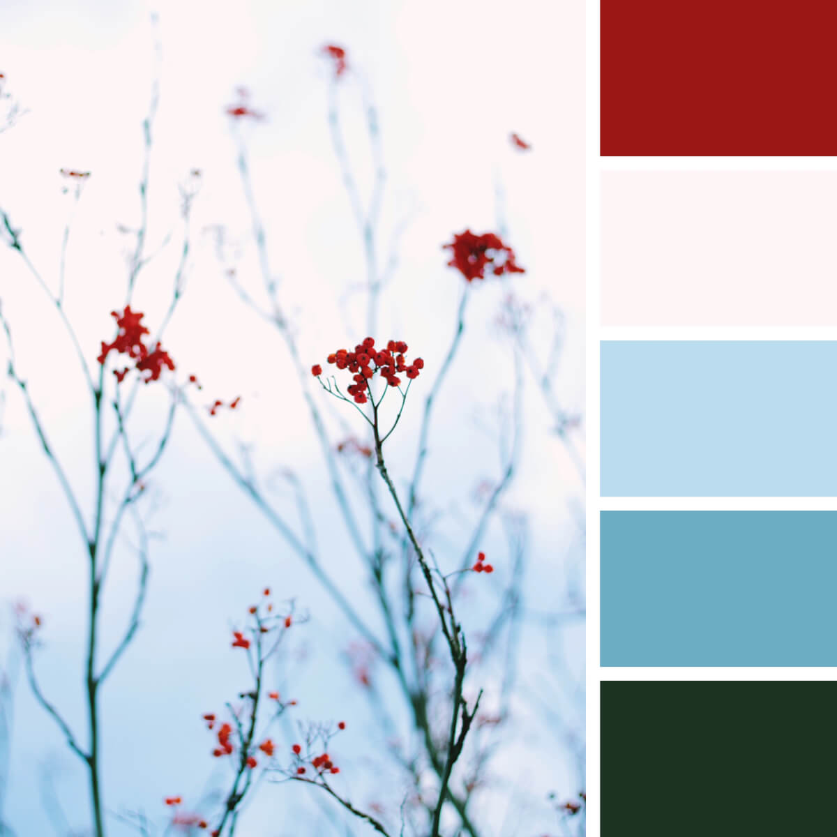
Winter Red & Frozen Blues
People-Inspired Color Combinations
Cultures, religions, tastes, characters, and languages — that’s just a part of things that makes every one of us so unique. And it’s true the humans and human interaction can be the greatest source of new ideas and motivations. So we’ve made an imaginary walk around the cities of the world, meeting new people and transforming their personalities into color palettes.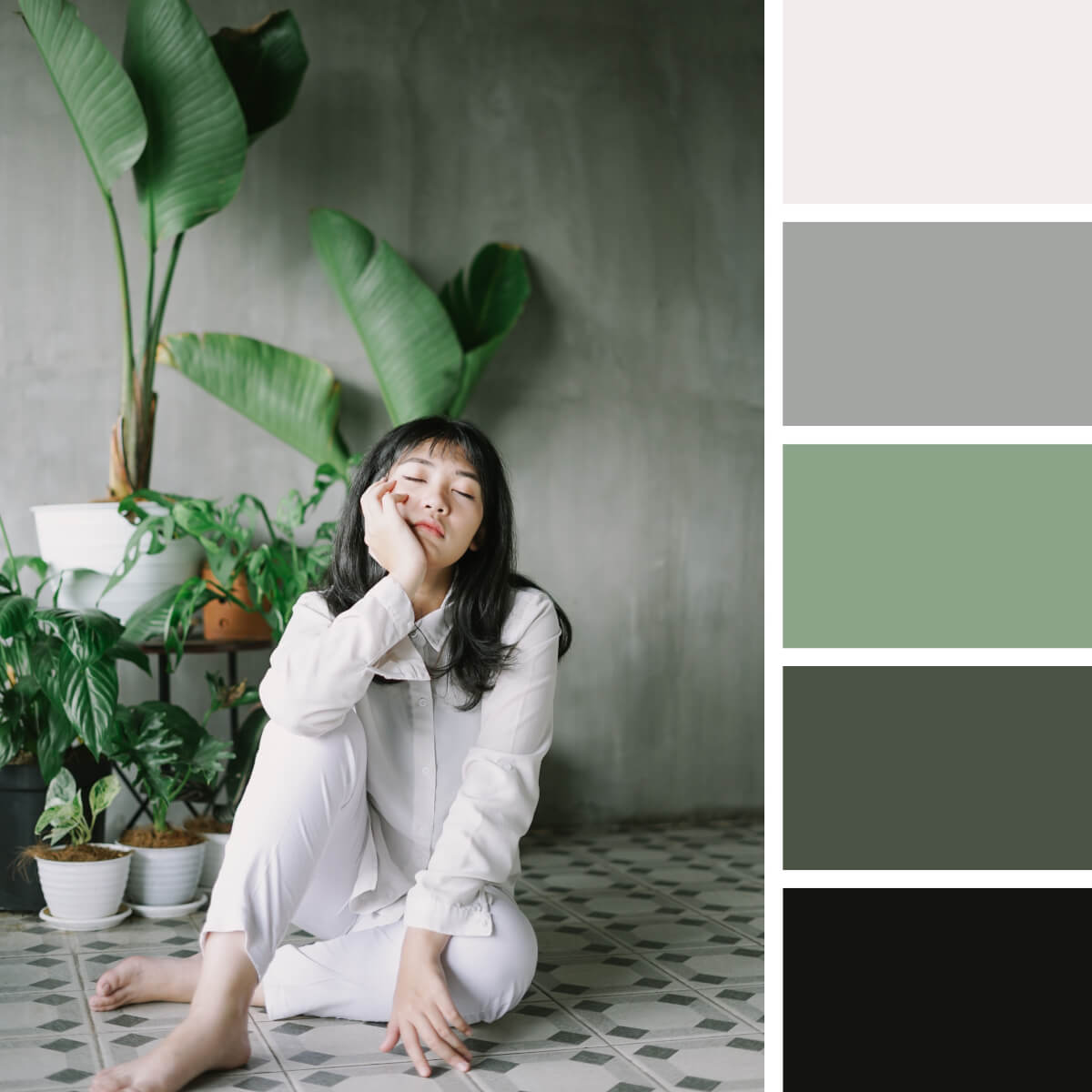
Scandi Green & Gray
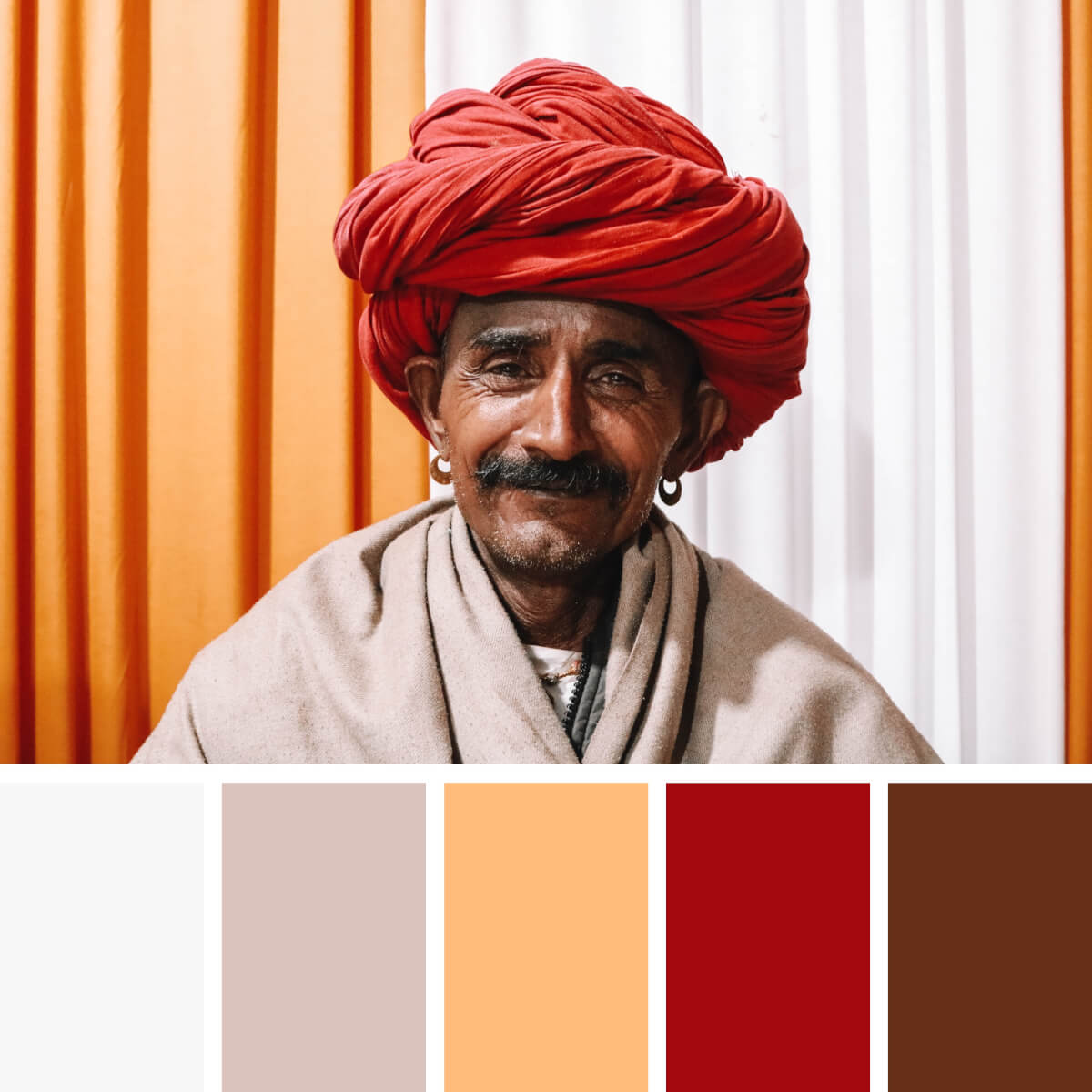
Ethnic Red & Orange
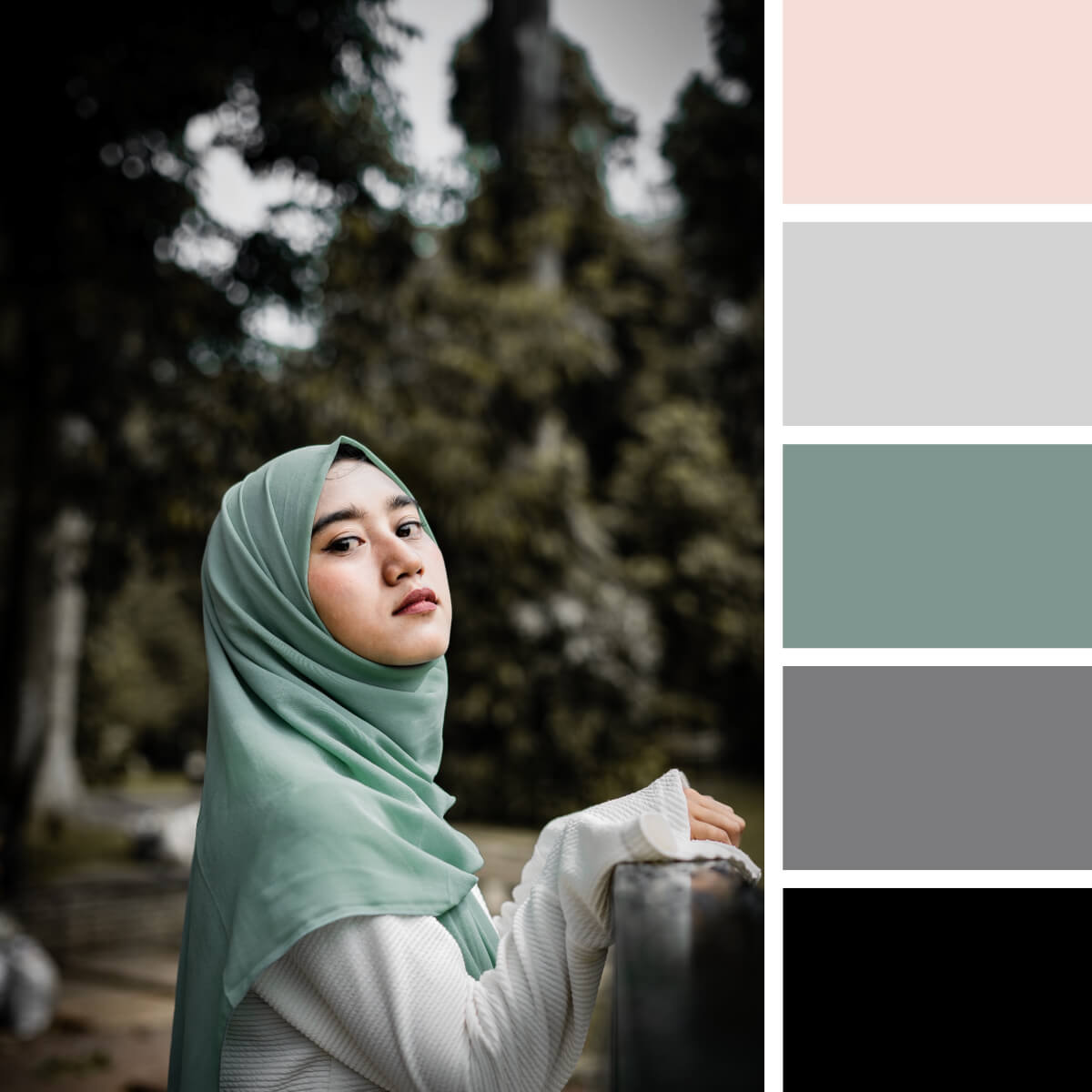
Basic Mint & Gray
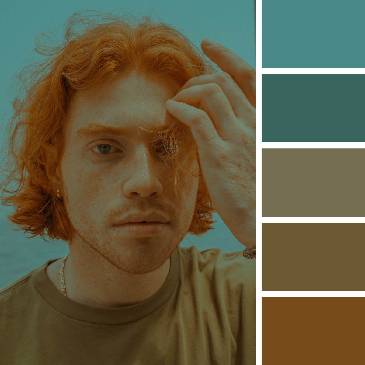
Warm Red & Soft Teal
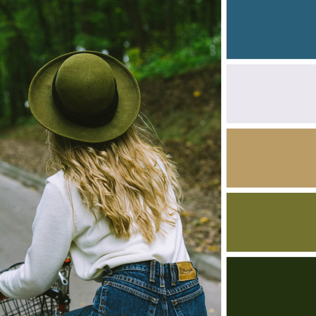
Leafy Green & Milky White
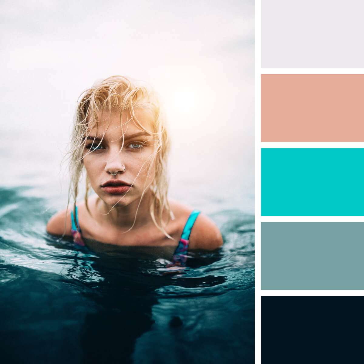
Cyan & Deep Blues
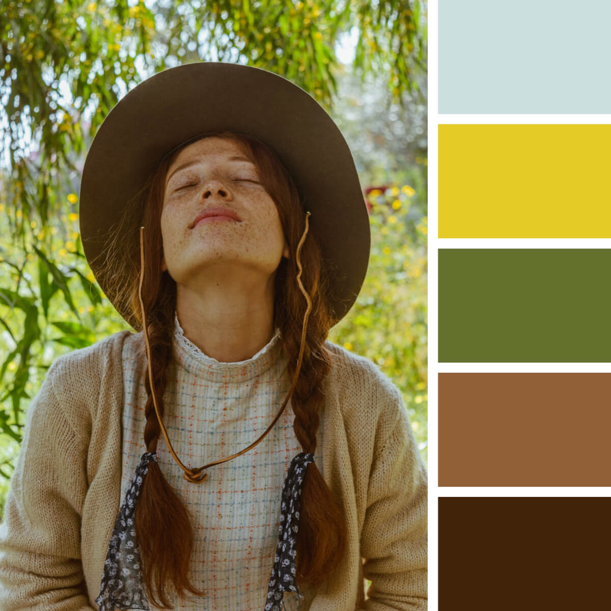
Rustic Greens & Brown
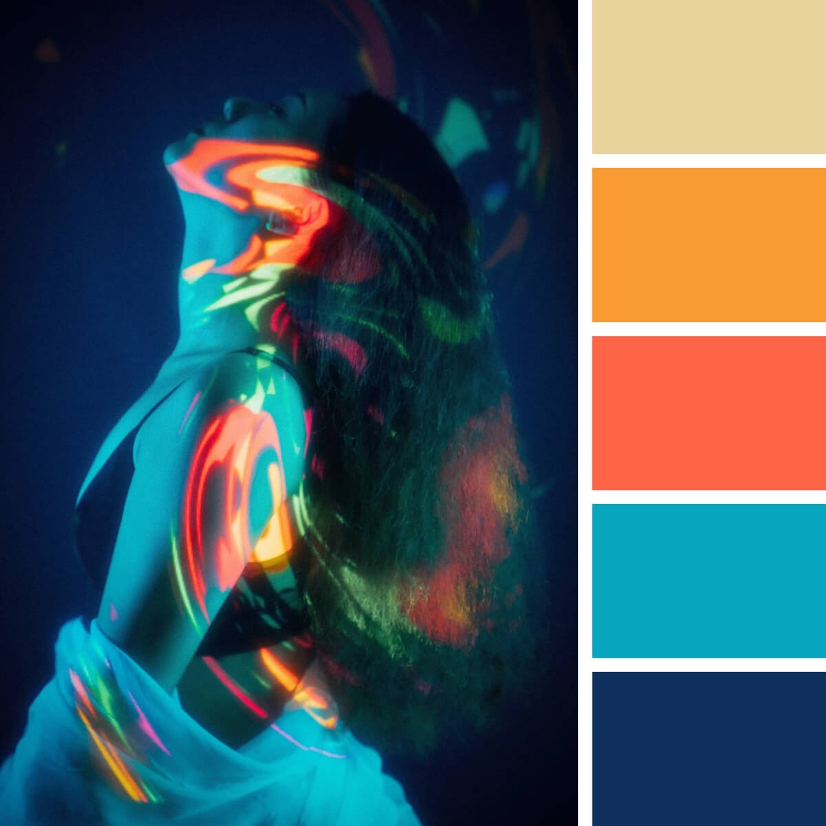
Electric Blue & Orange
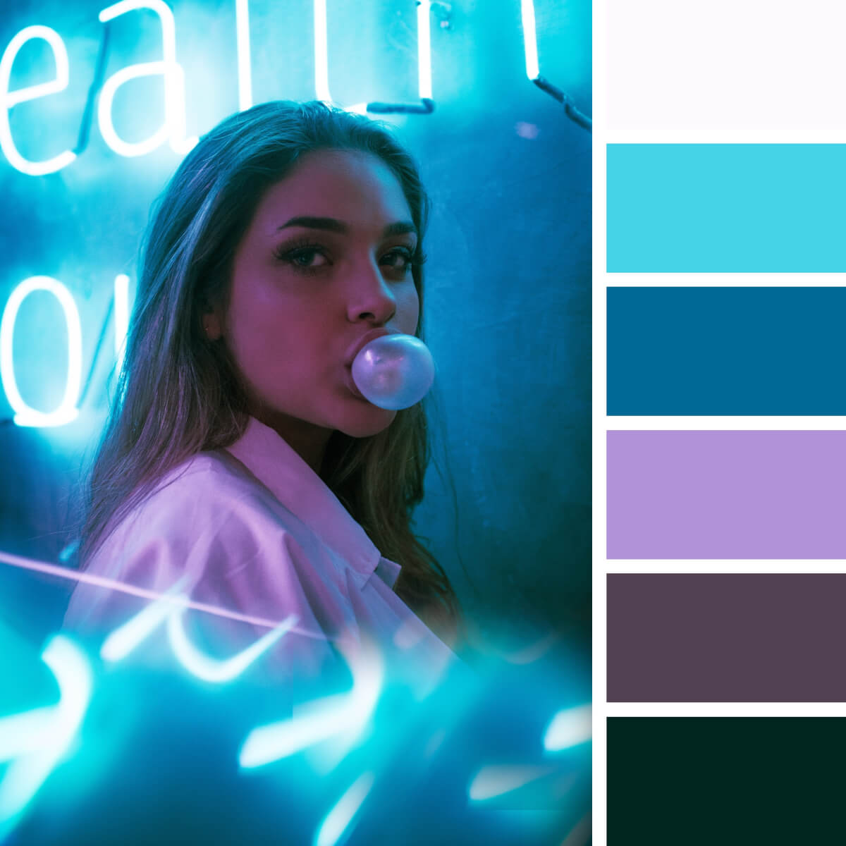
Neon Teal & Violet
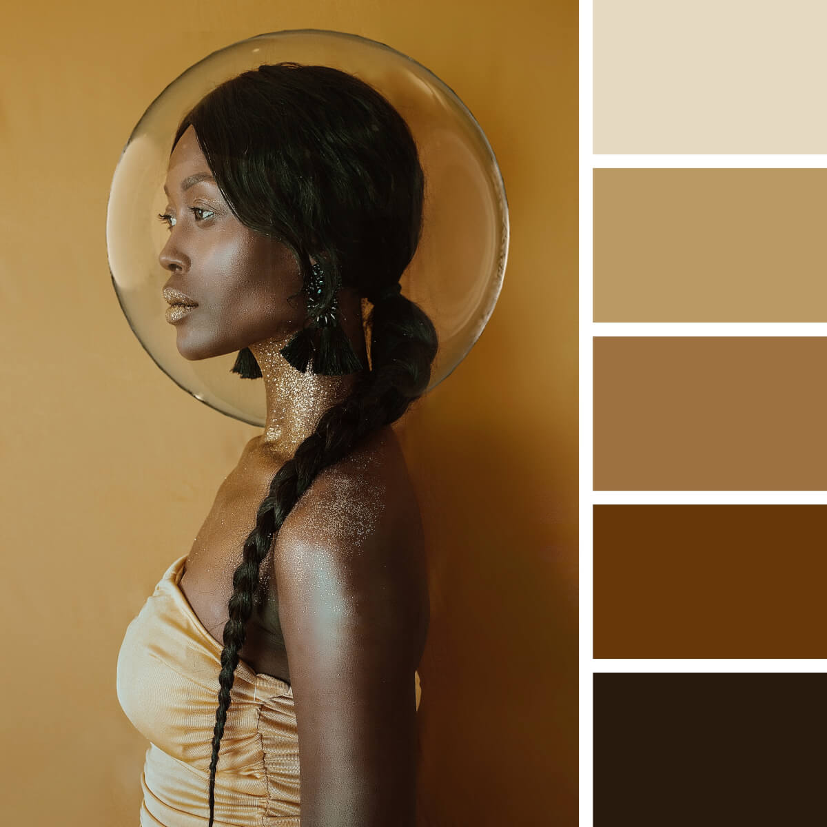
Noble Ebony & Gold
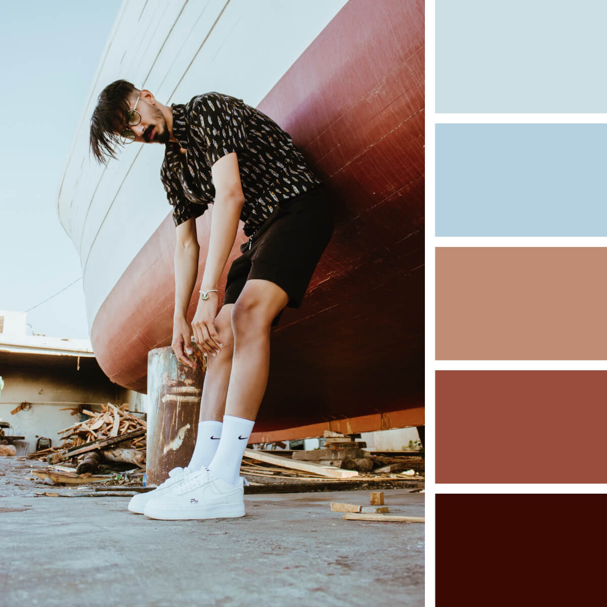
Cherry Red & Pale Blue
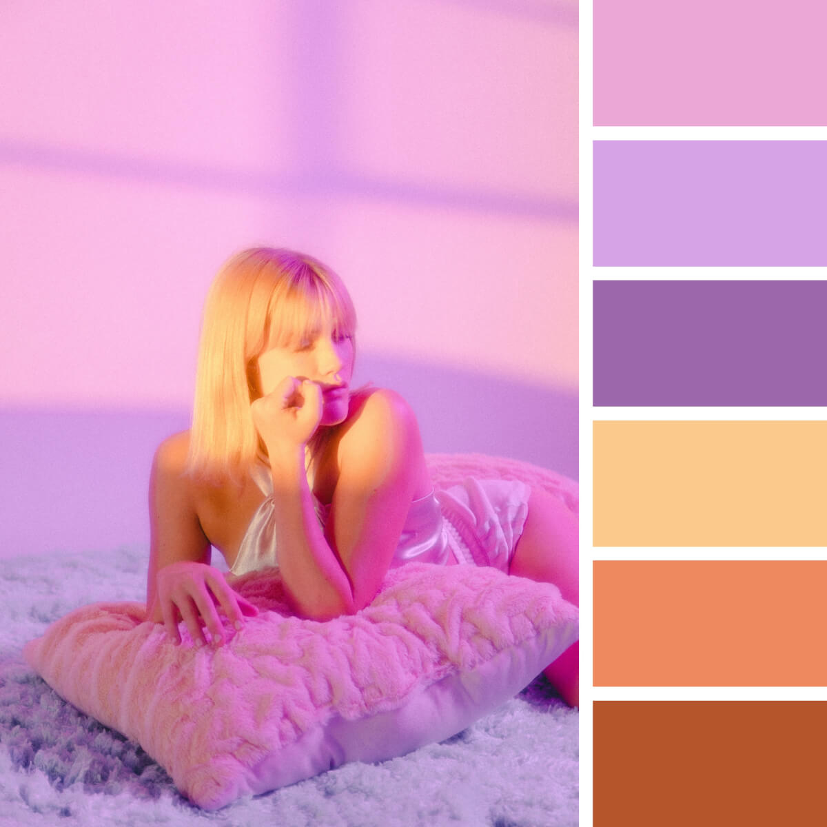
Playful Pink & Lilac
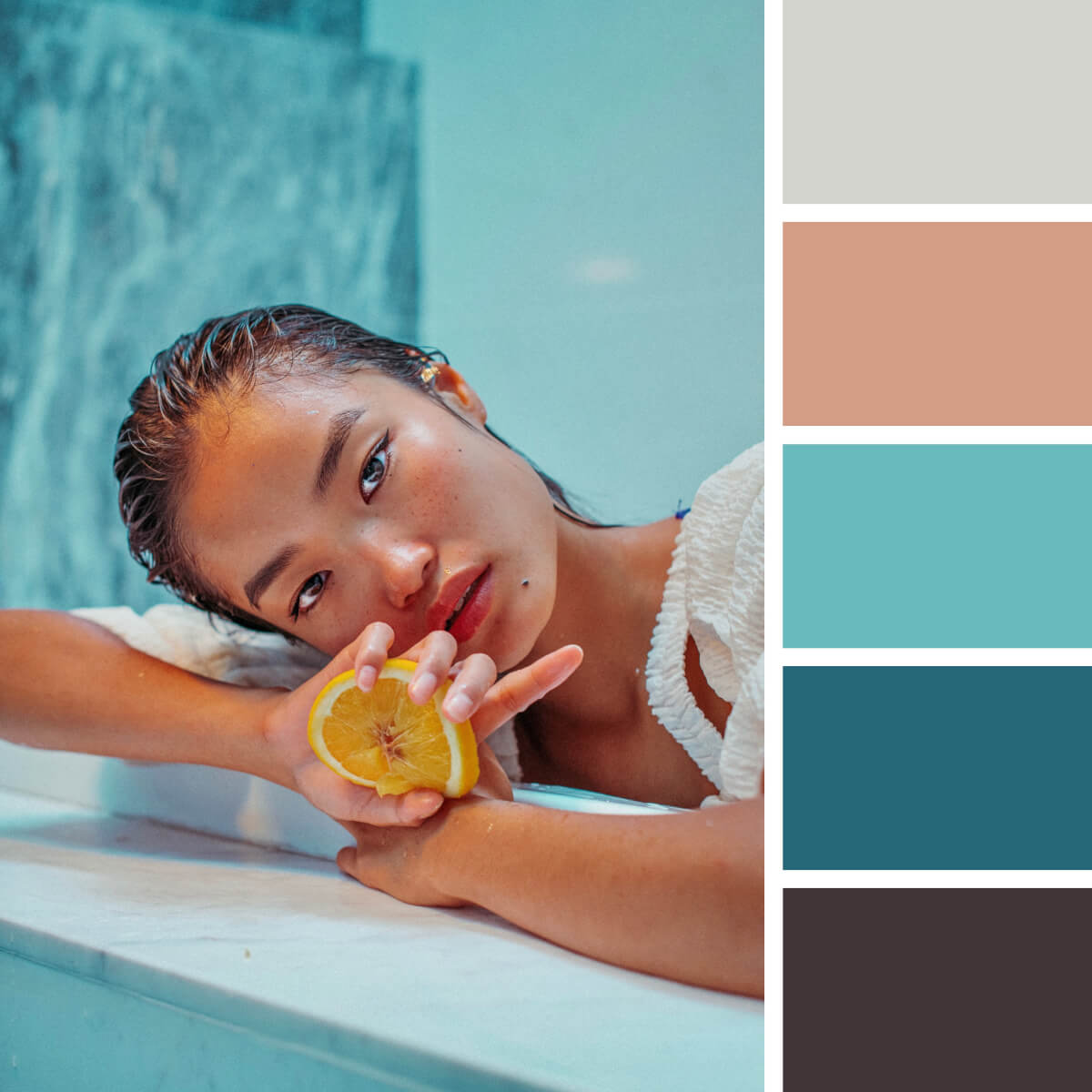
Sea Turquoise & Peach
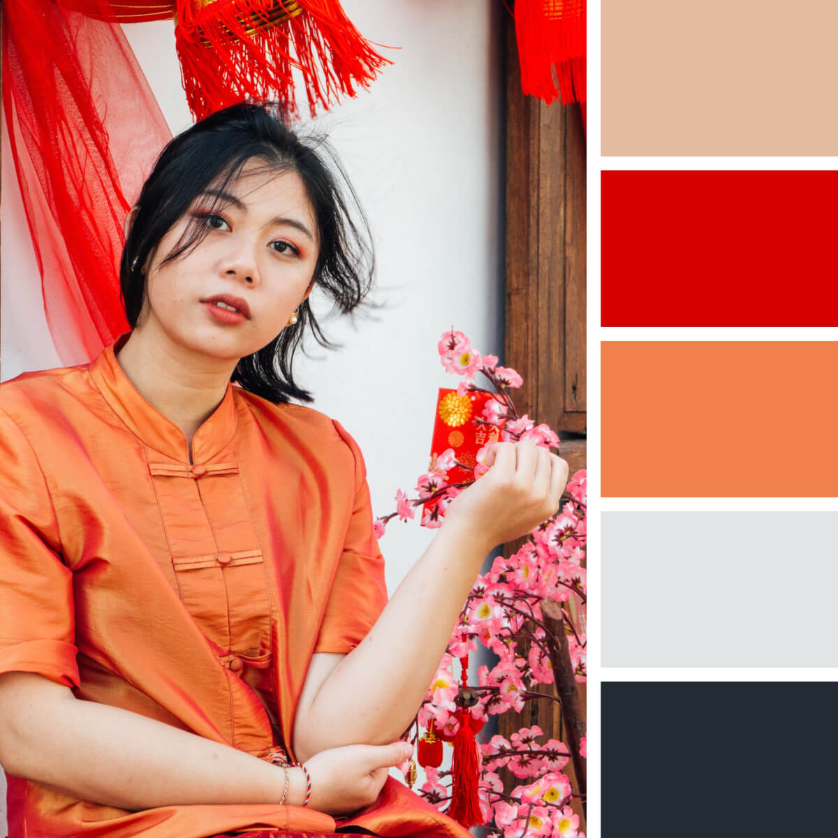
Chinese Red & Orange
Chinese culture is lush with orange, red and pink in their omnifarious arrangements and shades. Don’t be shy to borrow the already paired combinations from cultural motifs to experience how successful this palette solution can be in your work. Even with the prepared color scheme, the initiative is all yours — experiment with saturation and contrast!
Patterns and Abstract Color Combinations
Beauty is in the eye of the beholder, so we invite you to explore the endless beauty of color, texture, contrast, and shadow of abstract compositions. You’ve already explored the urban and natural landscapes, so now it’s time to create that very color combination from the everyday objects. That’s how you can learn to see the colors of the world around you!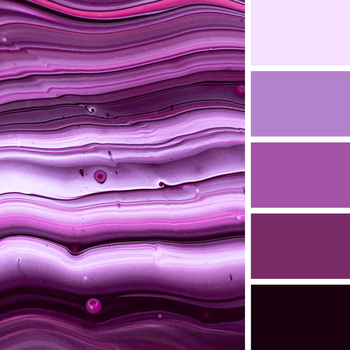
Monochrome Violet & Lilac
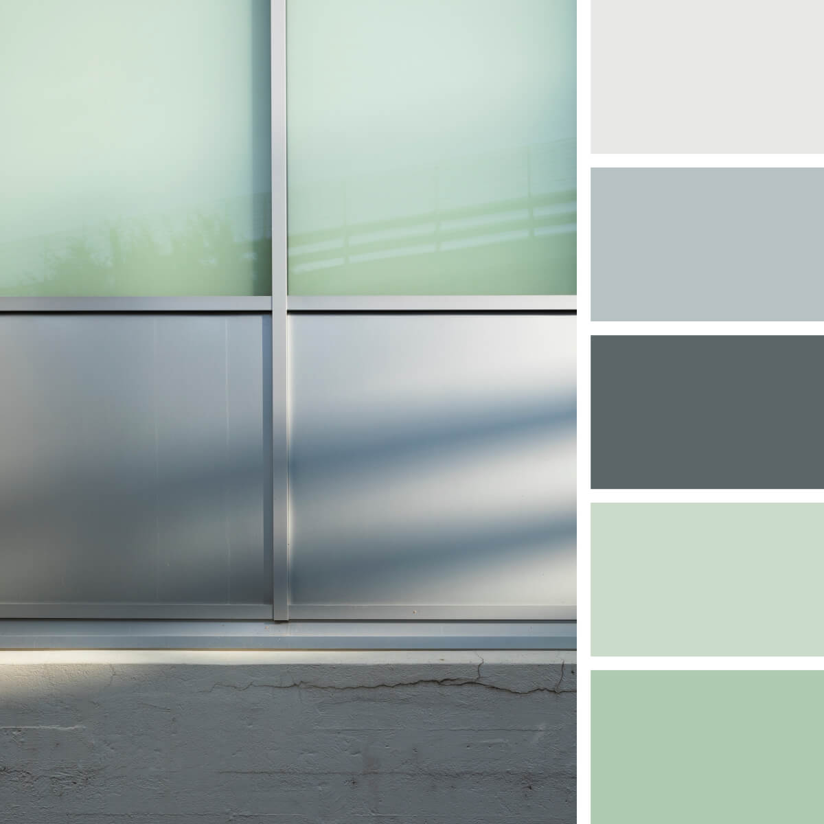
Pastel Mint & Gray
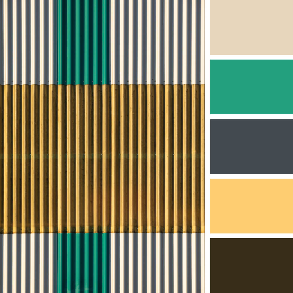
Basic Green, Yellow & Gray
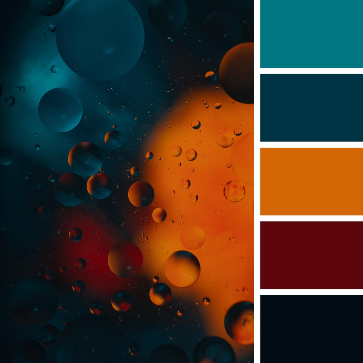
Magnetic Orange & Teal
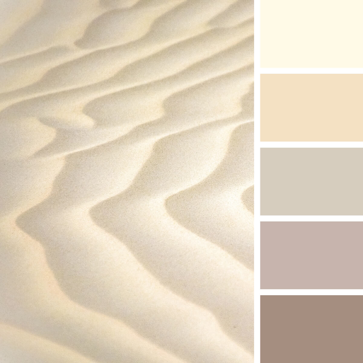
Sandy & Milky Beige
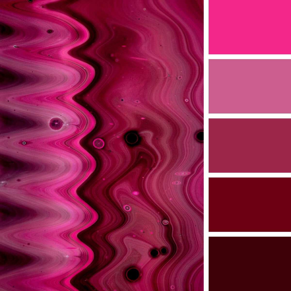
Liquid Pink & Fuchsia
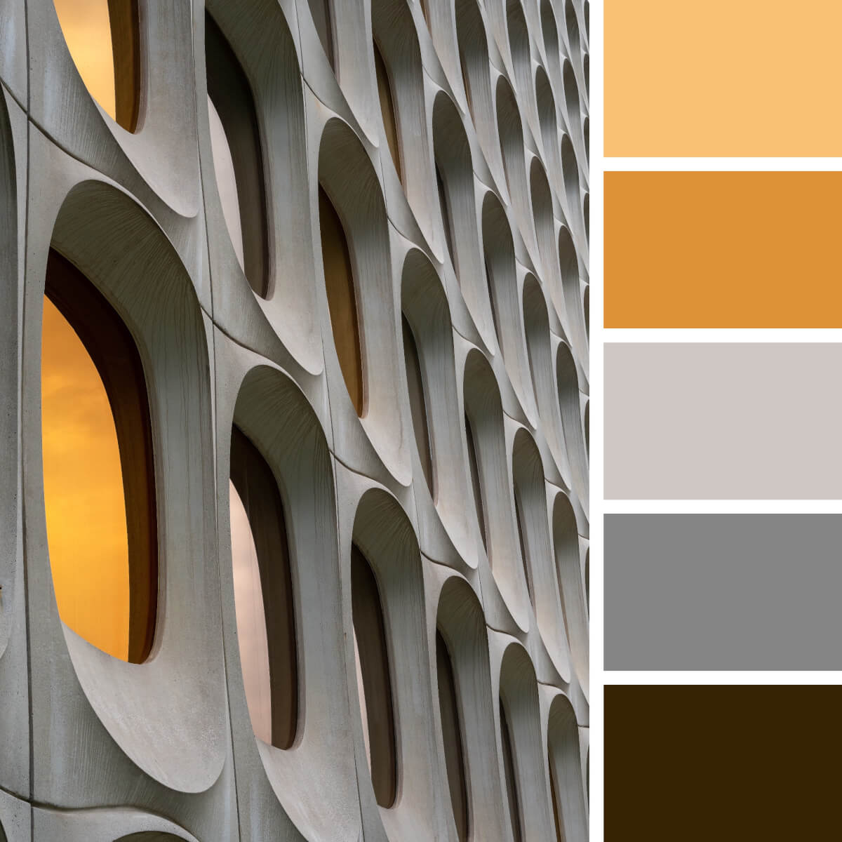
Concrete Gray & Orange
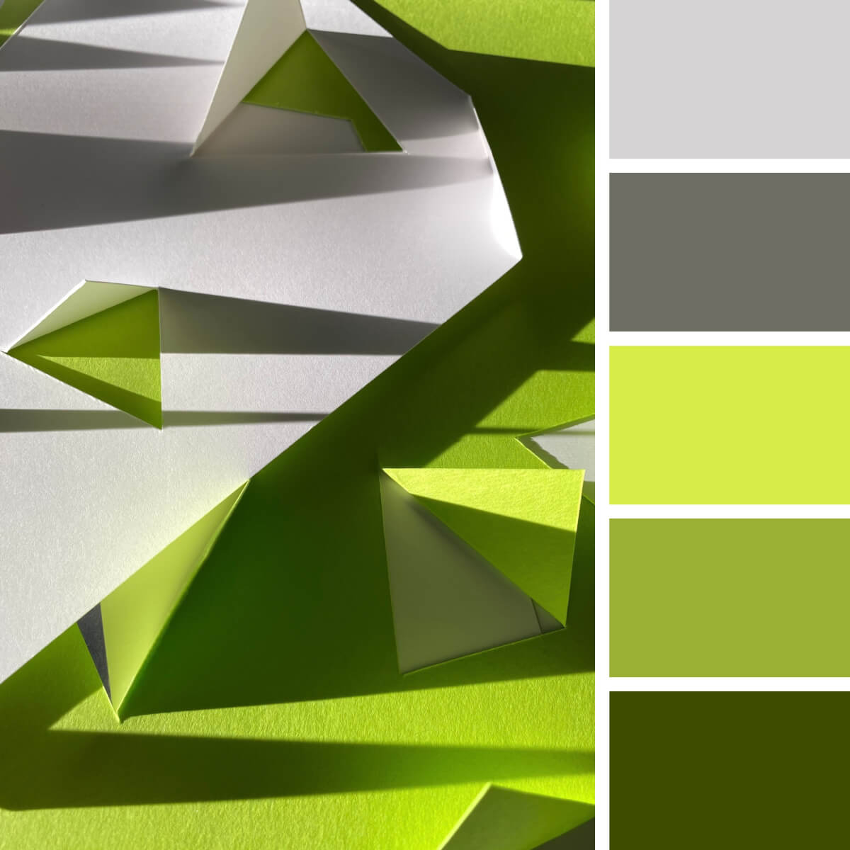
Lime Green & Gray
If you are a fan of gray-based color combos, you don’t have to stay with a classic gray-orange or gray-yellow combination. Lime green is a cool option too, and it’s a great way to add exceptional freshness and energy to any design project. So, you can design sportswear or anything else for a sports brand, create eco merchandise, and these two colors won’t let you down.
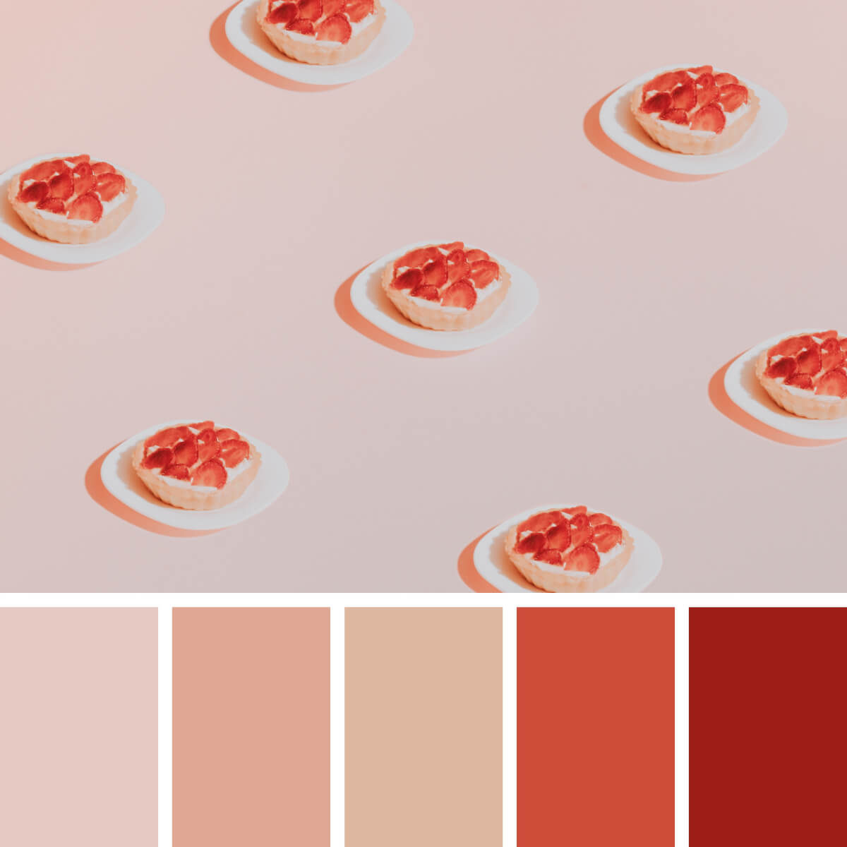
Coral Red & Sweet Peach
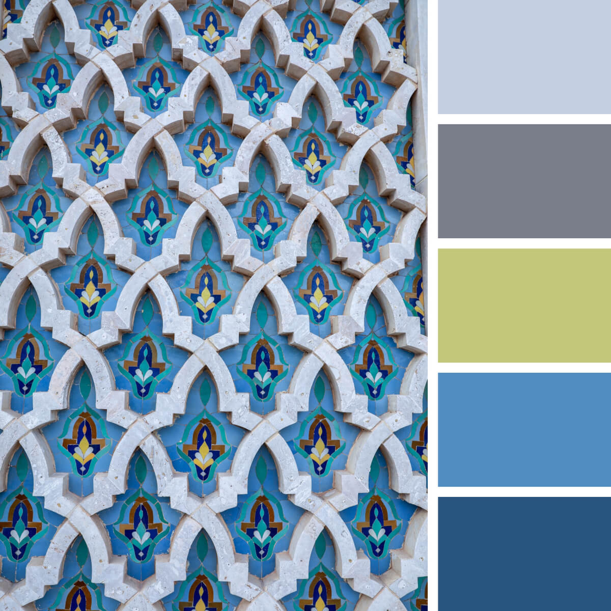
Moroccan Blue & Lime
We still can’t stop the flow of appreciation to the Moroccan landscapes and the color schemes we can get from them. The traditional color scheme is extremely rich and varied: it combines various shades of teal, rare greens and blues, and of course, sunny red-yellow colors. Apparently, it’s hard to surprise anyone here — however, have you ever considered some lime yellow to highlight the cool blue tile?
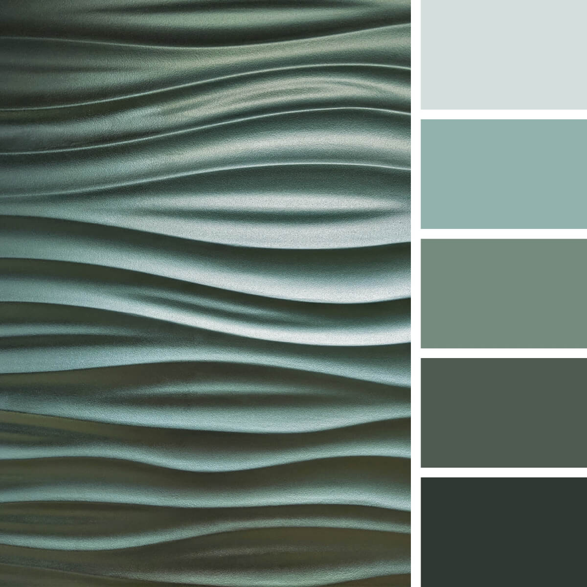
Grayish & Cool Greens
Is it a fanciful sea surface or a wall texture? You can set your imagination free and source inspiration from these colors and textures! It’s an eye-catching monochrome color combination where every shade of green is a great pick for modern design and interior projects. Since there is a huge trend for muted colors, now you have a very bold palette for such cases.
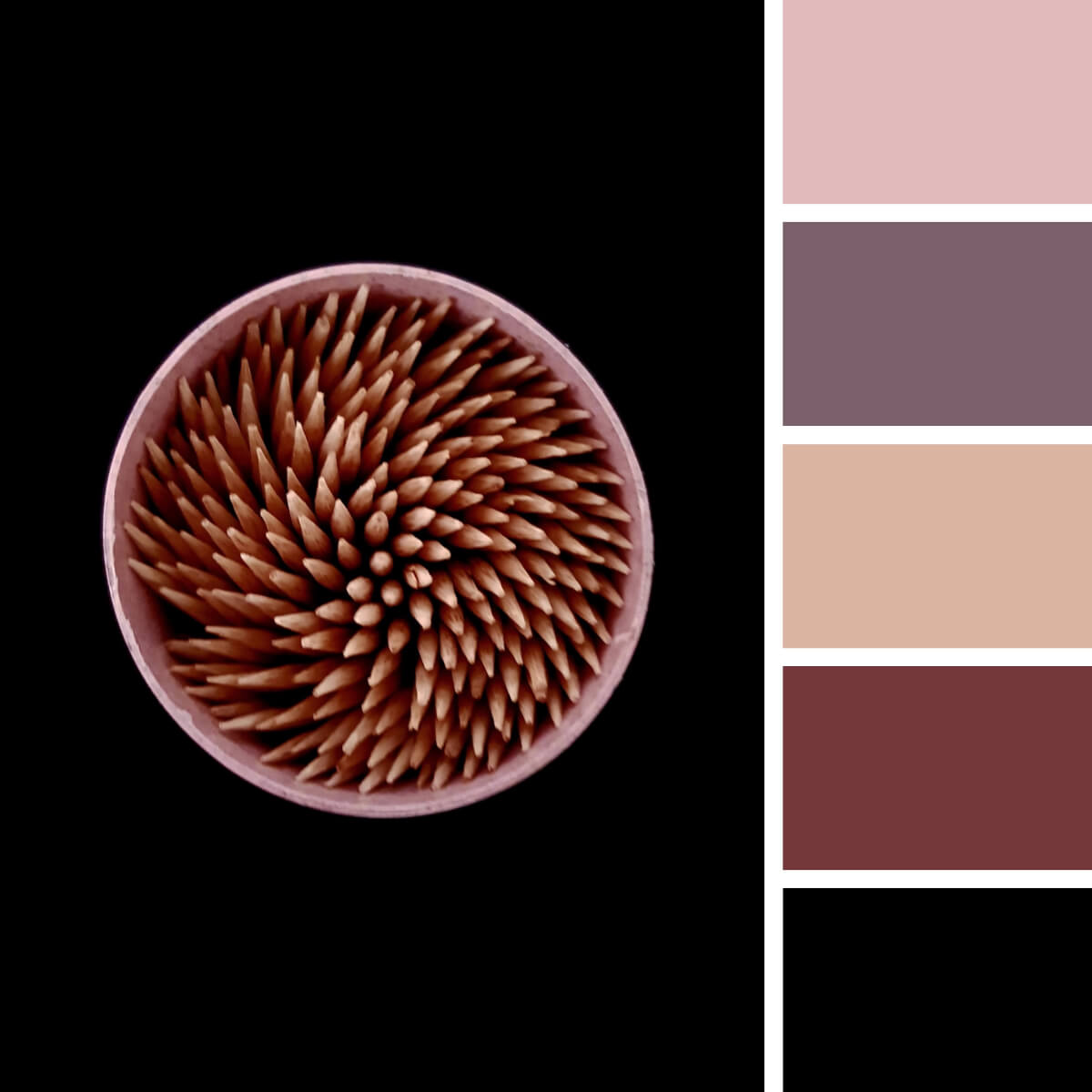
Contrastive Pink & Violet
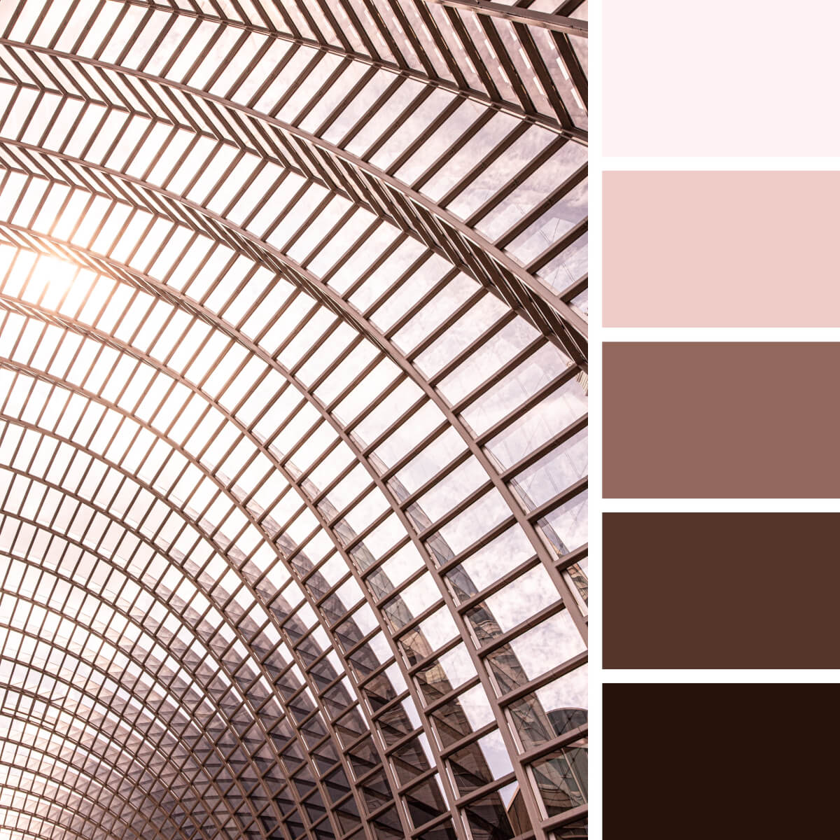
Urban Pink & Metal
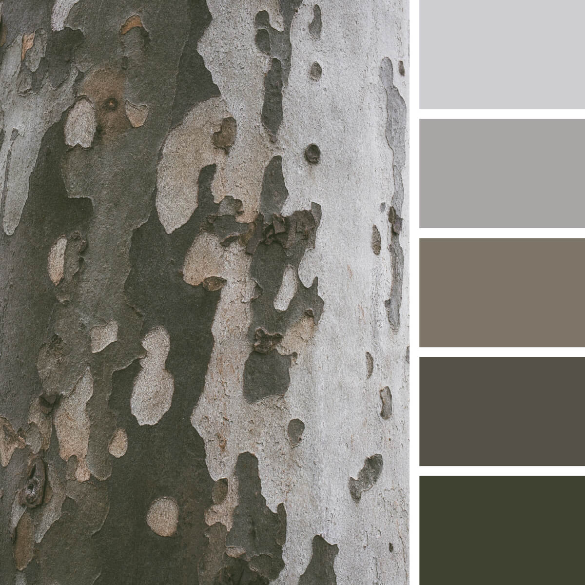
Camouflage Gray & Green
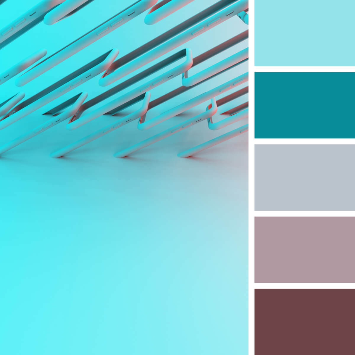
Techno Teal & Rosewood
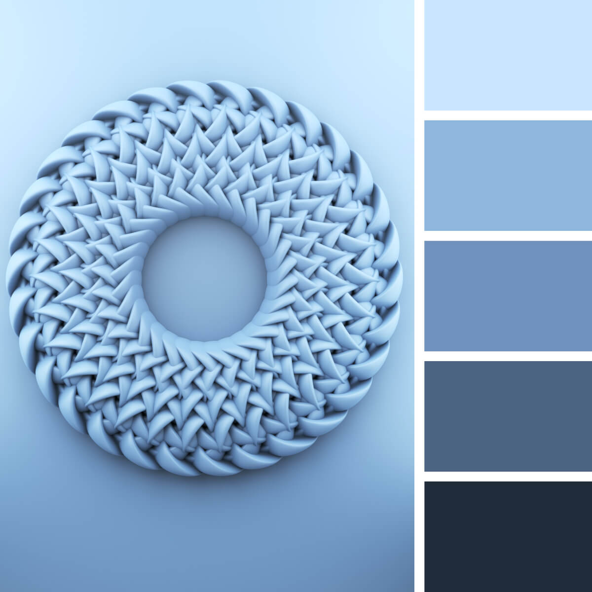
Airy & Tender Blues
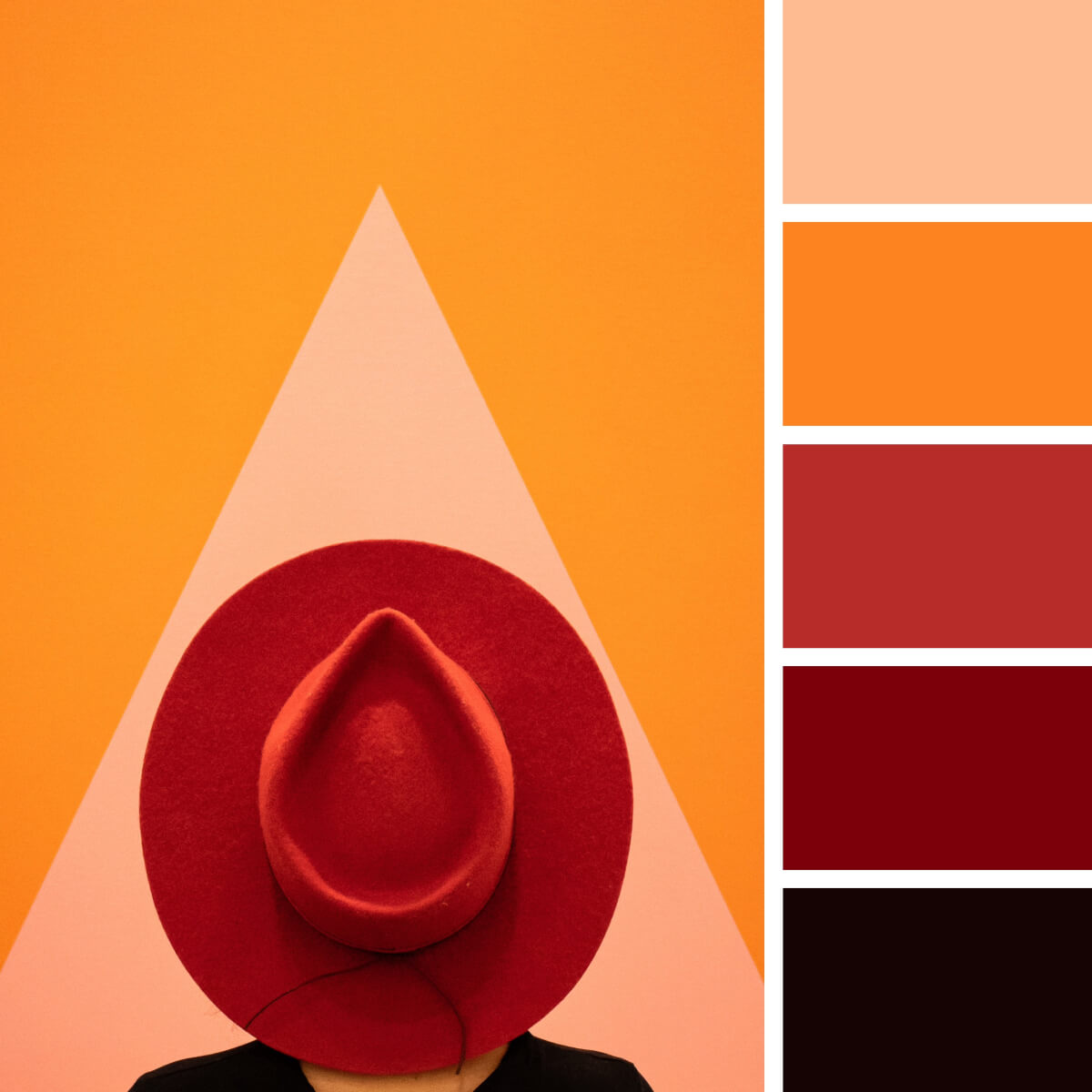
Juicy Red & Orange
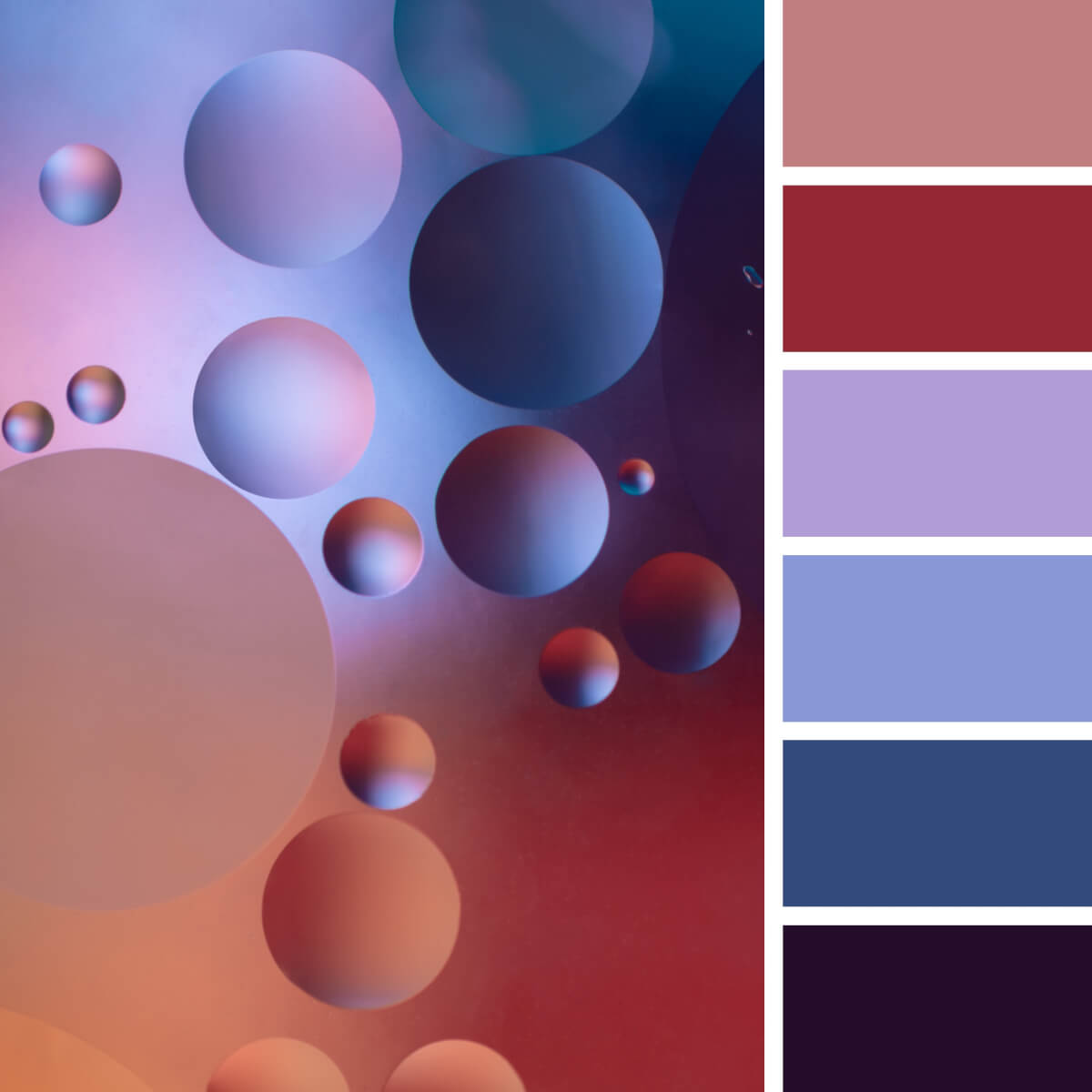
Basic Purple & Peach
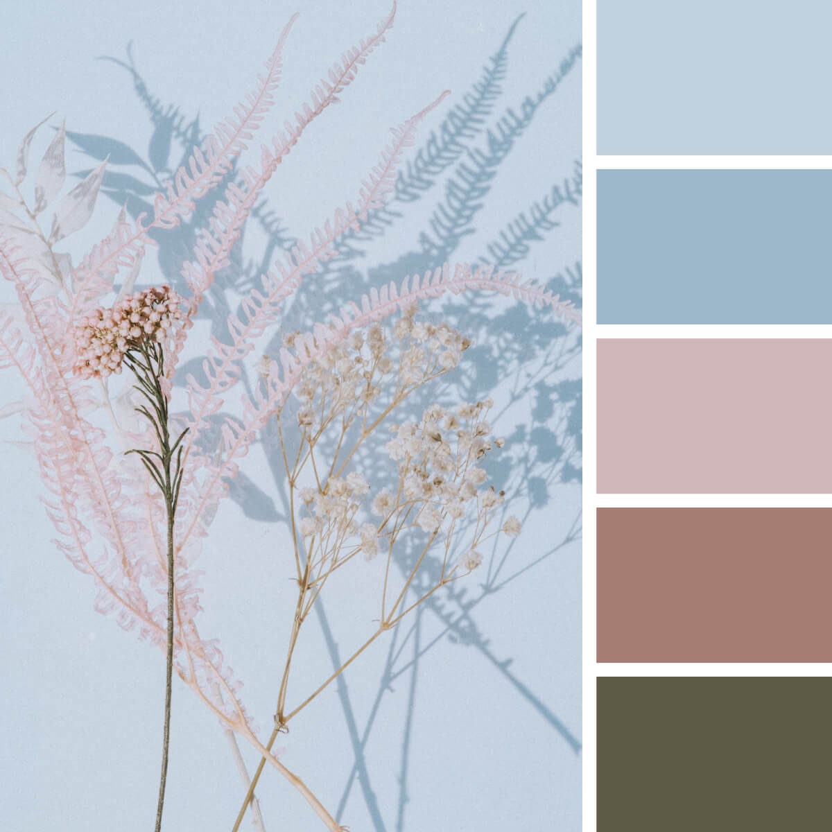
Mesmerising Pink & Blues
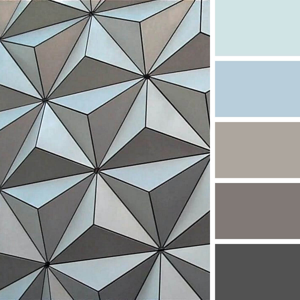
Urban Brown & Blue
Frequently Asked Questions

