30+ Best Instagram Color Schemes & Aesthetic Ideas
Beautiful visual goes first — especially if it's Instagram. Now, with beautiful palettes, you'll find it so much easier to establish the perfect look for your account.
The Designest may receive compensation from companies, products, and services featured in this publication. For more details, please refer to our Affiliate Disclosure page.
The fun ends when the creator switches from a personal Instagram account to a business one. This may sound confusing and definitely not what everyone wants to hear However, running an Instagram blog takes lots of time and effort and has nothing to do with the relaxed post-and-like behavior. But don’t let yourself go downhearted, as this work is likely to turn into your passion, and that flow of inspiration and aesthetical satisfaction discovered in the process is infinite. Especially when it touches your Instagram color palette.
The days when just posting interesting or helpful content are long gone — especially for businesses. Once companies and influencers made Instagram their primary platform, the stakes are higher, and there is an enormous attention to the visual. And here comes another important thing: the appearance of the creator’s blog is as important as every single post in it. That is why Instagram coachers and trainers emphasize thoughtful content planning and developing your unique style.
Of course, there is no article to help you cover all aspects of making a converting blog that gains thousands of new subscribers daily. However, what we can really assist you with, is to boost the aesthetic of your account and help choose (or create!) a proper Instagram palette that’s 100% you.
So, what’s on the list? Briefly, there are a few convent ways to create an Instagram color palette for your profile:
Use the ready-made color schemes;
Source ideas & inspiration from popular blogs;
Pick up matching Instagram templates;
Use dedicated apps to create a custom Instagram color combination or source from your existing posts.
Instagram Color Inspiration
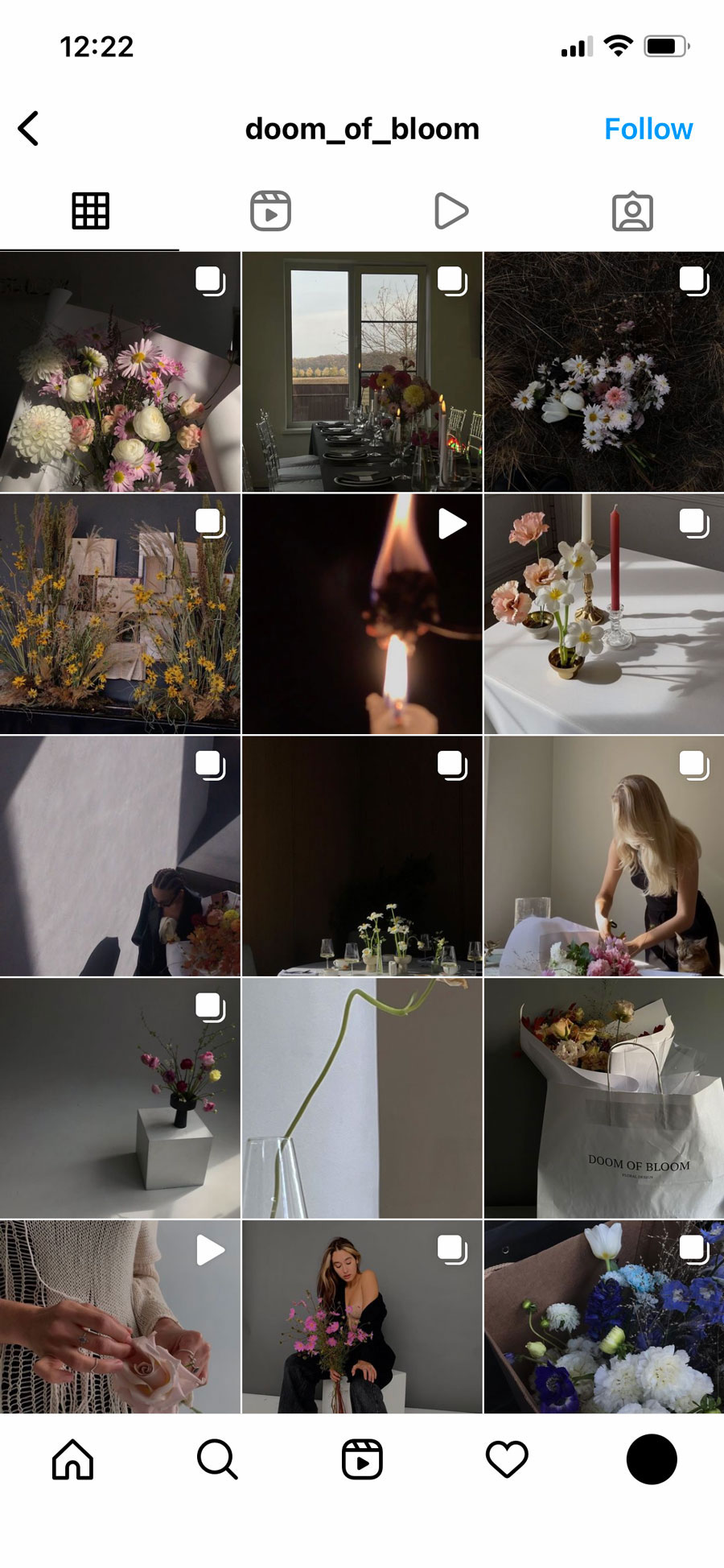
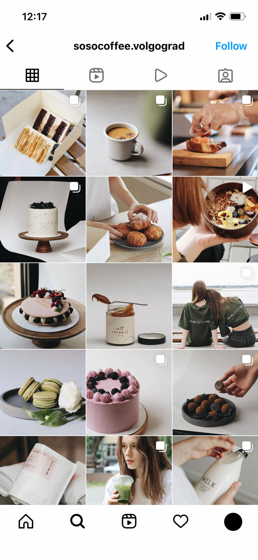
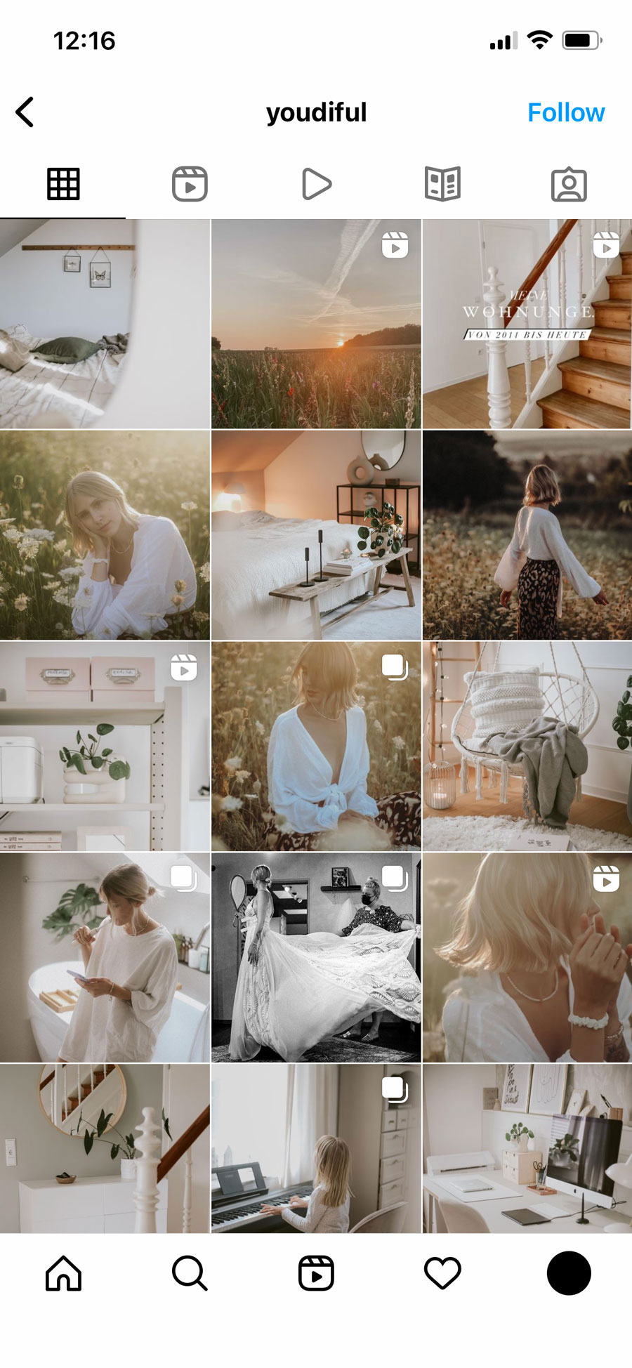
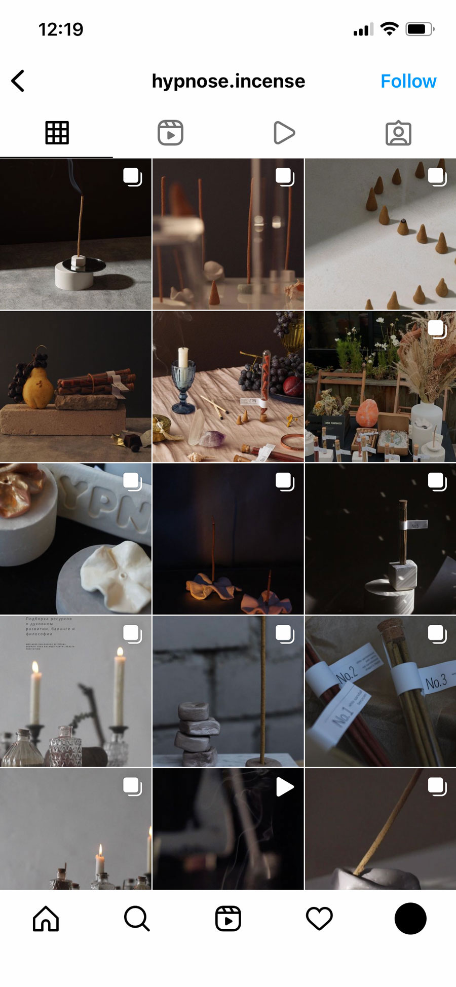
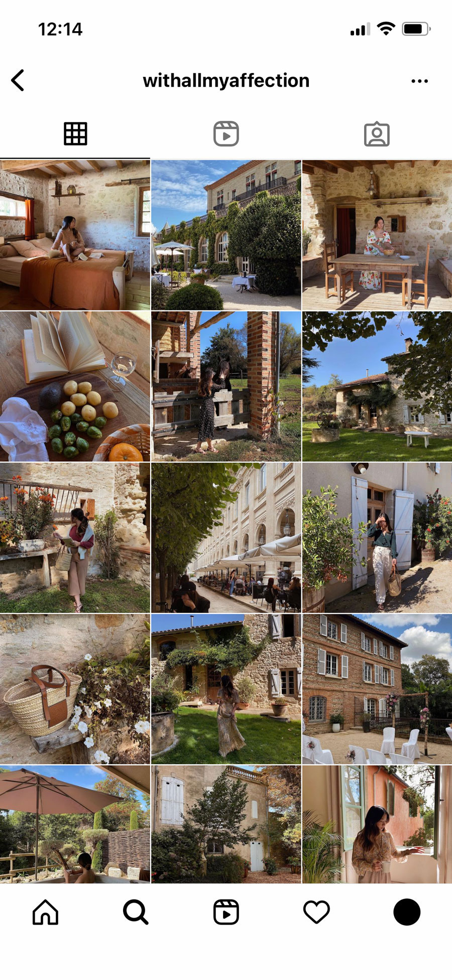
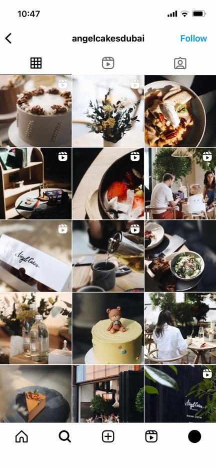
Probably, checking other bloggers’ accounts is the most effective way to understand what you want from your own and how it should look like. It has nothing to do with copying someone else’s style — instead, it allows you to catch the trends and see how big brands do it. And then it’s up to you: should you join the leaders or create your unique aesthetics. I’ve selected some accounts with totally astounding color themes, however, feel scree to scroll through your own Instagram feed to get a massive dose of color inspiration.
How to Make Color Combinations?
After you’ve chosen what you want your Instagram page to look like, time to select the basic color scheme that will set the mood of your account. For some accounts, though, this choice was accidental. However, I don’t recommend you to rely on luck or any special feeling here — as it may never happen, and you will just lose the precious time of developing your blog. In case you understand that the chosen Instagram color palette doesn’t work for you anymore, you can always make a soft transition to a different one.
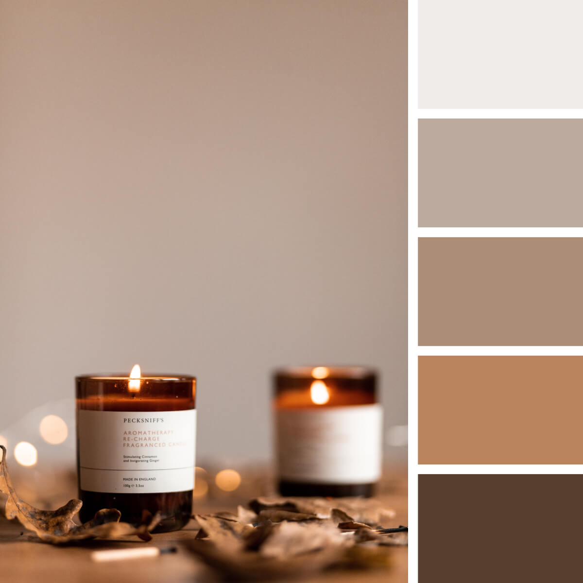
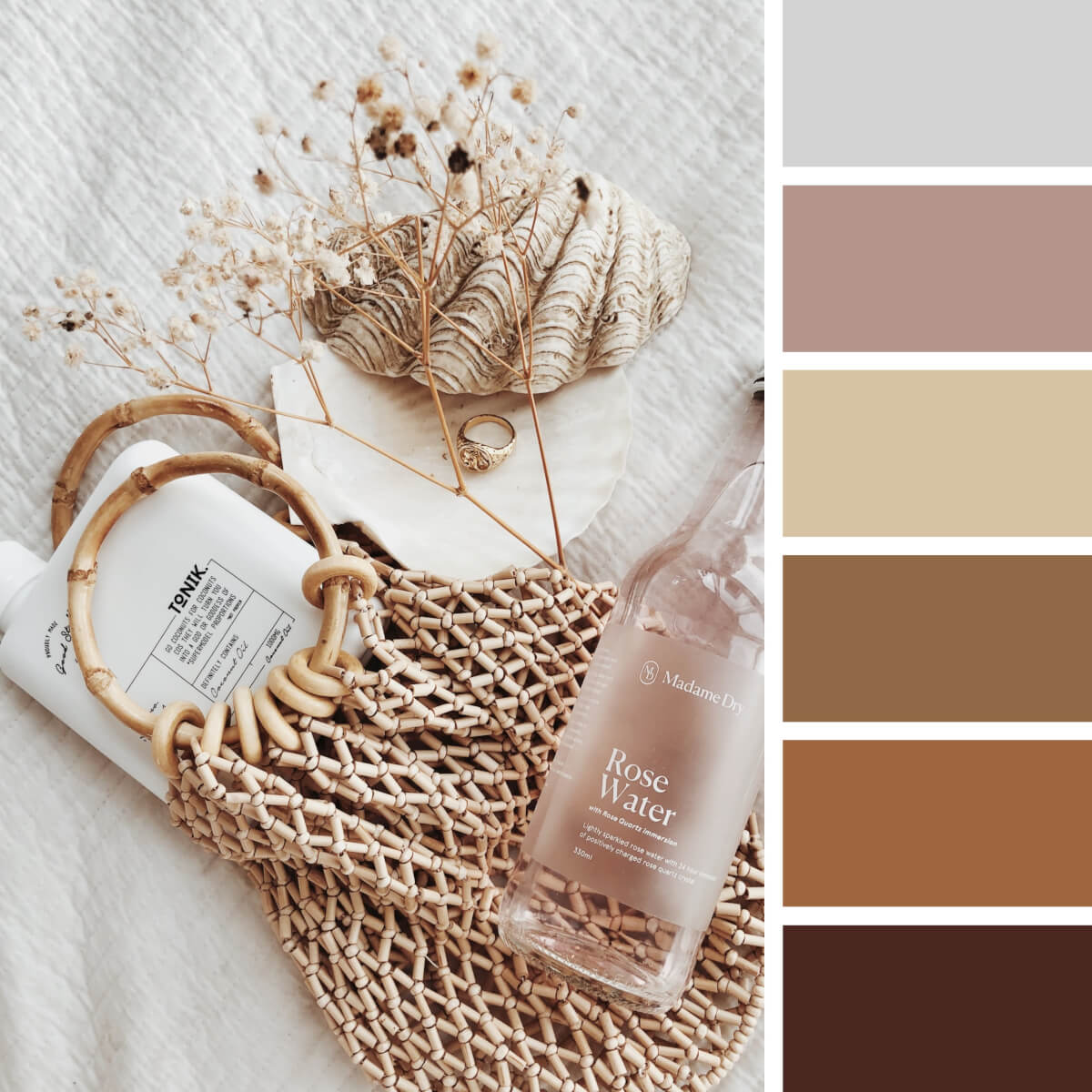
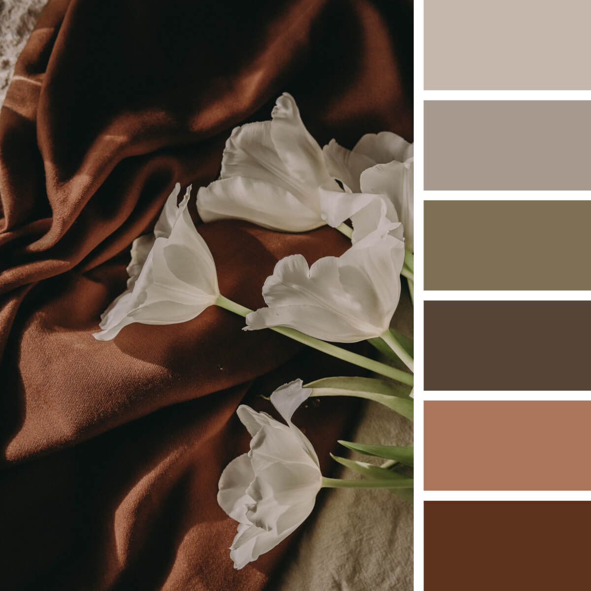
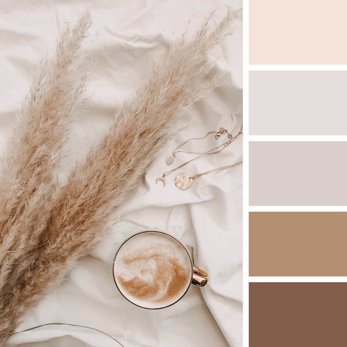
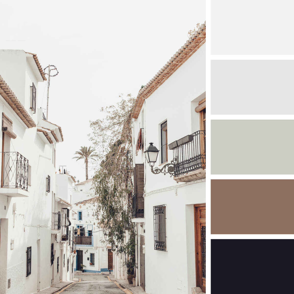
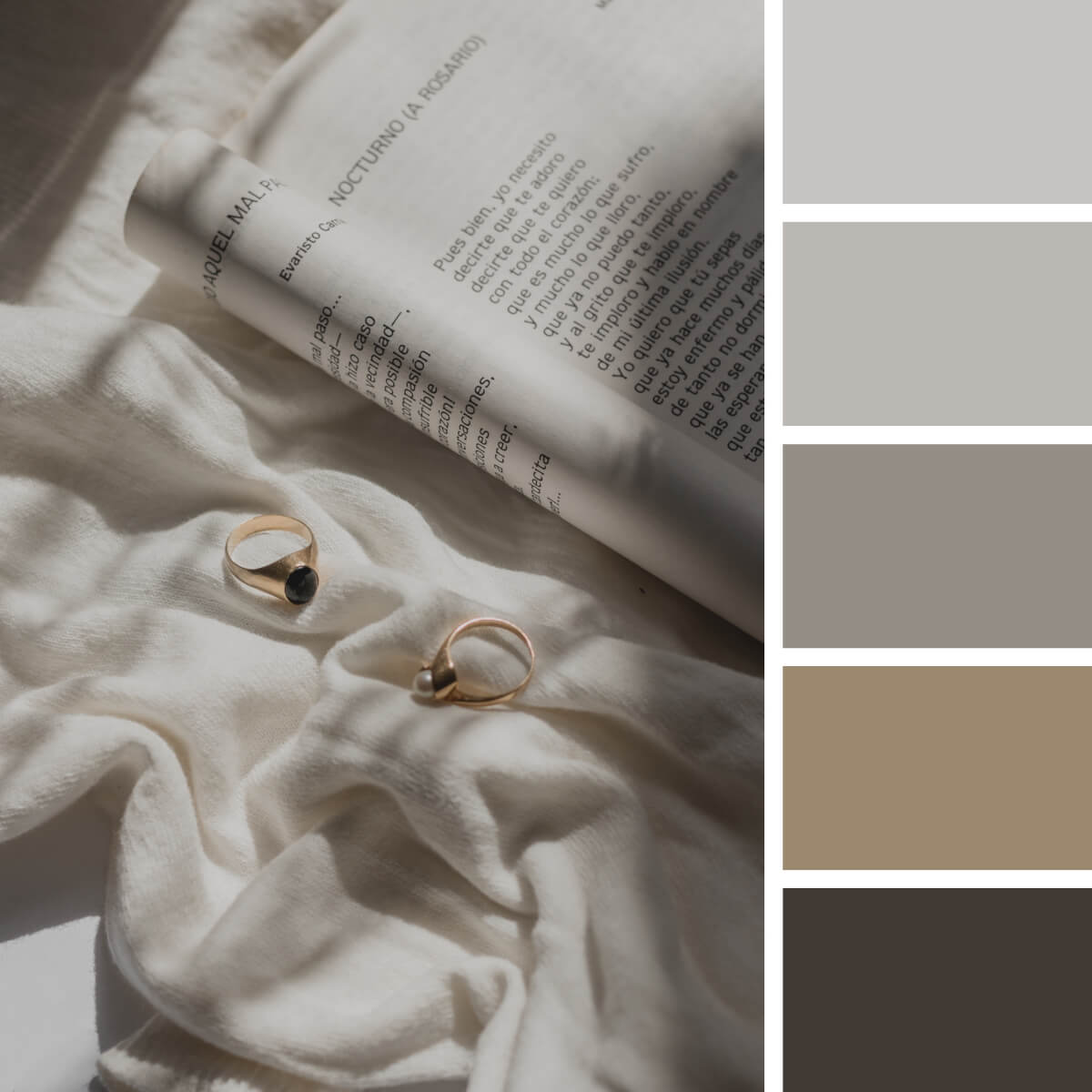
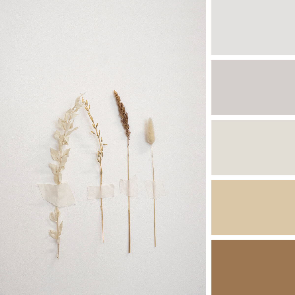
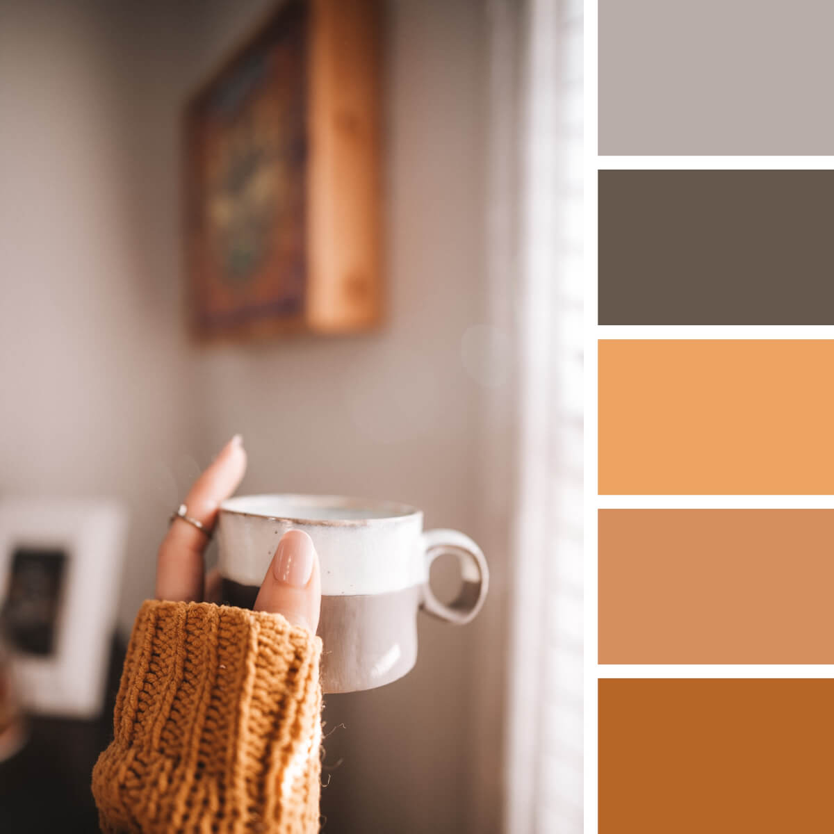
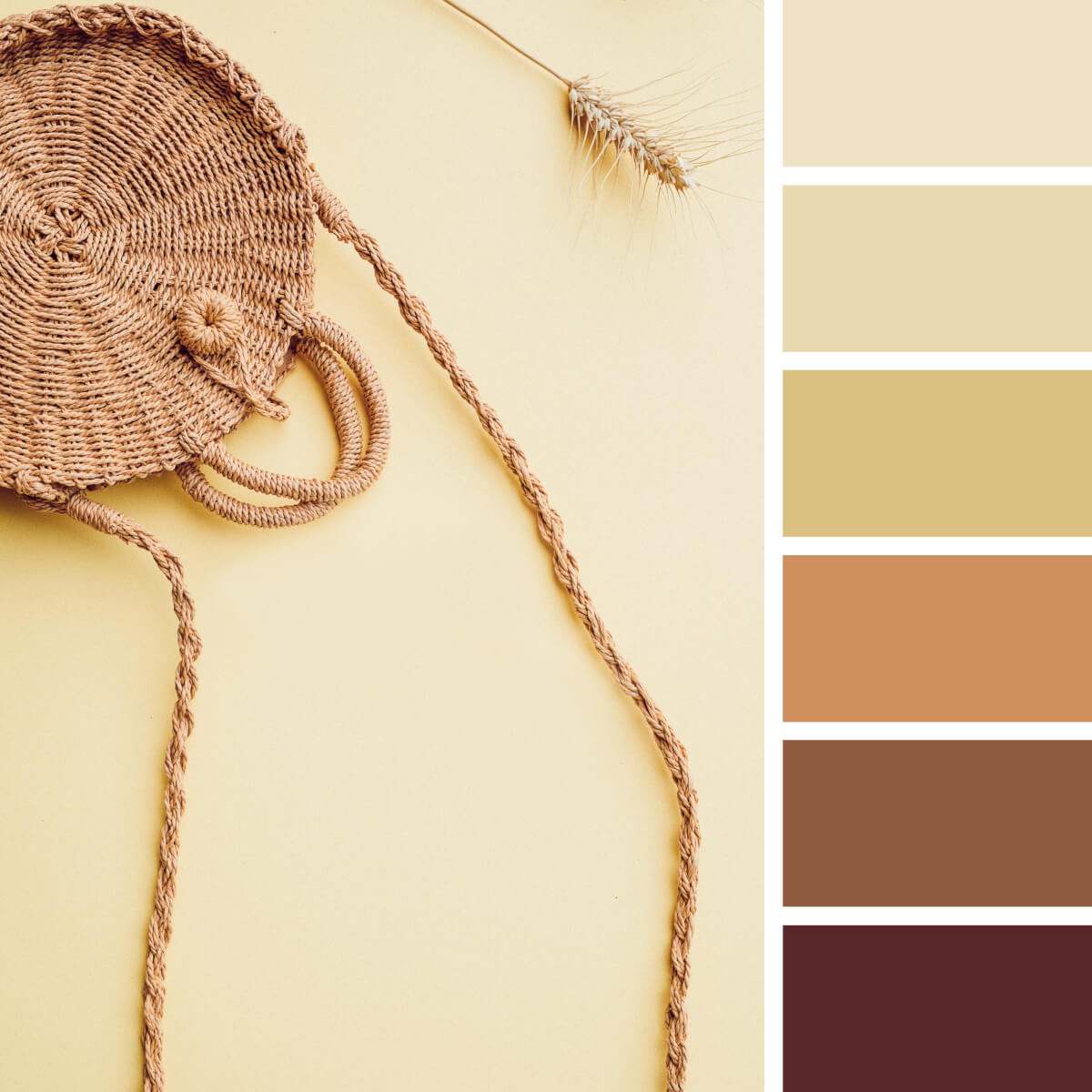
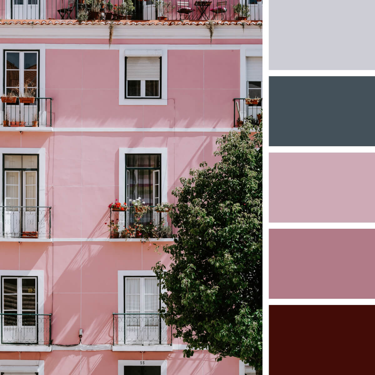
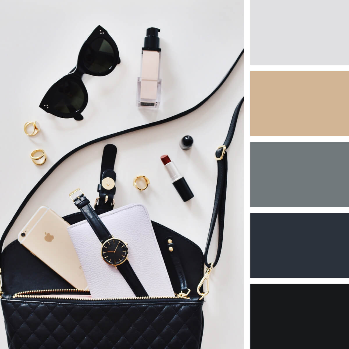
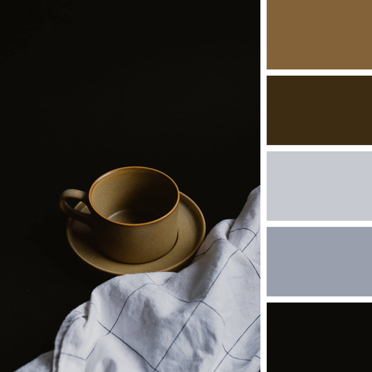
Earthly Color Palettes
Earthly Instagram color palettes don’t leave popular lifestyle, interior, and beauty blogs for a few years now, and picking this solution for yourself will be an easy yet compelling decision. The key to its success is the extreme coziness borrowed from the Hygge style. Lots of wood, natural fabrics, gold, and ceramics are the most frequent ingredients, and we’ve seen fashion blogs and entire brands successfully adopt such warm schemes and eventually become a visual magnet in the Instagram feed.
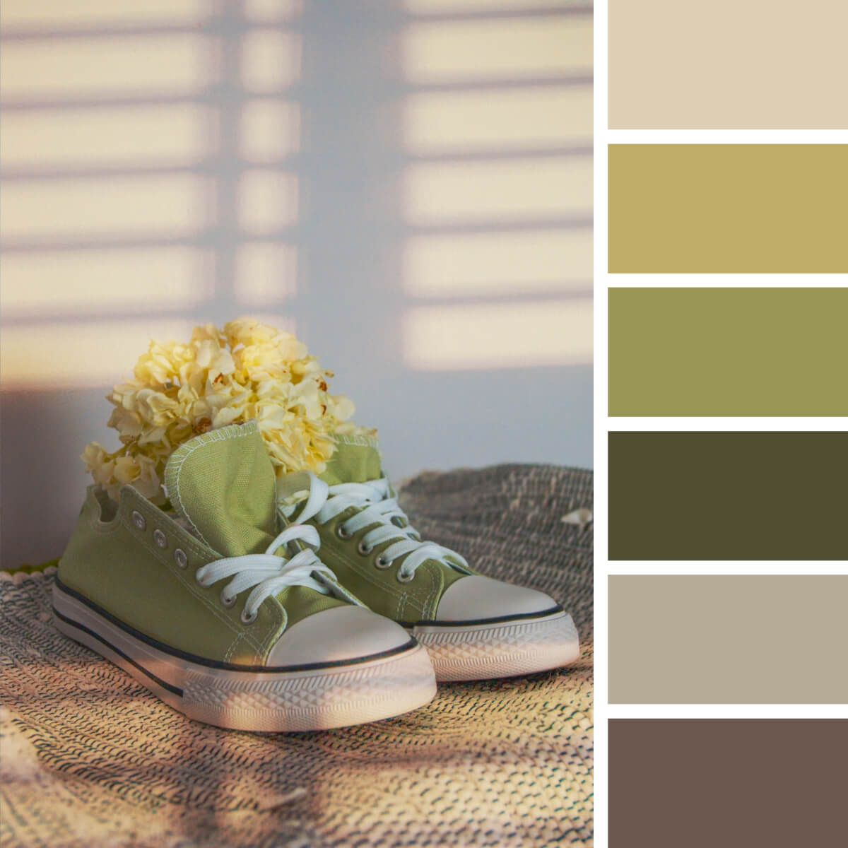
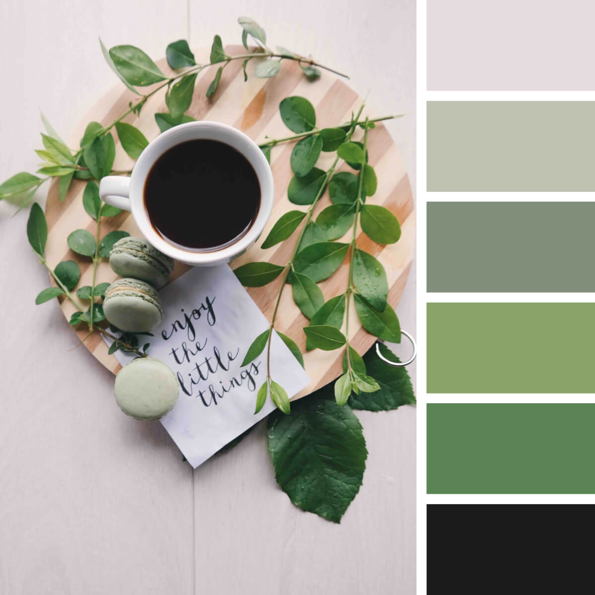
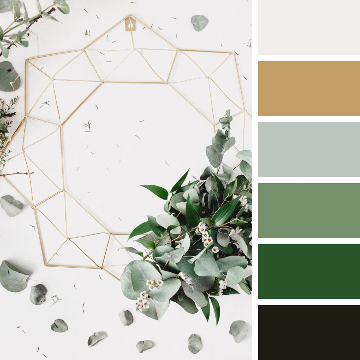
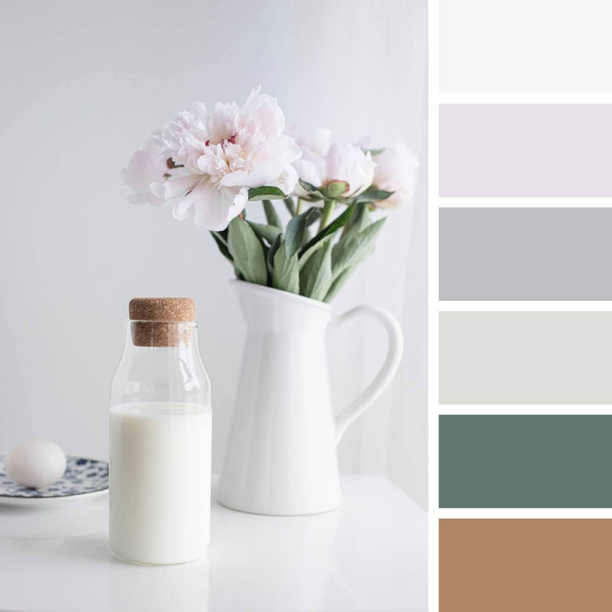
Green Color Palettes
Green is another face of coziness, and depending on its intensity in your Instagram color palette, you can vary from bold herbal vibes to more reserved schemes. The second option is easier to work with, as it easily adapts to most blog themes. However, if you feel yourself fed up with succulents, palm, and monstera leaves, running an account filled with the shades of green risks turning into torture, be aware of that.
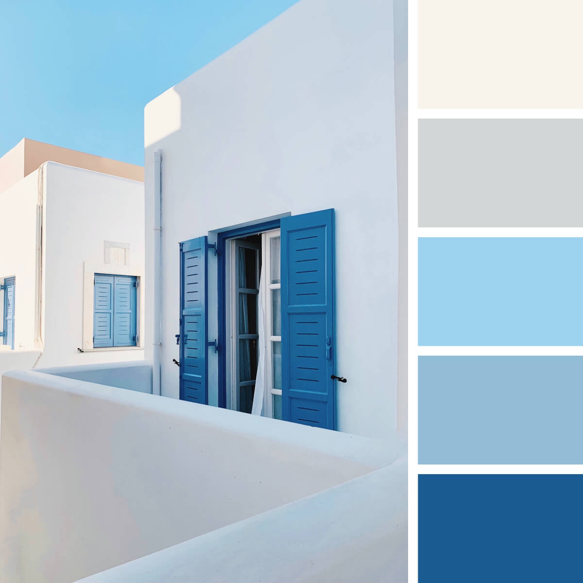
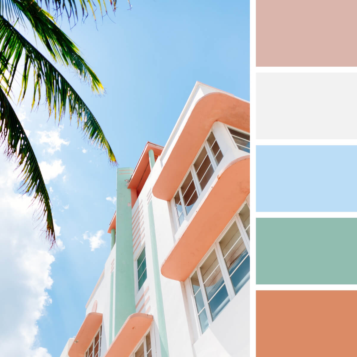
Blue Color Palettes
While seeking matching color suggestions for a travel & lifestyle blog, you’ll be surprised by how natural blue fits the image. When there are lots of landscapes under the blue sky or by the ocean, blue hues are the most obvious option — and a blue-based Instagram color palette will be the easiest to follow. Moreover, blue can make striking combinations with brown, beige, gray, and white — so most of the images you make during journeys will fit the overall aesthetics.
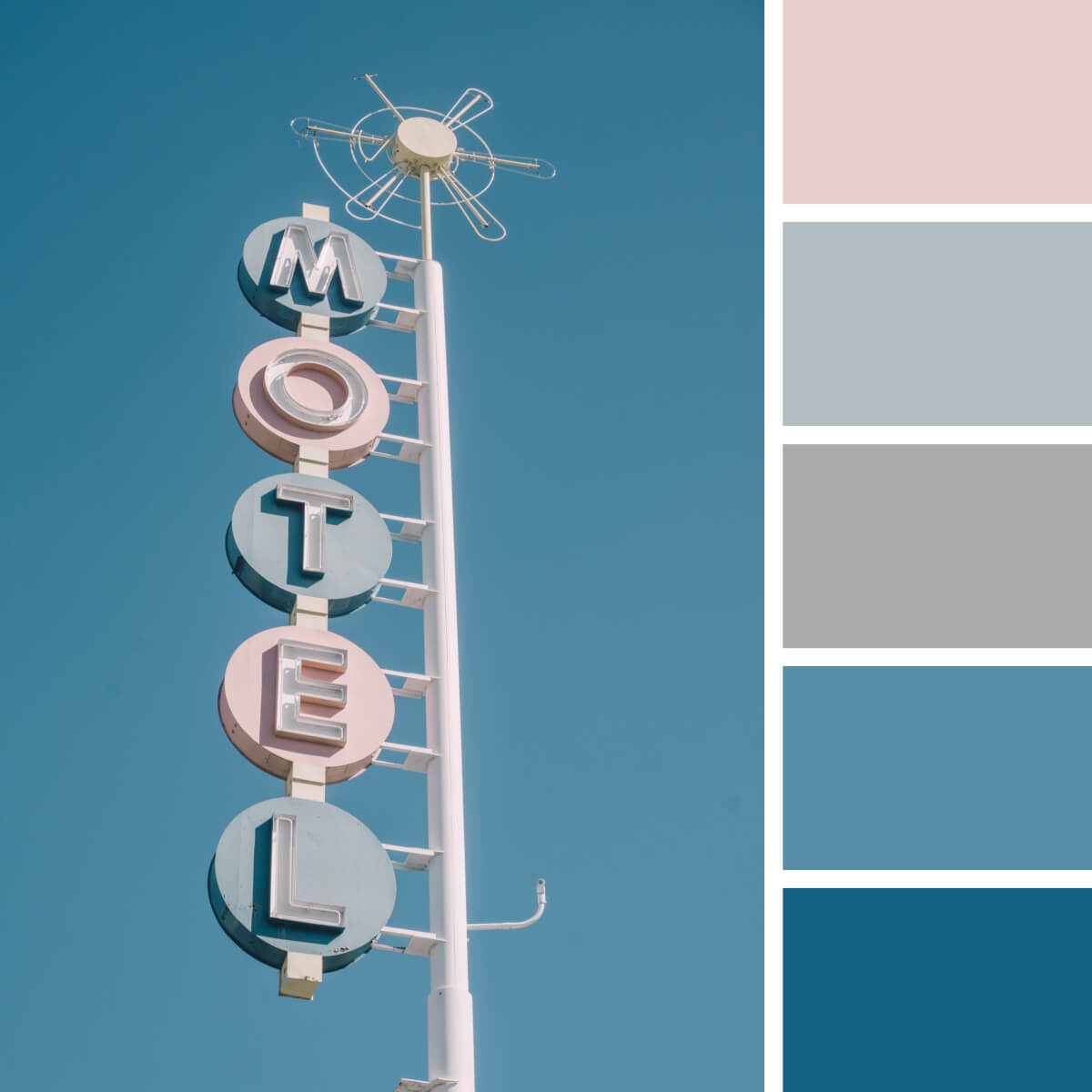
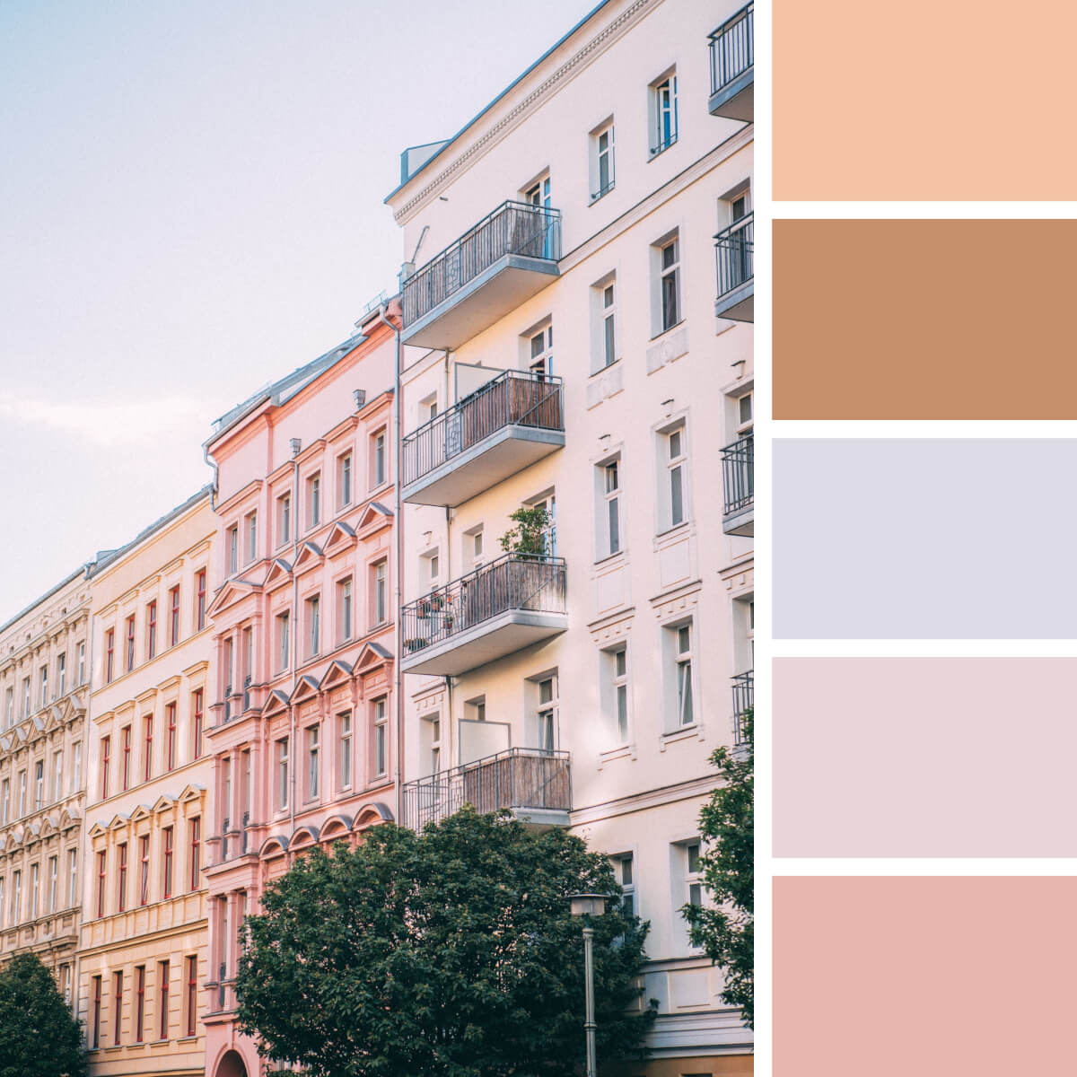
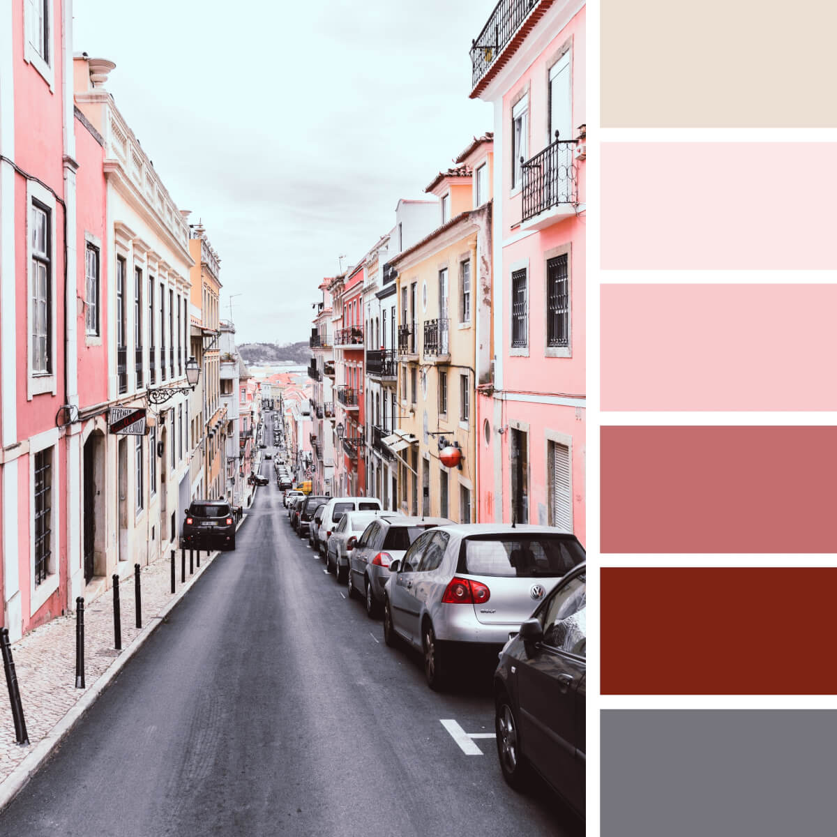
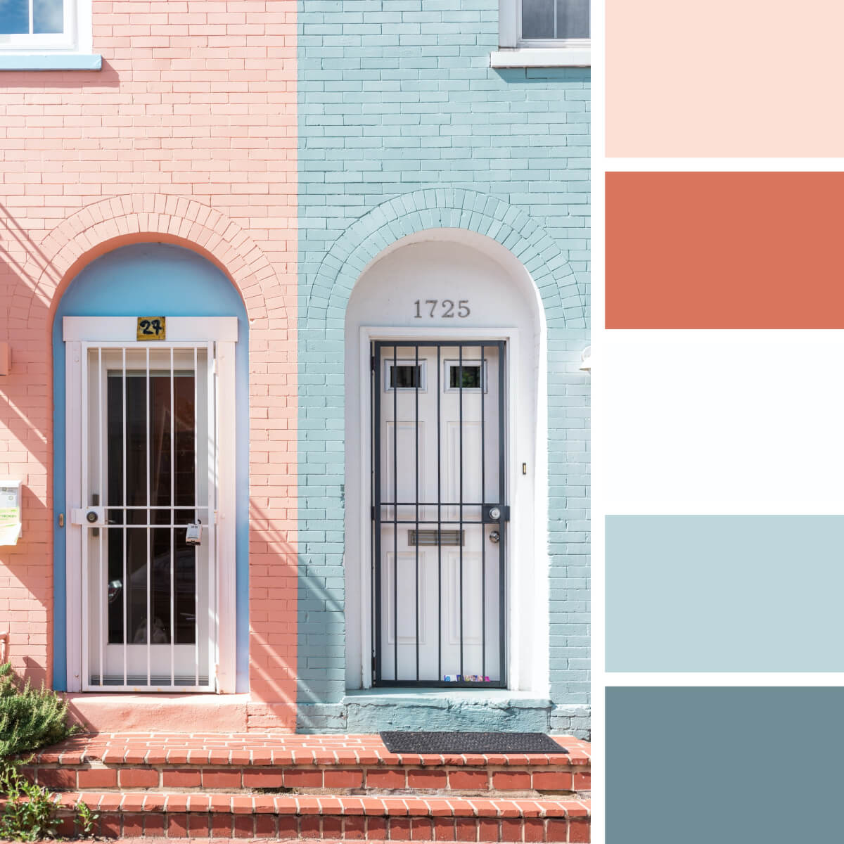
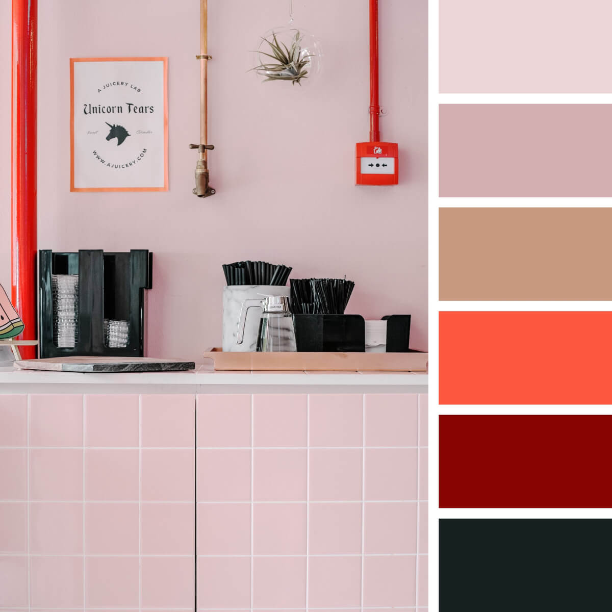
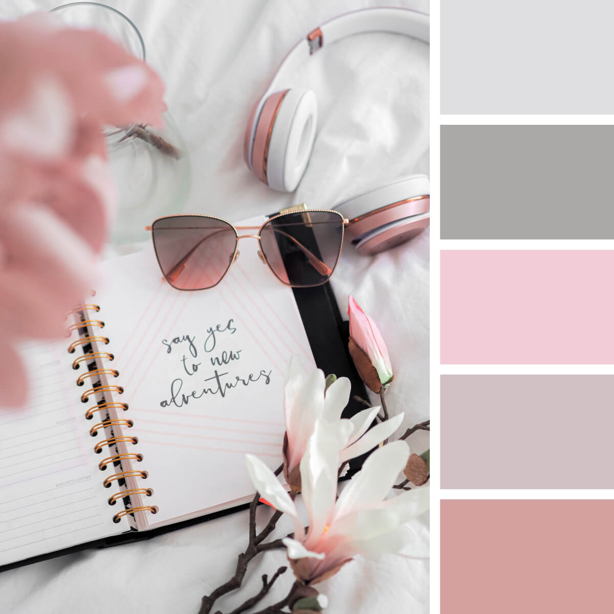
Candy & Pastel Color Palettes
If there is a rival to earthly Instagram color palettes, that should be the pastel schemes. And they have their reasons: the colors follow the popular interior solutions and appeal to the creative audience. Such accounts seem like brought from Pinterest, such sweet color themes and candy-like hues keep attracting attention as if they were invented yesterday, not years ago. The best application for pastel color schemes is artistic blogs focused on stationery, meditation, drawing, craft, floristry, or just as personal blogs with jaw-dropping flat-lays.
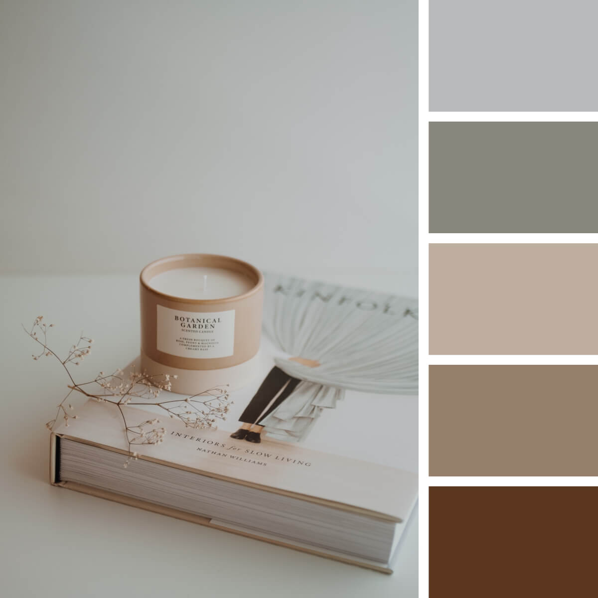
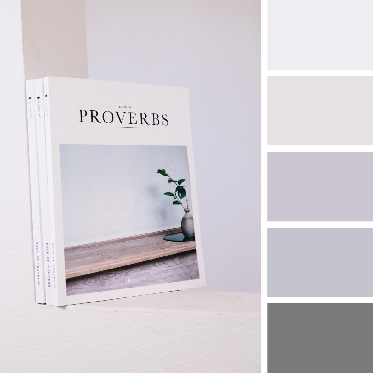
Gray & White Color Palettes
The fascination with the Scandinavian aesthetic seems to never end. It has given us a new understanding of minimalism and coziness, so today, white is rather associated with warm snuggly interiors than sterile cleanness. Neutral Instagram color palettes are easy to work with, and they are as flexible as pastel and earthly ones.
As you choose between the three most popular schemes, there is an amusing tip: if you have white walls in your place, the primary color for your blog images might be white too. At least, you’re guaranteed to have lots of it in your posts and stories, and can even try making white your brand color.
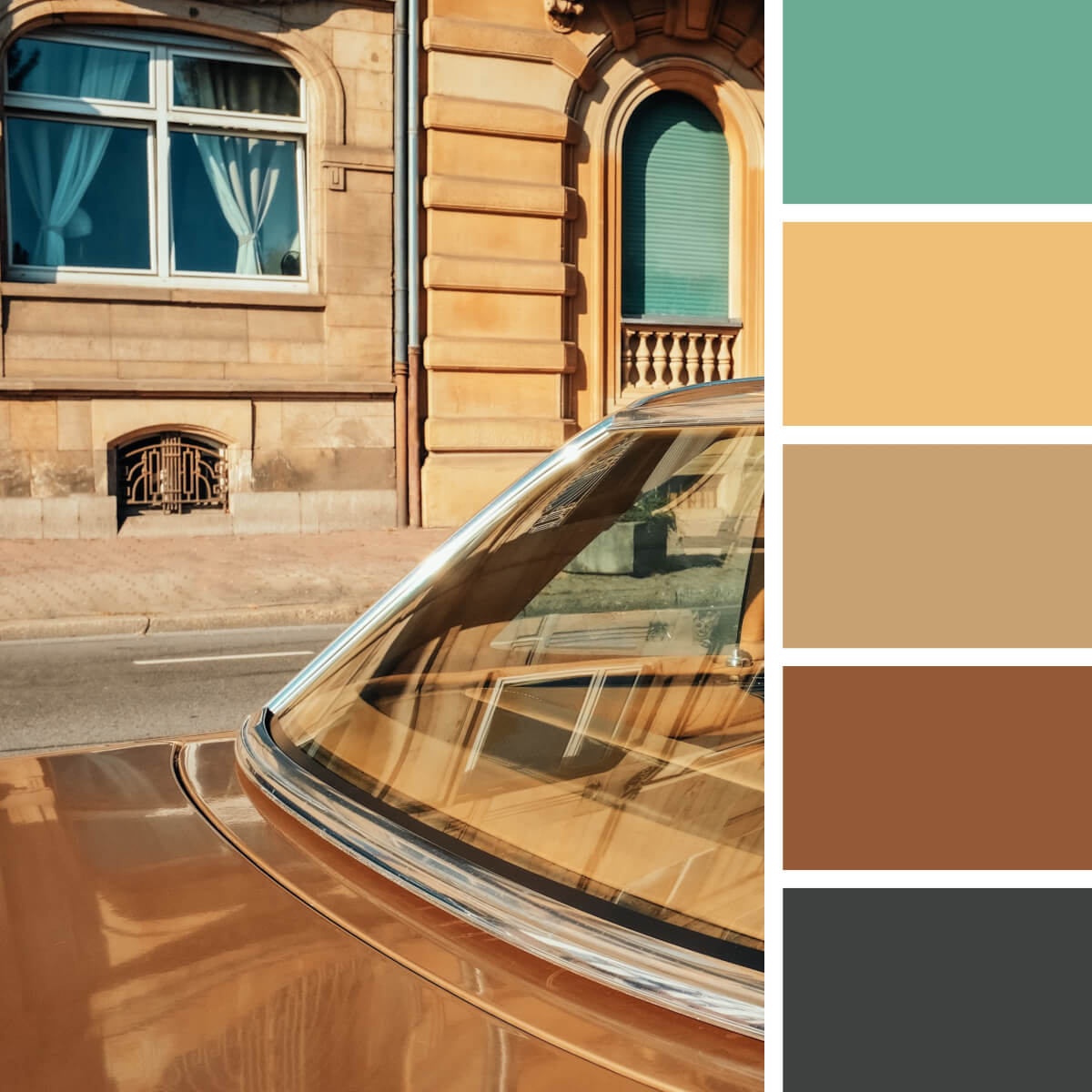
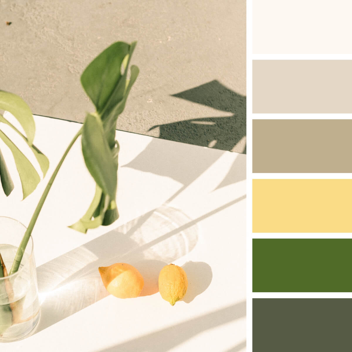
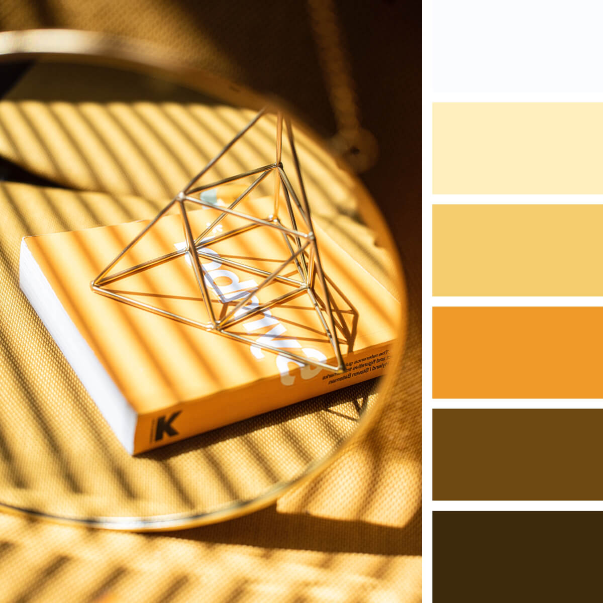
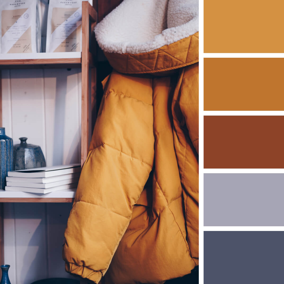
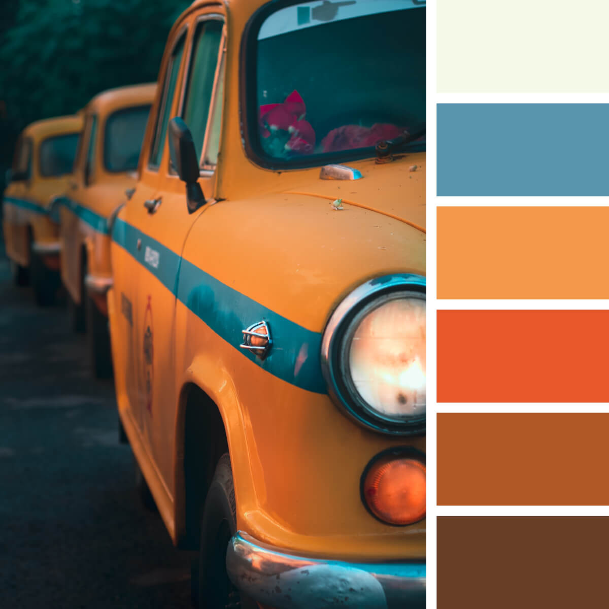
Yellow & Orange Color Palettes
Feel like making your account with sunny, warm vibes? Or make your account filled with Wes Anderson’s aesthetic? Yellow and orange Instagram color palettes are the most obvious option. Of course, adding the key elements of the matching hues will become more challenging, though that’s how businesses and independent creators may stand out in the feed. Indeed, while most posts are shot in the brown-beige-gray palette, bright yellow publications or juicy orange accents should pop and grab the user’s eye (great idea for advertised posts!).
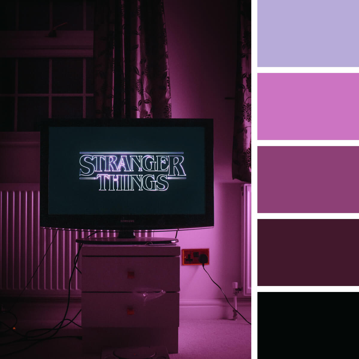
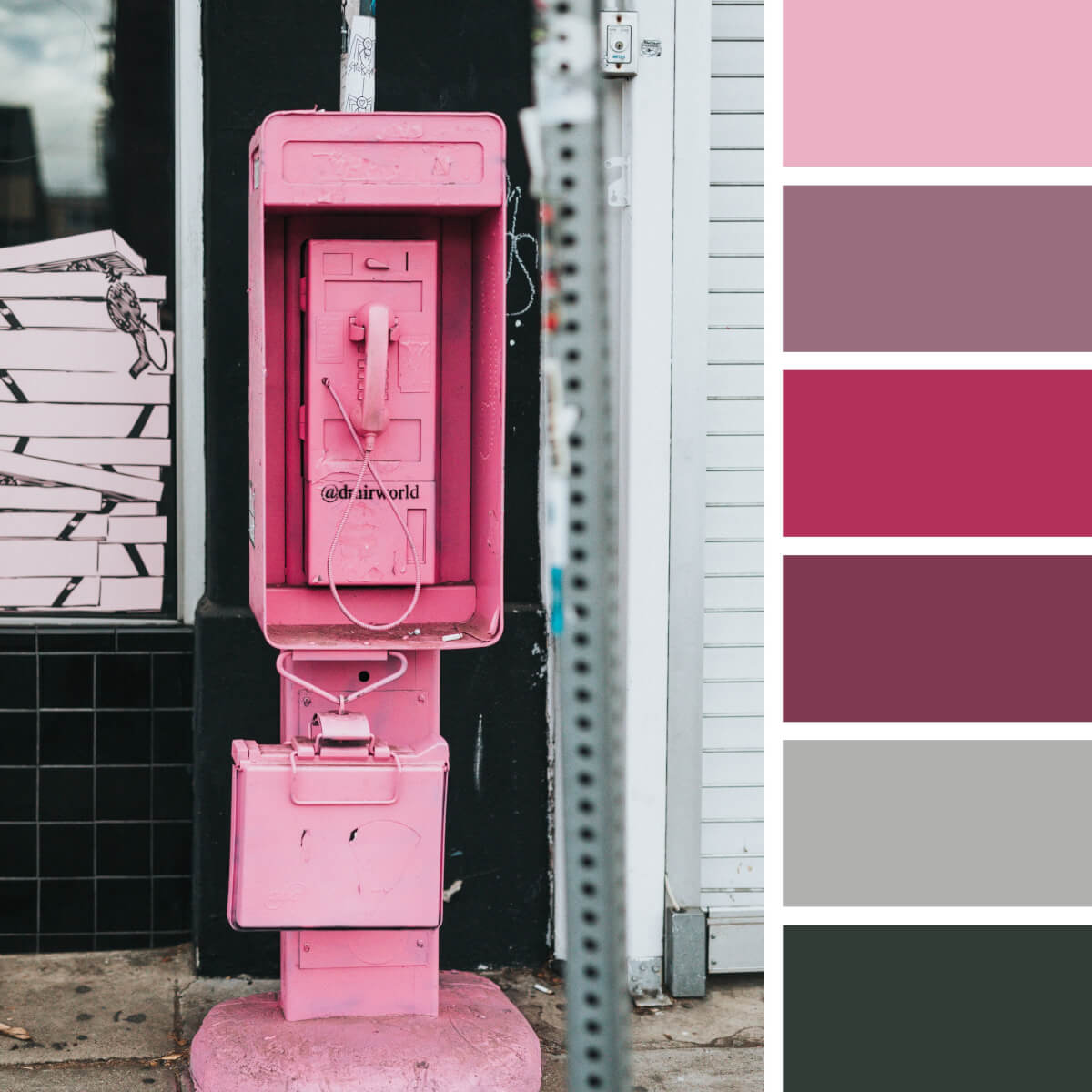
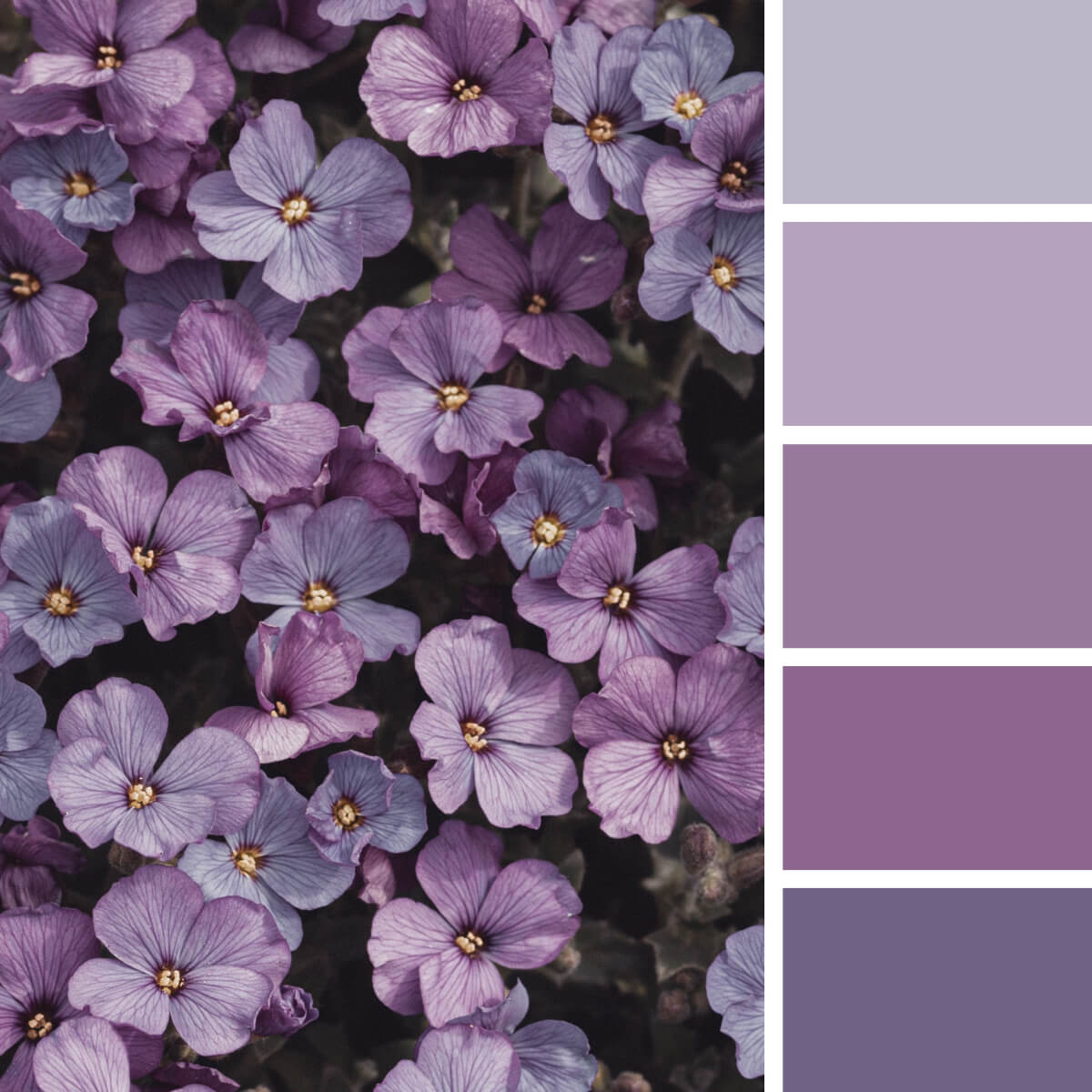
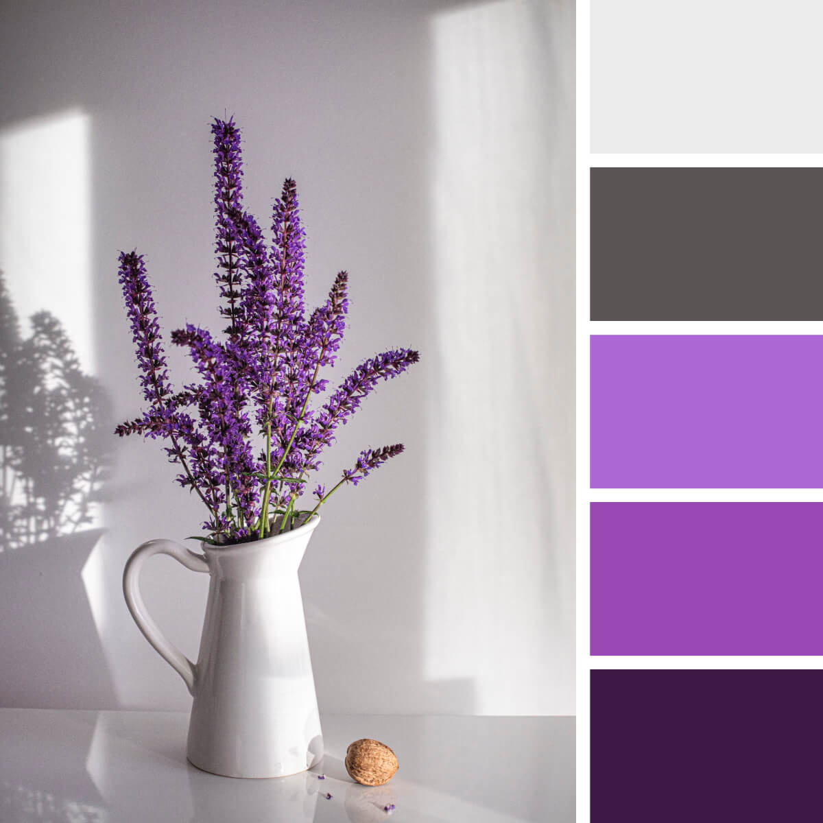
Pink & Purple Color Palettes
If you are not scared of challenging cases and have plenty of neon stuff at your disposal, you can try pink and purple for your Instagram account. On one side, such blogs immediately grab the eye. On the other, the necessity to stick to such complex colors might transform your blogging experience into a quest. Therefore, this decision should be made wisely, as a spontaneous intention to make a neon purple Instagram color palette may take you nowhere, and you’ll just lose time on elaborating and developing an effective color combination.
However, if you are running Instagram for some company with pink/purple as its brand colors, consider yourself as a lucky one — it’s a sleek opportunity to stand out with the visual.
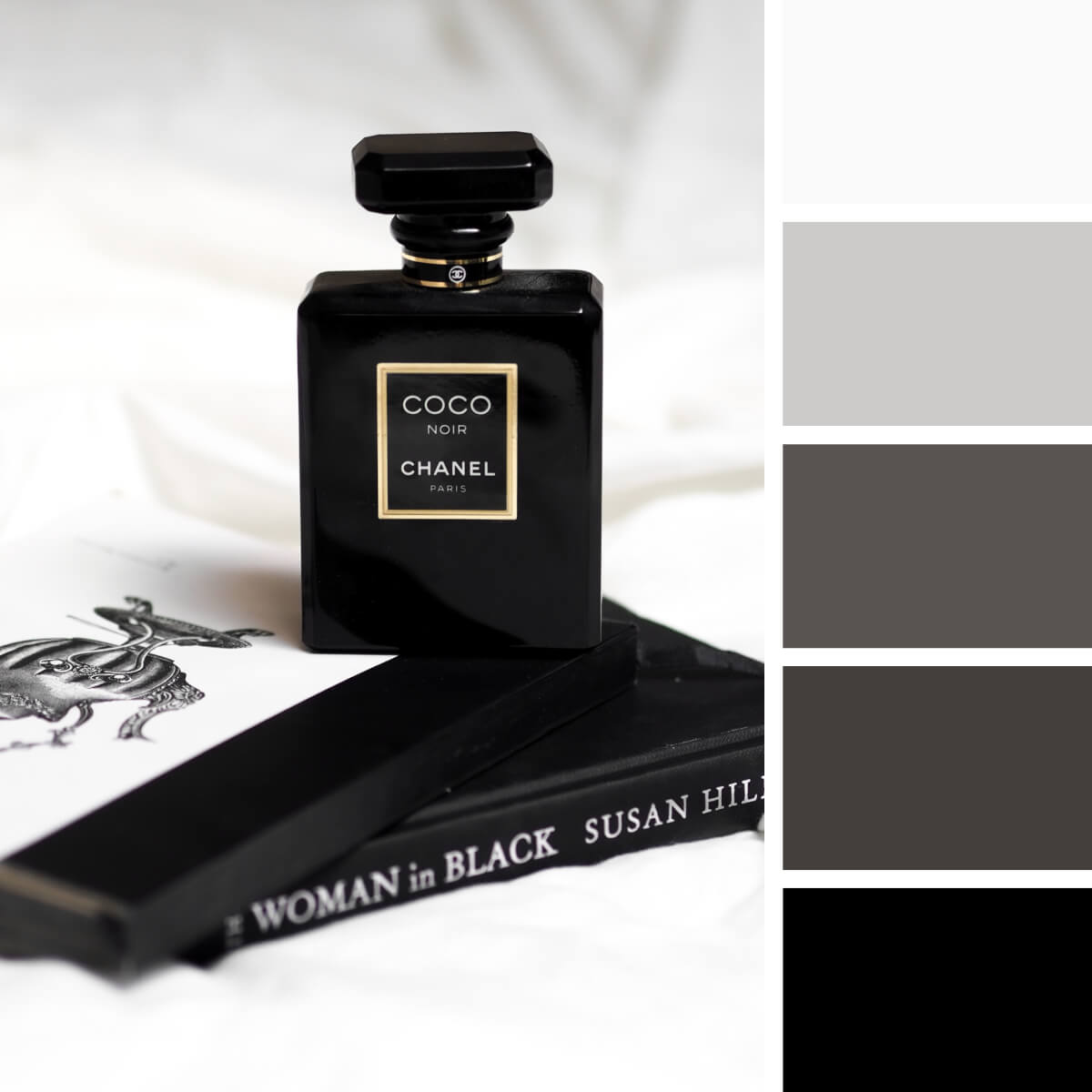
Black Color Palettes
Black Instagram color palettes are the least popular solution for brand palettes and probably the hardest too. If you have a b/w profile, it definitely looks conceptual and chic. However, how do you keep the balance between noble black and just hundreds of grim posts, all in dark, heavy shades? Here, as you pick black as your primary color, it’s essential to think about how you will dilute the darkness. Will it be some gold, orange, white or will you implement a couple of matching colors to make the scheme more applicable?
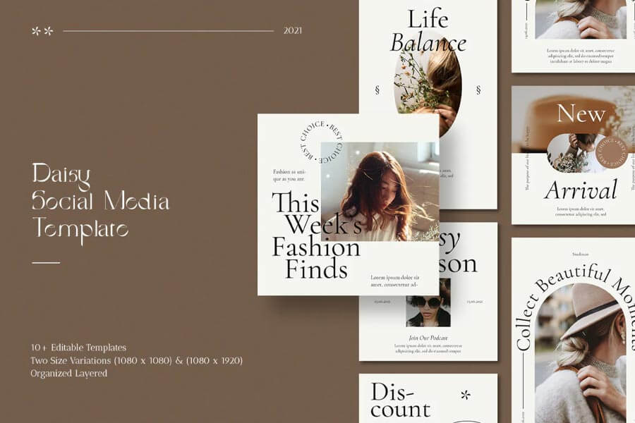
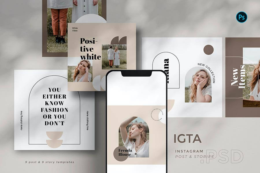
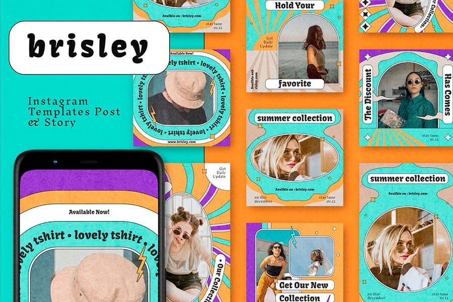
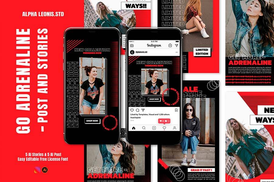
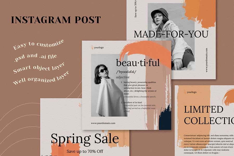
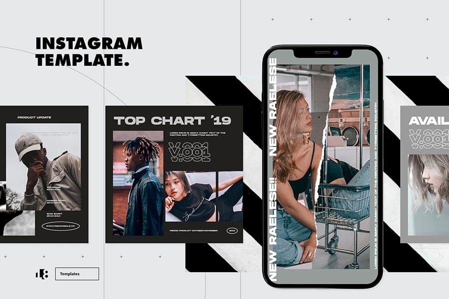
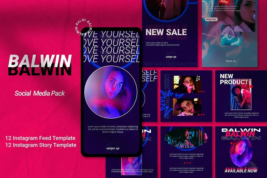
Instagram Templates: Posts & Stories
You can always resort to ready-made templates if you seek an easier way to set up an Instagram colors palette or choose colors that will naturally fit your blog’s message. Although they are far from being a winning everyday solution, there is no better way to test multiple color schemes and see how they match the overall aesthetic.
Design marketplaces abound with posts and stories templates designed in various styles. And as they feature modern typography, geometric shapes, and sharp color schemes, they allow content creators unbounded experiments with their blogs. You don’t have to publish every piece, but you can try dozens of different templates before you get the one or eventually understand what your Instagram color palette should be like.
If you make your first steps in blogging, Instagram templates are a great way to start. No need to fear customization, as they don’t require expert design skills. Most files contain Smart Objects, which means you can open them in Adobe Photoshop, select the layer where you want your images to be placed, and insert them. You may also like a tutorial on using Smart Objects, so here’s one.
Once you start an Instagram blog, there are a few important things to learn. First, it’s going to be a full-time job if you want to get tangible results. So be prepared to invest your time (and money) to see your blog grow. Second, you should never refuse to use extra apps to ease your work — no need to be a one-man band.
There is a great and easy-to-use software to publish and schedule your posts, intuitive photo, and history editors, and rest assured, there are plenty of handy solutions for creating an Instagram color palette. Whether you need pro assistance or just a convenient sandbox, they will go.
Canva. The app is one of the most frequently used photo editing and image creation services within bloggers and small businesses. It has three plans starting from $9.95, however you can use it for free to create a color scheme. To do so, you can either upload a source image or generate a palette from scratch using Canva’s color wheel tool.
Colorkuler. It’s an Instagram profile color palette extractor that can set us a color scheme based on your existing posts. There are two plans: the free plan analyses the last 9 posts, and the paid one ($2.99) analyses the last 28 posts. Colorkuler won’t fit you if you’re just starting the blog. But if you’ve made a few publications and want to see where they’ll take you aesthetically, there’s hardly a better option.
Coolors. This app is our absolute favorite option whenever we have to do some colorwork: from making custom color schemes to exploring fancy gradients. So if you need to establish an Instagram color palette, Coolors will fit too. You can generate a color combination from existing photos, source graphics taken from anywhere, or check trending color schemes, all provided with HEX codes for your convenience. The app is free and is available as an Adobe add-on, Chrome extension, and a stand-alone iOS app.