The Designest may receive compensation from companies, products, and services featured in this publication. For more details, please refer to our Affiliate Disclosure page.
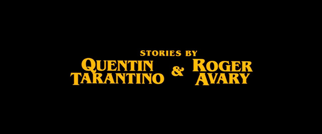
Quentin Tarantino is a notable and outstanding filmmaker, whose masterpieces contain juicy, eventful plots, playing with your mind and emotions. He takes care of all the odds and ends putting them on their rightful places in the plot canvas, which is just insane! But have you seen his movie title fonts?
Tarantino’s vision of art is not bound by any frames and is expressed even in the way he arranges the intros for his films. I’ve got to say, this man is a real film typefaces maniac! Most of his motion pictures have a successive chain offonts proudly demonstrated within nothing less than 3 minutes. He grabs so many variants not out of a design greed: the typographic twists Quentin chooses with the movie fonts can’t be called out of place.
Being a relatively average admirer of his work (and a huge fan of John Travolta, btw), it has never come to my attention until I’ve watched the latest “Onceupon a time in Hollywood” with its retro aesthetics of the 60s. Followed by curiosity, mixed with a desire to discover more about Quentin Tarantino typography style preferences, I invite you to come along on this typographic adventure in a chronological order of movies coming out from 1992 to 2019.
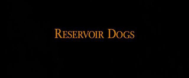
The long history of Tarantino film fonts was a bumpy ride. Looking back at the beginning of Quentin’s career, the tale should be started with the first-ever film he created — ‘’Reservoir Dogs.’’ This low-budget crime movie has set the course for the future mustard-yellow opening credits, which became a recognizable trait of all Tarantino’s works. The letters used here belong to Garamond Font — a pretty standard-looking typeface yet amazingly fitting the atmosphere.
Despite this fact, you might be more familiar with the poster font, which is nothing like the recently-mentioned one. Honestly, having no verifiable source of info concerning the original poster font, I would like to offer you a fair replacement — Reservoir Dogs font, replicating the poster version flawlessly.
Fonts by Pacific Title & Art Studio
To say that I was baffled means to say nothing — the reaction I experienced thanks to Pacific Title & Art Studio. Why does it make me feel lost and confused? According to that little loaf of information I’ve scraped for this article, Pacific Title & Art Studio Hollywood post-production brand was founded in 1919 and features 245 titles created for the most popular movies in the world like “Mission Impossible”, “King Kong”, “Sex and the City”, “Fight Club”, “Pirates of the Caribbean”, the list goes on and on. And with all due respect, how come this legendary lettering studio has absolutely no media presence whatsoever? Can you wrap your head around this? Neither their website nor Wikipedia page contains any up-to-date facts, news, portfolio works, at least something.
Speaking of the two early pop culture treasures such as “Pulp Fiction” and “Jackie Brown” with their bouquet of typefaces and titles created in yellow slabs with orange-shadowed outlines, the credit goes to Pacific Title & Art Studio as well. This company has a huge experience of making movie fonts for opening titles, which has ended in 2007 when the company faced a crisis, eventually ended with its liquidation. But their legacy lives on as the following two brightest examples.
Pulp Fiction Font
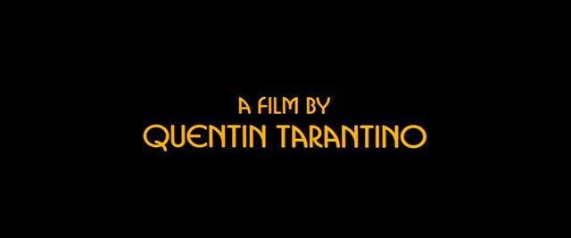
Do you hear the classic film soundtrack playing in your head while looking at the poster? I freaking love this song! But the typographic arrangement astounds me even more at this point as “Pulp Fiction” fonts come in an array of styles within about 2 minutes of into credits. The action kicks off with the first appeared typeface, leaning to Art Deco aesthetics and introducing “a film by Quentin Tarantino” type — ITC Busorama, designed by Tom Carnase in 1970. You can tell that some alternates were altered: S, T, and A letters.
Slowly sliding into the screen a classic Pulp Fiction font, created with Aachen Bold and decorating all the movie posters, hanging in every hipster room as a part of unique interior design (no judgement here, the canonic Uma Thurman shot is marvelous). Strong eye-hooking mustard yellow shade is the same, by the way, unifying different typographic solutions into one visual combo. What made it even more recognizable is the blindingly done retro style, which can decorate any of your artworks as well!
Wrapping up, the following credits get delivered in ITC Benguiat, notably the whole cast starting with John Travolta, Samuel L. Jackson, and ending with the Quentin Tarantino mention as well. All the fonts are presented in a variety of contrasting styles, it’s deeply fascinating and moving!
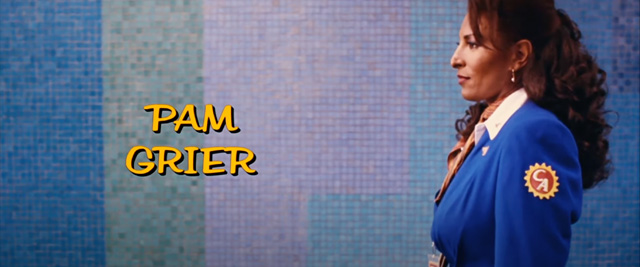
Spinning the wheel of geeky facts for you first, but promise you’ll love it. The leading role of Jackie Brown was played by Pam Grier, an American actress, participated in a string of 1970s action, blaxploitation movies, being very popular at that time. One of such films is called “Foxy Brown” starring Pam Grier as well. So get this, Tarantino’s movie is not only titled with the same “Brown” name, played by the same actress, but also uses the same typeface — ITC Benguiat Caslon. Mind is blown!
The “Quentin Tarantino film” font is another vintage find, an homage to the 70s cinema culture and “Foxy Brown” in particular — Goudy Heavy font. Skipping through the cast-presenting characters of Jackie Brown fonts, this custom typography was based on Imperator Script or Filmotype Hudson, representing a buoyant retro type.
Here we go again: the same retro aesthetics in yellow colors and “puffy” letterforms, whose swashes do all the magic. It might be a battered trick to apply such funky text when speaking of the‘90s or ‘80s but saturated color with brave forms is the formula, which can’t be replaced by something better.
Of course, the opening credits have a rampage of other typefaces, but there’s something in common among so many Tarantino movies. There are three chosen movie fonts, appearing in the majority of films: Busorama, Friz Quadrata, and ITC Bookman. I’ll show them to you a bit later but all you need to know right now is that they’re present in the above-mentioned movies.
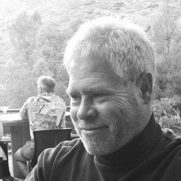
Meet Jay Johnson, Everybody!
You’re a real nerd if you knew all along that the majority of Tarantino movie fonts were designed by Jay Johnson — motion graphics designer, animator, and illustrator from Colorado. He inherited the Pacific Title duties with their thee classic fonts I’ve mentioned. However, the mysterious typography genius somehow manages to grasp the appropriate mood and create unique setting in his epic fonts letting design. All movies released from 2003 involve his participation.
Jay Johnson
Has designed Main Titles for many of the most memorable films of the recent past. His designs have complimented and enhanced those films.
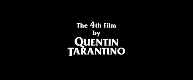
This was my first movie by Tarantino and the favorite one for quite a while. Concerning the fonts field, this project is the least colorful, gravitating to minimalism and giving up on typical yellow shades. Such decision is pushed by desire to mimic the noir mood of classic Akira Kurosawa movies. Although, the opening movie credits are still that rich with a number of fonts involved.
Now it’s high time to look closer at the “mighty three” movie fonts curated by Jay Johnson, became Tarantino’s calling card already and appearing in practically every film: Busorama, ITC Bookman, and Friz Quadrata, perfectly exhibited in both Kill Bill Vol.1 and Kill Bill Vol.2 opening credits.
If you think that on that the movie font rampage is over, you’re so wrong. Johnson has also pushed two more typefaces into the scene: Palatino and Avant Garde, the difference between which is exorbitant! How their combination could possibly appear in his head as the harmonious one?
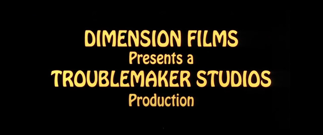
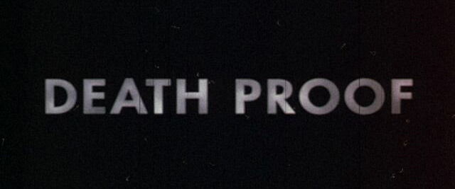
You might disagree with this statement, but “Death Proof” doesn’t seem to be as sizzling as the other films by Tarantino. Nevertheless, it doesn’t diminish the film’s quality at all. The movie font used at the very beginning this one is called Hobo and depicted in a joyful way with a bit of retro in it (too bad the shot lasts for about 3 seconds).
Like a lightning from a clear sky comes the movie title, very unexpected and contrasting in comparison with the preceding colorful credits. I can speculate on the whole philosophy of symbols in every movie credits but there’ll be more use in just taking a look at it. Tending to discover peculiarities in every work of art, what can be mentioned here is the use of an unexpectedly simple typeface for the movie’s main title — Futura PT font.
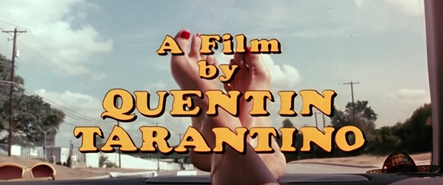
Already having an eye for the funky retro characters, you’ve probably noticed that the next shot with “a film by Quentin Tarantino” and the rest of movie crew introduction credits is made using Cooper Black font — rounded serif type, altered to have some little imperfections. The yellow shade is out of the question, obviously.
The screaming red movie font by Jay Johnson was used in a movie trailer and the official poster, which means with a high percentage of probability that exactly this font won’t be just floating around the web freely. Luckily for me, I’ve stumbled upon this very typeface on Behance, somehow imitating the stylistics of the original.
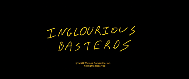
The turn has come to speak about the choking on satire Quentin Tarantino’s movie has brought to the world — “Inglourious Basterds.” What an abundance of fonts you’re exposed to… again! Starting from the intro, opening movie credits let you go through four different fonts in all their glory. Well, on the whole, this is not an unusual format as we already know, but you see how more personalized it is.
Abiding with the plot setting, taking place in the occupied France of 1944, the viewer observes blocky, heavy, old machine printed-like lettering — Ziggurat font. This brutal typeface presumably plays the role of a metaphoric rigidity of the reigning regime, in accord with background soundtrack.
The main inscription is one in a million font because it was done by the master himself. This handwritten phrase was scanned from the cover page of the final script draft, finished in July 2008. Very crafty and special, if you ask me.
Handwritten font on the Inglourious Basterds script’s cover page, made by Quentin Tarantino himself.
What about the rest of this typefaces symphony? These are the already familiar Avant Garde and Friz Quadrata typefaces — too good to have a cameo in only one movie by the director.
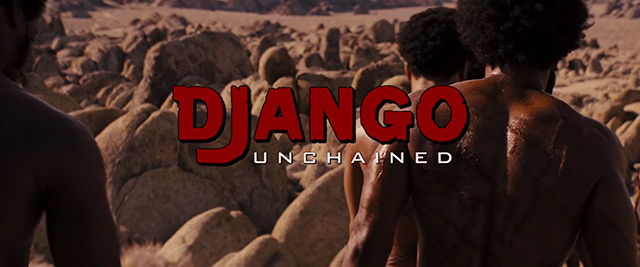
I was searching all around the Internet for the main title font and after quite a while I had to consider my mission to be failed completely. Turned out, it happened for a reason: Django Unchained font was fully custom-designed, supposedly, without any ready-made typeface used as a basis, and paying respects to Sergio Leone films. There’s a rumour floating around, that Sally Menke, Quentin Tarantino’s film editor used to work together with on his glorious movies. But these are just false facts, as unfortunately, Sally Menke passed in 2010 and couldn’t be related to “Django Unchained” movie, which came out in 2012. So don’t believe those forum messages rubbing this information in.
It seems like the only alternative solution is to offer you a close equivalent to Django Unchained font, and it will be Dobra Slab font in its Black style.
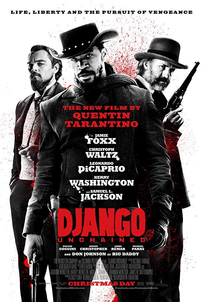
Django Unchained Movie Poster | imdb.com
Bank Gothic
Finding the ‘‘unchained’’ line was much easier — it’s written in Bank Gothic and was barely adjusted for the credits. If these little discoveries don’t fully cover your creative cravings, you can check out our selection of western fonts and pick something, made in a similar spaghetti western lettering.
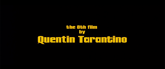
Johnson did astoundingly great working on the “Hateful Eight” movie font, inspired by spaghetti wester vibes, for which no exact typeface can be found. It’s cartoonish enough to be resonating to the western plot itself (especially with the bloodbath shots in the very end), and quirky with allusions to the way everything turned out. The two main introductory credits are completely exclusive, so no downloadable typefaces here, folks.
Tarantino’s movies wouldn’t be themselves without repeating the best typographic options he had already used in the previous films — Ziggurat and Friz Quadrata fonts.
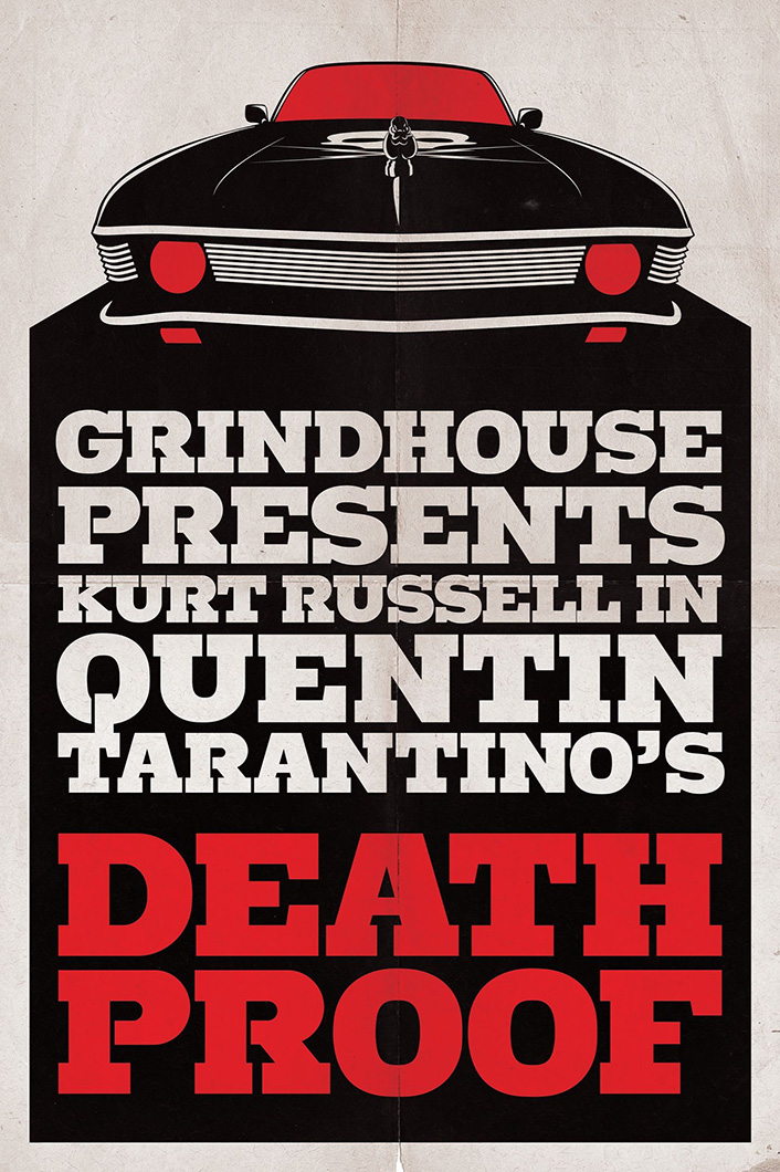
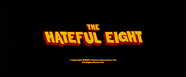
I simply can’t leave you high and dry on this one, so let me present you the “Hateful Eight” movie poster font as a compensation. The snowy storm background is cleaved with Stymie Extra Bold with roughness added to it. One more epic font in your piggybank of typefaces!
The Hateful Eight Movie Poster | imdb.com
Stymie
In 1931, Morris Fuller Benton created the Stymie typeface for the American Type Founders (ATF). Later weights were later added by Sol Hess at Lanston Monotype and Gary Powell at ATF.
Finishing up scrutinizing Quentin Tarantino’s title design solutions with the most recent movie he created, “Once Upon a Time in Hollywood,” based on the infamous story of Sharon Tate and Roman Polanski. Not much to ramble about here — the main typography is a precise duplicate of the classic Hollywood Hills font. I’m sure such solution was dictated by the idea of creating an atmosphere of a complete immersion into the 1960s Los Angeles. As for the rest typographic tools, the director signature ITC Busorama font is paired with Romana font, wiring the names in the cast and fully coinciding with the sixties B movie fonts. What’s peculiar is that the movie’s title appears only in the closing credits.
Stunned by the array of iconic movie fonts, which Tarantino used in his creations, it was intriguing to find some pattern in his choice of typography and maybe fall in love with his motion pictures once again. How many other directors do that? Hope this article has proved once again the director’s exorbitant sense of style and upgraded your fonts collection with a few typefaces for the most inspiring graphic design!
The famous Pulp Fiction font, used for the movie poster is delivered with Aachen typeface — you can download this font for free. Decorate a project with some typeface celebrity!
The definition of “Tarantino effect” describes the precedent of a successfull transition from low-budget to the most popular and influential Hollywood masterpieces. There’s one more version, stating that “Tarantino effect” refers to an abundance of graphic violence and blood in films.
The main title of “Djanjo Unchained” was designed exclusively for the movie, but if you’re looking for look-a-likes, the close equivalent to it will be Dobra Slab font in Black version.