Every year has been throwing challenges at our faces, both personal and global ones, but the heroic reserves of patience, support of the close ones kept the creative engines running! It doesn’t matter what other troubles are lurking around the corner, as there will always be wondrous and gratifying possibilities for self-expression. What do the top graphic design trends hold for us?
With 2024 approaching swiftly, it’s high time to start thinking about what will be trending. The fickle motion of tendencies in graphic design hinges on the social agenda, summarizing it into accessible, self-explanatory visual forms.
As we witnessed the revival of the 90s aesthetics and Y2K, anti-design, and extensive use of serif typography, 2024 is assigned to be a year of other vintage manifestations and bold creativity. We’ll see a crossover of traditional techniques, modern tendencies, and cultural phenomena employed to craft noticeable designs that are sure to impress. It doesn’t matter what trend will prevail because one thing is obvious: 2024 will surely be an exciting year for graphic designers everywhere.
List of Graphic Design Trends 2024:
AI Graphics
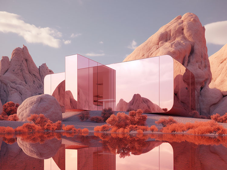
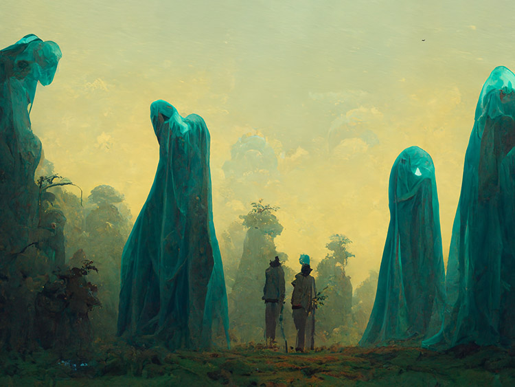
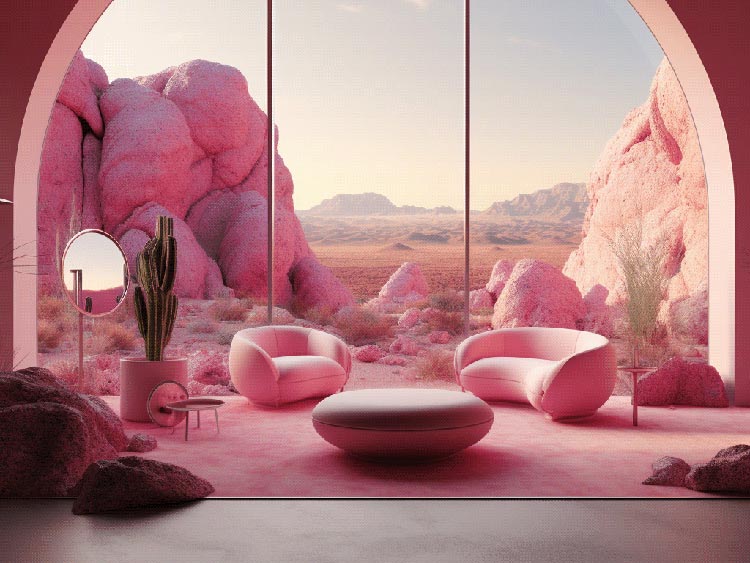
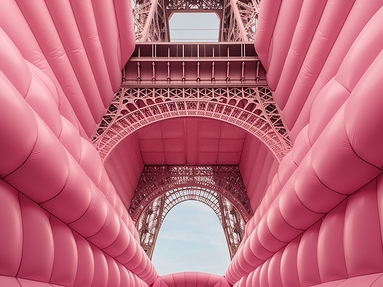
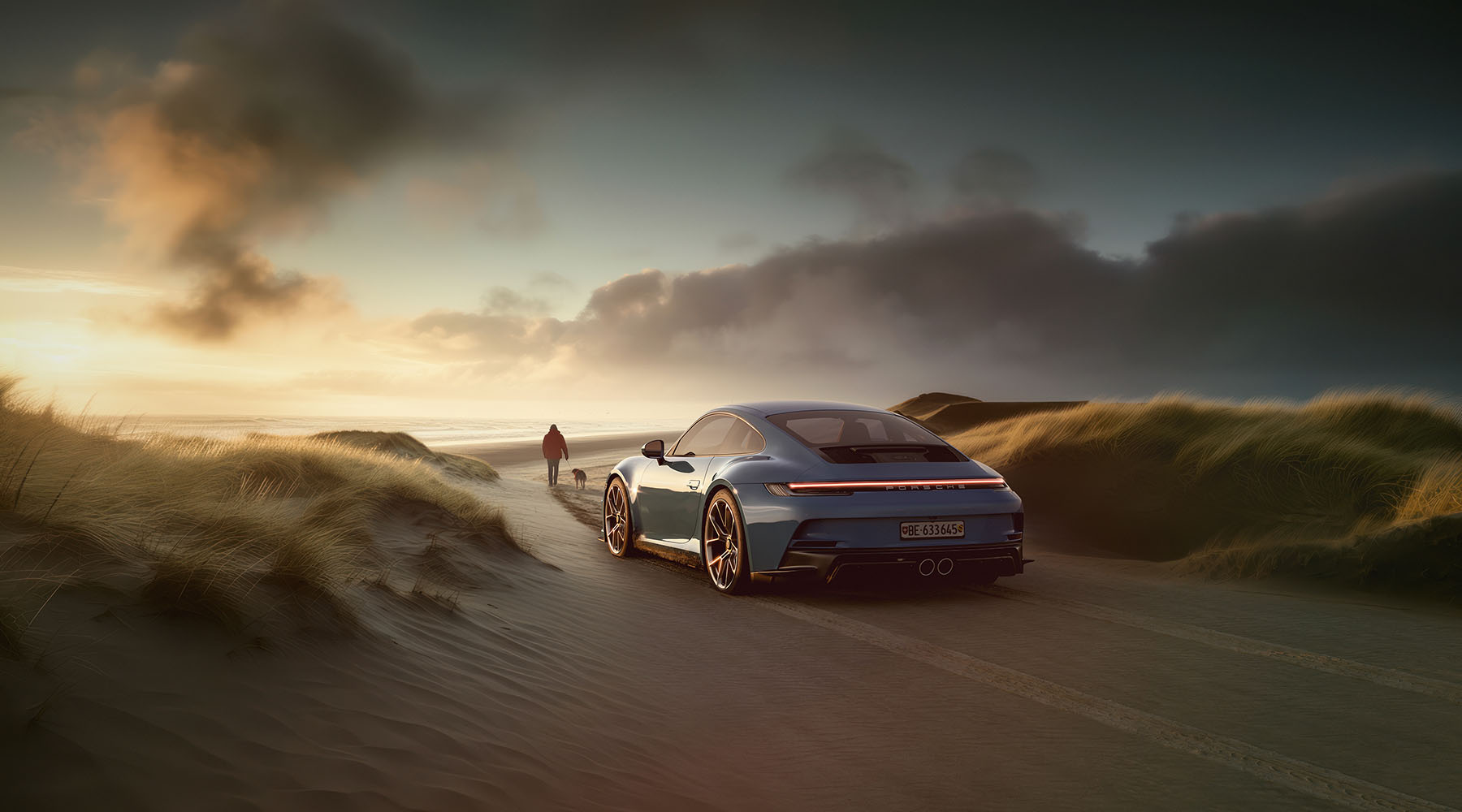
Since 2022, we have witnessed the rise of machine learning in graphic design, and in 2024, it’s time for AI to transform into a full-fledged graphic design trend. Indeed, text-to-image AI art generators have gone from hi-tech fun for creative minds to an essential tool in mundane creative work.
At first, AI-generated art was clumsy and demanded lots of trial and error, followed by hours of tweaking. But new technologies are constantly evolving, so you can explore new styles and create quite good-looking graphics in a minute. Moreover, you can easily find a tool specially honed for the needed job, such as Looka for logo creation or Beautiful.AI for presentation and data visualization design.
Talking about apps and services. There are so many AI-powered tools that have popped up recently that it may become confusing to know where to start. But in the first place, we advise you to go for the classics: DALL-E- 2, Midjourney, and Stable Diffusion. All of them are both versatile and intuitive enough to test the power of AI art and choose the best option for your workflow.
Graphic design is one of the fields most transformed by artificial intelligence, and this trend will continue in the future. Of course, despite the remarkable progress, AI still needs human supervision when it comes to faces and hands. Achieving the desired level of realism requires skill. But with the right prompting, fine-tuned settings, and a couple of iterations, you can get stunning, high-quality visuals. It’s one of the biggest graphic design trends in the upcoming year, so don’t miss your opportunity to catch the wave.
Unlimited downloads of 11+ million creative assets. From just $16.50/month.
Barbie’s Pink
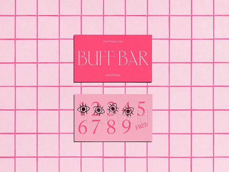
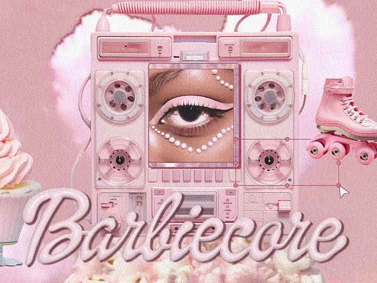
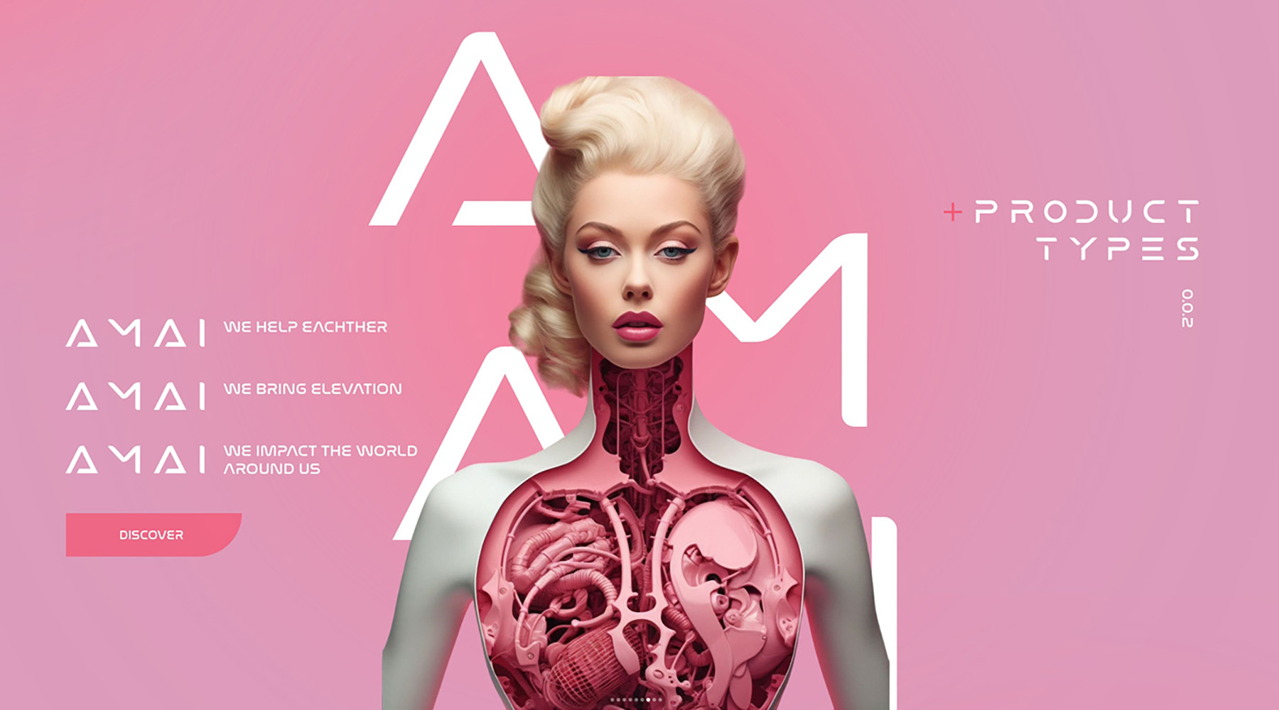
It would be a crime to miss Barbiecore: revived by the sensational movie graphic design trend is back to our lives. Right after Barbie’s release, all shades of pink quickly displaced the muted color palettes, and for some time, the world became one big doll house! Ride the wave and add those pinks to your designs, as they are, just like Barbie itself, immortal.
The last peak of this trend was in the 2000s — the all-pink outfits of Paris Hilton and Britney Spears on the red carpet screamed Barbiecore. But its popularity after the movie’s release broke all the records! The fashion professors attribute this effect to psychological reasons: the post-COVID world needs some bright, vivid colors, and what can be better than hot pink? When all the news is scary and dark, some playfulness in designs surrounding you on a daily basis can become escapism, even if the relief lasts for a couple of minutes.
Many brands, including Forever 21 and GAP, even launched new clothing lines: all pink, colorful, and fancy. The social media is also still teeming with pink-themed posts, so when, if not now, use this amazing color?
This graphic design trend flashes quickly, but it may disappear just as soon, hence it’s better to plunge into the Barbie world while we can without looking old-fashioned. Unfortunately, its popularity is unlikely to make it the Pantone color of the year to extend our excitement around its vibrancy, but hope springs eternal!
Pixel Mania
We’re sure you know that feeling when you’re desperately trying to load an image, and it simply doesn’t work. Those pixels! Can they be any more annoying? Well, actually, no. The irony is that they can actually be quite trendy.
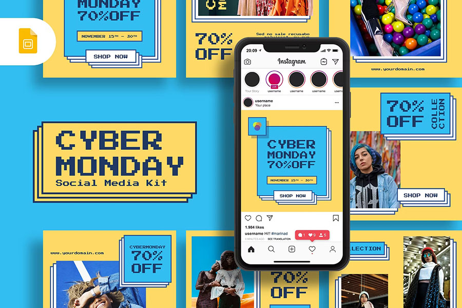
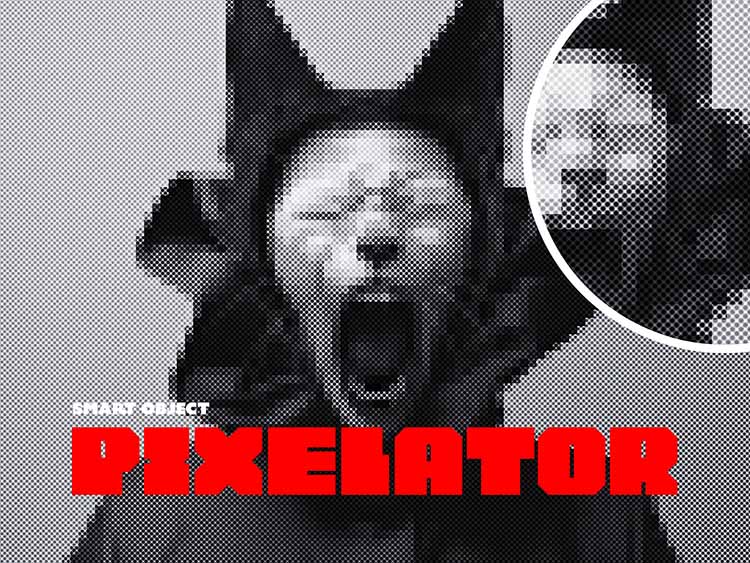
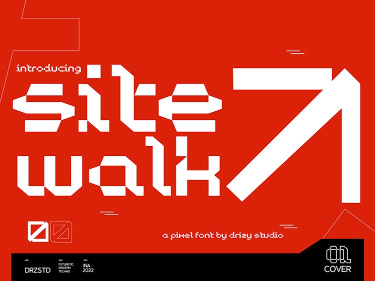
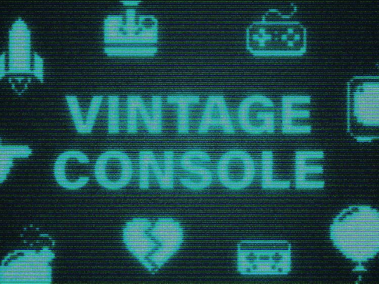
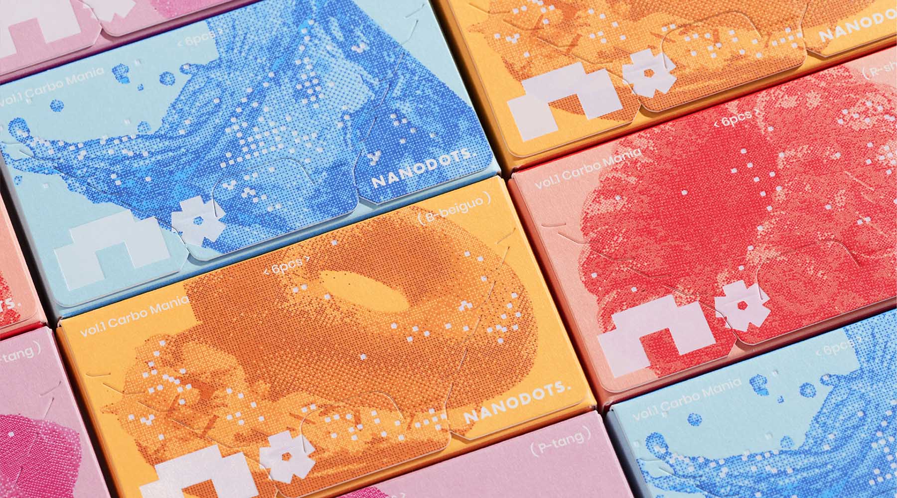
With the popularisation of the metaverse, virtual and augmented reality, 8-bit graphics have made a confident return into our lives — from pixelated camouflages by Pharrell Williams for Louis Vuitton’s Menswear SS24 show to newly-made games with NES and SEGA vibes. The nostalgia-evoking part plays a big role in why we love this aesthetic so much. So, no need to smooth out (punintended) what was once deemed low quality due to technological limitations — embrace the unique charm it brings instead.
Modern 8-bit graphics aren’t truly 8-bit. They provide high-resolution results for your projects, injecting them with a touch of nostalgia and heart-winning retro-style vibes. The artificially exaggerated pixels look stunning, are indefinitely zoomable, and add an element of fun — especially amidst clean and minimalistic visuals that flooded the industry and largely lost their appeal.
So, what’s the practical side of this design trend — what can you do with the 8-bit aesthetic? A myriad of things, really. A funky title for your landing page using pixelated typography, alluring illustrations for posters and album covers, eye-catching signage, simple yet memorable packaging design, and so much more! Use vivid colors to enhance the pixelated graphics even further or offset them with negative space and organic shapes.
Glass Blur & Distortion
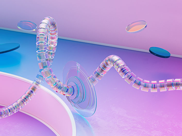
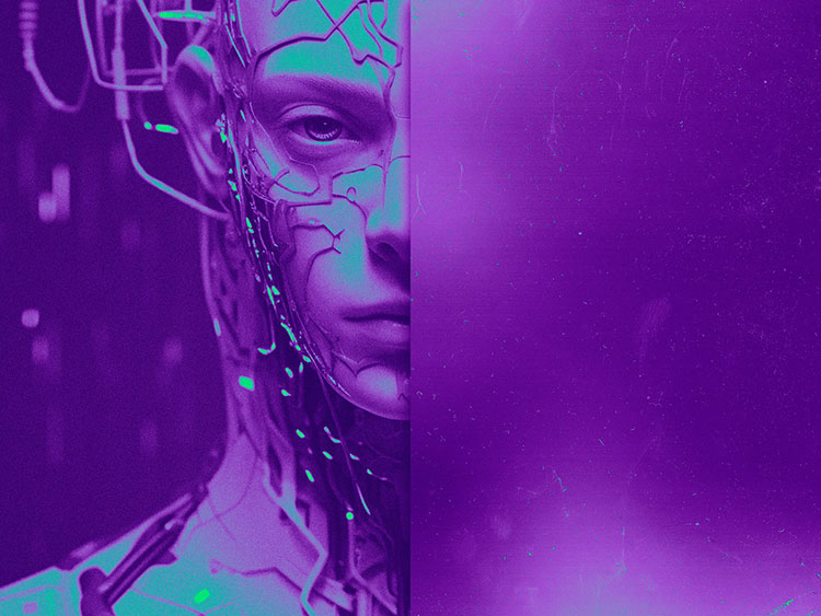
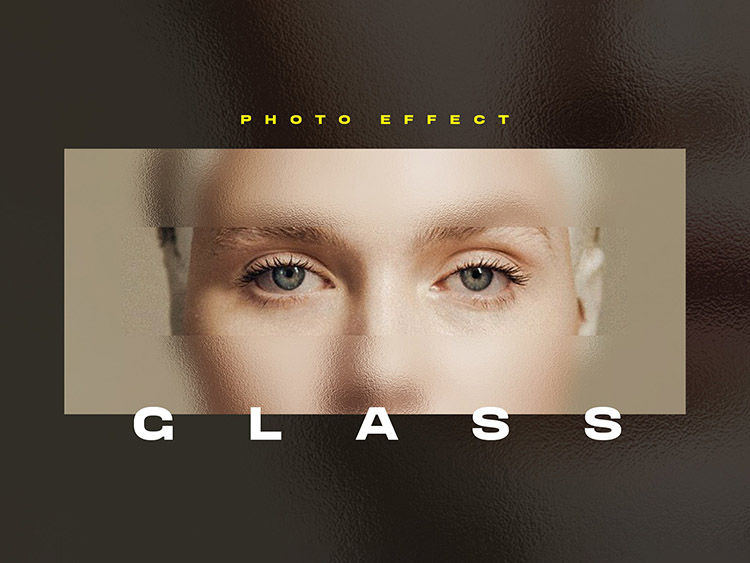
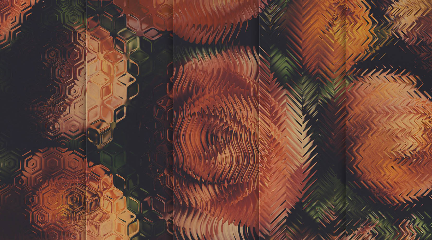
What do we do when deep inside, we’re rebels and crave glitch and distortion, while the project demands something more subtle and exquisite? We go for the most delicate deformation provided by textured glass. It opens up vast possibilities for image alteration: blur, skew, refraction, distortion, not to mention that the glass may be colored. You can even add scratches and imperfections for an extra edgy look. Sounds like this graphic design trend was a godsend for those who want versatility without being plain.
With the help of glass effects and textures, you can create unique layering that adds depth and dimension to your digital design work. To enhance the effect, it can be made into mesmerizing animation portraying intricate dance of artificial light into the realm of virtual reality.
This design trend is so eye-catching because of our inherent interest in the physical laws and phenomena translated into digital space. And, we must say, this interest is growing over time. Recently, glass refraction became one of the most alluring themes for graphic designers, so we certainly see it as one of the graphic design trends for 2024.
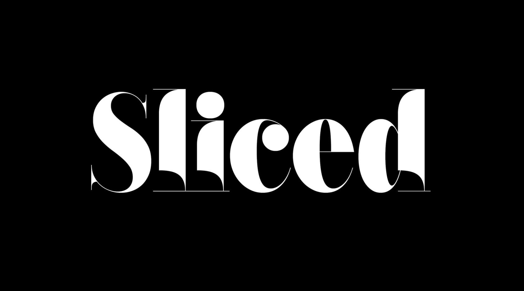
Serif Aesthetics
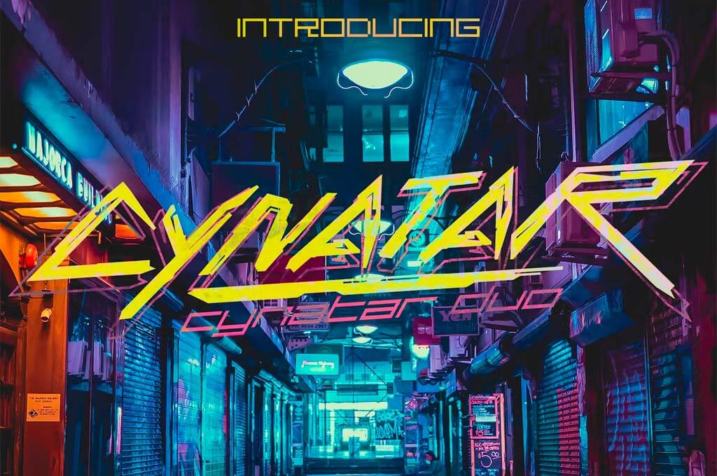
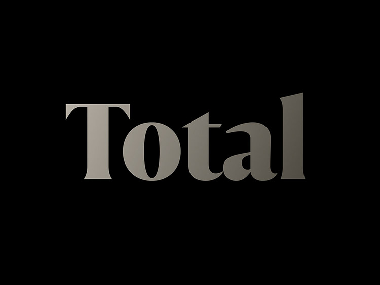
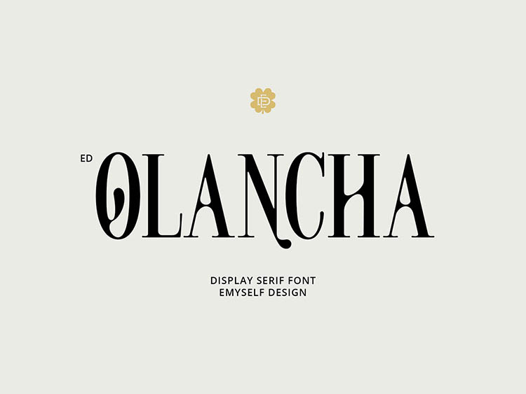
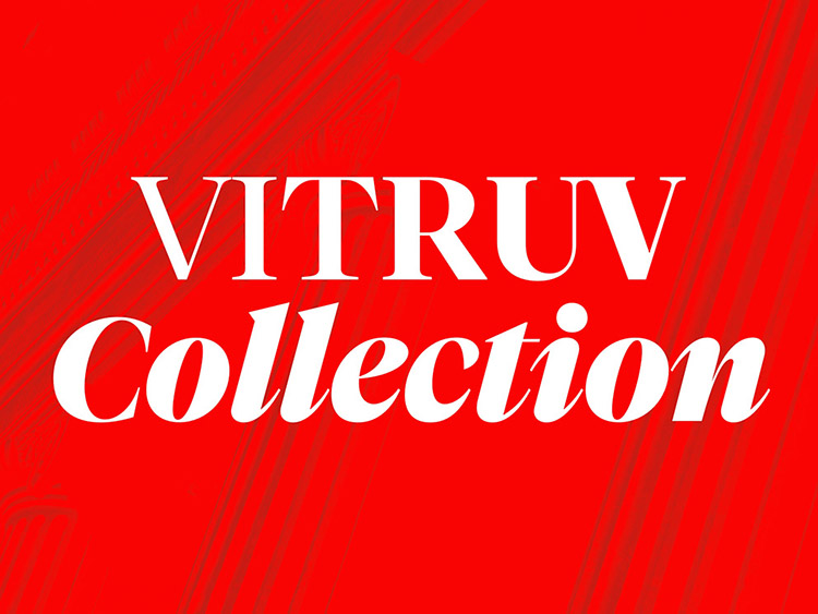
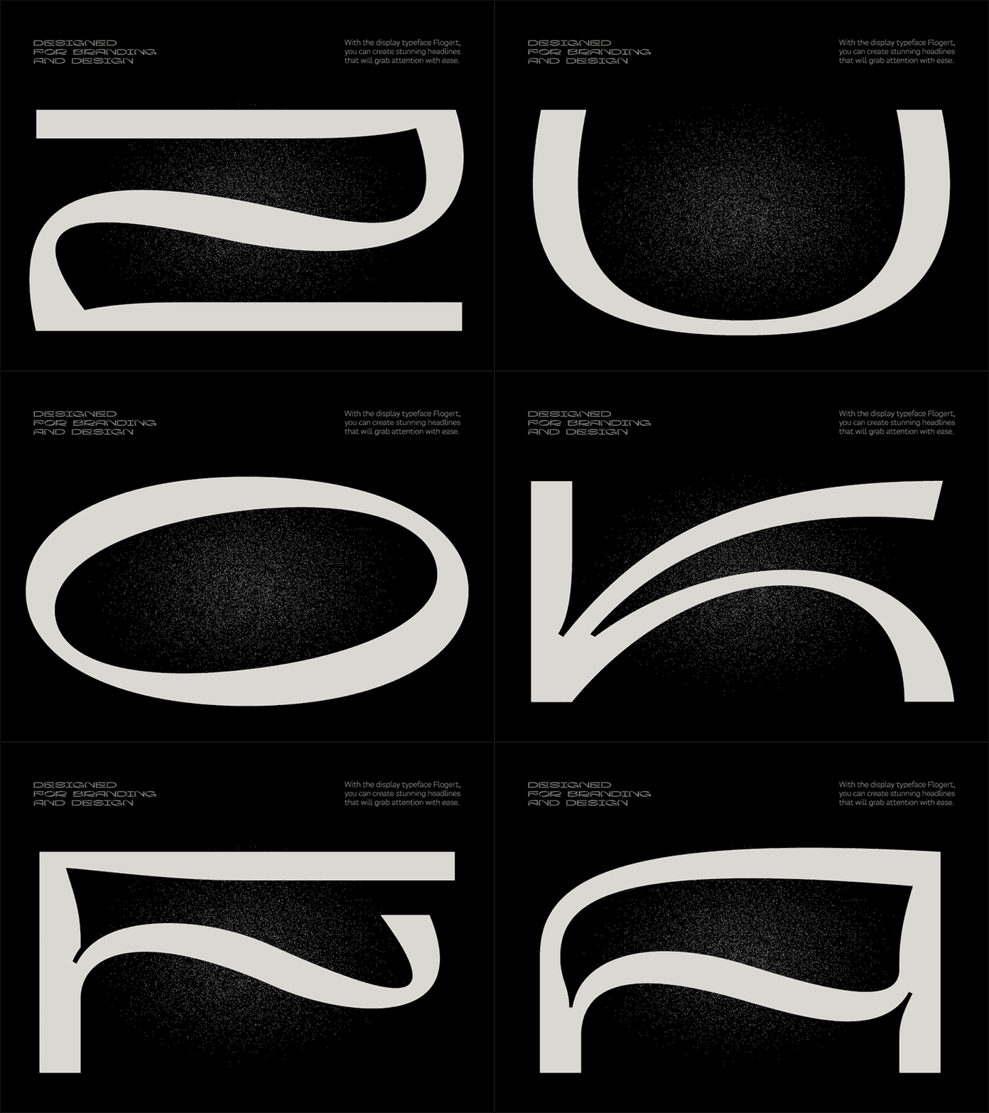
Last year, we had sans serif typefaces as a trend in the graphic design world, and now we’re switching to classic serif fonts! Their vintage aesthetics have already penetrated different spheres of visual space, and seeing it as a reigning typography tendency in the near future isn’t a big surprise for designers who keep up with hot topics. Amazing news for creative minds inspired by 80s and 90s designs!
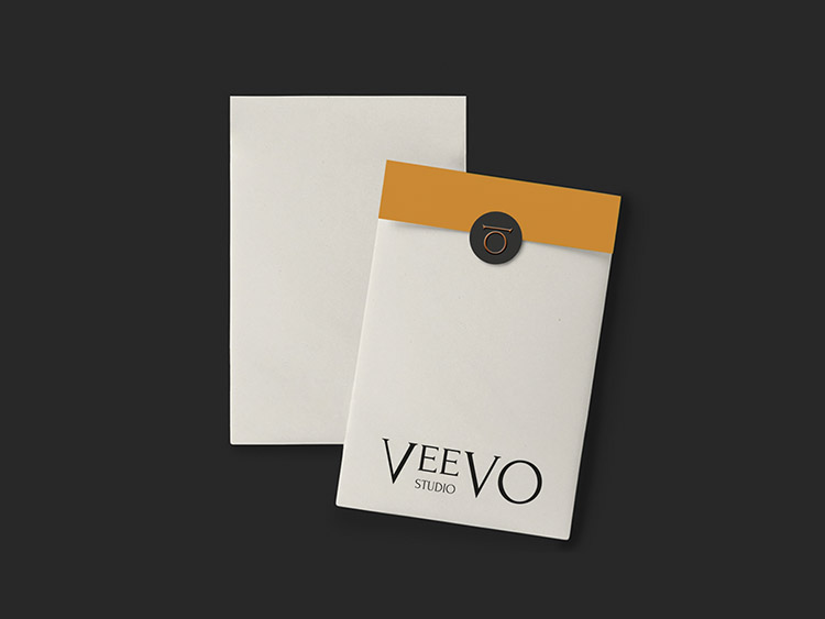
The reason behind the serif fonts revival is quite simple — fashion is cyclical. What adds even more to their recent popularity is the influence of minimalism on the graphic design industry in general. Though bold colors and intricate images are trendy, too, once the audience gets tired of flashy visuals, they turn to simple, calm designs. And that’s the moment of glory for serif fonts! They are perfect to add that sweet retro effect such artworks need.
Speaking of the serif fonts’ usage, we can give you just one easy tip — don’t limit yourself. They will look great with muted color palettes if you’re crafting more light-hearted projects like vintage magazine ads, or, on the contrary, with some vivid shades for bold, eye-catching designs to showcase creativity.
As these typefaces are gaining popularity, we advise designers to be brave and experiment in their own unique style without worrying about being outdated — serif fonts will add an aesthetic appeal and make any artwork look trendy! Luckily, finding new serifs is a piece of cake: the markets are already crawling with them.
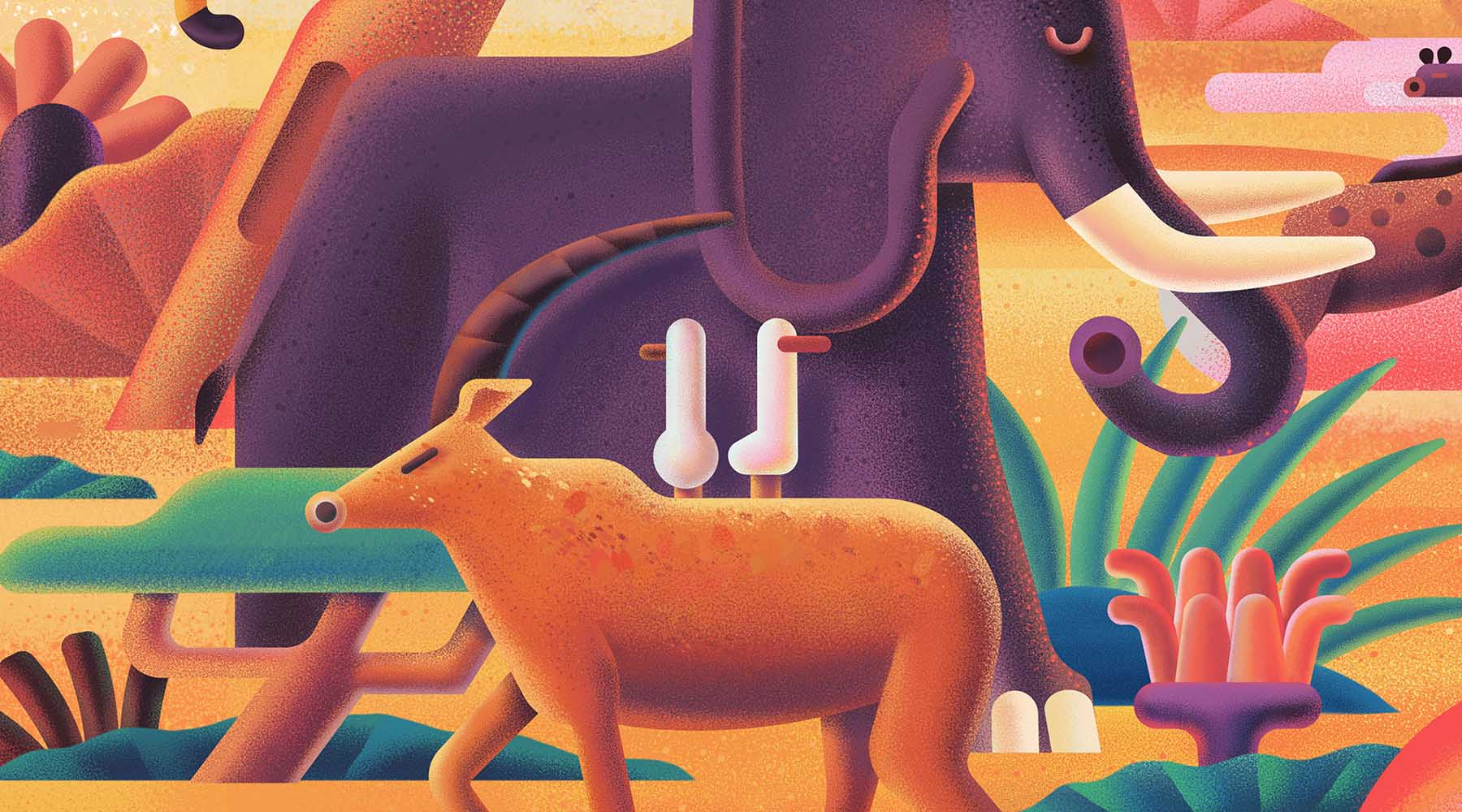
Gritty Art with Retro Vibes
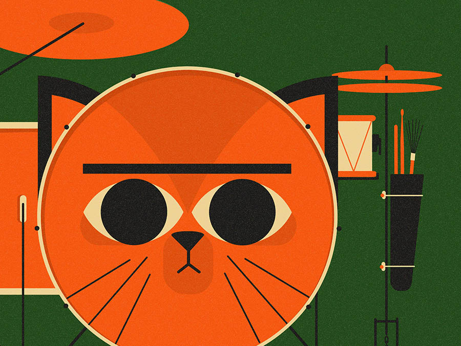
It seems we’ve been pursuing sweet vintage dreams for quite some time now, but they simply don’t let us go. Mid-century furniture, retro illustrations on the walls, and funky prints on T-shirts — we just can’t get enough, can we?
As we embrace the grit and grain of the old-day art, this shift isn’t just a mere longing for the days gone by; it’s a bold reinterpretation of retro aesthetics, channeling a sense of authenticity that’s often missing in our digital age.
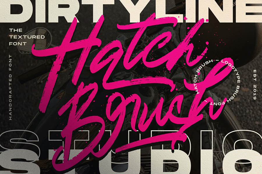
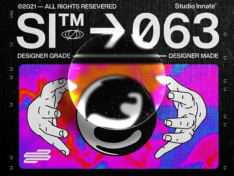
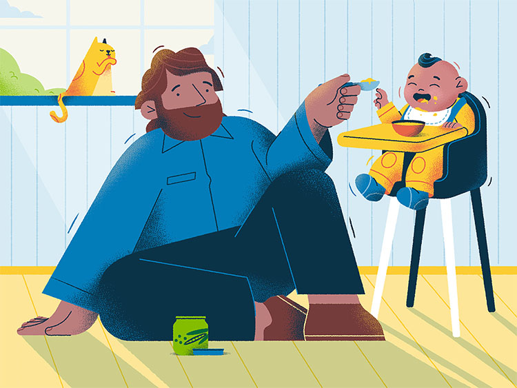
In the new world of gritty art, clean lines, and polished finishes give way to textures that tell a story. We’re seeing a resurgence of grained illustrations that add depth and character to the flat design. These aren’t the pristine, vectorized graphics we’ve grown accustomed to, but rather designs that embrace the imperfections of hand-drawn art.
Another aspect this design trend celebrates is the use of soft halftones — not just as a throwback to old printing methods, but as a stylistic choice that brings emotions to the table. These halftones give designers a new-old toolkit for shading and dimensionality, marrying the analog and the digital in harmonious compositions.
In practice, these soft-toned two-dimensional visuals will easily fit into anything from posters to branding projects. As opposed to 3D shapes, flat outlines will give way to intriguing textures, while the vintage touch will do its job emotions-wise. So, let’s carry forward the legacy of retro vibes into a future where every grain tells a story and every design is unapologetically authentic!
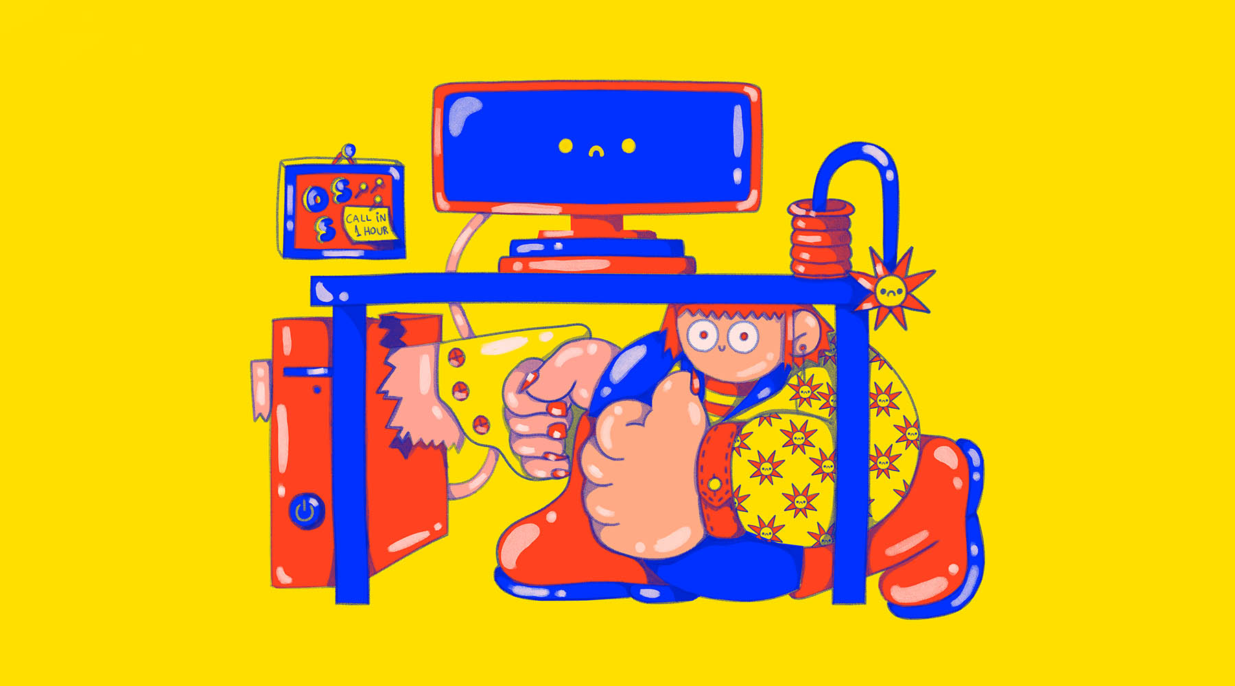
Popping Colors
Pantone color of 2023 marked the start of massive usage of deep, rich colors, setting the current graphic design trends. But in the near future, we anticipate them to be changed with vivid, dynamic, acid shades. Here, we can also see a glimpse of Barbie’s popularity, as it’s not only about all hues of pink — it’s a whole world of different bright colors. So, if you find yourself getting bored with minimalistic, muted tones of Scandinavian designs, it’s your time to shine in the direct sense.
Bright colors have been around for a long time, so it’s not something totally new. But they haven’t been as hot as they are these days! Vibrant colors make your brand recognizable, social media posts more eye-catching and add more visual interest. These reasons could be enough to become the solid foundation for the growing popularity, but there’s even more: there are many ways to play around and stay trendy. It is another advantage for graphic designers who don’t like feeling locked up within strict limits.
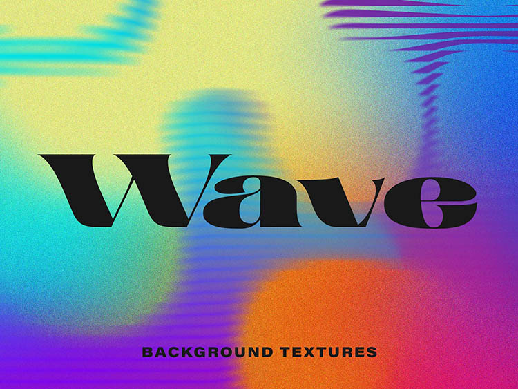
Experimenting with vivid colors is a whole creative journey: holographic designs, neon graphics, acid gradients, and much more! These energetic shades allow graphic designers to make a bold statement in their unique style and add visual interest. Mix rainbow colors, create gradients within shades of one color, and don’t be afraid to stand out with the bright vibrancy of your artwork — that’s the way to the top of the graphic design world in 2024!
Hand-picked cases:
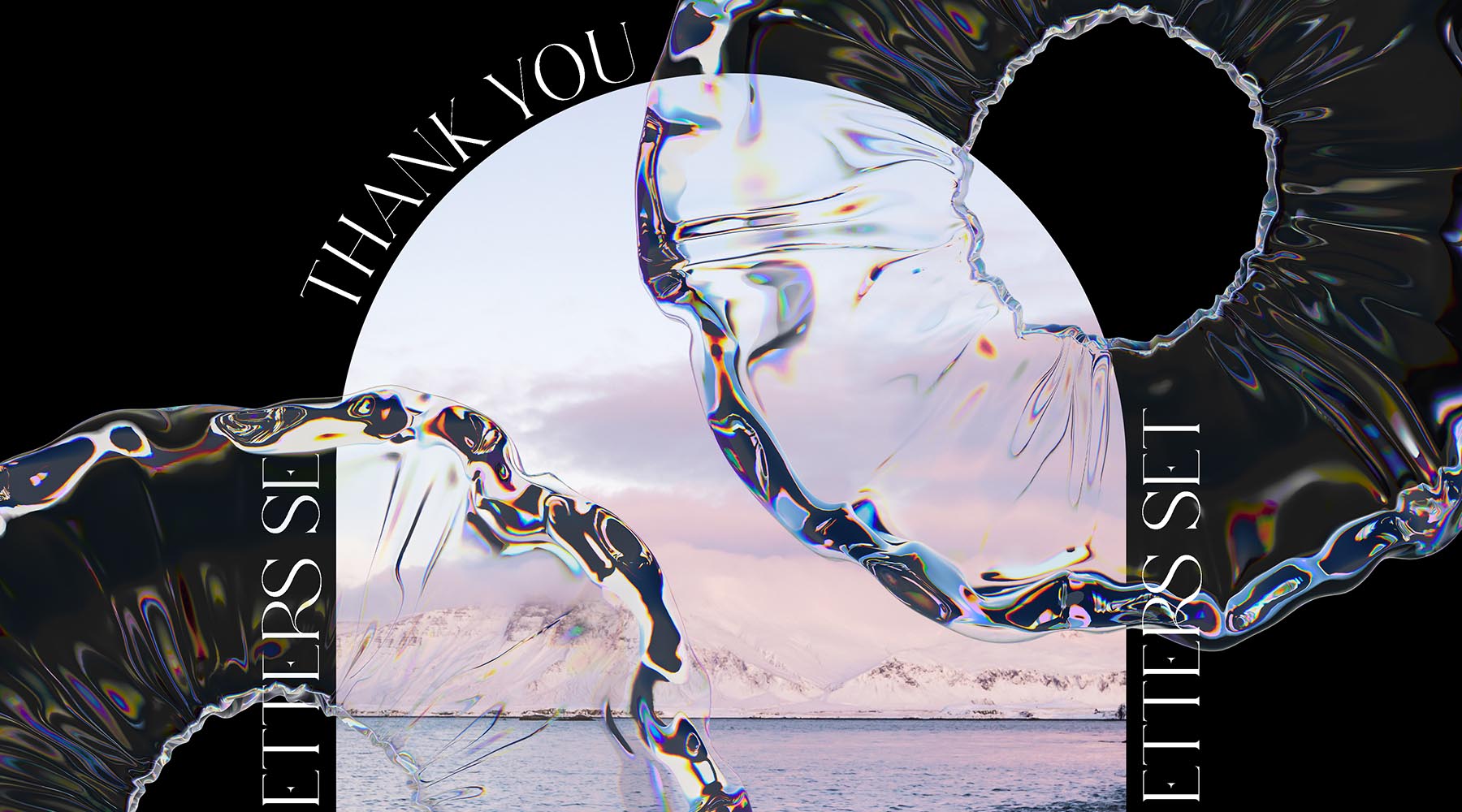
Industrial Grunge
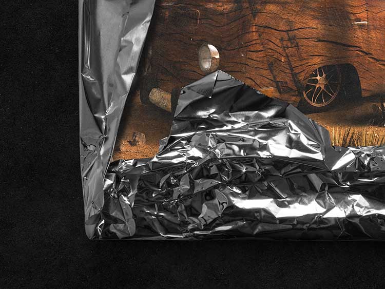
As a society, we live in cycles, and so do the trends — graphic design trends included. The grunge aesthetic peaked in popularity in the ’90s: back then, it was driven by the rise of grunge music, society’s desire to juxtapose the flashy ’80s, and the adoption of thrift-store chic as a response to economic downturns and uncontrolled consumerism. Do any of these sound familiar? Sure, we’re not as crazy about Kurt Cobain anymore (though, no questions asked if you are), but we’re also giving the side-eye to fast fashion and feeling the itch to break free from the minimalist era that’s overstayed its welcome.
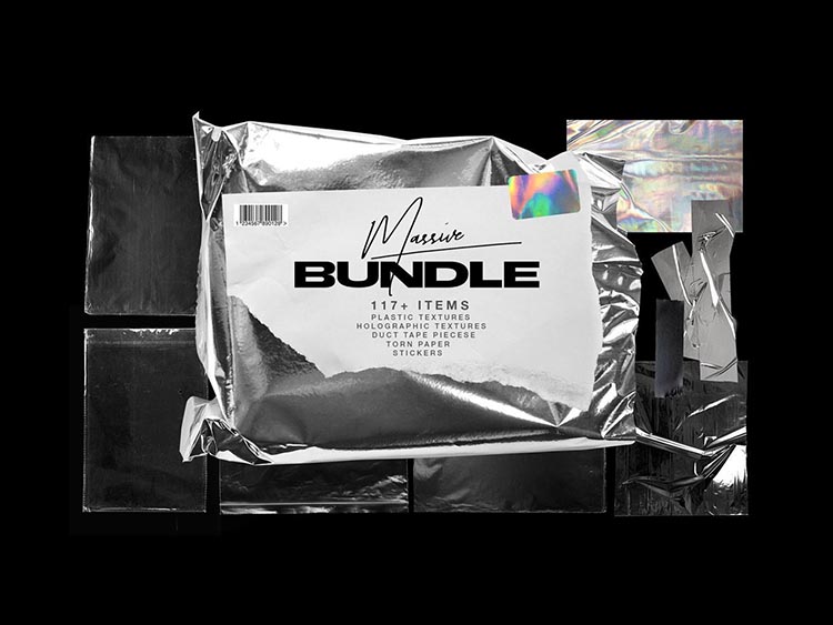
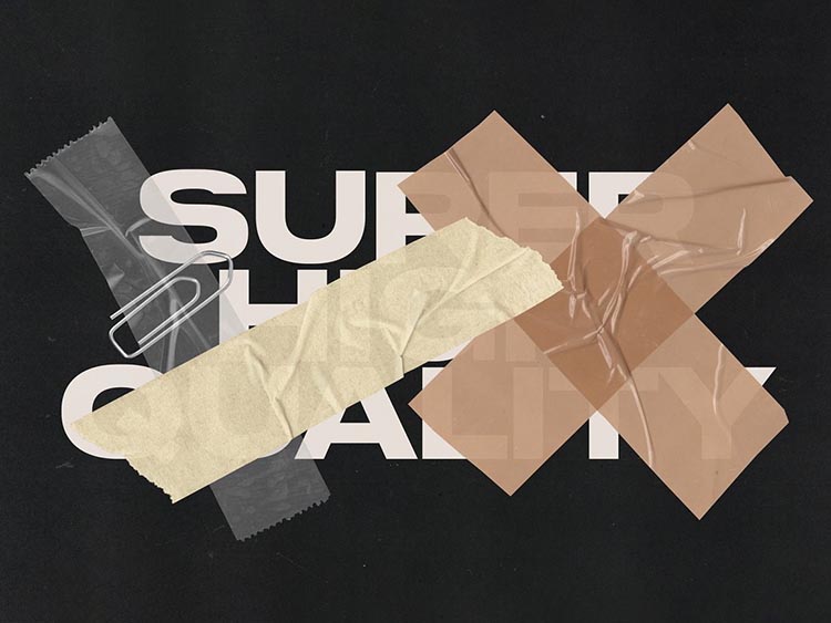
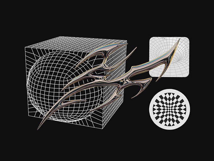
Design-wise, industrial theme offers ample room for experimentation and creative endeavors. Here comes a surplus of distressed textures — from broken glass and foil to plastic wrap and torn paper, dark color palette, collage-style illustrations, and unconventional typography. For some, this may stir nostalgia; for others, it’s a refreshing divergence from overly polished visuals.
Plus, the grunge aesthetic is more versatile than you think. Metallic textures look good on just about anything, collages add that personal touch so often missing in our digital world, while distorted and liquid fonts resonate with the increasingly popular virtual reality. It’s official: grunge is back, and it’s in full (rusty and squeaky) swing. So, designers, bring your unbridled creativity to the table — come as you are!
Gradient Abstractions
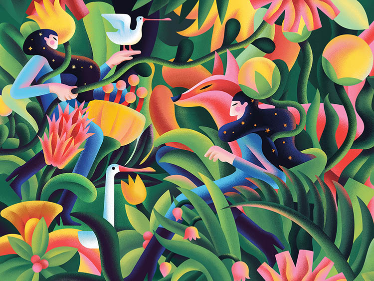
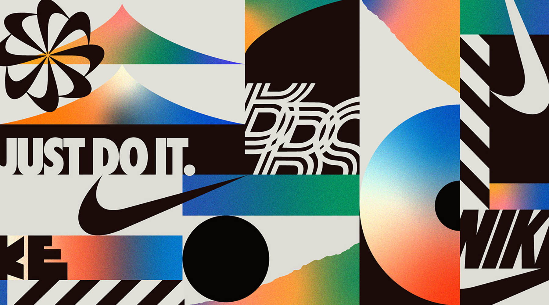
Gradients have been among the biggest graphic design trends for quite a time. In the early 2000s, they were used mainly as a way to add a retro flare to the design, then slowly started to fade as the flat design took off. The massive gradient renaissance began in 2016 when Instagram finally said goodbye to skeuomorphism and introduced a new logo. By this means, they breathe new life both into gradients and flat design, which had already started to become boring by that time.
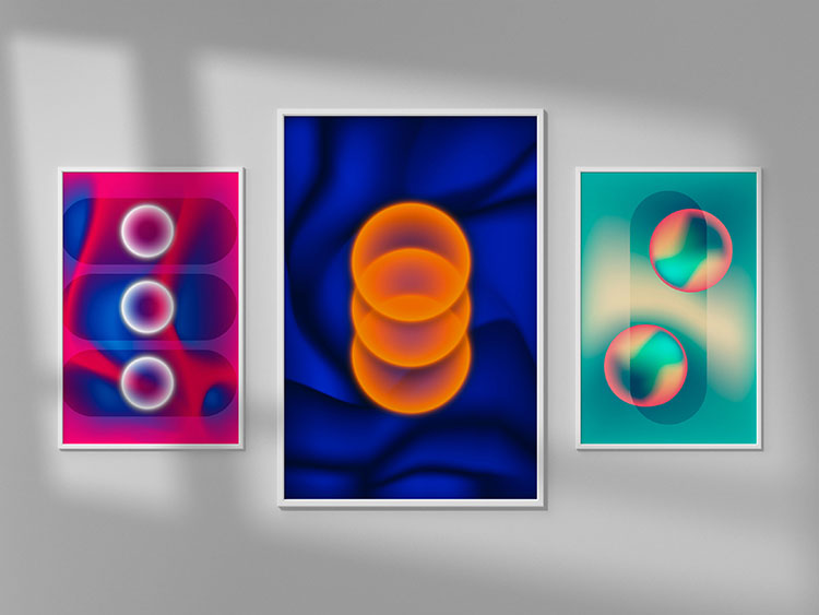
Gradients also have been a controversial graphic design trend, it almost haunts digital artists for all these years. They are adored, they are called outdated, and they are constantly reinvented and reimagined. And most of these at the same time. Through the years, we saw simple similar shades, gradual blending, vivid contrasting-colors transitions, elaborate mesh gradients, and many more. The gradient trend is extremely versatile.
Nowadays, we spot gradient abstractions playing with organic shapes are gaining traction. Designers experiment with these in their illustrations, web design, and visual communications. These new gradients use brighter colors and a mix of flowing and geometric shapes that make them feel fresh and sophisticated. There has been so much agitation among graphic designers and digital artists about new gradient abstraction recently, that it’s simply impossible not to call it a trend.
Typographic Artistism
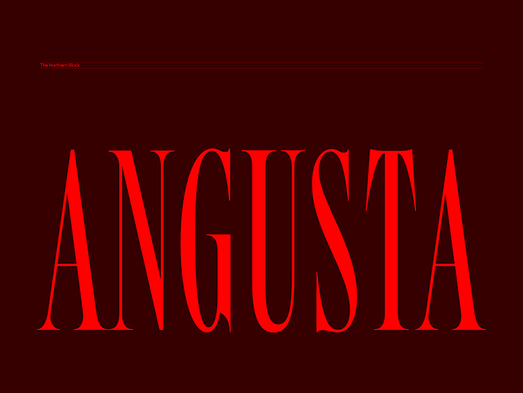
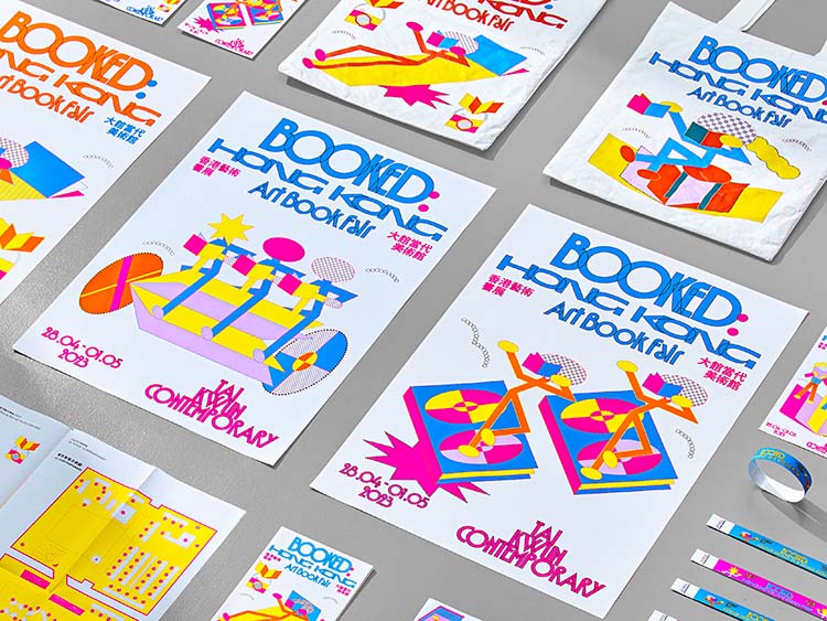
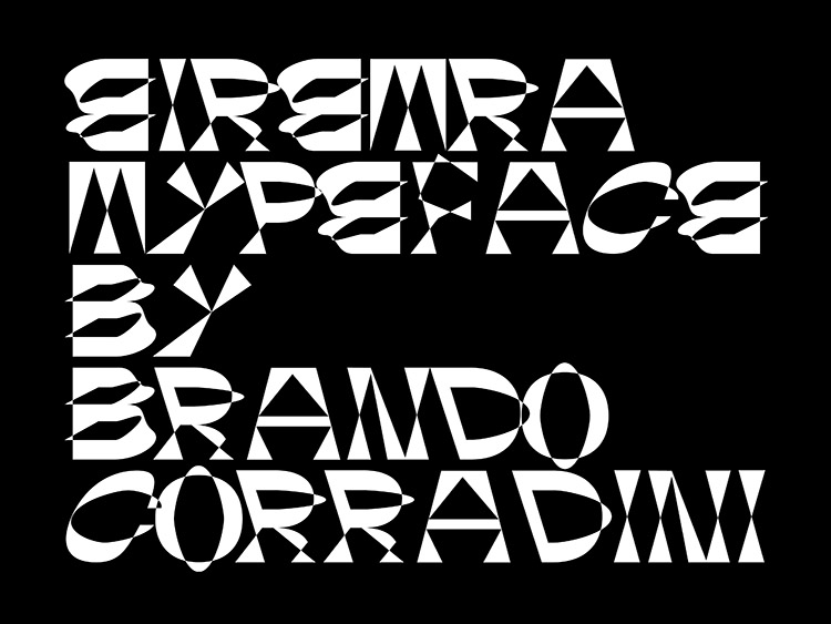
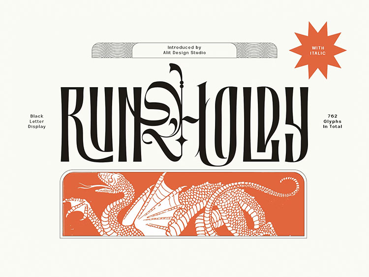
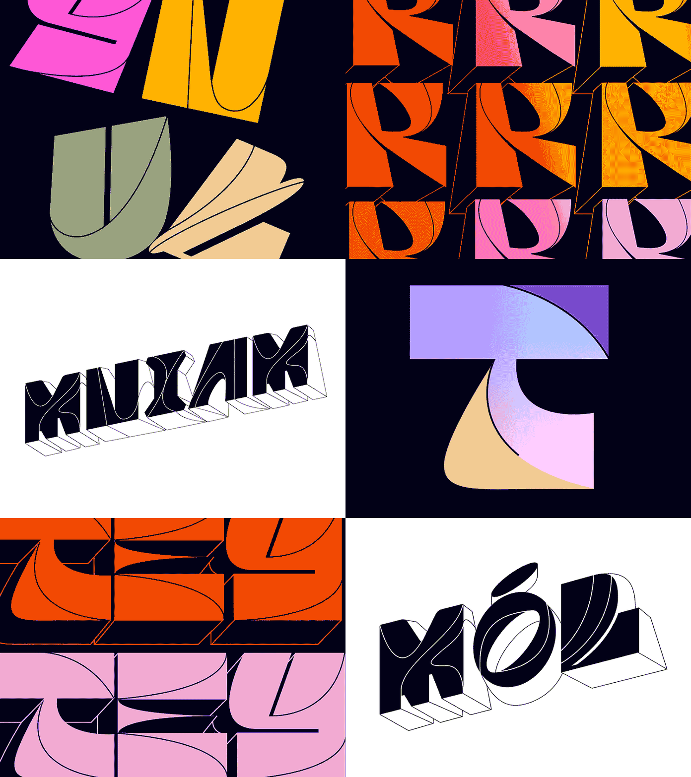
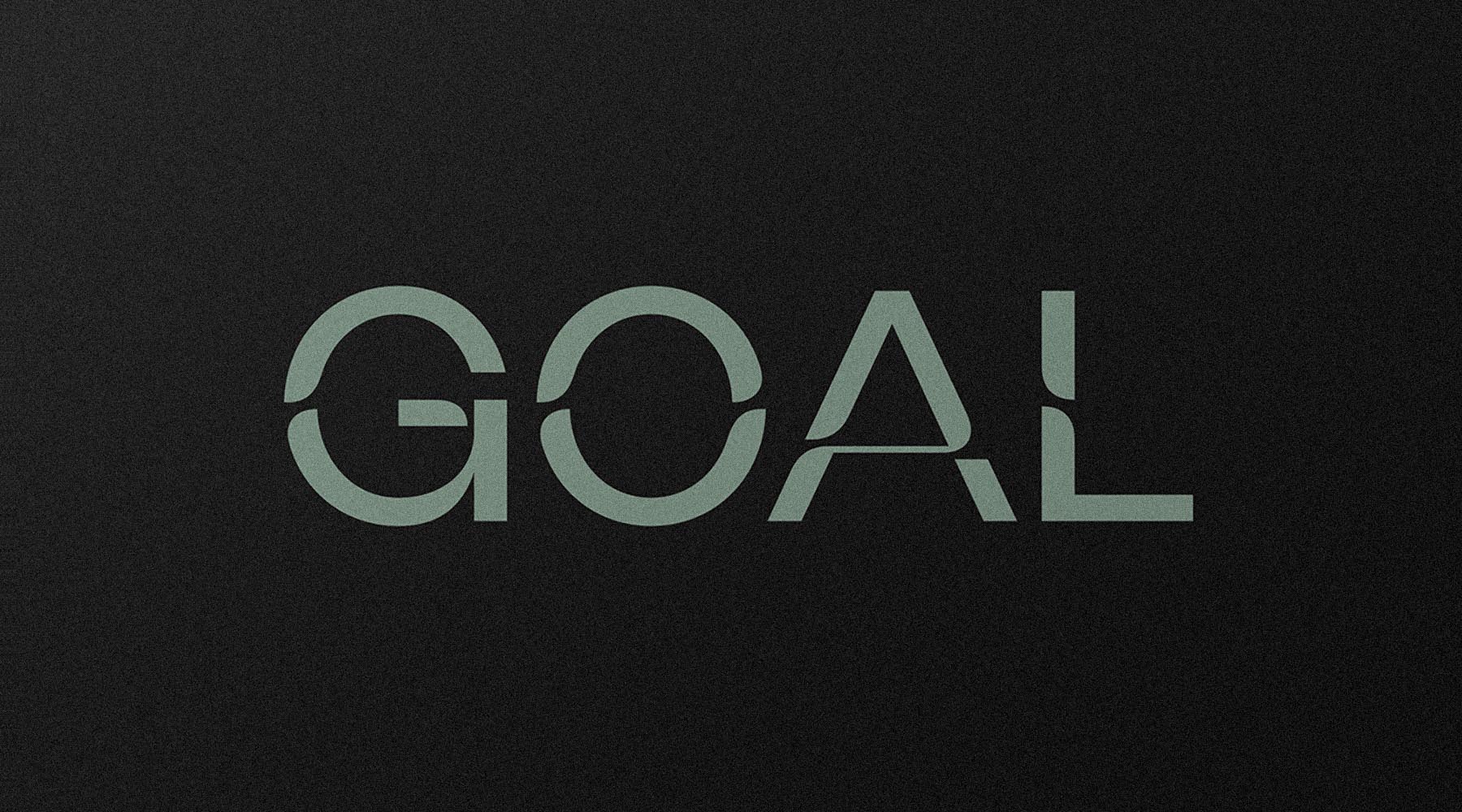
Typographic artistism is one of few top graphic design trends that follow us from year to year. Both functional and beautiful, it is growing and taking over new spheres of the design world. These aesthetic fonts inspired by vintage typography can be found everywhere, from packaging design and marketing campaigns to food delivery. They are a great example of versatility and charm being the key to a long-term life and not becoming boring and feeling overused.
The other side of using the graphic design trend that has been on top for several years in a row and becoming quite niche is, of course, worrying about being repetitive. However, this problem is actually non-existent — just keep up with the graphic design trends of 2024 and don’t doubt the power of experimenting. Mix it with bold colors, abstract or organic shapes, diverse typography, and other design elements. There are no strict guidelines you need to follow. This trend can be adapted to any needs and still look fresh and stylish.
Despite the rapid technological changes we witness, having something so stable is a reassuring feeling. There are many creative ways to integrate artistic fonts in your design and make it look modern, so don’t give up on this trend just because you see it every year. Try it out in print goods or digital mediums, see how perfectly bold fonts complement your art, and throw all the worries away. After all, there is surely a reason for typographic artistism to be one of the 2024 graphic design trends.
Hand-picked cases:
Conceptual Branding
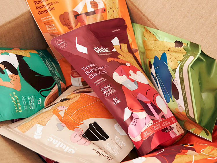
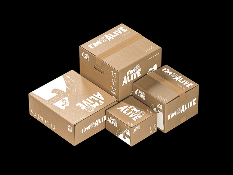
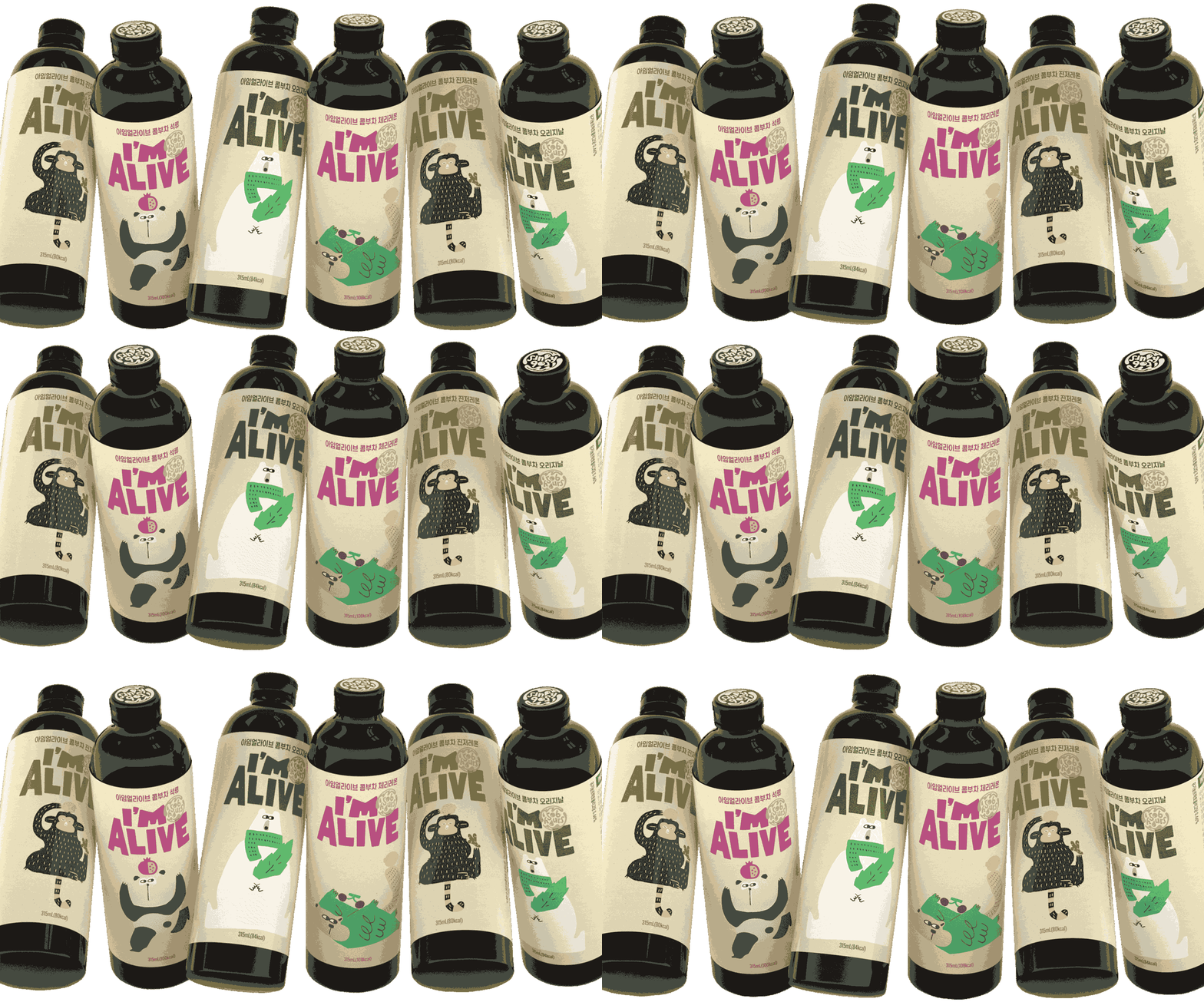
Design is not only about aesthetically pleasing visuals, it also must convey the message, especially when it comes to branding and identity. You may say that any branding communicates the core values by default. But let’s face the truth; how many “clean” minimalistic mediocrity and barely-there branding have you seen for the past few years? I guess a lot. Hopefully, conceptual branding is gaining popularity. There are more and more graphic designers who let their creativity off the leash and go the extra mile to create something really meaningful.
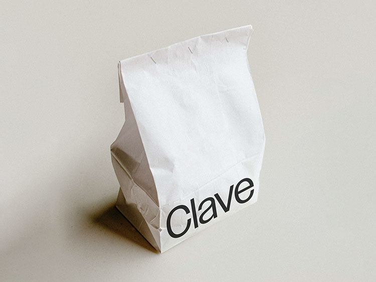
Conceptual branding shows the ideas that a product or service stands for and helps it speak for the potential customers. It utilizes visual storytelling to bring more context and resonate deeply on an emotional level. Many brands rethink their visual communication in order to add more personality and unique quirk. Therefore if you want to keep up with the best, it’s time to put some extra effort in brand conceptualisation so it pays off greatly.
It’s a mastery of a designer to communicate a cohesive narrative through the color palette, chosen shapes, typography, and other design elements that support and enhance each other when combined. With this task, you cannot hide behind omnipresent minimalism, trending font pairs, or metaphors from the first shelf. It’s a scrutinous work, but when done, it feels like magic.
Hand-picked cases:
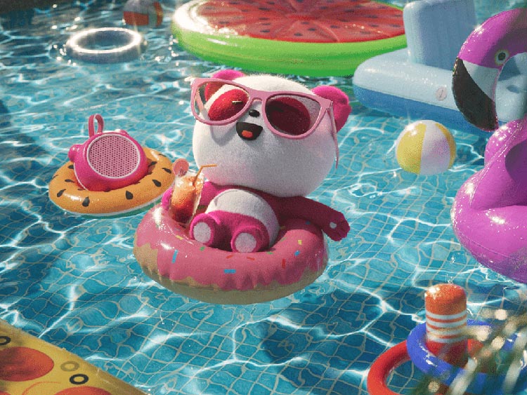
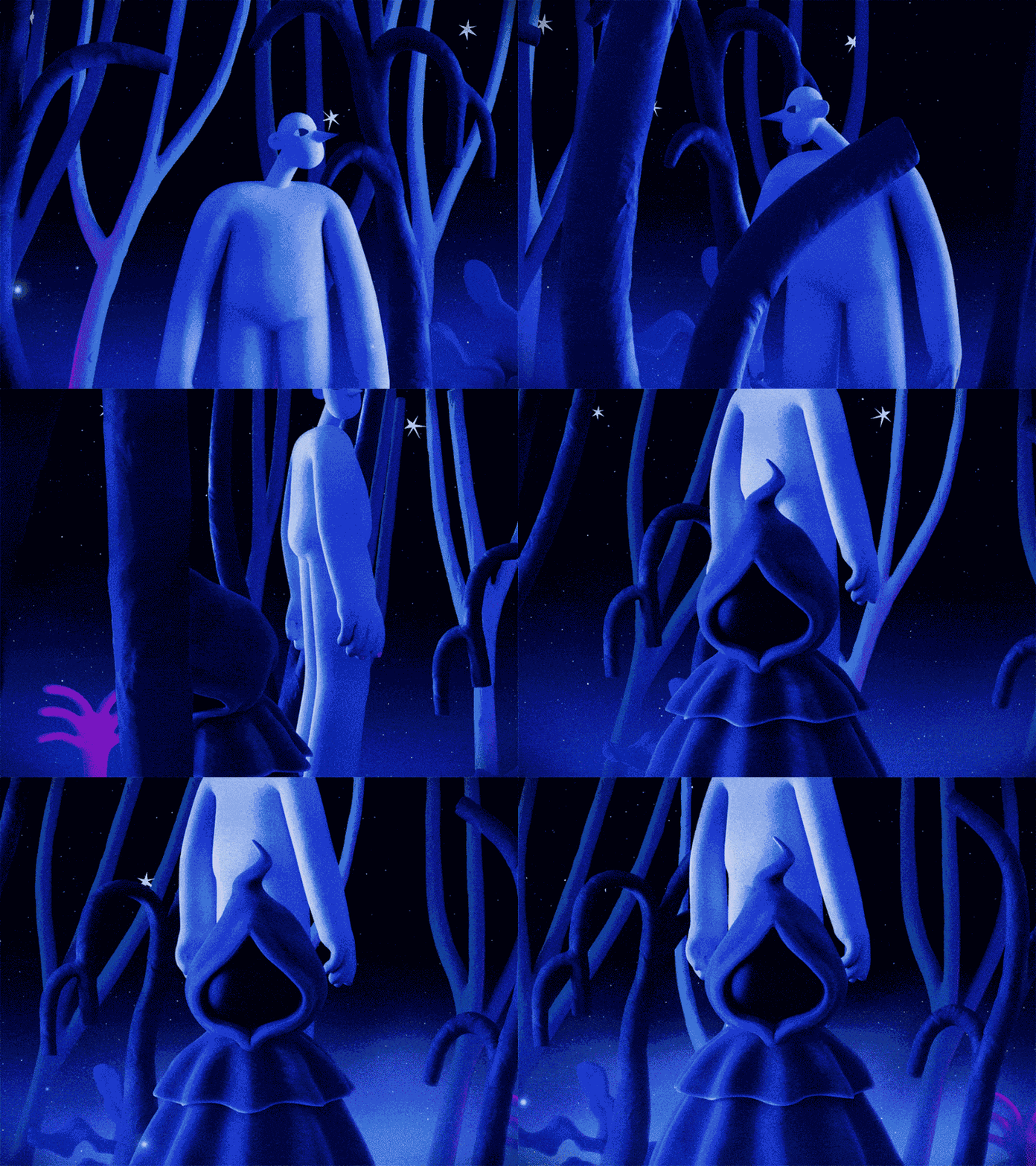
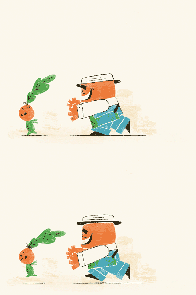
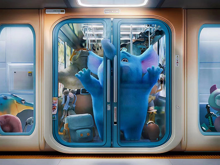
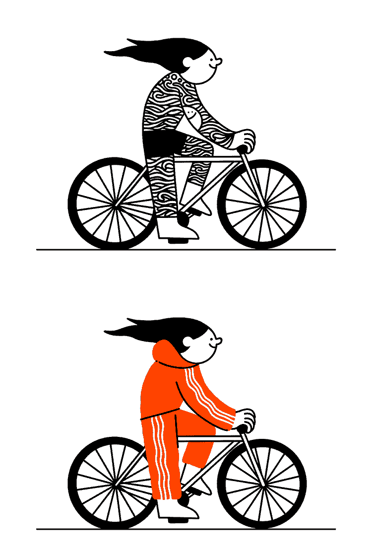
Cartoon Characters
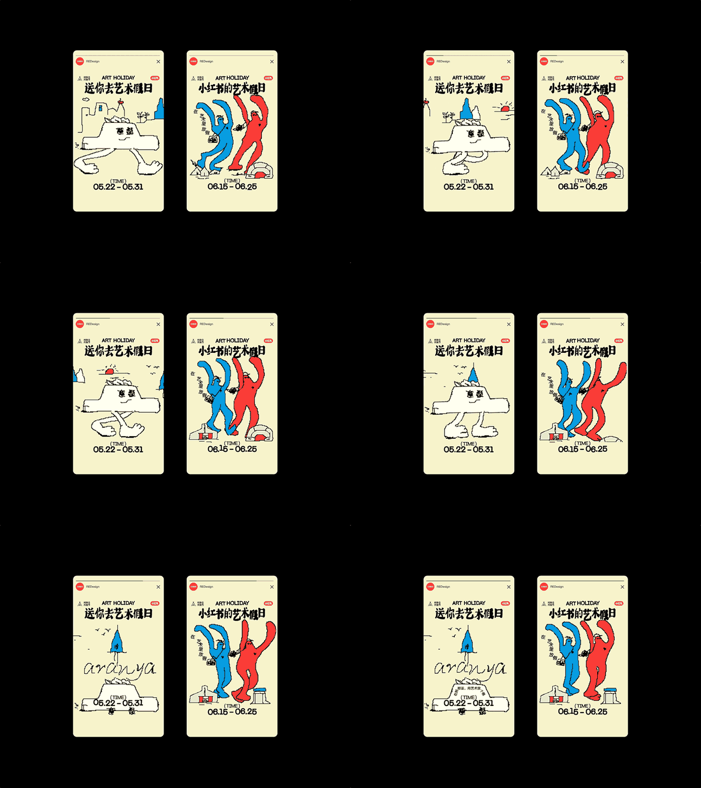
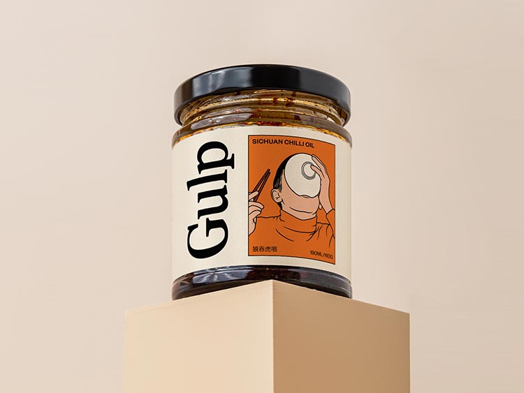
Trapped in the harsh realities of the modern world, we always long for an escape. In the case of graphic design, cartoonish-style illustrations can easily become that no-fail safe space we seek.
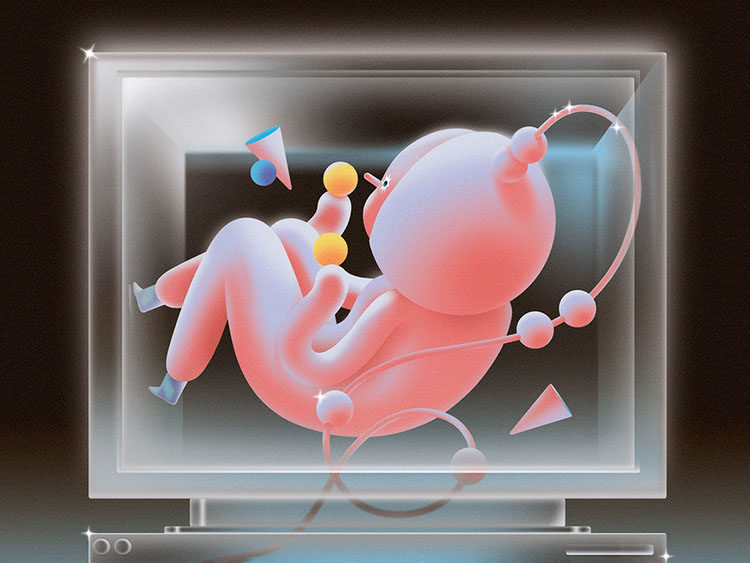
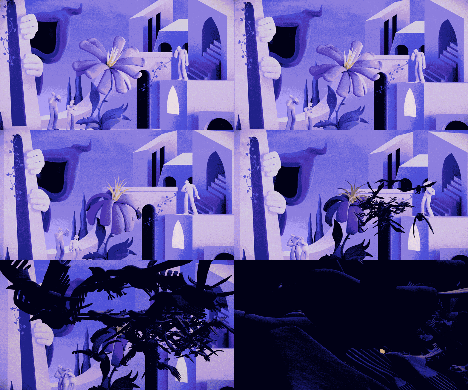
The great thing about cartoons is that there are so many visuals and techniques to choose from: classic American animation, comics, caricatures, claymation, retro cartoons, and so much more!
Plus, none of these has to be used solely in its original way: design features from different cartoon styles can be easily combined in a single design to achieve a new intriguing interpretation of the topic that will definitely catch your audience’s eyes. As far as dimensions go, both 2D and 3D seem to be in favor of this year’s graphic design trends, so you can choose whatever you like more!
Anything can be turned into a cartoon, but the most obvious application of this design trend is through brand identity projects, specifically by creating cartoon characters out of the product being advertised. In addition to brand storytelling, educational content is also adopting these styles for better engagement.
What’s more, cartoon characters serve as perfect vessels for immersive experiences in AR and VR, offering a friendly guide in unfamiliar digital landscapes. There are tons of other examples, but one thing is clear: cartoon characters are fun, useful, and engaging.
Graphic Design Trends to Avoid
While some visuals can make our designs feel fresh and appealing, others can easily bring them down. So, what are the anti-design trends of 2024? They may be loved by many, but everything is good in moderation: line art, Y2K, and minimalism have to go.
Think of line and flat art as that catchy tune we hummed to all summer long. It’s comfortable, familiar, perfect for web design, and it has served us well. But as the seasons change, so do our playlists. Line art will always have a special place in our design hearts, but we’re putting this style on pause for now.
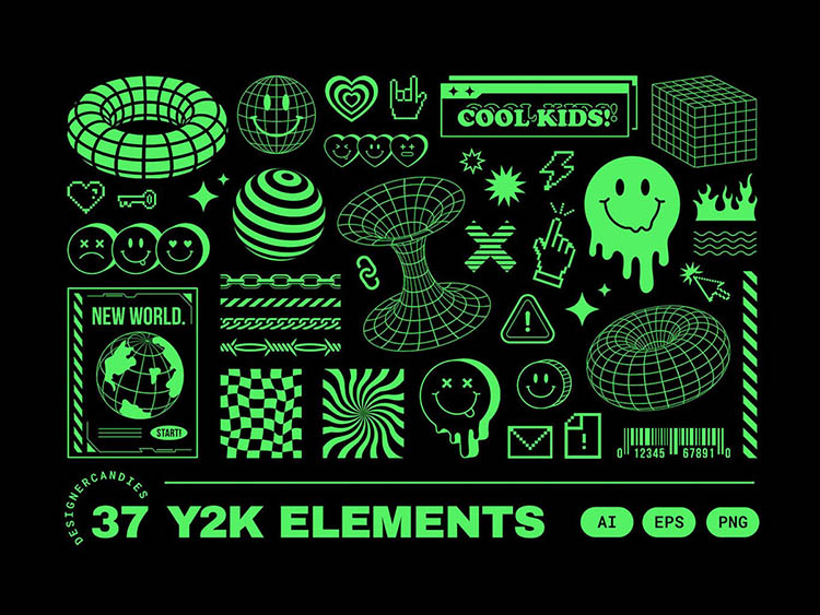
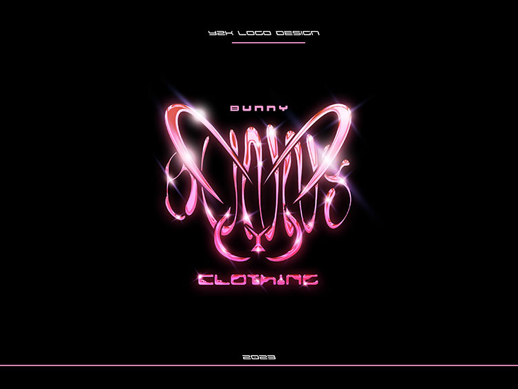
Moving on to Y2K design style, you can’t help but admire its boldness to stand out — just like in fashion, it’s a trend that everyone has tried at least once, for better or worse. We’ve enjoyed the revival, the funk, and the kitsch of it all, but perhaps it’s time for Y2K to take a little breather while we explore the ”more calm” retro aesthetics.
Minimalism, oh minimalism — you’ve been the sleek, smart dress code for the longest time, bringing an aura of sophistication to any project. But while clean and simple has its perks, hiding behind the bare minimum has started to feel a bit… well, bare. So as we nod appreciatively to minimalism’s timeless appeal, we look for designs with a dash more color and complexity.
So, what’s the takeaway? We love a bit of nostalgia and simplicity, but when it comes to setting the pace for future trends, let’s strive for something with a bit more zest. It’s about getting that edge, warmth, and a vibe that says “fresh” over” flashback.” Let’s craft designs ready for tomorrow’s gallery walls, not just today’s Instagram scrolls.
Frequently Asked Questions
- Clay 3D characters
- Sans serif fonts
- Rich colors
- Minimalist vintage
- Advanced microinteractions
- Creative typography
- Retro cartoon style
- AI Graphics
- Barbie’s Pink
- Pixel Mania
- Glass Blur & Distortion
- Serif Aesthetics
- Gritty Art with Retro Vibes
- Popping Colors
- Industrial Grunge
- Gradient Abstractions
- Conceptual Branding

