Hey there, design enthusiasts and font fanatics! Buckle up because we’re about to take a whirlwind tour of font trends that are shaping up to rock your design world this year. Forget the same old, same old — typography 2024 is diverse and dynamic!
From the crystal-clear legibility of accessible fonts to the sharp angles of geometric sans serifs, we’re seeing it all. Artistic typography isn’t just about looking pretty anymore; it’s about striking that perfect balance between art and function. And let’s not forget the nostalgia-packed journey with cartoon fonts, elegant serifs, and the irresistible charm of bubble fonts. And that’s not all! The year ahead is also about experimentation, bold pairings, and remembering something that seemed to be long gone.
So, whether you’re a seasoned designer or just dipping your toes into the vast ocean of type, this is your ultimate guide to the fonts that are set to make waves in 2024. Let’s unravel the current font trends together and discover how they can transform your next project from ‘meh’ to ‘wow’!
Ready? Turn the page and start this typographic adventure!
List of Font Trends 2024:
Accessibility is the Key
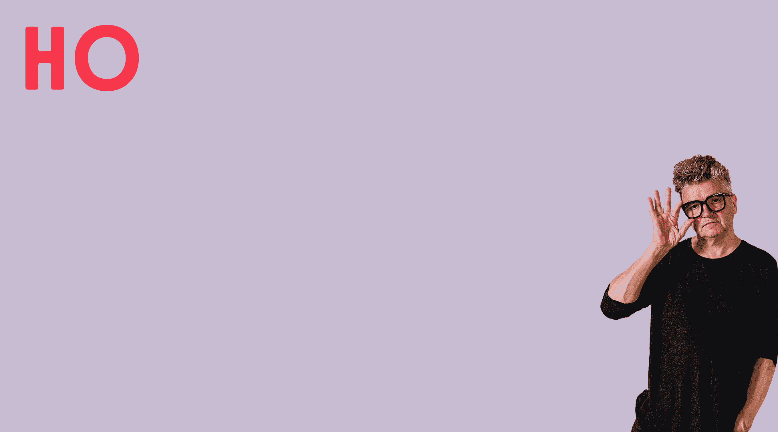
Embracing diversity in design isn’t just about celebrating our unique qualities; it’s also about constructing typography that’s comfortable and accessible for everyone. After all, the goal of any text is to communicate effectively with as wide an audience as possible. Accessibility plays a crucial role in achieving this goal — and opens our chart of top font trends for 2024. However, inclusivity in typography doesn’t mean sacrificing creativity or expression.
When it comes to creating accessible design, you should aim to strike a balance between functionality, aesthetics, and accessibility. This often means choosing more straightforward typefaces over bold, complex display fonts or intricate SVG characters. Sans serifs, for example, are particularly effective in this regard, offering the clarity and breathing space that make text easily readable for diverse audiences.
Neurodiversity in typography involves more than just adhering to proper kerning or choosing subdued color combinations. It’s about considering clear letter design, appropriate type sizes, non-intrusive textures from the start — and thanks to variable fonts it’s now easier than ever. But it’s not just about retrofitting existing designs to meet accessibility standards. As we move into the new year, the concept of inclusive typefaces and styles is becoming a foundational element of visual identity. More and more brands are committing to making their typography accessible and inclusive for all audiences — the new logos of Intel, Johnson & Johnson, and Infiniti are great examples of that.
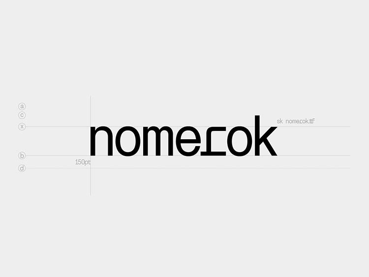
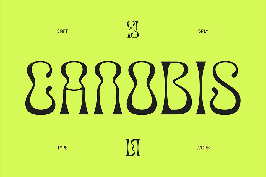
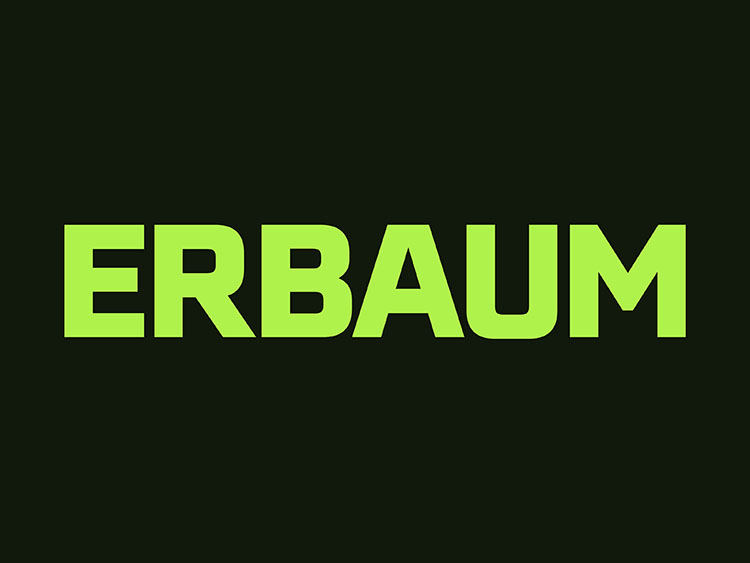
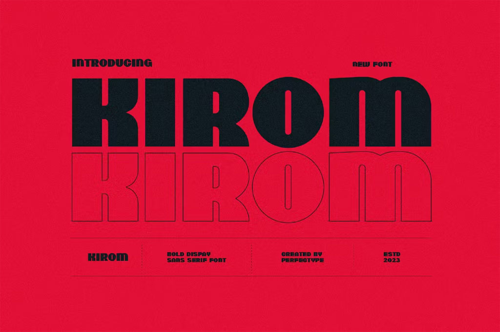
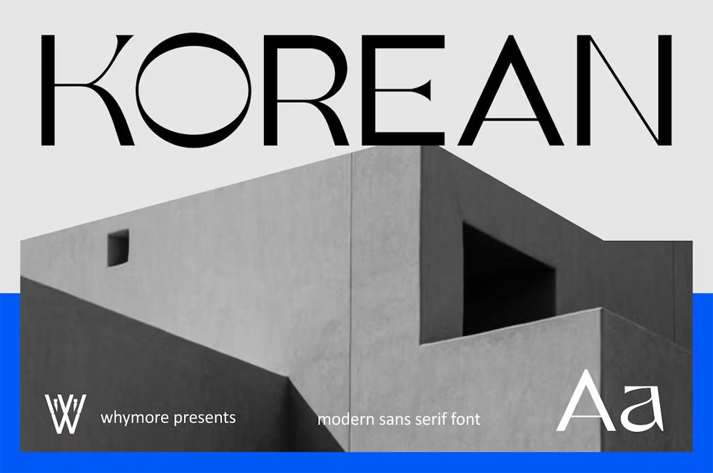
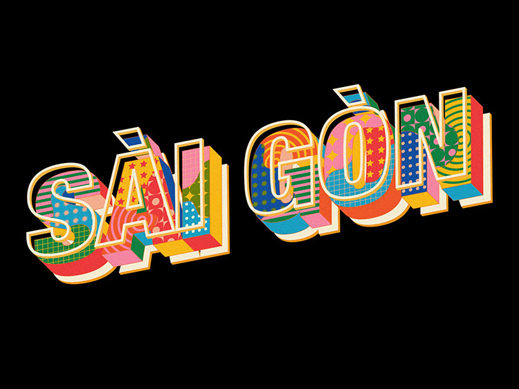
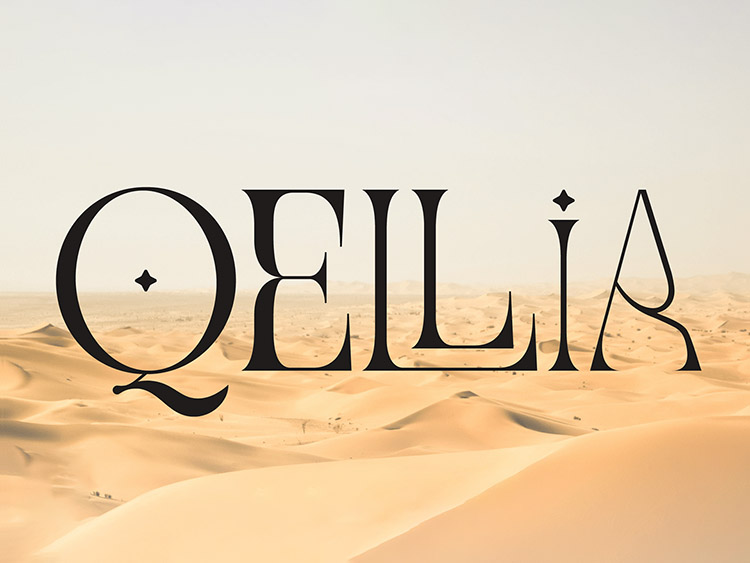
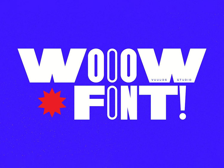
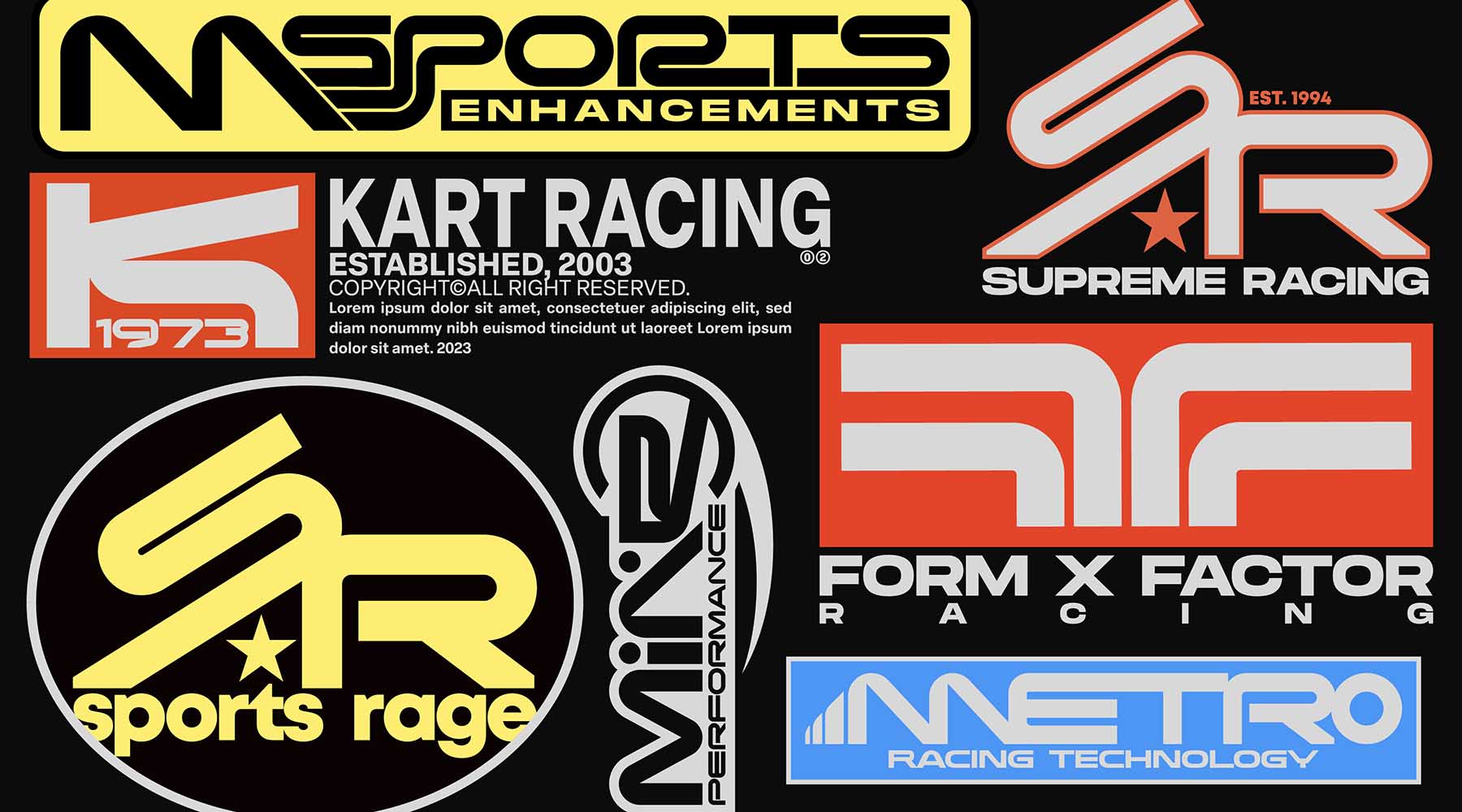
Geometric Sans Serifs
It might seem that the sans serif font family has nothing else to offer. Clean lines, rounded letters, minimalist aesthetics — we’ve seen it all. But just because we’ve seen it, it doesn’t mean it can’t be a trend, or turn into something greater, for that matter.
Fuss-free sans serif typography has long held a loyal fan base. Initially favored by minimalism-lovers for its simplicity, it’s now becoming a playground for experimentation and creativity. Yes, sans serif fonts can be exciting!
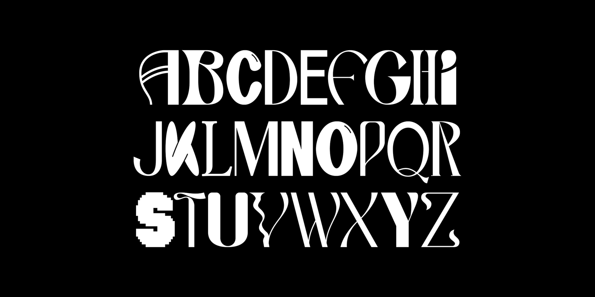
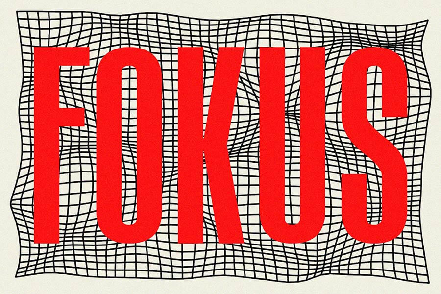
We are seeing more and more examples of digital designs that hold themselves back, giving way to typefaces that seem simple only at first glance: it’s all about the details. In these sans serif fonts, we can observe — with great enjoyment, by the way — the emergence of new shapes, unconventional letters, and completely unexpected design solutions. Uneven character width? You got it! Letters slanted into different directions? You got it too! Sleek shapes that draw inspiration from Art Deco? No problem here either. With this sans serif font trend, there are no boundaries to what can happen.
Any sans serif font with unconventional elements will instantly spruce up your projects and make them more dynamic while also being an organic part of the composition. We’re talking logo design, brand identity, web headings, and even print media — all because, while ensuring engagement and joy, these experimental and fun sans serif fonts offer high readability, strike a perfect balance between classic and modern aesthetics, and easily combine with other graphic design features. So, set your serifs aside (for now!) and explore the dark side — or shall I say the sans serif side of the moon that sure bears trendy fonts.
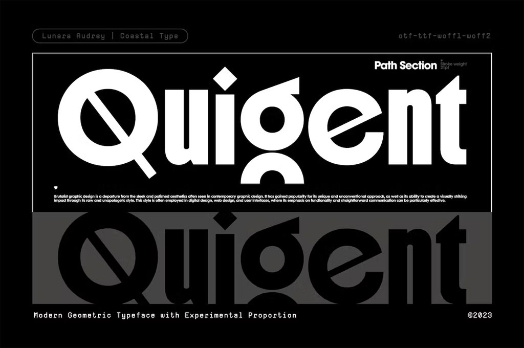
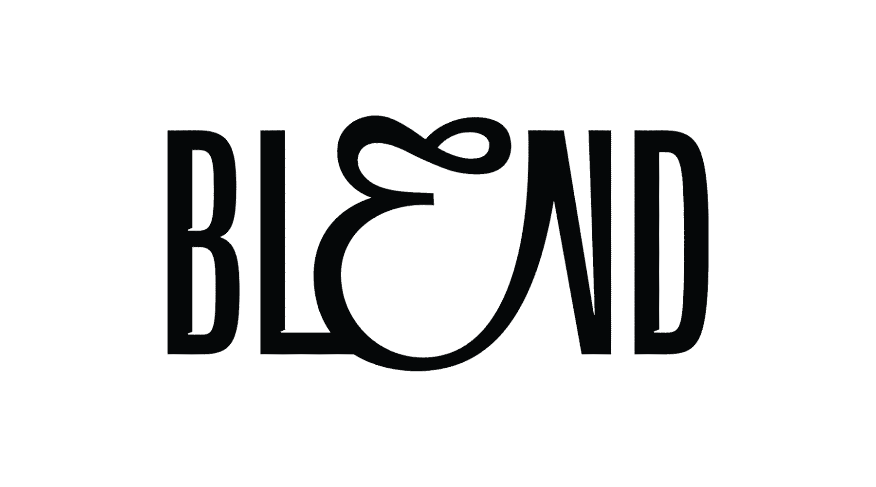
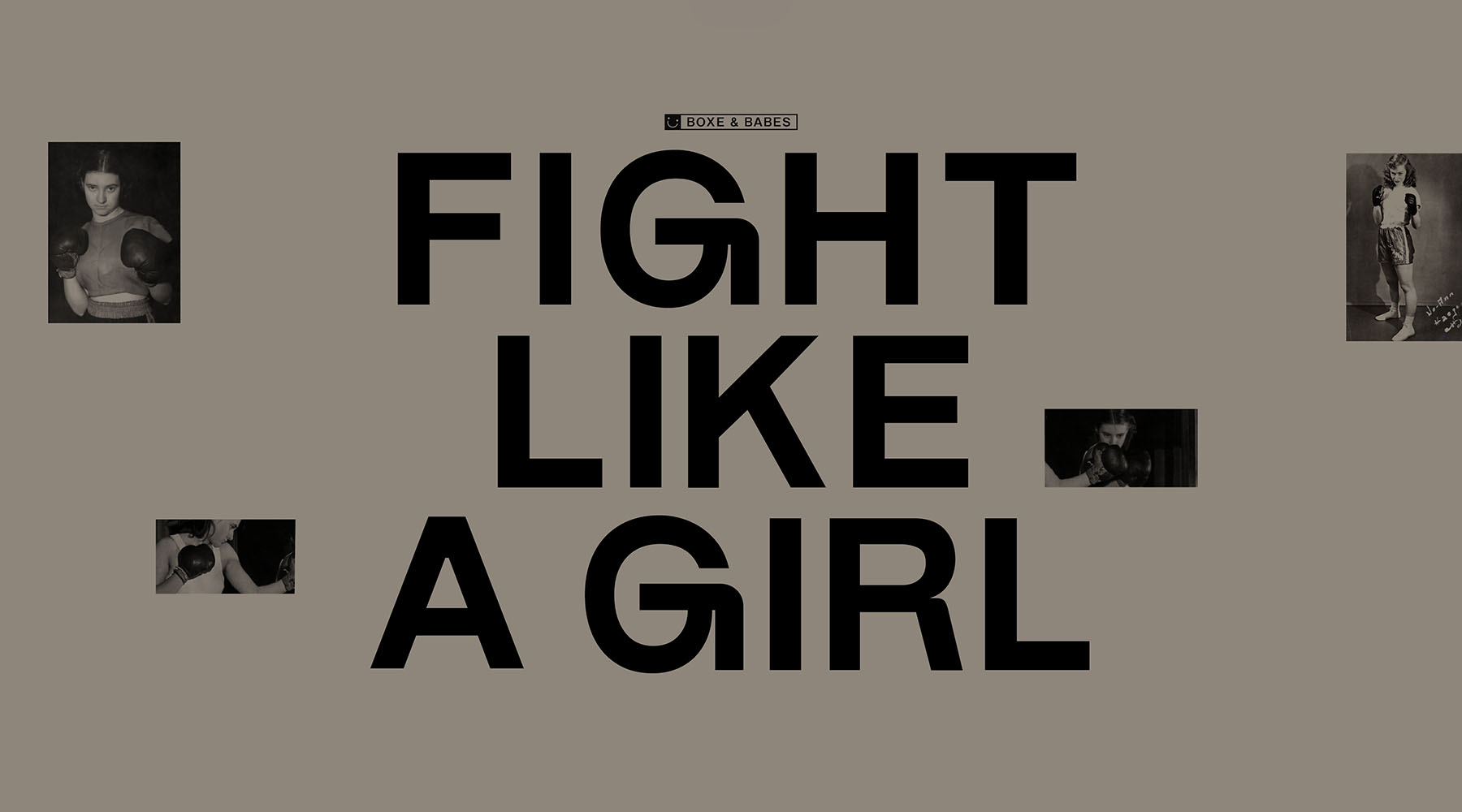
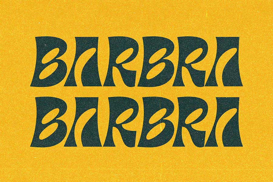
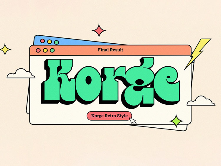
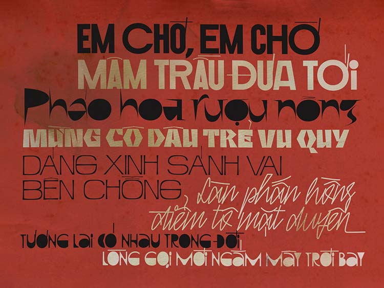
Artistic Typography with Balance
Experimental typography has been trending for a while and is, again, one of the trends for 2024. Back in 2019–2020, designers were trying to outdo each other in inventiveness, and one could simply get dizzy from the abundance of new fonts — oh those glorious days! This font trend continues to evolve — let’s see where it’s headed next.
The trend of balanced expressive typography is a logical extension of the previously mentioned typographic accessibility, which is the main typographic trend for 2024. If experimental styles inspired designers to refuse the human-centered philosophy in favor of self-expression, now we’re witnessing a reverse process. The user and their needs come first, followed by the brand’s personality and expressivity. And we also return to the essential question: “What’s the point of typography if it doesn’t serve people?”
And here’s the plot twist: brands are totally digging this new direction. Gone are the days when brand personality was pushed aside in the race to be the most out-there. We all have seen those logos and website designs where the graphics were drop-dead gorgeous but kinda missed the whole ‘this is who we are’ memo from the brand.
Good news, designers — we’re swinging back to a more harmonious design philosophy. A perfect blend of the brand’s style, audience needs, technical wizardry, organic font choice, and, yes, the designer’s flair, but all tuned to complement each other without any scene-stealing. It’s about writing a chorus, not a solo — and that’s music to our design ears!
Hand-picked cases:
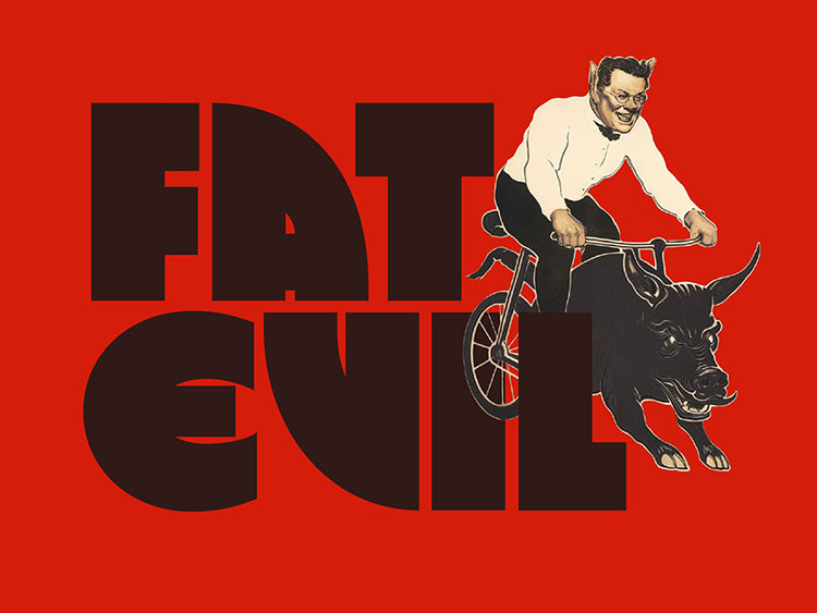
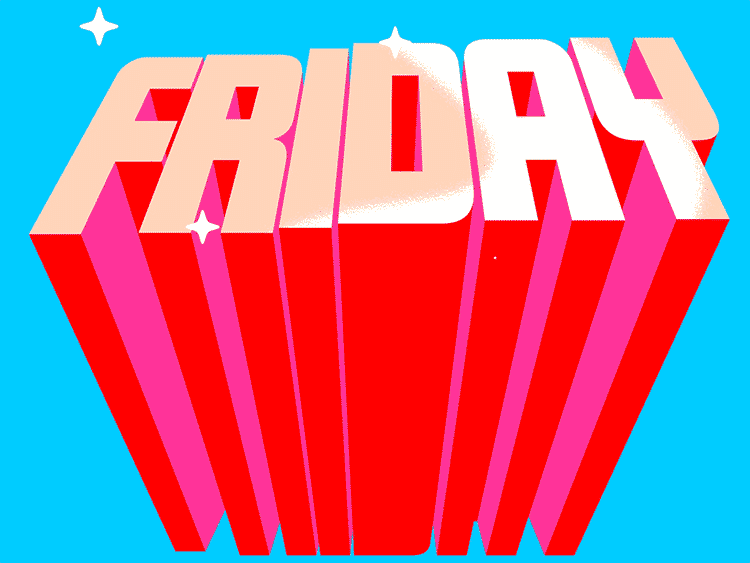
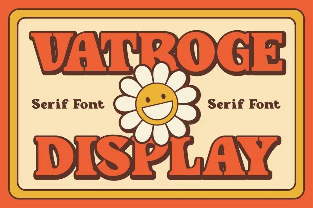
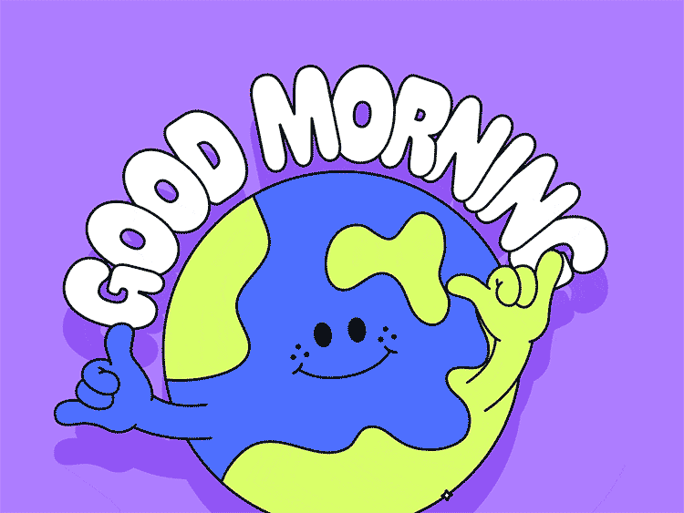
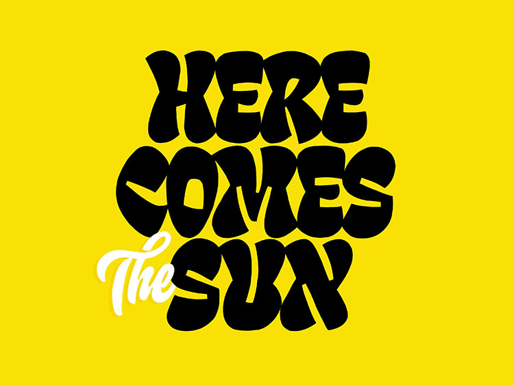
Cartoon Letters
Exploring font trends 2024, let’s sprinkle a bit of joy and whimsy onto our texts — a much-needed respite from the tough realities around us. And what’s a prime example of this playful escape? Fonts dripping with cartoon aesthetics!
Being (almost) the most trending fonts this year, these are more than mere lines and strokes; they’re bursting with character, ready to jump off the page or screen. Cartoon letters do not just shape words; they embody stories and emotions, adding a lively dimension to any written message.
These fonts also straddle the line between retro and modern. Some hark back to the days of classic comic books, instilling a sense of nostalgia. Others represent modern twists on the cartoon theme, pushing the boundaries of traditional typography. This duality makes cartoon letters incredibly versatile — equally at home amongst movie poster fonts as they are in a cutting-edge app interface. This also means cartoon typography guarantees a diverse audience for your projects!
In essence, cartoon letters in 2024 are a celebration of creativity and fun. They remind us that fonts can be both a nod to the past and a leap into the future. So, whether you’re aiming for a touch of nostalgia or a burst of modern flair, these playful typefaces are ready to transform your projects into something truly memorable.
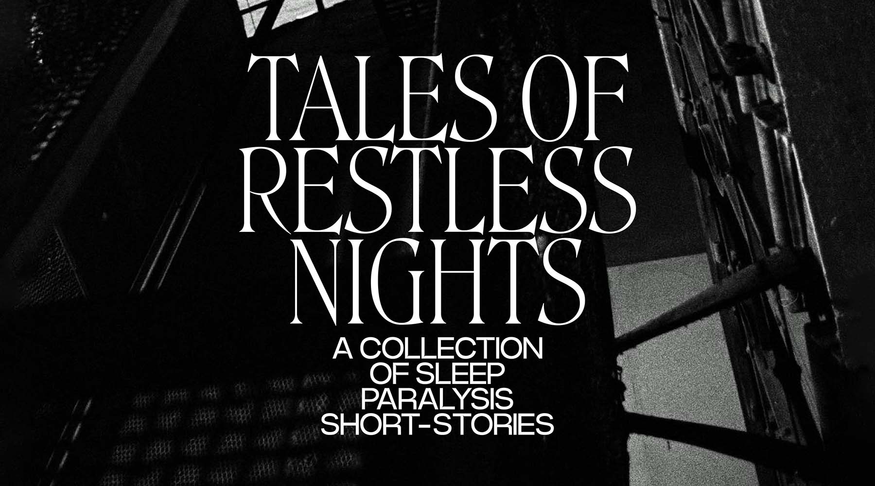
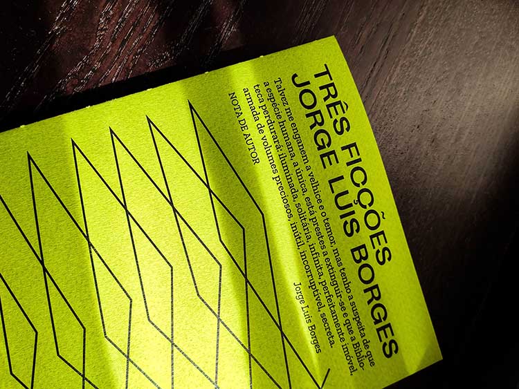
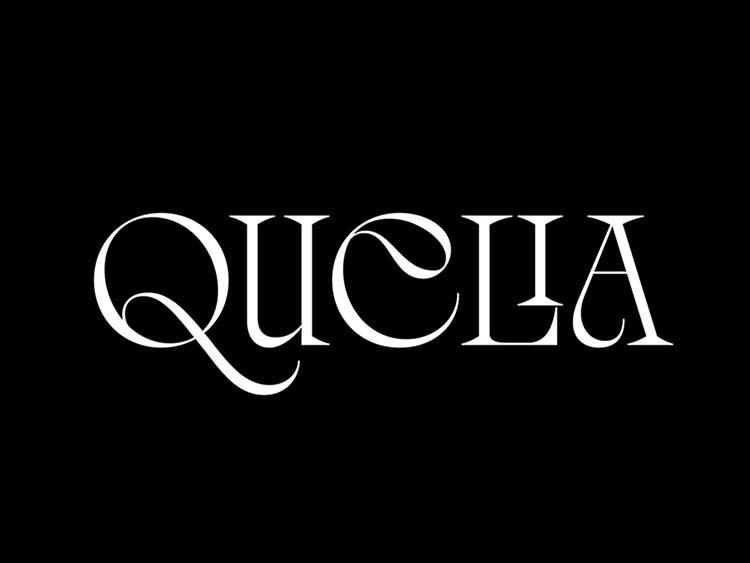
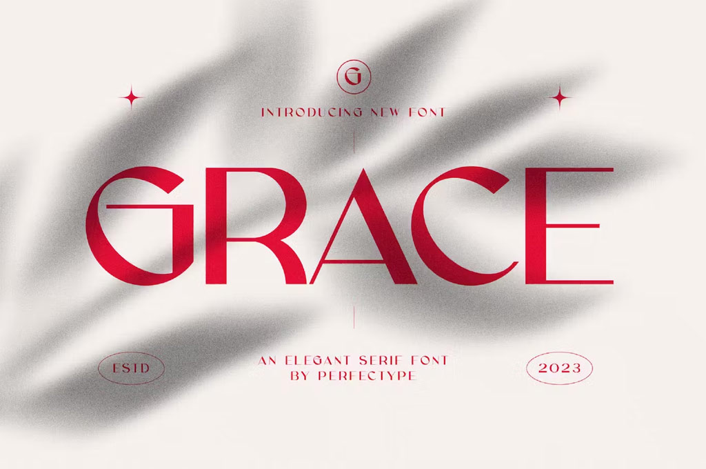
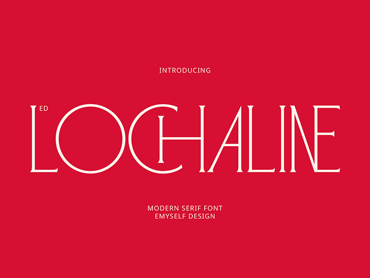
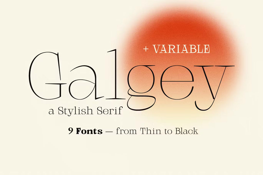
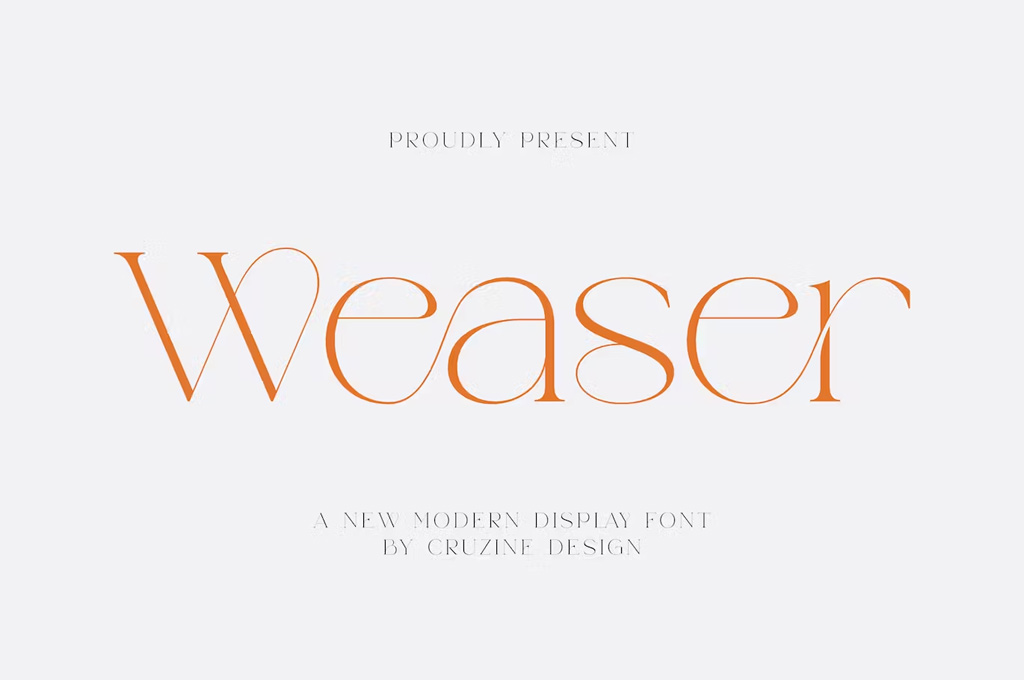
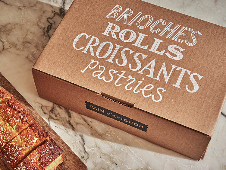
New Serifs: Thin-Thinner-the Thinnest
Sophistication has never been more in demand, and nowhere is this more apparent than in the latest serif font trend. Serifs are in their golden age, and this year, it’s all about pushing the boundaries of delicacy with strokes that are so fine, that they’re almost ethereal.
Where’s this trend coming from? Well, in a world that’s constantly buzzing with bold graphics and loud messages, there’s a growing appreciation for the subtle, the understated, and the quietly confident. Enter the new era of serifs, with their whisper-thin letter lines and elegant curves. They’re like the soft-spoken poets of the typography world, bringing a touch of grace and refinement to every design.
But don’t let their slender appearance fool you — these fonts pack a punch when it comes to versatility. From high-end branding to sophisticated editorial design, these sleek serifs can elevate any project. Imagine a luxury brand’s logo rendered in a font so fine it speaks volumes without shouting, or a magazine spread that captivates with its understated elegance.
Moreover, these ultra-thin serif fonts are perfect for digital spaces where clarity and readability are paramount. They can give website designs and app interfaces a modern, upscale feel while ensuring that the text remains approachable and easy on the eyes.
So, if you’re looking to add a touch of finesse to your work, the new wave of serifs has got you covered. In 2024, embrace the thinnest solutions — because sometimes, the quietest voice in the room is the one that commands the most attention.
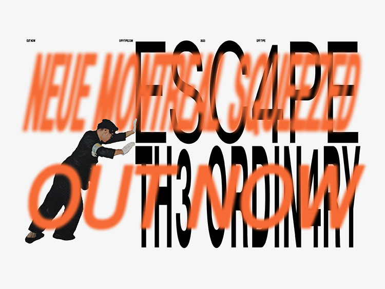
Typographic Combinations & Pairings
Get ready to play the matchmaker in the world of fonts because 2024 is all about typographic combinations and pairings. It’s like creating a perfect cocktail but with fonts — a bit of bold here, a dash of delicate there, and voilà!
Picture this: you’ve got a heavyweight champion of a font, bold and brash, paired up with its elegant, slender counterpart. It’s the design equivalent of a power couple walking down the runway — everyone can’t help but stare. We’re talking about mixing weights, styles, and even completely different fonts. The possibilities? Endless!
This year’s type scene is all about novelty and experiments, tailoring font pairings for a graphic design that feels fresh but doesn’t necessarily use anything new. By blending the unexpected — like modern geometric typefaces with calligraphy fonts or italic styles with bold weights — we create designs that resonate with a diverse audience. It’s experimental typography at its finest, redefining the very definition of what a typeface can do. Each pairing is more than just a stylistic choice; it’s a statement, a nod to an ever-evolving culture that always craves something different. Plus, by combining different types, you can enhance reliability and shift focus towards what’s more important.
Things to consider here are balance and contrast. It’s like mixing stripes with polka dots — done right, and it’s a fashion statement; done wrong, and well, you get the picture.
Whether you’re working on branding, logos, web design, or just jazzing up a presentation, remember: typographic combinations are your playground. Mix, match, and create something that makes people say, “Now, that’s a look!”

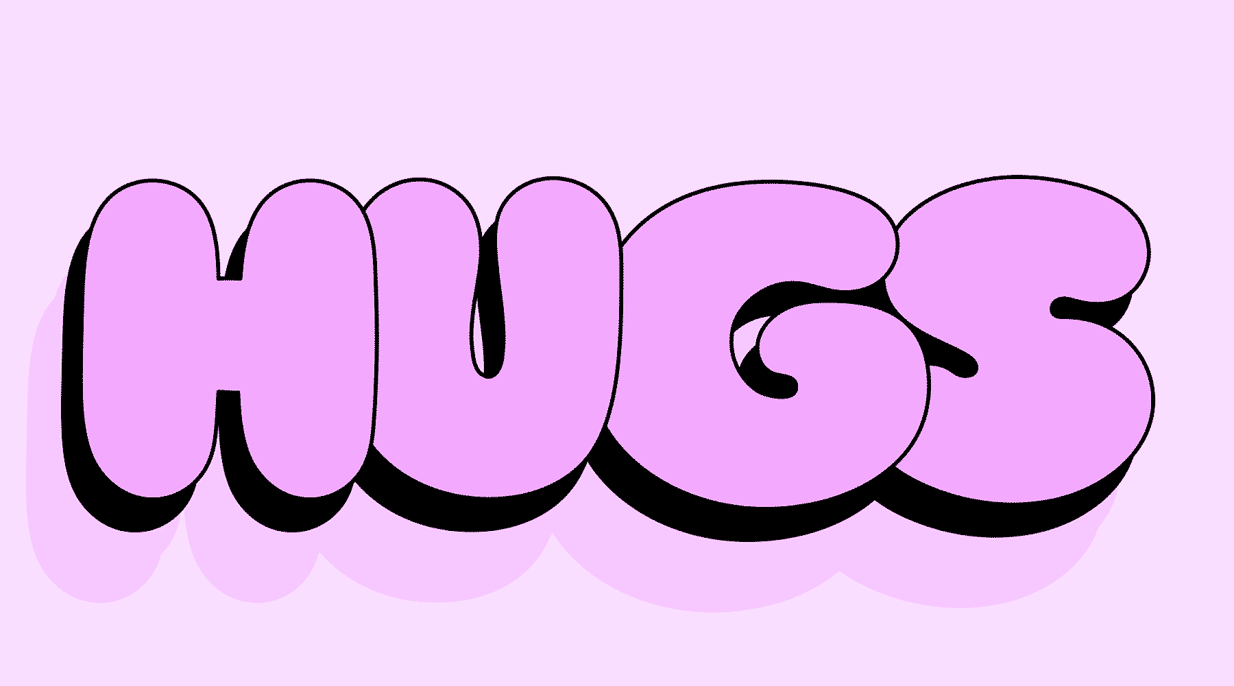
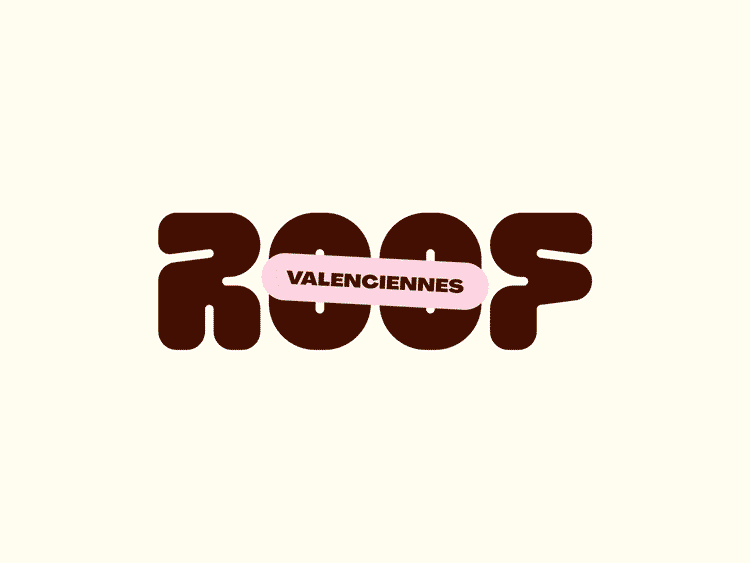
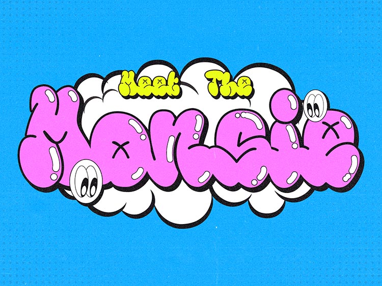
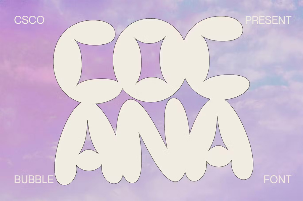
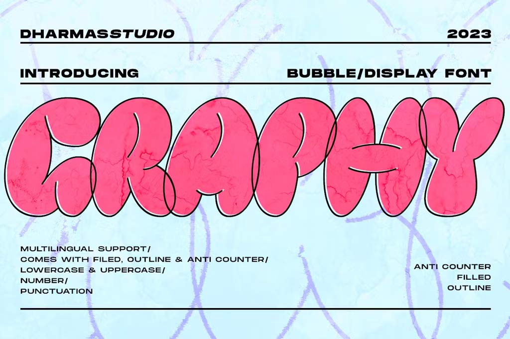
Bubble Fonts
Living in a bubble works perfectly fine in the world of typography trends 2024. Bubble fonts are popping up everywhere, from playful cartoons and 3D wonders to graffiti-style projects and even more formal iterations. The latter is especially intriguing — it’s all about how designers are adapting this emotive aesthetic for projects that need a touch of class.
Think big, bold, and bouncy letters that feel like they could leap off the page or screen. They’re the kind of fonts that make you want to reach out and touch them. This way, your audience will definitely engage!
But the versatility of bubble fonts is what truly stands out. Beyond their obvious playful and streetwise allure, they’re finding their way into more polished and sophisticated designs. Their boldness can be restrained by various means: a neutral color palette, minimalistic backgrounds, and so on. Bubble fonts don’t have to “invade” your designs, but rather complement them.
So where would these fonts be useful? Since they catch our eyes so easily, they work especially well in logos, brand identities, print design, social media posts, and so much more. So go ahead and embrace the bubble — it might just be the pop your project needs!
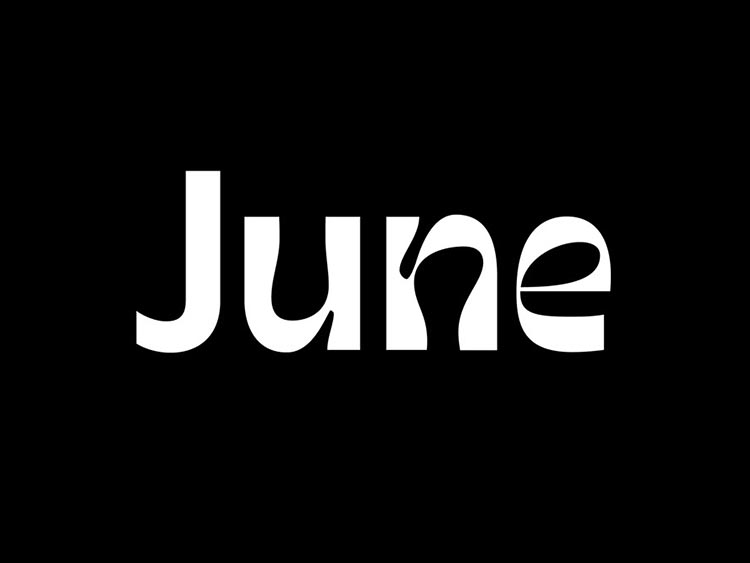
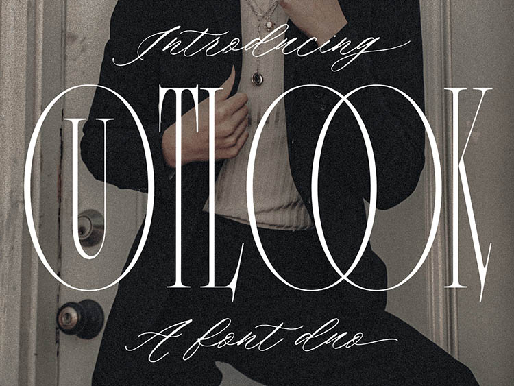
Flowing Monoline Fonts
Alright, let’s talk about the font trend that’s like the smooth jazz of typography. Sure, cursive fonts aren’t typically the life of the design party, but who says we can’t shake things up a bit for 2024?
Imagine a font that’s like your favorite coffee shop’s signature on a chalkboard — effortless, smooth, and with just a hint of that handcrafted vibe. That’s monoline typefaces for you. They’ve got this easy-going, one-weight line that just flows like a gentle stream. No ups and downs in thickness here — just one smooth ride from A to Z.
Why are they catching on, you ask? Well, in a world full of bold statements and digital sharpness, sometimes you just want something that feels like a warm hug for your eyes. These fonts are like that cozy sweater of design: comforting, soft, and oh-so-welcoming. They bring in a touch of humanity, a dash of personal flair, and a whole lot of chill vibes.
And let’s talk versatility! Need something that looks fab on a logo? Check. Want a font that doesn’t scream but still delivers a message on your website? Double-check. How about making your packaging design a bit more approachable? Triple check! Flowing monoline fonts are like your design BFFs — they just get you.
Maybe it’s time for your monoline era? From elegant curves to sleek ligatures, embrace the beauty of these nearly-script typefaces in the year ahead. You’ll see: going with the flow can look amazing.
Hand-picked cases:
Frequently Asked Questions
Font trends 2024 offer designers who want to feel artistic freedom and keep up with the times a wide choice of font solutions:
- Accessible fonts;
- Geometric sans serifs;
- Artistic typography with balance;
- Cartoon letters;
- Thin serif fonts;
- Pairings of different fonts;
- Bubble fonts;
- Flowing monoline fonts.
With the diverse font trends of the year 2024, there is no way we could name just one that will be at the top of the design world. This year, every designer will find a suitable option for themselves, no matter what style they work in. The final goal of your designs is what matters.
If you’re looking for an elegant addition to your brand identity, consider thin serifs. If your logo design needs a spruce-up and wants to attract a more diverse audience, try out cartoon and bubble font trends. If you aim to give your project a fresh feeling, check out different font combinations or go after modern serif font solutions that aren’t afraid of unconventional shapes and patterns. Remember that this year a user is what designers should focus on: accessibility should go hand in hand with all your creative decisions and influence the choice of trending typography.
Currently, the font trends are a diverse mix, offering something for every design need. Here’s a list of the most popular font solutions:
- Accessible fonts;
- Geometric sans serifs;
- Artistic typography with balance;
- Cartoon letters;
- Thin serif fonts;
- Pairings of different fonts;
- Bubble fonts;
- Flowing monoline fonts.
In 2024, there isn’t a single ‘most popular’ font, as trends are focusing on a rich variety of styles. However, accessible fonts are gaining significant traction for their universal readability and inclusivity. Among other trends are geometric sans serifs, thin serifs, monoline scripts, and cartoon fonts — the choice depends on your specific design needs and the audience you’re catering to.
Moreover, such typography could be used in many projects, from packaging design to various illustration projects. The great news is that easily legible fonts are still in trend this year, so don’t be quick to delete all these types from your library! You can use them in your next project and not be afraid of looking out of fashion.