For a long time the dating apps crown belonged to Tinder, recently the Facebook dating app has showed up with a confident step in the market. You may haven’t heard of it but there’s also adorable Hinge — dating app, initially launched in 2012 and remastered this year, having a new branding design with a nice story behind it.
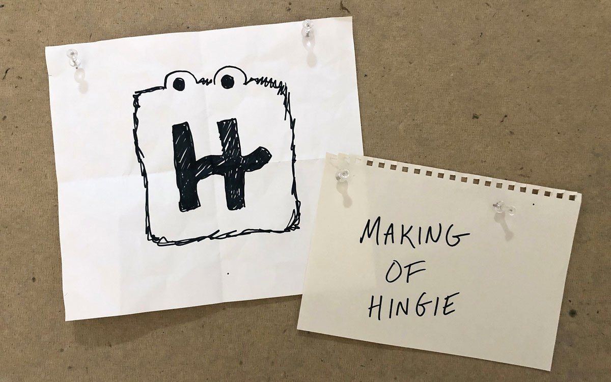
The concept design unveils a cute furry creature, born to connect people online. It follows the couple everywhere through thick and thin, suffering from dogs’ attacks, candle burns, taxi driving over them, and a bunch of other injustices, presented in the advertising campaign for the app design. He, basically, becomes a martyr for cause and puts up with every challenge just to connect two people, tired of scrolling, liking, matching and other actions they spend time doing online, instead of actually going out. Deleting Hinge is a sort of mercy killing (even if it sounds not funny at all), letting him go help more people find their perfect relationships.
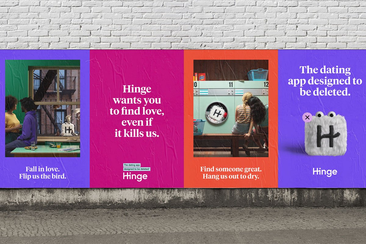
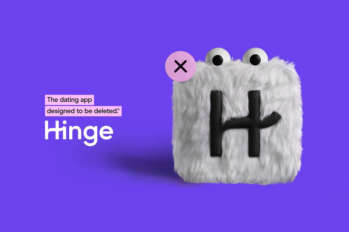
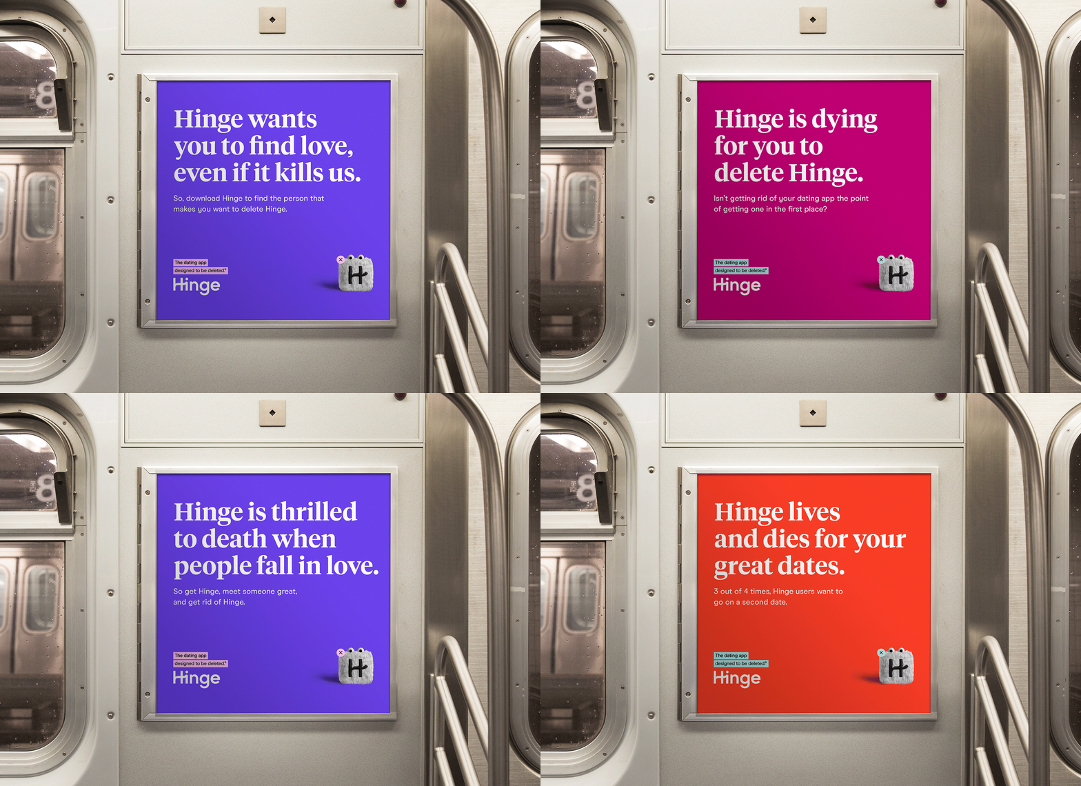
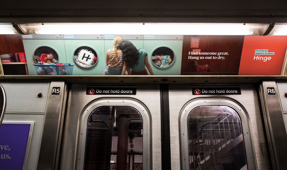
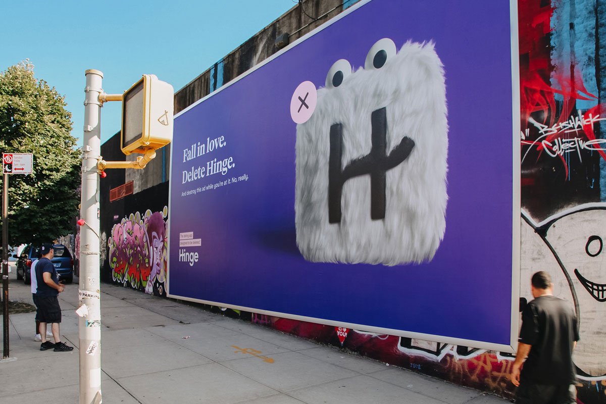
It’s the unique idea, wrapped in a goofy execution with a series of short and funny videos. Branding design with a mascot is a thing great for both branding and marketing, making the app stand out from the crowd. No cheesy love-stories, romantic mottos, so typical when things come to dating-related products. Red Antler always has its way with the audience through their concept design, and they’ve done it again! The campaign turned out to be memorable, funny, with a light sense of humor. Check out the advertising campaign for Hinge dating app, and see how death saves love!
