• Home
  • Design
  • Freebies
  • Toolbox
  • Tech
  • Tutorials
  • Inspiration
  • Digital Art
No Result
View All Result
Subscribe
The Designest
  • Home
  • Design
  • Freebies
  • Toolbox
  • Tech
  • Tutorials
  • Inspiration
  • Digital Art
No Result
View All Result
The Designest
No Result
View All Result
Home Design

Helvetica and the aesthetics of Swiss design

Legendary font and trend at a time — might there be anything more canonic than Swiss Design?

Ksenia Pedchenko by Ksenia Pedchenko
September 25, 2019
in Design, Inspiration
1
Share on FacebookShare on Twitter

Wrapped into Helvetica, Swiss Design unveils more essentials than you expect from a legend. A model of artistic honesty, pure good taste — is it all that captures designers’ hearts?

Some time ago I was lucky to introduce Web Brutalism to you — my favorite design style, that I’m searching for everywhere. In whole, I love all trends that involve bold minimalism, engaging visual support that is not too rich in detail and reserved typography that makes the artwork scream. So once we’re done with the brutal design, comes the time for the Swiss style.

In the beginning there was Helvetica

Swiss movement is Helvetica first. One of the most legendary typefaces. So legendary, that it has been praised and portrayed by many authors already. Start with Helvetica documentary by Gary Hustwit, 50 Years of Helvetica exhibition in the Museum of Modern Art in New York City and endless rows of books and articles written and published. And what about logos? Webdesigner Depot has embraced 40 world-known logos featuring or based on Helvetica, and still, there are many more to add: Placebo, Zanussi, NYC Subway, Bayer.

The most iconic typeface in the desigh history
The most iconic typeface in the design history
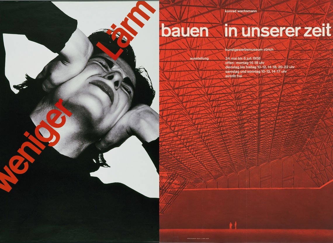
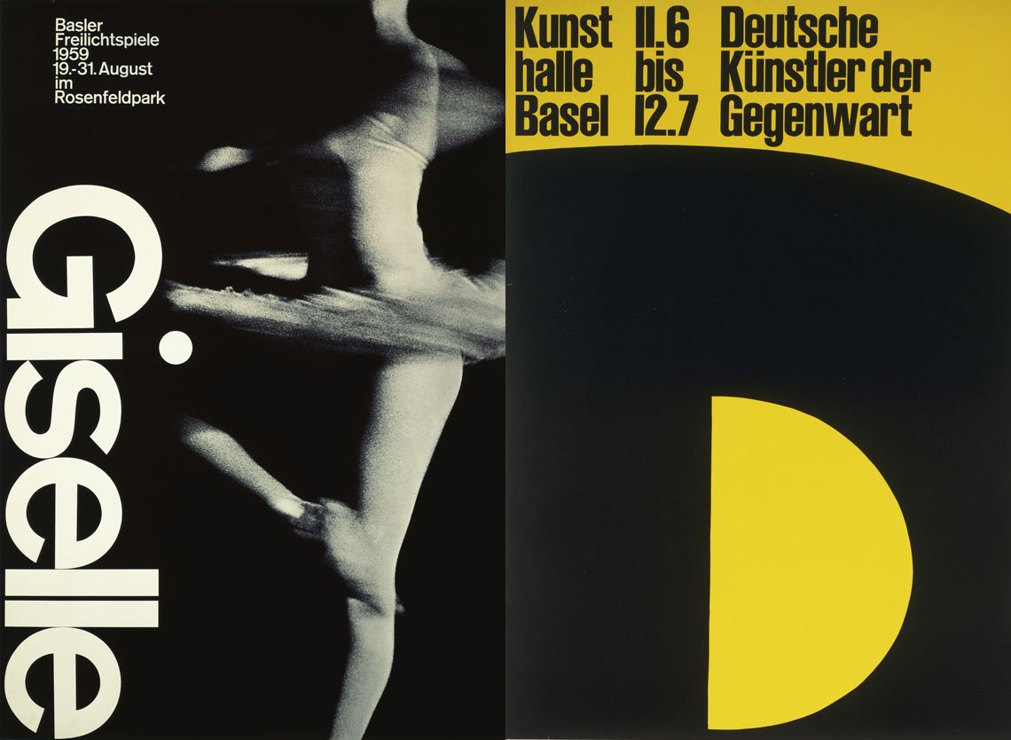
However, after such a long preamble I am not gonna write about technical details of Helvetica and won’t tell you how beautiful and versatile this example of international typographic style. So many bloggers have done it for me. Instead, I’ll show you the magic of Swiss design.
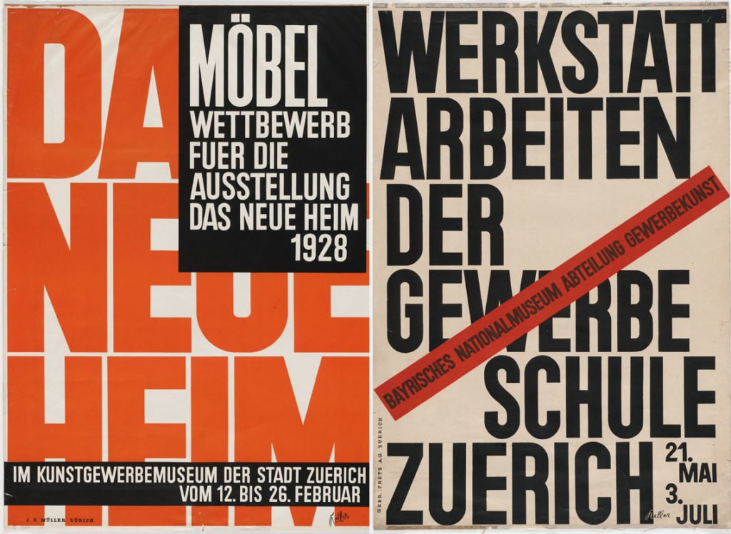
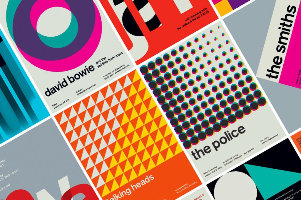
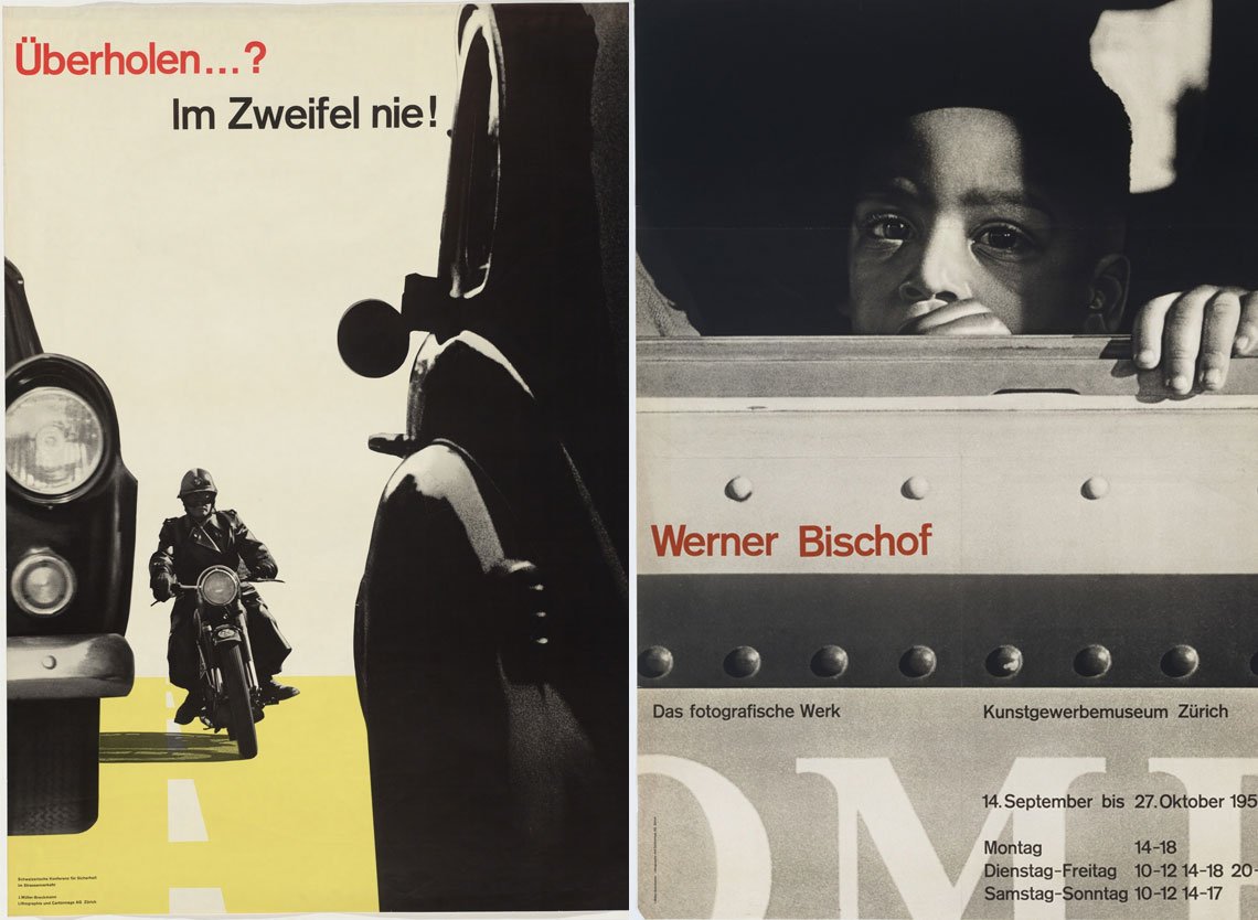
Affectation Aside

Helvetica was strongly influenced by earlier created Berthold typefaces and for 60 years already represents Swiss graphic design — so reserved, clean and objective. However, Swiss design isn’t Helvetica as it may be easy to think.

Designs by Ernst Keller
Designs by Ernst Keller 1927-1928 (via moma.org)

The phenomenon of Swiss design appeared far earlier, at the end of the 19th century. Swiss design schools with such mastermind as Ernst Keller emphasized on purism — an idea delivered without hacks, without ornaments, and without an opinion. These canons represent the actual mindset and the attitude towards the media of the Swiss. Like with Helvetica. Made with engaging vertical or horizontal terminations solely it fits long texts of a newspaper and attracts human attention when used in a logo or a title.

So I will not lie if I speak of ultimate openness of the Swiss poster design as well — they accordingly work to deliver facts, not opinion.

Grid as a model

Swiss design schools regard grid as a basic element for bringing information in the most organized, logical way. So if you are a newbie in the industry, you MUST check it out to see how this content framework works. It even helped my far-from-design-friends to understand what I meant when speaking about grids in UI. Grid systems in graphic design may be built vertically, horizontally, they may be curved, they may intersect. But the major point is that they stay visible and the layout looks harmonically.

Text Matters

Journalism and Swiss style are almost a single thing, and they influenced each other a lot. And no, Helvetica isn’t everything, as many more other sans serif typefaces, that look convincing and ‘progressive’, are a perfect fit. However, I doubt you will find many works with serifs. They are considered as too formal and not legible enough.

Swissted, a project by graphic designer Mike Joyce

The designers are all into size and color experiments, matching monstrous and tiny letters for accents, bold and thing letters to express mood, monochrome and vivid palette to add vibrancy. Or to make you stop in front of a banner. That works well.

What I love most about such experiments is the use of white. It not only works as powerful emphasis but brings the matter of the whole artwork in a single element. Swiss design favors it, and you may try and see how it works with your audience. CV templates, posters, banners sticker — why don’t you help the community sink in the sense you’ve put into the typography?

Graphics, Not Ads

Images — photos and illustrations — are not to sell, they are to show and to tell a story. That’s why original Swiss design, even if it’s used in commercial, will not bore you with happy kids with chocolate of a popular brand. You may even hardly ever guess something is sold. But still, you won’t be able to pass, as the combination of a bold Swiss font, powerful color solution and images won’t leave you a single chance to stay indifferent. Collages with roughly cut out photos and bright geometric elements or symbols keep being attractive, and that’s another thing you should try out. Seems simple, but eye-grabbing imagery can always provide you with some spin-off.

Designs by Joseph Müller-Brockmann
Designs by Joseph Müller-Brockmann 1957 (via moma.org)
Designs by Joseph Müller-Brockmann
Designs by Joseph Müller-Brockmann 1958-1960 (via moma.org)
Designs by Joseph Müller-Brockmann
Designs by Joseph Müller-Brockmann 1959-1960 (via moma.org)
Previous
Next

There are some retro pieces and some great Swiss-inspired items I’ve listed already. However, if you’ve discovered the love to this style, check Rudolph de Harak, Jacqueline Casey, Armin Hofmann, Emil Ruder, they deliver tons of inspiration.

What I like most is that Swiss design can help you understand the basics and its comprehension pushes you to a new level, packing with essential skills you won’t do without — mastering and matching typeface weights, adding power to graphics and placing the right accents where you need it. Briefly, there are trends & movements to love to watch, but this is the one to master.

Tags: HelveticaTrendsTypography
Previous Post

Hinge: dating app branding design, which is meant to be deleted

Next Post

Memphis style, the legendary 80s design trend

Ksenia Pedchenko

Ksenia Pedchenko

The Designest editor and passionate design blogger with over 6 years of writing experience. Ksenia has an eye for the trends and never misses an opportunity to share some helpful or inspiring content. She's in love with a good text, perfect visuals, and inspiring stories that energize the industry.

Related Posts

10 Font Trends 2023: The Year of User-Oriented Typography

by The Designest Staff
January 19, 2023
0

If you need a trouble-free method to understand what the design industry is up to, look at the typography trends....

12 Graphic Design Trends For 2023: The Visual Euphoria

by The Designest Staff
December 20, 2022
0

It was the best of times, it was the worst of times, and whatever part of this statement applies to...

100+ Best Business Card Mockup Templates For 2023

by Alina Yakovleva
December 16, 2022
7

Rummage through a selection of the best business card mockup sets to present your work!

Creative Power of Shutterstock: Introducing CreativeFlow+

by Alina Yakovleva
December 8, 2022
0

Having all the needed tools on one platform is the dream of many creative minds. And Shutterstock made it come...

Best Drawing Software in 2023 For Your Creativity

by Evgenia Papicheva
December 8, 2022
9

We’ve collected the best free art programs and paid software for you to always have a wide choice of creative...

Pantone Color Of The Year 2023: Viva Magenta

by The Designest Staff
December 2, 2022
0

The new color celebrates self-expression without restraint and comes as a tribute to power of humanity.

Next Post

Memphis style, the legendary 80s design trend

Leave a Reply Cancel reply

Your email address will not be published. Required fields are marked *

Popular Posts

  • 70+ Best Photoshop Text Effects & Styles PSD Templates

  • How To Sell Digital Art: 20 Best Places To Sell Your Digital Design Online

  • Top 9 Logo Design Trends in 2023: The Triumph of Typography 

  • 20 Digital Artists You Should Know: Famous, Talented, Inspiring

  • 45+ All-Star Baseball Fonts

Envato Elements
with Envato Elements membership

Categories

  • Design (80)
  • Digital Art (27)
  • Freebies (80)
  • Inspiration (43)
  • Other (5)
  • Tech (20)
  • Toolbox (148)
  • Tutorials (57)
Youtube Facebook Instagram Dribbble Pinterest Twitter RSS

Subscribe

The Designest

Weekly Email Updates

We got tons of fascinating articles, videos and freebies for you every week!

SUBSCRIBE

Design Blog

  • Design
  • Digital Art
  • Freebies
  • Inspiration
  • Other
  • Tech
  • Toolbox
  • Tutorials

About Us

Welcome to The Designest — a professional design blog aimed to deliver fresh news & trends of the industry as well as the most essential courses & tutorials you must have been searching for.

Company

  • Advertise with Us
  • Contact Us
  • Cookie Policy
  • Privacy Policy
  • Terms and Conditions
  • Affiliate Disclosure

© 2023 The Designest — Professional design blog aimed to deliver fresh news & trends of the industry

No Result
View All Result
  • Home
  • Design
  • Freebies
  • Toolbox
  • Tech
  • Tutorials
  • Inspiration
  • Digital Art

© 2023 The Designest — Professional design blog aimed to deliver fresh news & trends of the industry

Subscribe to Regular Updates
We got tons of fascinating articles, videos and
freebies for you every week.
This website uses cookies. By continuing to use this website you are giving consent to cookies being used. Visit our Privacy and Cookie Policy.