Logo design trends are something mythical: almost everyone speaks and writes about them. But have you ever seen them in action? While so many creators are building up their tips on how you should better approach logo design to grab attention, we’ve decided to check up what real businesses do and sum it up as ten major logo trends that will probably work in 2024.
So what’s going on in the industry and what current trends are? As with general design trends, every year, we seek significant logo design trends, trying to help designers and entrepreneurs onboard fresh and distinctive brand’s identity. More or fewer colors, flat style or 3D, dynamic minimalism or maximalism — over and over again, it’s the same choice for everyone. The funniest thing is that even when the choice is made, nobody has a keen understanding of what an engaging modern logo should be like and keeps doing things their way.
In fact, every time there comes a powerful trend — as it happened a few years ago with reserved flower-based logos in Scandinavian style — there are always thousands of studios that overlook it. The same happens in other creative fields (or even outside the design industry), but logo design makes it particularly evident that any trend carries thousands of exceptions.
That’s why I recommend you to focus on something other than popular trends everyone’s about and see for yourself what’s what. To help you with that, we’ve explored hundreds of loud rebrandings of 2022 to make up an honest list of logo trends that most designers stick to. That must be of great help if you don’t know what to start with!
Design trends and logo trends in particular, don't change drastically from one year to another. Can you imagine how fluid and unstable the whole industry would be if they did? That's why the gold formula of sharp branding is the most winning solutions of the past year combined with more recent tendencies — where the crucial role belongs to the first component, of course.
Over the past years, logo designers have explored the edges of dynamic minimalism. And we’ve already seen so much of it: from indie projects on Behance to grand rebrandings of Citroën, Google, or Sprite. Similar to general graphic design trends, branding intensively adopted reserved typography and matched it with vibrant color schemes.
In 2024, new logo design trends will likely continue the general tendency, and we hope to see the aesthetics mentioned above globally reinvented. It also will be the time of flourishing typographic aesthetics in all possible forms. You’ll be amused to see that logo designers couldn’t withstand harsh minimalism and symbolism — instead, fancy fonts keep flooding the industry. Of course, we have seen lots of such concepts before, but this time, inventive typography is finally featured in real rebrandings of the real brands.
Along with that, you’ll meet some of the well-loved top logo design trends of the past two years: sketches, vintage branding, and some shifts in the preferred color solutions.
In 2024, you will hardly surprise anyone if you create logos based on a complex logomark. Such logos are usually hard to remember, and the target audience may find it challenging to build a bond between the company name and its graphic representation. This can be a huge problem for big businesses seeking to reinforce their presence and increase brand awareness. Therefore, there is a tendency for companies to opt for something fundamental and we clearly see it in corporate logo design trends.
Fanta Logo Redesign
Webflow Logo Redesign
Basic geometric shapes are various triangles, circles, squares, dots, and clean lines, which bring logo designs to a simplistic image. In compensation, designers suggest using a vibrant, high-contrast color scheme (sometimes associated with a brand story even better than the logo). Or, on the contrary, switch to black & white and bring this minimalist effect of simple round and square logos to a maximum. Finally, negative space is another great way to adopt simple geometry and sustain visual interest.
The principle “Less is more” isn’t new in graphic design, nor is this a stand-alone logo design trend. For example, in 2021, KIA or Google redesigned their logos (which initially were quite simple and reserved) using simple shapes. In 2022, Citroën introduced a similar redesign. In 2024 followed even more companies, including Fanta (they refused the iconic orange in favor of the white-blue color combination) and Webflow (WF Visual Sans + a simple geometric logo mark).
It’s vital to note that the logo trends of basic geometric shapes doesn’t strictly refer to logo marks. It is about fonts, too — but this happens less frequently and is more associated with the global typography trends and the overall popularity of minimalist types.
Experience shows that the work with color and the choice of the color palette for a logo is a very personal story. And it’s usually hard to track the global tendency or any logo trends associated with particular colors. Some prefer black-and-white logos. Some choose monochrome, nude, or earthy colors. However, if we look at big brands, we’ll be able to define a shift from muted to saturated colors used for a strong visual presence.
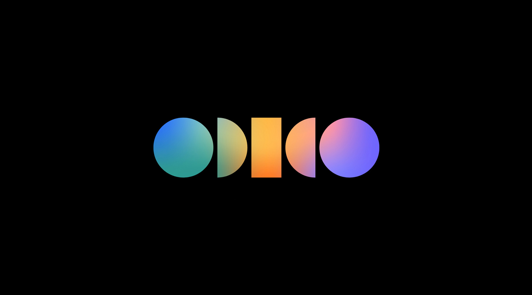
New Brand and Identity for Odido
True story: bright colors are erratic and hard to work with. They attract much attention, make a bold statement but there is much trouble in implementing them into the brand’s design system. Companies must show ultimate color proficiency so the saturated tones look natural on their websites, digital platforms, social media, or printed materials. Abbyy or Creative Cloud is an example. And although their success looks like a survivorship bias, logo designers choose to follow them. Instead of opting for deep, muted color palettes from 2023, they are more likely to maximize saturation and play with neon palettes, creating visually striking logos at first glance. Will this diligence pay off? I am skeptical about it, as vivid color trends failed so many times in graphic design that the opposite feels like a mirage.
Another aspect of this trend is gradient logo design, which started gaining momentum recently. It seemed that designers would never get back to them. But since 2020, followed a whole series of redesign projects centered around gradient logos, from two-color gradients of Avon to a complete gradient rainbow of Discovery channel and Adobe’s main logo. So, in 2024, I am looking forward to seeing new logo design trends where designers experiment with more gradients, whether muted or popping, in terms of color solution.
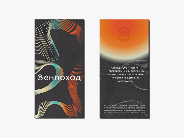
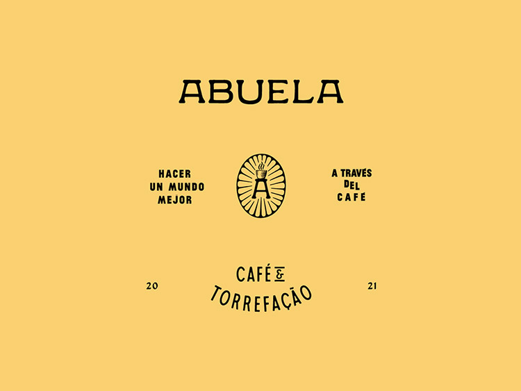
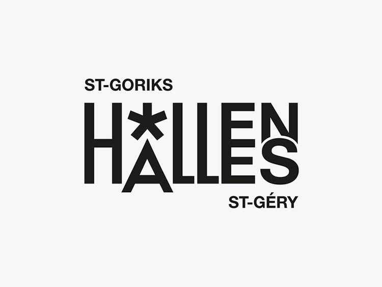
As a graphic design trend, vintage aesthetics comes and goes, but since 2023 we have it as a full-fledged trend in logo design. Yes, it’s still all the rage.
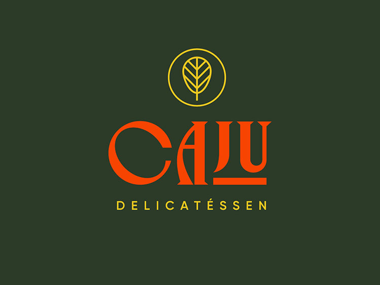
A couple of years ago retro in branding was more of an experimental or artistic solution. Today designers strive for balance between building strong brand awareness that aligns with core values and implementing elegant vintage aesthiects to catch audience’s attention. And that’s it! All those elegant old-school fonts and countless projects with traditional designs on Behance featuring vintage-style typography have finally found their clients in various niches, from resturants to healthcare. Despite the fact that sans serifs remain the main choice for logos, such a spread of retro aesthetics is amazing and gives hope for fresh eclectic solutions. Even now there goes one successful redesign after another, and they all feature typefaces that originated from the 1960s-1980s. And they look jaw-dropping. And get all eyes on them.
WAVE | branding
It’s an excellent sign for a logo trend to go beyond indie studios, small businesses, boutiques, salons, and individual creators and meet the broad community with its own vision of good design. For them, a good, attractive logo design should be understandable and memorable — these aren’t the features of a fancy designer’s stuff. That’s why even the fact itself that there is increased interest in retro design from real people means the world for this logo trend in 2024.
Searching for inspiration, it makes sense to check Behance projects. There are lots and lots of studios actively playing with experimental vintage typography and trying it for branding purposes — so you’ll probably come across someone who will share your personal feeling of perfection. On the other hand, as the world is increasingly interested in graphic design tendencies and logo design trends imposed by the industry’s leaders, we can count on some big companies to teleport their wordmark logos to the previous decades.
There are multiple logo design trends related to simplifying logos and minimalism — probably this one is the most illustrative of all. Every one of us has in mind the brand logos created as a genuine piece of art. Animals, florals, mythical objects, creatures, coats of arms — inside the logo, they demonstrate mastership and fascinating attention to detail. True, such logos look striking (as long as the image is high-quality, of course), but they lose other types of logos from the point of responsive design.
New Logo for Botanic Gardens of Sydney
New Logo and Identity for Nationwide
Responsive logos are one of the most significant “inventions” in branding, allowing companies to seamlessly transfer their logos from website headers to smartphone screens and badges. Around six years ago, it was a revolution, but today, hardly anyone considers responsive logos an independent phenomenon or trend. Instead, responsiveness has become a natural feature of a logo, and the movement of symbolism and minimalism proves it.
Realistic logomarks are cumbersome and inconvenient, especially when placed on smaller screens or compact business cards. And here come the simplified versions or brand new minimalist logos, which save lots of designers’ time and effort. They make it possible to create a single logo design that will look well everywhere — or it will be less tricky to divide it into separate elements. Mainly, this logo trend isn’t about visual beauty and style but convenience. A symbol-based logo is far more flexible, and its delicate appearance is a bonus, not an end in itself.
MOVIO – Logo Design I Furniture & Interiors Branding
If you think that vintage outburst is the most aesthetic logo trend in 2023, let me prove you wrong. Modern typography will have plenty of room to show all its aspects in logotypes, and we’ll finally see those fancy fonts in action! 2023 was announced as the year of experimental typography — precisely when we saw all those glitchy, wavy, and chrome types. Since then, they remain all the rage, and large type foundries on Creative Market and My Fonts release one best-seller after another.
It took two years for logo designers to look at fancily drawn letters and see how they could use them in projects. In fact, it was the same as with vintage logos. It all began with concepts, where creative minds played with the most outrageous types, color combinations, patterns, and graphics. Then followed the entrepreneurs who are always the first to try something new: hipster cosmetics brands, breweries, and street food. Then something impossible happened: last year, Nucao, a German chocolate brand, switched from an understandable and highly legible sans serif logo to one featuring an experiments type. I knew it was a milestone.
Nucao isn’t the only company that gave a go to experimental typography and profited from it. There are others: deliveries, food producers, convenience stores, and other companies targeting broad audiences. More and more each month, and even more rebrandings are yet to come! Something massive’s happening and proving that fewer people fear fancy branding, and well, fewer branding designers and businesses fear logo trends.
Artistic typography will become an escape for the lovers of serif fonts. Although they now go as a timeless classics, not a trend, you can always try some artistic variations. Yes, all those elegant serif fonts from 2022-2023 still shine bright like diamonds in branding and packaging. Yet, if you want your logo not just fancy but hip, pay attention to more twisted serifs.
While bold experimental typography isn’t a trend for everyone, sans serif fonts are the story everyone knows and understands. It’s been quite a while since designers refused fancy scripts and serifs in favor of sans serifs. This process has already slowed down a little. But as there is a general tendency, we can state that it’s still a logo design trend for 2024 — which, by the way, is supported by the popularity of simple logos and primary geometric forms we wrote about above.
New Logo and Identity for Glassdoor
New Logo for Johnson & Johnson
New Logo and Identity for Nokia
The motivation to refuse fancy fonts is simple — it’s much easier to work with sans serif fonts. Adapting them to different screens and canvas sizes for various social media platforms and mobile apps is less complicated, so they fit responsive logos more. What’s funny is that a couple of years ago, we observed an opposite process: many companies switched from sans serifs to serifs, as the retro design was hugely popular. Today, despite retromania getting back on stage, the healthy pragmatism is still there, and we can be sure to see lots of reserved sans serif text-based logos.
If you think that a sans serif logo is boring, you likely haven’t sensed the incredible variety of fonts with tons of geometry features, weights, and color solutions — as well as outline styles and lowercase-letters-only logo designs. We’ve even seen some sans serif to sans serif rebranding, which looks jaw-dropping and attracts attention better than the most exquisite script type. It is a great way to create impactful logos with personal touch, build emotional connection with target audience and leave lasting impression.
Experiments with minimalism could not bypass the lettermark logos. Either because designers have not paid attention to them for a long time or because they’re minimalist, even ascetic form, does not fit the general trend of creative search. However, the works of the end of 2023 and the latest logo design trends show that aesthetics and functionality can be combined in one letter or emblem.
New Name and Logo for JLR
Lettermark logos and emblems seem outweighed by more visually appealing vintage logos or experimental typography. However, when it comes to practicality, there are basically no equals to them. They demand little space, perfectly match with other elements, and adapting them to small screen sizes or business cards is elementary. Overall, this logo design trend reflects the understanding of responsivity by the modern design community.
If you want to go bigger, brighter, more expressive, this trend is hardly for you. But it is important to remember that a beautiful picture is not the essence of design. And logo trends are made to improve graphic design work, not to sabotage it. So from this point, working with lettermarks takes on a new meaning: to express in a single element the entire philosophy of the brand, its tone of voice. And at the same time, to create something ultimately appealing and meeting the aesthetic needs of the target audience. Sounds more like a challenge, doesn’t it?
Taiwan Design Expo 2023
Manor brand identity
New Logo and Identity for Harvard Graduate School of Design
Scribbles, sketches, natural patterns, and doodling are some of the most distinct logo design trends in 2024. Although it seems that freeform drawing has already exhausted itself, the increasing popularity of recent projects demonstrate right the opposite. The key to its revival is the steady interest in a designer’s personal approach to the brand. And apparently, there’s hardly anything better for that than fast sketches, hand-scribbled typefaces, and shapes drawn in a unique style.
Pazzesca
LAGO identity
Be prepared for more freeform shapes in logo design, as well as amusing logos and fast-drawn cartoon characters in corporate branding. Hand-drawn elements in logos, produced in a fast and unpretentious manner, are welcome, too, and we’ve already seen projects and teams that have their brand name written this way.
All of the mentioned logo designs will be celebrating the raw, unfinished look. And even if you are a passionate lover of clean minimalism and traditional logo aesthetics, for some brands, such a throwback from the mid-2010s will be the best way to deliver their aesthetics. You can even play around with pixel art style logos, as it is also the digital art that brings you back in time and gives much freedom.
The year 2023 can boast a few distinct redesigns that partially determined the fate of logo design trends in 2024. That’s how I actually work: I check the creative experience of the leading companies to see what visuals they’re up to and then define a general tendency. Of course, Behance and Dribbble do provide many more fresh, outstanding, and totally jaw-dropping designs that capture attention right away. However, only some of them reach the board audience and have such a strong impact on the entire industry. Yet, there are exceptions, too! For example, all aesthetic solutions, like vintage logos or twisted typography, that are modern logo design trends as well, are an accomplishment of indie studios and creators.
But let’s get back to the most significant logo designs of the past year!
In September, Dribbble introduced their brand new logo, created with an eye on the 50s typography. This redesign has greatly fuelled everyone’s interest (and anticipation) of vintage vibes in branding. And here they go as one of the major logo trends for 2024.
New Logo for Dribbble
There’ve been many more logo redesigns associated with typography. Creative typography, to be more exact. My favorite logos are the ones for Toggle, and Meridian. Each celebrates the anticipation of sans serif font as the most prominent element of the new logos. Find sans serifs boring? All these companies prove that you can go creative no matter what, and sans serif logos stand out.
New Logo and Identity for Toggl
New Logo and Identity for Meridian
I absolutely loved the new logo of the Oregon Zoo. To me, there is no more convincing confirmation that symbolism will be everywhere. Done with realistic logomarks and unnecessary elements, seriously. And even though they opted for quite a traditional typeface, it doesn’t kill the brilliant realization of logomark.
New Logo and Identity for Oregon Zoo
Logo Trends to Leave in 2023
Obviously, no clear boundary would separate the logo design trends of 2023 and 2024. Most of the trends at their peak have been with us for quite a while, so you shouldn’t expect any global changes.
However, we can safely say that, for example, negative space or 3D, which were extremely popular before, are unlikely to become the main character of the logo design this season. There have been quite a lot of them in the past few years, so the community has tired of it. The same happened to animated logos, one of the most promising logo trends back in 2021. By itself, animation is a popular trend that continues to capture attention of the audience, and this is a winning technique for branding presentation — but unfortunately, it didn’t prove viable. Since animated logos are applicable only in digital design, the inability to go out to the masses played a cruel joke on them, and the main feature — animation — became a disadvantage.
Finally, the fate of any trend is determined by many factors: from the social environment to separate tendencies of the digital world. Art Deco, Scandinavian design, or Boho failed to make a fresh appearance in 2023, as many businesses and creators were craving pragmatism from one side and a new artistic vision on the other. Consequently, the same can happen to any of the trends on the list, and up to customers to decide what a successful logo will be like in 2024.
The upcoming logo design trends of 2024 are the bright colors and gradients, which will substitute the modern aesthetic of muted pallets of 2023. Minimalist logo designs are still on the wave, so you can feel confident creating reserved branding with clean lines, sans serif fonts and simplified graphic elements. New logo trends will give you much inspiration to break free from traditional norms.
You can source inspiration from two major logo trends: vintage wordmark logos that spark elegance and creativity (simplistic style of Coca-Cola aesthetics, for example, is as relevant as ever before) and minimalist logos with not many graphic elements picked by many brands already. Choose your best option depending on your concept, your business’s needs, and whether the logo will be displayed on small screens of mobile devices.
2024 logo design trends will celebrate symbolism and typographic creativity. On one hand, you are free to play with simple forms to convey complex ideas and create logos thatreflect your brand’s identity . On the other, you can use the most exceptional typefaces and shapes. Or merge both concepts to get impactful and memorable logos that maintain visual impact.