It’s been a while since I started observing how Art Deco for some reason was getting back after its oblivion. Should we explain it by its penetration in interior design? Or gorgeous design resources which are released more and more often to add some sparkling to your projects? I vote for both. For me, since Art Deco design style is of French cultural heritage (and one of its most remarkable pieces), it will always run a specific part of the modern industry to speak about.
More than just another design movement, Art Deco imbued the philosophy and social moods of that time. Its star arose between two World Wars, where Europe (France, to be more exact) was starving to return its greatness, majesty and wealth. Chanel, Tutankhamun and Egyptomania, Machine Age, clean geometry and gold pattern — there they all met.
Origins
The name of the movement, Art Deco, comes from The International Exhibition of Modern Decorative and Industrial Arts, held in 1925 in Paris. The decorative arts section there was filled with classic modernism complemented by new materials and design. The innovations were about combining exotic woods, ivory, gold, and pearls with geometric forms, lines, zigzag patterns, and flower garlands.
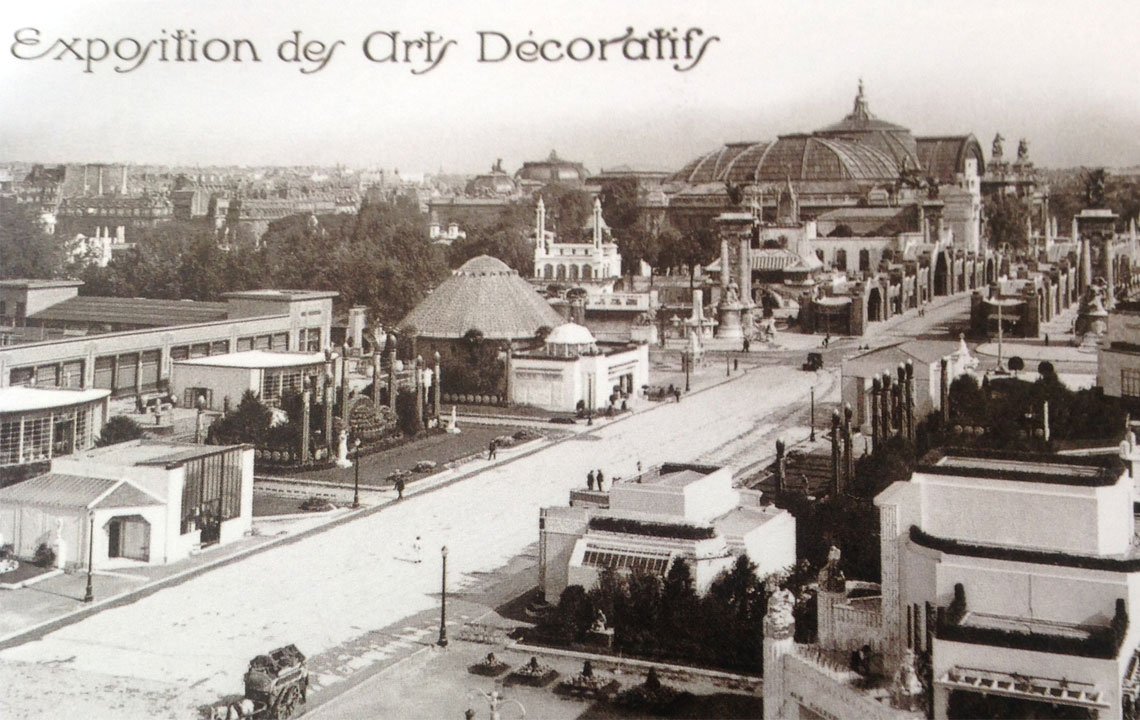
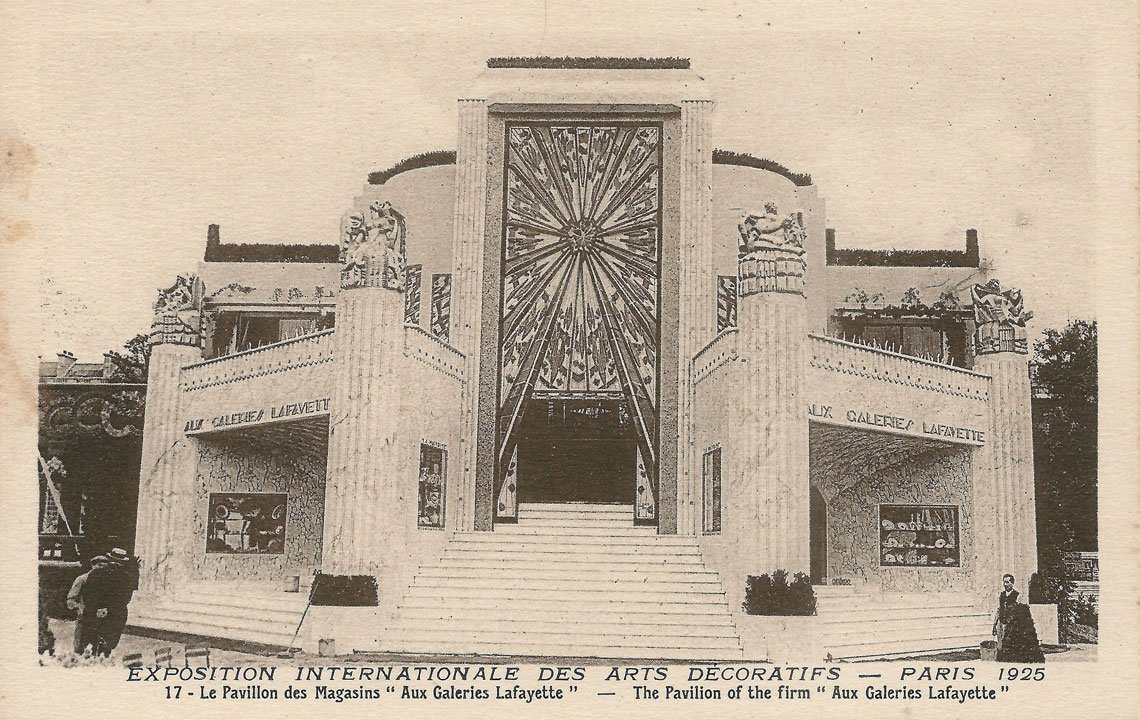
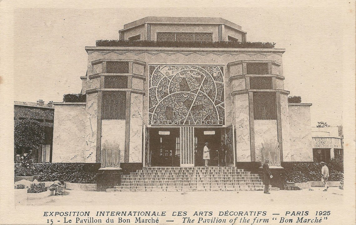
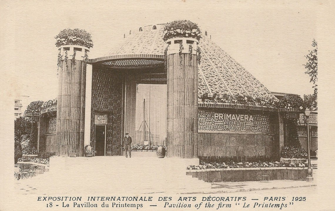
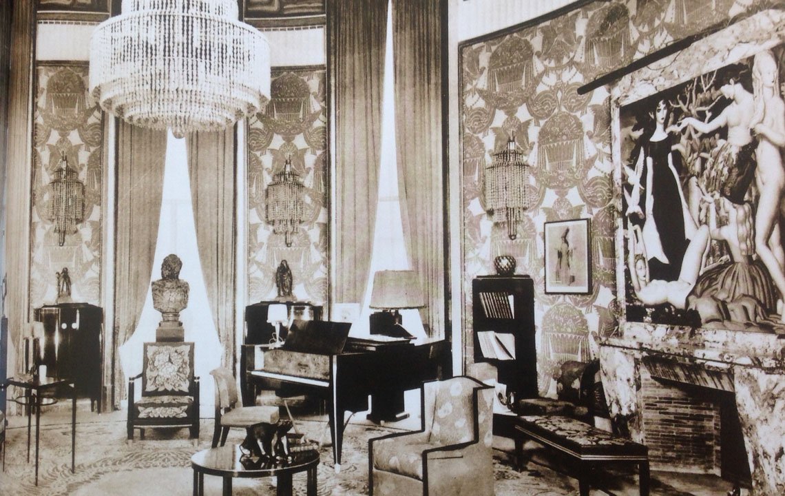
The historians explain such artistic splash by a rivalry between Germany and France. Germany produced furniture and sold it all over the continent, so France had to beat it by producing highly-competitive production where new trends and a vaster functionality would have been implemented.
As a result, Art Deco style absorbed everything the country and entire Europe had reached by that moment. First, Art Nouveau floral motifs (which were already a step away from rigid classical and hierarchical structures) became more geometric and streamlined to reflect the glamorization of the industrial revolution.
Second, the Egyptian and Antique discoveries which had already driven the continent mad set off mosaic, zigzag and ethnic patterns, mostly made in gold on a contrasting background.
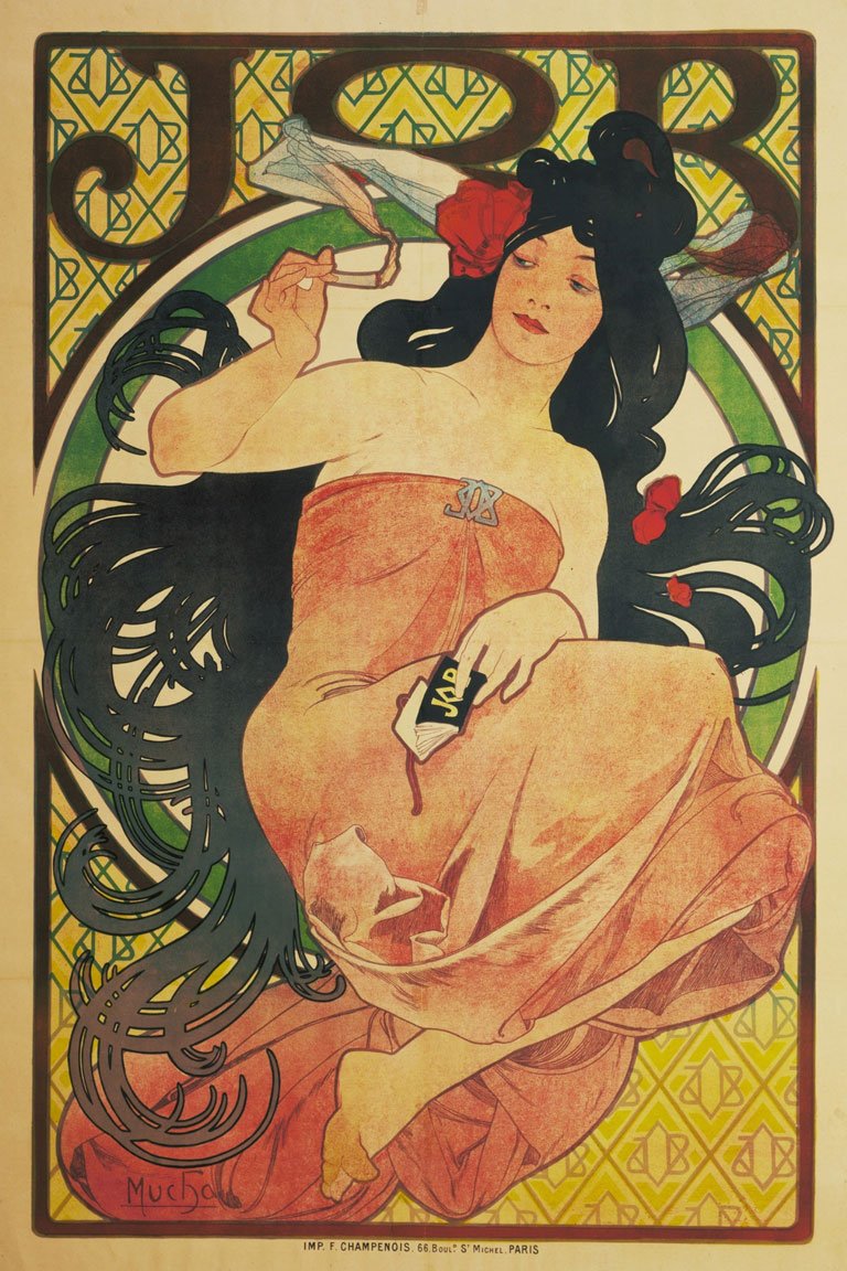
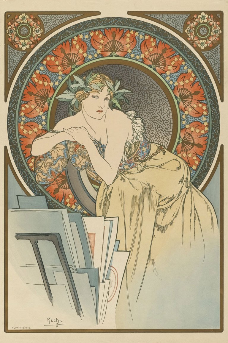
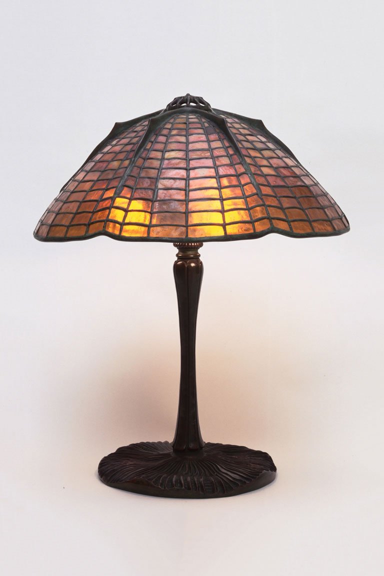
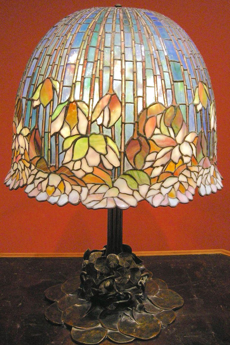
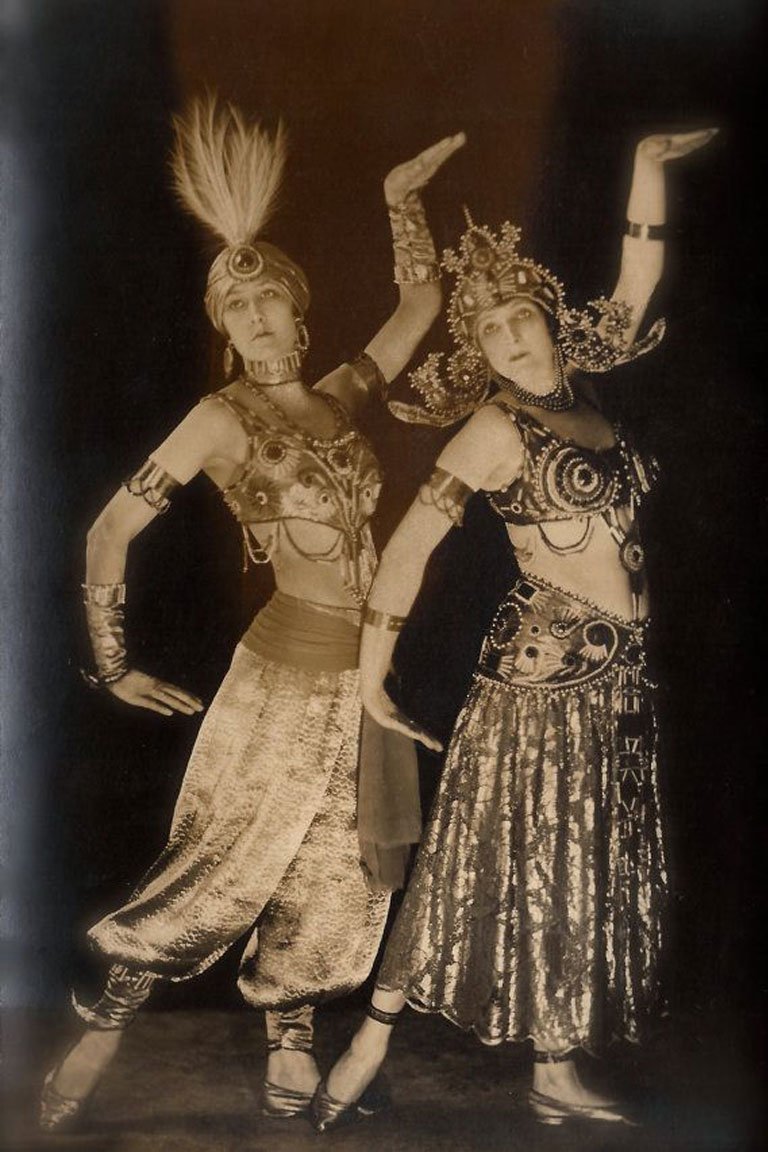
Third, it was the time of Coco Chanel, who remained quite frosty about diamonds and preferred pearls and faux bijoux. Thanks to her the Art Deco jewelry got accessible to the middle class and the trend was given a boost. Along with such fashion houses as Cartier and Louis Vuitton, she got into creating the new fashion, that had made a significant impact on Art Deco graphic design canons and vice versa.
The triumph of Art Deco was not so long, though. After the Second World War, French economics was too weak to support its richness. The social mood, the focus — everything had changed. If in the mid-20s Art Deco with its odd mix of trends used to be the embodiment of luxury and cultural uplift, in the late 40s it’s got treated as vulgar, violent and too glaring.
Art Deco as Is
Art Deco was born as a furniture & interior trend, that quickly took up architecture, fashion, and graphic art. And they all spoke glamour thanks to color solutions, tons of gold, intricate textures and fancy geometric patterns.
The new style, elaborated by French artists, decorators, and architects had ensured Paris a fresh look — and then the whole world, as it was quickly adopted by the United States. Was there any other trend to get a similar swing? I doubt so.
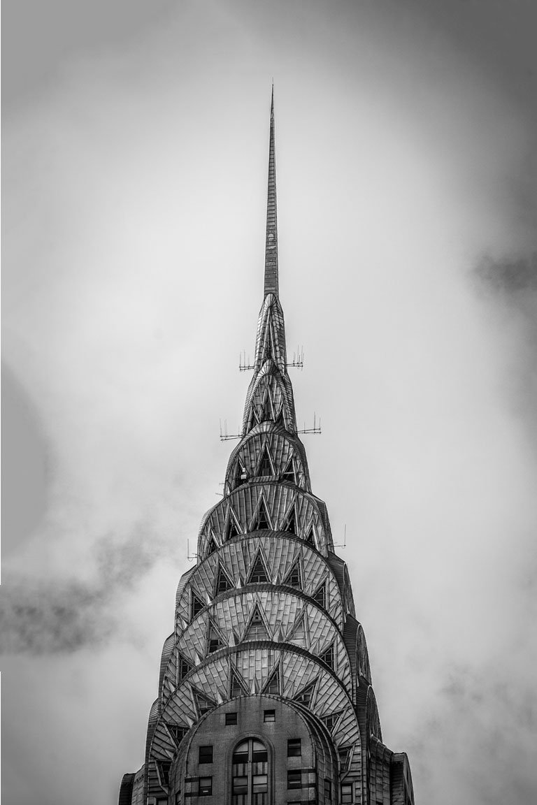
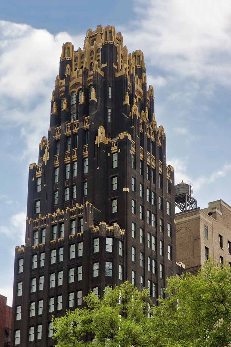
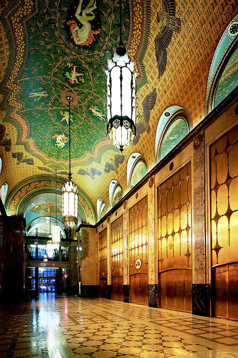
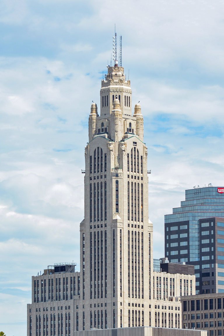
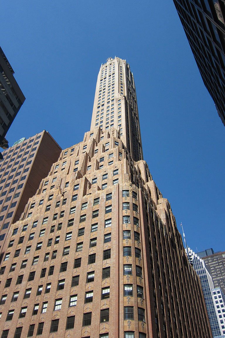
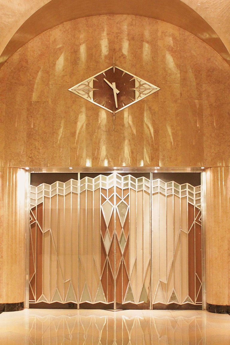
Art Deco architecture was characterized by straight lines, an ultimate geometry and sophisticated decor: gold lettering, sculptures, and glass. As for the interior, it was about heavy patterned velvet curtains and textile, sculpture (again) and paintings with massive ornamentation. Everything at a time and it remained charming nevertheless.
The illustrations and covers of famous magazines got into the new wave too. Art Deco had a great influence on the art of illustration. And the Art Deco posters, including the ones for the Ballet Russe witness that everything, from the painting style to colors, was new.
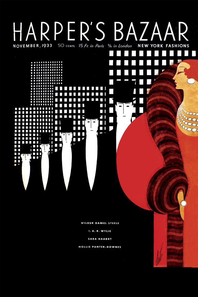
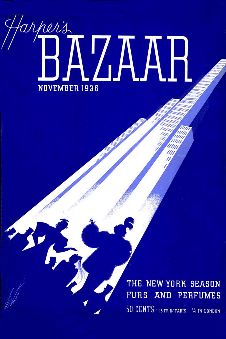
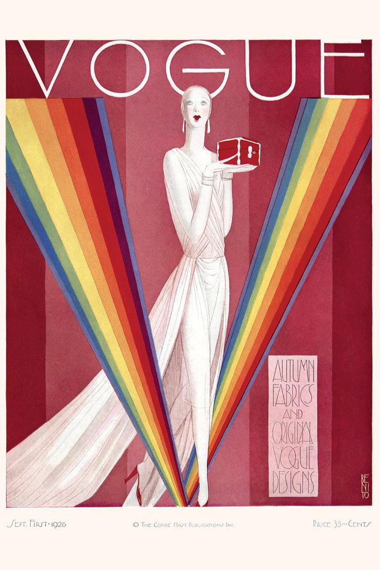
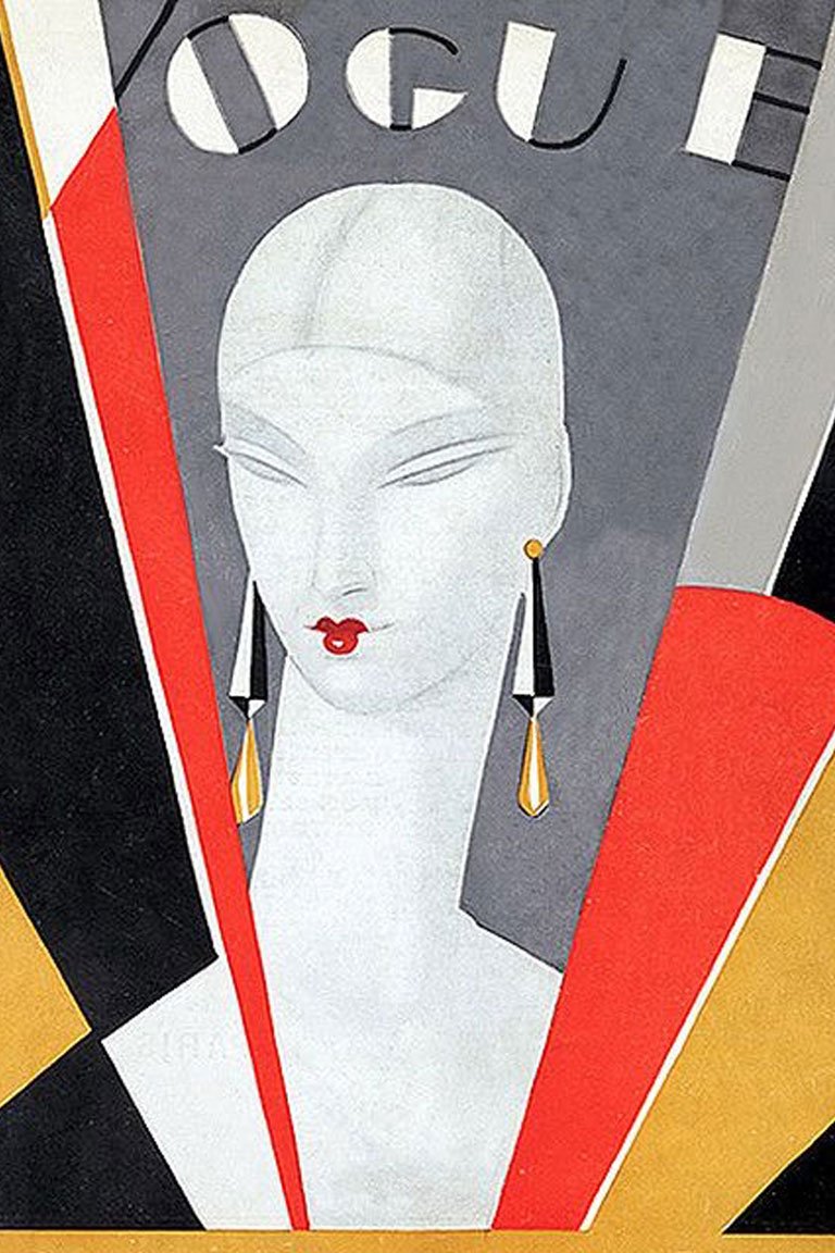
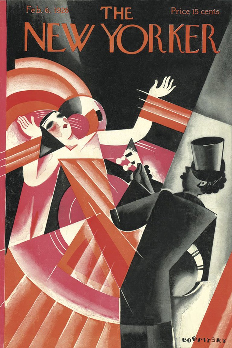
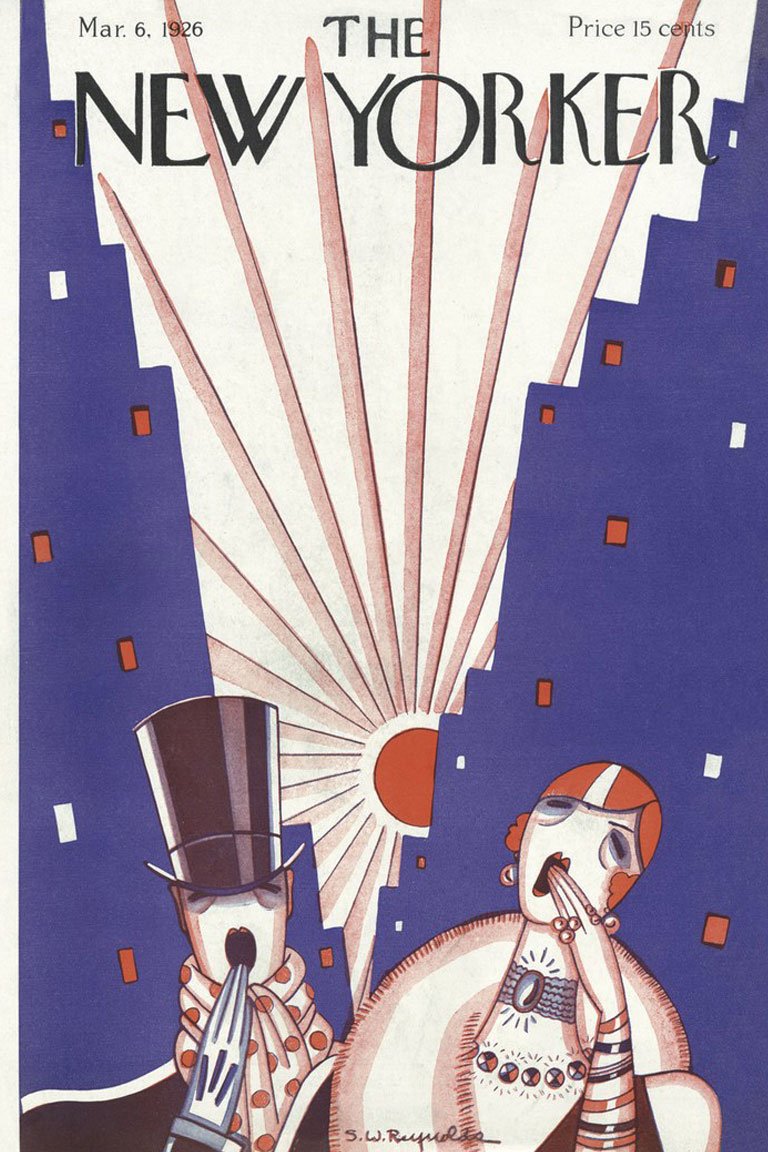
Further on the French La Gazette du bon ton and then American Vogue, Vanity Fair and Harper’s Bazaar quickly adopted the fashion trends and introduced new illustration style, that is now so characteristic for the 20-40’s. Bold, revolutionary colors, more sportive and daring female images, which brought charming luxury along with emancipation and industrial vibes.
Current Situation

Art Deco stands in a row of outstanding design trends the humanity has ever come to, so it’s clear why creatives return to its canons. Yet it’s true that the so-called deco art is not as popular as it used to, graphic designers still discover its retro vibes in patterns (of course!), typefaces and various decor elements, which make this style an inexhaustible source of inspiration.
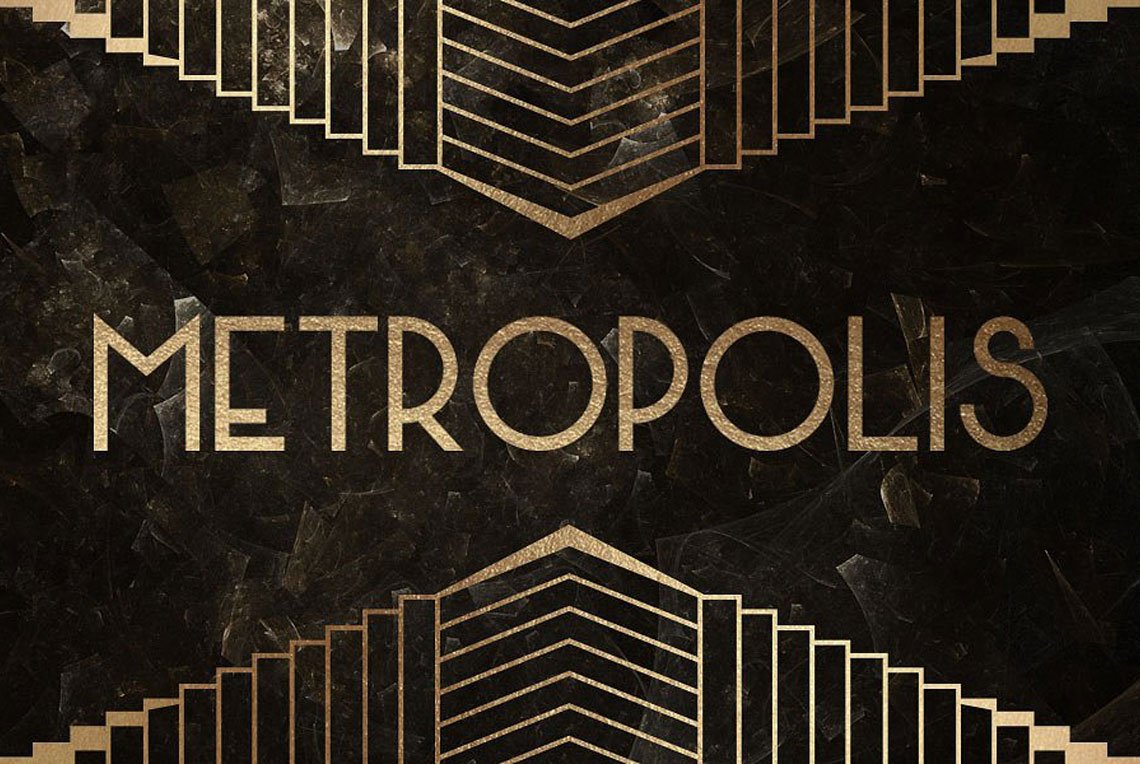
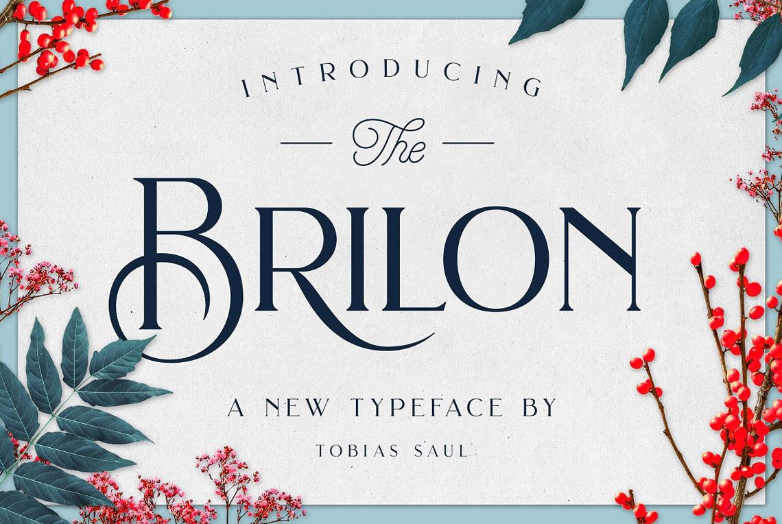
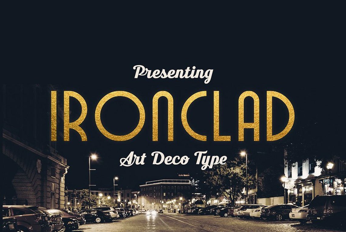
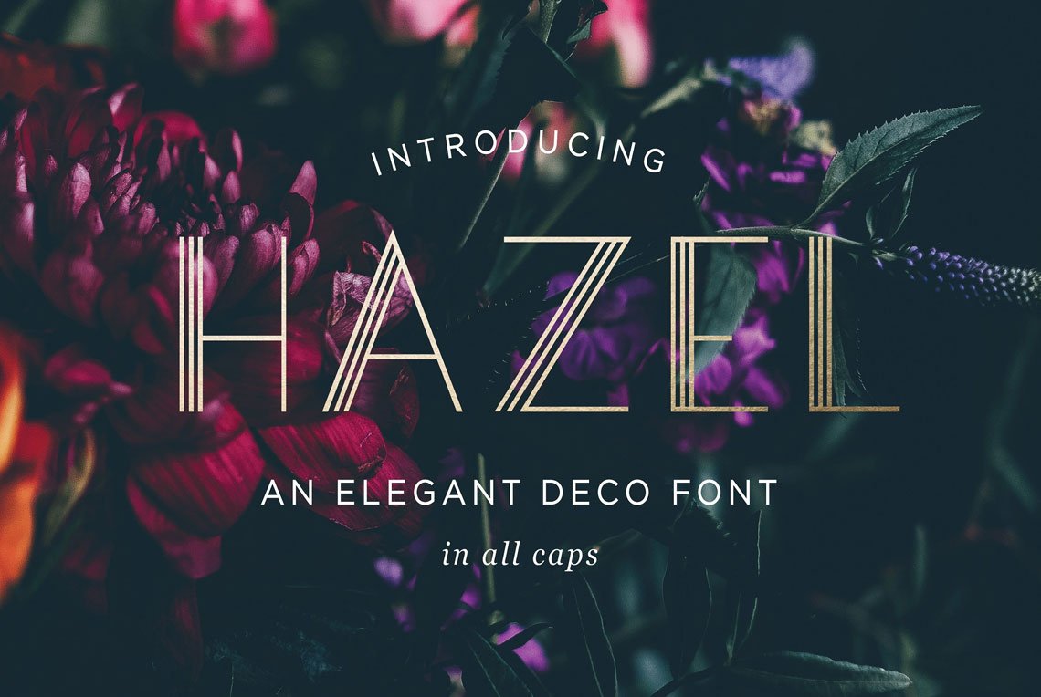
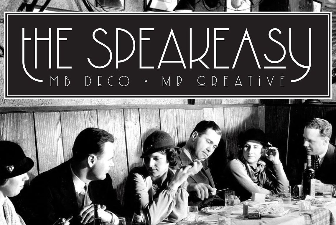
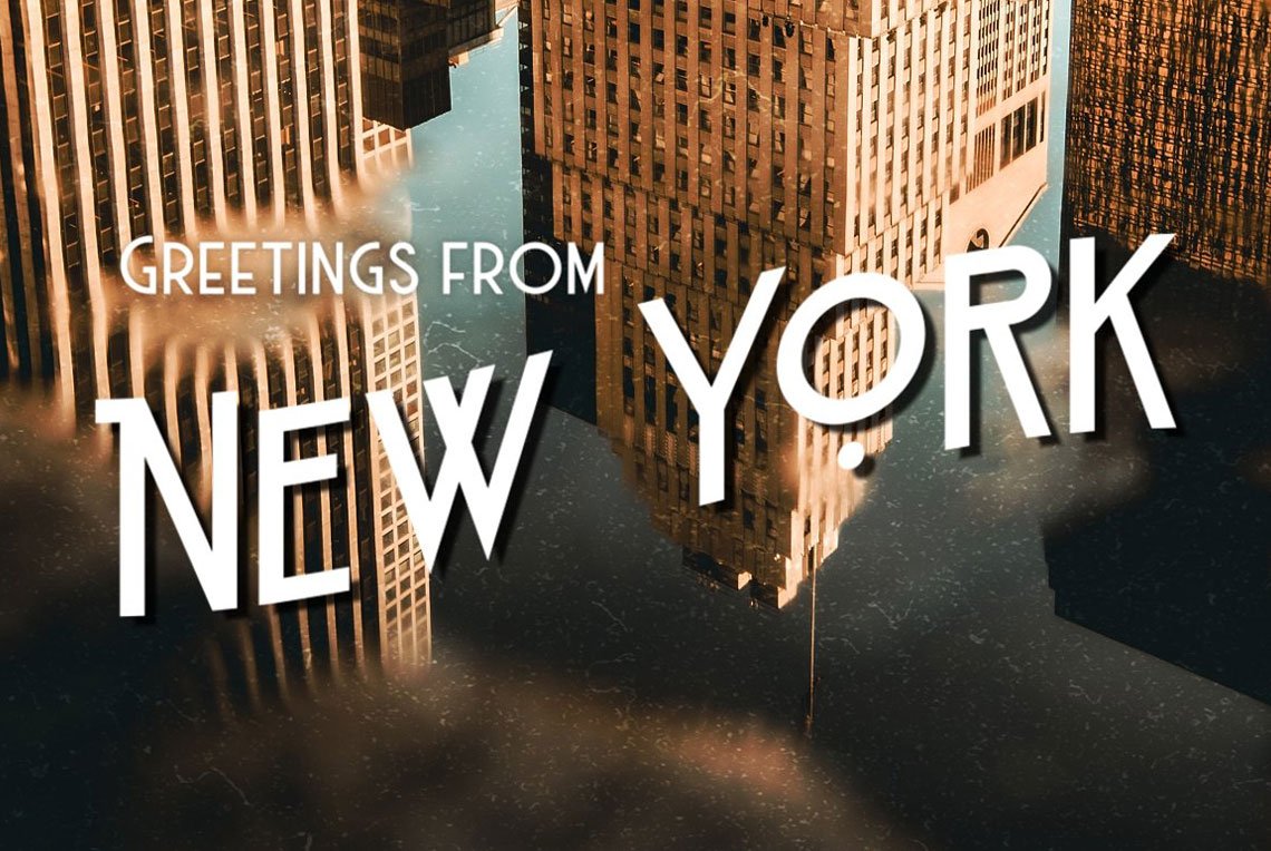
Art Deco fonts represents a class of fascinating display sans typefaces which go with Great Gatsby, cabaret and jazz. They escape from all pretentiousness focusing on straight yet elegant lines, ultra-simple geometry, and oblongish letters. The more gold texture you add, the closer you bring the copy to the good old 1920s art.
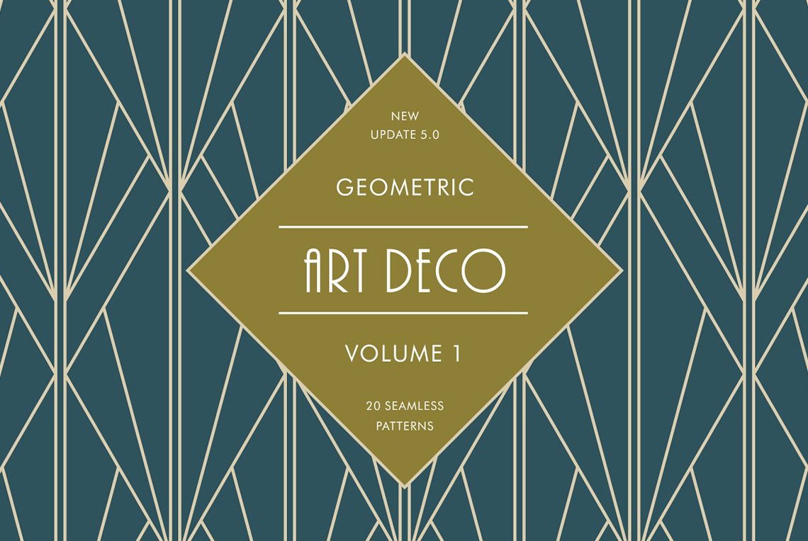
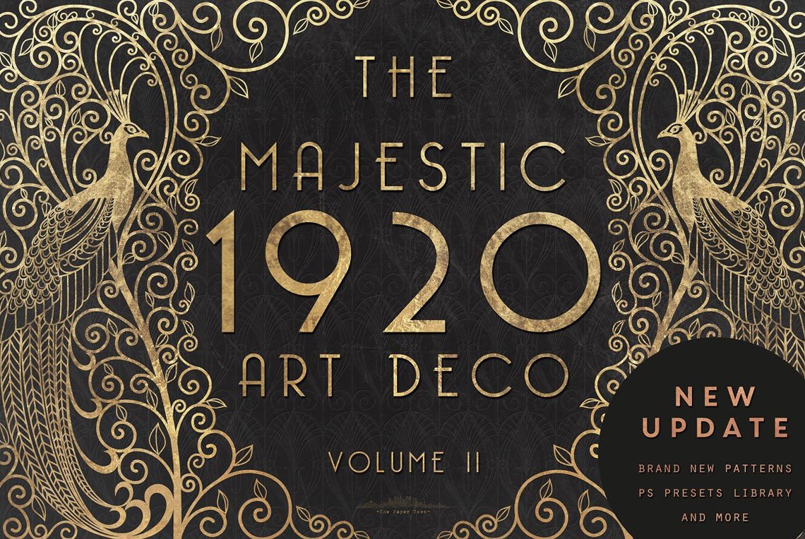
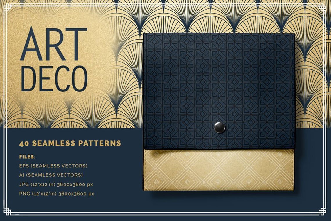
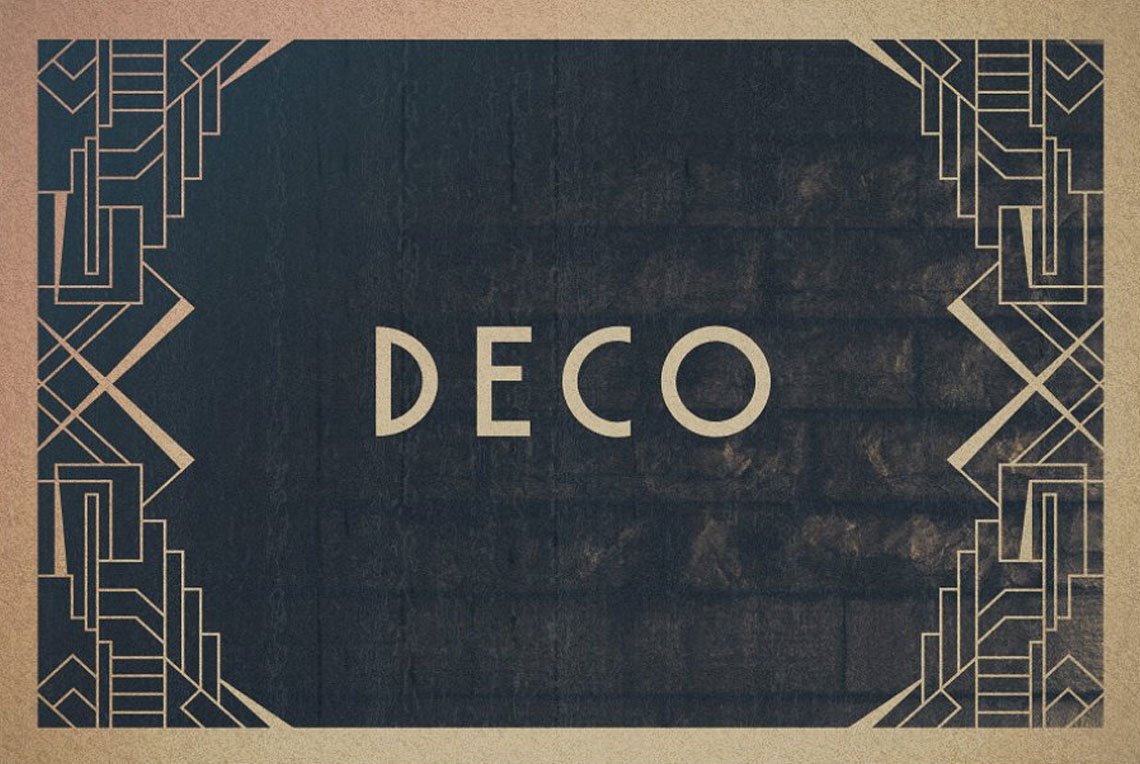
Pure Art Deco style today is primarily about the ‘archeological’ features. Arches, buttresses, and columns along with the pivotal traits of the style to construct the retro variety on design marketplaces. Strict shapes, loud colors, sunrise motifs, streamlined and sleek forms come along with metal gloss, which remains an irreplaceable attribute.
It’s curious that floral patterns, appear rarely and are mostly attributed to Art Nouveau (which is correct but not critical). That creates a very particular perception of modern Art Deco: geometry is the key, whatever the design product is.
With its excesses and kitschy nature, Art Deco may be repellent for today’s audience, and they have their reasons. It’s hard to think of another design trend that would embrace and give so much at one go without losing balance between visual harmony and fussiness. Hopefully, the modern graphic design embodiments represent only a bit of genuine Art Deco, without oddity and exaggerations. So it feels like a powerful movement has lived its resurrection and brought the best of it, which already merits your attention and interest.

