If you ask me what aspects of life fill me with most of inspiration, it will be music, stationery, and product packaging. In every beautiful piece, I feel a long creative process and meticulous psychological research to catch the customer’s mood, intent, and interest — and that fascinated me more and more.
A few years ago, I started exploring how differently countries and studios approach packaging design. Japanese package was the first field I delved into, and since then every time I do shopping, travel or even go down a rabbit hole.
What was the goal of the creators? Was it to play on the customer’s emotion, make them more tangible and valuable? Was it to show the product and help every person establish contact with it? Was it simply a wish to show the mastership or an ingenious idea, that would define the product and create an image for years? Every time I run into a stylish pack of biscuits, I’m all about these questions.
I believe that asking ourselves these questions and seeking to answer them develops a deeper understanding of creative thought and upgrades the skills. No, it’s not about copying another artist’s style. It’s about getting what really matters and what’s essential for you as a creator, because packaging design is multi-dimensional, and there is no style to fit all. And will never be.
Packaging design can balance between purely commercial and social incentives. It may grow around the principles of minimalism, be entirely pragmatic or kitschy — and in any of the cases, it has good reasons for it.
Therefore I’ve built up this selection to help you better understand yourself, find something special in other designers’ work (most of the projects are realized ones, not just concepts). Or at least, it can be a source to draw packaging design inspiration from.
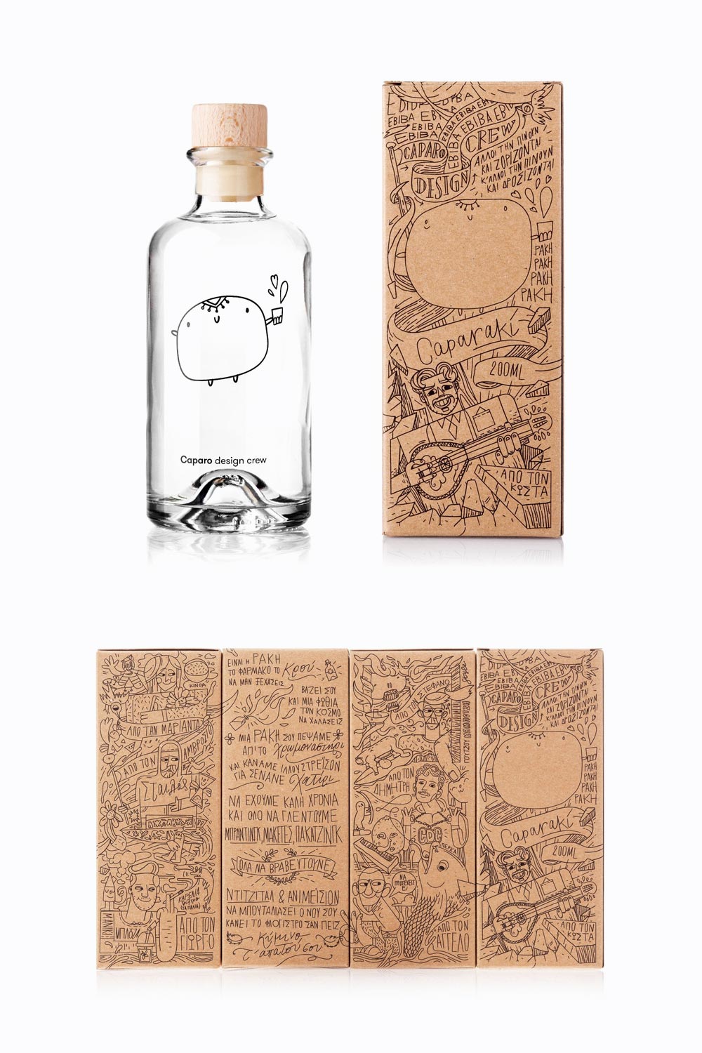
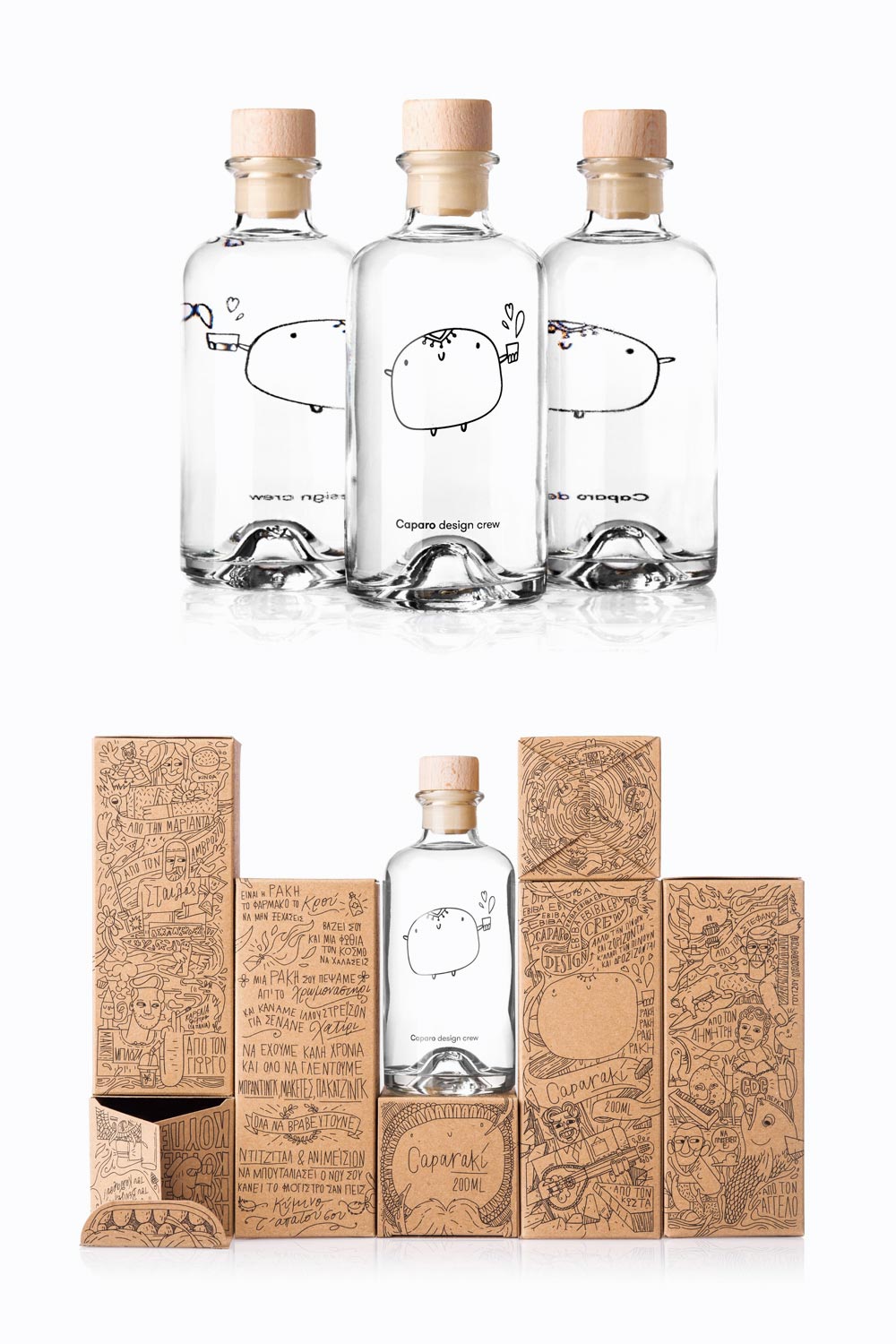
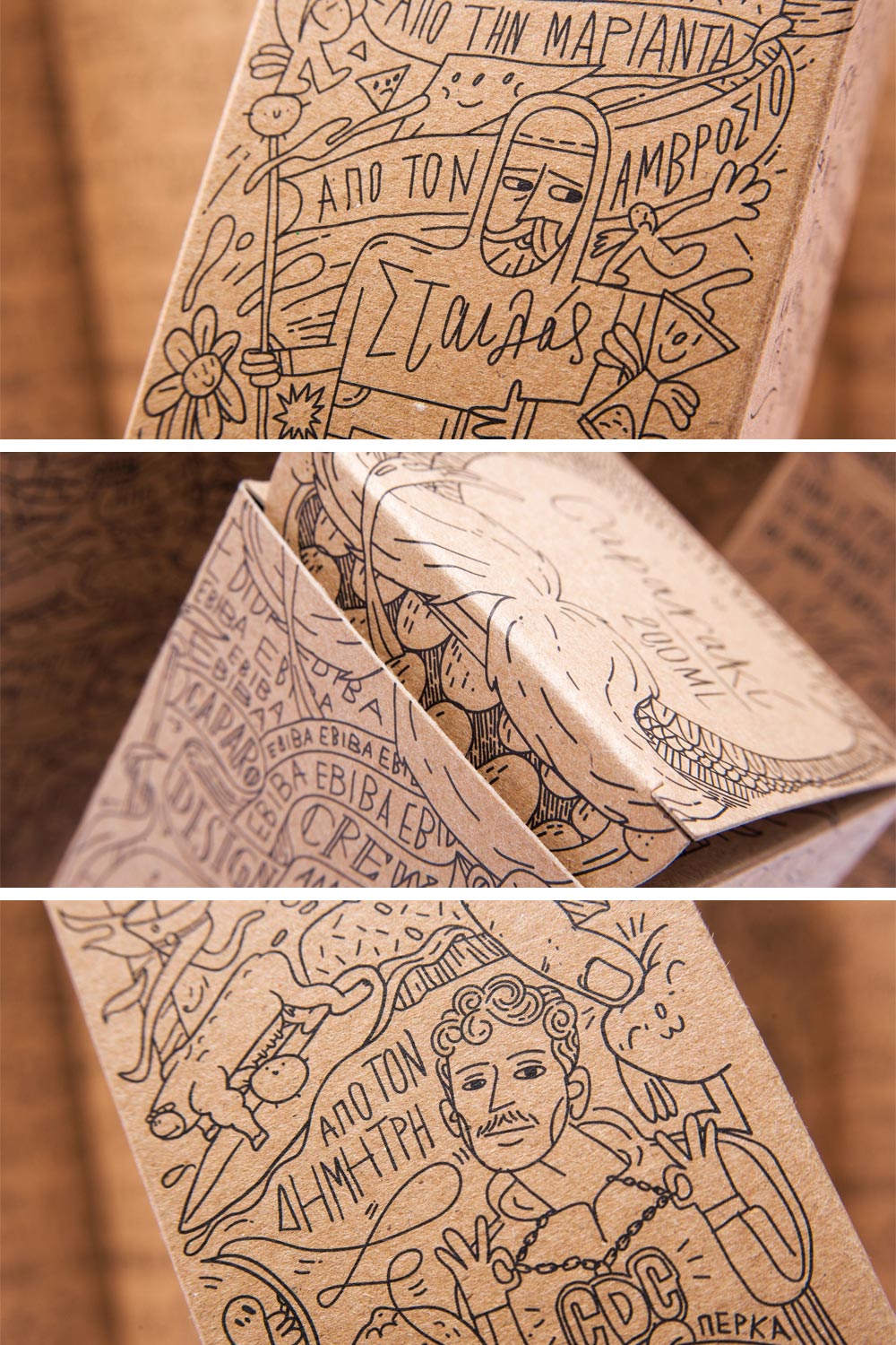
Caparaki
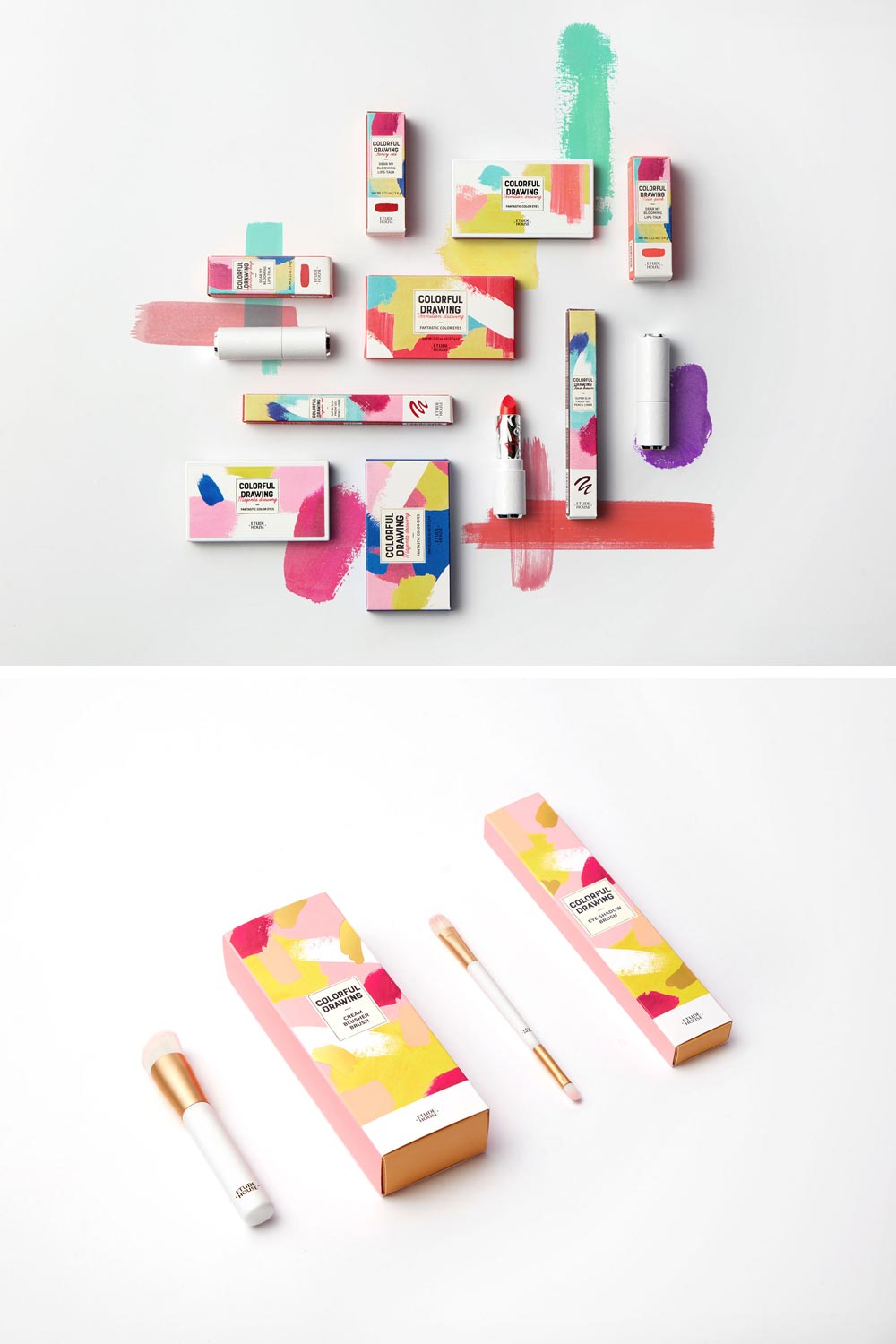
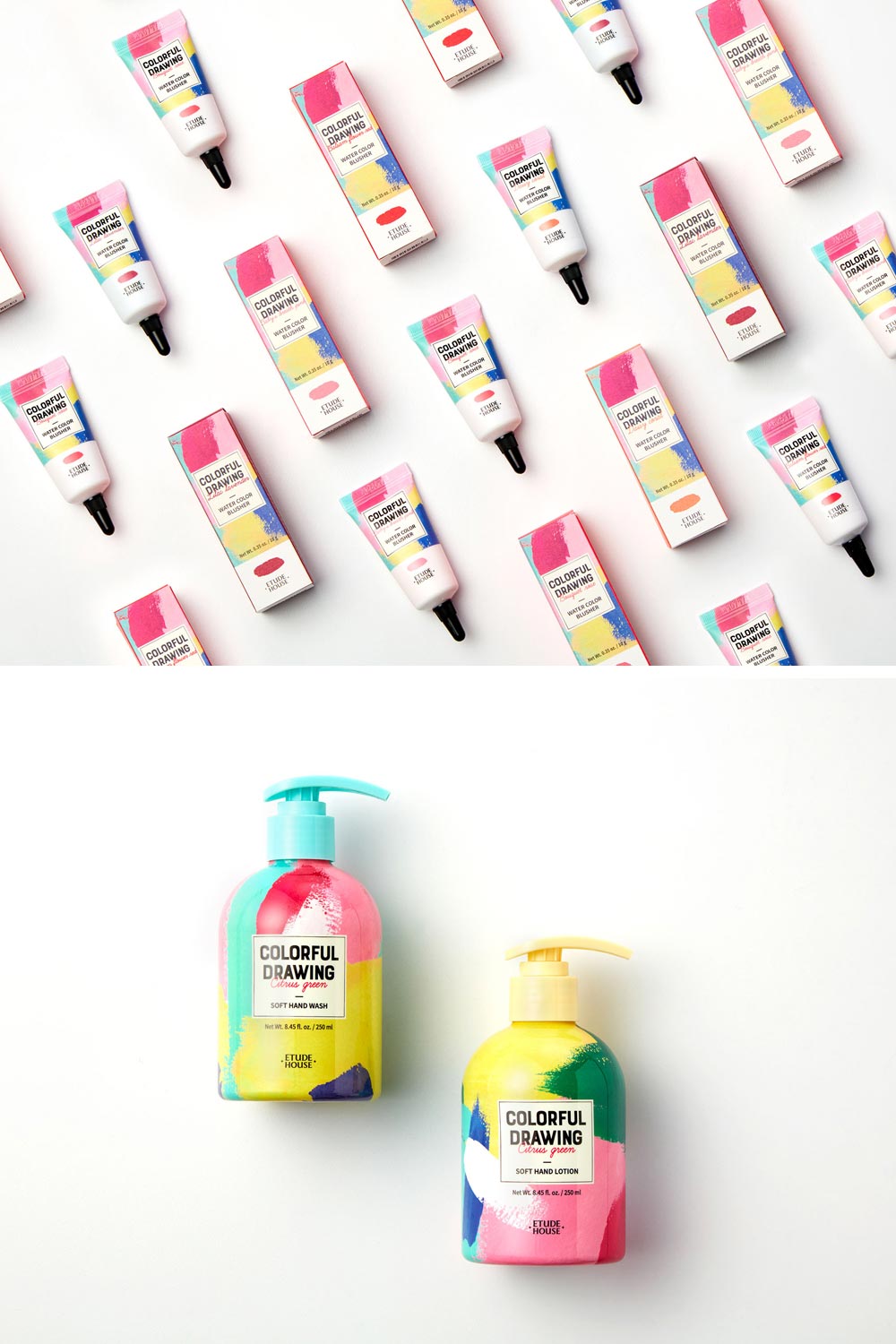
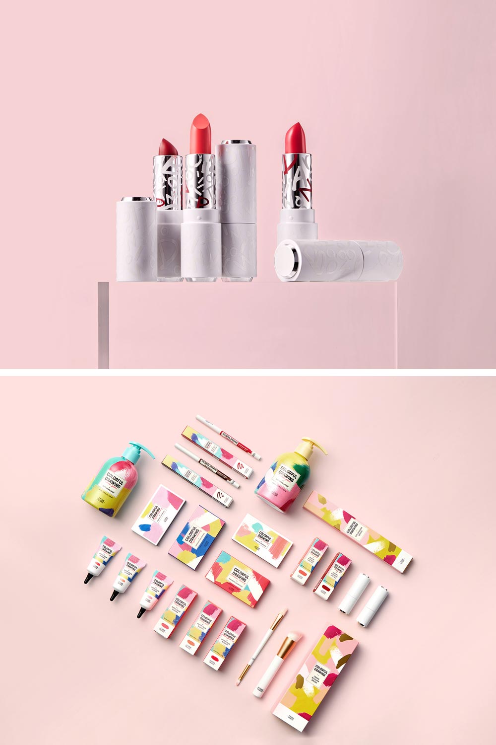
ETUDE HOUSE 2018 Spring Collection ‘Colorful Drawing’ packaging
Nearly every cosmetic brand has a collection with a similar style of packaging. And that makes sense: as opposed to minimalist design, abstraction combined with juice color palettes sounds fresh and new.
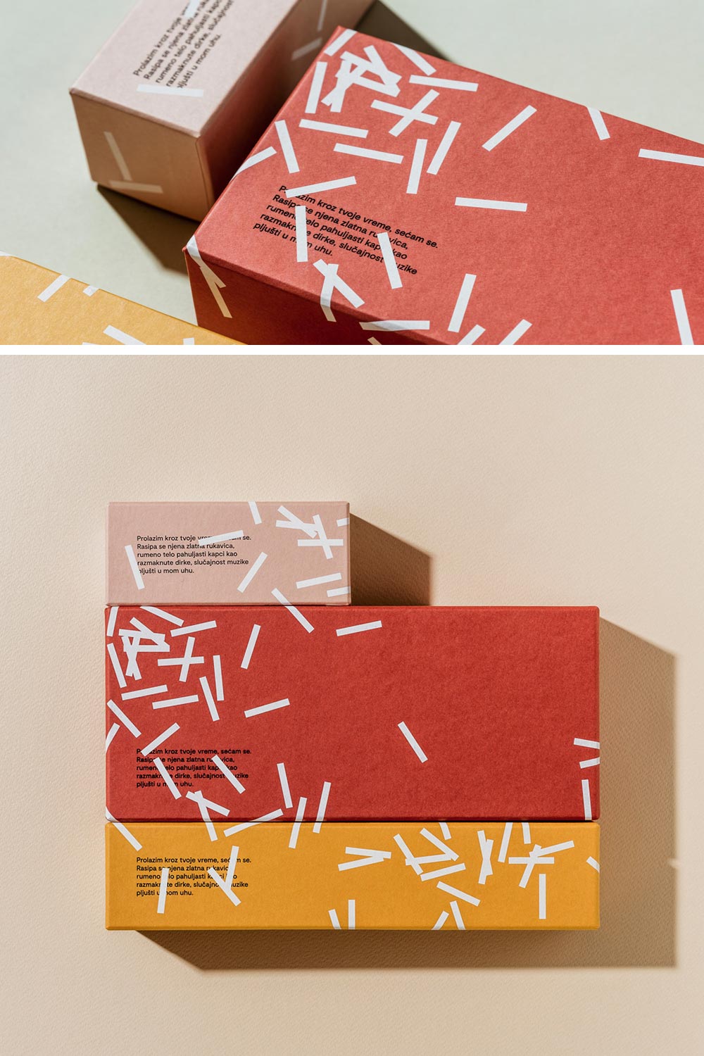
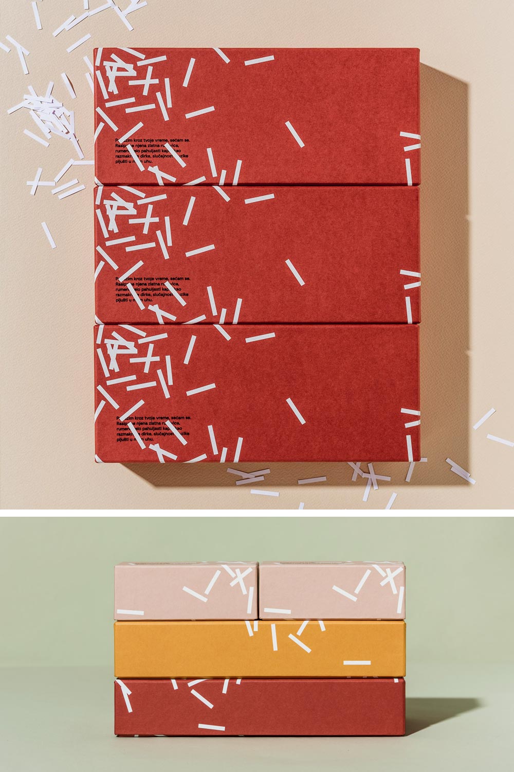
Fini Confetti Package Design
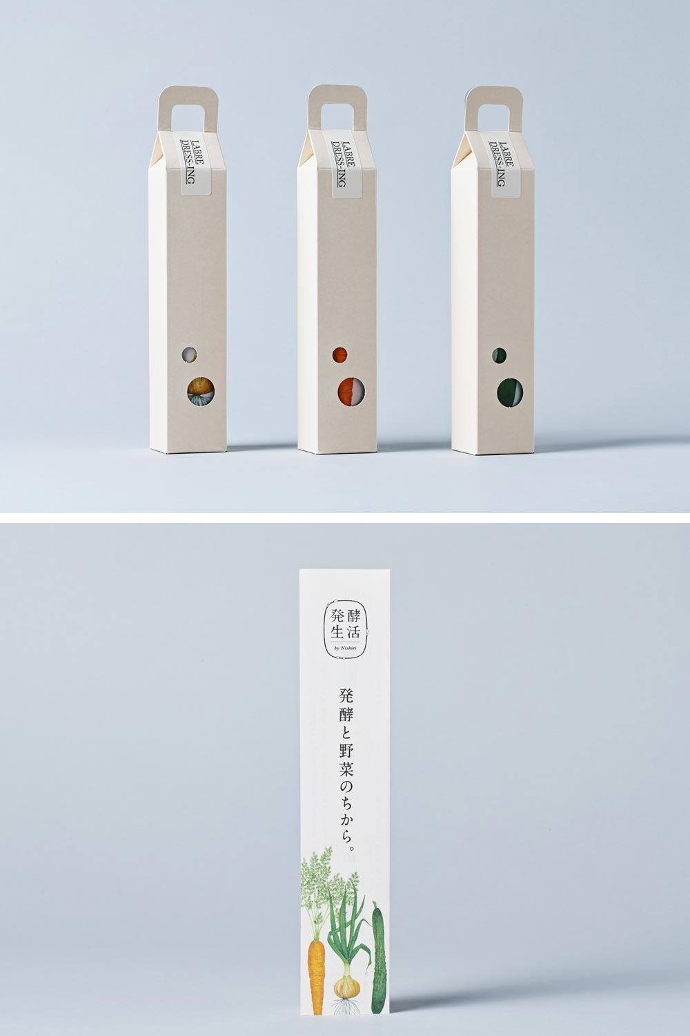
HAKKO SEIKATSU
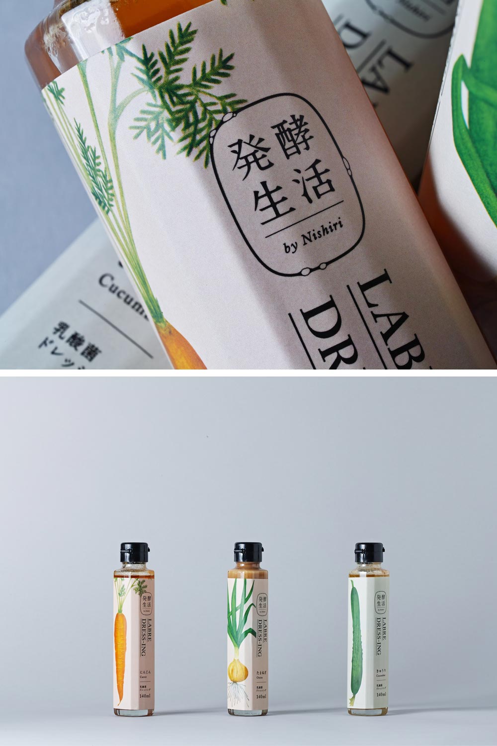
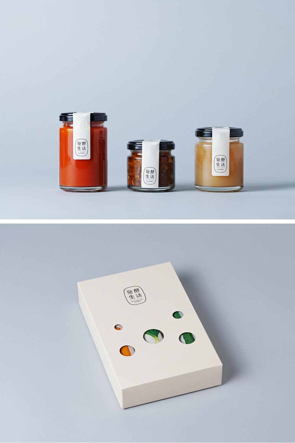
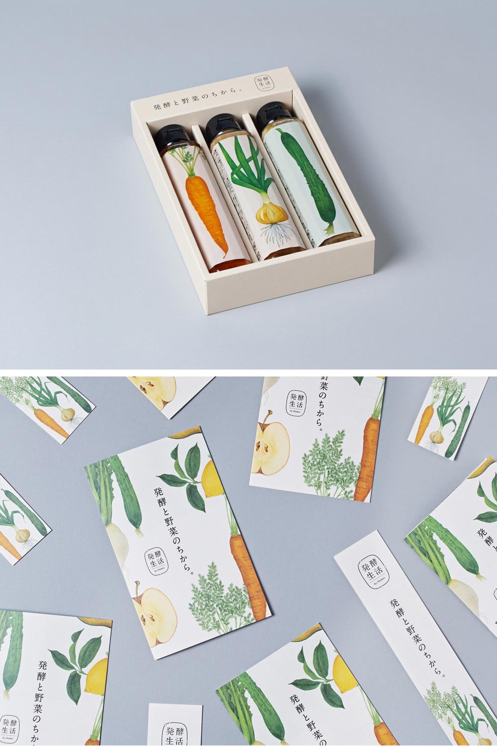
Everyone knows how much I’m in love with Nosigner’s work, and to me, these Kyoto pickles bottles are probably their most remarkable packaging project. To create a new image as a brand of healthy fermented foods, they designed the package to emphasize a sense of both Japanese and Western eclecticism.
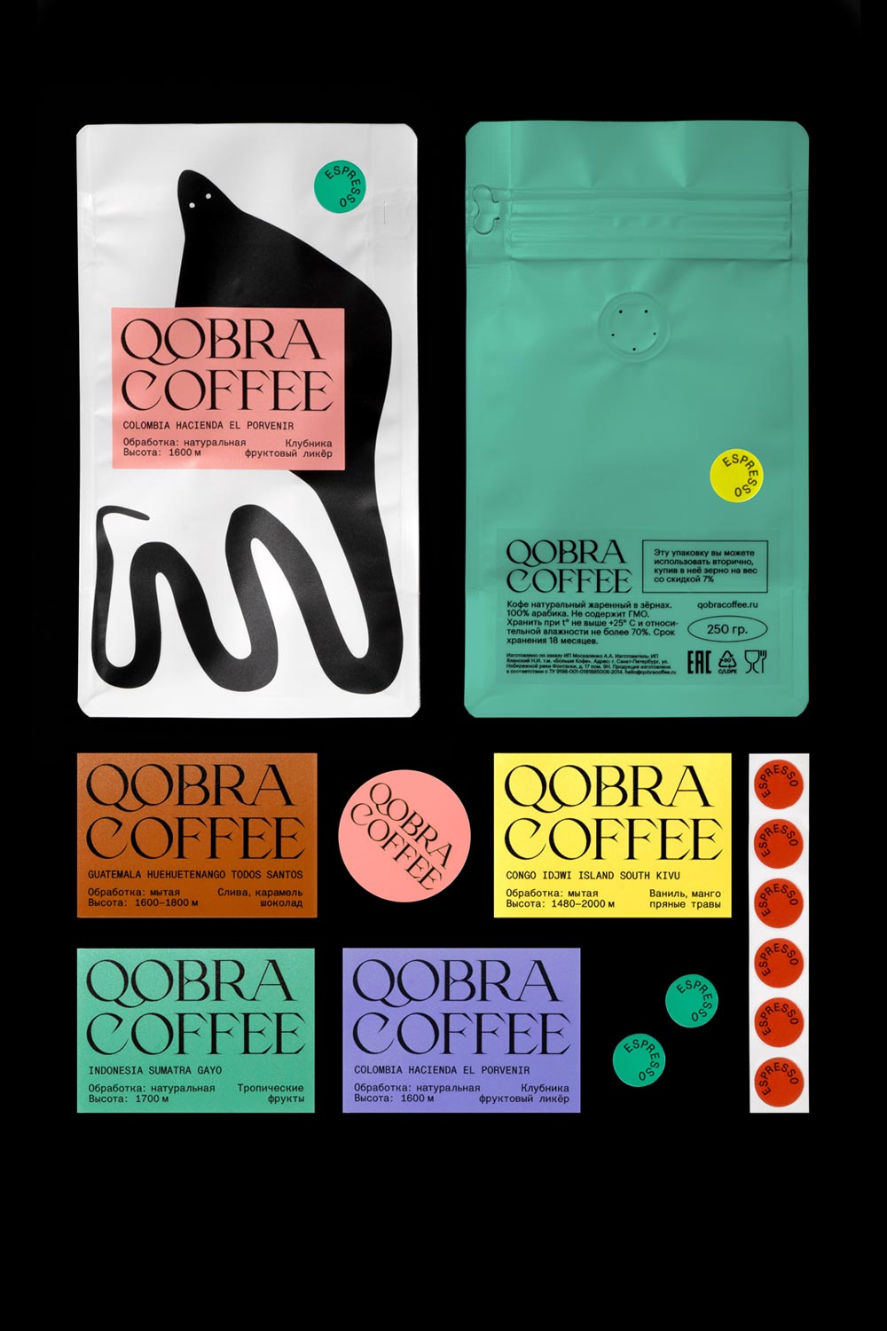
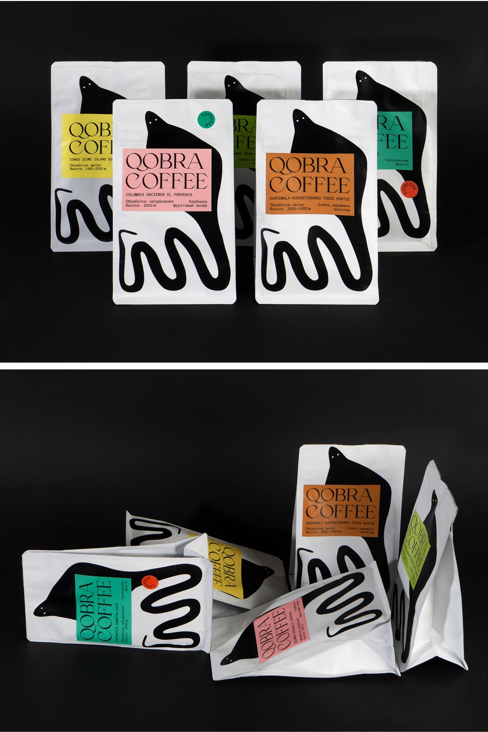
Qobra Coffee
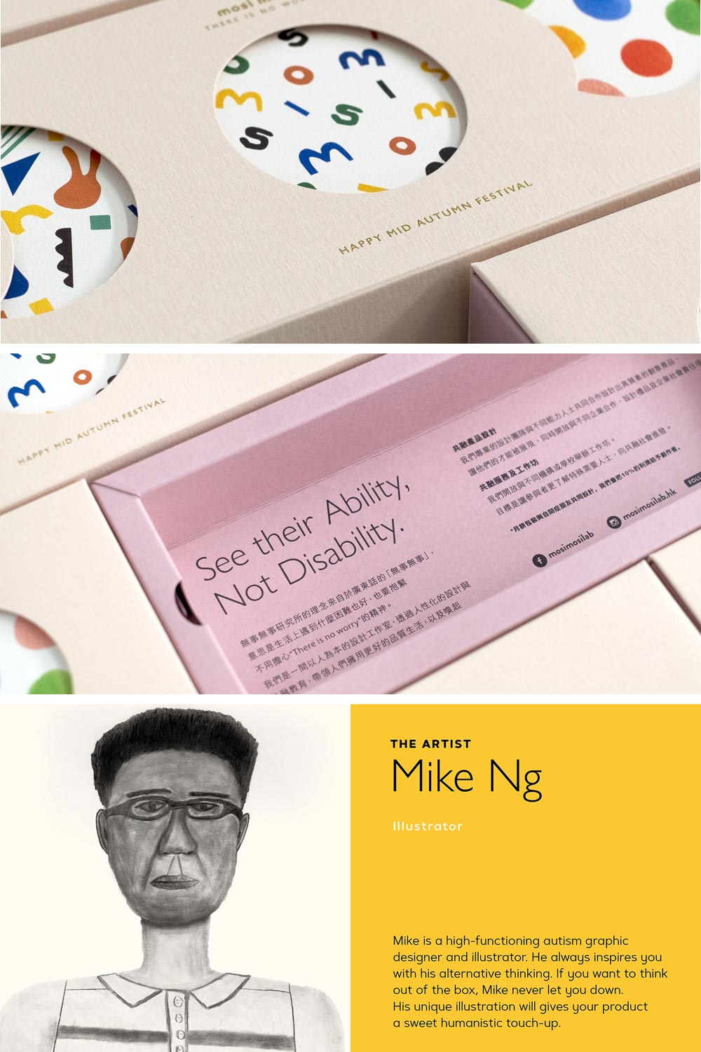
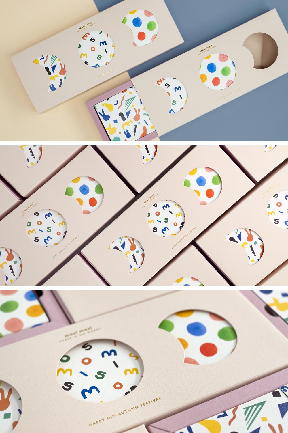
Mosi Mooncake
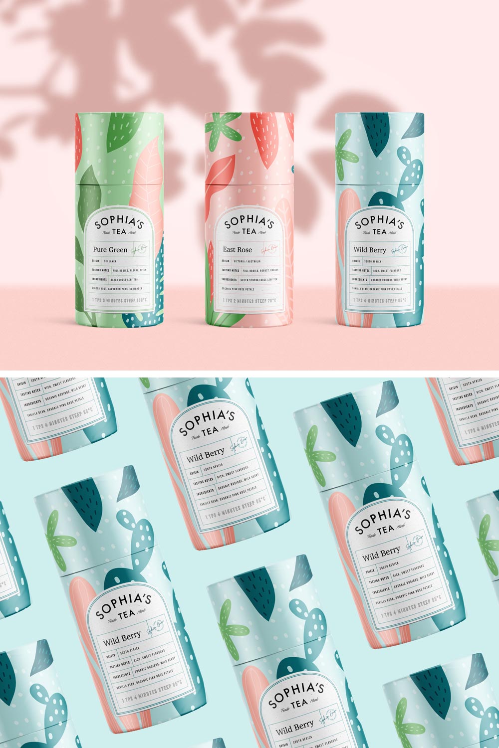
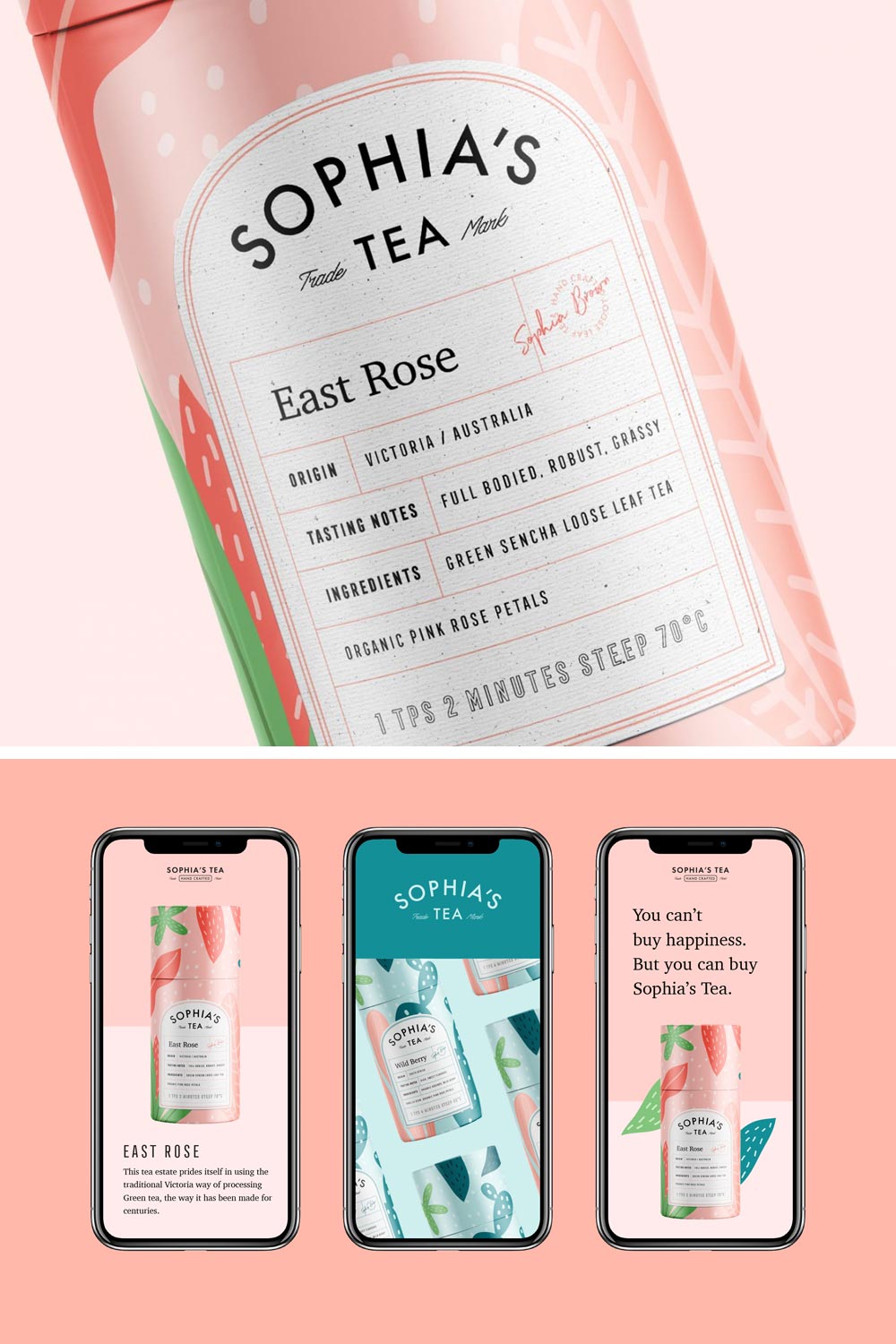
Sophia’s Tea
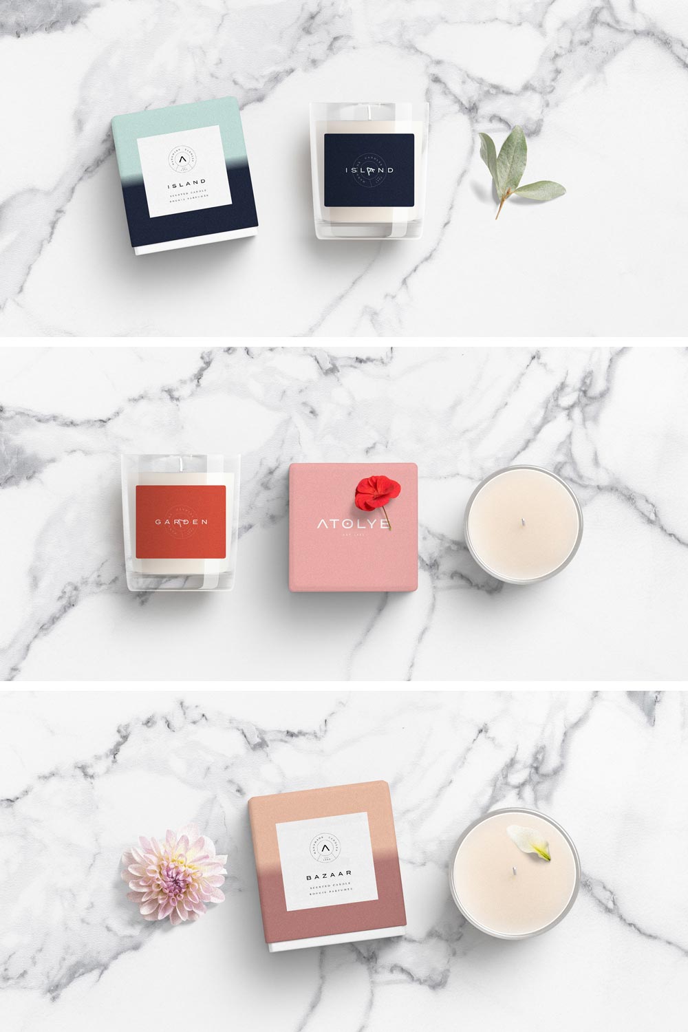
Atolye
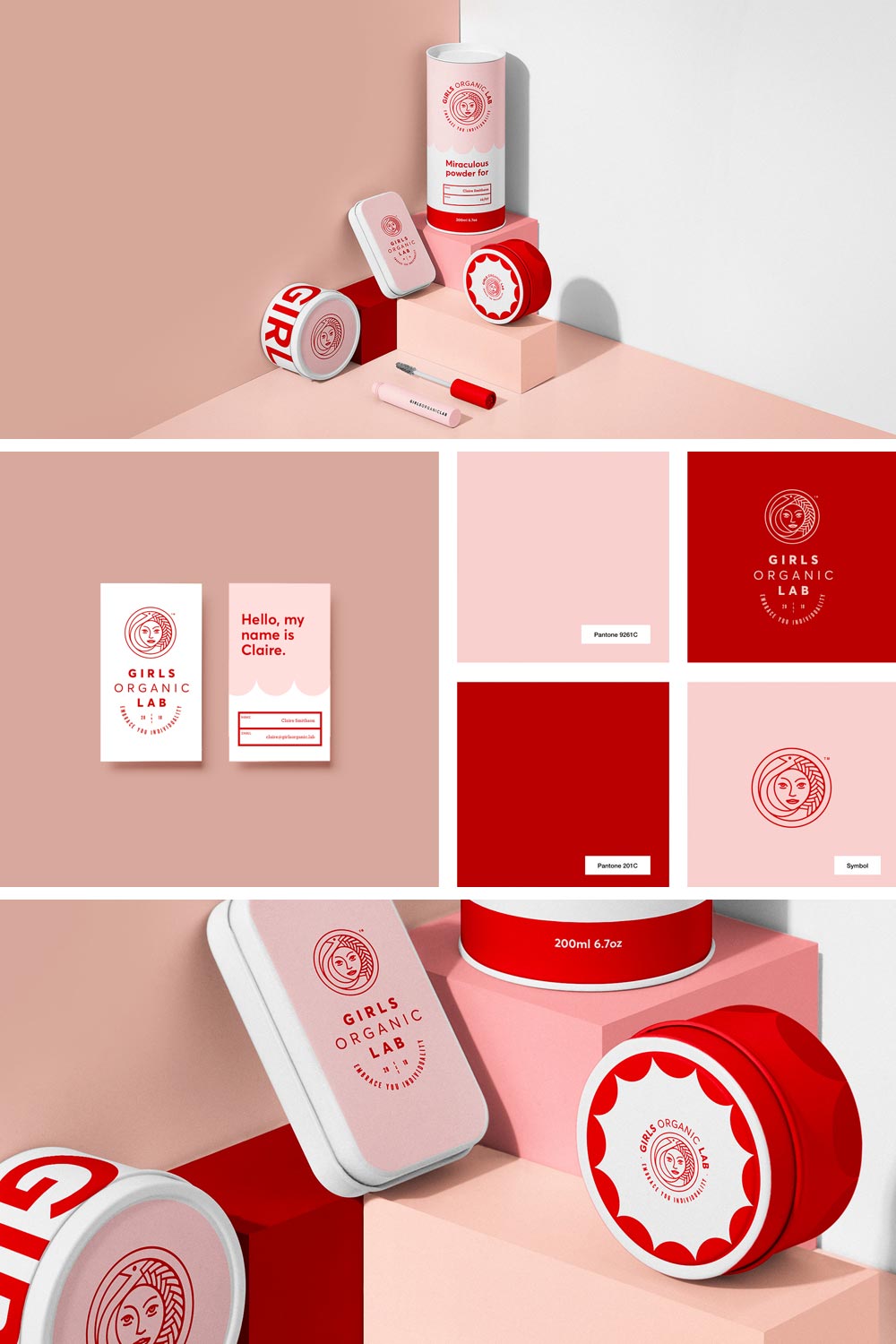
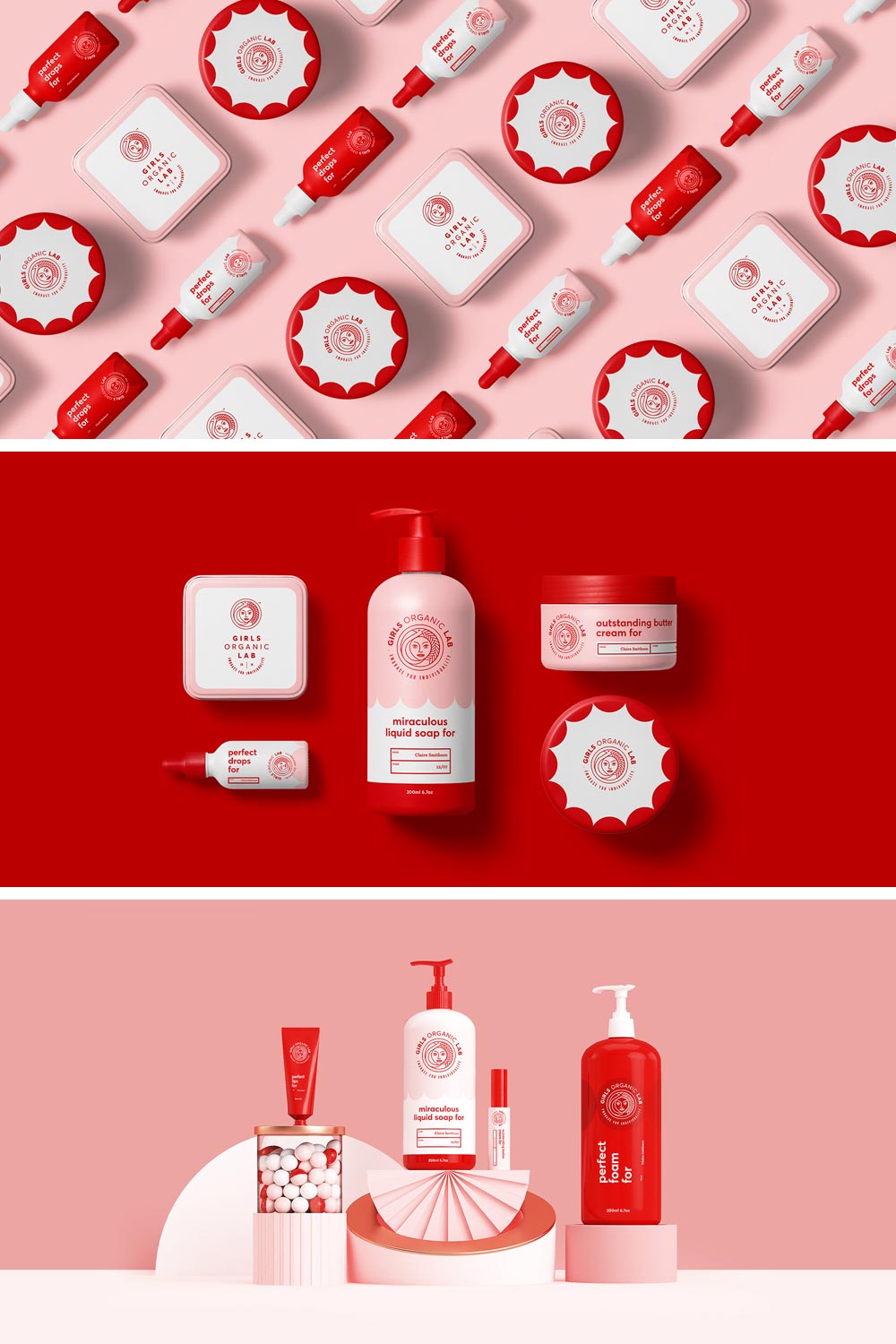
Girls Organic Lab
Sweety & Co. have created a strong and memorable identity for Girls Organic Lab. It uses the feminine form represented by Mami Wata as a highlight. The color palette brings warm tones to contrast the rosé, representing the modern woman. However, I have mixed feeling about the color palette: it both attracts and frightens me. Don’t ask why.
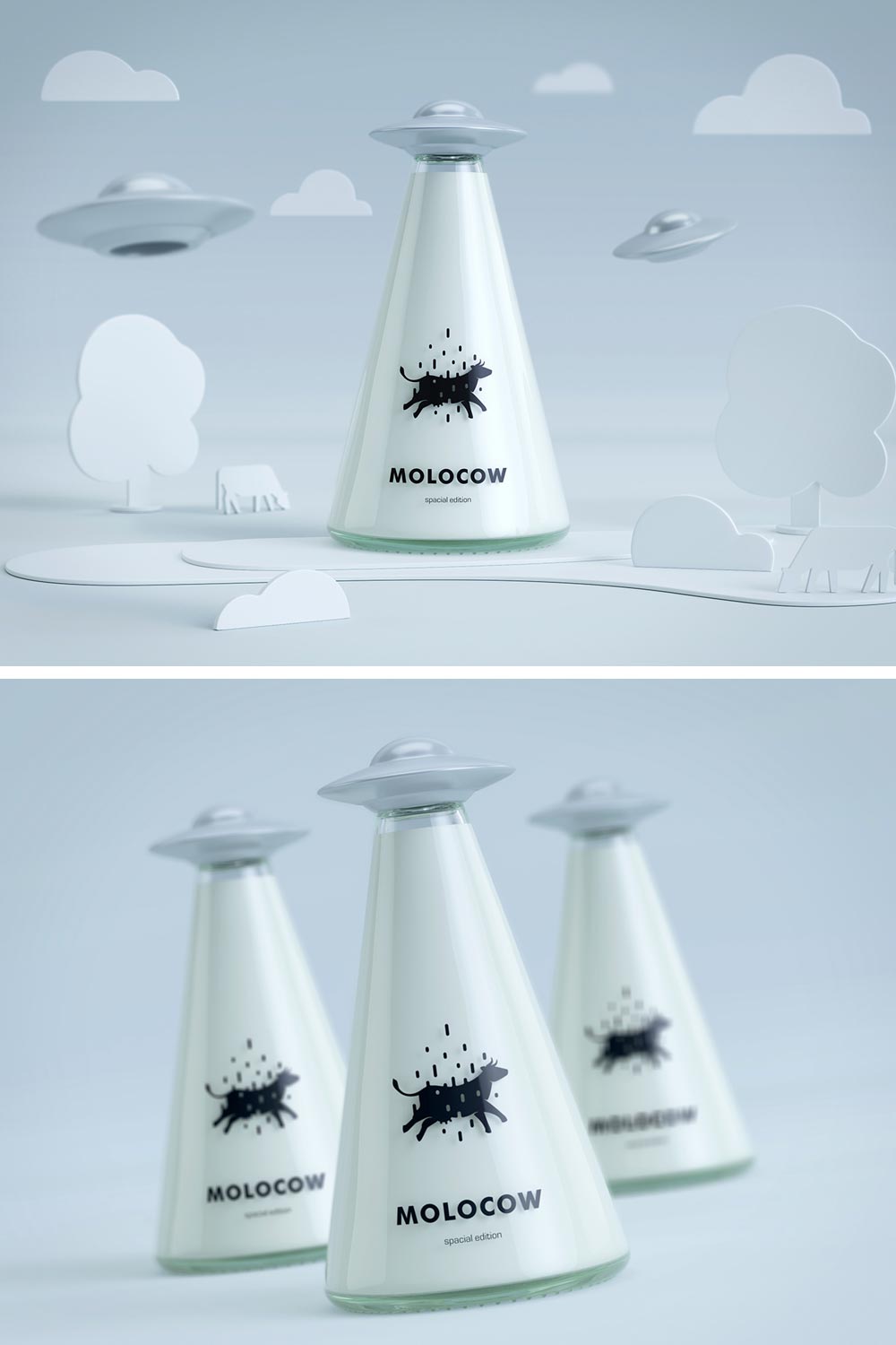
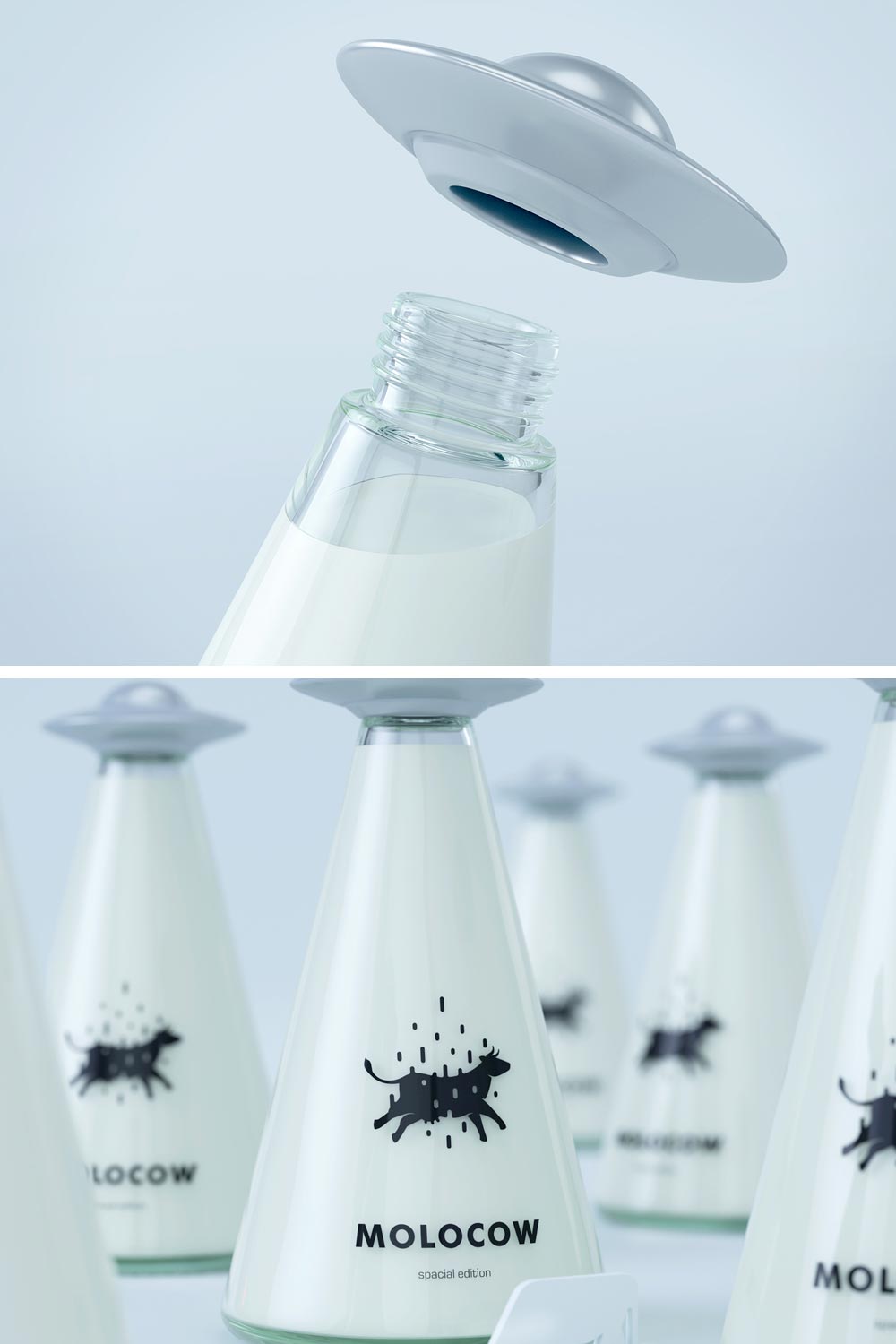
Molocow – Milk Package Concept
Persephone Bakery & Café
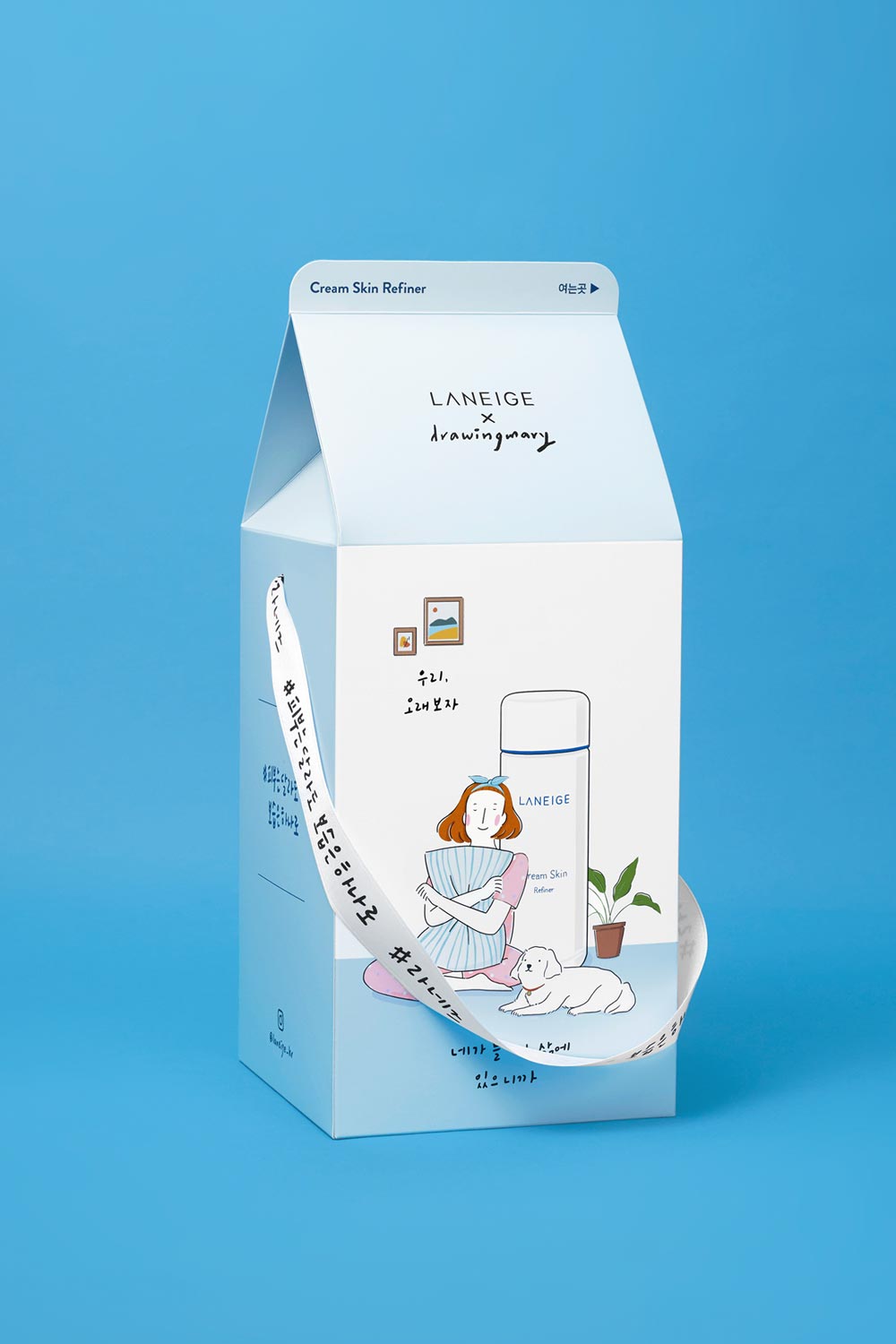
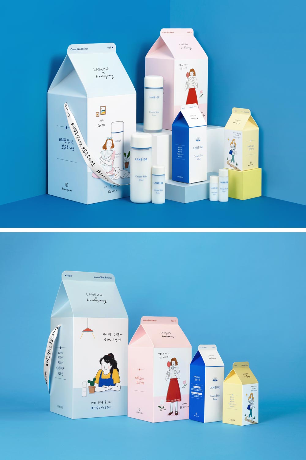
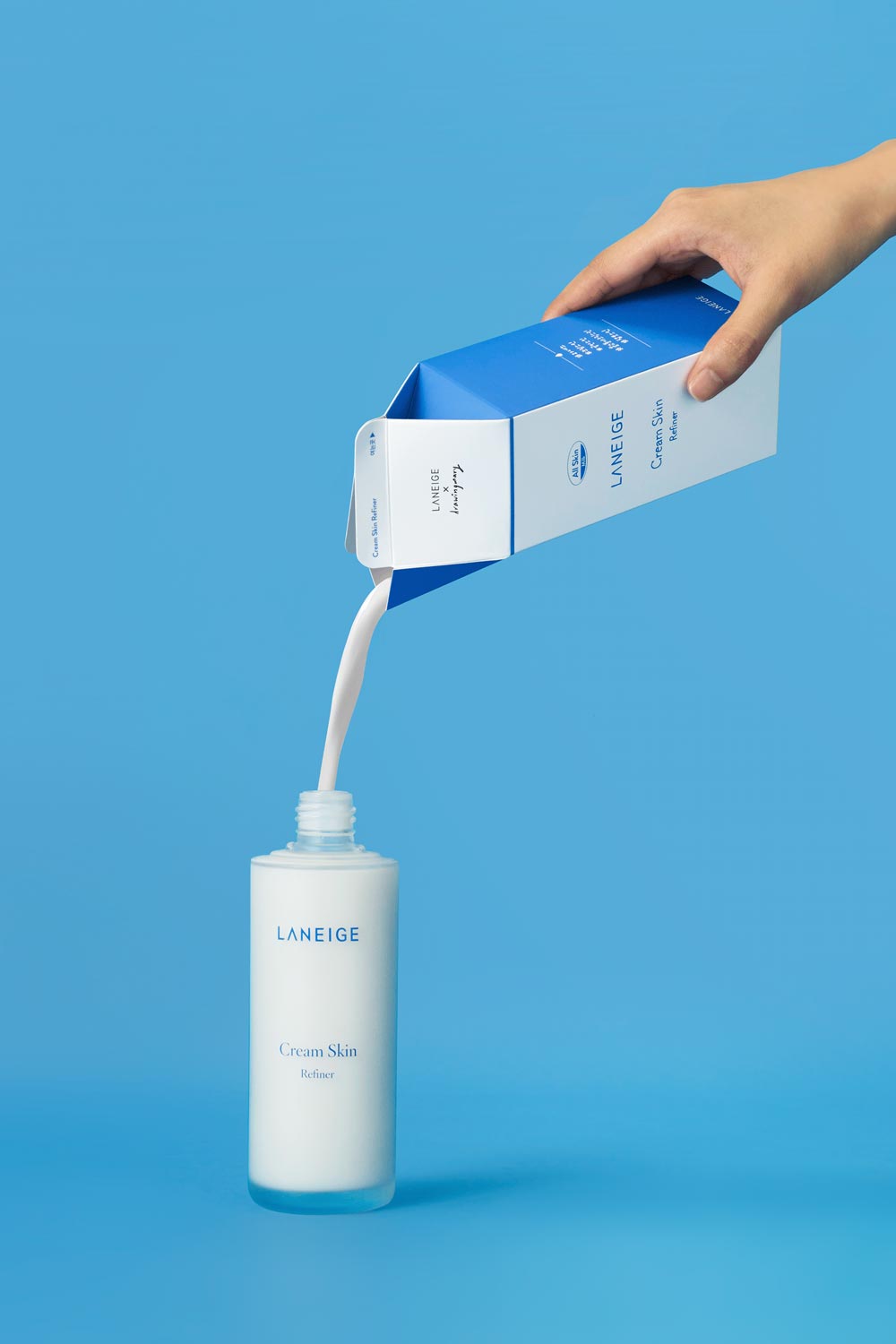
LANEIGE Cream Skin 1st Anniversary Kit
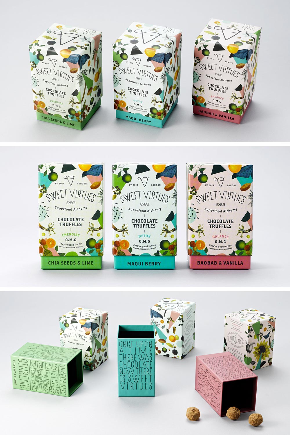
Sweet Virtues Packaging
Wölffer Cider Cans
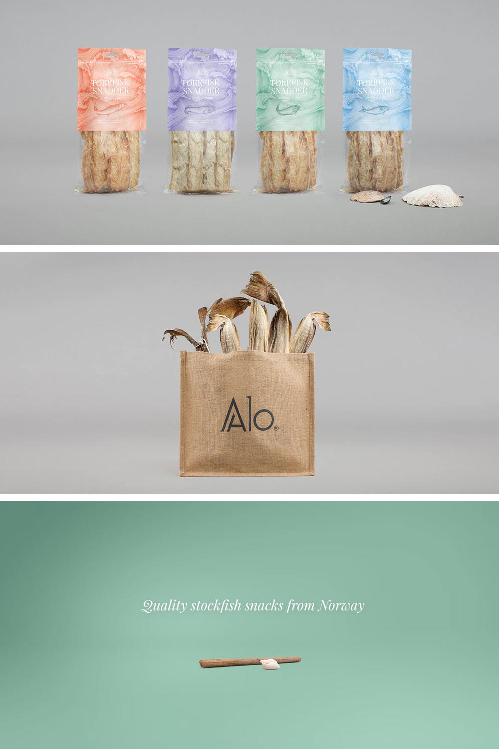
ALO
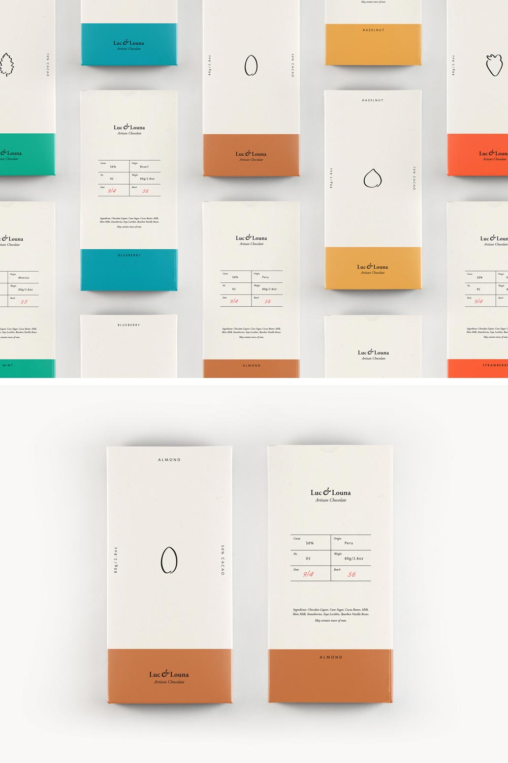
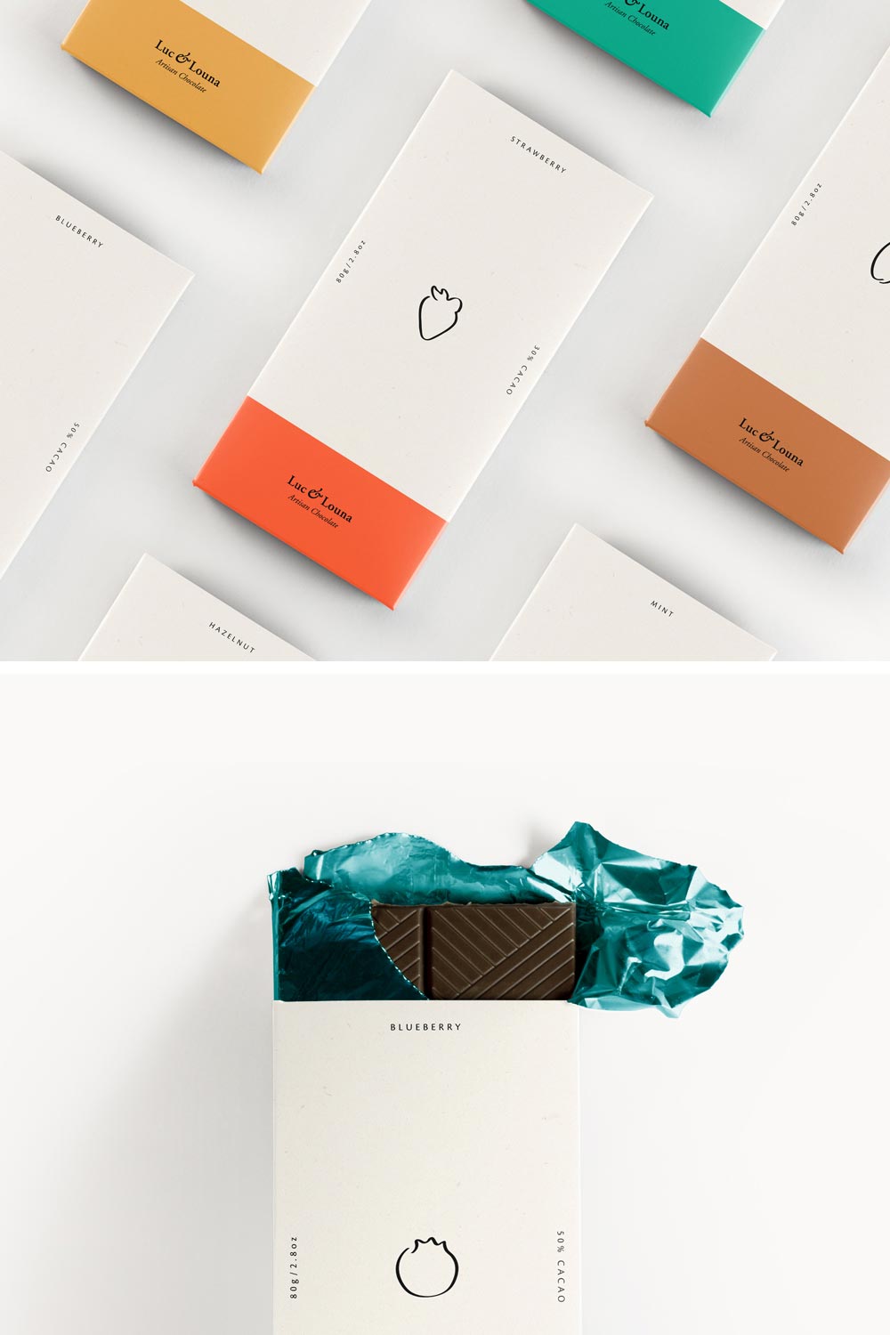
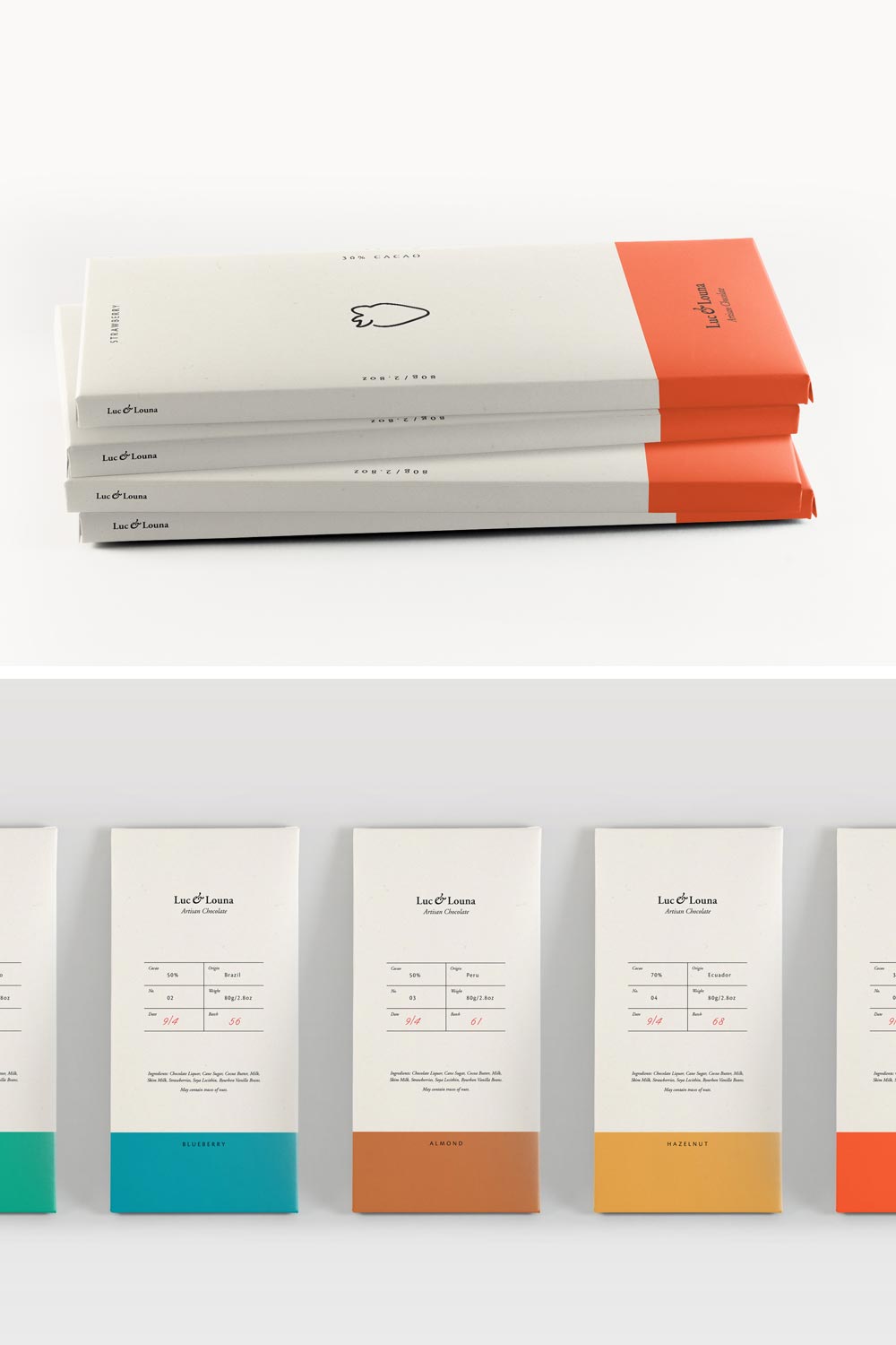
Luc & Louna Branding and Packaging
Branding and packaging created for a conceptual luxury chocolate brand Luc & Louna. A selection of chocolate bars was developed and designed to showcase the different flavors, each with a minimal approach leaving the chocolate in the spotlight. Such a shame there is no milk chocolate in this series.

