The Designest may receive compensation from companies, products, and services featured in this publication. For more details, please refer to our Affiliate Disclosure page.
The well-known saying goes “meet on clothes”, and it is a perfect description of what a portfolio means to graphic designers. So, if you want to build a successful career, you need to make an effort and create a truly outstanding one. It is an ideal way to showcase your unique ideas, design projects, and present your artistic vision in general. The portfolio is commonly the first thing the clients see when they are looking for a graphic designer, that’s why you have to put your best foot forward.
Essential Portfolio Website Templates
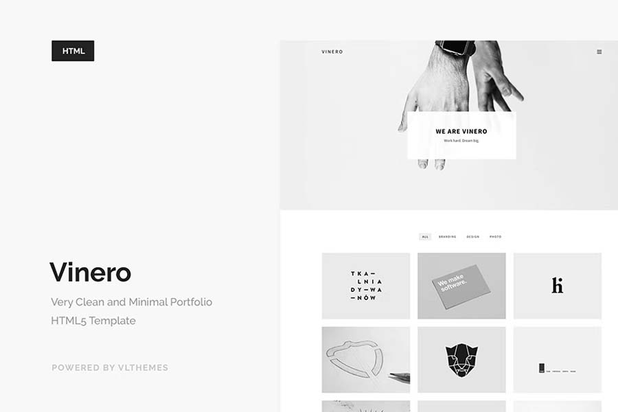
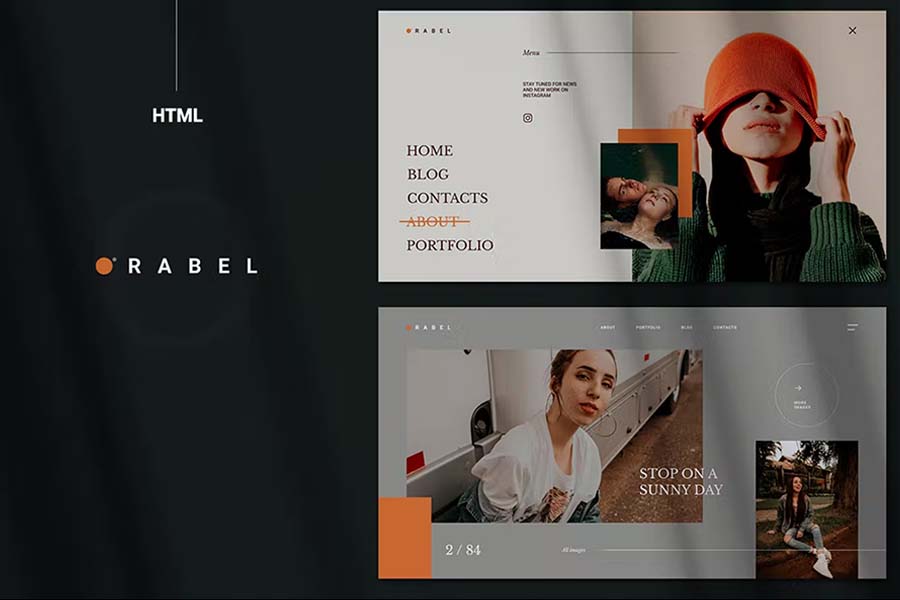
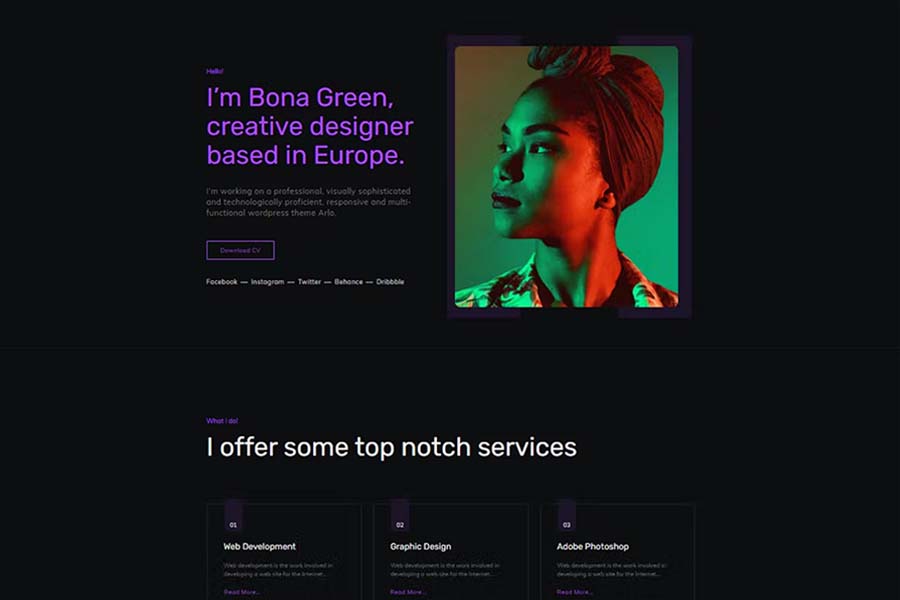
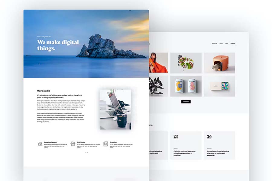
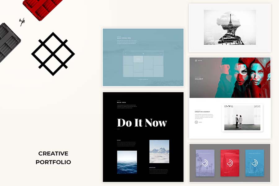
As I mentioned before, creating an eye-pleasing portfolio can open many doors on your way to becoming a successful graphic designer. Luckily, even if you have no idea how to build one that will catch your potential clients’ attention, there are many resources that can help you to do so. For example, you can use the premade resume templates, that already have everything you may need to make your portfolio stand out and enable you to showcase your style.
How To Make Graphic Design Portfolio
Whether you consider your design portfolio site as an opportunity to express yourself, create your own gallery or find potential clients, it has to be eye-catching. Building it has some patterns that will help you to stand out among other professionals of the graphic design field. The nice bonus is that despite the common belief that you can build a beautiful portfolio only if you are already an experienced designer, that’s not true. You can even craft it to see your progress as a graphic designer. Anyway, the steps you need to take to build a well-structured portfolio site are the same for any purpose and I listed the main ones here.
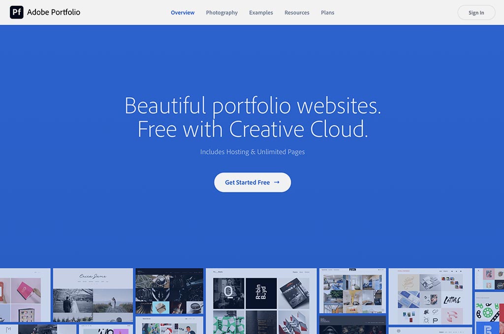
1. Decide on the platform
2. Include your best works
That’s a really important thing you should keep in mind while working on your own portfolio website. It is not a storage of all the works you have ever created and you don’t need to include every single one, especially when you have a decent number of high-quality designs to choose from. Do you have some past projects that you are proud of? Or maybe you past work experience with some big companies? That’s exactly what you need to put on your website. Not only does it allows your audience and potential clients to see you in a better light, but also you will be satisfied with your graphic design growth every time you open it.
3. Show your personality as a graphic designer
You might show your personality via your favorite works you created. If you have an art direction you want to work with you can add more designs you have already created in it. Also, an important part of this step is to remember that your artworks isn’t the only thing that may present you as a graphic designer. The backgrounds, the typography you use, your introduction in the infobox, animations — all these things will get your audience a whole picture of you. So, pay attention to all the little details and it will pay off in the form of a perfect website.
4. Go for quality not quantity
It’s not the number of artworks that shows your skill level. Even if out of ten designs you created you really like a couple, it’s not a thing to bother about. Don’t get overwhelmed with thoughts that your digital portfolio can turn out decent only if you upload tons of artworks. Remember that the one good artwork is better than a hundred mediocre ones and that high quality sets a professional tone to your website so go for it and put the ones you are proud of the most.
5. Spread the word
Finishing your design portfolio isn’t the last step of your working process here. When you are satisfied with the result you see, it’s time to get it out to the world. You can use keywords and hashtags, which are great, but your sharing your visual art on some visual-based platforms is even better. Instagram, Pinterest, LinkedIn — these platforms are perfect to showcase your artworks. You can also turn your personal social media accounts into business ones or create new accounts for this purpose, too! Such places often boost artists’ reputations a lot.
There are two rules of success if you choose Behance or Dribbble as a platform to promote your designs: be socially active (like other designers, subscribe to them, leave comments, etc.) and make regular publications so that you pop in the feed of new projects and recommendations.
Tips For Creating Graphic Design Portfolio
Creating an eye-pleasing online portfolio is quite a long and challenging process so the step-by-step guide on how to create it isn’t the end of what I have to offer. After you got the basics of what you have to do, which resources may help you with that and what you should pay attention to you may still need a few tips. Here I will cover some things you can add to your website so it becomes more vivid, advice on choosing the artworks and how to work with it in the future so you could be fully armed with all needed knowledge.
1. Choose versatile artworks
Versatility is one of the keys to the success of your own portfolio. If you are working in different fields of graphic design or just like going for different styles it is your time to shine. A rich variety of art directions your portfolio shows will be a way of self-expression and an opportunity to see your skills of a professional graphic designer for your audience and clients. However, consider structuring your artworks somehow so it doesn’t look visually busy — otherwise it would be hard to focus on your projects.
2. Results of your work
Do you have any personal graphic design projects in your arsenal that have become really successful? Your online portfolio is an ideal place to talk about it. For such works, you can add a study case where you can tell about the success of your project, and maybe speak up a little about the working process. If you also worked for some big names, you can put them in a special place on your website. For some clients, it may work as a sign to consider you.
3. Include the high-quality posts only
There is nothing that can ruin a masterpiece as much as the bad quality can. It makes your works look gritty, and small details risk getting illegible. So don’t forget to check if you are uploading your designs in high resolution. It is especially important for artists who draw by hand. In this case, you need to buy a good scanner that will help you to transfer your art to digital and maybe fix some imperfections on your device so you can showcase your skills in a better light.
4. Be creative
It goes without saying that a portfolio is an ideal place to overflow with your creative ideas. Here you can do anything that you like: bright flashes, interesting page-flipping styles, looping video animation, and, of course, an eye-catching home page. It’s important to choose a pleasant background, colors and typography for your website that will intertwine and become a one-piece picture that goes well together with your personal style. Your portfolio design is the first thing your audience will see so it’s vital to make it attractive and outstanding.
5. Don’t forget to update your design portfolio
As time goes by, you hone your design skills, get new knowledge, and discover new fields of graphic design, the trends are constantly changing, after all. That’s why what might attract attention a year ago may be outdated today. That is why it’s crucial to update the online portfolio, so you and the followers can see how you grow as a professional. I’m not talking about deleting all your artworks and uploading the new ones, but refreshing your art gallery is a must for a graphic designer who wants to become more successful. Don’t forget that it is the same for your portfolio design itself, too.
15 Best Graphic Design Portfolio Examples
While building a design portfolio, it is nice to keep in mind that the more creativity and personality you bring to it, the better any client will see who you are and what you’re capable of. The wording may be different, but I am sure that it was the motto of designers who stand behind the charming portfolios I gathered for you below. It’s impossible to just scroll through these sites — there are so many little details that make you want to spend your time discovering each of them. Looking at these portfolios will surely inspire you on creating your own masterpiece that will attract the audience’s attention the same as these carefully built ones.
Mariano Pascual, Visual Artist, Designer and Illustrator
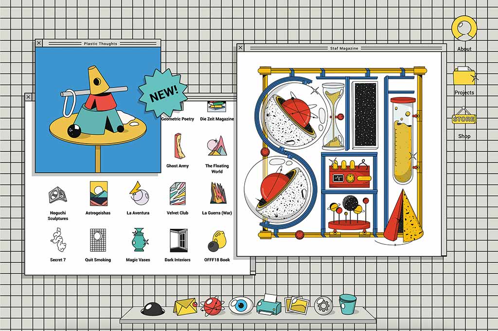
Whoa! This is not a website portfolio, but a simulation of an OS. Mariano has designed a desktop, folders, a parody of hype on the Internet, and all of this is illustrated in Memphis style. And if you are inactive for a while, there is Newton’s Pendulum as a screensaver. He really went off to create something outstanding and he surely did it.
Atipus, Graphic Design Studio
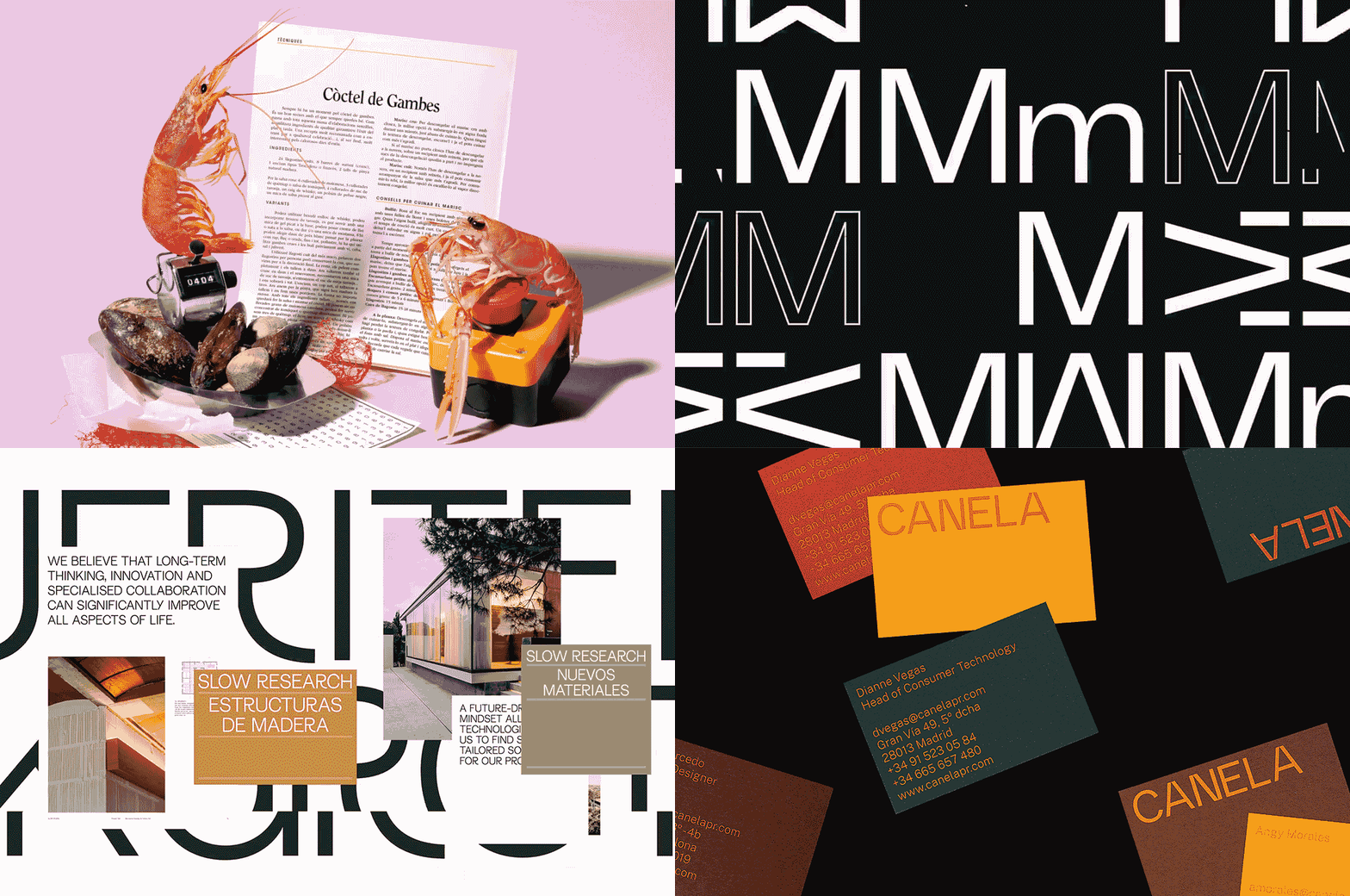
The art direction of Atipus is minimalistic, colorful and textured — and the design portfolio keeps to the same style. The juicy vibrancy meets simplicity here, and I absolutely love that there is no difficulty in exploring the site and all your attention is focused on the works. Little case studies following each project help plunge into the design process and minds of its creators.
Billyclub, Creative Studio
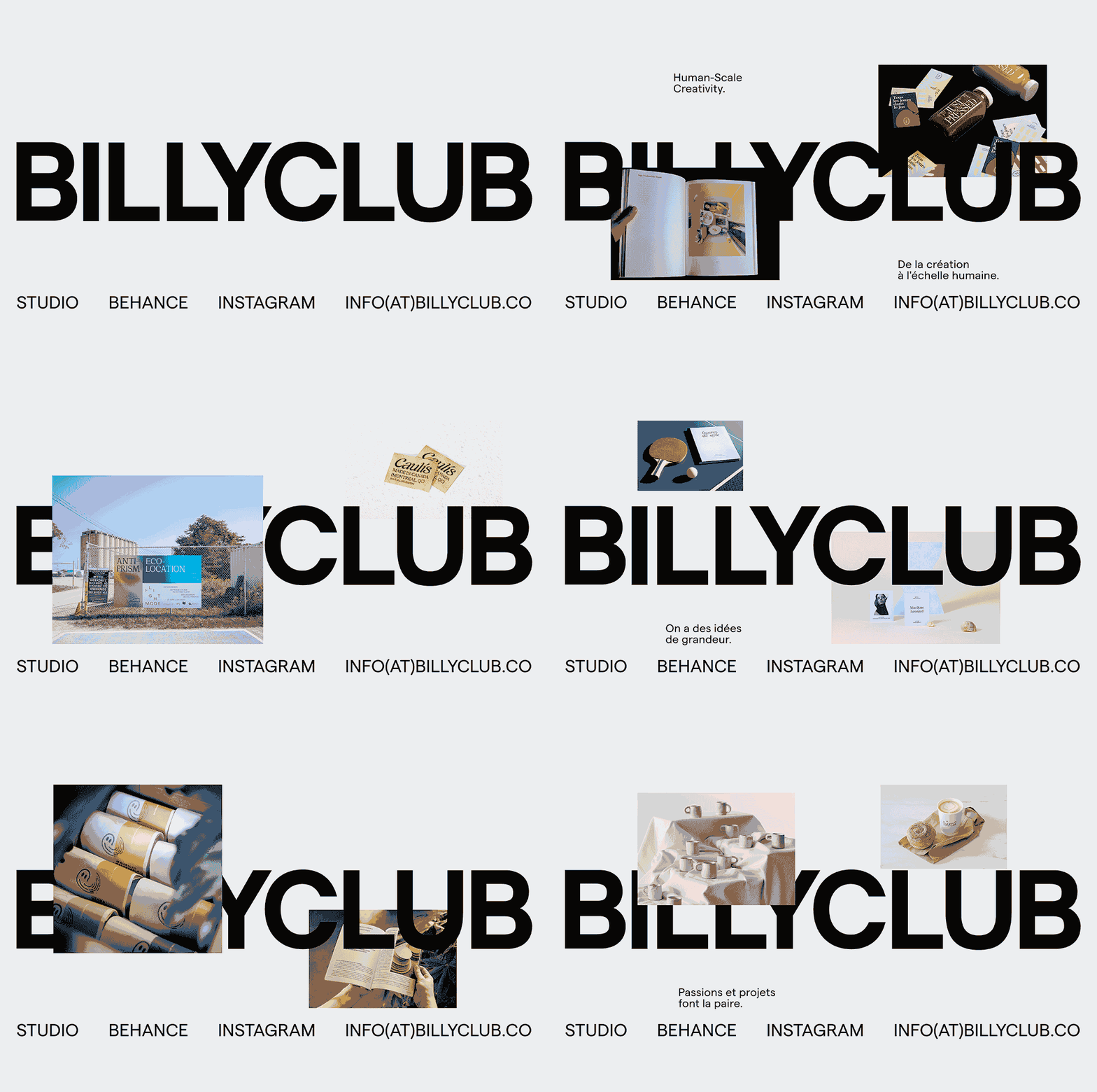
This website is made as simple as possible, and its tile distribution of the material is minimalist and clear. But there is a curious detail, which distinguishes this design portfolio from a range of the other masterly crafted ones: horizontal scrolling from right to left instead of the classic one, minimalistic color scheme and layout with a reference to antidesign, which has acquired modern, more accurate features — like a unified font system.
Etienne Murphy, Designer
Etienne Murphy’s portfolio is the embodiment of the saying “simplicity is the key to brilliance”. This site is an example of modern minimalism that the graphic designer has enriched with the help of unusual details in the classic sans serif and a geometric layout. The choice of forms and colors is interesting, too — since this is a reference to the practical, color-limited yet not plain Bauhaus. The designs in the portfolio confirm it — they all are stylish, restrained, and practical.
Toormix, Branding and Design Agency
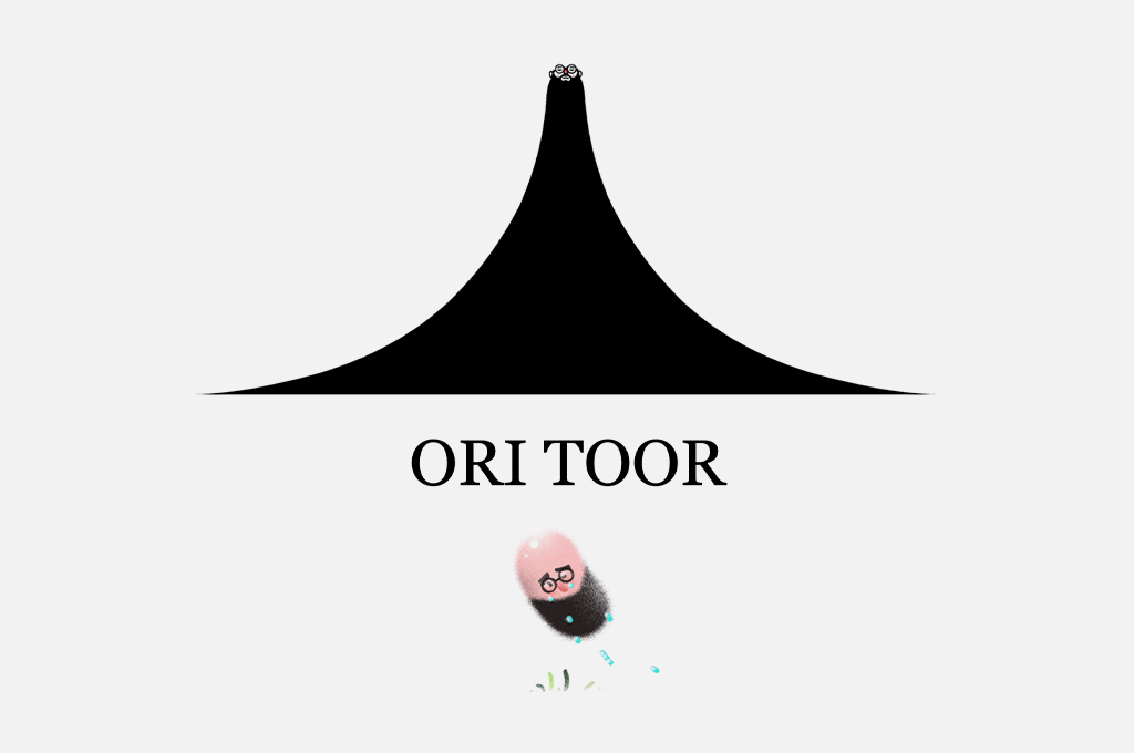
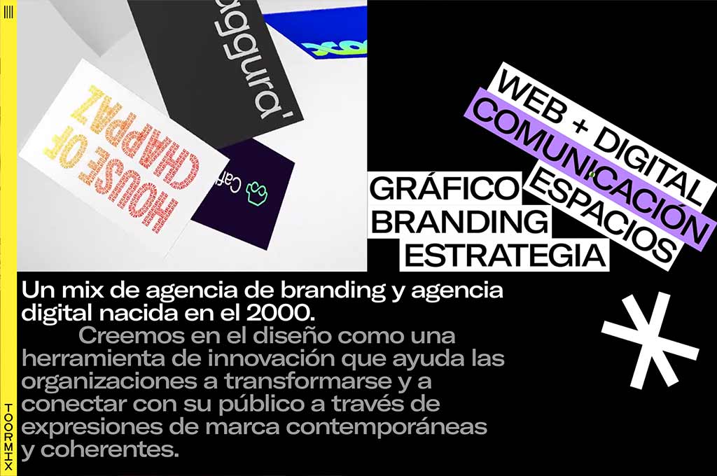
Like Alice once fell into the rabbit hole with so many weird items floating around her, you will scroll down this website. Toormix is a perfect example of a portfolio that not only attracts with the art in it but also entertains! Starting from the loading page, it is full of eye-catching animated images and there is an unusual cursor design. The designers use a limited color scheme, but they play with forms, font sizes, color and logical contrasts, and a minimum of decor — which seems impossible with such a variety of visual means. However, this is exactly the impossible that the Toormox team achieves.
Tobias van Schneider, Designer
Tobias van Schneider’s portfolio is also called “a new digital museum” by its author and we can only agree with this name looking at the interface design. The projects with case studies explaining design process, elegant animation, and the ambiance itself make you feel like you are in a real art gallery. The exquisite home page welcomes you with an invitation to the museum and by clicking the button you may next choose one of the rooms, where you’ll be greeted with charming music and amazing designs. Discovering this museum will take time but you won’t regret it: it will indeed inspire you on creating an outstanding portfolio.
Watson, Digital Agency
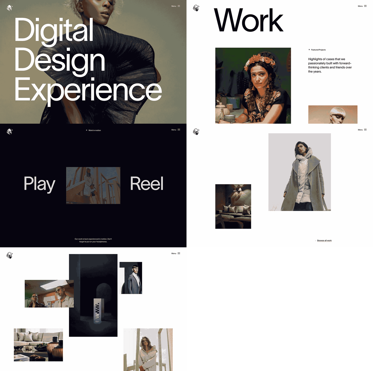
Watson digital agency shows how to present the versatility of your projects while keeping the portfolio in one style. Its design is kept in the aesthetic of minimalism that you can see in everything: fonts, laconic animation, color scheme. The site is half a step away from looking unfinished, but that’s how Watson demonstrates an incredible use of the white space, that allows the site and the user to breathe.
Emily Zhao Design, Visual Designer
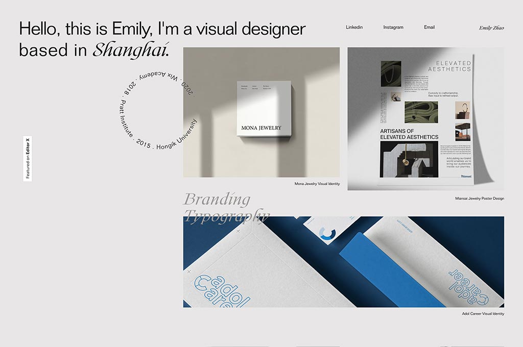
Emily delivers a very clean and easy-to-perform design option for his portfolio, as there is nothing to distract your attention from the arts. Plus, the website design itself is trendy. Here you can find everything that Behance’s users draw inspiration from, up to the font combinations and layout. The minimalist approach of the portfolio is perfectly correlated with the illustrations of the author: even the colors are alike. Such simplicity is more than enough, since entertaining the user with overloaded brutalism is not the goal of this portfolio.
Tiffany Gum Tian Cruz, Multidisciplinary Designer
Tiffany Gum Tian’s portfolio will help you to distract yourself from your daily routine: she offers you to swing by a real fortune teller! A graphic design teller, to be precise. All you have to do is pick one out of 7 cards and immerse yourself into Tiffany’s art projects. There you can find all the information about each design she made that gives you a deep understanding of what she’s capable of. As for the visual features, the studio focused on bright colors, vivid animation, и reinvented Pop Art aesthetic.
Lebassis, Lettering Artist and Art Director
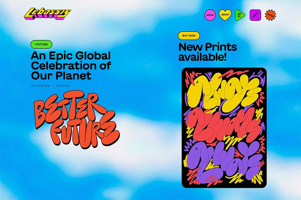
From the first seconds spent on this retro-themed colorful website, you fall in love with its unique approach, playfulness, animated previews of the featured projects of the designer — as you scroll the home page you pass from one to another, and the whole journey is exceptionally smooth and exciting. The portfolio design made by the art director is just as vivid and bright as the designer’s artworks so it is very pleasant to look at. Easy, well-structured navigation, nice design with many interesting elements, — what else could you dream of for your portfolio?
Maria Marie, Designer
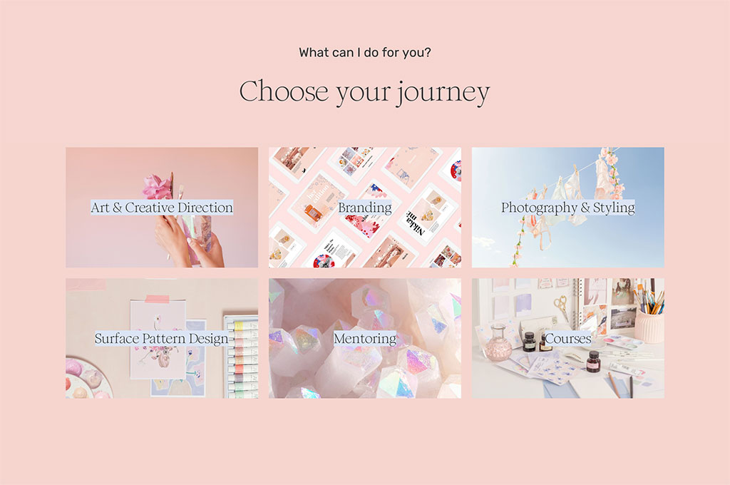
“Finding beauty in the unexpected” is the saying that greets you on the home page of Maria Marie’s portfolio website. And once you look at her artworks you see the embodiment of this phrase: there are so many beautiful things here. The site itself is really elegant, feminine and charming: the pink shades, exquisite fonts and all the inspiring quotes you’ll find there involve you with endless tenderness and warmth. It fully reflects the personal aesthetics of the designer and the style of her artworks. Such a perfect correlation between a portfolio and the designs the author showcases there is a very rare hit.
Pràctica, Design Studio
Pràctica’s portfolio has a somehow hypnotizing effect. Once you are on the home page, you’ll find yourself staring at the screen for a decent amount of time since the pictures change each other and make you stay anticipating what will come next. There is a small cross in the right corner of the site that leads you to the information about the design studio, their goals and beliefs and their social media accounts where you can discover all the designs they worked on and get in touch with Pràctica’s team.
Damn Graphics, Designer
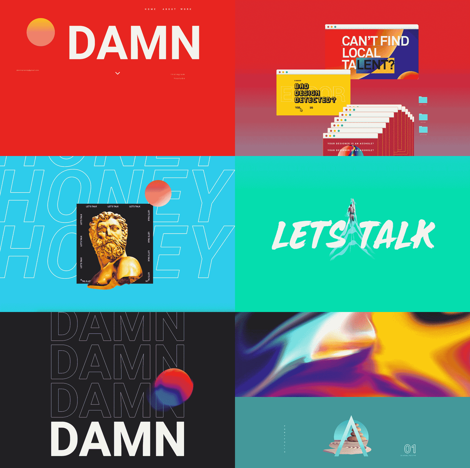
It’s impossible to count the number of times I smiled while exploring this portfolio. Starting from the name, Damn Studio, and to the usage of famous memes to describe the author — the site was surely made by a person with a great sense of humor. Not only you can find amazing design work collection here, but also the full information about the designer himself (even his zodiac sign and height). Bright colors, interactive animations and fresh look at the rebellious antidesign visual style make you want to find everything that the designer has to offer.
Alex Fisher Design, Graphic Designer & Illustrator
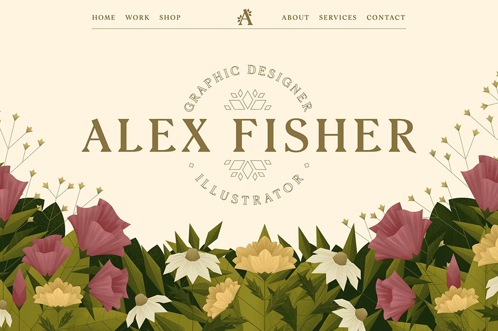
This portfolio website reminded me of a gallery, where you go through the masterpieces hanging on the wall. The designer preferred his own style to trendiness, and the design of his portfolio fully reflects the aesthetics of his artworks. It’s a little fancy, with a touch of Art Nouveau in its modern iteration that is seen in the choice of fonts, palette and logo design. The portfolio also shows you how to create a one-piece picture from your projects and the design of the site.
Exo Ape, Digital Design Studio
A wealthy, posh vibe the Exo Ape design studio’s portfolio radiates. The colors, animation, the design projects they showcase here — everything breathes charm and uniqueness, that makes you stay on the site and focus on the illustrations. As you scroll you discover more and more artworks that are versatile yet keep one style. An interesting part of this portfolio is the imitation of a runway walk with animations. This studio works with different projects, but with such an elegant technique they emphasized their overall vision of design and visual aesthetics.
Now you are fully armed with the tips on how to build a strong graphic design portfolio website and saw all of them on the real examples of designer’s portfolio websites to draw the inspiration from. You see how all of them are different? I wish I could give you the success formula for this but there’s none. Just follow your personal taste in graphic design and stay user-oriented — the rest is just a matter of imagination! If you still have any questions about portfolio creation I’ll be happy to answer them in the comment section.
Frequently Asked Questions

