With so much hype aroused around design systems, I weekly come across tons of ideas and posts on their essence.
Design Systems may be perceived as a set of templates, or a guide for developers, or a Sketch library. Also, some of them turned into complex resources where many cases, embraced by single approach and philosophy are featured. And yet all these variants happen to be, I’ve found it vital to sum up all the essentials and help you figure out what’s what.
Origins & Key Notions
The first ancestors of design systems appeared in the early 2010s. You know them as the Atomic design that has established a framework for UX designers to build upon and use repeatedly. Or as Google’s Material Design of 2014, that combined pattern libraries & Atomic Design. And was evidently meant to create a visual language that was applicable across all devices and platforms.
And then the design systems come up as an unified visual language and its technical reflection. It groups all the elements, enabling the team to design, release and continuously update the product.
So, as a set of deliverables, a design system includes following components:
- Visual language (involves a paradigm of corporate values & rules, complete production guidelines, best practices and a full library of design tools & styles);
- Programming code and its separate elements;
- Templates of web elements;
- Design system support & development team*.

*I’ve come across a vast number of theories where the last component was omitted, and I honestly find it wrong. As a long-lasting project the design system can’t do without its masterminds, managers and production team. And actually it’s up to you to decide who these people will be in your particular case — your teammates solely or you will employ an outsourced system designer for qualified support and control.
Last but not least point for you to keep in mind: a design system is never a stable, permanent guide. In contrast to it, the design system isn’t composed once and forever. It is born with the project and evaluates with it, follows the purposes, philosophy and trends, imposed by the team. Guide embraces the guidelines (sorry for the tautology) and acts as a solid marble stone. See the difference?
Design Systems in Real Life
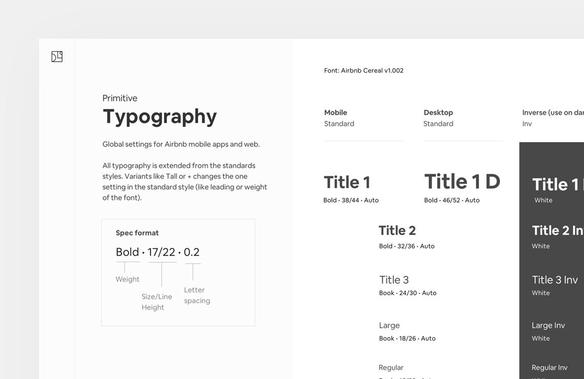
I can spend hours talking & writing about design systems. However, the theory is pointless without nice examples. So, here are some of great projects, based and maintained with the help of them: from such pioneers in adopting and implementing a design system to their workflow as Airbnb to ultimately detailed Human Interface Guidelines by Apple.
And if I were you I would thoroughly study these companies’ experience and keep their best practices once you realize you need a design system as well:


Destroying the Prejudices
I was following some conversations about the design systems and found myself drowning in the flow of panic and suspiciousness. Actually, there are 2 main points that make teams and project managers feel unconfident about the design systems, and I’ll be happy to crash both of them.
Design System is clumsy and unable to adapt to your constantly evaluating project.
Err, yes and no. On the one hand, there are integrated design systems, created once and forever and fit more or less stable projects. Portfolios, marketing campaigns, and promotions are a nice example.
On another hand, there are modular design systems which contain tons of variable elements. And still the team keeps completing them with even more to help you keep up-to-date. That’s more complicated but is the right solution for a global project like e-commerce or public websites.
Design Systems are solely for UI/UX design.
Well, it’s close to the truth. With the code as one of the essential elements of a design system, you use it to realize and develop a website or an app first. But why don’t you use the complex system of deliverables elaborated by your team for borderline products: posters, stickers and even interior design. Like with Creative Market headquarters which are imbued with their corporate values, philosophy and key visual features from the website. Just don’t hesitate to think globally!
Getting to your with this article, I was trying to hit one primary goal: bring you the trend and help you get rid of unconfidence and try it for your team. Sure, I’ve only touched the surface, and design systems require more expertise to be applied to your workflow. That’s why I recommend you not to limit yourself by this brief, but discover more sources, writing about design systems.
Discover the blog of Nathan Curtis that reveals professional approach or try Design Systems by Figma, where most curious topics and practices are embraced. There is never too much to check out!


