How do you engage and impress your audience? Quality resources, provocative naming, captivating texts — it’s all fine, but let’s focus on complex and smartly composed illustrations first. I’m here with some collage inspiration, and that must be awesome.
The genre of digital collage illustrations blew up years ago so that even our team could not stay indifferent. And since it’s a basis everyone should at least comprehend, prepare to complete this article with an intention to try it out if you never did that before. Besides, I’ve come with some outstanding works to make your designer’s heart beat so much faster.
The masters of visual
The main feature of digital collage illustrations is that you don’t attribute them to a particular design style. Everything depends on the assets you use and the idea you finally come to, what gives freedom and passion for creating.
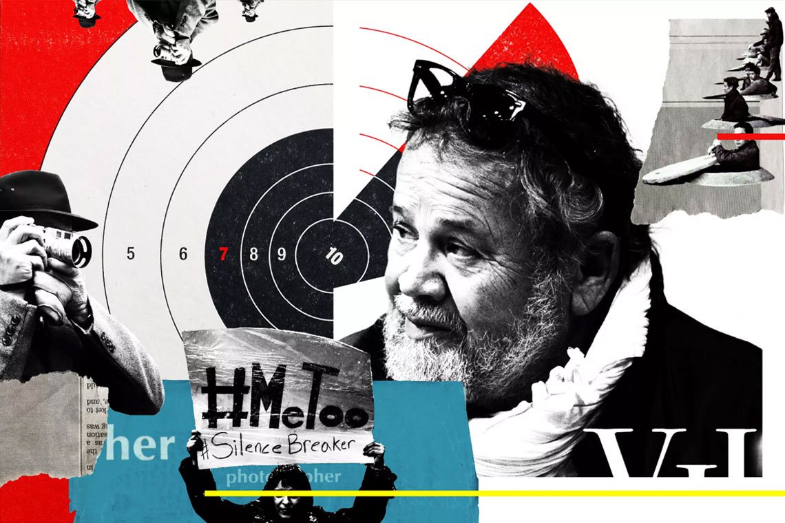
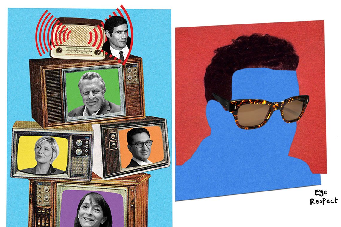
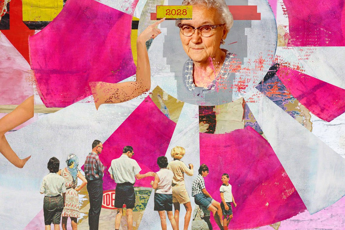
Just try searching ‘collage’ on Behance, and you’ll discover an endless flow of fascinating pieces, embracing brutalist, Scandi, Art Deco, polygonal art and many other genres.
Yet, of course, vintage-based collages stay on top, and I frankly have much to inspire you with here. Contemporary, Dali-like Anxo Vizcaíno. Mexican & Colombian creatives Oscar Rodríguez and Samuel Castaño. Or Pop-art & Memphis of my fav Selman Hoşgör. And, sure, his Danish Girl that I love a lot.
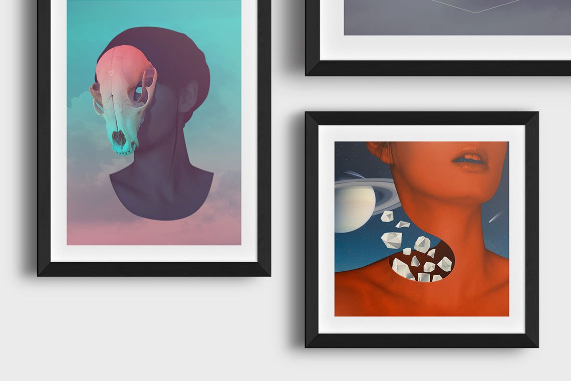
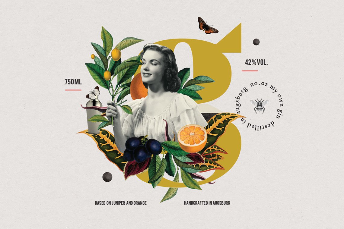
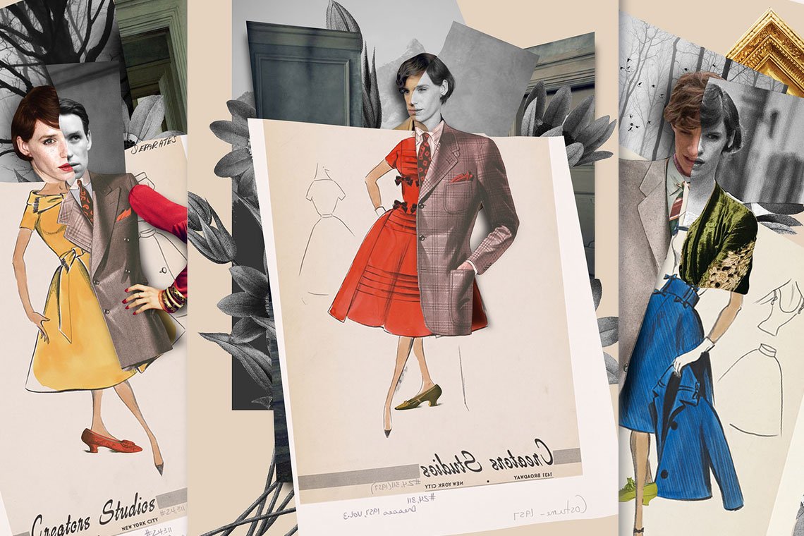
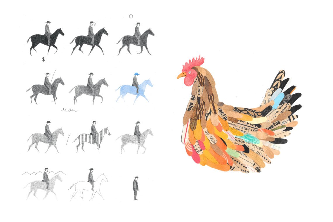
Despite that the genre of collages is quite eclectic, you will both find and obtain a distinctive and identifiable style. If you continue with Behance (or Pinterest, by the way), you’re gonna come across even more inspiring examples, which differ a lot and still represent the best of digital collage illustrations.
How to collage
Frankly speaking, inspiration is the most affordable thing once we speak about designing a collage. How to make it quality and magnetic and not to limit yourself with a mediocre artwork?
First, define if you want this as an illustration or rather as a compilation of ideas, like a moodboard. No, it’s not a typo. These graphic art genres of a collage and a moodboard can be quite close, and the latter is actually a collage, too where your ideas on a project or concept are embraced. Such works fit social media or the designer’s workflow where they are to deal with a client and convey the ideas.
But let’s focus on collages. Sure, you can create an illustration just because you want it — but it will be easier if you have a purpose. Without any idea conveyed the collage will probably look weird and chaotic. Much like a piece of contemporary art you don’t understand and call rubbish. So avoid emptiness and fill your artwork with purpose and sense.
Since you know what you will be designing/speaking about, it will be easier to move forward, to perceiving the style you will embody. We’ve seen already some outstanding projects you must check for their unique aesthetics. Look how minor details intersect with the story the designer tells via them. Look how many thrive on the allure of vintage. And here comes your first ace — retro always wins. For the main images or — on the contrary — powerful backgrounds, you may try old or artificially aged photos. Most of them are imbued with energy and emotion, so the probability they will attract attention is quite high.
Another tip is to do some Pop-art, which is also good to start and experiment with. I like Anthony Zinonos, who makes superb stuff doing quite obvious things and playing with different trends within this color hysteria.
However, just combining images will not drive you to a positive outcome. No matter how complicated and time-consuming the search of the right images is, it’s only the half of the journey, as a weak composition may kill everything.
If you’ve already dabbed your hand at flat lays, top view mockups or just good at product previews, you must do it easily. But if not, there is a helpful tip for practice: work with your images physically. Print everything you’ve chosen, including some textures and patterns you like for the project, get your scissors, some cut-outs from newspapers (good for typography wanderings and blackmailing people) markers, crayons, some glue and make up as many compositions you can to choose the winner.
‘Why can’t I do it in Photoshop instead?’. You surely can, but subconsciously you will feel less bonded and more daring if you work with pieces of paper that you can move, replace and fold instantly. Besides, this will help you feel if you need any effects applied — paper texture and natural shadows help a lot.
Finally, bring the ideas and images together to the illustration. And before you release it, allow yourself the last piece of control: show it to someone. Your editor, friend, colleague — you must be sure they see the idea you’ve created. And if they do, publish it.
Resources and tips, of course
Motivation, general hacks & practices are always welcome. But they are, well, pointless without a deep understanding of what to start designing from. That’s why the guys and I have run some brief research and collected a few source websites and how-to’s to help you.
Illustrations. Reminding you, vintage tops everything in the digital collage genre. So you should either fall back on top relevant New Old Stock, which has a name that speaks for it. It comes with nice photo solutions for every project, basically — and every shot has so much nostalgia and charm in it.
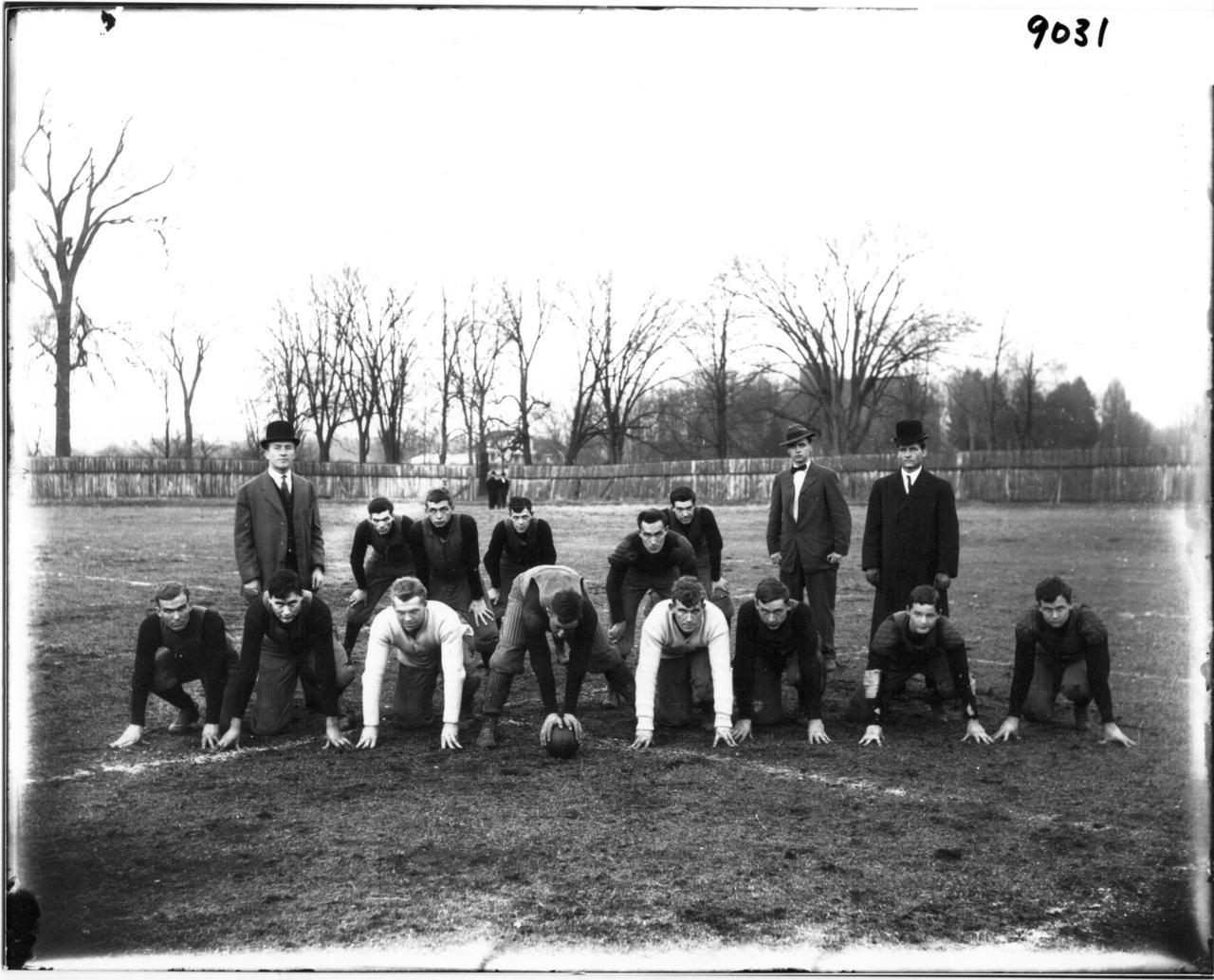
The second is (you won’t be surprised, no) Unsplash, as I don’t know a stock with more quality and up-to-date works. And yet the majority of them is a piece of modern photography, you can do some stylisation with retro add-ons, and I’ll show you where to get them in a moment.
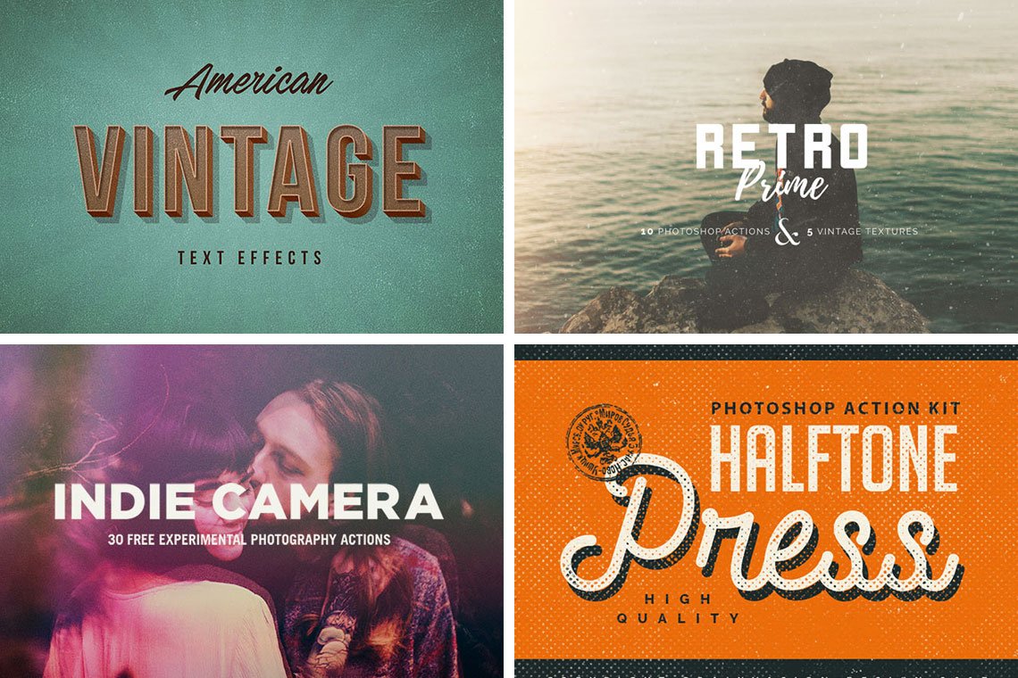
Aging. Okay, it’s so convenient if you have picked some retro photographs for the illustration. But if not, there’s hardly ever a problem since there are thousands of actions and effects to choose from: any design marketplaces or various deal services — you’re likely to come across lots of lovely items. Still, of course, you can save your money for a glass of good wine and get add-ons on a freebie blog. For example, on Pixelbuddha the choice of effects to add the desired vintage vibes is quite rich.
Cutting out. If with physical collages scissors do the job, in digital you can’t proceed without the cut-out skill. This way Chris Spooner offers a smart guide, where the most essential and efficient means are gathered: from the Lasso to the Refine Edge tool. For more complicated cases — like with hair, fur or other objects full of tiny, tricky elements — feel free to check our tutorial, which brings this skill in a quite comprehensible manner.
I’d like to note that in the list of my design favorites collage illustrations confidently enter TOP-5. They are not just a design craft, but an art — very thoughtful and complicated from one side and relaxing from another. Such illustrations perfectly accompany any text, any social ads. So, love it or hate it, it’s hard to find a more powerful, all-covering technique than this one. Try it, and we’ll return to you with its companion — moodboards, which are perfect for accumulating your discoveries in a single place.


