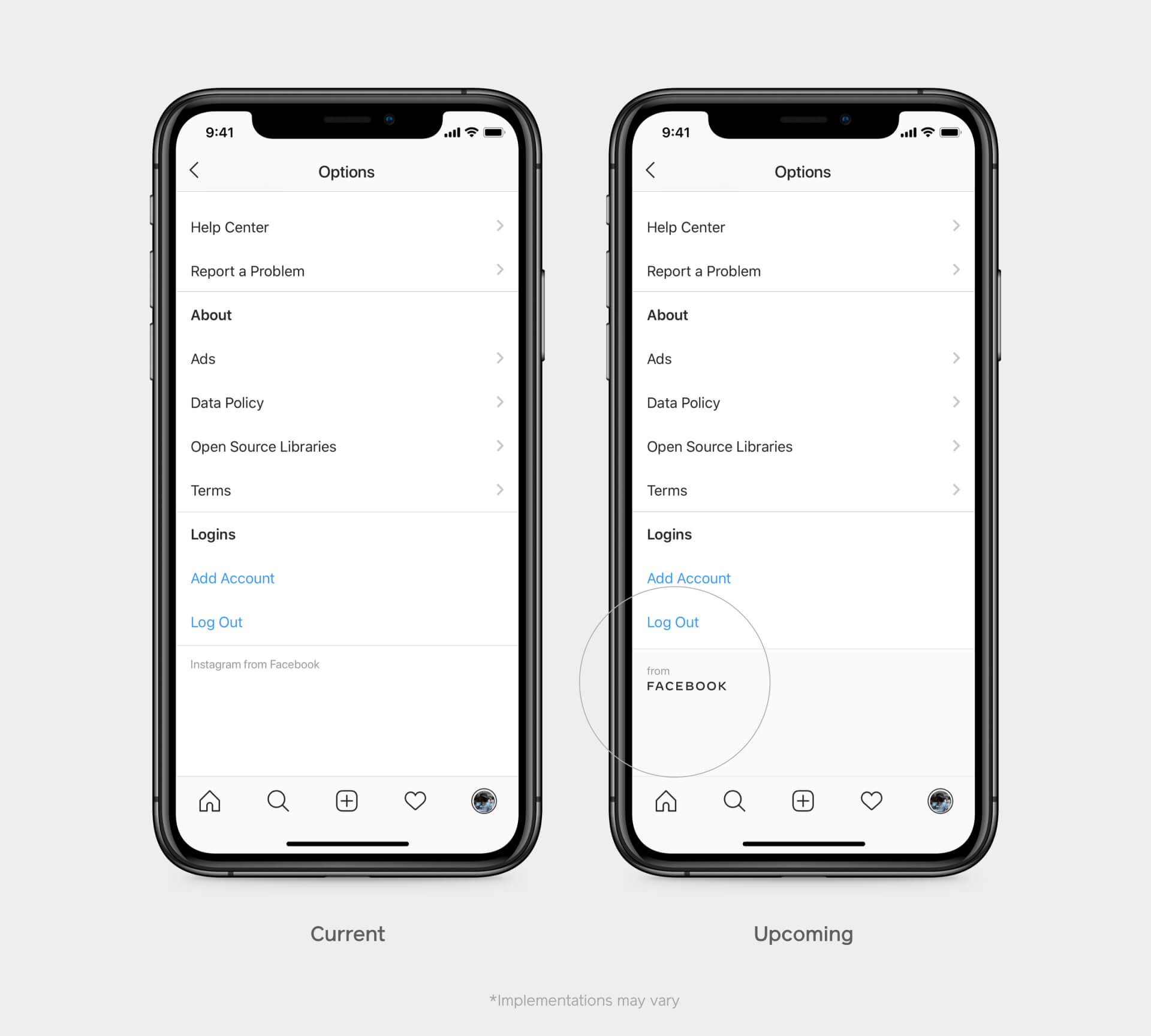
There have been some rumors about Facebook, Inc to change its name. But instead, the company comes with a new logo. This logotype will represent the parent company within Facebook-owned projects like Facebook, Instagram, WhatsApp as well as the company’s marketing materials.
Designers have chosen quite a reserved, up to generic typeface for the new logo word. It will appear in a few colors corresponding to the product it refers to: blue for Facebook, green for WhatsApp, pink-orange for Instagram.
The new logotype will help to distinguish the social network from the parent company. In its turn, the note “from Facebook” that they will soon add with their apps is to build up a more distinctive “shared infrastructure” — so the projects not only exist under a single brand but share common terms and philosophy.
Facebook has to deal with numerous problems today, and with a newly-designed logo, it hopes to restore its good name and gain the trust of the community. “Most people don’t really know that Instagram and WhatsApp are Facebook-owned — so when they learn it, they start to like Facebook more,” explains Antonio Lucio, Facebook’s chief marketing officer.
Aligning WhatsApp and Instagram with Facebook can improve the company’s overall image, and it can also have an opposite effect on some of the brands. Therefore, associating Facebook with WhatsApp can negatively impact users’ perception of the app, which is brought as a safe, private place for communication. Facebook’s story with privacy isn’t so reassuring — so the worth the new branding strategy is still an open question.


