• Home
  • Design
  • Freebies
  • Toolbox
  • Tech
  • Tutorials
  • Inspiration
No Result
View All Result
Subscribe
The Designest
  • Home
  • Design
  • Freebies
  • Toolbox
  • Tech
  • Tutorials
  • Inspiration
No Result
View All Result
The Designest
No Result
View All Result
Home Design

IKEA logo renovation: can you spot the changes?

They are different, I swear!

Milena Anisimova by Milena Anisimova
July 25, 2019
in Design
0
Share on FacebookShare on Twitter

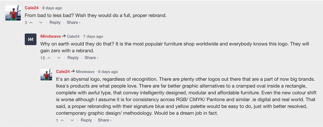
About a week ago, IKEA has presented its new logo and… Well, some people would say, that the word “new” in this case is not suitable at all. But if you look at it more carefully, the changes can be easily seen and then it becomes clear: in the name of optimisation!

IKEA logo development
IKEA logo development | via IKEA.com

If you take the SVG file of IKEA logos available for such curious fellas as we are, the adjustments are more than clear. First, the oval height gave the new space for enlarging the letters and even highlighting them a bit more. As for the logo box, it was shortened Of course, characters have undergone some changes after that. Starting with “I” shifted left more, the letter “K” angles got modified, the “E” now looks less massive, and “A” with its counter-spaces became more opened up. Oh, and this little registration mark is more integrated into the IKEA logo and not just floating somewhere around.

Old IKEA logo
Old IKEA logo
New IKEA logo
New IKEA logo

Now the colors: the previous version was more yellow and blue acid-looking, that was fixed by more faded palette. Your eyes will be grateful for that!

These changes are not so immense and hard to accept as it was with the Slack logo, obviously. Perhaps, one thing they’re similar with is the improvement for better brand performance, convenience comes first. How the Seventy Agency puts it: “The new IKEA logo is now optimized for both digital formats and small print formats”. But the audience is rich with the diversity of opinions anyway:

New Logo for IKEA comments

Our Instagram community voted in favor of a new variant but with a narrow gap to be fair (58% loved the renewed IKEA logo). I personally take these changes easy and kind of a happy for the brand for acquiring an evolved logo — it means that they actually look into the future.

Via: Underconsideration
Tags: IKEALogoRedesign
Previous Post

Game of Thrones fan art to take the edge off the new episode waiting

Next Post

Ballicons 3: 50 free flat web icons

Milena Anisimova

Milena Anisimova

Related Posts

How To Sell Digital Art: 20 Best Places To Sell Digital Art Online

by Alina Yakovleva
June 2, 2023
2

Spilling the beans about the online marketplaces we use to sell digital art and resources that surely worth checking out!

Quentin Tarantino Fonts: Exploring the Mastermind

by Milena Anisimova
May 2, 2023
7

You probably haven’t noticed but Quentin Tarantino managed to shove tons of contrasting movie fonts in opening credits and to...

30+ Best Instagram Color Schemes & Aesthetic Ideas

by Ksenia Pedchenko
April 27, 2023
1

Beautiful visual goes first — especially if it's Instagram. Now, with beautiful palettes, you'll find it so much easier to...

45+ Best Handwriting Fonts (Free & Paid)

by Alina Yakovleva
April 24, 2023
2

Soft curves, bold lines, charming decor — handwritten fonts are so hard to resist. And there is no need to!

10 Font Trends 2023: The Year of User-Oriented Typography

by The Designest Staff
January 19, 2023
0

If you need a trouble-free method to understand what the design industry is up to, look at the typography trends....

12 Graphic Design Trends For 2023: The Visual Euphoria

by The Designest Staff
December 20, 2022
0

It was the best of times, it was the worst of times, and whatever part of this statement applies to...

Next Post

Ballicons 3: 50 free flat web icons

Leave a Reply Cancel reply

Your email address will not be published. Required fields are marked *

Popular Posts

  • How To Sell Digital Art: 20 Best Places To Sell Digital Art Online

  • 70+ Best Photoshop Text Effects & Styles ⇪ PSD Templates

  • Top 9 Logo Design Trends in 2023: The Triumph of Typography 

  • 45+ All-Star Baseball Fonts

  • 20 Digital Artists You Should Know: Famous, Talented, Inspiring

Envato Elements
with Envato Elements membership

Categories

  • Design (74)
  • Freebies (82)
  • Inspiration (39)
  • Other (22)
  • Tech (18)
  • Toolbox (156)
  • Tutorials (57)
Youtube Facebook Instagram Dribbble Pinterest Twitter RSS

Subscribe

The Designest

Weekly Email Updates

We got tons of fascinating articles, videos and freebies for you every week!

SUBSCRIBE

Design Blog

  • Design
  • Freebies
  • Inspiration
  • Other
  • Tech
  • Toolbox
  • Tutorials

About Us

Welcome to The Designest — a professional design blog aimed to deliver fresh news & trends of the industry as well as the most essential courses & tutorials you must have been searching for.

Company

  • Advertise with Us
  • Contact Us
  • Cookie Policy
  • Privacy Policy
  • Terms and Conditions
  • Affiliate Disclosure

© 2023 The Designest — Professional design blog aimed to deliver fresh news & trends of the industry

No Result
View All Result
  • Home
  • Design
  • Freebies
  • Toolbox
  • Tech
  • Tutorials
  • Inspiration

© 2023 The Designest — Professional design blog aimed to deliver fresh news & trends of the industry

Subscribe to Regular Updates
We got tons of fascinating articles, videos and
freebies for you every week.
This website uses cookies. By continuing to use this website you are giving consent to cookies being used. Visit our Privacy and Cookie Policy.