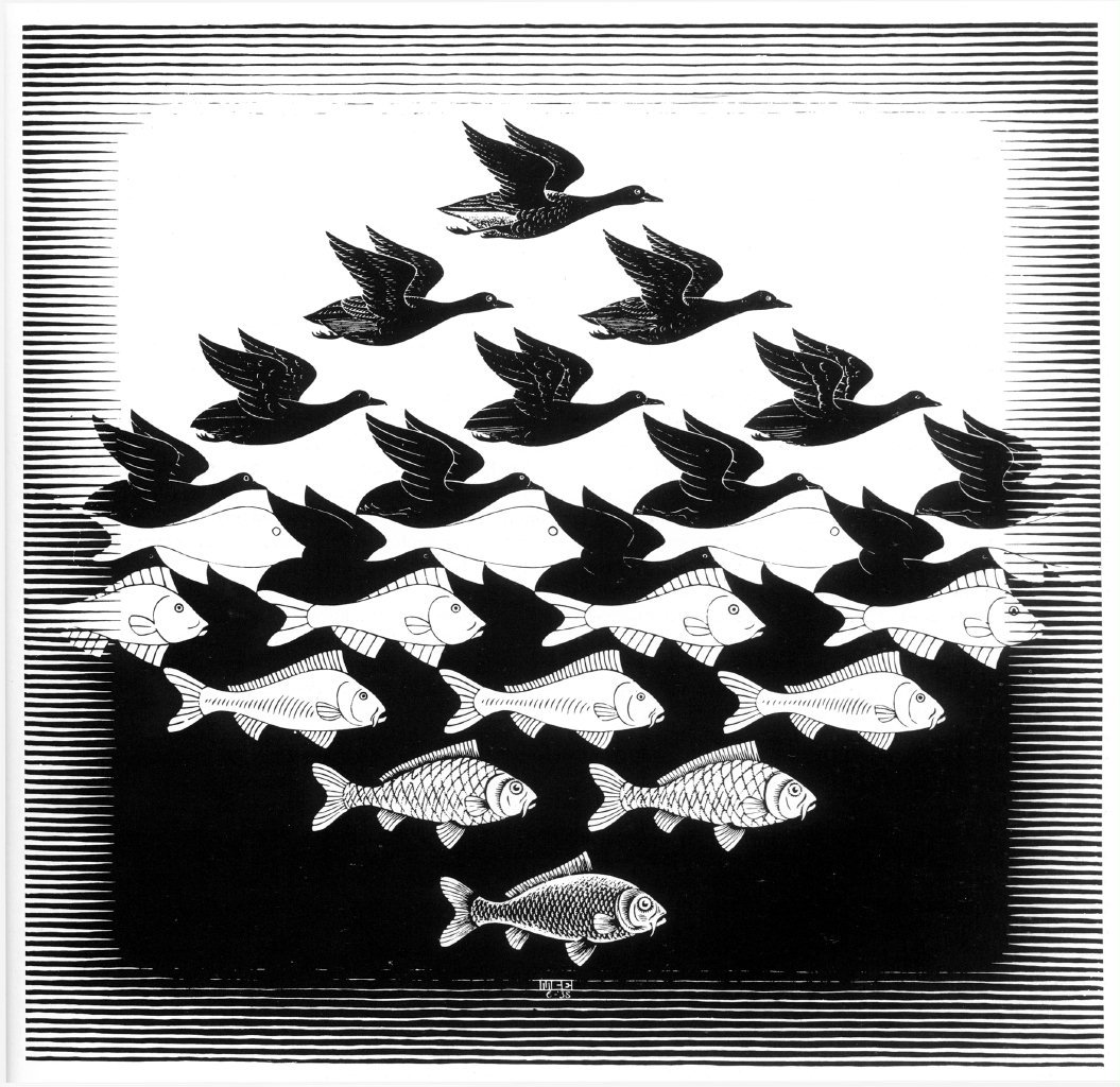
Sometimes only after months of owning certain things you start looking closer at them. Who knew that buying a t-shirt in a local second hand would result in digging deep into the meaning of the print, which turned out to be a negative space art.
It’s called “Sky and Water I”, the picture by the Dutch artist M. C. Escher, who created a hypnotic puzzle of birds slowly converting to fish and vice versa. This infinite interchangeable image uses the perception trap of negative space art, where spacing and objects are placed a special way to mess up your mind.

Nowadays, negative space compositions can be met not only in graphic or web design, but in nail drawings, tattoos, window stickers and more. People usually compare negative space with silent parts in music, giving the melody a contrast in structure — it’s just one more reason to get to know this artistic move.
What is Negative Space?
In general, negative space is the outline area around the object — it’s that simple. But the negative space definition can’t be brought up without mentioning its opposite, positive space, representing the object itself. Every object possesses positive and negative space, correlating with each other in terms of proportions, composition, and arrangement. The way they interact affects the way this or that illustration is perceived by the viewer. As long as you stick with the principles of balancing between positive and negative space, your designs can be dramatically enhanced.
Negative Space in Art
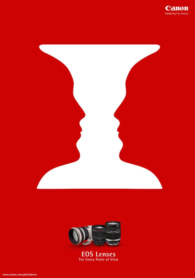
There’s no surprise that the negative space definition in art is being nothing different from the above-mentioned one. Professional artists, studying negative space in the course of academic art, get introduced to Rubin’s vase. This optical illusion is a black vase on the one hand but if you switch your vision to the white side, you see two faces staring at each other. This old trick was invented by the Danish psychologist Edgar Rubin, who was studying the way optical perception works and how our brain composes visual patterns into one concept. The pretty similar idea is developed in the famous Rorschach test, where your subconscious matches positive and negative space according to a psychological state of mind.

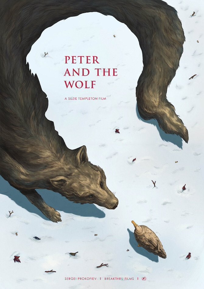
It’s exciting how an artist can accommodate two images in one with them being shown simultaneously through the negative space! Minimalistic black and white versions or works stepped to the advanced level of colored illustrations — there are dozens of negative space art, deserving your attention. The before-mentioned form of art is a suitable strategy for portraying symbolism and ambivalence of obviousness.

One more successful use of negative space in art is its implementation in social ads: one meaning at first sight but there’s some twist, turning it into a morality tale. Impressive, convincing, and definitely memorable — only benefits for such genre of advertising.
Negative Space in Branding
While designing a logotype as a part of the company’s corporate identity, the aim is to tell as much as possible about the brand, to develop the right idea of what this company specializes in. The negative space logo allows to take two distinguishing features and merge them, without harming the core message. The real menace here is to decide on the definite representation of two ideas you’re implying with negative space or else the overloaded complex imagery won’t be easily perceived (remember about the psychological side of this).
It’s not necessarily should be the image as a logotype: any designer can get away with negative space art through typography. One sophisticated letter can say surprisingly a lot with its positive and negative space solutions, enabling associations in mind. The whole alphabets, initials, and one letter designs obtain their special history and build certain imagery around them by playing with negative space accents inside one character or throughout the word and text. It looks a lot like yin and yang, don’t you think?


