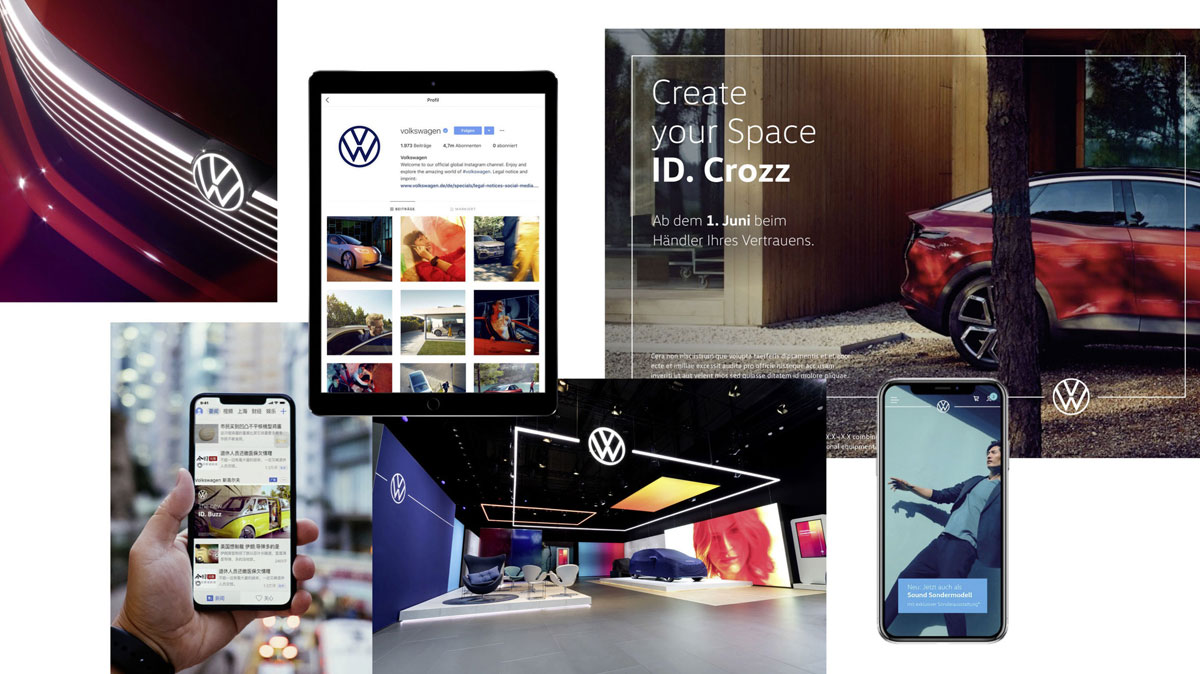
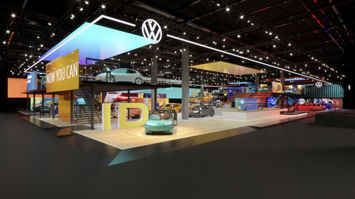
‘People’s car’ has presented their remastered brand identity together with vw logo, introducing the new company objective — emphasis on creating electric cars. On the whole, Volkswagen logotype has the same structure but it got reduced to essential recognizable elements, perfectly getting along with the contexts it may be put into.
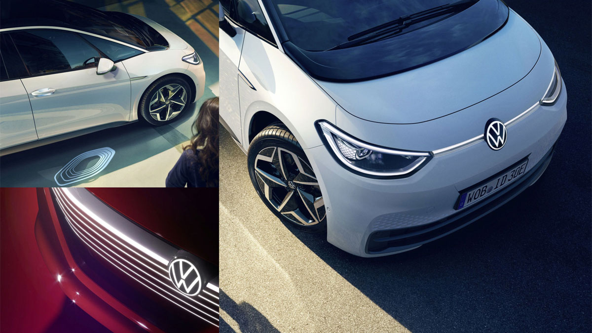
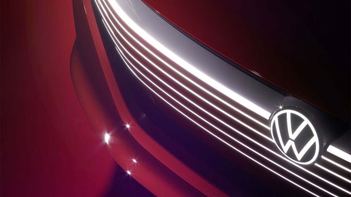
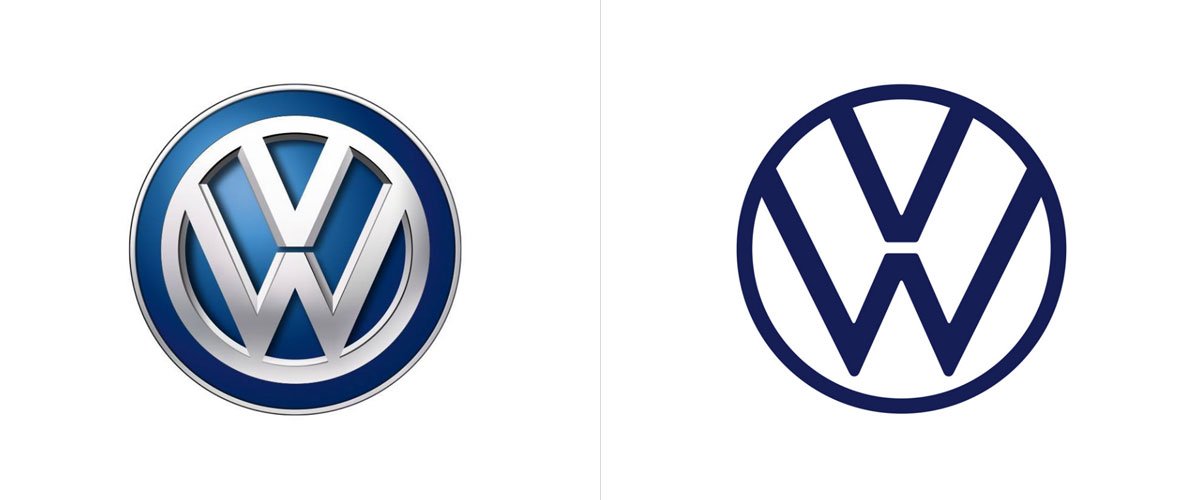
The reign of minimalism takes over the world and it doesn’t stop for a minute. Which is a healthy tendency, fostering so many companies to think in a less complex way. The simplicity of genius you may say, provoking a vast range of benefits the brand. At least out of pragmatic reasons, such as logo flexibility in terms of communication, the vw emblem has obtained a new convenient form. Now its constituents are light and plain, dropping out of the massiveness previous Volkswagen logo had. No more skeuomorphism with its silver badge!
VW Logo inside of a Moving Frame
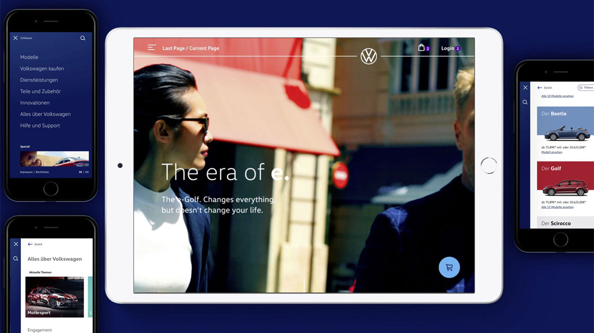
The handy feature, giving carte blanche to all types of Volkswagen logo positioning. Any device adaptation won’t be a composition suicide, pursuing, primarily, the user-oriented goals. It may be referred to as an allegory for the Volkswagen official statement to be ‘more focused on people’. The company promised to exclude previous perfectionism in their cars’ showcasing, opting for realistic situations all Volkswagen customers can find themselves in.
Colors and Shapes
After introducing the flat vw logo design with open elements, playing around with colors is no longer a problem. Getting rid of an old school chrome (considered to be a ground rule for any car manufacturing company back in the day) was like opening the door for new design possibilities, remained unaffordable for such a long time. From now on Volkswagen logo embodies a balanced structure, saving the well-known imagery. Deep dark blue color as the main one and numerous variations with blue and white look together as a design system, elevating the vw logo even more.


