To be frank, I can’t call myself a fan of alcohol drinks. But as an illustrator, I’ve developed a certain taste for the most unexpected forms of inspirational material. You may consider this to be my major excuse for picking label design in this field.
Having explored so many gin, bourbon, and whiskey brands with their sophisticated packaging, now I kind of want to buy an exquisite bottle for the interior at my place. The best thing about this decision is the abundance of styles involved in the label design. Each has that peculiar style and some special idea execution: ‘diversity’ is the best definition here.
Booze label design variety
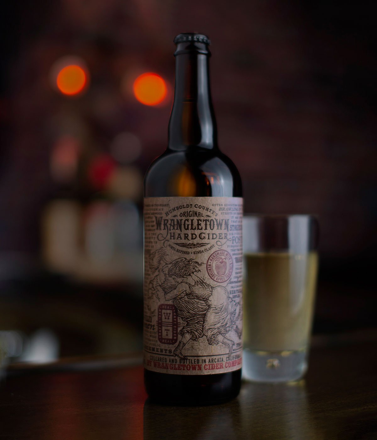
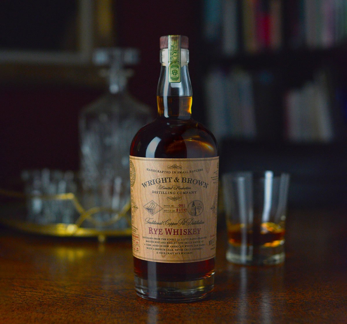
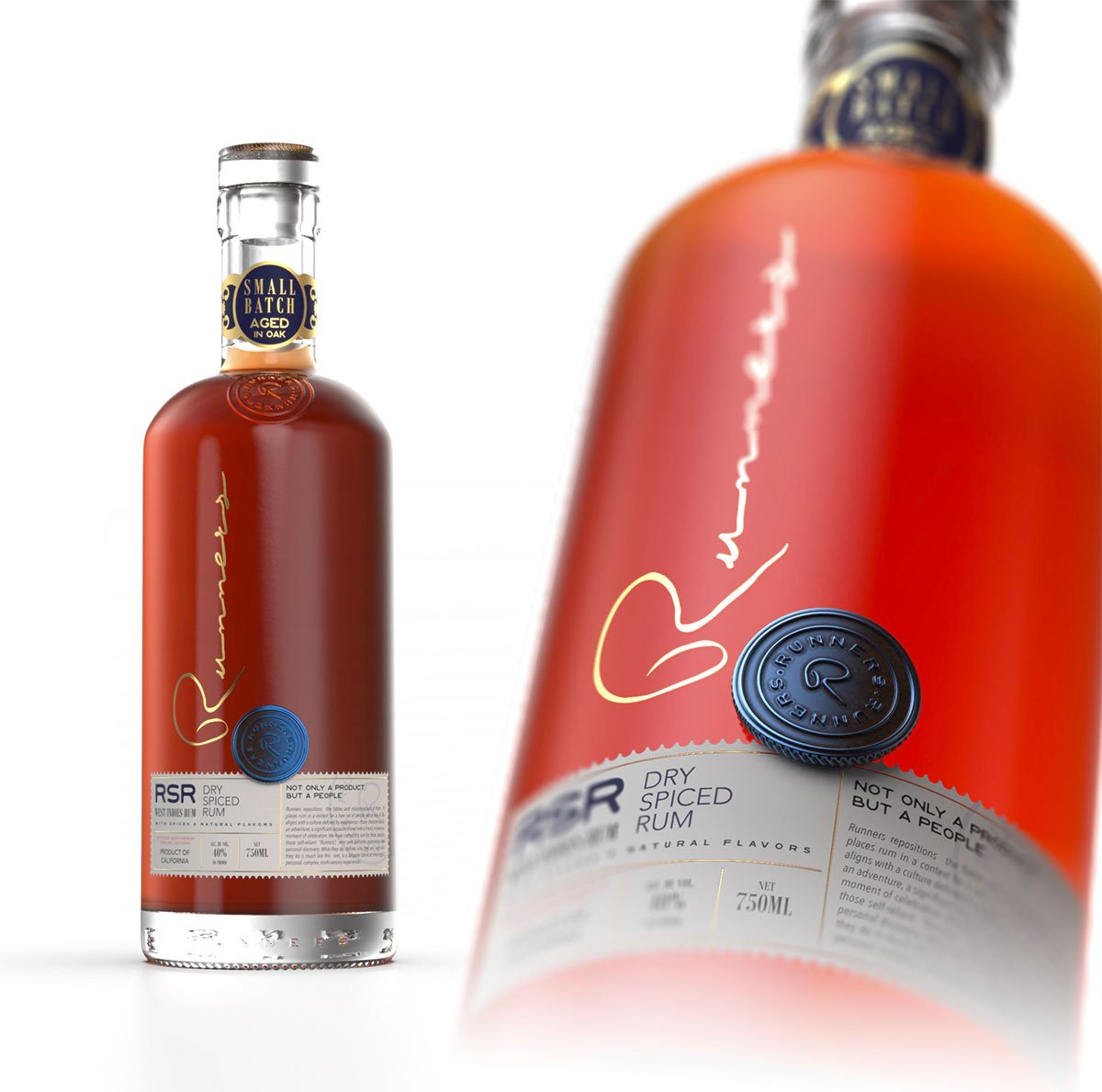
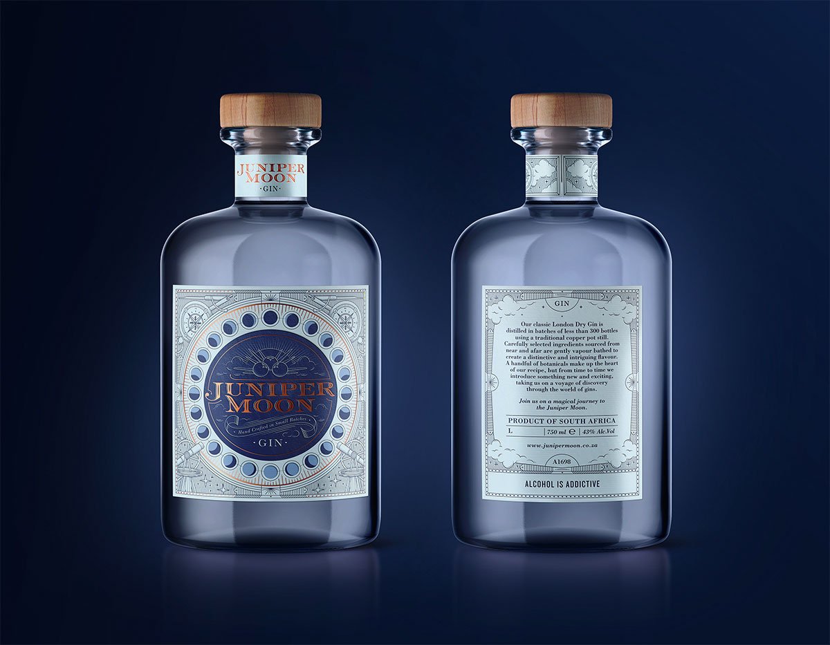
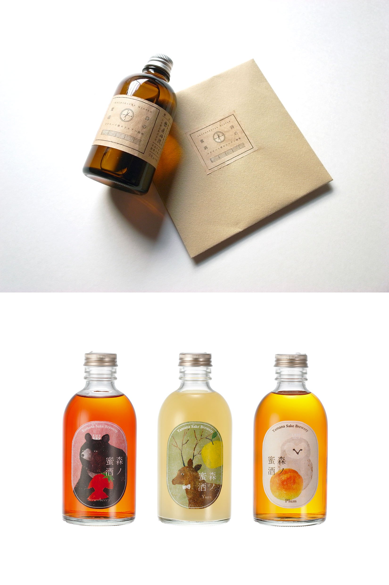
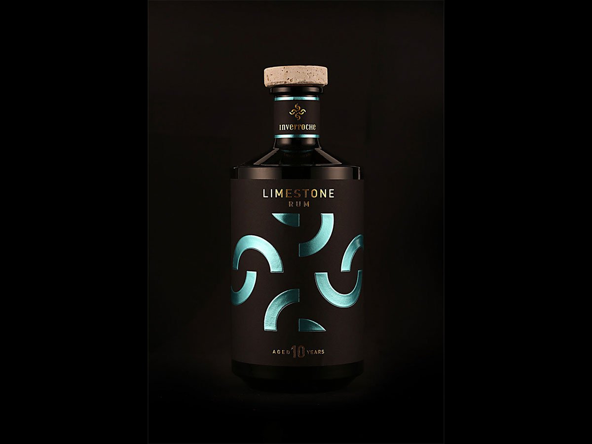
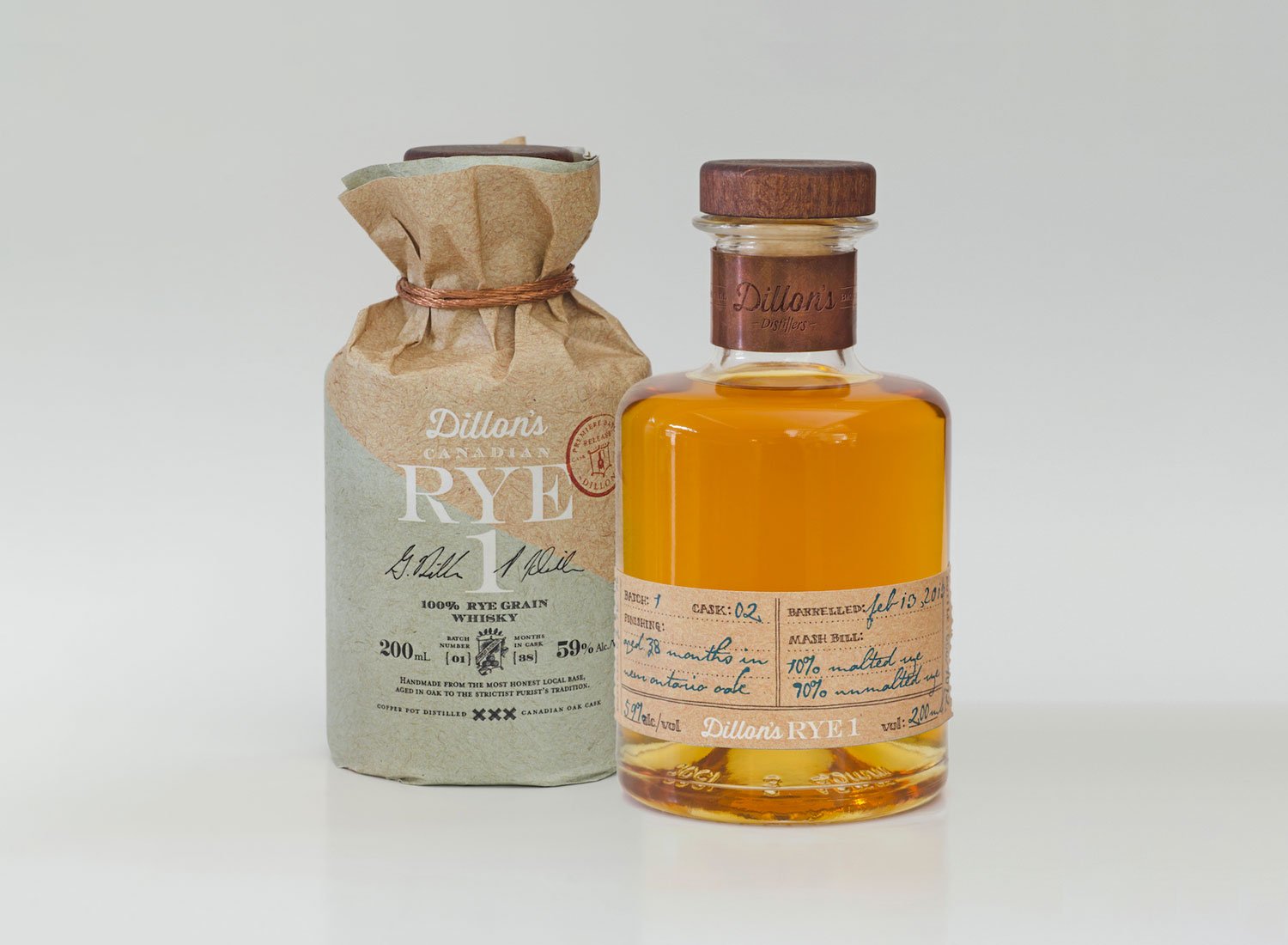
First, there are vintage-looking labels reminding of pirate adventures and Tortuga. Like aged yellow paper with the rough retro font on it, it’s amazing! I love the way some of the bottles are decorated with craft paper as well — this is a detail, making any beverage look luxurious and expensive.
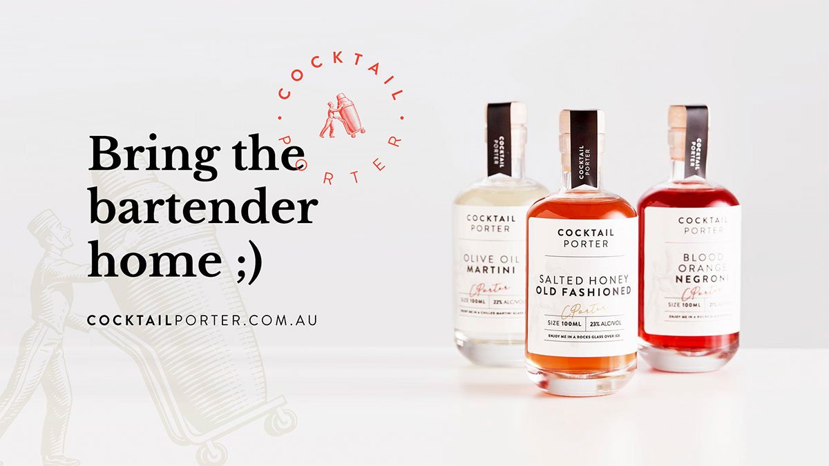
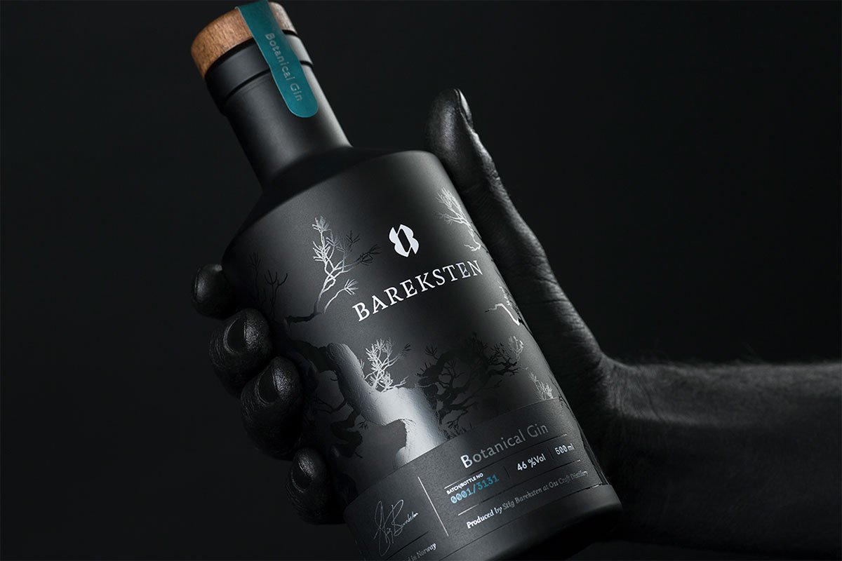
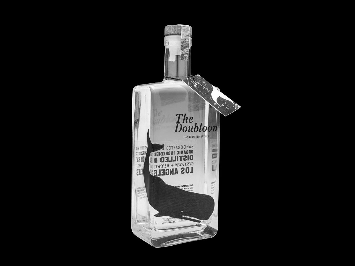
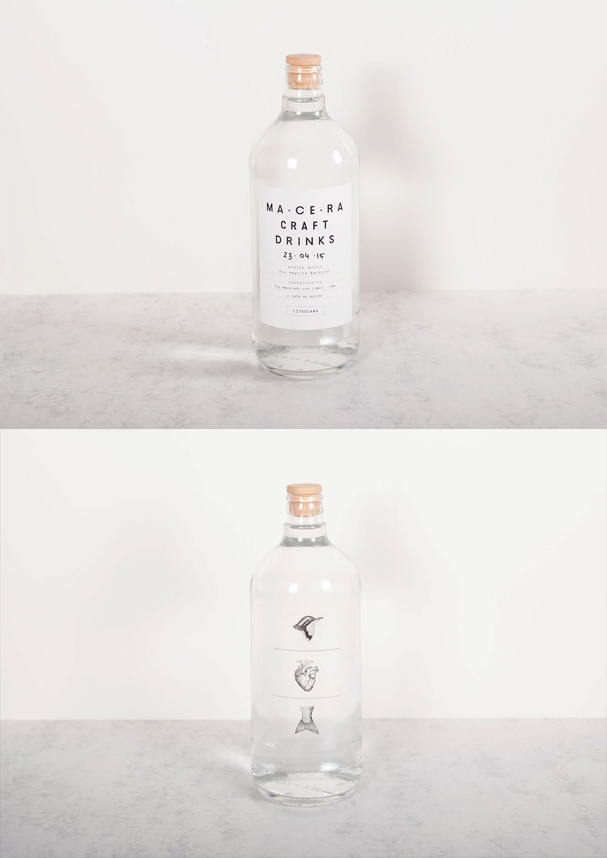
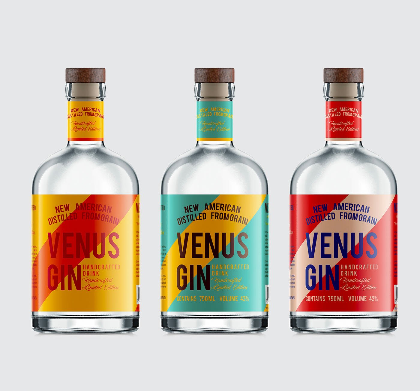
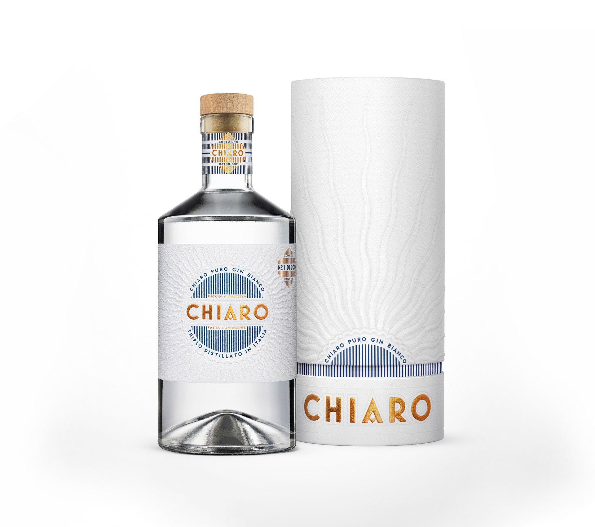
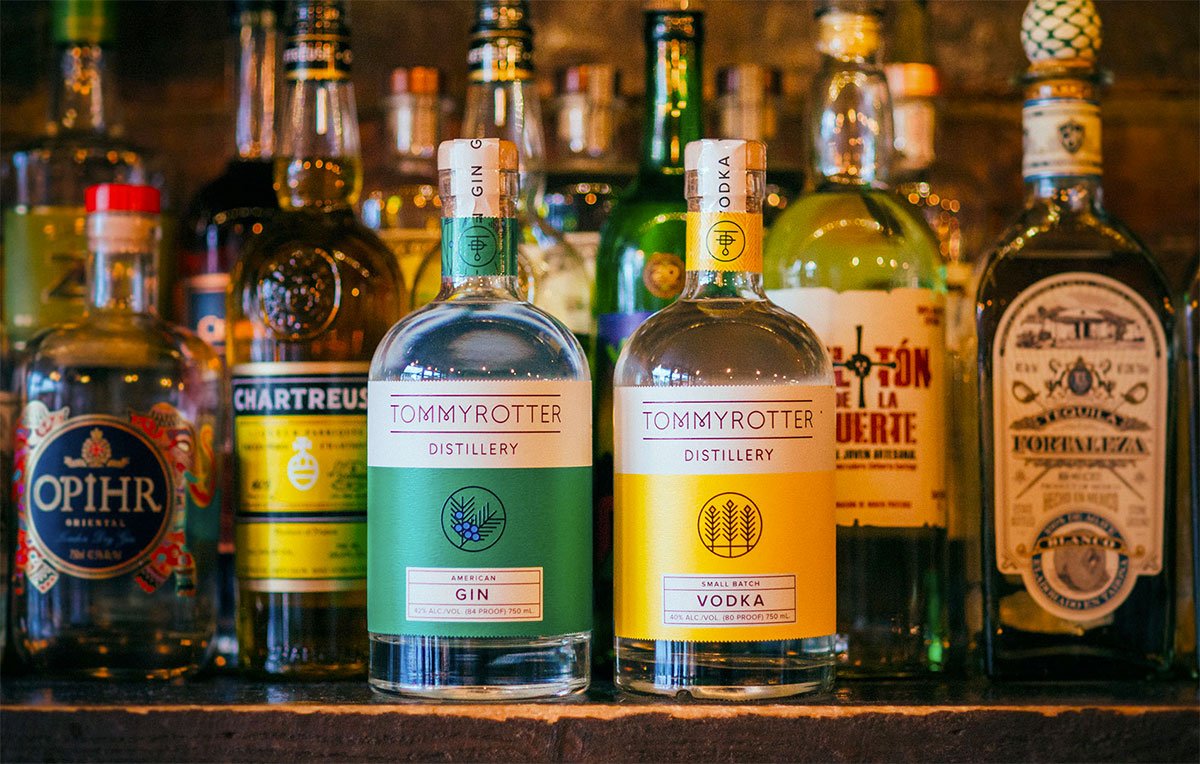
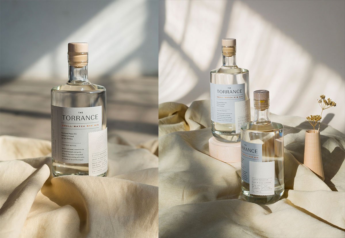
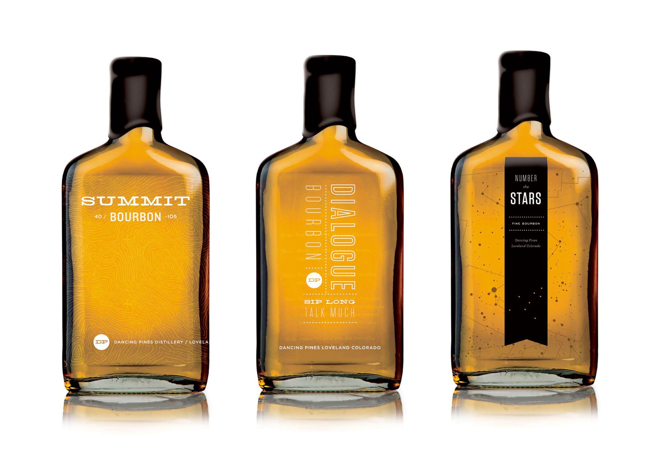
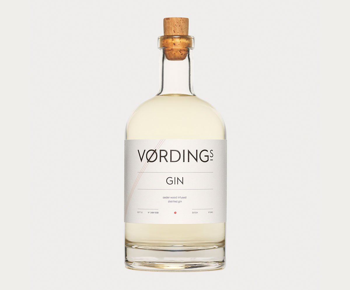
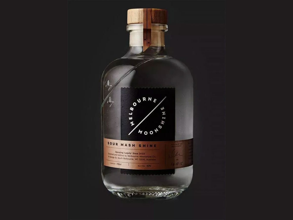
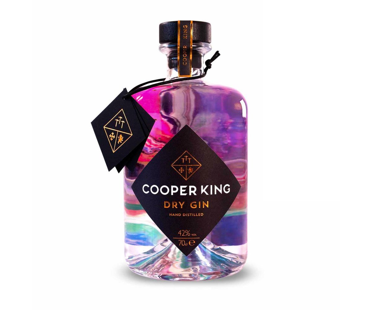
Minimalism is the other feature I’d love to bring your attention to. Transparency of glass opens a wide range of opportunities to play around with label design. Check out how some of the brands implemented graphics or special backside textures to let the liquid inside create a volumetric composition. Geometric forms are also a favorite instrument for packaging, as far as I can tell: the lines, cubes, triangles add more edginess to perception.
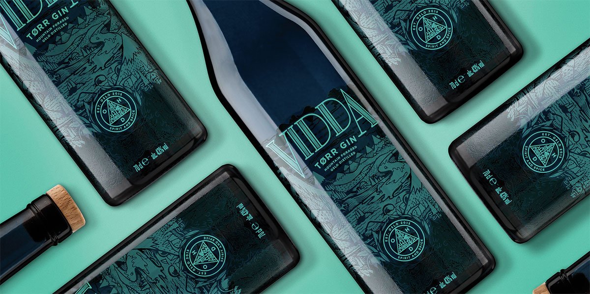
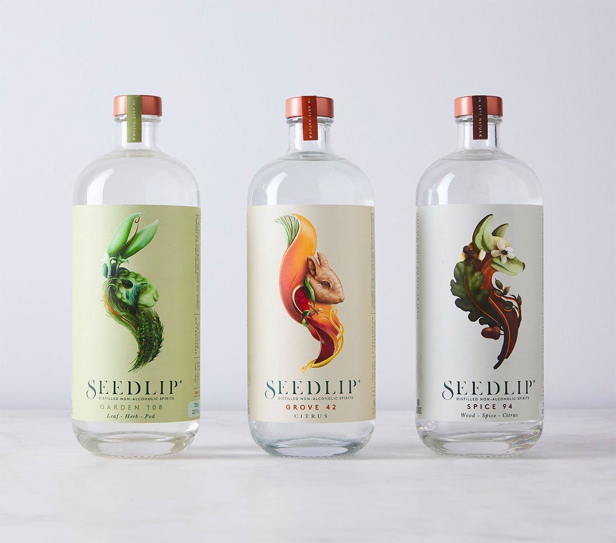
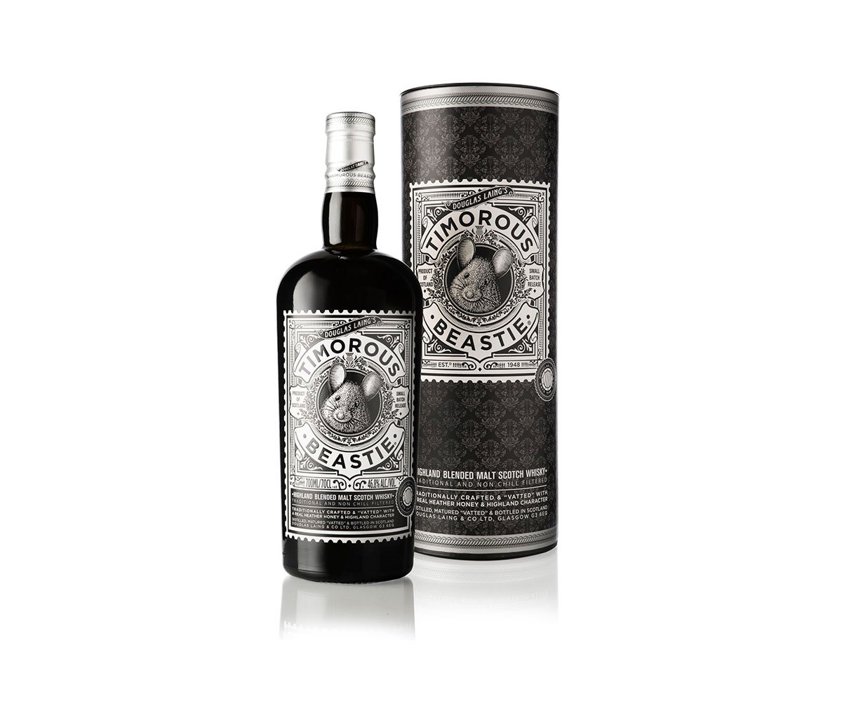
Of course, I can’t leave illustrations unreviewed, this is a special domain to talk about. But let me just point out that such alcohol-oriented mascots on the label design are so complex! The more you watch them, the more details you see. They appear to express the ‘drink’s temper’ so-called.
Alcohol can not only be a balm for someone’s soul but also a nice thing for your inspiration to be provoked by!

