Let me introduce you an ampersand, the typography mammoth which is as ancient as the Imperium Romanum as well as popular within bloggers, marketers, advertisers and many other masters of text. Well, it’s used so often that I could NOT pass by. Moreover, this phenomenon is above graphic design.
Let’s give credit to Marcus Tullius Tiro, a freedman of Cicero for bringing shorthand along with multiple cut-off techniques and an ampersand. True, the shorthand has changed beyond all recognition but this probably most successful logogram has lived a long life of evolution to be what you type by Shift+7 command.
Thanks to the Latins
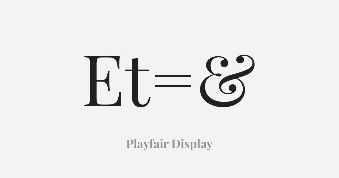
Introduced somewhere in the first century AD an ampersand was initially a ligature for E and T — et as and in Latin. And if you check out some ancient or medieval texts, you’ll see how two letters, first combined sketchily, iteration by iteration are approaching the glyph you know.
Typography’s version of E=mc2
Why an ampersand exactly? According to rule, characteristic for the young European languages, the speaker had to add per se before every letter of a Latin alphabet that also served a word. So in our case, it sounded like And per se and (first and for the final word in the list, last — for the & itself). 4 short words in a single expression never survive to stand alone, so they’ve been transformed into a single word.
What amuses me most is how significantly the ampersand has changed. At every stage of typographic history, there were dozens of variations. And still, the standard we use today entirely differs from most of them.
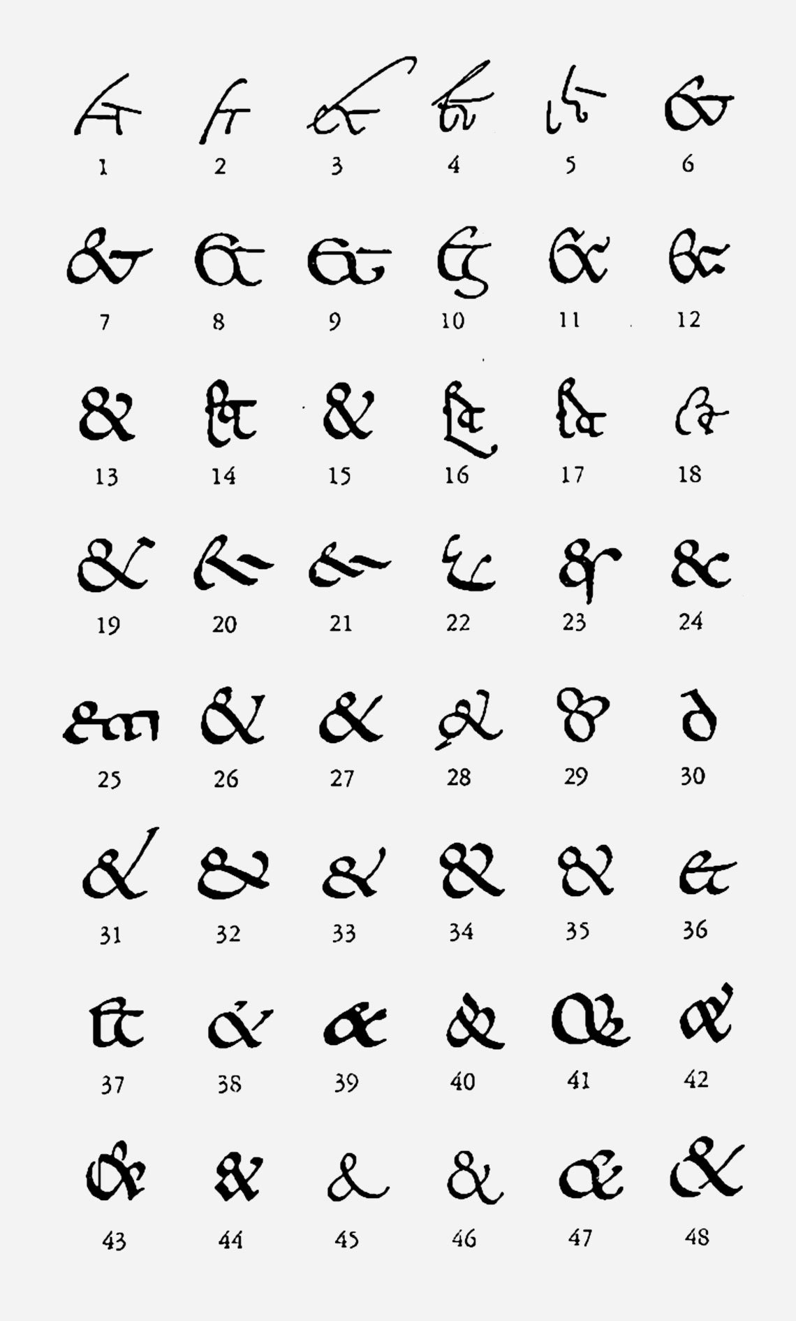
Collected ampersands in Jan Tschichold’s The Ampersand: its origin and development (1957). Notable here are (1) Pompeiian graffiti; (8) an insular majuscule ampersand from the 7th century Book of Kells, and (13) an 8th century Merovingian ampersand, already recognisable as the modern ampersand form.
For the good reason of convenience, the ampersand was featured in every Roman font. And since it was first added to dictionaries in 1837, it appeared more and more frequently in other typefaces.
Write it well
I am Russian, and in my linguistic culture, the usage of an ampersand is superficial and incorrect as the conjunction we have is a one-letter word already. Same must be true for your language as well if your and is not longer than a single letter.
Otherwise & is acceptable — yet not to totally replace the word but in three cases you should keep in mind. Going beyond this is fatal, and you risk to be attacked by Grammar Nazis.
Logical unities within a list. It’s the first thing that comes to my mind actually. Probably since I write a lot and have to keep a balance between comprehensibility and proper syntax. The ampersand here helps to create a stable, indivisible unity on your list. For instance, Koalaman incubates funky bacteria, saves dinosaurs, prawns & baby kiwis, and protects your home tasks against the neighbor’s dog Simon. With multiple and‘s the construction would go wordy and so hard to read.
An unsplittable union. Dolce & Gabbana, Marks & Spencer, Abercrombie & Fitch, Dungeons & Dragons or Tiffany & Co. serve a good example of an unsplittable union — the words obviously don’t work separately as well as and would ruin the well-know verbal image. It is so not only about brands, but ALL stable unities like R&B (rhythm and blues) or B&B (bed and breakfast).
A tight partnership. In this case & denotes ultimately close collaboration of co-authors, screenplay writers or entrepreneurs: Smith & Jones, Dun & Bradstreet, Breadcrumbs & CookieMonster (present). And sets that the first dominates above the second. An ampersand sets the equality no one can doubt. See the pitch of difference?
More than a word
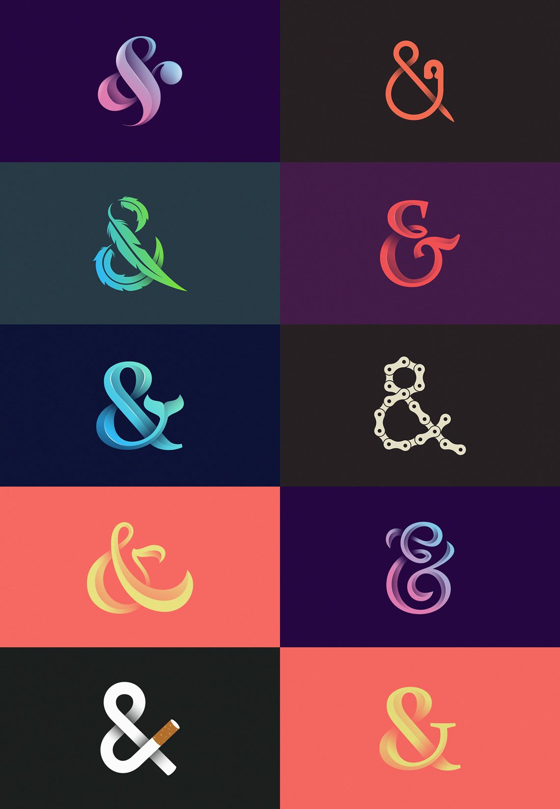
It’s hard to portrait how inventive and ingenious were the type foundries to create an ampersand of their own. Initially, they have taken a long way to refuse from the ET-resembling glyphs which were replaced with more complicated ones. And as soon as our well-loved & was introduced, there was a boom of fresh solutions and extraordinary approaches towards how an ampersand should be designed.
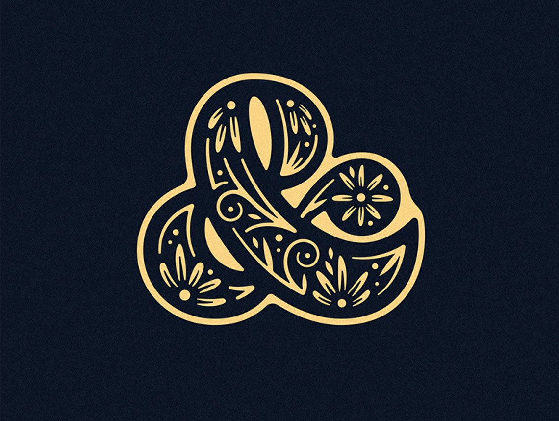
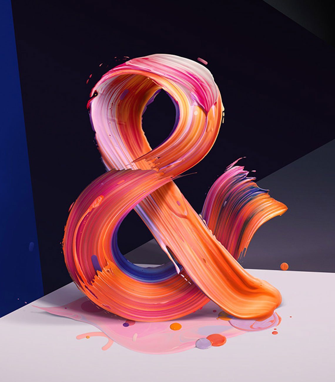
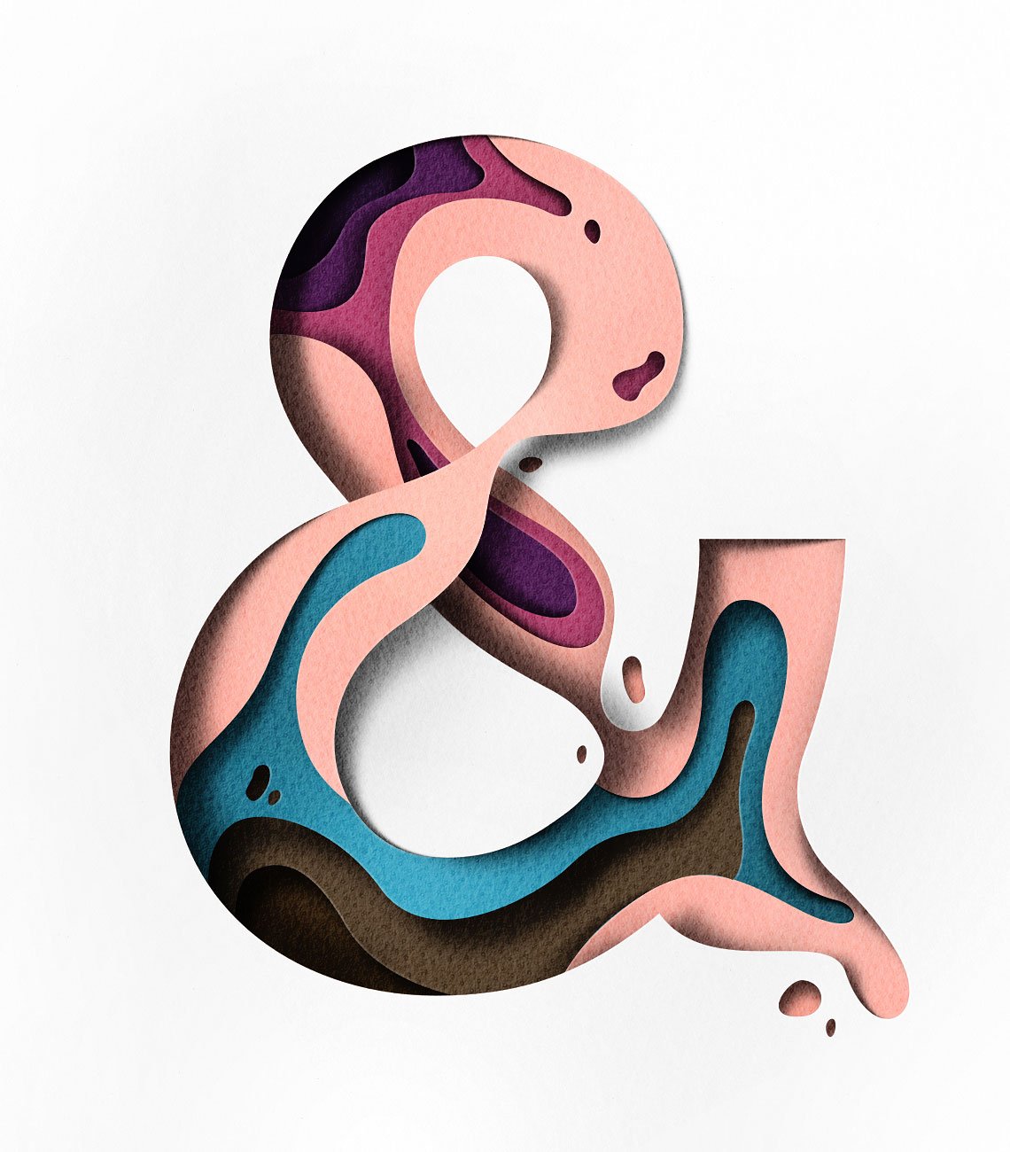
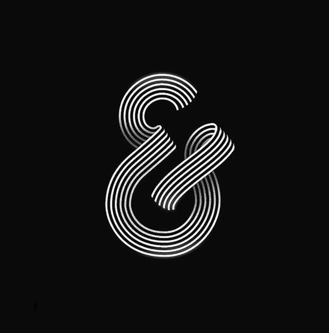
The today’s range of ampersands is utterly mesmerizing — thanks to the massive typographic uplift and the introduction of SVG fonts, extra support of the typographer’s creativity. So even the ampersand’s design is something standardized there is pretty much space for creativity and personality.
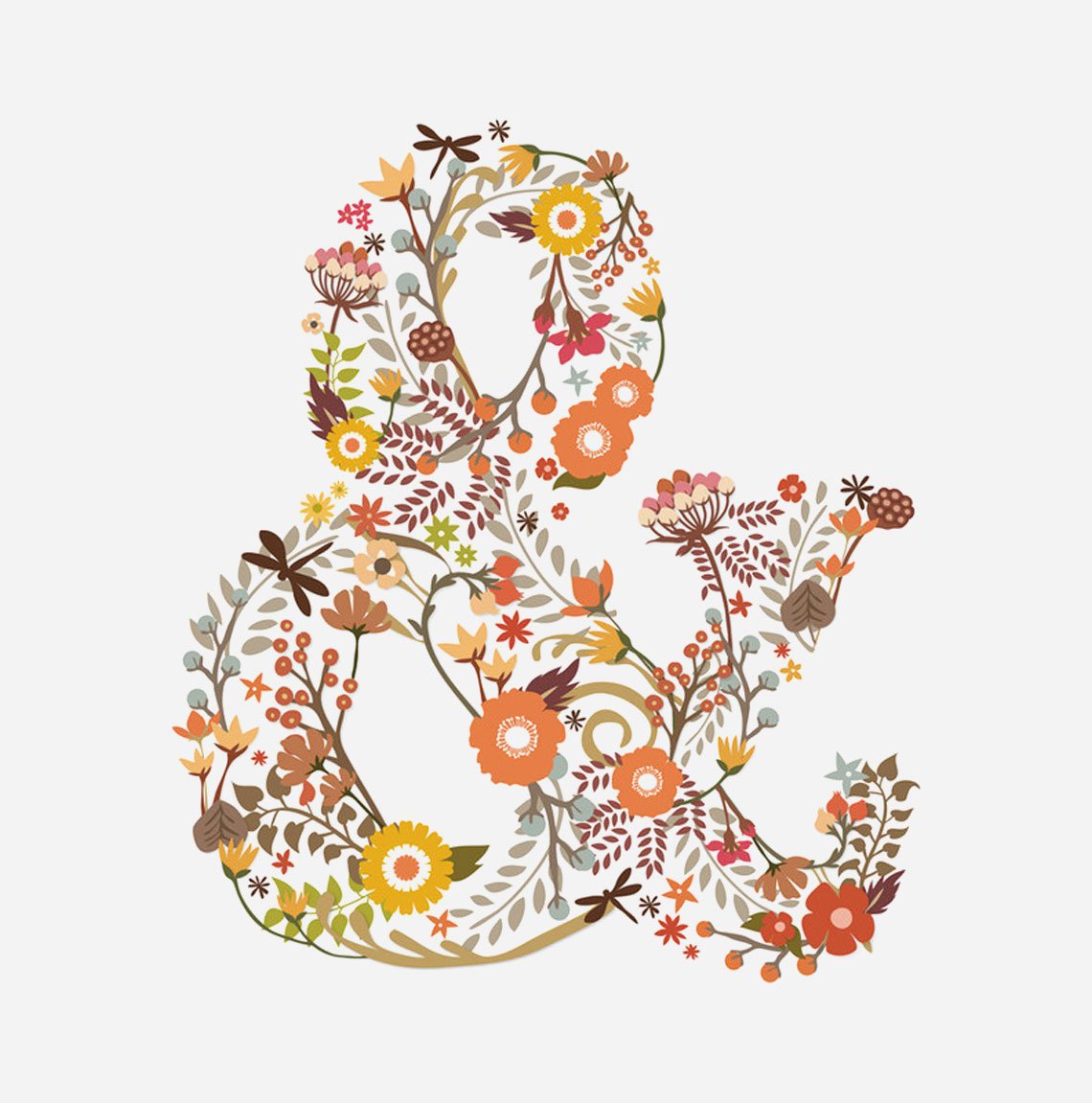
Collection creative Ampersand by Yuri Kartashev via Behance
Pencil ampersand by Usama Awan via Dribbble
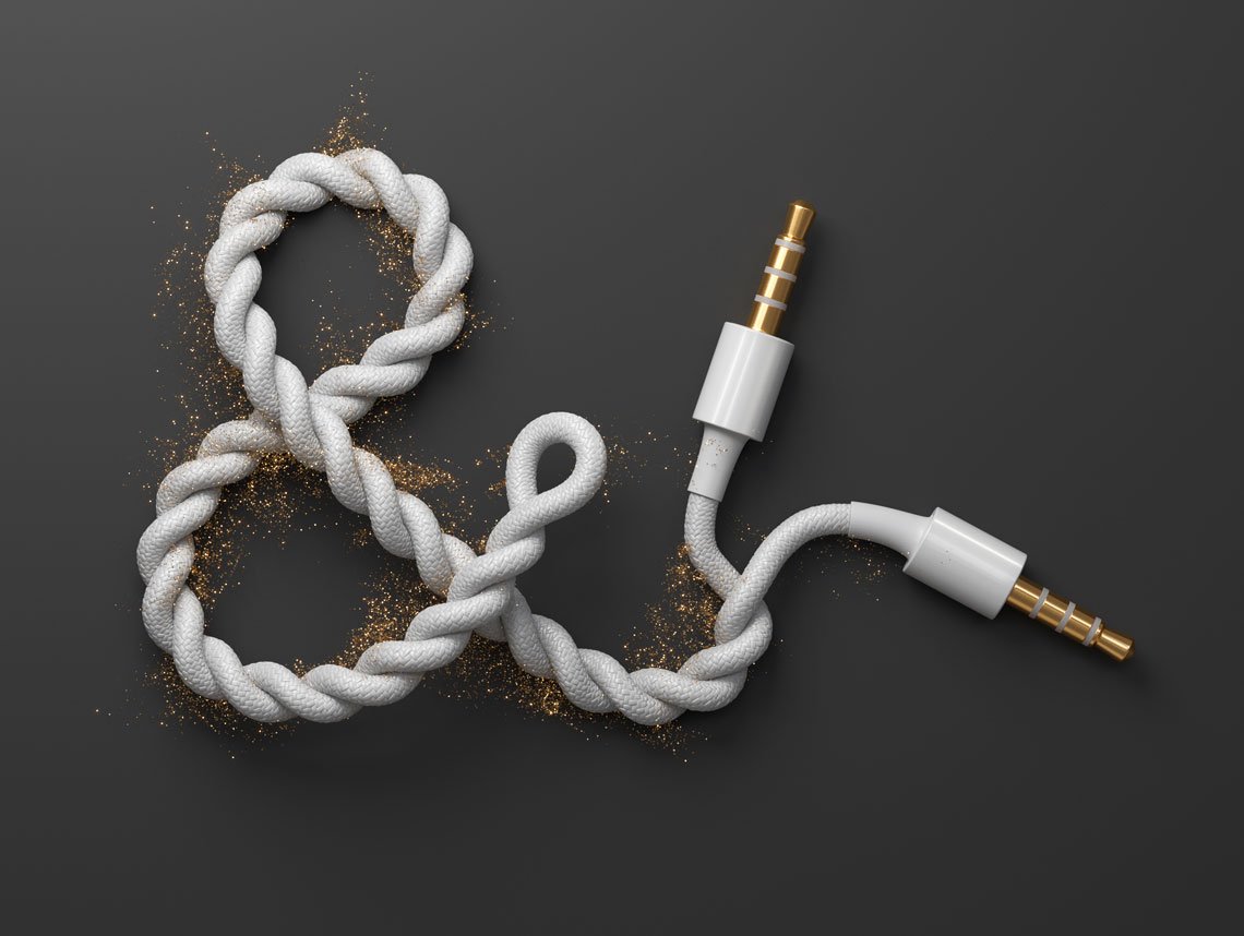
Ampersand Audio Cable (3d) by Mikael Eidenberg via Dribbble
Ampersand Pin by Nick Matej via Dribbble
The New Republic Magazine - Ampersan by Pawel Nolbert via Behance
Hither & Yon wine label by Eiko Ojala via Behance
Amfursands by David McLeod via Behance
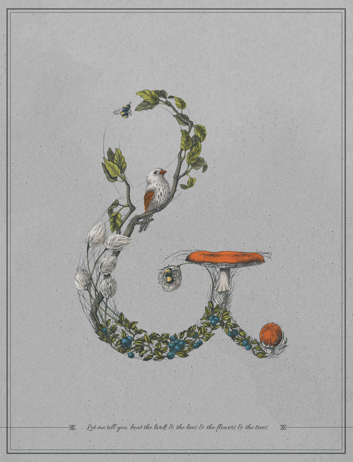
Let Me Tell You About Ampersand by Stella Björg via Behance