Actually, we all know the only true definition of bad graphic design — it’s the one that has been made by someone else but you. In order to help you keep this statement correct, we’ve prepared a comprehensive guide to the design failures. After going through our selection of bad graphic design examples, you’ll be able to spot and avoid many common pitfalls in your creations. Look, laugh, learn.
Jokes aside, graphic design is the practice of projecting ideas and experiences with visual and textual content. The goal is to convey a particular message or idea in a way that is both effective and aesthetically pleasing. I use the term ‘practice’ intentionally because the word ‘art’ often confuses novice graphic designers and makes them think that a designer’s job is about aesthetic and artistic expression only. This misunderstanding often becomes the root of epic design fails.
Graphic design usually has a specific objective, whether it’s to sell, inform, entertain, or evoke an emotion. It utilizes text and visuals to communicate a message and leverage the audience. What’s important — target audience. Graphic design often tailors its work to communicate effectively to a specific group of people. Thereby, good graphic design delivers the message the best way possible, while bad doesn’t.
This can manifest in numerous ways. At its core, poor graphic design fails to serve its intended audience or achieve its goal, but with just a little understanding graphic designers can cure this. We all agree that design is subjective, but there are certain universal indicators of inferior design. Let’s have a closer look at the common design mistakes and bad graphic design examples, so you don’t make them in your own projects.
Key Mistakes in Graphic Design
1. Lack of Clear Hierarchy
In the complex dance of design elements on a canvas, visual hierarchy plays the role of a choreographer, guiding the viewer’s eye with purpose and intent. At its core, hierarchy is about organizing information in a way that conveys importance, sequence, and interrelation ensuring a smooth user experience. A well-implemented visual hierarchy seamlessly takes a viewer through a journey — from the most dominant element, often the main message or focal point, to the more nuanced, subsidiary details. It’s a delicate balance of size, color, contrast, spacing, and placement that helps in distilling complex messages into digestible visuals. However, mistakes in establishing a clear visual hierarchy can confuse, disorient, or even repel viewers. Signs of poor hierarchy are glaring even for non-designers yet often overlooked:Equal Visual Weight to All Elements
If everything on the canvas screams for attention, nothing stands out. When every element — from the main headline to the tiniest footnote — bears the same visual weight, the design becomes a cacophony of words and images where the main message is lost. Bombarding viewers with excessive information is counterproductive — no one will capture it. Just go on any news website to experience this. Have you ever tried to navigate through all the self-playing videos and sponsored articles to find what you’re here for?


Missing Focal Point
Every design should have a north star — a focal point that immediately draws the eye. Without this, the viewer’s gaze wanders aimlessly, making it harder to convey the primary message or evoke the desired emotion. One of the common mistakes is when everything appears equally weighted, leaving viewers unsure where to look first. It can be called a graphic design fail as long as it disrupts the flow, provides an unsatisfactory user experience, and eventually ends up with the viewer’s confusion rather than understanding. To remedy this it’s better to add more white space balancing content blocks.


Neglecting Clear Spacing and Grouping
Elements related to each other, when spaced too far apart or unevenly, can disrupt the flow and confuse viewers. Complex fancy layouts with multiple columns, boxes, and sections can disorient readers leaving them guessing and squinting what was it all about. Of course, by a professional designer, this faux pas may be used as a design tool but it takes a lot of trial and error (and sometimes even epic design fails) to balance readability and artistism, so exercise caution.
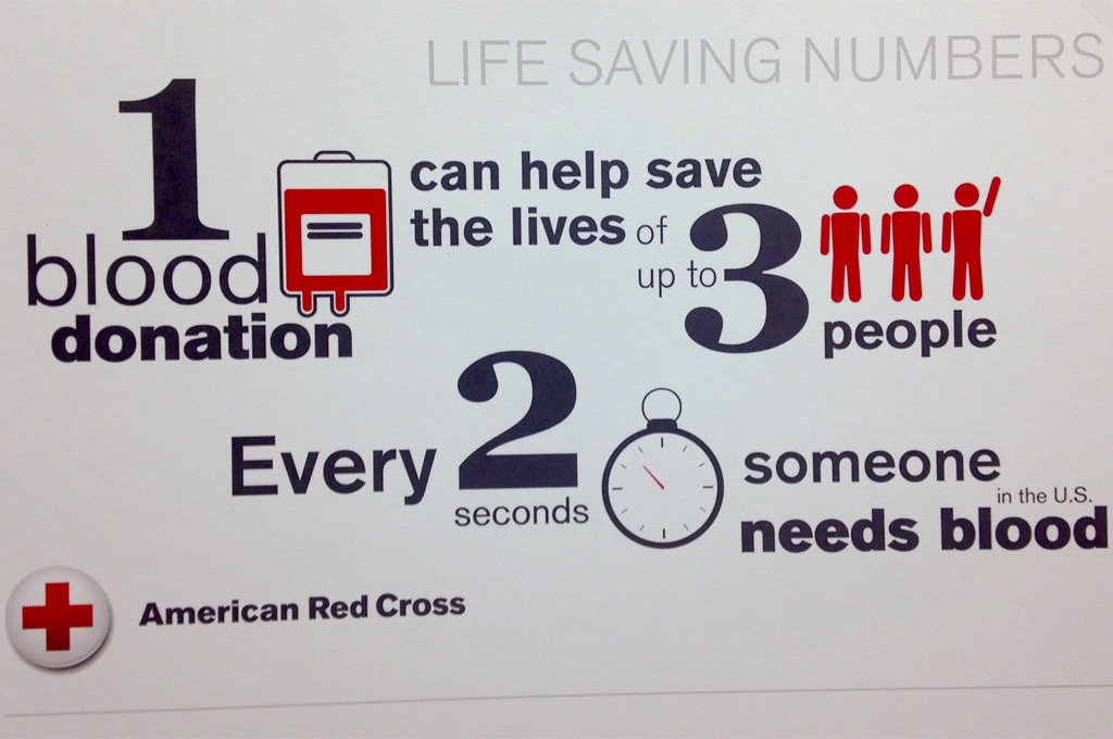

To sidestep these pitfalls, it takes just a little understanding and a lot of planning:
- Define the primary message, secondary information, and any tertiary details.
- Sketch or wireframe your design first, enabling you to visualize the hierarchy before diving into the finer details.
- Use white space generously to give elements room to breathe.
- Regularly step back and assess the design from a distance or ask for feedback to ensure the visual flow is logical and intuitive.
- Remember, the goal of visual hierarchy is not just aesthetic; it’s to ensure that the design communicates effectively and provides a satisfying experience for the viewer.
2. Poor Color Choices
Colors are the symphony of visual design, creating mood, evoking emotions, and setting the tone for any piece. They communicate even before shapes, words, or images do, that’s how the human brain works. Studies show, that the moment you experience the color it affects you instantly without you even noticing. It’s a powerful tool, but just like a discordant note in a song, poor color scheme can quickly derail even the most well-intentioned designs. Therefore, to create a really impactful project choose used spectrum wisely.
Ignoring Color Psychology
Every color evokes an emotion or a reaction. Red can signify urgency or passion, while blue might convey trust and calm. In most situations, green is for ‘yes’ and red is for ‘no’. Using the wrong color for a message while following color trends can confuse the viewer or even convey the exact opposite of an intended emotion. This is a huge thing in logo design, where careful choice of the color scheme is an essential part.

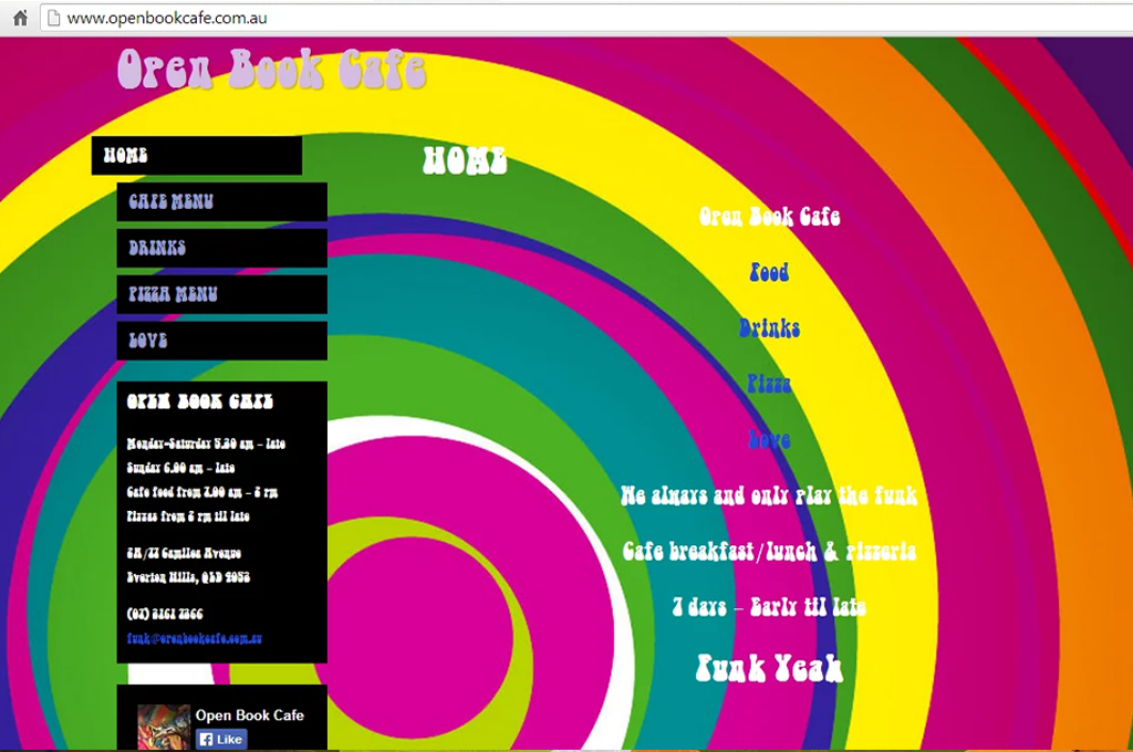
Overcomplicating the Palette
Simplicity often trumps complexity. Using too many colors can overwhelm the viewer and dilute brand identity. It’s generally wise for graphic designers to stick to a primary palette of 2-3 main colors, supplemented by a few secondary or accent colors.
Ignoring Accessibility
It’s crucial to ensure that designs are accessible to everyone, including those with color blindness or visual impairments. Lack of contrast is the most often accessibility mistake. Light gray text on a white background might look sleek and modern, but if it’s too light, your message is lost.

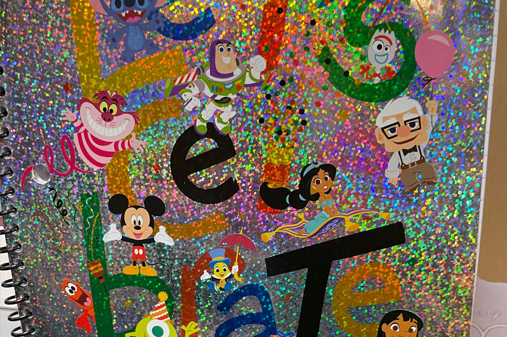
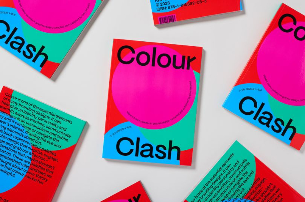
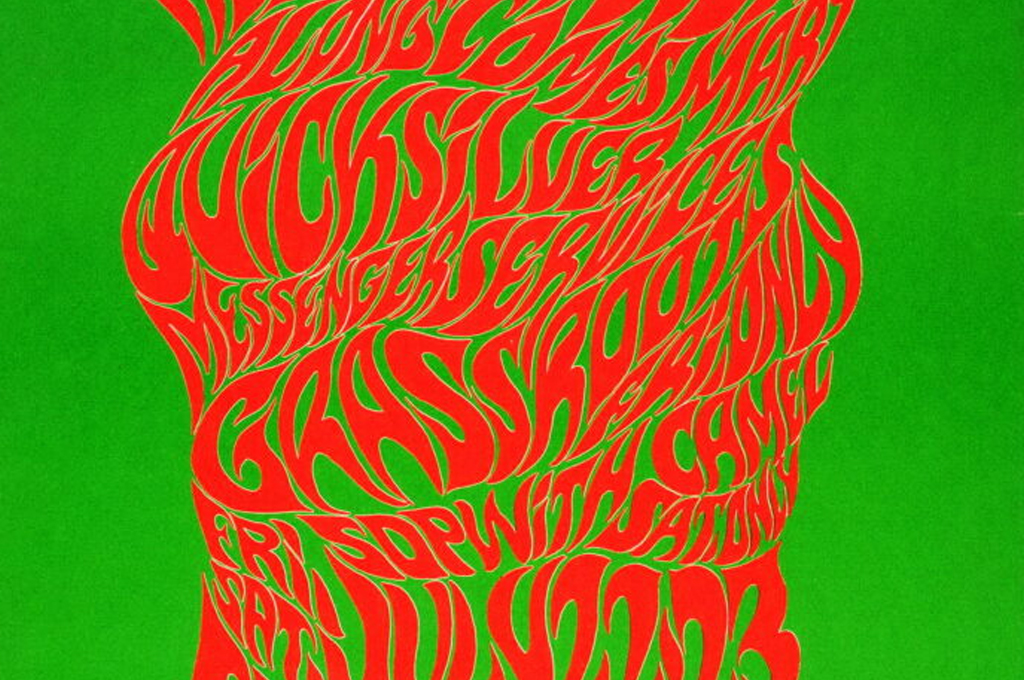
Why did I miss the clashing colors? Because when used thoughtfully it can become a great design choice in some cases. There was a time when it was one of the color trends. It’s not ‘no-no’, it’s just ‘be sure why are you doing this’ and, as always — communication first.
To avoid these colorful pitfalls, here the good design tips:
- Always start with a clear understanding of the project’s goals and the audience’s needs.
- Ensure that the chosen colors align with the message or mood you intend to communicate.
- Adhere to a limited primary color palette, preferably 2-3 colors.
- Employ tools like color wheels, contrast checkers, and graphic design software that can suggest harmonious palettes.
- Regularly seek feedback, and don’t hesitate to iterate and adjust.
- Prioritize readability, remember, colors are not just decorative; they’re communicative.
3. Misuse of Fonts and Styles
Typography is the voice of design. It speaks volumes, not just in words, but in style, tone, and context. Fonts can be as evocative as images, but their misuse can spell disaster. Beyond aesthetics, poorly chosen fonts can alienate or confuse the audience, making content inaccessible or misrepresenting the intended tone. We designers must balance form and function, ensuring that our typeface choices enhance, rather than hinder, the overall communicative goal.
Overloading with Styles
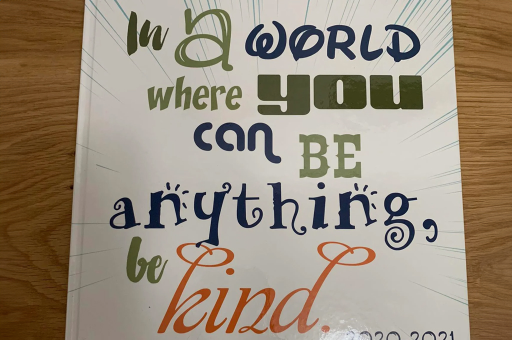
In the vast sea of fonts available, it’s tempting to use multiple typefaces, thinking it adds flair. However, using too many can make a design seem disjointed and unprofessional. It can result in feeling inconsistent in design. Not many viewers (nor creators) can understand the artistic idea of why this exact page needs 8 different styles and what they represent. They’ll just say that it’s chaos.

Sacrificing Legibility
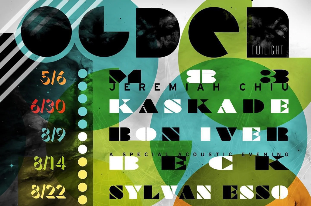
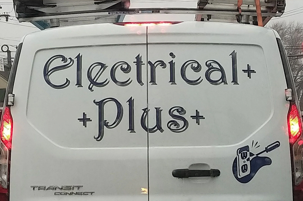
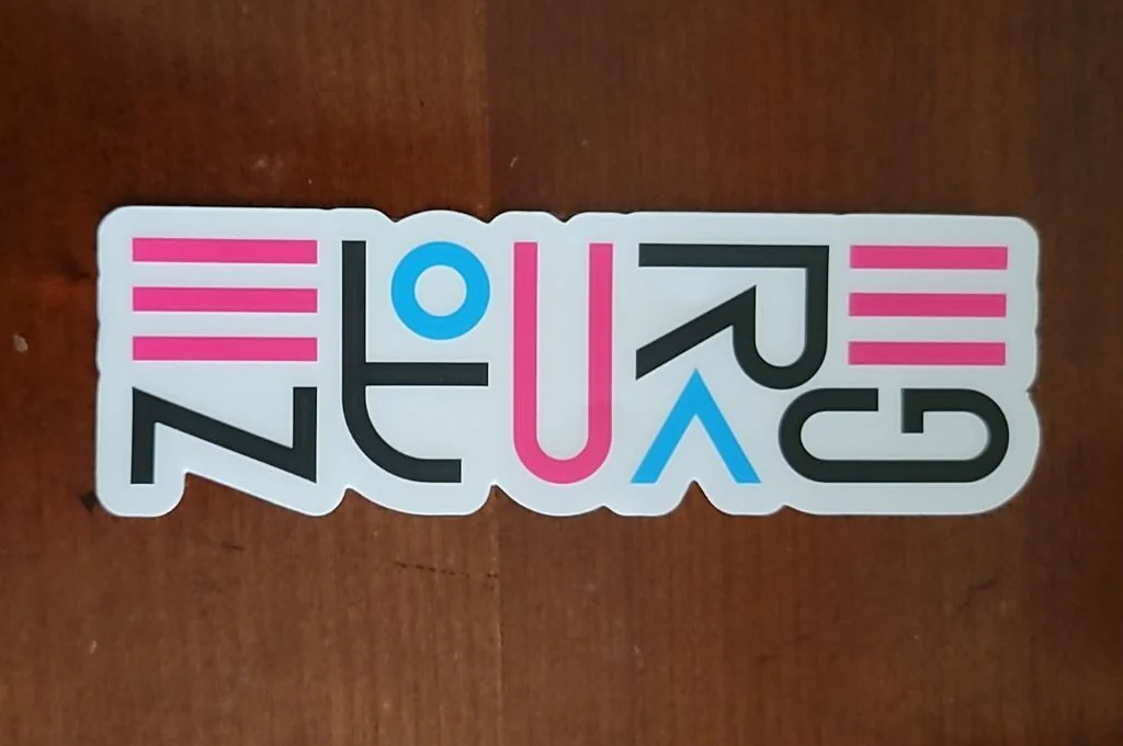
Decorative fonts have their place, but abusing or using them in the wrong context can compromise readability. It’s crucial to ensure that text remains clear and legible, especially in primary content areas. Also, good kerning (spacing between characters) and leading (spacing between lines) can greatly affect readability and aesthetics. Remember? Design is a communication.


Forgetting Context
A playful, whimsical typeface might appear inappropriate in a solemn context, just as a formal serif might feel out of place on a children’s event poster. Always consider the message and audience when choosing the right font. Also, note that some fonts look fantastic alone but jarring when paired. Research and tools dedicated to fonts pairing can guide you in choosing typefaces that enhance each other.


To navigate the intricacies of typography effectively, you need to begin with the end in mind: Who is your audience? What is your message? Tools like typography books, font pairing guides, typographical scale calculators, and graphic design software with built-in kerning and leading adjustments can be invaluable.
Not to fail with styles use the general rule of thumb: stick to 2-3 typefaces that complement each other— perhaps one for headings and another for body text. Keep it simple and elegant. And, as always, seek feedback and keep refining. Typography, when done right, can elevate a design from ordinary to extraordinary, so give it the attention and respect it deserves.
4. Lack of Alignment and Consistency
Alignment and consistency in graphic design are akin to the rhythmic beats that give cadence to a piece of music. They provide structure, create balance, and set the tone for a cohesive visual narrative. Ensuring alignment and maintaining consistency not only beautifies the design but also clarifies the message, making your work both pleasing and purposeful.
Random Placement of Elements
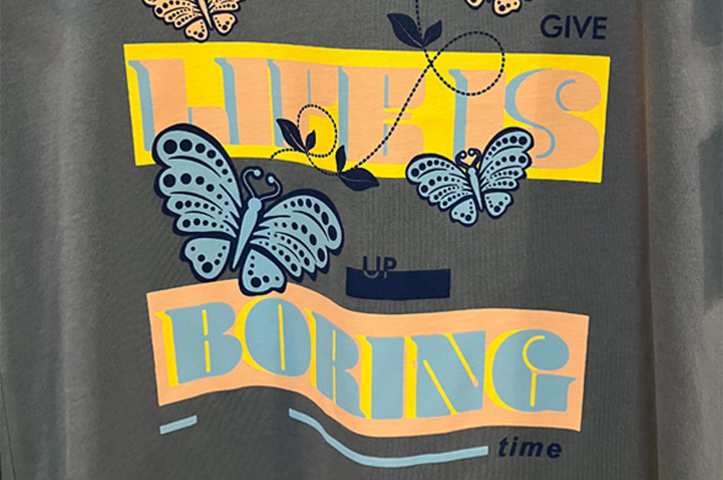
One of the most noticeable missteps is placing elements haphazardly. Without proper alignment, designs can look unorganized and disjointed, making it difficult for the viewer to navigate or absorb the content. Even mixing alignment types without a strong purpose is not welcome, try to stick to the most user-friendly left-side alignment. Another common mistake is inconsistent spacing around elements or the edges. To ensure a balanced and harmonious look it’s crucial to keep them uniform.

Lack of Repetition
Repeating certain design elements or styles can create a sense of unity and consistency. Using the same colors, fonts, or styles for similar elements or sections enhances user experience and elevates the whole project. While randomly introducing new styles or elements can make the design feel fragmented and untrustworthy. Consistency in styling not only distinguishes the works of a good designer but also reinforces recognition of the brand you’re working for. That’s why many companies have their own brandbook.

Here are some design tips on how to maintain alignment and consistency in your own projects:
- Start with defining your limitations: Set style guidelines at the outset, determine fonts, colors, and other design elements you may and may not use.
- Utilize grid systems available in most of the design software. By dictating the rhythm and flow of content, grids foster coherence, enhancing readability and the overall user experience.
- Review your work periodically, checking alignments, margins, and styles. Zooming out and viewing the design as a thumbnail can also help spot misalignments or inconsistencies.
- Always remember, that design is as much about the white space between elements as the elements themselves.
5. Ignoring Audience and Context
To call yourself a professional designer, creating visually stunning work is only half the battle. What is the other half? Ensuring that the design speaks effectively to its intended audience and fits its context like a glove. When designers neglect to consider who they’re speaking to and where their design will be seen, they risk creating work that, while beautiful, might be ineffective or even counterproductive. Don’t be one of those bad designers.
Ignoring Medium Specs
Every platform, whether print, web, or digital ad space, has its unique specifications and requirements. A design that looks stunning on a desktop screen might not translate well to mobile or billboard dimensions. In addition to the tech specs, different mediums have different audiences. So it’s essential to keep in mind where your work will be placed and who will see it.

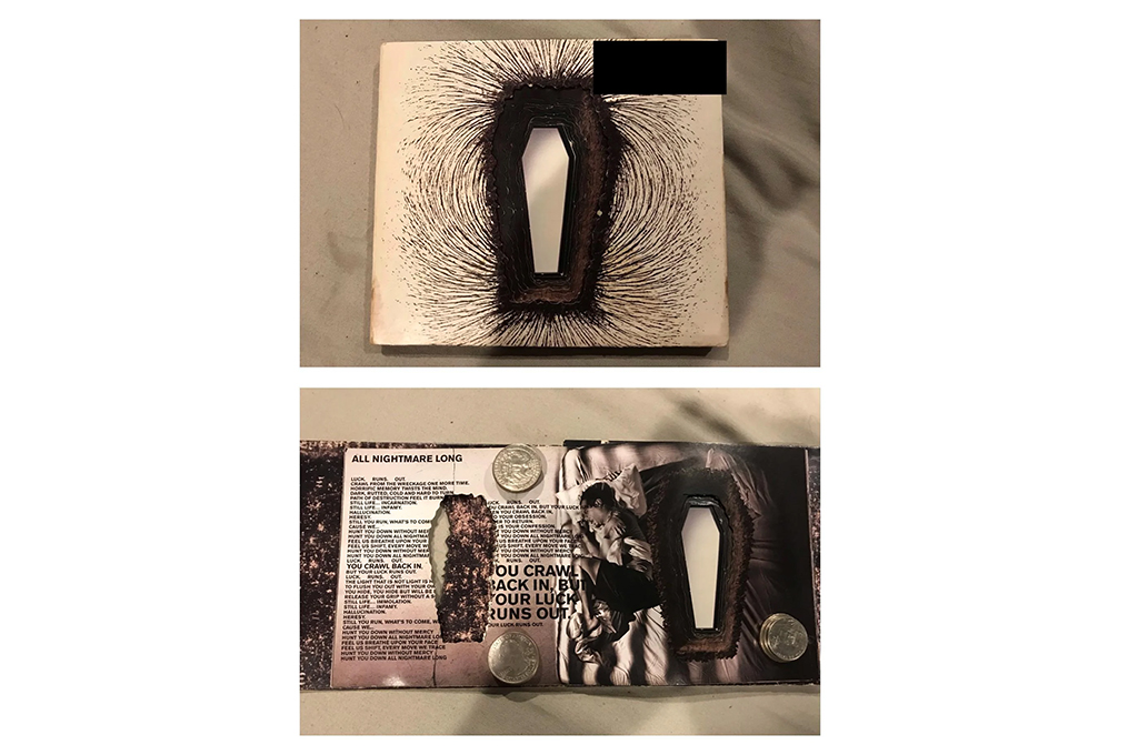
Misaligned Messaging
One of the most evident signs of neglecting audience and context is when the design’s messaging feels out of place. Let’s take Comic Sans font as an example. This typeface is quite good for dyslexia, but emotional baggage and meme flare instantly turn everything related to this font into a joke. As well as designs intended for diverse audiences should always consider cultural sensitivities.

To circumvent these challenges, the solution starts long before the actual design phase: in research and planning that constitutes good design practice. Understand the target audience’s preferences, habits, and needs. Familiarize yourself with the platforms or mediums the design will appear on.
And always, always design with empathy – place yourself in the shoes of the end viewer and ask if the design feels relevant, resonant, and appropriate. By anchoring your design process in context and audience considerations, you not only make your work visually captivating but also contextually powerful and impactful.
6. Overdesign and Overcomplication
In our quest for originality and impact, we designers often tread the path between artistic expression and overwhelming excess. Overdesign, or the act of adding unnecessary elements and complexities to a piece, can overshadow the message, confuse the viewer, and detract from the core purpose of the design.
Unfortunately, there may be clients unfamiliar with minimalist design and basic design principles, thinking that more different elements result in more style, otherwise, they wasted money on a bad graphic designer. Well, in this case, it’s our duty to educate them and not let the following mistakes happen.
Muddled Message
By this point, I guess, you’ve deeply learned that, at its heart, design communicates. Therefore, it’s best to aim for clarity first. A well-composed design directs the viewer’s attention strategically. If viewers are lost in a great number of elements and struggle to discern the primary message, it’s a sign that the design might be overcomplicated. Or there may be another example for this case, when in pursuit of artistry designer completely ignores the “clarity – first” principle and eventually makes poor design choices that lead to design catastrophy.

Crouded Canvas
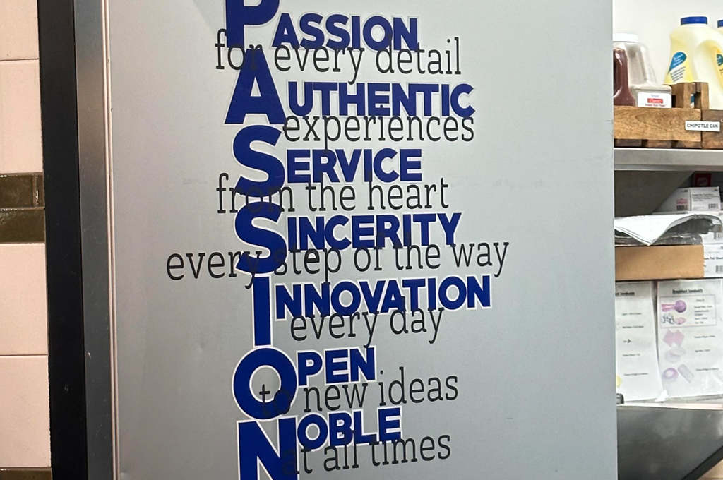
White space, or negative space, is a designer’s best friend. It offers breathing room, emphasizes what’s truly important and balancing content blocks. An over-designed piece often feels cramped, with every inch filled. Graphics and other design elements should serve a purpose — either aiding in communication or enhancing aesthetics. If removing an element doesn’t affect the design’s message or balance, it might be superfluous.

The key to sidestepping overdesign lies in embracing the principle of ‘less is more.’ Begin with a clear understanding of the design’s objective and core message. As you craft, regularly step back and assess — does each element enhance and serve the purpose? Be willing to edit ruthlessly, and always prioritize clarity and effective communication. Seeking feedback from peers or target audience members can also offer invaluable insights. Remember, true design mastery is not just about knowing what to add, but also recognizing what to leave out.
How to Avoid Design Mistakes
It’s worth noting that while certain aspects of design can be subjective, there are widely recognized standards and best practices in the field that help in distinguishing good design from bad. At the heart of every compelling design lie fundamental principles that ensure a clear, cohesive, and communicative outcome. So it’s always best to start with the basics like contrast, repetition, alignment, proximity, balance, hierarchy, and the strategic use of white space.
By embracing these principles, graphic designers not only enhance aesthetics but also ensure their designs communicate effectively and resonate with their intended audience. While ignoring these foundational principles is akin to constructing a building on shaky ground. No matter how beautiful individual elements might be, without these guiding rules, the overall structure is susceptible to chaos and confusion.
When Bad Design is Not So Bad
At the same time, it’s important to remember that there are graphic design styles that intentionally mimic what many might consider “bad design”, while not being examples of the last. These styles often aim to challenge conventional norms or tap into nostalgia. Here are the most notable styles:
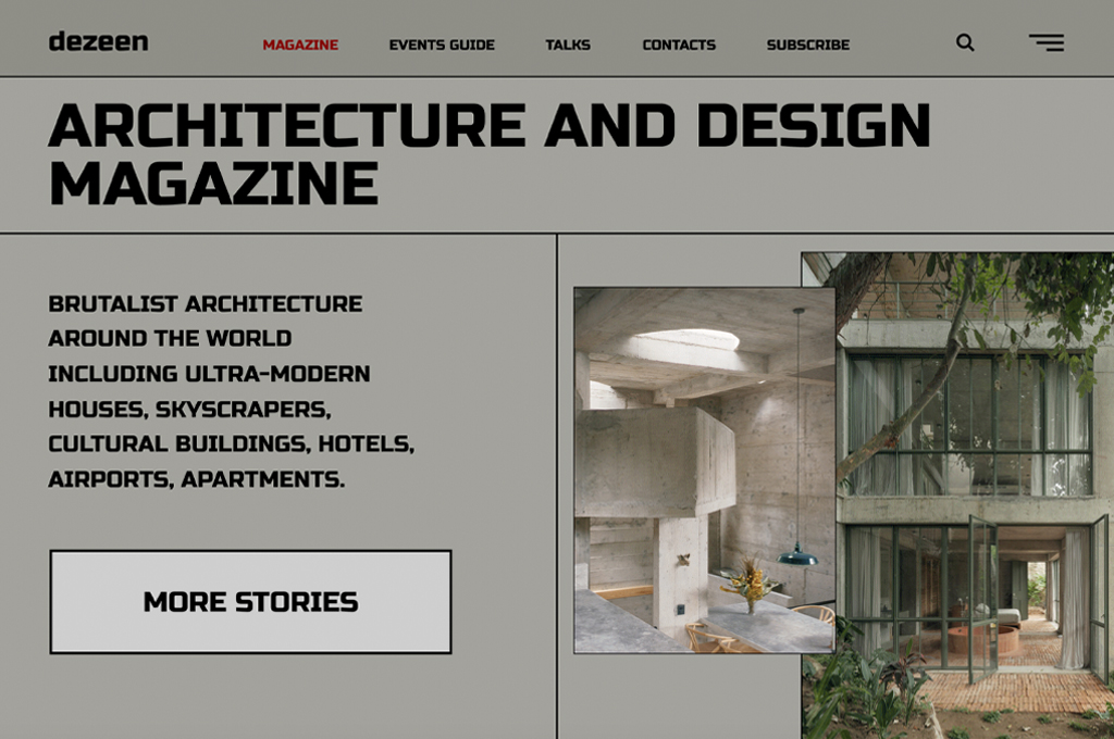
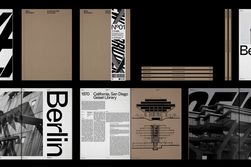
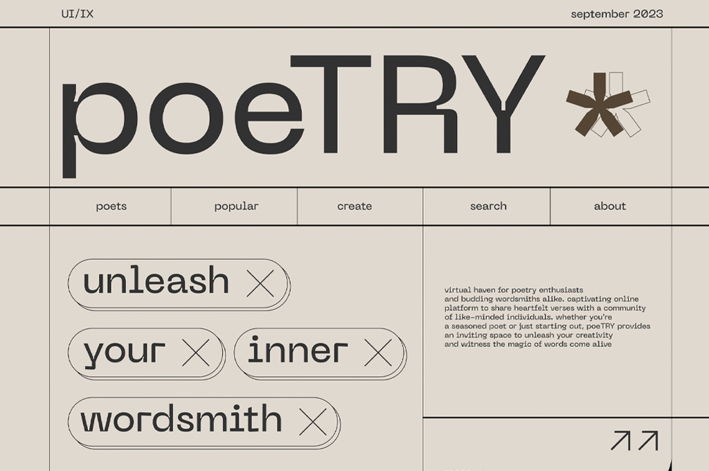
Brutalism
Inspired by brutalist architecture, brutalist web and graphic design are characterized by a raw, unpolished look. Websites might have clashing colors, basic typefaces, and lack conventional hierarchy, mimicking early internet aesthetics.
Anti-Design or “Ugly” Design
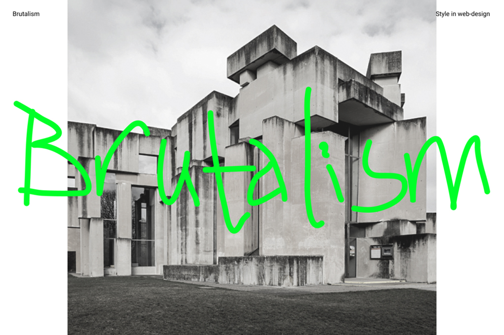
This style challenges traditional aesthetics by intentionally using elements traditionally seen as “bad” design choices. Think too neon backgrounds, discordant patterns, and misaligned elements. Brands, especially in the fashion industry, have adopted this to stand out and appear avant-garde.

Frequently Asked Questions

