I can exactly remember how I once discovered web brutalism — lots of thanks to Dropbox — and how I suffered after that.
However, as the time passed, I discovered more and more such websites and fell desperately for the brutalist design. It’s like with Kandinsky’s abstract art. You call it weird first, and then you find yourself in the gallery making tweets about how exclusive it is.
So now, as a true Brutalist maniac, I do feel like bringing you the essentials of this rebellious trend. If it’s your first experience, you’d better get some herbal tea. And if not — just prepare to get lots of visual satisfaction.
Who, when and why?
After having checked dozens of various articles both from some broadsheets and amateur bloggers I honestly haven’t detected any information about the first developers to introduce this web style. So we may treat it as a spontaneous wave, something like an echo from the 90’s.
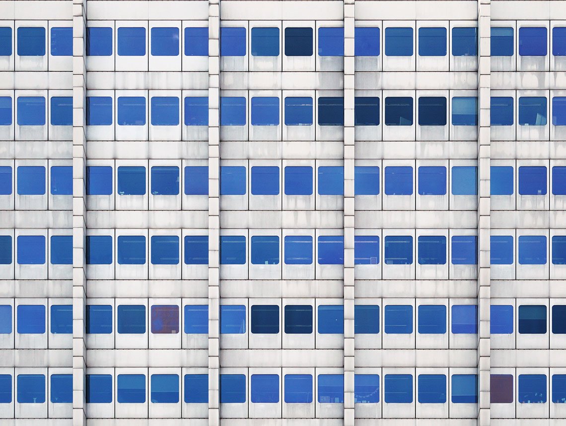
Photo by Pierre Châtel-Innocenti on Unsplash
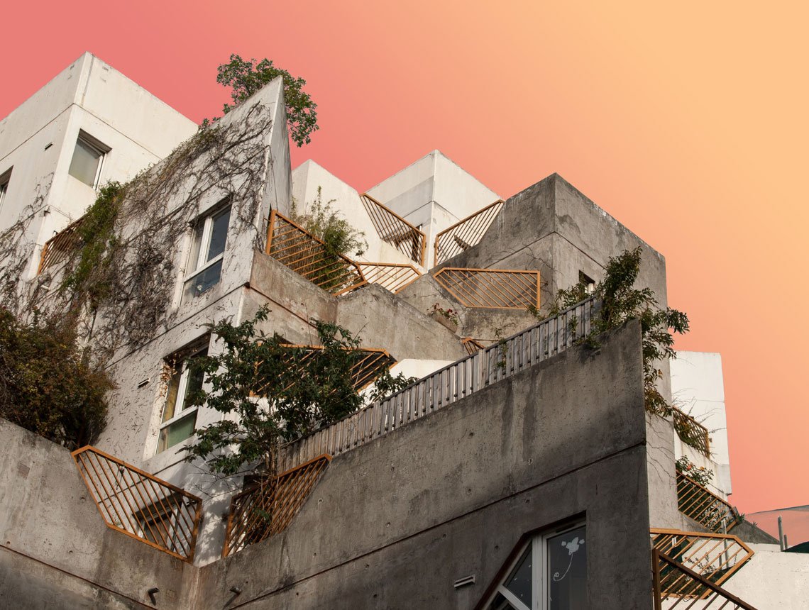
Photo by Pierre Châtel-Innocenti on Unsplash
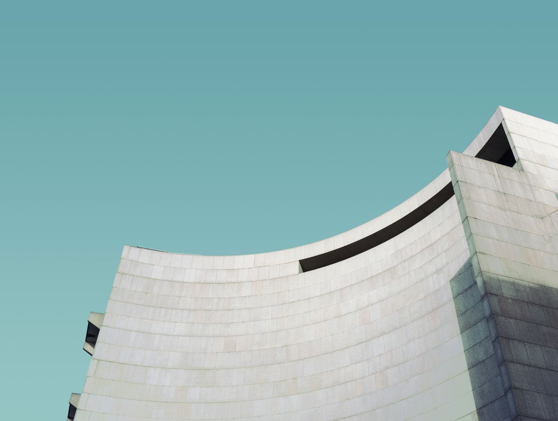
Photo by Pierre Châtel-Innocenti on Unsplash
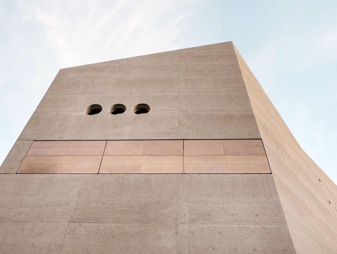
Photo by Samuel Zeller on Unsplash
But initially, there was Brutalism — an architecture trend of 40’s — 50’s. It was treated as a social and artistic reaction against artificiality to be the embodiment of honesty and daring. Simple, right lines, concrete and bricks, no odd decor or accents, focus on practical aspect rather than on attractiveness. Such buildings were called ‘raw,’ and it’s pretty clear now why.
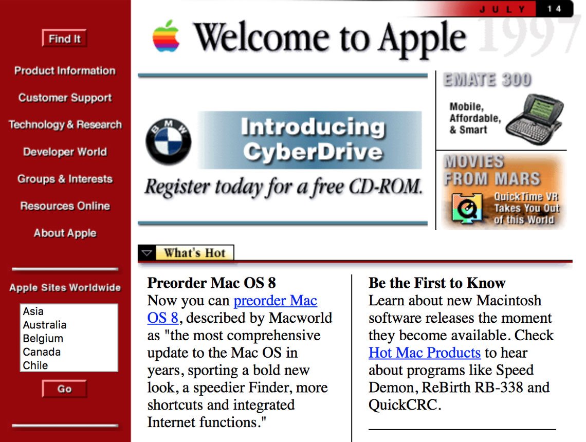
Then came the 90’s bare-bones websites, with blue hyperlinks and monochromatic monospace text — like Craigslist and the Drudge Report.
However, it was not the choice of style, but imposed by constraint limitations of HTML, and I believe these were not the onlу brutal sites of that age.
Web Brutalist: Apple Computer, Inc. website, 1997
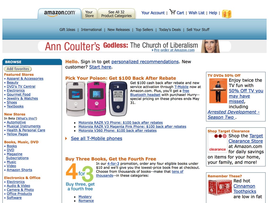
Amazon.com, Inc website, 1998
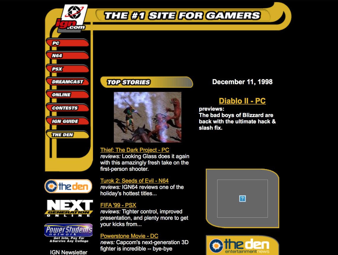
IGN.com website, 1998
Finally, after almost 25-year silence brutalism has lived its glorious resurrection and penetrated your screens while you had been away. Nice trends are always back, aren’t they?
Brutalism vs Antidesign
Opposed to commonplace yet beautifully coded mainstream websites, these are something like raw concrete. But in terms of UI, of course. The designers have made a step away from polished pages towards artistic negligence most community may treat as ‘ultimately ugly.’
Brutal design may ignore everything web design has acquired over the years of its evolution: symmetry, spacing, canonic color palette, navigation, strict hierarchy you expect to see. And it brings instead crowded design with monospaced typography (or just a single font throughout) and frequently overlapped elements.
However, keep in mind that it actually doesn’t mean a catastrophe on the screen. Not yet. Such element as a grid is often conserved, so there must be a structure — even if it’s not that evident.
You may say ‘Hey, but I’ve seen…’. Oh, I know what you’re gonna ask about, so let me tell a pretty unexpected thing: ‘That isn’t web brutalism.’ Nope.
It’s quite simple to mix brutal design and antidesign, actually, so let’s dot all the I’s now and forever.
Brutal design is a logical opposition to classic web design and is rather for the essence of the site than for the nutshell you put it into. It may look ugly, but it doesn’t affect the contents. OR it may seem ultimately minimalistic and even charming — the landing page of Apple’s iMac Prois to illustrate it:
iPac Pro 2018 landing page
Antidesign is a rebellious opposition to simple & clean design, where the creatives impose lurid color solutions and patterns, distracting animations and the weirdest font combinations ever.
So, if you started reading the article with ‘Oh,that’s bullshit’ on your mind, ask yourself whether you were really thinking of brutalist design, okay?
Relaxing Time
I must have poured too much text on you, but it’s hard to stop once you’re about something you adore. Let’s give the text a rest and watch some real websites which are actually the best examples of brutal design (let me leave out antidesign this time. Guess, it’s not its cocky moment yet).
I’ve already dropped a line about Craigslist and the Drudge Report, but they are only a part of this glorious selection.
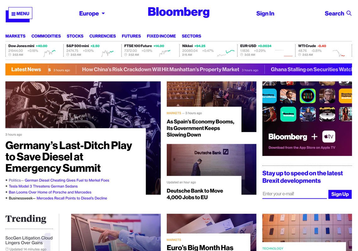
The team that was Number 1 to adopt the style was Bloomberg, as before web brutalism existed only in some art projects streetwear brands. Unfortunately, these guys have had their site redesigned while I was working on this article, so today it’s already quite calm and modest. But not so long ago it definitely stood out with its blue links and ultimately simple grid with no pretentions. Just the essence.
Bloomberg Business website, 2017
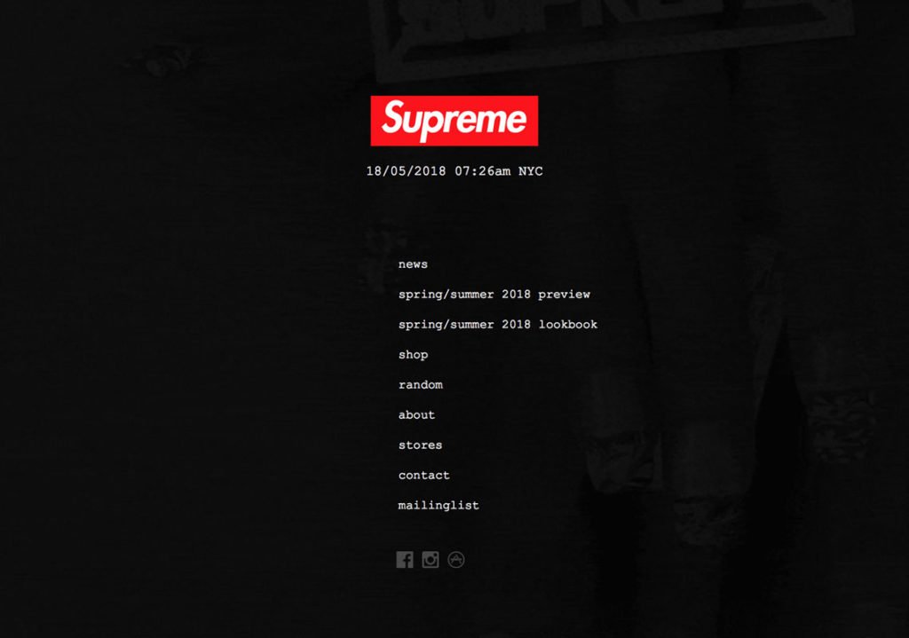
I’m sure you know Supreme. Or at least have come across some of their items, which instantly grab your attention with eye-popping colors and prints. However, it’s not about the website at all. It’s super minimalistic with super compact pages — you never need to scroll at all. Black-red-white color solution and only 1 typeface used. That’s all. But — it may sound kinda strange — I find their website more attractive than most of the cookie-cutter templates, ’cause there’s nothing of ‘too much,’ and every element is light and simple.
Supremenewyork.com homepage
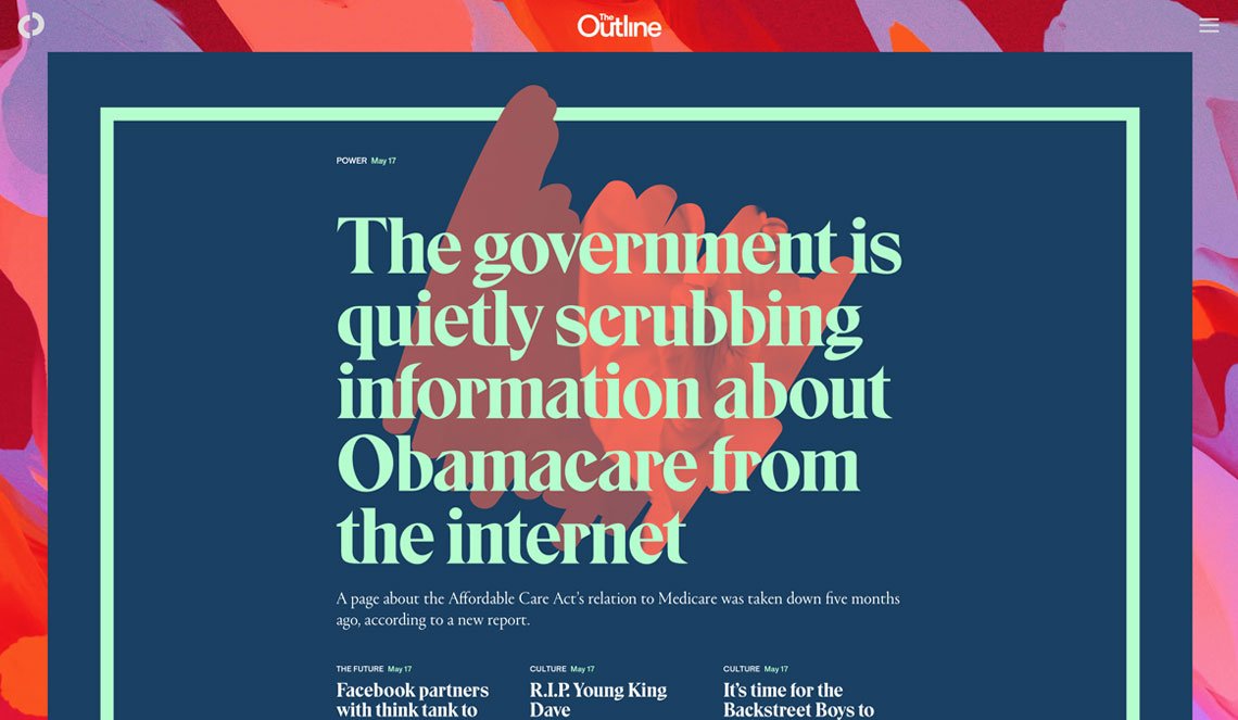
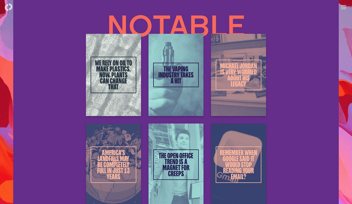
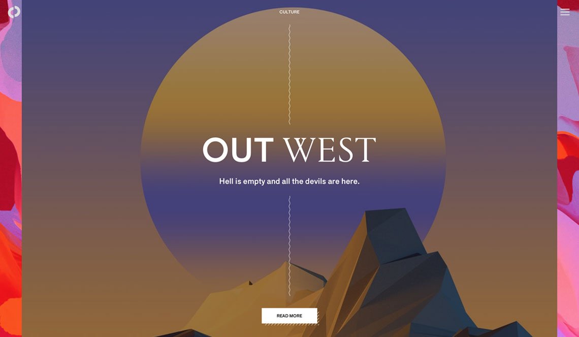
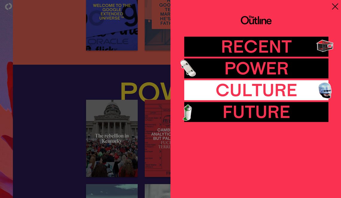
Another titanic project that serves an excellent example is The Outline. The one will hardly ever call the site minimalist, as it is really abundant on color accents, animations, bold illustrations, yet without a single trait of antidesign. The structure is on the supreme level; typography is reserved and engaging at the same time. And — what’s the most important — you don’t get irritated by odd decor elements. Juicy but not weird, I’d conclude here.
The Outline website
The Outline website
The Outline website
The Outline website
And, finally just for fun and practice: check the brutal selection from the Awwwards and do your best to find some true antidesign hidden there (frankly, not hidden at all). Try to come to an end!
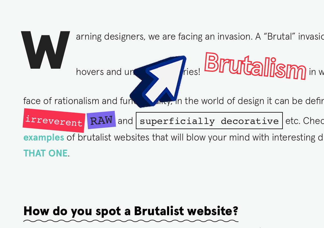
Just check out this insane cursor!
Well, if you write about a design style, you’re meant to finish your story with some burning appeal. Like ‘let all your designs be brutal’ or something even worse. But I won’t. The true message is that you never should be conservative as a designer or hostile to the trends you don’t understand. Minimalism is not forever, and the more styles and ideas you accept and master today, the more powerful you will be tomorrow. You don’t need to love web brutalism or antidesign, but I find it essential for any creative to check Brutalist Websites platform and pack themselves with some handy theory and some eye-popping images — further steps will be intuitive.