It’s been 80 years already since the first Batman comics was revealed to the world! Have you counted how many times has the epic Batman logo evolved and changed its appearance during this huge timespan? We also haven’t but from the designers’ perspective, the evolution of Batman symbol is too fascinating to remain silent about.
While the world is waiting for more of the DC Comics-related movies yet to come, we’re in The Designest are great comics geeks and keep looking at the past (catching pleasant nostalgia vibes is our thing for sure). To be more precise, the attention is switched to Batman adventures: from vintage and modern graphic novels to cinema appearances. We took this Batman obsession, added there our passion for logos and voila — this very article. All aboard, it’s time to roam the seas of Bruce Wayne cult with our time-travel through the history of Batman logo!
Batman Logo Development in the Comics
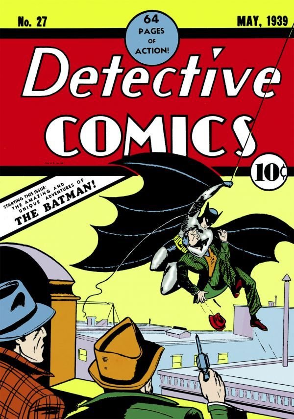
The first Batman sign appearance is traced back to 1939’s Detective comics #27, illustrated by the creator himself Robert Kane, and written by Bill Finger. This plain-looking ‘thingy with wings’ reminds of a real bat so distantly, that, probably, the need for an update to Batman symbol was more than evident. With that being said, 5 wing points were turned to 7 and, what is more important for the whole look we got used to, pointy bat-ears!
Detective comics #27, 1939
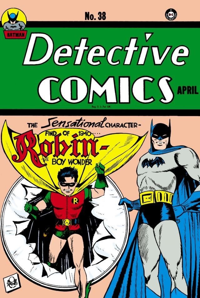
In a year the whole Batman logo concept obtained a more complex detailization, so to say. The wings shadowing was presented with the blue outlines to make it look more voluminous. While the pointy wings and more superhero mask-looking head with ears became the attributes, preserved since then till nowadays.
Detective Comics #38, 1940
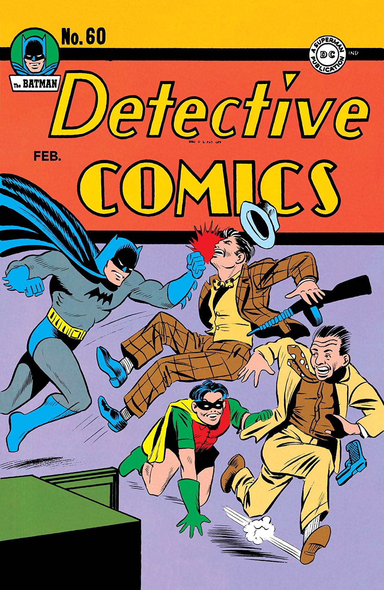
Oh, in 1941 the Bat symbol deflated: the logotype became more narrow and sharp, going back to 5 wings points.
Detective Comics #60, 1941
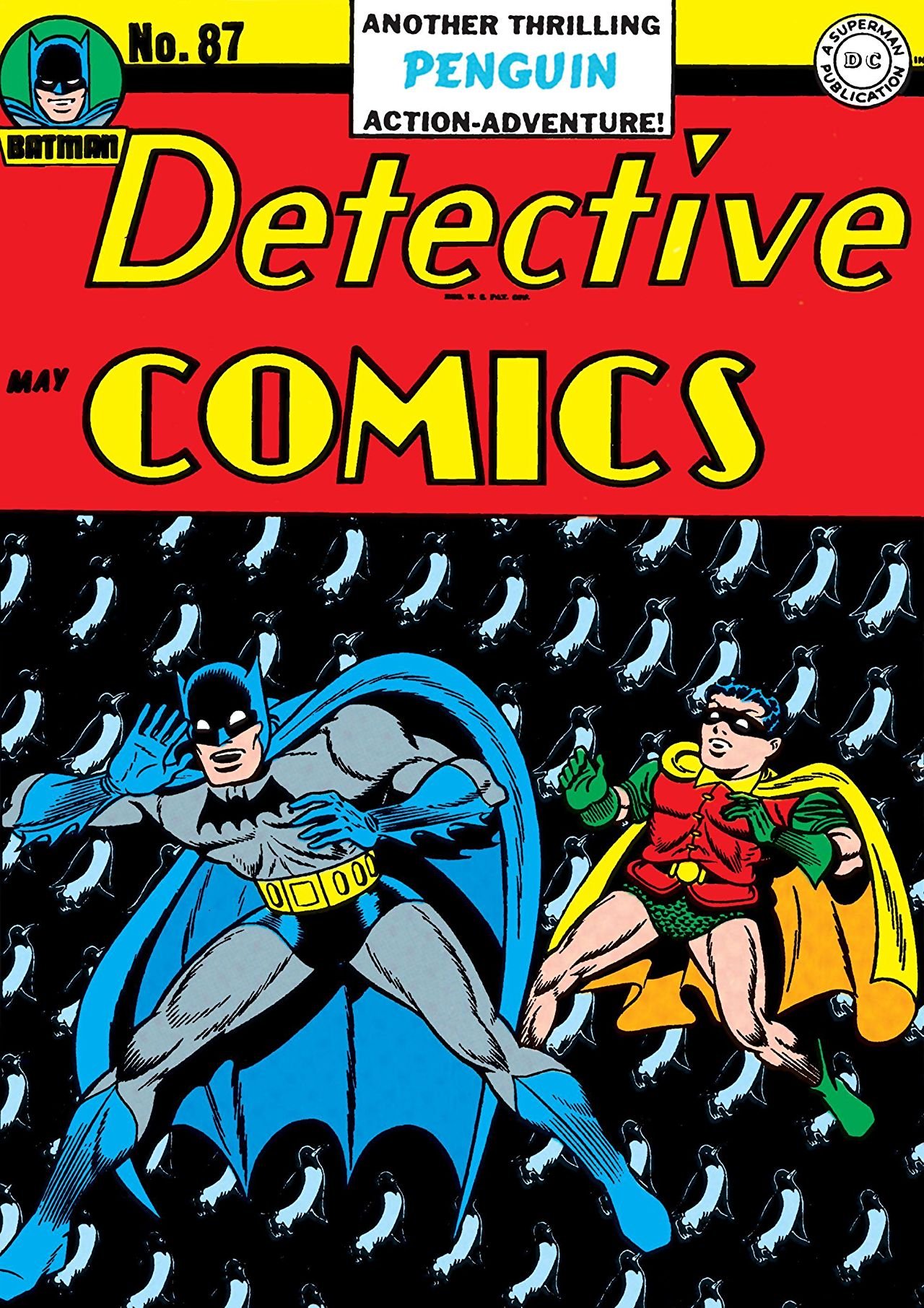
Detective Comics #87, 1944
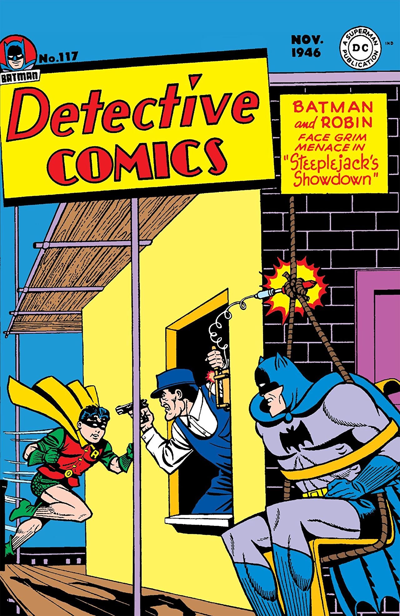
Detective Comics #117, 1946
Truth be told, no that standing out distinctions should be put a light on in the 1944 and 1946 Batman sign. Different number of wing points? Yes, certainly. The loss of edginess to more rounded forms is another move towards the classic Bat logo.
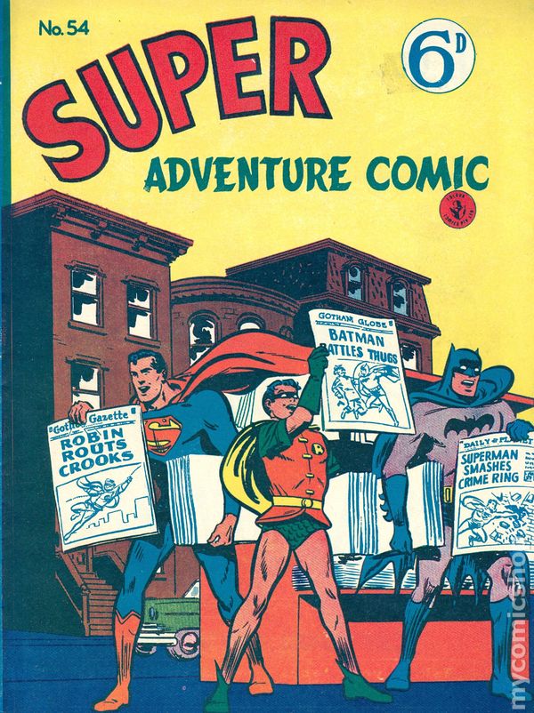
Further metamorphosis represent a constant hesitation about the same Batman sign shape. So, basically, 1950, 1956, 1958 and 1960 are the variations, torturing the roundness of wings, their width and, of course, this constant struggle with points. In fact, such meticulousness is practically useless with the comics printing deformation, disguising the tiny details of a Bat symbol.
Super Adventure Comic #54, 1950
Then It Was All Yellow
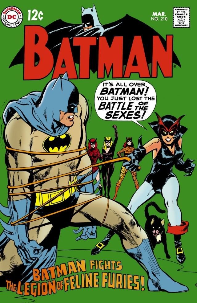
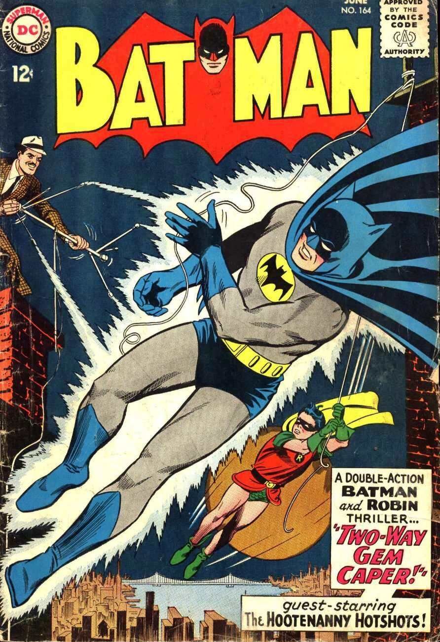
The glorious era of yellow Bat logo starts in 1964. Later on in 1966 it was polished and modified to set the tendency for the iconic Batman sign oval, standing out from the other super hero symbols untill the next update was made 30 years later.
Batman #210, 1966
Batman #164, 1964
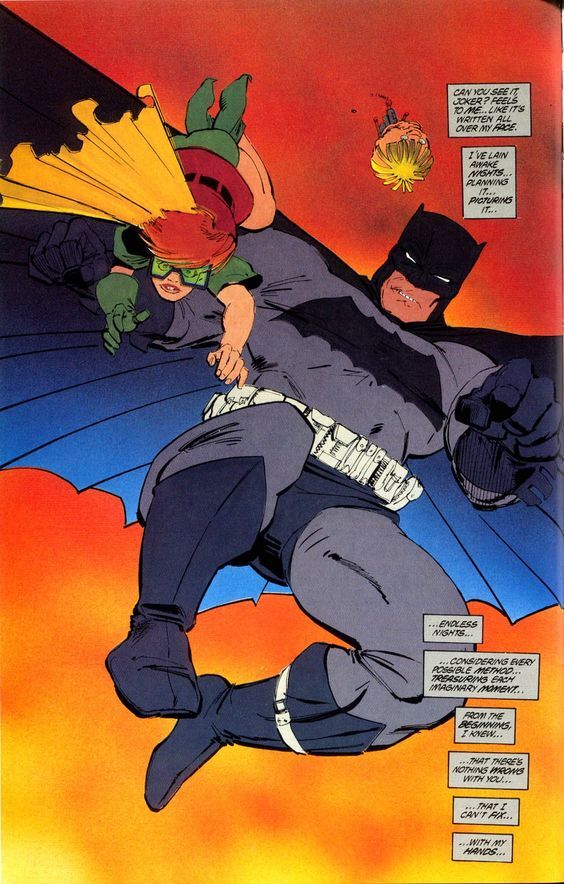
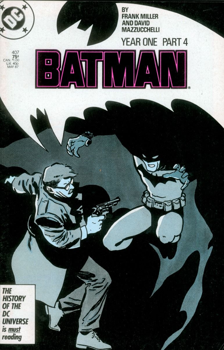
I like to call the next couple “the Batman logo before and after a diet” due to the tremendous difference in their shape. Silly as it is, but very accurate I think. Here we have the massive 1986, proclaiming the rise of a Dark Knight in all its powerful image of a fighter for justice. And in a year this meaning was reduced for the launch of Year One series about Bruce’s salad days. This is what this more smooth and narrow Bat symbol stands for.
The Dark Knight Returns, 1986
Batman #407, 1987
The Batman Symbol on the Big Screen
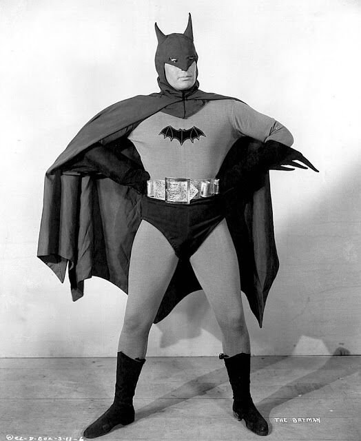
In 1943 Lambert Hillyer took the liberty of creating the first screen adaptation of Batman adventures. It was the black-and-white serial of 15 episodes… and poorly-crafted costumes, let’s be honest. I mean, no judging: the time was not that prosperous in terms of visual effects and superhero outfits as well. How about the Batman logo? First it represented just the more or less ordinary bat silhouette with white outlines. Even so, in 1939 it gained a new element – confusing ram horns instead of ears. Apparently not the golden days of the Bat symbol.
Batman, 1943
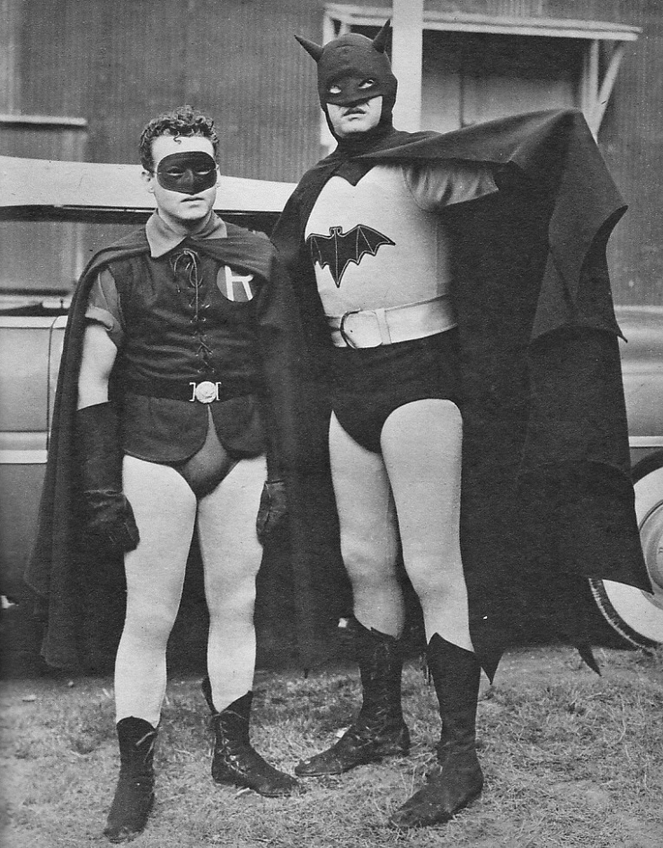
Batman and Robin, 1949 series
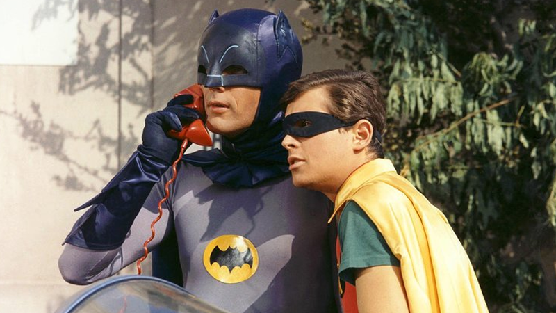
Finally, in 1966 Batman and Robin story obtained its colors: so did the Batman logo, gifted with an eye-popping yellow oval was the bat background.
Batman 1966 with Adam West & Burt Ward
New Batman Era Reveal: Innovative and Diverse
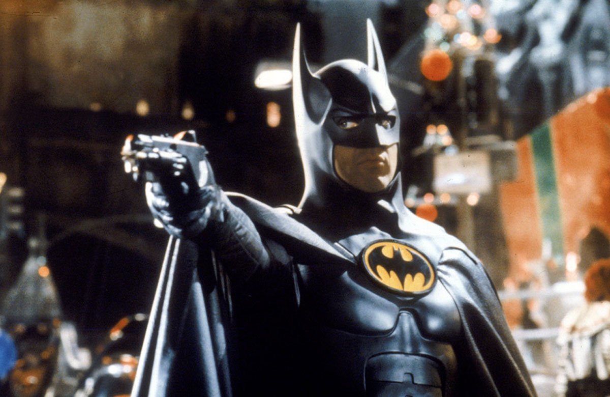
When Mr. Burton hit the ground running with the Batman universe in 1989, Bat symbol has become sophisticated as hell. It looked like the reverberation of all the classic elements, which have burst into success for the previous Bat logo versions. These are the same yellow oval, circular and pointy wings (maybe even too much of points at the bottom).
Batman, 1989
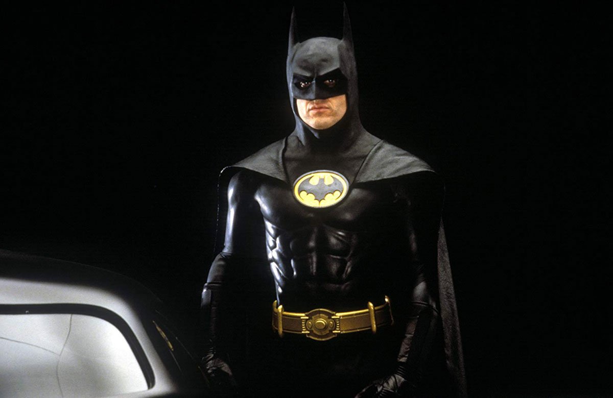
The second time Michael Keaton played Bruce Wayne in 1992, the more coherent Batman symbol was garnishing his chest; probably, even the master of dark and gothic movies thought such Batman logo was too much.
Batman Returns, 1992
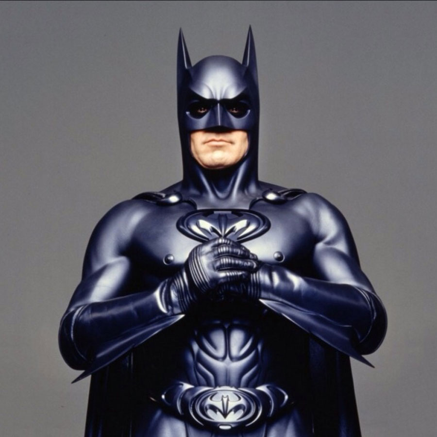
In 1995 Batman Forever was released and here the upgraded carbonic Batman sign saw the light. Or darkness, ‘cause it’s Batman after all.
There’s no way I omit the Joel Shumaher’s nipple suit in 1997! This notorious movie appearance is often referred to as a mistake, but I’d rather call it the director’s peculiar vision. Besides, where could you possibly see the macho George Clooney himself with a Bat logo on his chest? Nevertheless, in 1997 Shumaher made a Bat symbol to be the first one, alluding to the existence of Batman and Robin collab, fighting for justice.
Batman and Robin, 1997
Batman and Robin logo
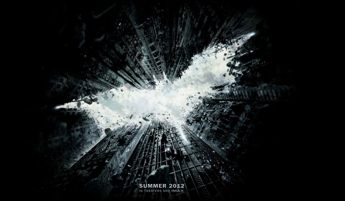
We’ve finally reached the perfect, amazing and the heebie-jeebies giving saga about the Dark Knight by Christopher Nolan. There are two Batman logo versions, coming classic as they are: strong and bold, meant to be frightening the Gotham criminals.
The Dark Knight Rises, 2012
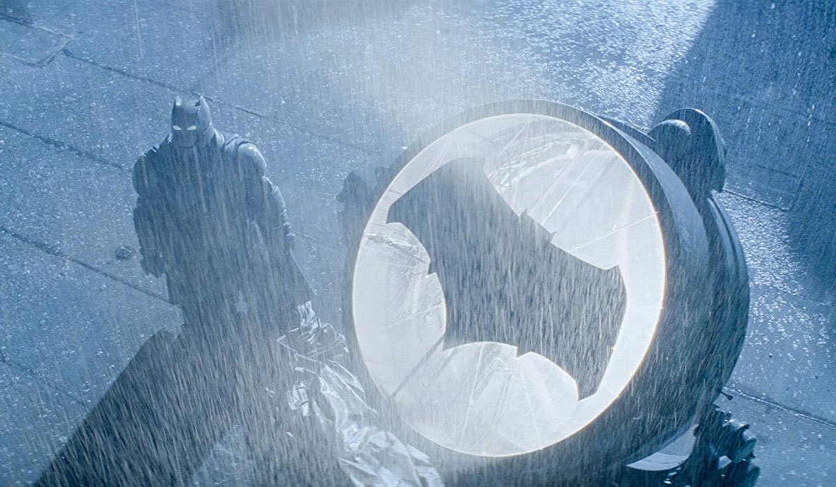
The recent Batman vs Superman movie presents the massive 1986 comic bat-look, decorated with sharp points. I shove away my discontent with Affleck playing Batman and emphasize the surprisingly well-transferred immense figure of this very Batman version, showing off his influence and brutality.
Batman v Superman: Dawn of Justice, 2016
What is the Best Bat Logo Then?
So many men, so many minds… and so many Batman logo appearances. Speaking of men, our Instagram community has voted in favour of the best Batman sign version and guess what? The 2000 symbol was ranked first. Well, I have nothing left to say but absolutely agree on that one.