• Home
  • Design
  • Freebies
  • Toolbox
  • Tech
  • Tutorials
  • Inspiration
No Result
View All Result
Subscribe
The Designest
  • Home
  • Design
  • Freebies
  • Toolbox
  • Tech
  • Tutorials
  • Inspiration
No Result
View All Result
The Designest
No Result
View All Result
Home Inspiration

Brand Identity Concept for Clubhouse Which Surpasses the Original Design

There a quite a few branding concepts for Cloubhouse, but this one, enriched with human-oriented approach, merits our particular attention.

Ksenia Pedchenko by Ksenia Pedchenko
March 31, 2021
in Inspiration
1
Share on FacebookShare on Twitter

Clubhouse has reinvented audio chatting and transformed it into a privilege. How many of you have been asking for an invite to join the app and start following your favorite speakers? So while the idea of the app is just brilliant, let’s admit that its design is quite bland, and there is plenty of room for alternative concepts.

It would be fair to highlight that Clubhouse had chosen the best concept and was introduced right when we needed it most. The protracted pandemic from one side and massive interest to various podcasts from the other — and here we have a unique social network based on voice, where people get together for discussions, sharing interests and spreading the news. Complemented by the invitation-only format, it has immediately stood out and got tons of interest from the global community.

Brand Identity Concept for Clubhouse Which Surpasses the Original Design
  relevant:
Hinge: dating app branding design, which is meant to be deleted September 24, 2019
Next
Prev

Getting back to the UI and branding of the app, there is hardly anything to grab our attention. So…ordinary? In fact, Clubhouse brand identity relies on a clean, simple design, which is a versatile option. By its means, the designers aimed to present their core principles: candid, pioneering, joyful. However, there’s still a feeling that Clubhouse deserves a different visual design that would better meet its concept.

Clubhouse Brand Identity by Alexis Balinoff Studio

There a quite a few branding concepts for Clubhouse, but this one introduced by Alexis Balinoff Studio merits our particular attention. Probably, it’s due to a focus on the human aspect, which remains one of the focal features of modern graphic design.

Getting back to the UI and branding of the app, there is hardly anything to grab our attention. So…ordinary? In fact, Clubhouse brand identity relies on a clean, simple design, which is a versatile option. By its means, the designers aimed to present their core principles: candid, pioneering, joyful. However, there’s still a feeling that Clubhouse deserves a different visual design that would better meet its concept.

Brand Identity Concept for Clubhouse Which Surpasses the Original Design
  relevant:
GoDaddy logo is remastered in company’s fresh branding design January 17, 2020
Next
Prev

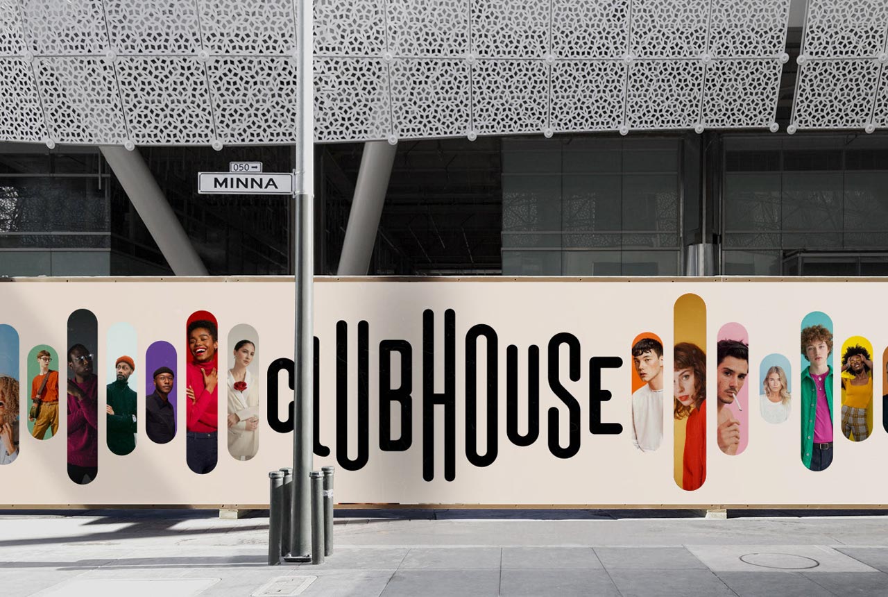
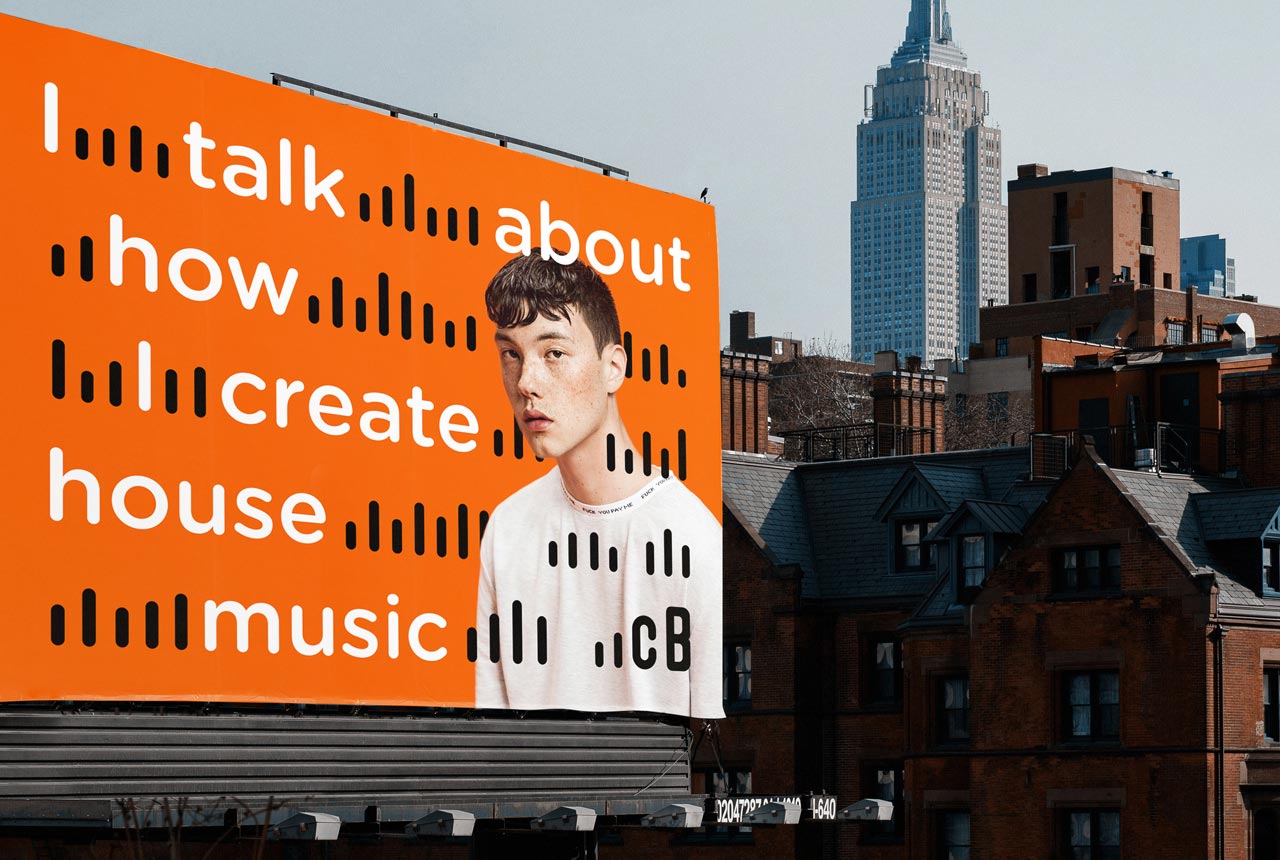
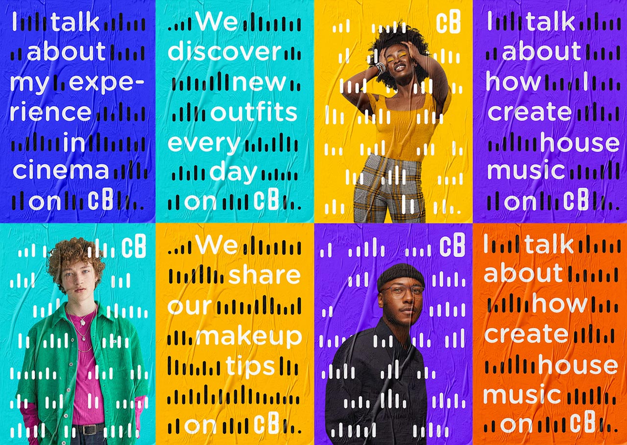
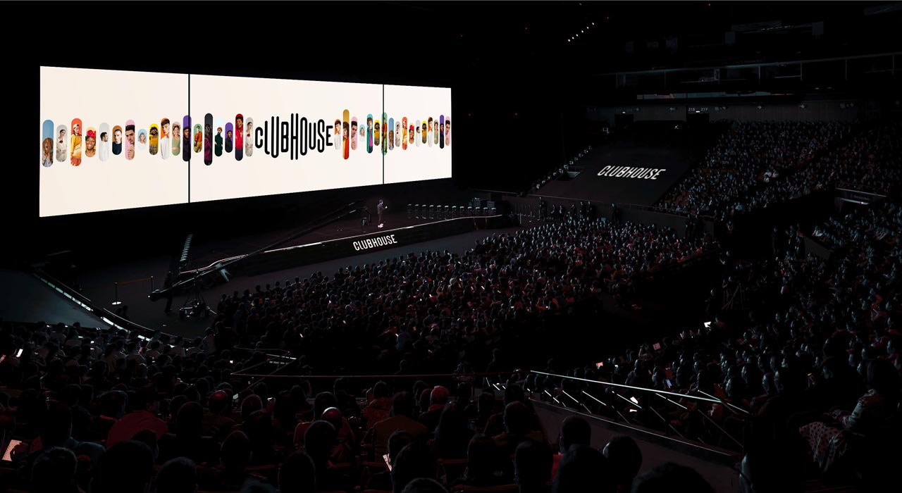
Indeed, as the concept of the Clubhouse is to bring people and ideas together through live conferences, they’ve emphasized each person behind each voice through vertical bars that represent the common audiovisual representation. For the basic color, they’ve selected skin-like beige, which once again highlights the human aspect in terms where we never see the people talking.

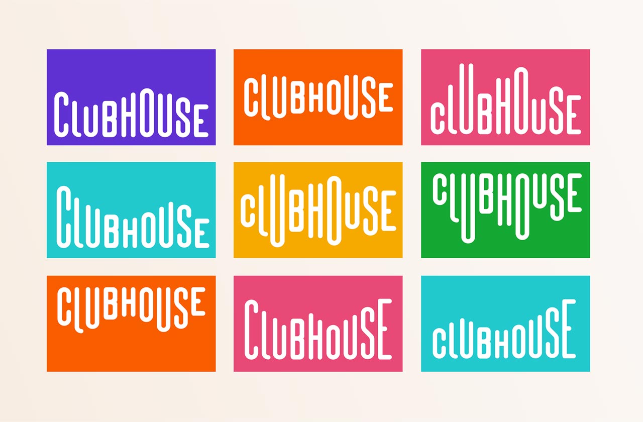
Frankly speaking, the alternative logo design suggested by Alexis Balinoff Studio is the most precise hit, and it definitely beats the original one:

I wanted to offer the same flexibility to the logo to be able to adapt to its environment, taking the principle of audio that changes according to the volume of the voice.
Alexis Balinoff

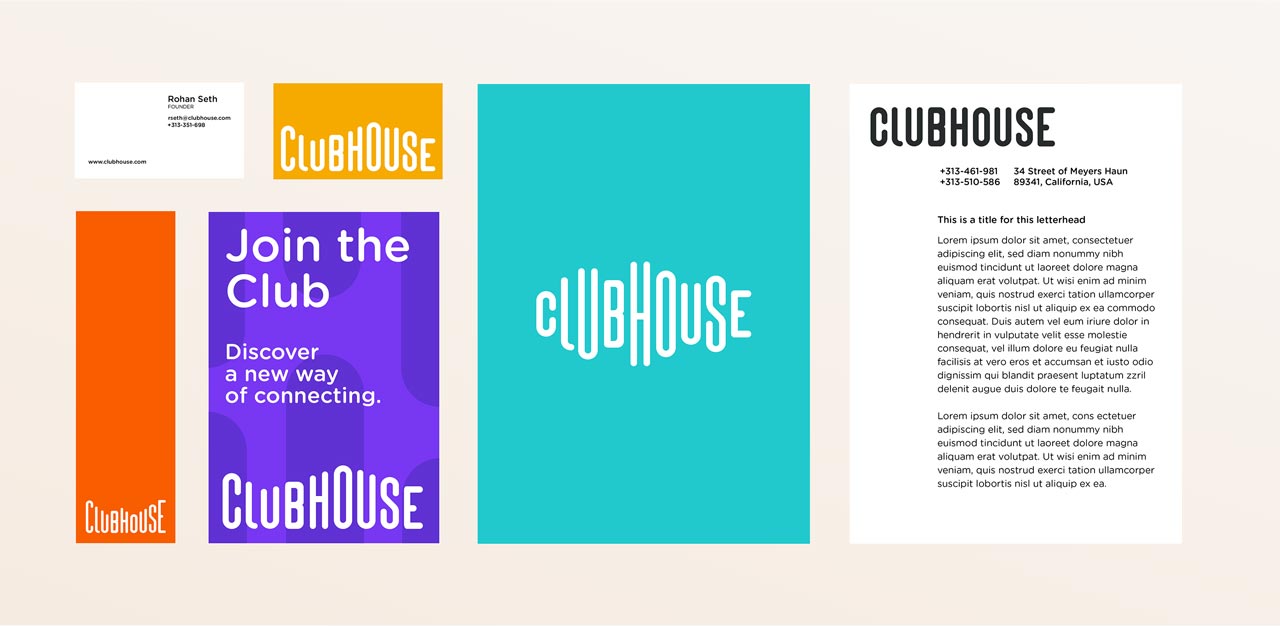
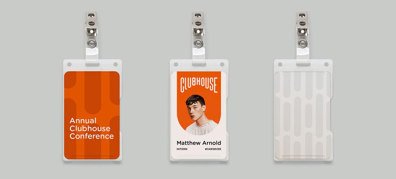
This brand identity concept is an intricate project, which has compiled branding, app and logo design. They go united by a very thoughtful approach to the human component and understanding of what Clubhouse is in the eyes of its community.

Tags: AppsBrandingLogo
Previous Post

30+ Best Ice Textures

Next Post

How to Fight Digital Piracy & Whether It’s Worth It

Ksenia Pedchenko

Ksenia Pedchenko

Related Posts

From Print-Like Longreads to Animated Interactive Websites: Exploring The Best (7+) Readymag Editorials and Their Impact Over 10 Years

by The Designest Staff
July 17, 2023
0

Delve into the 10-year story of Readymag project as viewed from the prism of its in-house digital longreads.

20+ Drawing Techniques: How To Elevate Your Sketching Skills

by Olga Lysenkova
June 30, 2023
2

This guide is as much for the seasoned artist as for the beginner. It's a testament to the continuous learning...

20 Digital Artists You Should Know: Famous, Talented, Inspiring

by Ksenia Pedchenko
May 19, 2023
1

Meet the most prominent digital artists and illustrators of the industry, and let their creative spirit guide you in your...

30+ Best Instagram Color Schemes & Aesthetic Ideas

by Ksenia Pedchenko
April 27, 2023
1

Beautiful visual goes first — especially if it's Instagram. Now, with beautiful palettes, you'll find it so much easier to...

Working With Millennials: Features & Tips for Effective Collaboration

by Ksenia Pedchenko
August 17, 2022
0

Welcome to the new corporate reality, which you'll now share with all-so-different millennials.

Inspiration Drop #4

by Ksenia Pedchenko
August 12, 2022
0

Loads of visual preciousness to charge you with creativity for a week ahead!

Next Post

How to Fight Digital Piracy & Whether It’s Worth It

Please login to join discussion

Popular Posts

  • Free CD Mockup Set For The Iconic Retro Design

  • Freebie: Aluminium Can Mockup

  • Freebie: a logo mockup, charged with elegance

  • 40+ Best Metal Fonts to Rock Your Designs

  • Bad Graphic Design Examples: Good vs Bad Graphic Design

Envato Elements
with Envato Elements membership

Categories

  • Design (80)
  • Freebies (88)
  • Inspiration (40)
  • Other (22)
  • Tech (26)
  • Toolbox (161)
  • Tutorials (57)
Youtube Facebook Instagram Dribbble Pinterest Twitter RSS

Subscribe

The Designest

Weekly Email Updates

We got tons of fascinating articles, videos and freebies for you every week!

SUBSCRIBE

Design Blog

  • Design
  • Freebies
  • Inspiration
  • Other
  • Tech
  • Toolbox
  • Tutorials

About Us

Welcome to The Designest — a professional design blog aimed to deliver fresh news & trends of the industry as well as the most essential courses & tutorials you must have been searching for.

Company

  • Advertise with Us
  • Contact Us
  • Cookie Policy
  • Privacy Policy
  • Terms and Conditions
  • Affiliate Disclosure
Advertise Options

© 2023 The Designest — Professional design blog aimed to deliver fresh news & trends of the industry

No Result
View All Result
  • Home
  • Design
  • Freebies
  • Toolbox
  • Tech
  • Tutorials
  • Inspiration

© 2023 The Designest — Professional design blog aimed to deliver fresh news & trends of the industry

Subscribe to Regular Updates
We got tons of fascinating articles, videos and
freebies for you every week.
This website uses cookies. By continuing to use this website you are giving consent to cookies being used. Visit our Privacy and Cookie Policy.