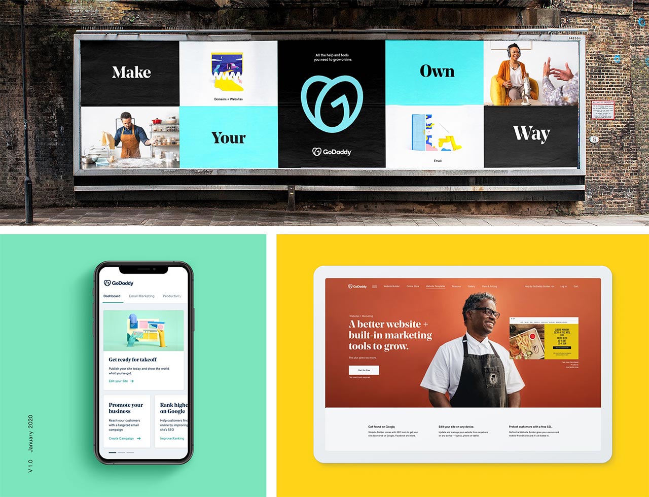
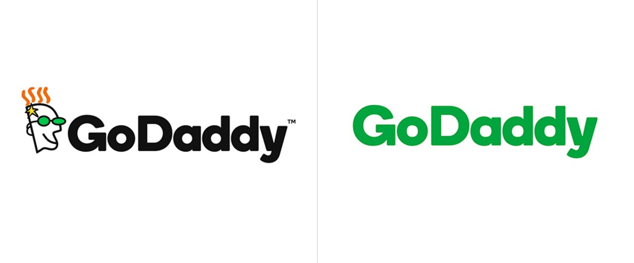
The veteran of the first-generation web companies has completely turned into the modern-looking service for entrepreneurs, embarking on new business fields. GoDaddy logo with a jaunty mustard-haired guy was replaced by a heart with GO hidden in it.
Entrepreneurial spirit, joy, and humanity — the Holy Trinity of the world-known domain registrar and web hosting company now has its reflection in a renewed branding design. From losing its quirky mascot design in the 90s style to a company’s grown-up version, everything about GoDaddy was sentenced to renovation. But the main fuss is made, surely, by the new GoDaddy logo. Go or don’t go?
GoDaddy logo metamorphosis took two years
In 2018 they removed the daddy’s floating head, saving the recognizable green color for the company’s name, written in sans serif. That was okay… except for the company’s main spirit loss. GoDaddy logo had a memorable mascot they could do something about but they’ve given it up in exchange for something new. Long afterward they’ve decided to relaunch the company’s perception by introducing a new logotype — a heart-shaped GO, supporting the encouraging “do what you love” slogan.
The sans serif predecessor was granted a new color solution and that’s, basically, it. Speaking of fonts in this branding design, trendy and elegant serif was implemented for the headline typography — that’s what many respectable publishers opt for in the search for the bold style.
Branding design with illustrations of all kind
There are still drawn guys to look at! Heads up for the great 3D animation work and hand-drawn icon illustrations. This trait perfectly suits the wave of 2020 design trends with a reign of the human approach. Although, the brand identity illustrations might give you a little of “I’ve-seen-it-already” feeling. Dozens of projects in the same style appear on Behance every week irrespective of the trends, so to say.
Showcasing is all neat
What is undoubtedly great about the project is the way a new branding design is reflected through the photos of happy entrepreneurs and themed merch (tote bags, pins, t-shirts). It all makes you think of a family-like atmosphere GoDaddy offers to people in pursuit of their dreams. Too sweet for a domain registrar? Wait a couple of years and you’ll see how the oddness of it fades away and GoDaddy branding design gets what it was created for.

Getting to know the new GoDaddy logo and the branding design philosophy has left a shade of confusion about integrity. Isn’t it all a little bit too much? Many parts of identity seem to be put randomly together and not interrelated. The company tried too hard, saturating the branding design with hopes, joy, smiles, and color. But that’s just my own grumpy opinion.


