Visual harmony is not something chimerical as it may probably sound. In fact, it is defined by the Golden ratio, the law of perfect proportion that comes from maths and nature and defines balance in architecture, painting, and all fields of design.
The closer an object is to the Golden ratio, the better the human brain perceives it. So since it was discovered many creators used it their works: Da Vinci in his Mona Lisa and The Last Supper, Vermeer’s Girl with a Pearl Earring or Hokusai’s Great Wave off Kanagawa. Feels far from you are actually doing? In fact, if you’re searching for the balance and harmony to your interfaces, logotypes or mockup scenes, the Golden ratio is a perfect tool to arm yourself with.
What is the Golden Ratio?
The Golden ratio, also known as Φ (Phi) in Greek, is a mathematical constant. It can be expressed by the equation:
Φ=a/b=a+b/a=1,618033987, where a is greater than b
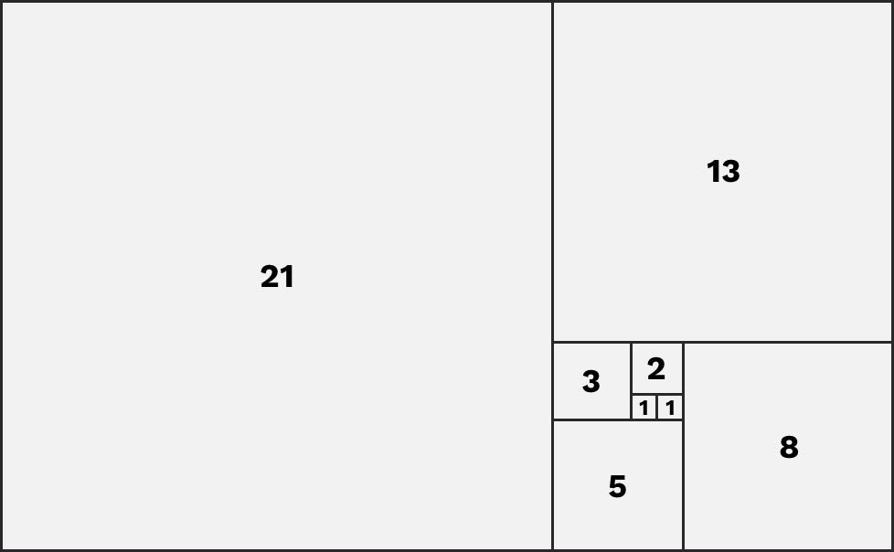
This can also be explained by the Fibonacci sequence, another divine proportion. The Fibonacci sequence starts with 1 (some say 0) and adds the previous number to it to get the next one:
1, 1, 2, 3, 5, 8, 13, 21 …
The golden rectangle
If you try to find the quotient from the division of the two subsequent Fibonacci numbers (i.e., 8/5 or 5/3), the result is very close to the Golden ratio of 1.6 or Φ.
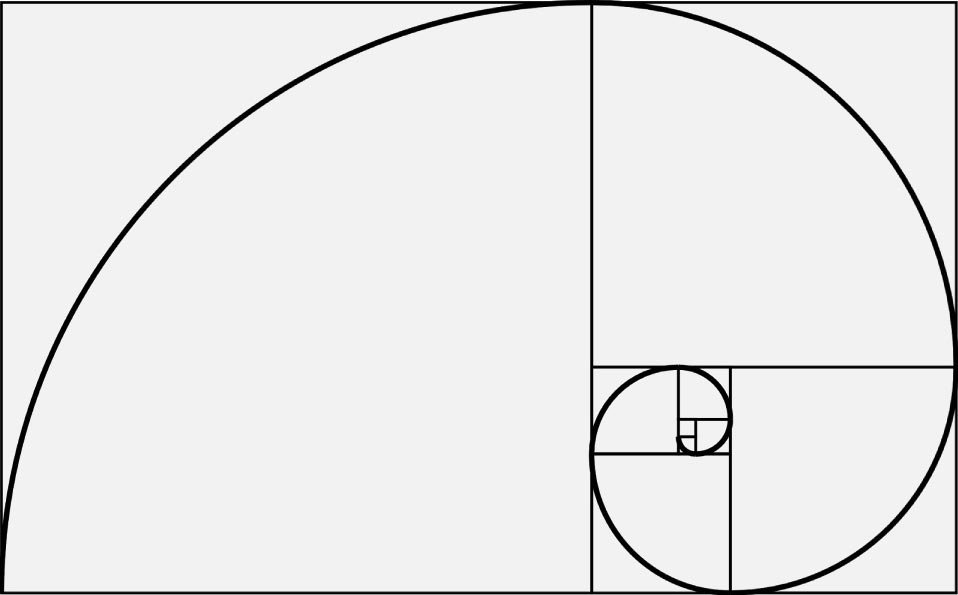
With the help of a Golden rectangle, a Golden spiral is also created. If you have a rectangle of squares 1, 1, 2, 3, 5 and 8 respectively, as shown in the picture below, you can build the Golden rectangle.
The golden spiral
Using the side of the square as a radius, you create an arc that touches the points of the square diagonally. Repeat this procedure with each square, and you will eventually get the Golden spiral.
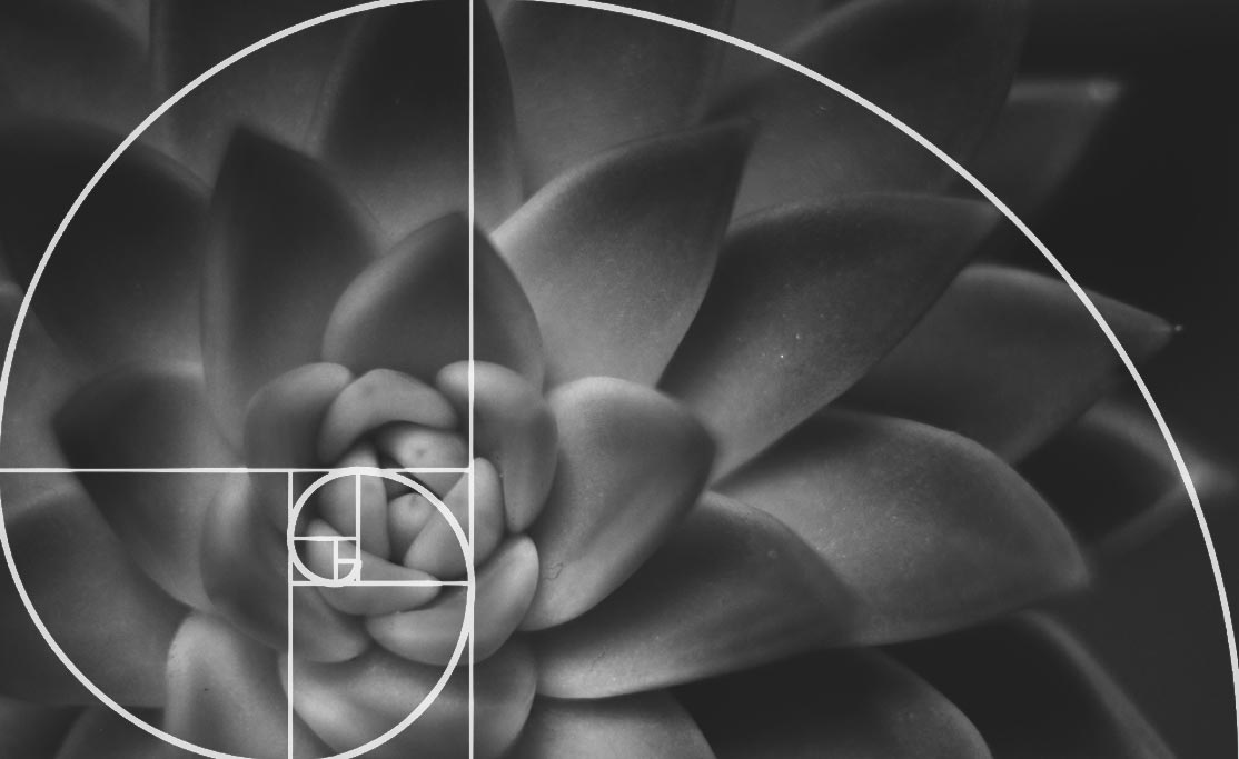
Examples of the Golden rectangle and Golden spiral can be detected everywhere: so there is a Golden ratio in nature, human body and its parts, and almost all works of art.
The Golden Ratio in Design
The Golden ratio is another tool to help you deliver the right emotional and visual tone to the user. This theory exists whether you apply it intentionally or not — but what really matters is that you should understand and acknowledge it in an effort to create the most usable design possible.
So, there are four basic ways a designer can use the Golden ratio and affine there designs with it:
Typography
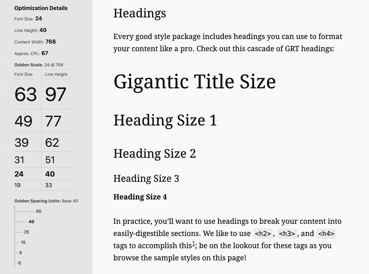
Golden Ratio Typography Calculator
With the Golden ratio you can see what font size to use for headers and body copy on a website, landing page, or blog post.
Let’s say your body copy is 14 px. If you multiply 14 by 1.618, you’ll get 22.652, meaning a header text size of 22 px would follow the Golden ratio and balance the 14 px body font size.
To make sure the image is still balanced after you resize it, you can use the Golden spiral to keep the composition of the image — simply overlay the Golden spiral on an image to see the focal point is in the middle of it.
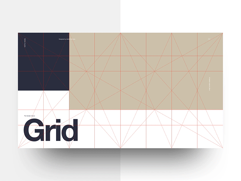
Layouts
Golden Ratio Canon Grid
With the Golden ratio, it’s easier to comprehend and design appealing interfaces. So, if there is a page that highlights a wide block of content on one side with a narrower column on the other, the Golden ratio’s proportions will help you decide where to put the most important content.
Logo Design
With the Golden ratio, it’s easier to comprehend and design appealing interfaces. So, if there is a page that highlights a wide block of content on one side with a narrower column on the other, the Golden ratio’s proportions will help you decide where to put the most important content.