At least once in your life, you’ve had a chance to purchase an item by Adidas, didn’t you? The brand once specialized in sports shoe manufacture, over the decades has become a trend-setter not only in the world of athletics-related activities but for an everyday lifestyle. Well, aside from the high-quality, stylish shoes and apparel, the brand has a spectacular story of Adidas logo evolution — that you’ll be excited to hear.
The biography of the Adidas brand is so saturated in rich in details, unexpected twists, and legend-like events that it can make you appreciate the Adidas brand much more. The changes touched everything from the company name to brand identity and overall philosophy. If you’re into the visual narrative more and would like to discover the extra fact about the company’s development, you can check out the biopic about the brand’s founding brothers (it’s called “Adidas vs. Puma,” google it and you won’t regret). But the spotlight of our attention comes from the designer’s perspective, so we invite you to go along the way of Adidas logo development.
What does Adidas stand for?
The world-known brand used to produce sports shoes only, and the company was called “Dassler Shoes” after its founder, a German cobbler named Adolf Dassler. And as it goes in a classic fairytale-like plot, he had a younger brother, Rudolf Dassler, who had eventually become his rival. But long before that, the Dassler brothers were very successful, selling thousands of shoes gaining recognition for their craftsmanship all over the country.
Adolf “Adi” Dassler
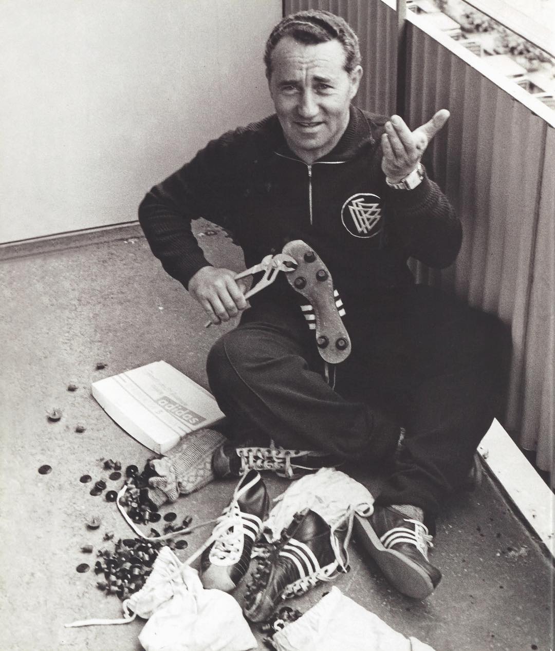
Adolf Dassler was born in a small town in eastern Franconia. After returning from the First World War service, he began making sports shoes. Adolf partnered up with his brother Rudolf in 1924 and in 1936 they gained fame by providing running shoes for American athlete, sprinter Jesse Owens, who won four gold medals at the Berlin Olympic Games.
Unfortunately, all good things come to an end, and for the Dassler brothers, the year 1947 became a crucial one when brothers split up to go separate ways. The reasons for that are still unknown for sure, but despite the breaking up, two things remained the same for the Dassler brothers after all. They were both busy in a shoe manufacturing business, and both came up with their company names using the same word-merging technique. The first name part + a bit of the last name and voila, they had Rudolf’s ‘’Ruda’’ (which became Puma in a while, what a turn!), and Adolf’s ‘’Adidas’’. But why not ‘’Adidas’’ then?
Speaking of Adidas, meaning the word for naming a brand, comes from the older brother’s nickname “Adi.” Imagine what your company’s name would be, based on a nickname you had in childhood? Dassler got extremely lucky with his one and registered “Adidas” company in 1949. The original Adidas logo of that time had a very visual design: a sports shoe, trapped behind the bars of Adidas word and the company’s name decryption above.
The three-stripe company
Every new iteration of Adidas logo’s concept represented an extensive search for the essential look. This way, the follow-up of a 1949 logotype was less graphic, with a switch to typographic look, leaving only the company’s name. Unlike the current version, this one had pointy “a” letters and distinguish “d” tails, while a whole word written inside a rounded rectangle.
In 1967 the obvious character peculiarities were made into rounded, softer versions, whereas the “s” signs got wider and longer. As you can tell, the background shape was not mandatory as well, which made the new logo more versatile. This word mark is still being used nowadays, as you can tell, but what about the iconic trefoil, where does it come from? What meaning is hidden behind the Adidas iconic logo?
In 1967 the company unveiled a fresh design concept, including three stripes along the side of each shoe, allowing Adolf Dassler to call Adidas “the three-stripe company”. In fact, the three stripes trademark was bought from the Finnish sports brand Karhu Sports. There’s even a legend-sounding story about the price Dassler paid for this Adidas logo version: only €1,600 and two bottles of whiskey — the conditions, suiting Finnish company after the WWII crisis.
All the shoe models of that time just included three stripes on the side instead of a distinct Adidas logo, but served the significant push to founding one of the most recognizable logotypes of the previous century and nowadays.
Word On Adidas Tennis Shoes
It can be said without a glimpse of sarcasm that at some point, Adidas has created a metaverse of different product lines they presented, all revolving around the well-developed three-stripes ideology. Pioneers in many domains of the shoe-making industry, the company hasn’t missed a chance to show something new to the athletes’ community. In 1963, driven by the idea of Horst Dassler (Adi Dassler’s son), Adidas created the first-ever leather tennis shoe laid the basis of a classic Adidas shoe line we know nowadays. This brand new model was named Robert Haillet after the professional tennis player from France.
When Haillet retired from sports, the product required a new ambassador, an active tennis player, able to represent the line. Between the end of the 1960s and the beginning of the 1980s, the prominent figure in tennis was an American player Stan Smith, so the company offered him a contract, granting the sportsman royalties for using his name. At the early 1980s, the Adidas logo featured Stan Smith’s portrait with his signature, placed on the shoe tongue.

Adidas trefoil was born
There’s little known about the company experiencing some problems with the brand controversy (it’s rumored that during WWII, Adolf Dassler was attracted by the Nazi ideology) and target audience concerns. But armed with a desire to highlight the diversity, the Adidas trefoil emblem was brought to life. It’s an Adidas logo, composed of three leaves, standing for North America, Europe, and Asia — the three main landmasses where Adidas shoes were sold. As you can tell, the three stripes are still here, adding the final touch to the Adidas logo, making it the first corporate symbol of a company. Adidas trefoil has reserved its place for the Adidas Originals line.
Mountain logo as a new Adidas symbol
At the beginning of the 90s creative director of Adidas, Peter Moore helped Adidas logo to find its new dimensions: this time the legendary stripes have flipped the way they started to represent the mountain logo. Three bars, placed in ascending order (inspired by the way the stripes look on a footwear) symbolize the challenging path of achieving a goal. This topic is especially close to the challenges athletes face, who’re opting for Adidas apparel and footwear for their sport events.
A year after that Adidas had a collab with Salomon Sports, combining the blue color of Adidas logo and red color scheme from Salomon. The logotype was made into a diamond-shaped figure, but there was also the silhouette of a man, raising his arms up, celebrating the victory. Such a vivid inspirational imagery for the company’s performance products.
Adidas NEO steps in
The year 2002 is marked by the emergence of a sub-brand under the Adidas group, called NEO, and changing its emphasis from sport to everyday fashion and the young generation style. All the Adidas products from the collection were made more affordable, and the Adidas logo appeared as a sphere with the three classical stripes. This Adidas symbol version was often depicted as white icons on a green background. It’s a perfect example of a flexible concept inscribed in new, contrasting geometrics.
When Adidas logo met simplicity
Since 2005 Adidas symbol hasn’t changed much from the older versions of a reduced logotype, containing three stripes only. The introduced word mark Adidas logo is a representation of the minimalistic and iconic look of the brand, paying respects to the origins of a trademark, invented by Adolf Dassler and brought through the whole performance line. This Adidas logo version is meant to denote leadership, improvement, and evolution.
Frequently Asked Questions