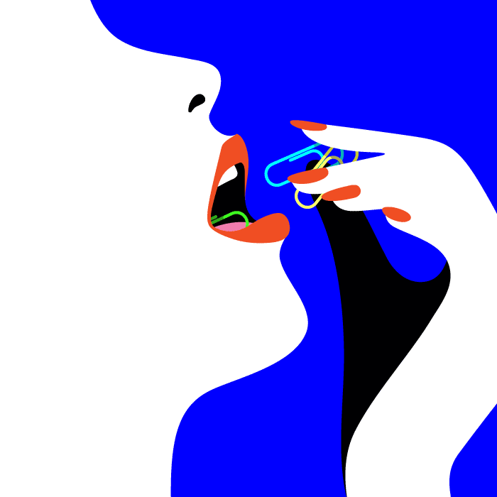
Malika Favre’s style is often described as “Pop Art meets Op Art” — optic illusions, shadows and curvy, sensual shapes precisely define what her art is. Malika’s works accompany projects of Vogue, Sephora, Le Monde, and she serves a role model for the world’s illustrators who do or just onboard vector art.
My latest @NewYorker cover “Summer hours” celebrates unusual and ingenious commuting ideas, bringing a breath of fresh air to the coming summer. pic.twitter.com/v7ZtIzeFZd
— malika favre (@malikafavre) May 20, 2019
Malika acquired her artistic background in Olivier de Serres in Paris and Surrey Institute of Art & Design, the leading art college in the United Kingdom. Before going freelance in 2011, she worked at Airside design agency, which she joined for an internship five years ago. Airside had a great influence on Malika’s style — the footprints of their eye-popping campaigns and animations can be traced in her personal projects. But let’s admit it, that’s not her work in Airside that inspires us today.
Alphabunnies of Malika Favre
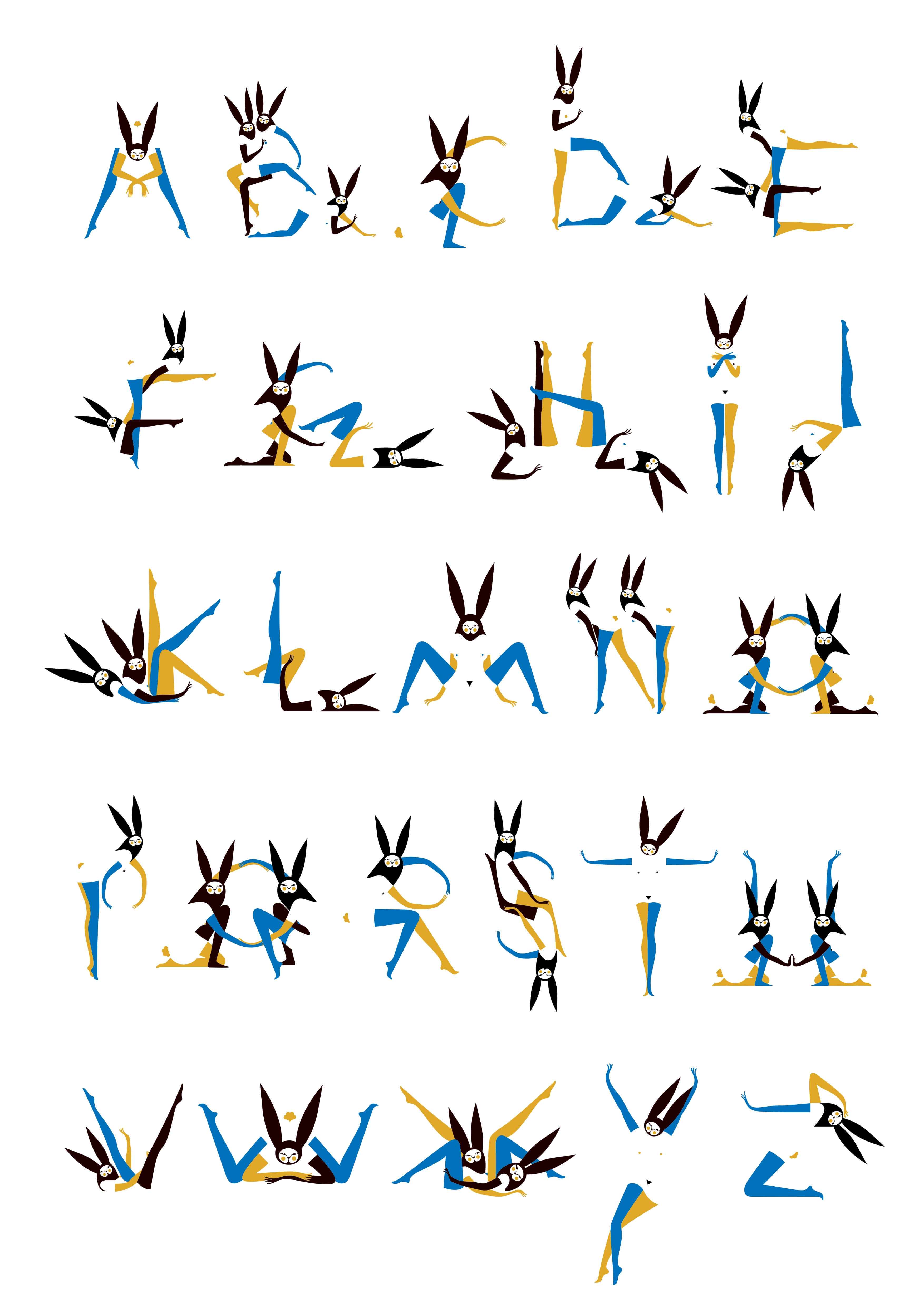
The real Malika starts with Alphabunnies, a set of erotic letters. As she states herself, they have become her breakthrough moment, when Malika’s finally been able to approach the illustration style to show her off.
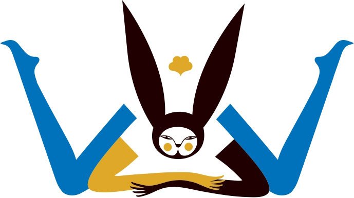
Via Alphabunnies Malika explores erotic drawings and adds them a more “graphic design” touch. As a result, she comes to the white negative space for the bodies, lots of tiny details to feast the eye and the letter-like look. And yet initially to create an alphabet isn’t a purpose, Malika takes it as a challenge.
Malika’s Illustration Style
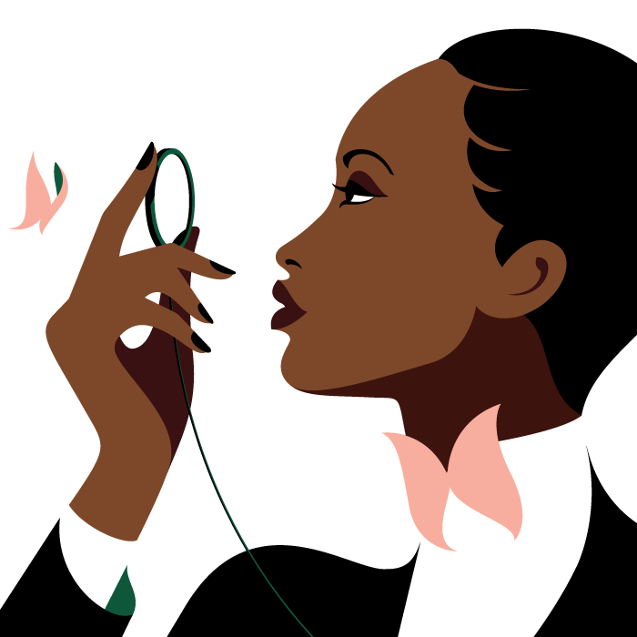
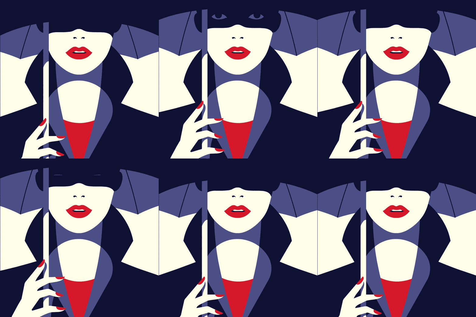
With her works, Malika Favre builds perfect balance upon color, shape and shadow, the three constructs of her style. The images she draws rely on strong forms and contrasts, which altogether pop off the page with cinematic quality and a powerful message that she conveys with no words but with bold minimalism.
As a vector illustrator, Malika searches for ideal geometry within every composition. And as Malika Favre, she immerses herself in the play of light and shadow — mainly to obtain a flawless minimalist look.
Malika’s earlier works are filled with optical illusions, which she realizes through repeating patterns, colorful objects and an expert grasp of line. Today, she is more about using colors to build perspective — green as the shadow of white or black as the shadow of purple — as well as perfecting curves and reducing forms to maximum. Consequently, all Malika’s experiments help her create something more than just a pretty picture: the image pushes the viewer, pulls the viewer, it leads the viewer’s eye around, and in a way, it tells a story.
Malika’s Collaborations and Projects
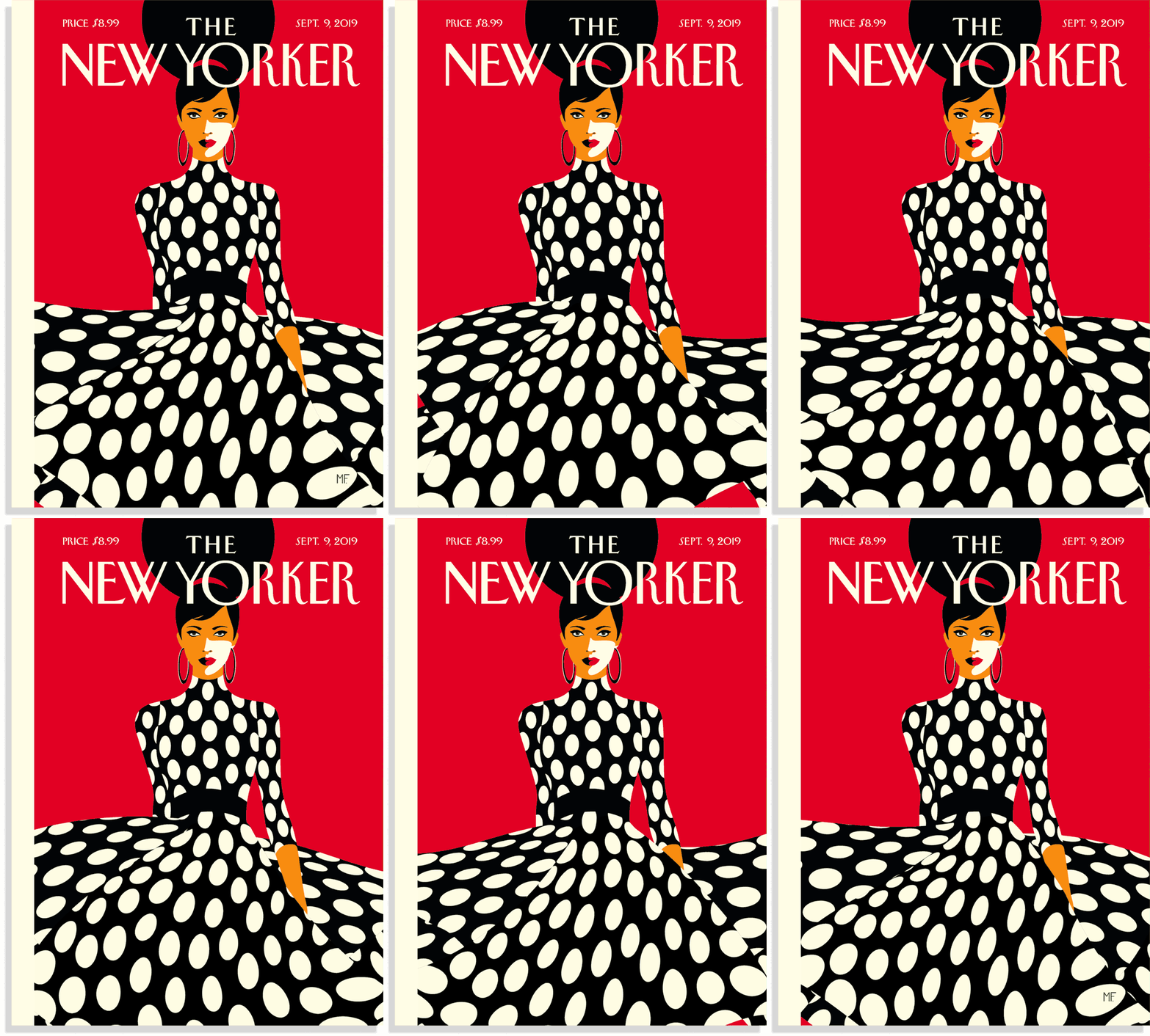
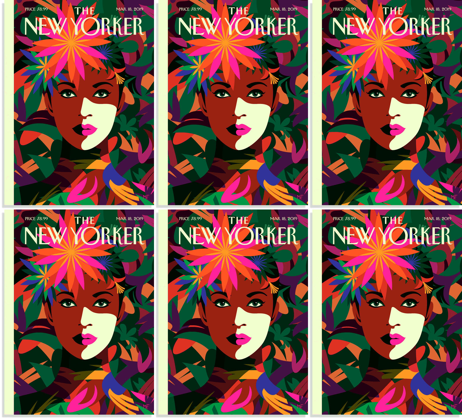
Today, Malika Favre mainly does magazines and collaborations, which get her unlimited creative freedom. Her unique Pop & Op art works have been featured by Sephora, Le Bon Marché, Penguin Books, Vogue, The New York Times, The Sunday Times, and Vanity Fair, etc. She has designed eight covers for The New Yorker — the last one was released in September 2019 and filled with powerful femininity.
