Every year as Pantone comes up with the announcement of the new Color of the Year, the whole design world freezes in anticipation of the big news. This is so because this long-awaited announcement isn’t a random selection of a color from their library. It’s a deep analysis of the past year with its rises and hopes that brings us the courage to continue our creative journey and remember the importance of what we do.
It hurts us to summarize everything humanity has faced in 2023. Wars, terrorism, global social and food crisis — we hardly can name darker times in modern history. However, 2023 has also shown the greatest courage of people. Their willingness to support each other and be human. This is what gives us hope for a different future and big changes. It’s also what we’re waiting for from the Pantone color of 2024 — a promise of a protective shelter of our well-being and a better future that art never fails to give.
Pantone Color of the Year 2024 Contents:
Pantone Color of the Year 2024: Introducing Pantone 13-1023 Peach Fuzz
Welcome to the new era of kindness and stillness, that Peach Fuzz brings us. It embraces a comforting and inviting tone that symbolizes our yearning for connection with others and the tranquility of finding solace. The color introduces a refreshing take on a gentle and soothing shade, displaying an attractive peachy hue delicately positioned between shades of pink and orange. PANTONE 13-1023 Peach Fuzz evokes feelings of belonging, a chance for reevaluation, and an opportunity for nurturing. It evokes a sense of serenity, providing a sanctuary where we can simply exist, experience, mend, and thrive.
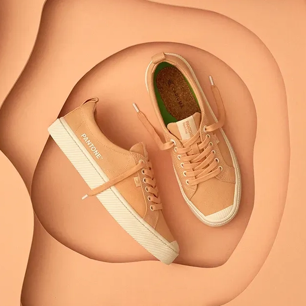
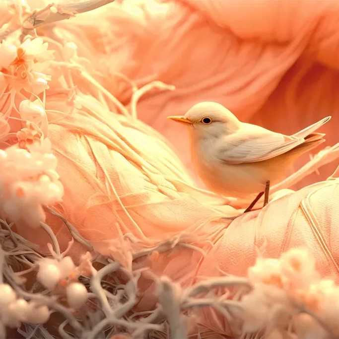
Aesthetically captivating and welcoming, PANTONE 13-1023 Peach Fuzz embodies a nurturing peach shade that naturally beckons us to reach out and make contact. This color communicates a sensation of touchability, evident in its velvety, quilted, and fuzzy textures, delivering a luxurious, calming, and gentle tactile experience. PANTONE 13-1023 Peach Fuzz envelops us in its peachy embrace, awakening our senses to the soothing sensation of touch and the warmth it provides.
Anyone else notice the neat correlation between the new @pantone Color of the Year & @CyberpunkGame
— Juliana DiChiara (@jichiara) December 10, 2020
Can we expect a collab in the future ;)? #cyberpunk2077 #pantone2021
Origins of the Pantone Color of the Year
Pantone, as it is known now, was established in 1962 after Lawrence Herbert, purchased the firm. At the time, it was a modest business that produced color cards for cosmetics businesses. In an instant, he altered its course, creating the first color matching system in 1963. The company’s CEO, Chairman, and President are still Herbert.
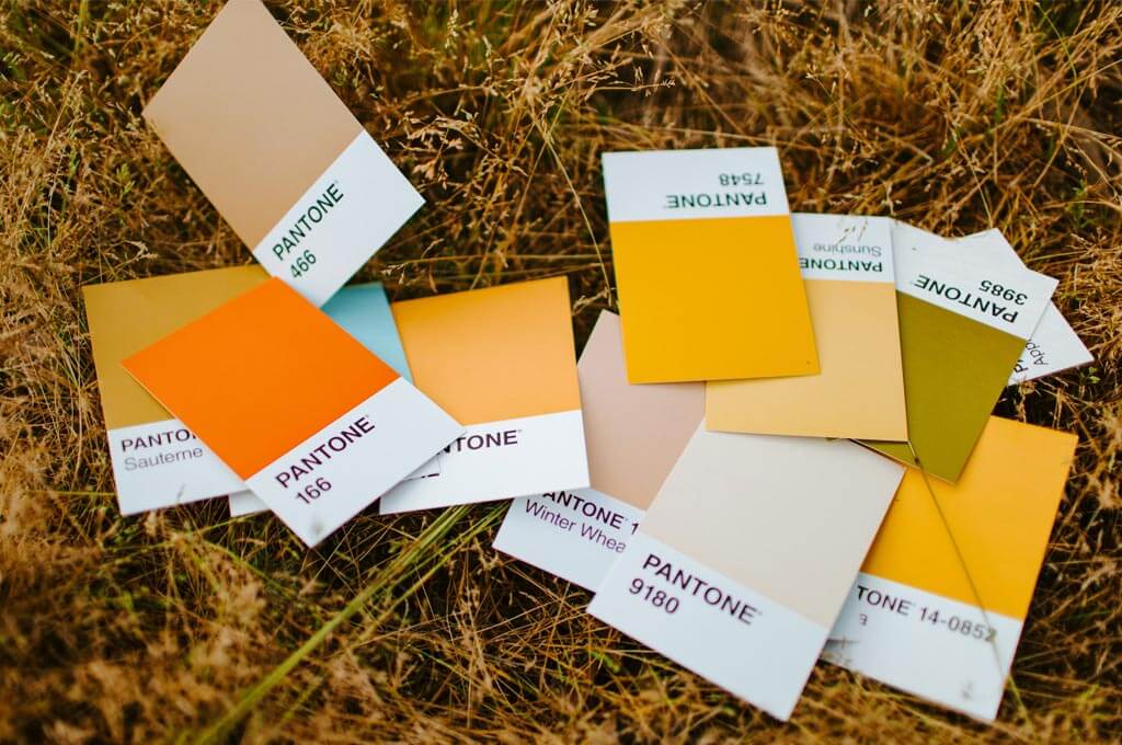
The Pantone Guides are one of the company’s main offerings. Each item is made up of a large number of tiny (about 62 inches or 15×5 cm) thin cardboard sheets that have been bonded together and have had a series of related color swatches printed on one side.
Pantone Color Matching System
The CMYK process and other current color reproduction technologies are enhanced by the Pantone Color Matching System. The CMYK process uses four inks — magenta, cyan, yellow, and black — and is a standardized way to print in color. This method is used to create the vast majority of printed materials in use. The Pantone method is built on a particular pigment mixture to produce new colors, known as Spot Colors. Numerous “unique” colors, such as metallics and fluorescents, may be made using it. The colors that can be simulated using the CMYK process are marked as such in the company’s guidelines, even though the majority of them are outside the printed CMYK gamut.
The Pantone Color Institute
Many creatives, such as designers, producers, and businesses have the opportunity to collaborate with the Pantone Color Institute in order to establish a strong and compelling color presence. Their understanding of color is unmatched since they are the top color matching system. They are the foremost authorities of color marketing who know how color influences both design and consumer behavior. Therefore, there is a team behind the choice of the Pantone Color of the Year, not a single person or department.
Color of the Year Tradition
The Pantone Color of the Year was developed by the Pantone Color Institute in 2000. It is seen as a trend-setting idea for marketing, branding and the creative community as a whole, as many designs for both individual and commercial projects tend to have this color in them. Every December, designers, artists and even global enterprises eagerly await its announcemen, now accompanied by relevant color palettes and inspirational ideas. Plus, everyone who comes just in time for the announcement, can get much useful information from Pantone’s team, including some insider knowledge.
Where & How Pantone Colors Are Used
The Сolor of the Year, chosen annually by the Pantone Color Institute, traditionally determines trends in the new season. These are both color palette solutions & combinations and the emotional component of the projects. Thus, the past year’s social mood and cultural phenomena directly affect the newest works of interior designers, musicians, artists, and, most importantly, everyday mood.

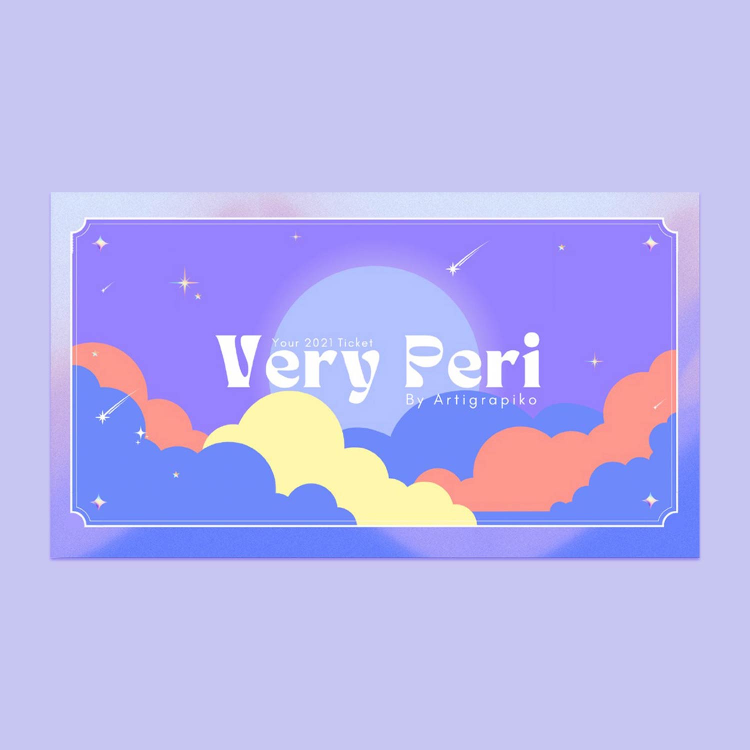
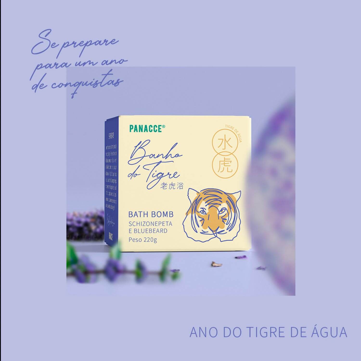
Countless blog posts, tweets, and Instagram publications follow the color announcement, making it one of the most anticipated events in the world. Soon after that, Pantone Color of The Year and its palette penetrates almost all aspects of human life, and we can see it in apparel design, fashion, interiors (those stylish kitchen cabinets and living rooms), interfaces, — everything made by the wide design community!
Pantone Color of The Year: Choices of the Past Decade
Pantone annually holds a press release where the Color of the Year is announced. They consider what happened that time and have somehow become a mirror of age. Looking back at Pantone’s picks of the last decade we can reminisce what the world has been through, both politically and creatively. It also may give a dose of nostalgia, as these colors were truly one of each year’s prime symbols.
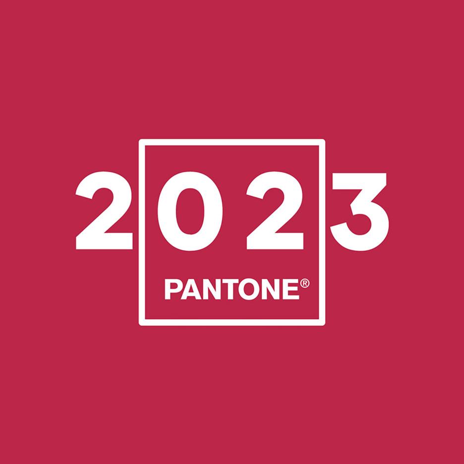
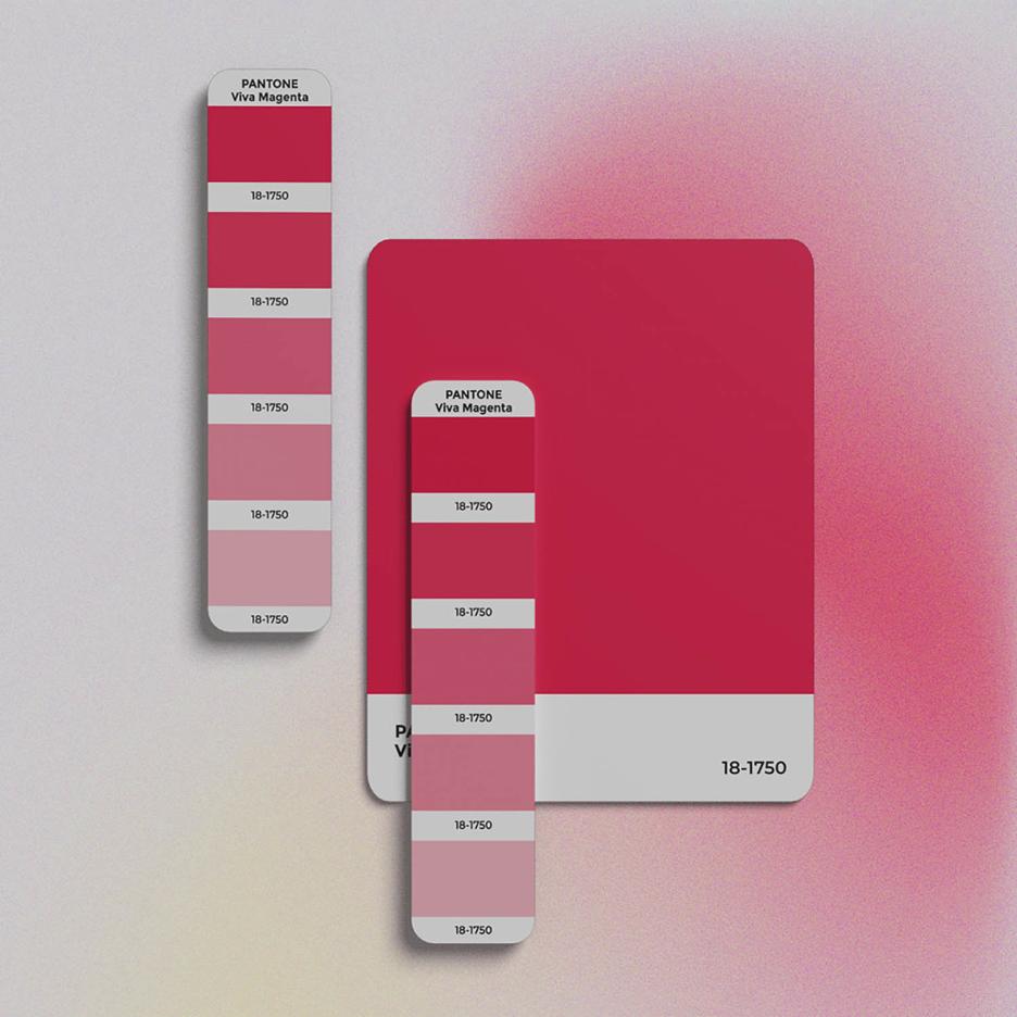
2023: Pantone 18-1750 Viva Magenta
Viva Magenta is an animated full-bodied red that revels in pure joy of a primary color, encouraging creativity and self-expression without restraint. Pantone’s 2023 color Viva Magenta is an answer to the difficult times that conveys something even bigger the hope: power and resistance. Viva Magenta welcomes anyone and everyone with the same verve for life, vital energy, and rebellious spirit. It is a color that is audacious, full of wit, and inclusive of all.
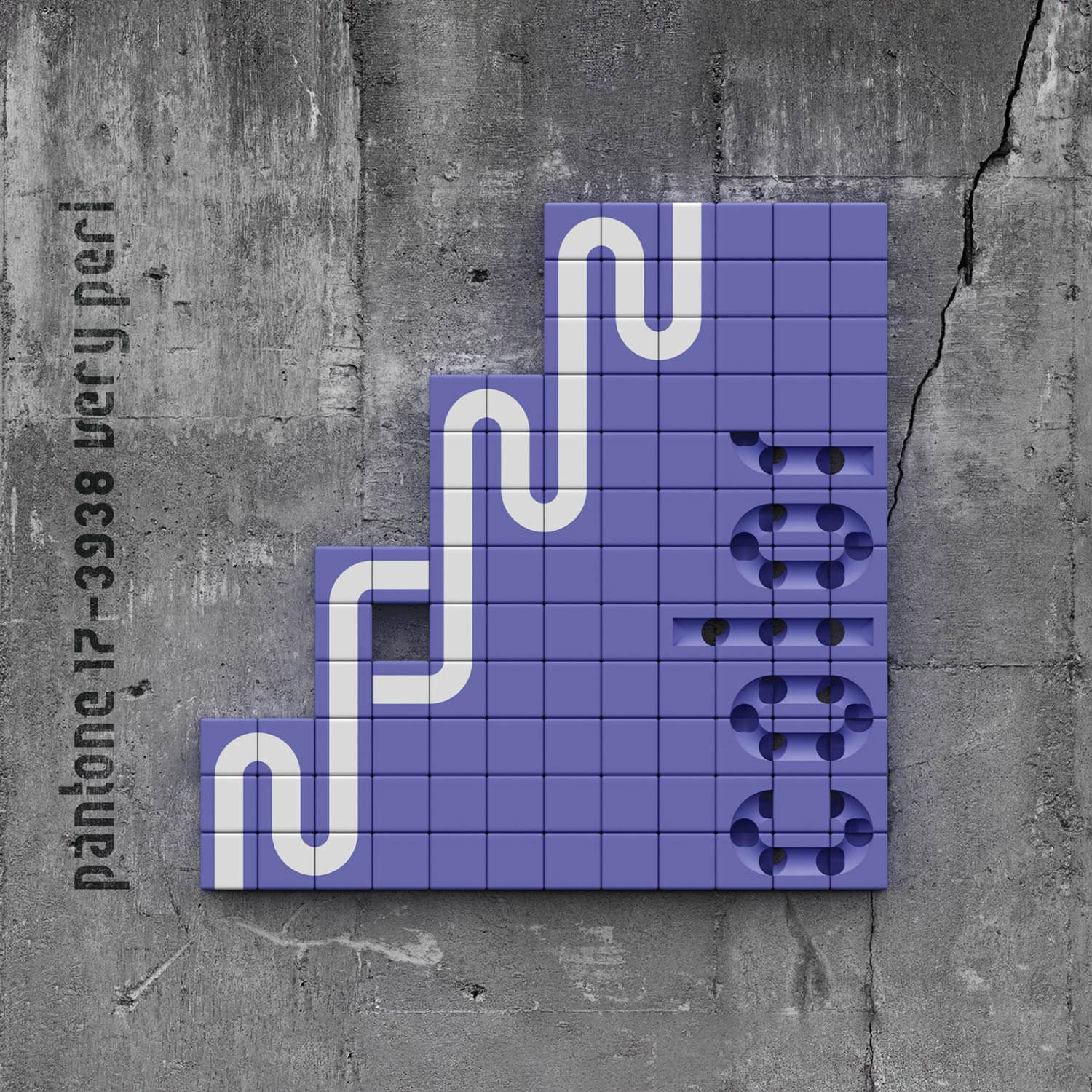
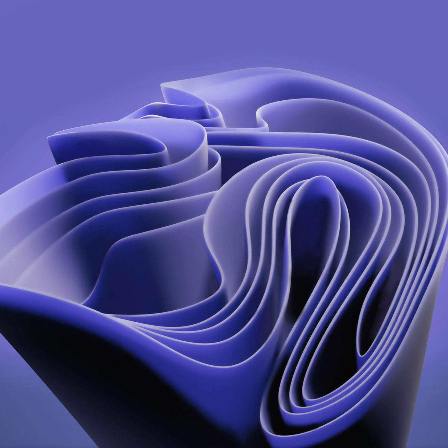
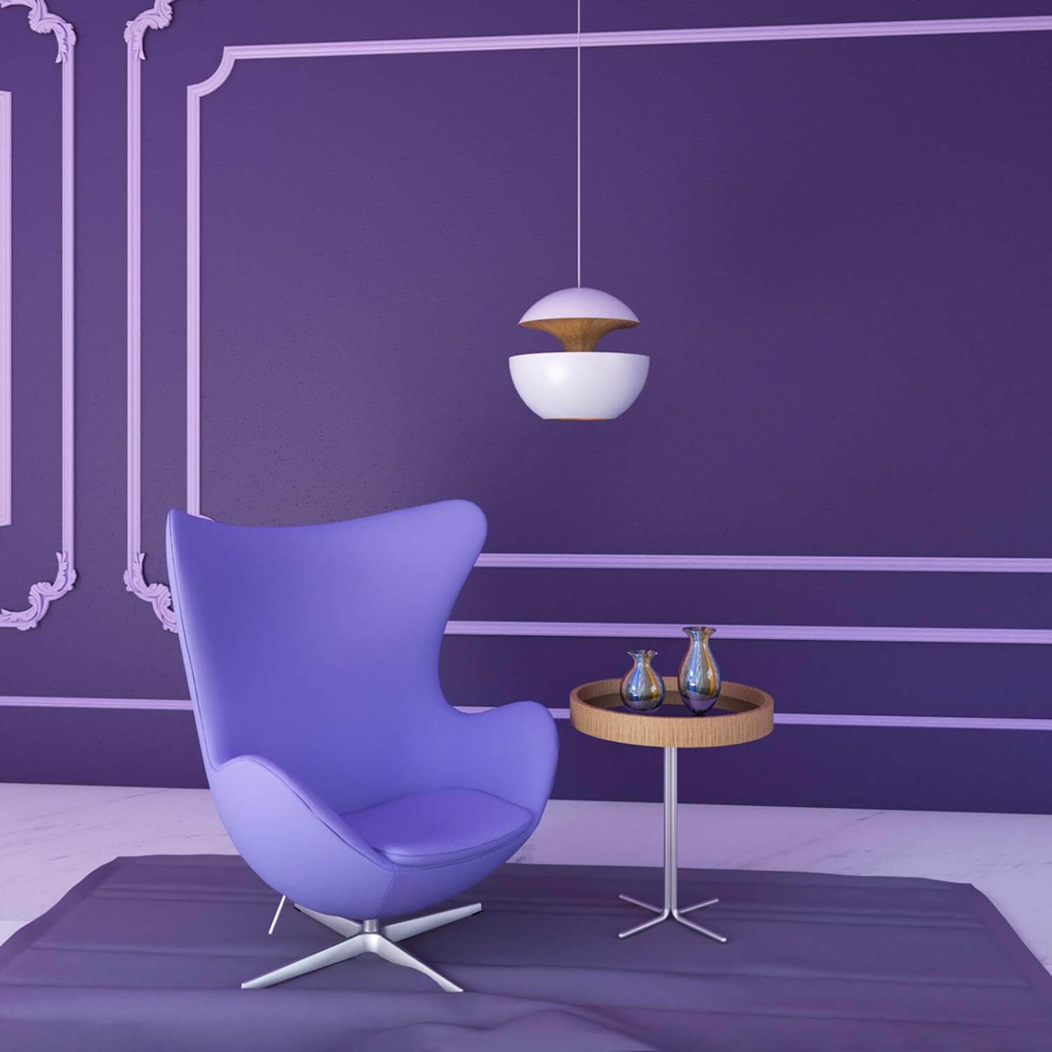
2022: Pantone 17-3938 Very Peri
The hue has violet red undertones and is a part of the blue family. Nature has already incorporated the exquisite balanced blue tone into its vibrant feathers and delicate pastel lilac. This color scheme encourages courageous creativity with its sprightly presence and is ideal for designing upbeat, colorful environments with a dash of flair.
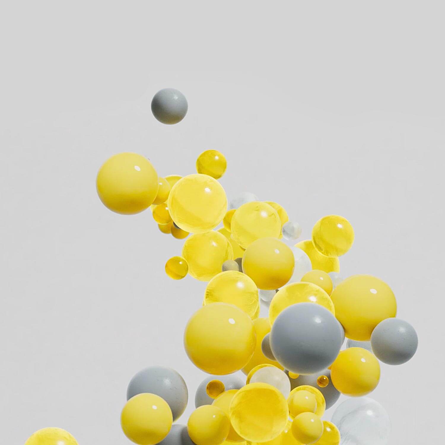
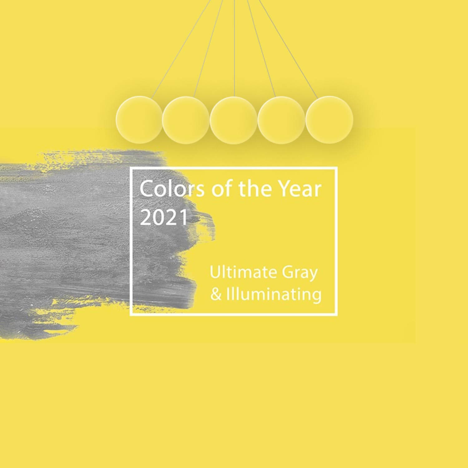
2021: Pantone 17-5104 Ultimate Gray + Pantone 13-0647 Illuminating
Illuminating, a brilliant yellow tone promotes positive relationships and encourages self-expression, whereas enduring Ultimate Gray with more grounded neutral undertones spoke more to composition, solidity, and durability. According to Pantone, these reliable core tones infused with a contemporary edge were somewhat akin to hardy natural components, like beach stones that have weathered over the years. These contrasting colors were chosen so people could feel some fresh air and fortify themselves with vitality, clarity, and optimism.
2020: Pantone 19-4052 Classic Blue
Everyone has been in awe when Pantone 19-4052 Classic Blue was named the Pantone Color of the Year for 2020. Its calm blue hue made us think of the ocean, the deep blue sky, and perhaps even gushing rivers. It forced us to return to nature and made us appreciate simplicity.


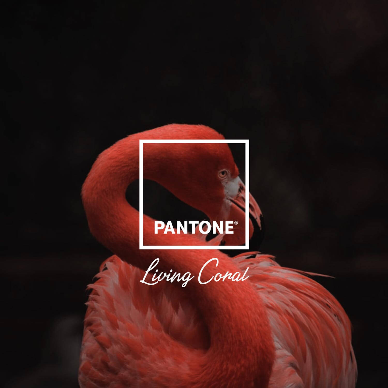
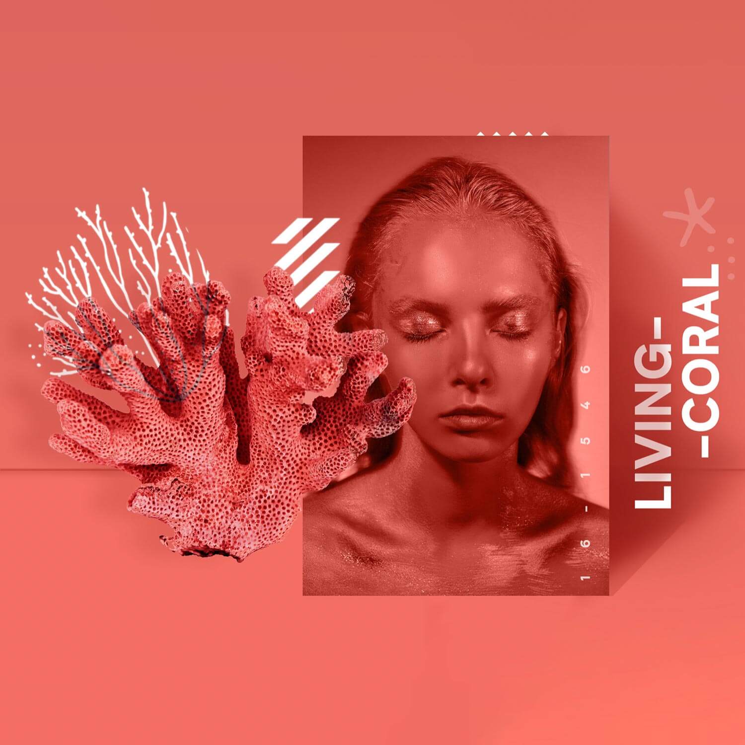
2019: Pantone 16-1546 Living Coral
Pantone 16-1546 which is known as Living Coral, is a peachy orange with a vivifying golden undertone. The sea invertebrate gets its colorful tone from the small algae growing on its surface, and the hue implies vigor and buoyancy. The color serves as a stark reminder of the harm that global warming has caused to the Great Barrier Reef.
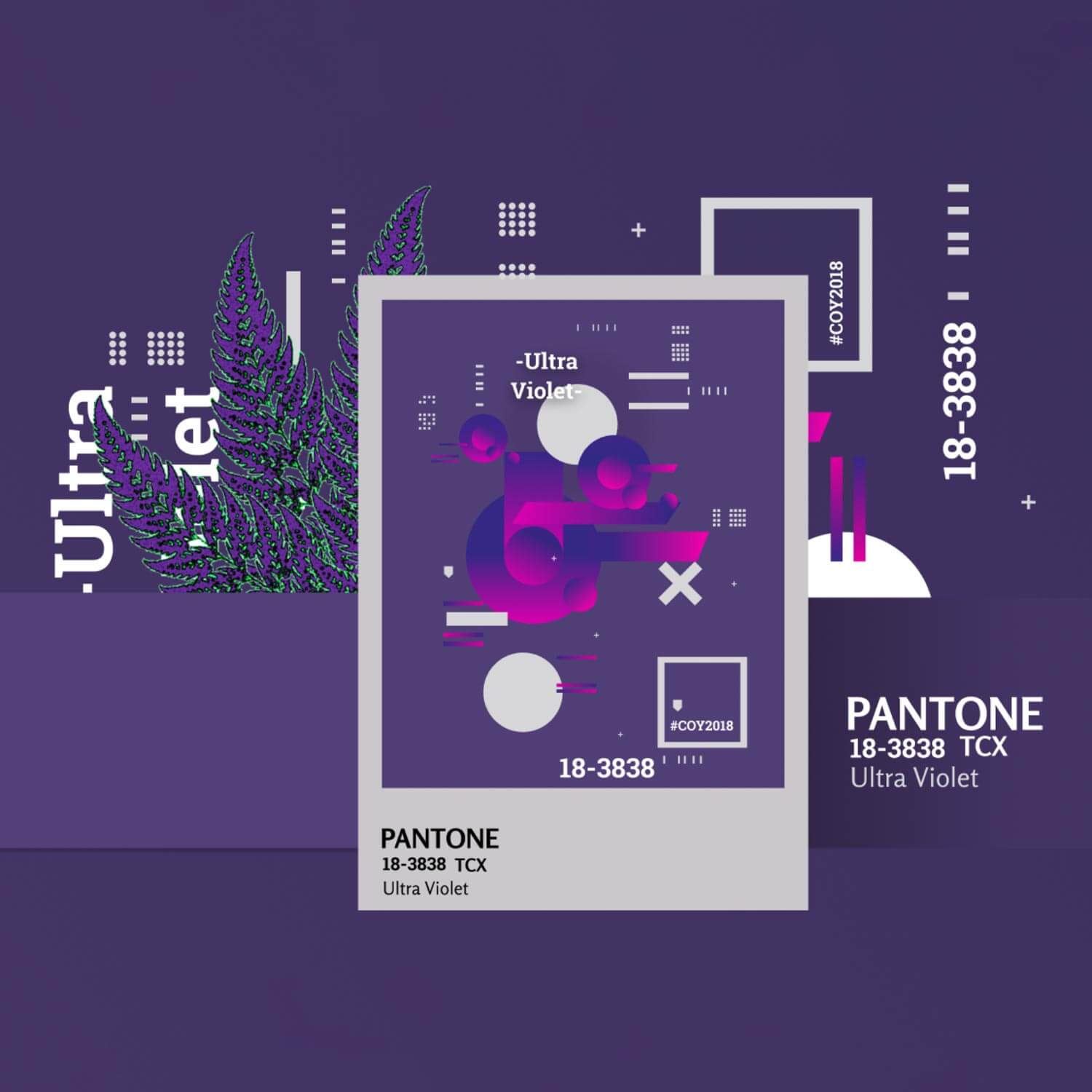
2018: Pantone 18-3838 Ultra Violet
Pantone’s Color of the Year for 2018 was Pantone 18-3838 Ultra Violet, a profoundly thought-provoking and dramatic purple shade that communicates uniqueness and creative thinking that looks to the future. The color is complex and meditative and alludes to the cosmos’ secrets, curiosity, and discoveries that lay beyond our current understanding.

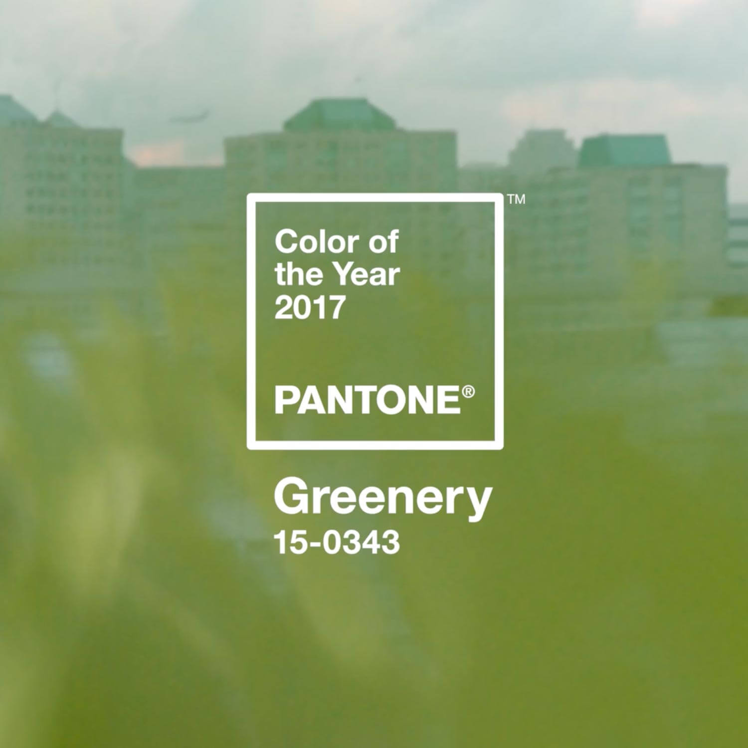
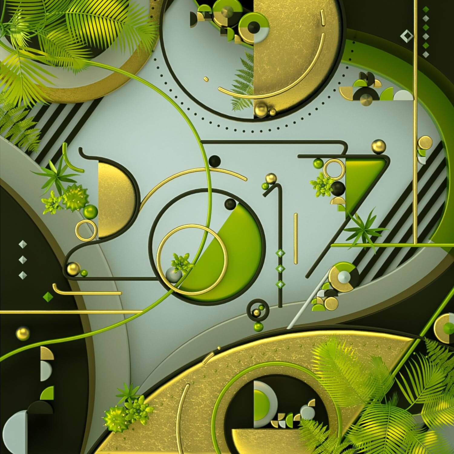
2017: Pantone 15-0343 Greenery
In a turbulent social and political climate, Pantone’s 2017 Color of the Year, Greenery, erupts to provide us the renewed comfort we want while meeting our rising need for renewal and revitalization. Symbolizing fresh starts, Greenery is a bright, zesty yellow-green tint that reflects fleeting elements like the early days of spring when nature replenish, repair, and revitalize us, feeding our desire for reaffirmation and rebirth.
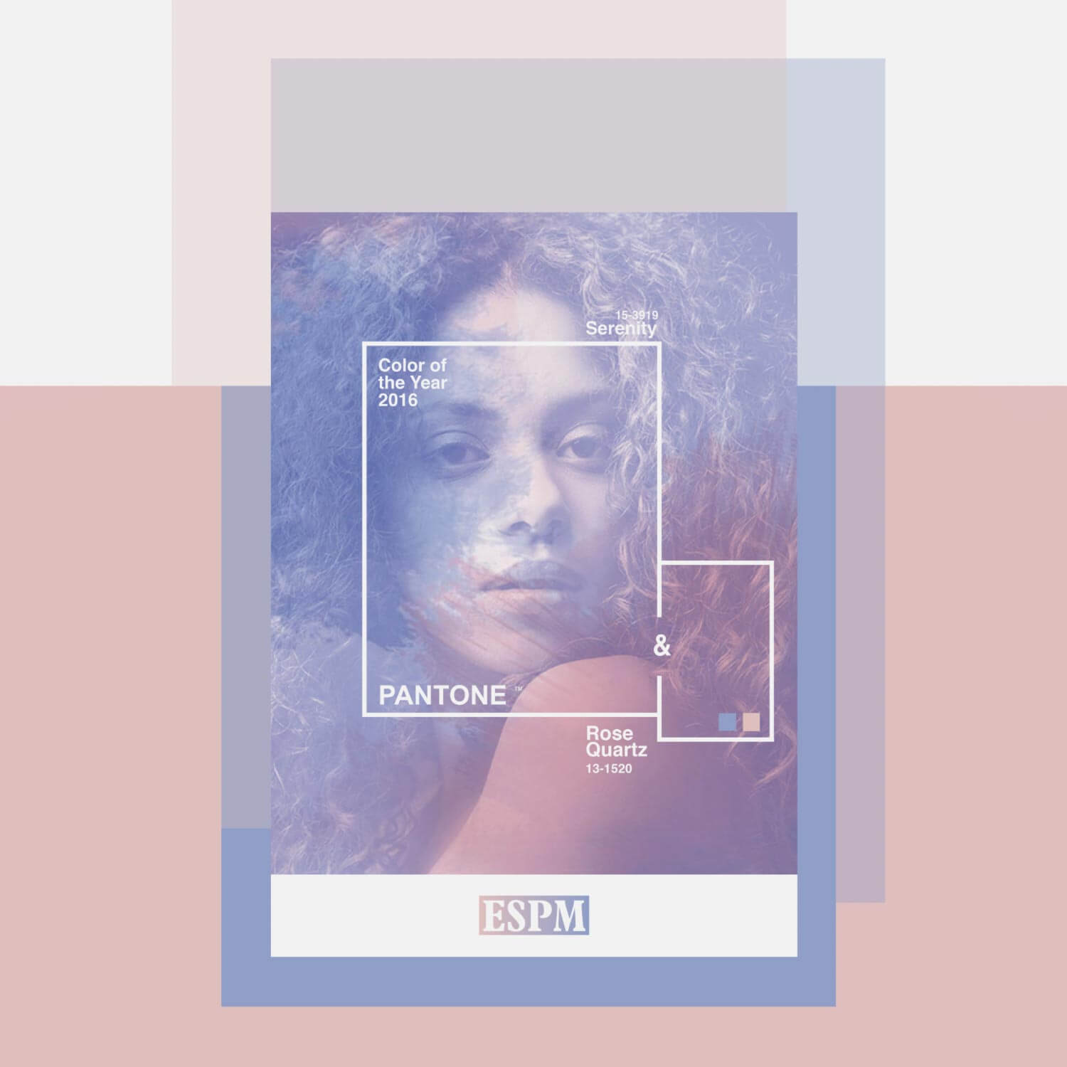
2016: Pantone 13-1520 Rose Quartz + Pantone 15-3919 Serenity
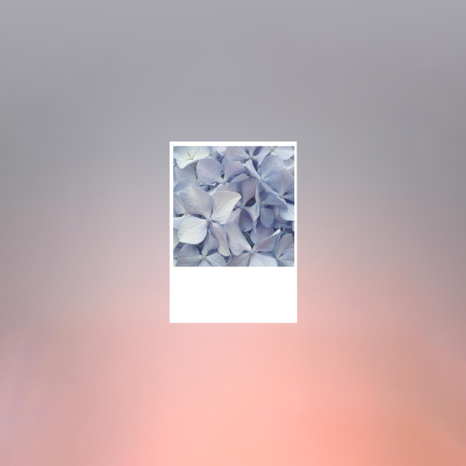
Pantone 15-3919 Serenity is light and airy color, like a pure blue sky, whereas Pantone 13-1520 Rose Quartz is seductive and soft and portrays calm and compassion. In an effort to fight the strains of contemporary life, the natural blend of these two soothing shades work together to evoke a sense of relief and relaxation in both consumers and business people.
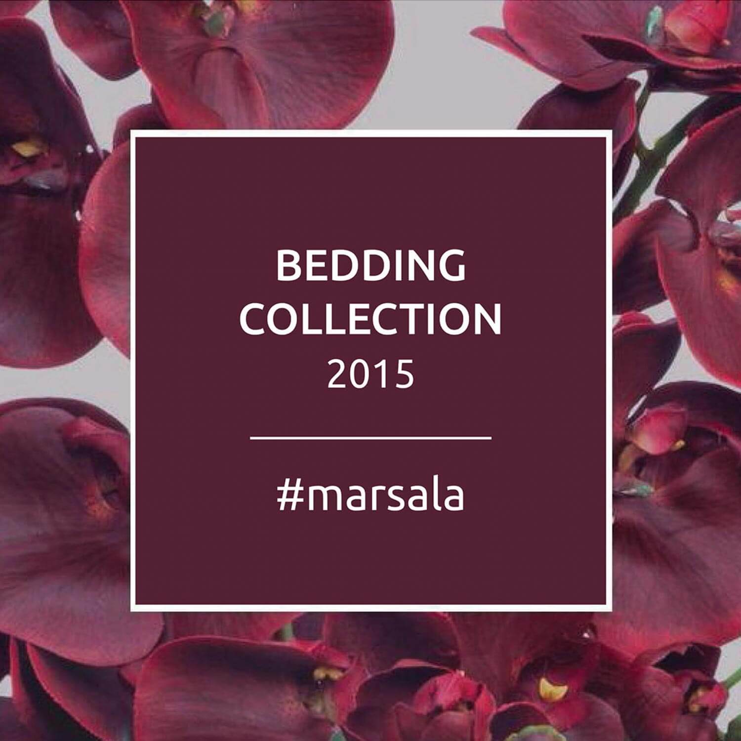
2015: Pantone 18-1438 Marsala
The color 18-1438 Marsala is a warm, welcoming one that is gently alluring and draws everyone in. This warm, attractive tone with a twist of unique spontaneity is generally attractive and adapts well to fashion, interiors, cosmetics, industrial design, graphic design projects, or home furnishings. Its elegant shade represents the richness of a delicious dinner, similar to the sweet wine that gave Marsala its name.
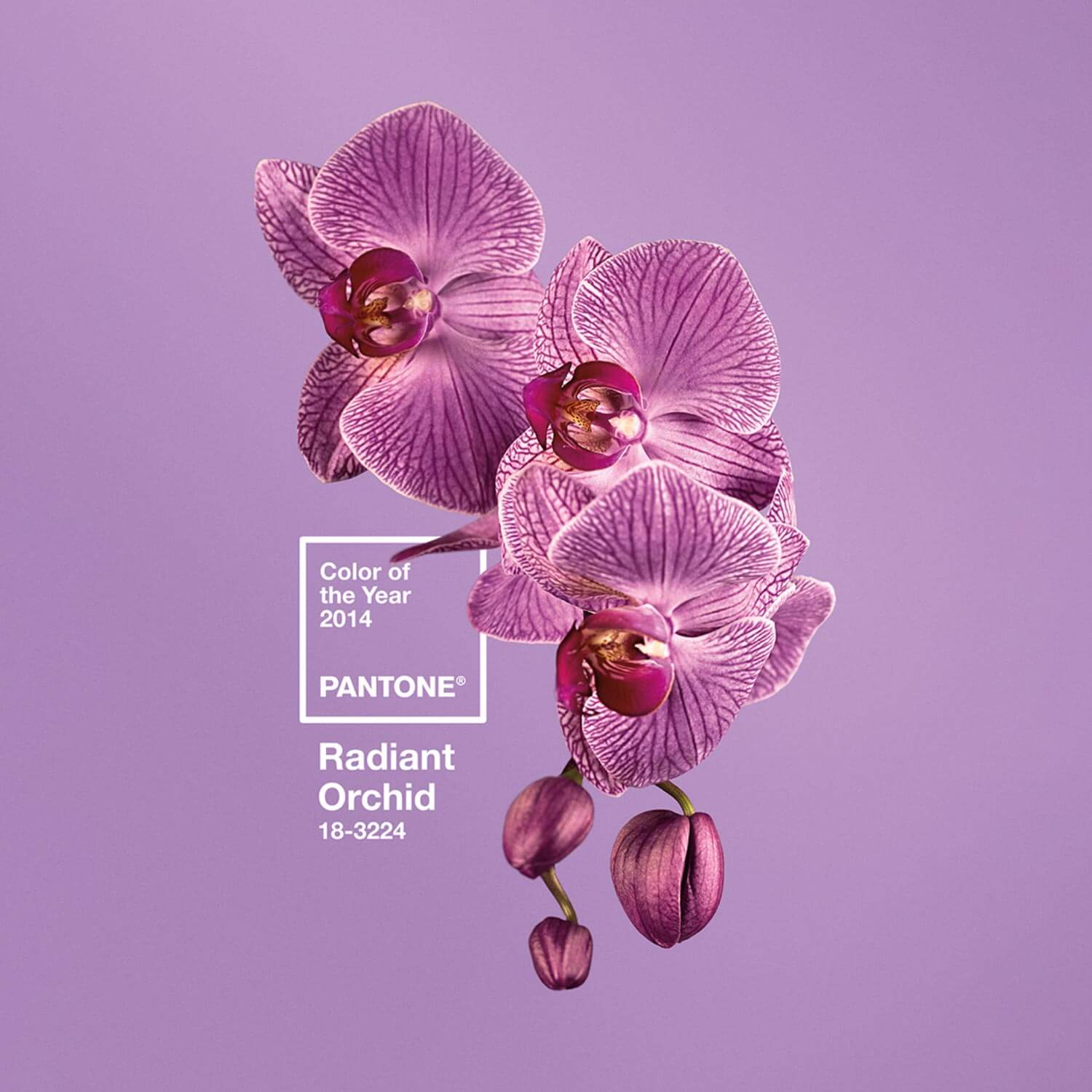
2014: Pantone 18-3224 Radiant Orchid
Radiant Orchid extends across the color wheel to catch the attention of viewers and pique their curiosity. Pantone 18-3224 promotes new sense of extended creativity and uniqueness, which are more appreciated in today’s culture. Radiant Orchid, a fascinating purple with seductive charm, is a harmonious blend of fuchsia, purple, and pink undertones.
Frequently Asked Questions

