Refreshes without filling — the slogan you see in many vintage Pepsi posters, telling you how to make your life better by sipping on this miracle drink. Actually, it won’t necessarily be a false statement because back in the day, Pepsi aimed at helping people with digestion issues. So how exactly it had transformed into the fashionable beverage? Taking a look at the Pepsi logo design history would help you find out.
Pixelbuddha Plus Membership
Get access to the creative content of premium quality! Pixelbuddha Plus brings remarkable deals, trendy design goods and exclusive time-limited offers for a price of a single premium product.
Before The Pepsi Logo Began
Since 1850s the soda fountain inside the pharmacie was a hip thing: every drugstore owner could have worked as some sort of a curing bartender, inventing own recipes that promised ailment relief, while tasting good too. It can’t go without mentioning that these power supplies were generously boosted with caffeine and cocaine (yes, until 1914, opiates were allowed in products for public consumption). Imagine the fanbase of these gorgeous beverages!
Now you have the certain setting drawn in mind about the times when Pepsi takes its origins.
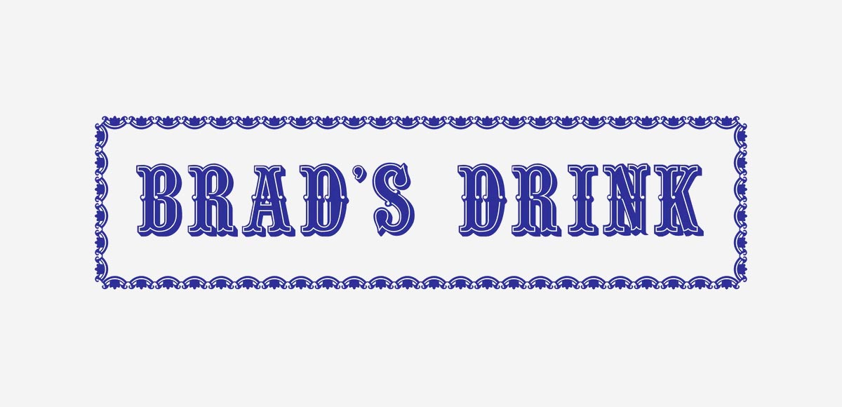
It would be ridiculous to state that Pepsi was always called like that. Originally, it had a name “Brad’s drink” and it wasn’t fizzy at all. “Brad’s drink” was called after Caleb D. Bradham, a North Carolina pharmacist, invented original Pepsi-Cola formula by combining cola nuts extract, vanilla, and “rare oils”. Bradham believed that his miracle beverage aided digestion just the way pepsin does (the gastric juice, that reduces proteins into smaller amino acids), so in 1898 by putting “pepsin” and “cola” together the“Pepsi-Cola” name was registered, replacing the “Brad’s Drink”. No Pepsi logo whatsoever, but it was the first step before establishing the product’s logotype.
Caleb Bradham started selling the beverage at his pharmacy, situated in New Bern, North Carolina. In a little while, people spread the word, and the Pepsi-Cola soda syrup got distributed across the whole state to be sold by other stores and pharmacies. “Exhilarating, Invigorating, Aids Digestion,” — original slogan and Pepsi logo tagline highlighted the health-related aspect of the drink, advertised by the auto racing pioneer Barney Oldfield. On the whole, the brand’s emergence is an exciting subject matter to investigate in terms of graphic design and advertising, nevertheless, let’s focus on visuals more.
Old Pepsi Logo Was Burning Red
Between 1898 and 1940 the first logo of Pepsi was nothing but the word “Pepsi-Cola” written with a red script (first swirly and ugly but then smooth handwriting font). That wasn’t their most legible logo version at all. In the 1898 Pepsi introduced a new variant that looked spiky and aggressive, there was no way you could read this Pepsi script logo clearly.
The Pepsi-Cola Company expanded quickly after that. Bradham registered the term as a trademark in 1903, and within a year he had sold 20,000 gallons of Pepsi-Cola syrup. In 24 states, there were 240 Pepsi-Cola bottling companies by 1910.
Next, after the first logo with a swirly red font that had no much success, Pepsi decided to change it. But the next Pepsi logo design in 1905 wasn’t the best, too. It seemed like the improvements began from the left to the right: letter “P” was okay but look at the very last “a”, it’s sick! And what’s wrong with this “C” with its scarf-on-the-wind swirl? This approach to the Pepsi logo works in the criterion of being a memorable red stain, associated with the drink, and not a well-designed logotype.
One year has passed since this release and in 1906 the new Pepsi logo was significantly changed. There were spikes again but the image of the Pepsi logo obtained the softness and coherent style. See the incline? It made the Pepsi logo look more alive and mature. Last but not least, the appearance of “drink” in the top left corner, standing for the product’s meaning and a call-to-action. Nevertheless, the new Pepsi logo was still very raw.
Saving the swirls but adding the clearness — the company didn’t want the Pepsi-Cola logo concept to be changed and just added the smooth lines to the typeface. This iconic logo design became a sight for sore eyes!
Like prior Pepsi-Cola logos, the 1940 logo was created using traditional lettering. The serifs on the wordmark’s lower letters shrank once further, becoming practically undetectable, and its larger letters grew taller and wider. Overall, the letters became thinner, making the emblem appear less compressed.
The Similarities Between Coca-Cola and Pepsi-Cola
Let’s spend a minute discussing the parallels between Pepsi and Coca-Cola at this time. Years separated Pepsi from being known as the trendy, young substitute for Coke. And those comparisons weren’t groundless, actually those beverages have a lot in common, including the similarities between the Coke’s logo and the one of Pepsi. Both drinks featured wavy, swooping, semi-cursive wordmark logos in red and white and were marketed as health drinks.
Pepsi-Cola faced many difficulties during the 1920s and 1930s, and at times it appeared as though they would lose the ongoing “cola wars”. Pepsi-Cola filed into bankruptcy and was later acquired by Craven Holdings Corp., as Coca-Cola established bottling facilities in Europe and was led for the next 60 years by Robert Woodruff. Pepsi-Cola declared bankruptcy a second time in 1930.
By increasing the size of Pepsi bottles to 12 ounces and preserving its five-cent price tag in 1933, the company discovered its first approach to set itself apart from Coca-Cola. When compared to Coca-Cola’s 6.5-ounce bottle, it was clear which brand offered superior value.
Despite the fact that the two brands share a striking visual similarity, Pepsi-Cola persisted with the red and white ribbon logo until 1950, altering it only once more for a simpler appearance in 1940.
Pepsi-Cola Logo Got Its Cap
Pepsi began new era and persisted in positioning itself as the cola that offers the best value during the 1950s. The advertising slogan of the day promised more than simply more soda per bottle than Coca-Cola: “More bounce to the ounce.” More fun was promised.
The Pepsi-Cola logo in 1950 still had “cola” in it, which got changed in 1962 due to some company reformations, so it became just Pepsi. It seems like with losing this word, the brand has lost its “archaic” look, marking the new branch of its evolution. The Pepsi logo history as the development of a separate brand starts right here, with bold cap letters – the first major change of the design. Moreover, the new motto claimed that Pepsi was the drink “for those who think young” and this black sans serif across the Pepsi logo implied this idea successfully.
Along with getting rid of the word “Cola,” Pepsi ditched the red font that it had been using for 64 years, too. Now, Pepsi introduced its identity to the world on the bottle top with a large, black, sans-serif wordmark that resembled a stamp. Since 1958, Pepsi had established itself as the beverage “for those who think young,” with Coca-Cola being associated with people who didn’t, had outdated perspectives, and were disconnected from the youth culture of the day. And they needed a perfect logo to represent this idea.
The Pepsi logo also became more symmetrical in the 1960s. It narrowed down its target audience and actively marketed itself to younger consumers with this more contemporary, geometric-feeling logo and minimalist, almost brutalist font, referring to them as the “Pepsi Generation” in a 1961 advertising campaign. The logo of that time had the same red and blue colors on the entirely white background.
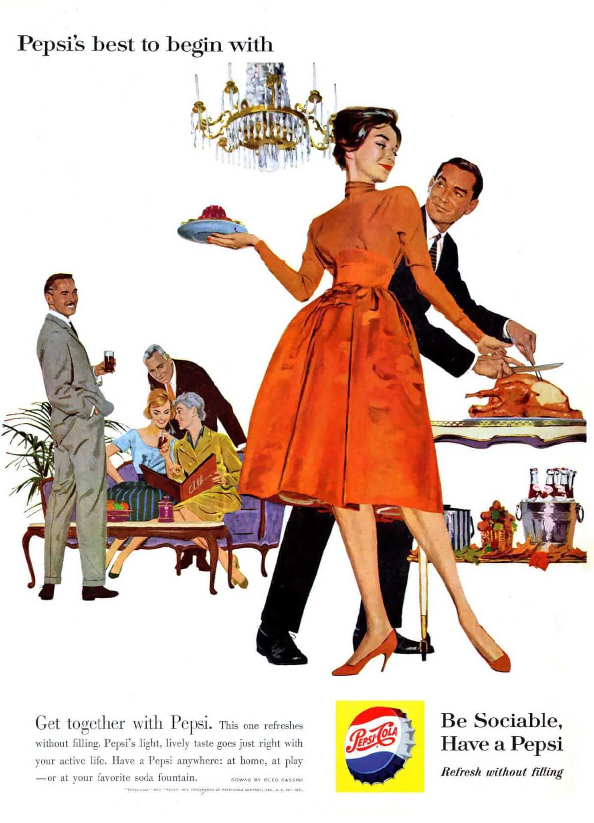
In its advertisements at the time, Pepsi-Cola positioned itself as the ideal beverage for any kind of socializing: a day at the beach or an evening out with friends. It was advertised as a light beverage and soda that makes you feel refreshed without filling you up; in particular, it was the ideal drink for attractive young women who desired to maintain their trim bodies, as the ads said.
In 1964 the brand introduced Diet Pepsi for the first time, providing an even sugar-free, lighter beverage choice for the so-called “Pepsi Generation” to have fun with.
New Twist in The Pepsi Logo History
Launched by the trend for modern looks and technologies, in 1973 the Pepsi logo became minimalistic. What happened? Every detail turned flat, the same three colors (white, red and blue) remained in a new bottle cap logo, and the resonating black letters were replaced by dark-blue ones. One more peculiar thing about the new Pepsi logo is the use of a colored background, which is made the way that even omitting the background doesn’t ruin the logotype itself, a point to versatility maybe?
In 1975 Pepsi launched the challenge to stop Coke’s market supremacy. That year Pepsi started the Pepsi Challenge to demonstrate to the world that their soda tasted superior to Coca-Cola. Passersby were asked to do blind taste tests of Coke and Pepsi in malls and other busy pedestrian areas and indicate which they preferred. People favored Pepsi’s cola over its rival. At least, that’s what the company claimed after the Pepsi challenge came to an end.
What caused this radical changement from the more conventional design? The corporation perceived a significant shift in popular culture. Design trends like minimalism and technology were emerging.
The frills of the bottle cap logo and the previous logo’s swirls were out of date. They just did not correspond to the times. Frills and curls were out, while simple forms and clean lines were in. The bull’s eyes and other extraneous elements were visually busy.
Of course, there were other advantages of a cleaner design. With its fundamental shapes and forms, this clean, minimalistic design was simpler to apply to a wider variety of objects. Additionally, in the increasingly crowded market, it was easier to identify. The significance of these advantages grew on the world stage.
But the Cola Wars did not end after that. They were merely intensifying. As Pepsi outsold Coca-Cola in supermarkets by the early 1980s, the company was riding high on its reputation as the beverage that customers liked. Pepsi triumphed in the end, right? Spoiler: nope.
In order to compete with the sweeter soda, Coca-Cola changed its recipe and released New Coke to the public. The audience also detested it. However, it didn’t turn them against Cola. Additionally, it didn’t elevate Pepsi to the position of top-selling beverage. Coca-Cola brought back the original formula as Coke Classic when New Coke received a significant amount of negative public feedback, then covertly phased off New Coke so Coke Classic could once again just be Coca-Cola.
And Coca-Cola was exactly that—a classic, old-school beverage that everyone knew and adored. It was associated with Christmas, Santa Claus and joy thanks to the advertisement. In contrast, Michael Jackson and Michael J. Fox were endorsing Pepsi. Pepsi was up-to-date and vibrant; they didn’t need to change their recipe to cater to today’s drinkers. However, they kept on changing their logo.
Fun fact: in 1987 the brand even has created its own custom font, the Pepsi font, having the futuristic look and representing the brand for over a decade.
More design changes were coming in 1991 and they were still about minimalism… and rearrangement of elements in the Pepsi logo. The word “Pepsi” was lifted to the top, while the colored circle with a spherical shape went to the right bottom corner, leaving the huge red trace. It gives the feeling of movement, like a trip into the future this Pepsi logo invites you to take.
In 1998, the Pepsi company celebrated its 100th anniversary and commemorated this event with a new Pepsi logo! It started looking much different, pushed from flat minimalism to realistic 3D effect. The white typeface with shadowing, blue color of the background, and a voluminous two-colored globe with shadowing — this Pepsi logo looked very modern and responded properly to the new millennium coming ahead.
21st Century Pepsi Logo Designs
There are two Pepsi logo design versions we’ll be talking about here. Let’s take a look at the one of 2003 first.
The new Pepsi logo underwent a slight modification in 2003. In order to give the logo a flatter appearance, the Pepsi globe was altered to contain huge, noticeable white “shine” patches that gave the impression that it had been vacuum-sealed in plastic. It was truly an iconic logo.
The Pepsi wordmark and the circle of the spherical shape were both outlined in light blue color to make them stand out against the background and its gradient that was adjusted to make the lower left corner the light source rather than the globe.
The word “Pepsi” was also given a slight makeover. The font’s tiny serifs were re-added, and the letters were given a light gray shading to give them a more three-dimensional appearance.
This one is my least favorite but the one I saw so many times in my childhood: the hyper-futuristic Pepsi logo with so many 3D details it hurts to look at! I mean, the word is okay, but the idea of “freshness” is being shoved into the eyes with icy blue background and tons of ice drops on the sphere.
Pepsi cemented their position as the cool hipster drink brand in the Cola Wars. And they continued to keep their image as a fresh, cool drink. And in 2006 they decided to make the Pepsi logo fresh and cool. In the literal sense of those words.
The now fully three-dimensional Pepsi globe was transformed into a cold soda glass with sparkling condensation droplets forming on its surface in this rendition of the new logo. The font remained bold and slanted forward like it did in the 2003 revision.
We’ve moved to the up-to-date version of the Pepsi logo and look how different it is. Only the typical Pepsi colors remain the same but the font, the sphere, and the stripes are all new. I have to say that minimalism won after all, and the font resembles the script it all began with. It looks like a nice fulfilment of two missions for the Pepsi logo: catching up with the social development and paying respects to the company’s heritage.
The new logo was welcomed by the audience. This Pepsi was still lively and youthful, but also welcoming and friendly. It was approachable, interesting, and unmistakably unpretentious.
However, not everyone liked it. People compared it to other logos of that time and said it was far too simple and even lazy.
Others described it as being soulless and cheap. Critics labeled Arnell Group’s explanation of the meaning behind the design, including its use of the Golden Ratio to establish the ideal angle for the globe, as pretentious and ludicrous after they compared it to the famous Mona Lisa. Pepsi stuck with its decision to rebrand despite the mainly unfavorable reaction from the general public, and in 2014 made a little change to the logo by eliminating the dark royal blue outline around the globe.
Despite the Pepsi logo being recognizable worldwide, it has undergone a number of alterations over the course of the company’s existence. It reflects the changes in the company as well as the era itself.
Although the Pepsi brand has been instantly identifiable for many years, their incisive graphic mark has undergone changes in order to better reflect the company’s culture, attitude, and objectives. Pepsi has altered not only its logo but also its name and ingredients. The company’s logo has been significantly impacted by this “Pepsi evolution.”
We looked through the Pepsi brand’s history as well as the process of how the Pepsi logo evolved. Anyone wanting to create a logo may learn a lot from this. Since the Pepsi logo could change and yet be identifiable throughout time, it has endured for years in one form or another. It is a perfect example of the designers’ and marketing managers’ teamwork that leads the company to worldwide success. And it is best shown by the fact that Pepsi logo was mistaken for the South Korean flag during the 2018 Olympics.
Occult Side of The Logo
Even when it included ornate swirling text, the Pepsi logo has always been quite simple. The amount of details was never excessive: at first they used just a name and now it’s a circle with 3 colors. Its two bull’s eyes, which were intended to demonstrate that they were the greatest on the market, were the most intricate and delicate design features ever used. However, this “simple” Pepsi logo actually contains a lot of symbolic meaning.
Let’s examine the company’s beginnings in more detail to understand its history deeper. As I already told before, the beverage was created by Pepsi’s creator Caleb Bradham at his pharmacy, where he also first marketed it. The Greek word pharmakia, which means sorcerer, is where the word “pharmacy” comes from.
Even though everything appears quite hazy and doesn’t make any sense now, it will become clearer. Bradham initially intended to create the first energy drink ever, and he largely succeeded in doing so. That’s what makes him a sorcerer. Modern chemistry was beginning to show its power in many facets of life at the time Pepsi was created.
Pepsi spent millions of dollars to get a logo with a hidden occult meaning when they shifted to the circular design. They recruited the Arnell Group’s quirky designer Peter Arnell to create it. As absurd as it may sound, the Pepsi logo’s primary components all have symbolic interpretations.
The current Pepsi logo design we are all familiar with, a circle with blue bottom and red top, divided by a wavy white line, symbolizes the American flag. But it’s not the only meaning the logo has. The golden ratio, feng shui, Pythagorean geodynamics, the theory of relativity, and the earth’s magnetic field are all intended to be represented by the colors and proportions of the logotype.
All these meanings are still here, at least in the initial notion, despite how absurd they may seem. It is defined by a 27-page letter written by Peter Arnell for PepsiCo that was leaked to Newsweek.
The Parthenon, the Mona Lisa, the relativity of space and time, and magnetic fields are all allegedly referenced in the Pepsi design. The purpose of the design is to draw attention to the “perimeter oscillations” of the Pepsi brand and the “gravitational pull” of a can of Pepsi on a grocery store shelf. It is also planned to be connected to the speed at which the cosmos is expanding.
Of course, many thought it is just a joke made by those conspiracy theories fans. All these interpretations seem to be far-fetched. But the world of design is quite small. Peter Arnell really stumbled with this one. Numerous other designers and design studios learned about all the meanings Peter put in the Pepsi logo and made fun of him. Without a doubt, Arnell’s pricey insane design was a flop.
Or so they thought. For Pepsi, the new logo was like a brand new start as it was loved by the customers. It appeared to alter the company’s momentum. Regardless of the absurd meanings behind the Pepsi logo’s creation, it is undeniably a well-designed mark.
Frequently Asked Questions
