One of the most primary ideas to adopt when starting doing design work is that it is not a synonym for art. Art by definition is a means of creative self-expression. And though there are also certain canons, styles and frameworks in it, it is absolutely not necessary to comply to them. Design, unlike art, is not entirely about self-expression. It is charged with purpose, and to achieve it, it is important to adhere to the basic principles of design.
You may be skeptical about the idea that self-expression is not the main goal of design. In fact, there may be no room for self-expression at all. However, it is crucial to remember that the primary purpose of good design is to create an effective user experience. And it is impossible to achieve it uniquely by means of creativity, because creativity and inspiration are abstract concepts that are perceived by everyone individually.
In order to make design effective, there are design principles. Knowledge of these principles allows to create products that people will understand and that they will want to use. Beauty (which is a subjective matter) alone will not be enough for a successful project.
What Are The Design Principles and Why Are They So Important?
Principles of design are the rules established by designers in order to discipline and shape their work. These principles emphasise on the focal design elements, and following them should serve to help designers create effective projects that resonate with wide audiences.
Although design principles may sound freedom-limiting, they were created to support designers in their work instead of setting obstacles. You can treat them as spelling rules which establish general order but don’t interfere with the author’s creativity. Hence, design work relies on principles of design, and once they are used correctly, it starts drawing the viewer’s attention and interest. Understanding these principles means understanding and being in control of the entire project, the process of creating it and every involved design element.
Different teams and studios distinguish a different number of design principles. However, seven principles are considered as fundamental. These are unity, balance, hierarchy, contrast, emphasis, scale and repetition/rhythm. However this number isn’t one-stop, as there other principles with equal influence on the project perception. Here you will find the full list, so you can define which of the additional design principles correlate with your niche best. Obviously, for graphic designers, web designers, UI/UX designers, branding designers and even interior and fashion designers this short list will vary.
1. Balance
Balance is probably the most obvious and straightforward principle to apprehend. And it’s also an important feature to make the perception of visual content (photography, illustrations, or website layouts) comfortable. The idea is that every element of design — like fonts, colors, graphics, backgrounds, shapes, patterns, buttons, text, etc. — have their visual weight. Heavier elements quickly grab the viewer’s attention while lighter elements don’t and mainly serve to complete the integrity and harmony of the overall scene.
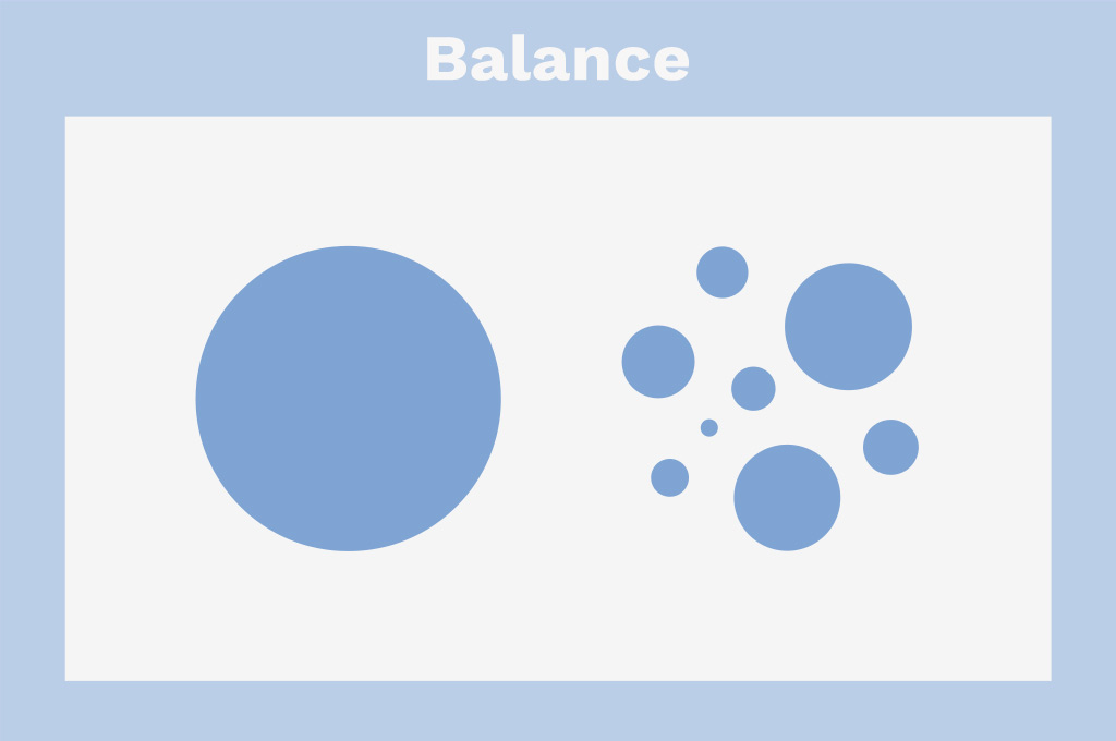
There are two types of balance, symmetrical and asymmetrical. Symmetrical balance is achieved through equally-weighted elements aligned along a center axis. Asymmetrical balance is the opposite of mirroring. It uses elements of differing weights and occurs more commonly. Such compositions are arranged around one or a few prominent pieces, so the creator seeks balance between light and heavy elements for a calibrated image.
Symmetrical designs are quite rare, as the human eye likes some imperfection, and strict symmetry may feel uncomfortable and unnatural. So for good design balance, the elements should be distributed evenly, with no pressure to seek absolute mirroring on either side of the center line.
2. Hierarchy
Hierarchy is one of the most crucial design principles in web and app design. It serves to prioritize elements of design and set the accents based on their importance. Here a simple yet compelling rule works: if everything’s marked as important, nothing’s important at all.
Hierarchy guides the user across the interface from focal to second-rate objects and helps to absorb things in logical order. When this principle of design is overlooked, the composition looks messy, and it’s hard to find the necessary information.
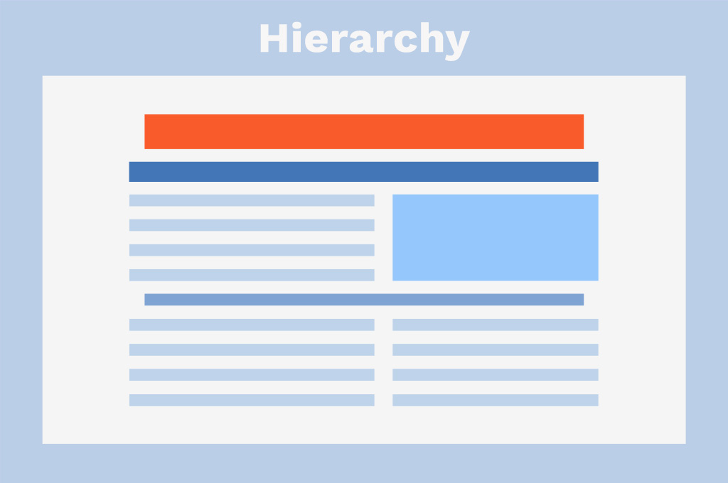
There are two major types of hierarchy in design: visual and typographic. Visual hierarchy can be obtained through the scale of the objects inside the scene and color accents. You can easily spot it on well-designed landing pages: the elements naturally guide you from the intro to the CTA button and finally to the smaller elements, which are usually less important. Typographic hierarchy is realized through different typefaces, sizes, and font weights — and here, a regular Wikipedia page can be the most evident and comprehensive example of how the relation of importance should be set between certain elements and pieces of content.
3. Unity
This principle of design fights the “everything-at-once” concept. You probably have encountered such websites, prints, or even interior design concepts: loads of elements hardly go together, so the overall image looks like a disastrous mess. Especially if they are seasoned by aggressive pop-ups and banners, eww. To resolve this graphic cacophony, there is the principle of unity, which should create visual and psychological harmony.
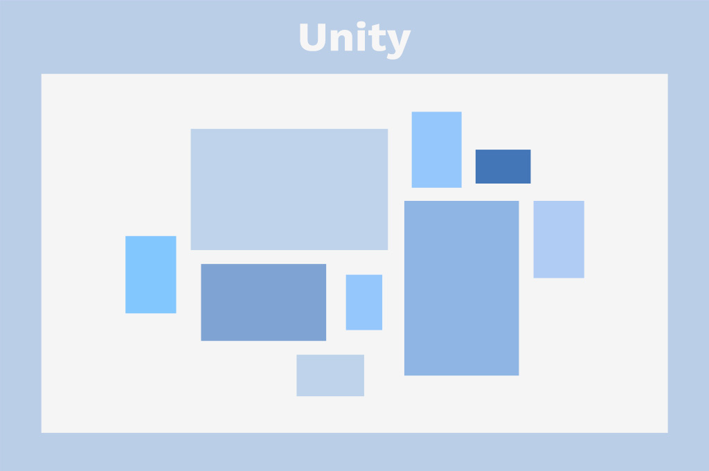
The focal point is that various elements inside the scene should co-exist in agreement and function together to create a balanced and logical composition. This can be obtained through proximity, alignment, or repetition. Repetition is a stand-alone principle of design we’ll speak about later.
Also, unity implies a connection with the brand philosophy and message, so every produced design, whether a website page, t-shirt print, or advertising, should be a part of it. It is closely related to design systems (which are even described as a unified visual language) and is a principle most graphic design companies and projects should take into account.
4. Variety
While unity and balance create visually acceptable designs that are easy to interact with, the variety adds the details to call attention. Without variety, even the most balanced and thoughtfully organized concepts would lack contrast and go dull and monotonous — like something is missing, but you’ll never say what exactly.
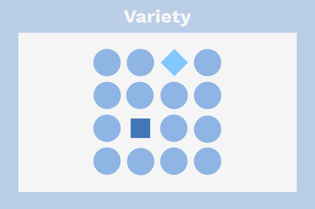
This design principle is responsible for adding intriguing accents to the project: different visual elements, patterns, symbols, or typography. In fact, this is where a designer can let their creativity go wild and play with trends — as used in small doses, they can fit even the most reserved and stiff concept.
However, resorting to variety just for show is even worse than going bland and monotonous. In such cases, it’s so easy to crash the overall message and end up with the previously-mentioned “everything-at-once” design.
5. Emphasis
Emphasis is the design principle responsible for creating and supporting visual interest by setting focal elements within a composition — or even the creative contrast between selected elements. When it is well set, the prominent parts of your design are intuitively noticeable. This means they will catch the viewer’s eye but won’t outshine other elements, or the balance will go tipped. It’s like with a good poster design: you immediately catch what band is playing (this is the focal info), and there’s no problem with finding the details: date and place of the concert, ticket price, etc.
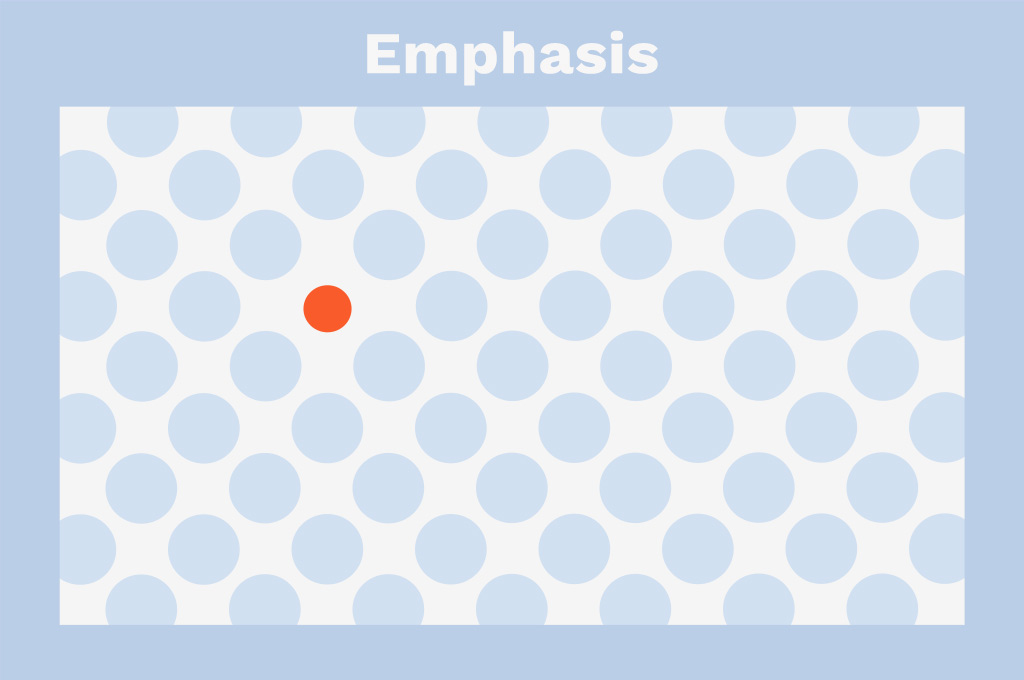
Emphasis can be realized through scale, weight, position, color, shape, and style. It requires a thoughtful approach and understanding of how the human brain works. It’s insufficient to create a bold, massive, color-popping element, as everything should work coherently within a design. That’s why beginner designers might emphasize the wrong elements of design, making the user feel confused and uncertain while using the end product.
6. Proportion
Proportion refers to the size of elements in relation to one another and is the most comprehensive design principle. Tweaking the proportions and grouping the objects based on their size and visual weight helps highlight the emphasis and maintain the unity of the composition. It’s an example of how principles of design work together in a cohesive manner.
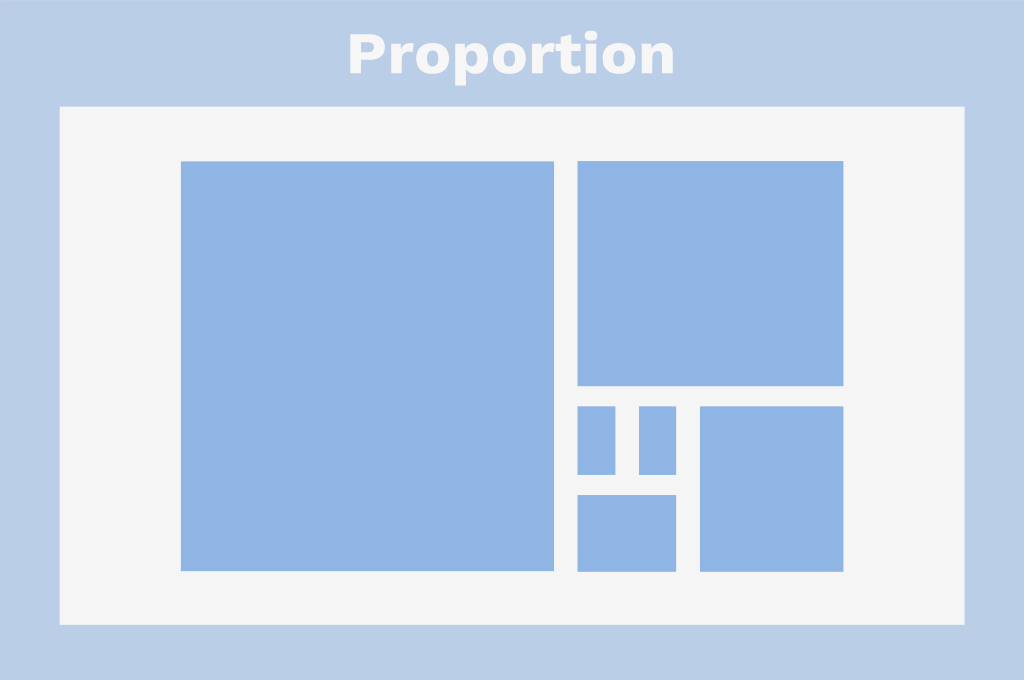
The primary idea of proportion in design compositions is that more important elements are larger and less important are smaller. It’s like with a landing page, an article or a poster, where the proportion relation between the objects are correlated with their importance for the reader. There can be an opposite action when the important info is made small, so it slips from the viewer’s attention — but this is a dark pattern, and you shouldn’t do that.
Though this design principle is quite simple, it shouldn’t be taken lately. By establishing size relation between elements, avoid reaching extremes making them teeny-tiny or, on the contrary, or bizarrely large.
7. Contrast
Making design juicy and vibrant is the goal of contrast. It opposes light and dark, thin and thick, neutral and colorful, and creates easy-to-perceive scenes. There are many ways this design principle can be realized, and the most frequent one is opposing the subject to the background — that’s how exactly contrast works for typography. Here, contrast is probably the unique means to make a text legible and readable. Another example is the website or app UI, where contrastive solutions help navigate between pages and their elements or guide to the target action.
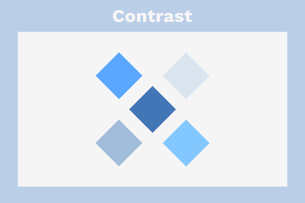
Design contrast can oppose stylistically different fonts, objects, shapes, and even patterns in order to make selected elements stand out and create accessible design. If the work is bland and low in contrast, its accessibility drops. Insufficient contrast can make graphics and text content complicated to read and analyze, especially for people with visual impairments.
8. Negative Space
Negative or white space is the areas where there is no design, so they are empty, as a matter of fact. This design principle is meant to protect designers from overusing creative means. Most of us know this ultimate temptation to add more and more to the composition to make it complete. The negative space is here to help stop when it’s time.
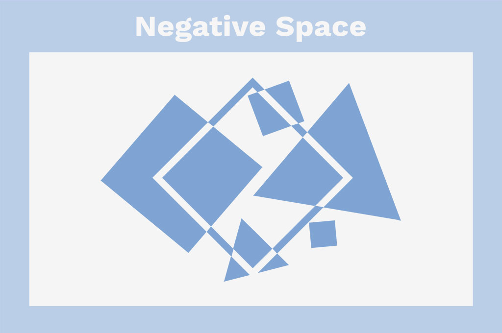
White space isn’t just a sense of proportion. It gives the elements of design some room to breathe in order to be better perceived. This is particularly relevant for typography, as with enough negative space, the text becomes more legible. Also, it helps establish a hierarchy between elements and performs as a supportive tool when the designer seeks to set emphasis inside the composition. You might be surprised as you discover that sometimes the most powerful way to create an effective and comfortable user experience is to reduce the number of objects on canvas or screen and opt for more white space around the important element.
9. Movement
One of the major design principles for UI designers, movement, describes the way the viewer’s eyes move across your composition. Nothing to do with actual motion. To understand how movement in design works, you should think of a landing page. Its interface will be controlling how your eyes go from the title/offer to the offer details and then to the CTA button. Or, if it’s a concert banner, you’re likely to check the info in the following order: band, date and time, place.
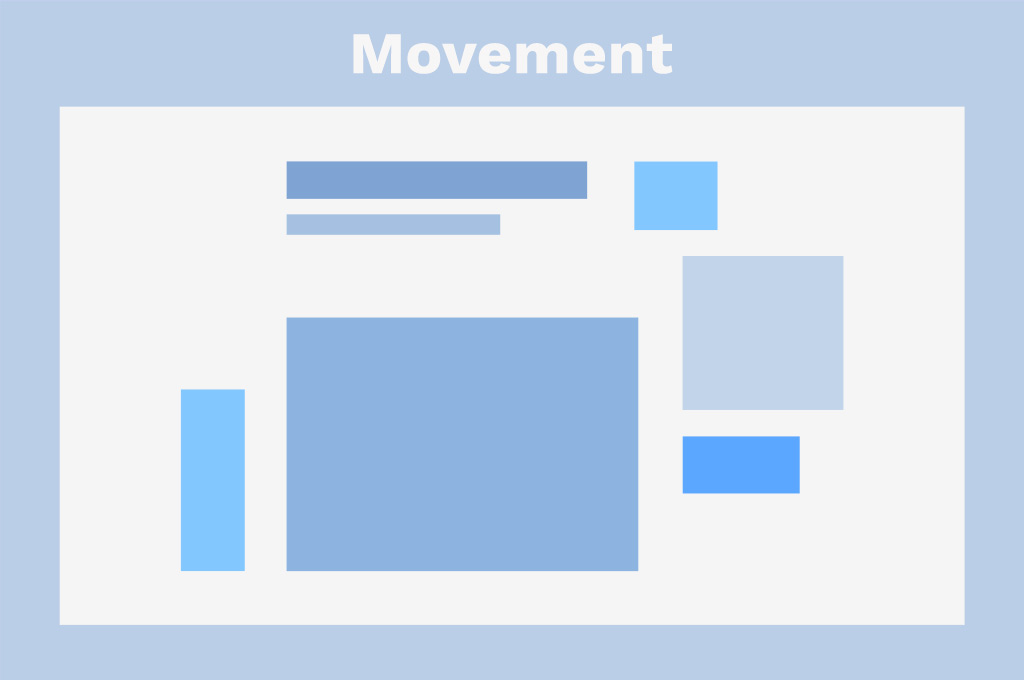
How is it possible? There are lots of means, actually. First, design elements and principles tell a story via graphics, colors, buttons, and texts. Second, this is done through positioning, scale, color, and emphasis. Third, there are F and Z eye movement patterns that are often taken into account. Fourth, there can be diagonal, vertical, or curved lines to control eye movement and keep the viewer engaged. And finally, the basic knowledge of the Golden Ratio helps designers understand how the user will read the provided graphic content.
10. Alignment
Alignment is the design principle that describes how the objects are placed and lined up inside the composition. When not respected, the image, scene, or text looks messy. Even in antidesign and web brutalism, crashed alignment should have some logic or idea — because if this principle is entirely omitted, the problems with the visual perception of the information are imminent.
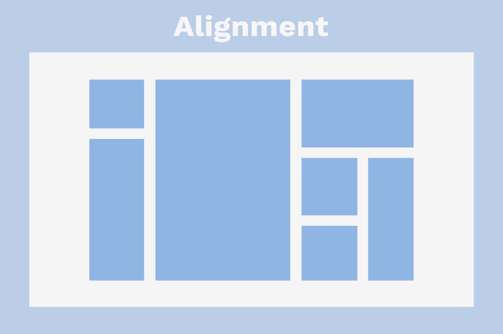
Alignment can refer to the placement of different elements in relation to the entire composition, e.g., center, right, left, or their placement relative to each other. As a rule, both these types are used to the same extend within a project.
11. Repetition & Rhythm
These two design principles come along and complete each other. Repetition refers to implementing the same or similar elements within a design: like images, buttons, colors, fonts, or shapes. It is used to create unity and consistency. Repetition can be easily reached by resorting to the same icons, background, or stylized elements. When used correctly, it can help control the viewer’s movement across the page, as repeated elements, like anchors, can be an excellent means to draw and guide attention. It’s important for them, though, not to have big visual weight, or there is an imbalance in the composition.
However, when overused, repetition can produce the opposite effect: aggressively repeated elements can make an effect of the looped design, and there is no movement at all. So here goes rhythm to help find balance.
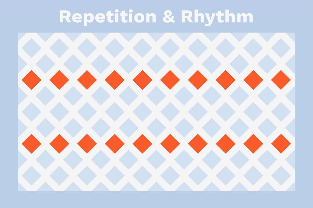
The way the elements are repeated creates a sense of rhythm. When there is a feeling of tempo in the design, the viewer takes it as a melody. There are five types of visual rhythm: random, regular, alternating, flowing, and progressive.
- Random — repeating elements with no specific regular interval.
- Regular — the same intervals made repeatedly. It’s often obtained by creating a grid or a series of vertical lines.
- Alternating — allows repeating more than one element in a design.
- Flowing — mimics natural flows and shows the repeated elements following various bends and curves.
- Progressive — obtained by changing one characteristic of an element when repeated.
12. Pattern
In UI, pattern belongs to the trio of design principles, which also includes repetition and rhythm, and it’s also connected with them in other graphic design fields, like photography, advertising and branding. The trick is that the human brain is attracted by patterns and treats them as an example of harmony and balance. When used in the design, pattern instantly grabs the viewer’s eye.
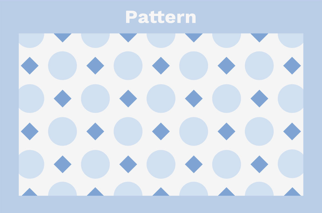
Patterns are made by repeating an object throughout the composition. Patterns are frequently seen in photographs and texture images — and these work really well when used appropriately. However, savvy designers can create patterns out of other elements: texts, shapes, or icons.
Are There Other Design Principles?
As was previously mentioned, there are seven core principles of design, and there are also dozens more. Resorting to them will be due to the needs of the design team and the purposes of the project. Design principles are fixed and documented for big companies, while smaller teams establish a set of regulations depending on the current task.
Among less common principles of design there are:
- Typography;
- Color;
- Gestalt principles (similarity, continuation, closure, proximity, figure/ground, symmetry and order);
- Grid;
- Framing;
- Shape.
They can be merged into more complex principles or be assumed without being considered individually. Again, it all depends on the graphic design project and the team working on it.
In fact, it doesn’t always make sense to define what principles of design are to be used, as they can get involved and rejected during the creative process, where the primary goal of the designers remains to communicate the important information, create a harmonical composition, and good-looking design.

