Supreme’s logo has got a title of the most powerful one — according to Hypebeast, they have left such names as Gucci, Fila, Adidas, Louis Vuitton, Nike, and many others bite the dust. A well-deserved victory, so I could not pass by this box of red-and-white.
Supreme is intensively pushing the philosophy of a street rebel to the masses: from the wear they design, limited to their brutal website and a logo with no decorative oddities. And the fact they’ve been selected #1 means there is at least one (huge) reason to take a closer look at Supreme and absorb some of their branding experience.
Is the Supreme logo a rip-off?
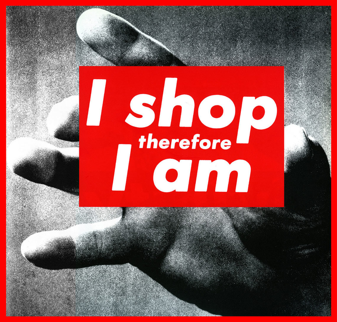
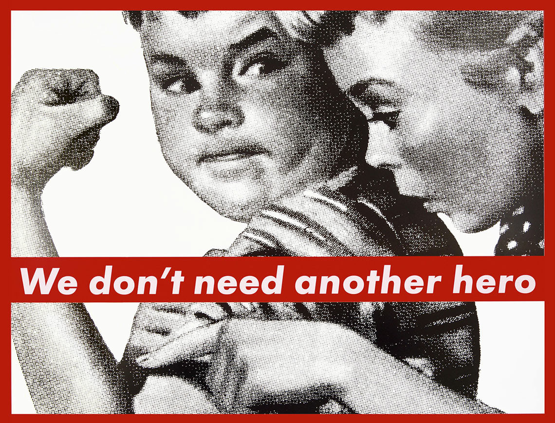
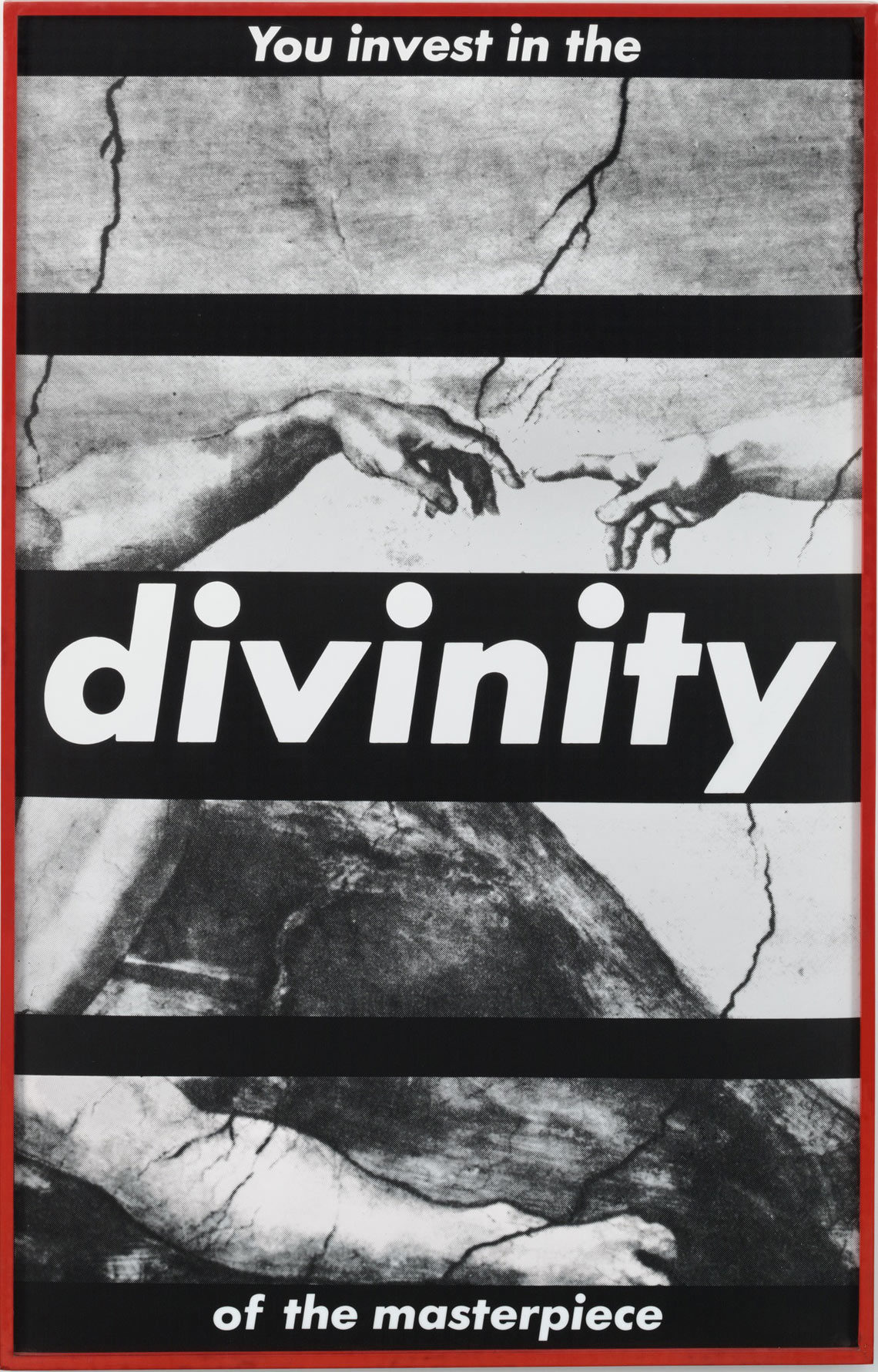
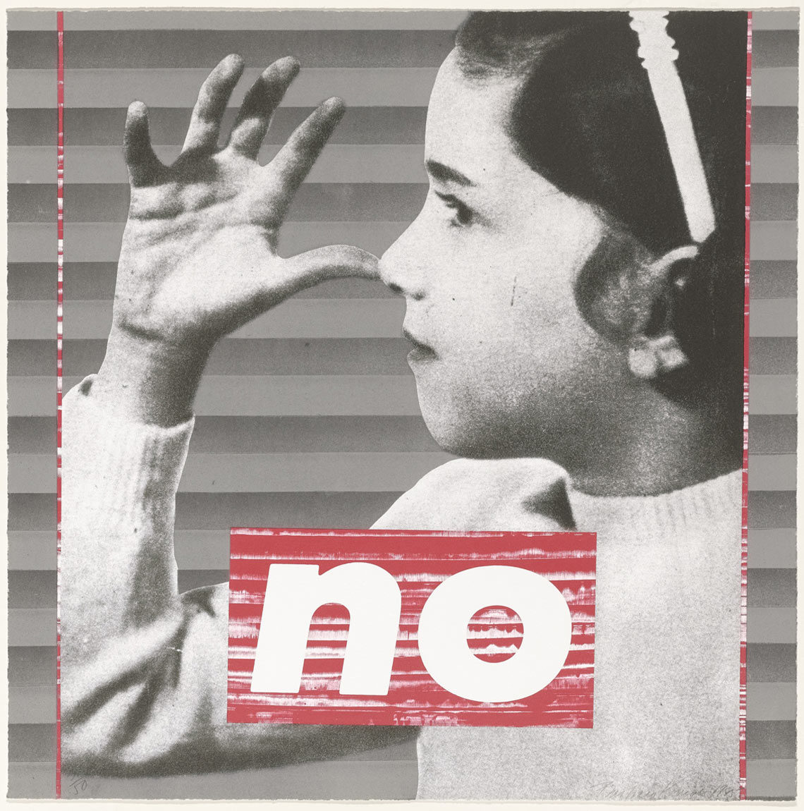
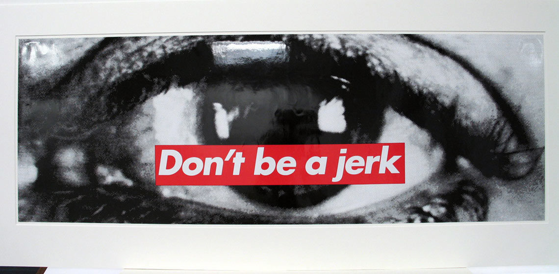
Well, errr, kind of. Initially, they did not sell products of their own but for a few t-shirts with a Supreme logotype on them. That one was designed by James Jebbia’s (NB: a fashion designer and founder of Supreme) friend, and it was good. However, Jebbia wanted it to be deeper, so further experiments led them to the style of Barbara Kruger, a New York conceptual artist.
Truth be told, Kruger didn’t own any copyright on the logo itself, so there could be no legal action against Supreme. And despite her displeasure about copying her style the logotype is where it is, full of rebel and teen protest.
It’s quite amusing that the protest vibes which are a common thread of Supreme logo aesthetics and Barbara Kruger’s artistic style have their rise in the Russian school of suprematism. So the truth is that suprematism, known for bold geometry, provocative colors and motifs as well as the philosophy the supremacy of pure artistic feeling rather than on visual depiction of objects has influenced the self-positioning of Supreme more than you think. An excellent incentive to go deeper into the basics.
What is a Supreme logo?
It’s generally accepted to be made of bold, oblique Futura-typed white Supreme in a red box. What can vary is a background. It’s either of corporate colors, which are red and black or adapt to some creative collaboration with another brand. Oh, well, in the second case not only the background but the whole logotype can completely change its face.
Among the collaborators of Supreme, there are Lacoste, Louis Vuitton, Aquascutum, Jordan Brand, Champion, Nike, and even Playboy.
Are there collaborations only?
The focal feature of Supreme is that they don’t play like another streetwear brand, setting trends and telling their story. Instead, they are involved in modern art and they don’t stop experimenting with their designs in general as well as some particular details.
Obviously, it’s got common with Supreme to join multiple collaborations which drive to unexpected results. But along with that, they launch various limited t-shirt series with a modified logo or logo box stickers on a fantasy background — only Futura type stays intact.
I can’t call myself a Supreme lover or follower. I watch their bold, up to bizarre stuff and the way fashion geeks starve for it from the sidewalk. But as a designer, I enjoy apperceiving how much of the individuality they put into the logotype, the brand, and positioning. Launched 25 years ago Supreme stays true to their philosophy despite an incredible number of experiments with the core concept — and still, the traditional red-and-white box with Futura doesn’t seem ever to fall out.

