One person once asked me: “Why do designers keep making and selling fonts if there is already plenty of them in my Microsoft Office library?” Well, maybe because it features the worst fonts of the type history.
Everything that happens in this world has its reasons. Same about the fonts: they were all created for good and can fit a very particular environment. However misuse and overuse have turned them into a disaster. And although we’d better replace these typefaces with something more versatile and modern, we keep using them.
What makes me feel especially awkward about these terrible fonts is that I see them on business cards, packaging logotypes, or receive emails in Comic Sans from designers (God, why?). Hope you aren’t one of them — and if you are, that’s the right moment to make a cheat-sheet on the worst fonts anyone might use.
‘Playfugly’ Fonts
The name speaks for itself — these fonts pretend to be nice and cute, but what they really are is an ugly, confusing thing. But people keep adding them to their cards and posters, especially addressed to children (as if the real purpose is to prevent a child from forming good taste in visual design).
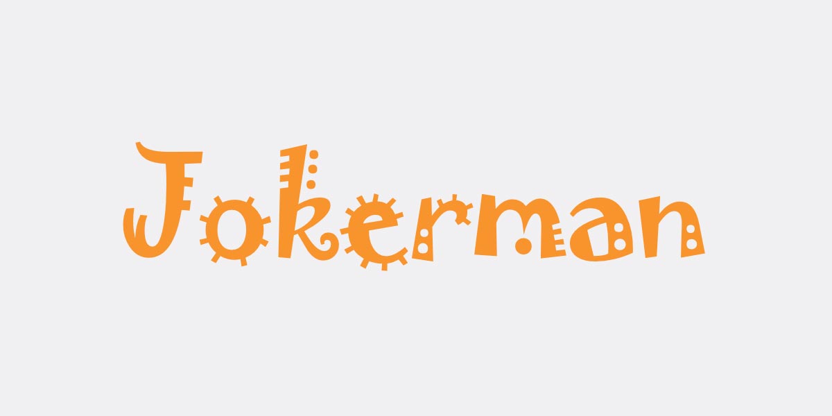
For some reason, someone (like James Cameron) is still using Papyrus font outside history lessons about ancient Egypt. Or Jokerman font and Curlz MT, which have only one merit — being the most eye-catchy fonts in MS Word. Or Brush Script font, which has billions of more elegant and less boring alternatives. Or my favorite Comic Sans, which helps make a decision about the company and its designer at a glance.

All these fonts were okay in the 90s, but like other stuff from the 90s, they can do nothing in 2020 — just let them live happily in your memories. And stop using MS Word fonts for any creative content, please.
Overused Fonts
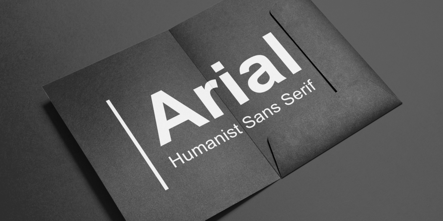
Good news: these fonts look fine. Bad news: everyone uses them. Absolutely everyone, from schoolkids to writers. The key to the popularity of such fonts as Arial, Trajan Pro, Courier, or Copperplate Gothic lies in their versatility and neutrality, which seem to be a good sign.
We should make a serious distinction between those who use such fonts for documents and those who use them as a design tool. Obviously, the second option is unacceptable. There are hundreds of sans serifs and serifs with a clean and modern look, so picking something like Times New Roman or Calibri font instead is a crime against good taste. Please, don’t — unless you are a student of a medical college writing your thesis.
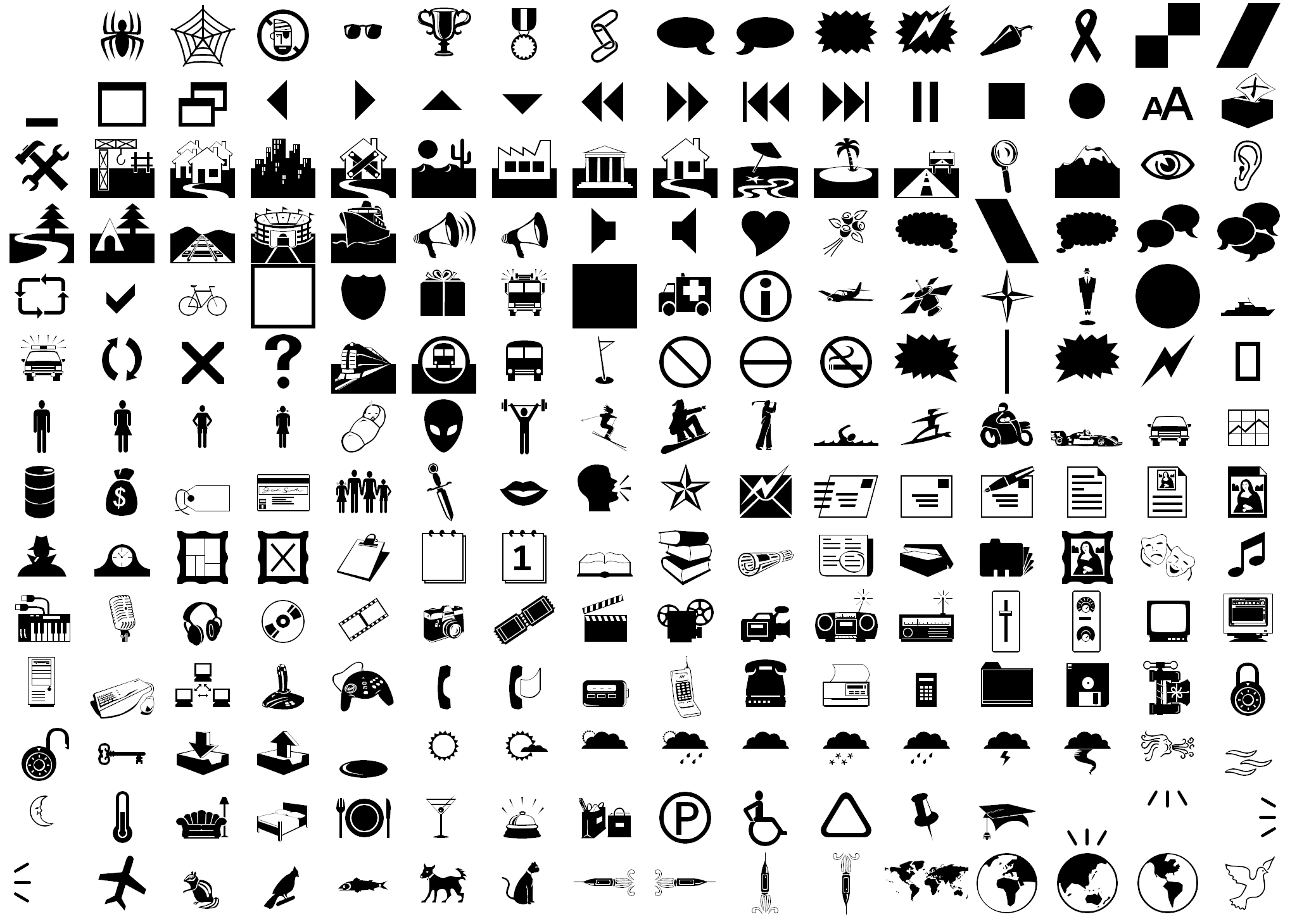
Wingdings & Webdings
While it’s quite simple to say what’s wrong Comic Sans and what makes Arial and Times New Roman the worst fonts for a logo, I don’t have a clue why Wingdings and Webdings simply exist. Does anyone here know how to use them? It would be okay if they were just sets of special symbols — but no!

By definition, Wingdings and Webdings (sound like Tweedledum and Tweedledee) are dingbat fonts that should normally deliver ornaments, decorative characters, and spacers. However, for some reason these very fonts come with a huge set of ugly and unpopular symbols like an old Windows logo or ridiculous animal pictograms.
I’m sure you don’t use Wingdings and Webdings, so it’s rather my hint to the folks from Windows. Maybe you should just let them die peacefully?
Pseudo-Sophisticated Fonts
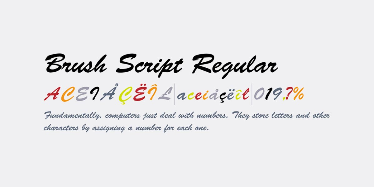
These are the script fonts that look like you’ve seen them somewhere — probably on an ugly greeting card in a supermarket. I frankly don’t have a clue why many designers suddenly decided that any font that is a script font will look elegant by definition. Well, no.
A high-end script font will not make you think of sentimental quotes from female forums — but of proper geometry, beautiful glyphs, and all those perfect pairings you can make with it. And if proper geometry and beautiful glyphs tell you nothing, try choosing best-sellers, the chance of a fatal error is less likely. Don’t thank me.
your dropdown signup, just made me add you to my block list
I use Webdings and Wingdings like emojis in emails on occasion. Wingdings 2 is particularly useful in Excel or Word. For example, a capital letter “P” is a check mark and I can indicate something as complete. I’ve been using these fonts since 2004 and never found a better solution for the way that I use these two programs. While I agree with the sentiment on bad fonts that especially designers and professional organizations should not be using, you can’t call for a font family to be eliminated simply because you – one person – don’t know how it can be used effectively. Other than that – I’m with ya!
Wow, thanks for sharing your experience Lainey. Do you mind if I mention your ideas in this post update?
Don’t be such a font snob. Not everybody has access to, or can afford the luxury of InDesign, or similar. In fact, MOST of the world doesn’t. For good or ill they are trapped in MS!
I’m not. Users are free to use any fonts they have access to. However, none of us think that these fonts are a good choice for designers and other creators. Especially if the industry delivers thousands of free fonts of a better quality.
you forgot Comic Sans
Of course not. It comes as one of the “playfugly” fonts 😉
Thanks, Ksenia! Your bio says you have an eye for the trends and feels what I want to read and learn. You’re in love with a good text, so be sure there won’t be empty talk, only precisely picked content. If true, I’d love to see you provide a list of/link to on-trend fonts, rather thank simply stating, “Try choosing best-sellers, the chance of a fatal error is less likely.” If your goal is to educate and inform, provide examples rather than criticize old-school choices. Just food for thought. Thanks for the article.
Thanks for your feedback, Carla. We regularly collect selections of the best typefaces in different categories, which you can find in our toolbox section. We also have great stories about experimental and trending typography. However, in this piece, I aimed to point out/remind that these fonts are really old-school and can’t exist in the graphic design of the 21st century 😉
Thank you for your thoughts. I’m with Carla here. For those of us who appreciate good design, but make no claims of knowing the whys and wherefores of typography, I long for a list of good alternatives to Arial, Calibri, etc. and a bit about what each of those alternatives connotes or says or communicates from a designer’s point of view. For example, I need a day-to-day, fade into the background font that communicates nothing to the uninitiated, but just looks nice … And so on. I will look around your site, but I found this post when I Googled something like designer’s alternative to Arial. I’d love your ideas!
I should have added some more examples. If Arial is my “ignore-typeface” font, Calibri is when I need a small, clean, get-the-most-on-one-page readable type I can use for 14 pt. Brush script would be for, say, an invitation. What are better examples of these? The smallest/cleanest? A brush script that isn’t THE Brush Script?
In my experience, most overused font is Trajan Pro, I was wondering if this font will show up in this list 🙂
How could I forget this one! Thanks for reminding, Stan. Will add it to the list 🙂
Ksenia,
I am and have been a creative director/art director/corporate designer with some of the best agencies/ design groups for over 30 years. I know typography inside out having used Letraset/Icarus/metal type.
I know all about type space….
Yes there are many horrible typefaces which are poorly constructed, clumsy and just awful.
Much of this comes from “designers” or groups that dont fully understand or have a passion for typography. Designers who dont have the knowledge of setting type/line breaks as beautiful communication pieces or works of art in their own right.
BUT and a big BUT…Just because a font etc is “old”, “horrible”, “unpopular” or not used by “trendy” designers does not mean it should be binned or disposed of. I am sick and tired of millennial designers who want everything modernised for no reason and give us useless typefaces cos theirs are supposedly creatively better…Digressing a bit, its the same with awful logo reworks from incompetent designers and brand managers. I have seen many new and great fonts that have evolved from “bad type”.
cheers
Thanks for sharing your opinion John. I am neither for modernizing typography nor for banning overused fonts. I am for the good taste for designers and an adequate approach to choosing and using fonts.
I couldn’t agree more (but I’ll try 😉 )
cheers
I do agree with you that many font choices seems to be ill advised and that so many options exist that we should be seeing more variety and less over-use of certain typefaces. As part of my “new machine” setup routine, I always go into the Font section and manually disable Comic Sans, for instance.
However, as much as I hate to admit it, even Comic Sans have it’s uses. A shop nearby is offering quite a nice selection of interior design articles – glassware, kitchen stuff, brass ornaments etc. All around, quite high-end brands in this segment. However, all of their signage in the store is set in Comic Sans. For me, this is hard on the eyes, but this store isn’t targeting me as a customer. It is attracting seniors and consumers from an overall lower income bracket. The use of Comic Sans indicates that the shop is not “too fancy” and a brilliant trick to get more people in the door. It simply looks more “affordable” to more people.
There is a big difference in perception if an item is offered at $50 set in Bodoni vs. Comic Sans. Not a rational difference, but still a smart business decision.
Hi Ksenia,
First of all, know that I really appreciated your article and forgive me for my broken english (if sometimes I may seem “harsh” )
I’d like to mention that I agree with ALL the points mentionned by John Papa and alas by Tormod… Furthermore, I’d like to add another “special occasion” to use specific out-dated-overseen fonts. I am especially thinking of BRUSH SCRIPT font as it is one of your examples : What do you think of retro/vintage style feeling ? It is well known that there is a trend for that and that font is soooo 50’s/60’s look. This font was designed in 1942 and could be seen in thousands of posters and ads during nearly three decades after its creation… I would presonnaly use it without guilt if I want the public think it was made during that period. (recently I read an article about Alan Chao (the main designer of “Better call Saul” tv show) you should also read this thing as nearly all the fonts in use are “UGLY” (really, I mean it 🙂 ) BUT thos fonts were the ones to use and that’s it.
I also see that you mention ARIAL (which I personnaly hate) but not Helvetica…… Isn’t it the same situation ? The thing with those fonts — without being a student of a medical college — is that THEY WERE PERFECTLY DESIGNED, with entire families (thin, light, medium, bold, etc…) , by real TYPOGRAPHERS and when I buy new fonts (yes, it happens) made today by young designers (some are brillant !) I cannot reach that perfection.
Well, we could discuss hours about good or bad taste and fonts. I just think you may “temper” your argument…
Yours
Hi Jean-Joseph,
Well, it’s true, we can discuss these things for years, or even longer 🙂
I’ll just say that it’s hard to compare Helvetica with Arial. Arial is a popular font that is used over and over again everywhere by everyone. Helvetica also managed to become a symbol of European typography. It’s an important element of Swiss design, and it’s an embodiment of the late fifties-sixties which can still be natural in modern logos. I can’t same the same about Arial.
It’s like a little black dress, which will remain appropriate for years.