• Home
  • Design
  • Freebies
  • Toolbox
  • Tech
  • Tutorials
  • Inspiration
No Result
View All Result
Subscribe
The Designest
  • Home
  • Design
  • Freebies
  • Toolbox
  • Tech
  • Tutorials
  • Inspiration
No Result
View All Result
The Designest
No Result
View All Result
Home Design

IKEA logo renovation: can you spot the changes?

They are different, I swear!

Milena Anisimova by Milena Anisimova
July 25, 2019
in Design
1
Share on FacebookShare on Twitter

About a week ago, IKEA has presented its new logo and… Well, some people would say, that the word “new” in this case is not suitable at all. But if you look at it more carefully, the changes can be easily seen and then it becomes clear: in the name of optimisation!

IKEA logo development
IKEA logo development | via IKEA.com

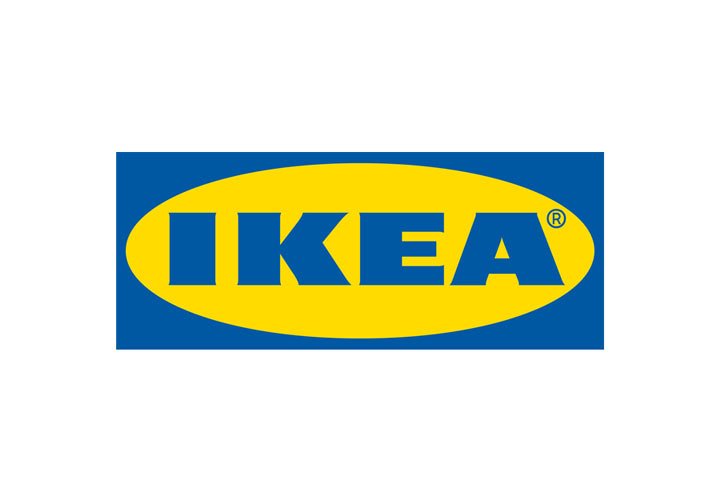
If you take the SVG file of IKEA logos available for such curious fellas as we are, the adjustments are more than clear. First, the oval height gave the new space for enlarging the letters and even highlighting them a bit more. As for the logo box, it was shortened Of course, characters have undergone some changes after that. Starting with “I” shifted left more, the letter “K” angles got modified, the “E” now looks less massive, and “A” with its counter-spaces became more opened up. Oh, and this little registration mark is more integrated into the IKEA logo and not just floating somewhere around.
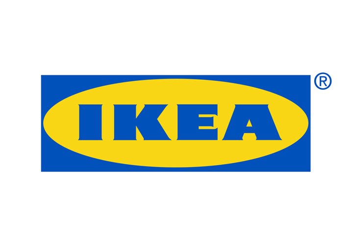
Old IKEA logo
Old IKEA logo
New IKEA logo
New IKEA logo

Now the colors: the previous version was more yellow and blue acid-looking, that was fixed by more faded palette. Your eyes will be grateful for that!

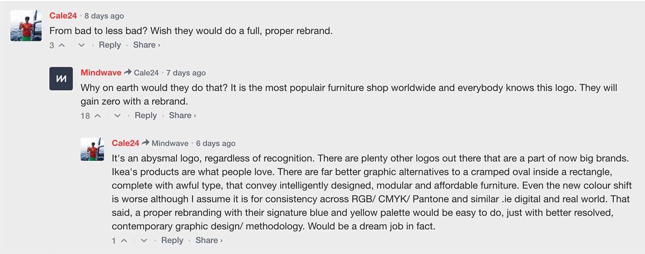
These changes are not so immense and hard to accept as it was with the Slack logo, obviously. Perhaps, one thing they’re similar with is the improvement for better brand performance, convenience comes first. How the Seventy Agency puts it: “The new IKEA logo is now optimized for both digital formats and small print formats”. But the audience is rich with the diversity of opinions anyway:

New Logo for IKEA comments

Our Instagram community voted in favor of a new variant but with a narrow gap to be fair (58% loved the renewed IKEA logo). I personally take these changes easy and kind of a happy for the brand for acquiring an evolved logo — it means that they actually look into the future.

Via: Underconsideration
Tags: IKEALogoRedesign
Previous Post

Game of Thrones fan art to take the edge off the new episode waiting

Next Post

Ballicons 3: 50 free flat web icons

Milena Anisimova

Milena Anisimova

Related Posts

Best Drawing Programs & Apps in 2024 For Your Creativity

by The Designest Staff
February 7, 2024
9

In 2024, art software scene is as diverse as ever. Read our guide to the top free and paid drawing...

Top Graphic Design Projects That Can Enhance Your College Portfolio

by The Designest Staff
January 26, 2024
0

What projects should you include to ensure your portfolio stands out? Let's dive in.

The Key Role of Digital Video Editing for Marketing

by The Designest Staff
December 26, 2023
0

Learn how to enhance videos and why video editing is important for marketing. Follow these best practices to improve your...

Pantone Color Of The Year 2024: Peach Fuzz

by Alina Yakovleva
December 7, 2023
0

The new color celebrates serenity, providing a sanctuary where we can simply exist, experience, mend, and thrive.

Bad Graphic Design Examples: Good vs Bad Graphic Design

by Evgenia Papicheva
December 5, 2023
4

Design is a powerful tool, but like any tool, it can lead to unforeseen accidents when misused. Check our guide...

Font Trends 2024: Creativity, Elegance & Usability

by Daria Lemiakina
November 27, 2023
0

Your guide to trending fonts that'll foolproof your designs in 2024. A blend of functionality and creativity is what we're...

Next Post

Ballicons 3: 50 free flat web icons

Please login to join discussion

Popular Posts

  • Free CD Mockup Set For The Iconic Retro Design

  • Freebie: Aluminium Can Mockup

  • Freebie: a logo mockup, charged with elegance

  • Freebie: Film-Inspired Photoshop Actions

  • Quentin Tarantino Fonts: Exploring the Mastermind

Envato Elements
with Envato Elements membership

Categories

  • Design (80)
  • Freebies (88)
  • Inspiration (40)
  • Other (22)
  • Tech (26)
  • Toolbox (161)
  • Tutorials (57)
Youtube Facebook Instagram Dribbble Pinterest Twitter RSS

Subscribe

The Designest

Weekly Email Updates

We got tons of fascinating articles, videos and freebies for you every week!

SUBSCRIBE

Design Blog

  • Design
  • Freebies
  • Inspiration
  • Other
  • Tech
  • Toolbox
  • Tutorials

About Us

Welcome to The Designest — a professional design blog aimed to deliver fresh news & trends of the industry as well as the most essential courses & tutorials you must have been searching for.

Company

  • Advertise with Us
  • Contact Us
  • Cookie Policy
  • Privacy Policy
  • Terms and Conditions
  • Affiliate Disclosure
Advertise Options

© 2023 The Designest — Professional design blog aimed to deliver fresh news & trends of the industry

No Result
View All Result
  • Home
  • Design
  • Freebies
  • Toolbox
  • Tech
  • Tutorials
  • Inspiration

© 2023 The Designest — Professional design blog aimed to deliver fresh news & trends of the industry

Subscribe to Regular Updates
We got tons of fascinating articles, videos and
freebies for you every week.
This website uses cookies. By continuing to use this website you are giving consent to cookies being used. Visit our Privacy and Cookie Policy.