The constructs of Japanese design remain a mystery wrapped into an enigma that the rest of the creative industry endeavors to perceive. There is so much behind it: mentality, history and culture aspects. And despite the world is getting more and more borderless we know surprisingly little about what Japanese design is and how it’s realised in web, typography, social media or branding & packaging.
The latter gets the most of the social contact, being in use daily and by the broad masses, and that’s invaluable if we mean to know more about graphic design in Japan. For the purpose, I have completed my research of the Japanese packaging to show you what’s behind.
What everyone thinks
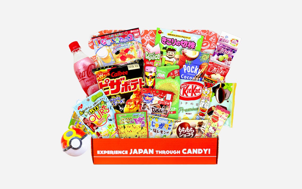
Many of us traditionally associate Japanese product design with ultra vibrant up to creepy packaging with kawaii (and not so kawaii) characters. And that’s exactly what I came across on Flickr while searching for the Japanese packaging inspiration: pages and pages of brightly-painted wrapping which make you get lost in the coloristic abundance. Some are just eye-popping, some are fine and even cute, and some are ‘Stop the world, I want to get off.’
It’s natural for the mainstream production, from food to tech, to be packed like that: otherwise, would you notice the very candy bar on the shelf? Shall it be Europe, America or Asia, the general approach remains the same. But what makes Japanese truly special is accompanying it with fancy creatures, which can be pretty and adorable or as weird as my first day in high school.
How do they come to it? Is it an influence to consider along with the Japanese modern culture in whole (since the packaging is not a single example: take also TV commercials, anime & manga, literature, and illustration)? Or is a vibrant wrap no more enough to stand out and grab the sight and interest of a consumer, so it has to shock them as well?
The art of harmony
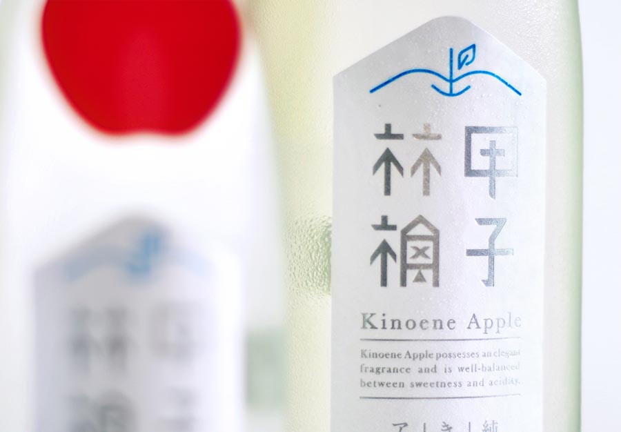
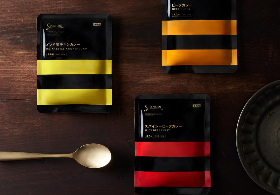
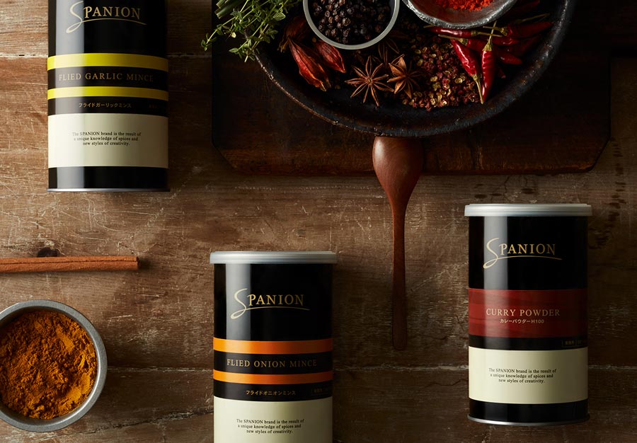
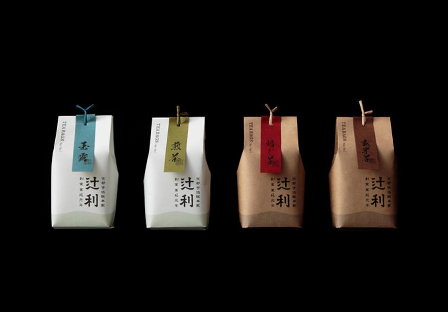
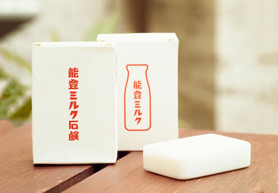
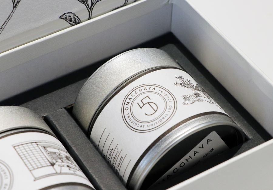
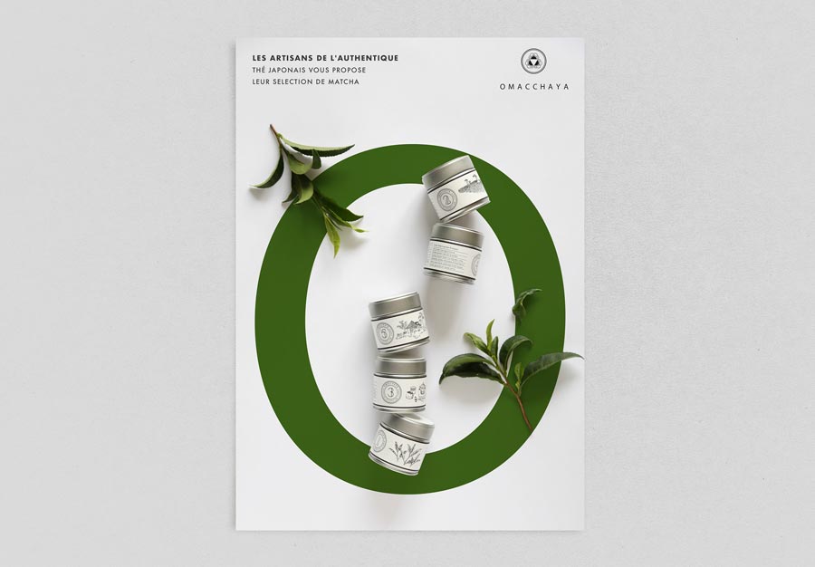
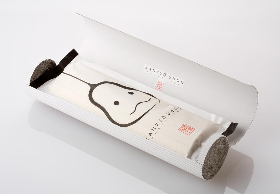
It’s comforting to know that beyond this well-distinctive colorful packaging come up trends of a different sort, which build a great contrast upon the weirdness and traditional motifs. With a single scroll over Behance, it turns clear that Japanese designers have grown their own understanding of the familiar minimalism and cleanliness. And I can’t hide the admiration, so beautiful it is! Feels like they’ve tuned off all the noises and buzz to remind the consumers that you don’t need much to stand out and speak the harmony.
Many of Japanese creators play over implementing classic palette and folklore to bring remarkable and very personal packaging. By reinventing and involving Seigaiha patterns, koi motifs, and floristry, they restore the cultural aspect in packaging and fill it with a greater sense. So there is not just tea in the ai-iro blue box, but the nation’s cultural background alongside.
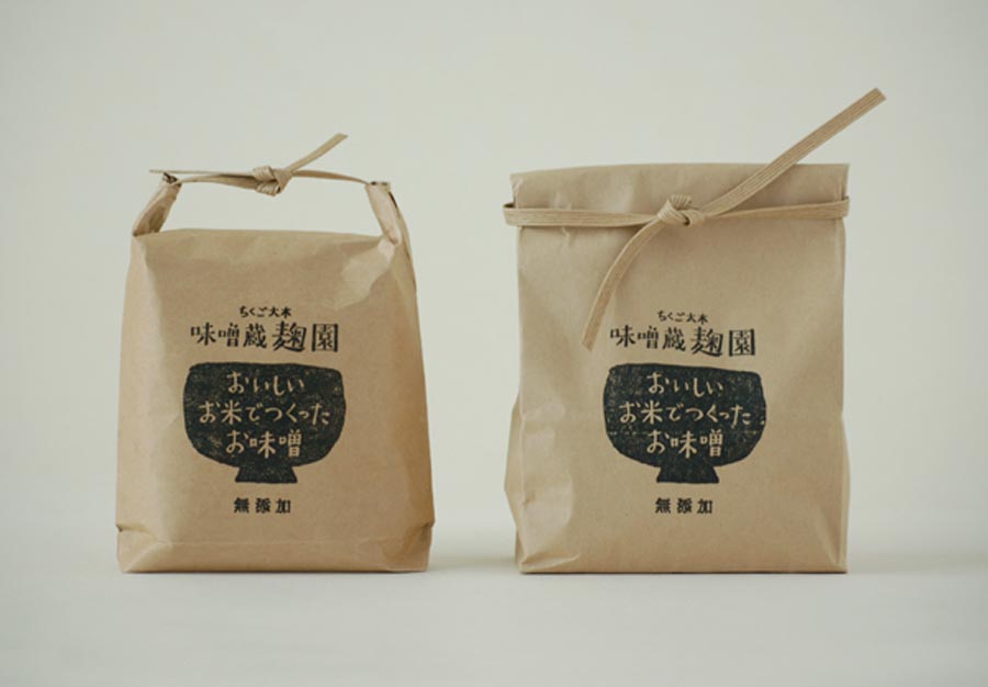
Finally, how could Japanese design — and packaging in particular — exist without reckoning the eco vibes and subtle natural aesthetics, which covers a significant part of the traditional fine arts. And yet today’s common trend is applicable to many design studios and projects worldwide, the Japanese take it to a new level by implying washi paper (or its imitation) along with well-known kraft paper and experimenting with decor. The latter varies from witty and amusing to laconic and quite reserved — however, the presence of the Asian touch remains intact.
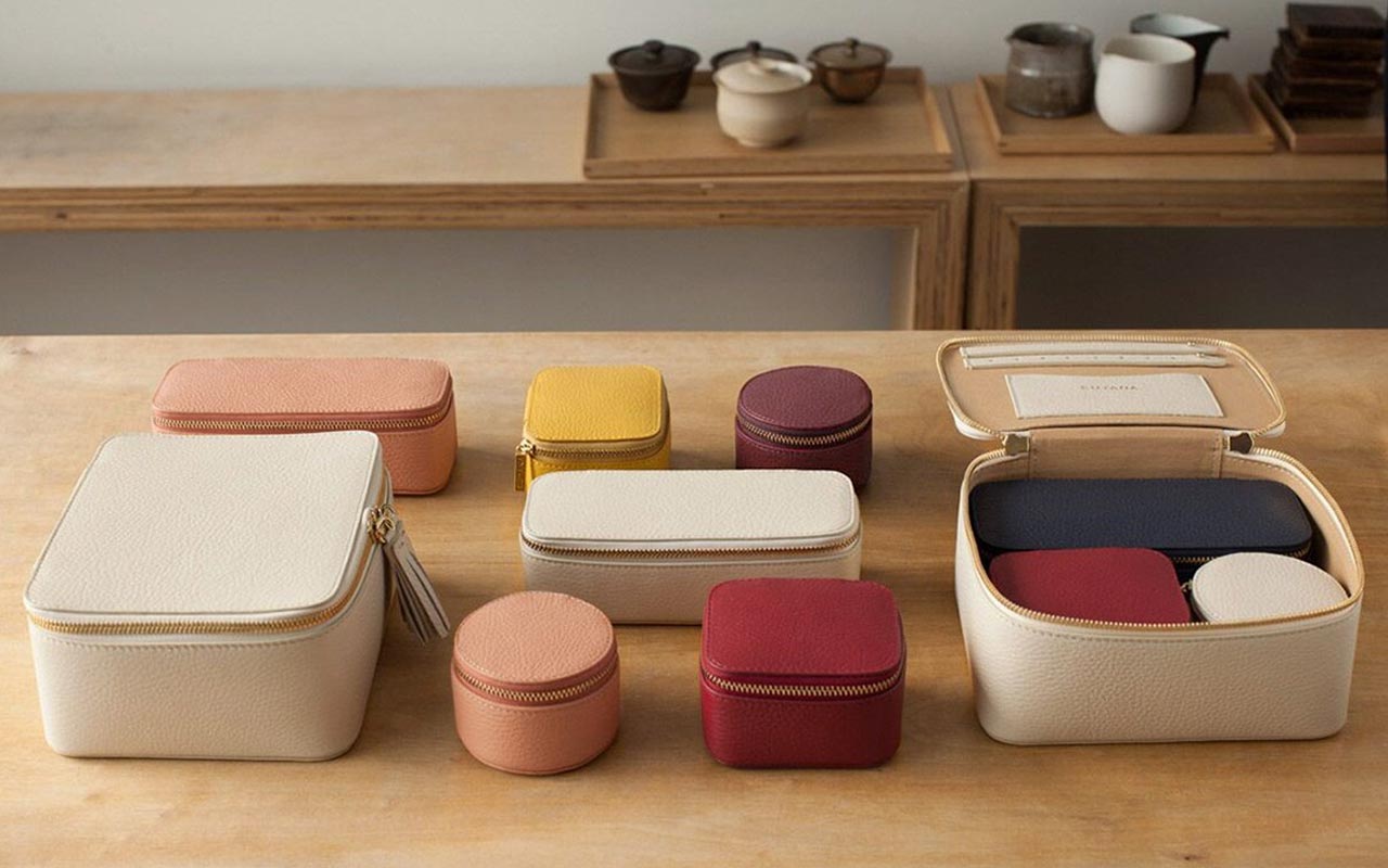
Charm and harmony are fine but don’t come as a single feature that fascinates the consumer. Have you ever marked how practical the wrapping is along? My inner perfectionist is stunned by the ergonomic design — I first noticed it in the collab of incredible Marie Kondo and Cuyana, a bento-inspired set of leather cases.
The image of bento boxes and origami is omnipresent in the Japanese packaging, so the designers are not only about how it looks but how it feels in the arms and how the user interacts with the product and what emotion they live during the whole use & consumption process. 10 out of 10, ladies and gentlemen!
Japan Package Design Awards
Pinterest and Behance unveil thousands of incredibly beautiful projects, so regardless of where you work and who you design for, you will find lots of inspiration there (no one is surprised, right?). However, if you are focusing on the package, you should discover the Japan Package Design Awards — held every 2 years, they introduce the best works and teams of the industry.
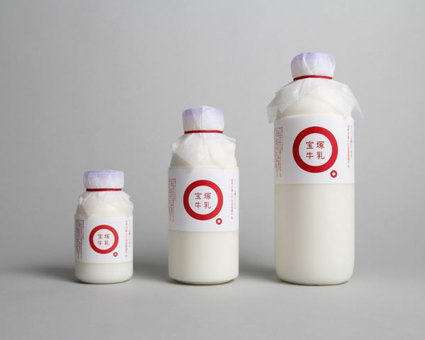
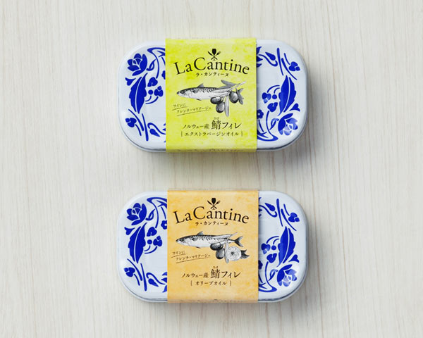
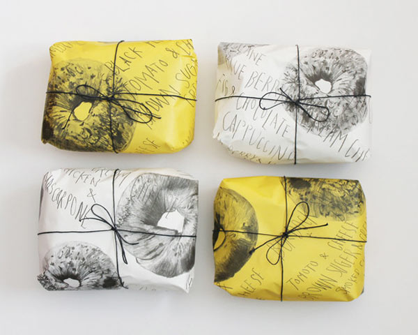
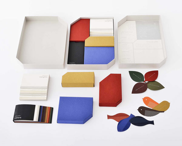
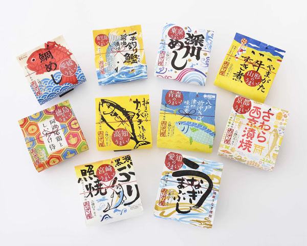
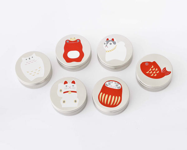
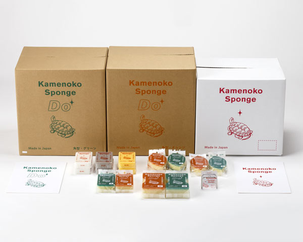
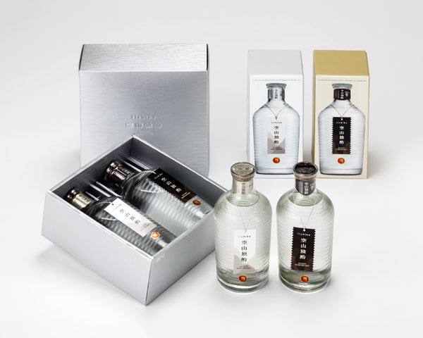
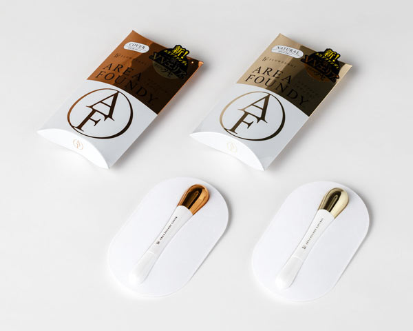
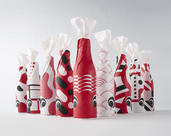
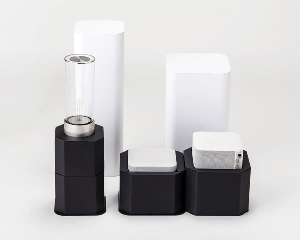
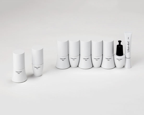
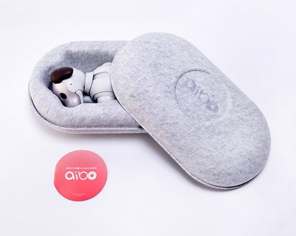
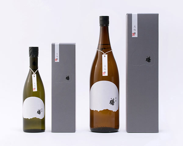
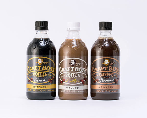
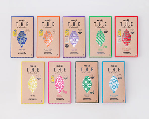
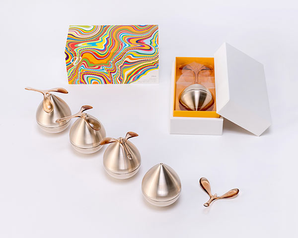
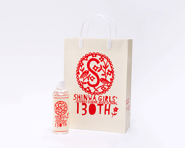
There are many new names as well as popular brands like Shiseido (who turn packaging into a cult), Sony, Pola, and even Coca Cola — again the cross-cutting theme is the classic Japanese visual attributes, from minimalism to folklore motifs.
All in all, the best practices of the Japanese packaging not just show another side of design, filled with the nation’s culture, history, traditions, and philosophy. They are primarily a great source of knowledge for a creator of any level of expertise: being beautiful is not everything, you should think big, focus on the details and hold the customer’s interest till the end. And that’s right what the Japanese do with every single pack of cookies.

