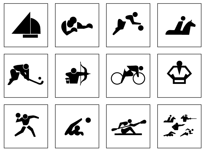
After Tokyo 2020 promo video was introduced at the Closing Ceremony of the Olympics in Rio, there were some rumors about the pictograms design. A number of creatives stuck to an idea they would conserve some of Nintendo aesthetics since the video was imbued with it. However, the team headed by Masaaki Hiromura has chosen another source of inspiration.

The Games held in 1964 in Tokyo went down to history as the first ones where the pictograms were used. They were designed with straight lines and precise circles to attain simple and beautiful appearance.
Masaaki Hiromura spent two years to remaster the motives by adding fluidity and motion. So that’s right what the Tokyo 2020 pictograms are about: a combination of dynamic beauty and respect to the pioneers of the Japanese design industry.
The set includes 50 pictograms for 33 sports on the 2020 Olympics programme, which means there is more than one pictogram for some sports. They will follow Games in every medium: from the website and tickets design to the official printed production and souvenirs.
For the first time in Games history, #Tokyo2020 has created kinetic sport pictograms! #Tokyo2020 has created the first animated pictograms to highlight just how dynamic, innovative, and special this Games will be! ✨#UnitedByEmotion @Olympics @Paralympics pic.twitter.com/NFw8uhFaU2
— #Tokyo2020 (@Tokyo2020) February 26, 2020
A year later, on February 26th, the Tokyo Organising Committee announced that the pictograms for Tokyo 2020 Olympics and Paralympics would be the first kinetic sport pictograms in the history of Games.
The animation is to highlight how dynamic, innovative, and special these Games will be!

