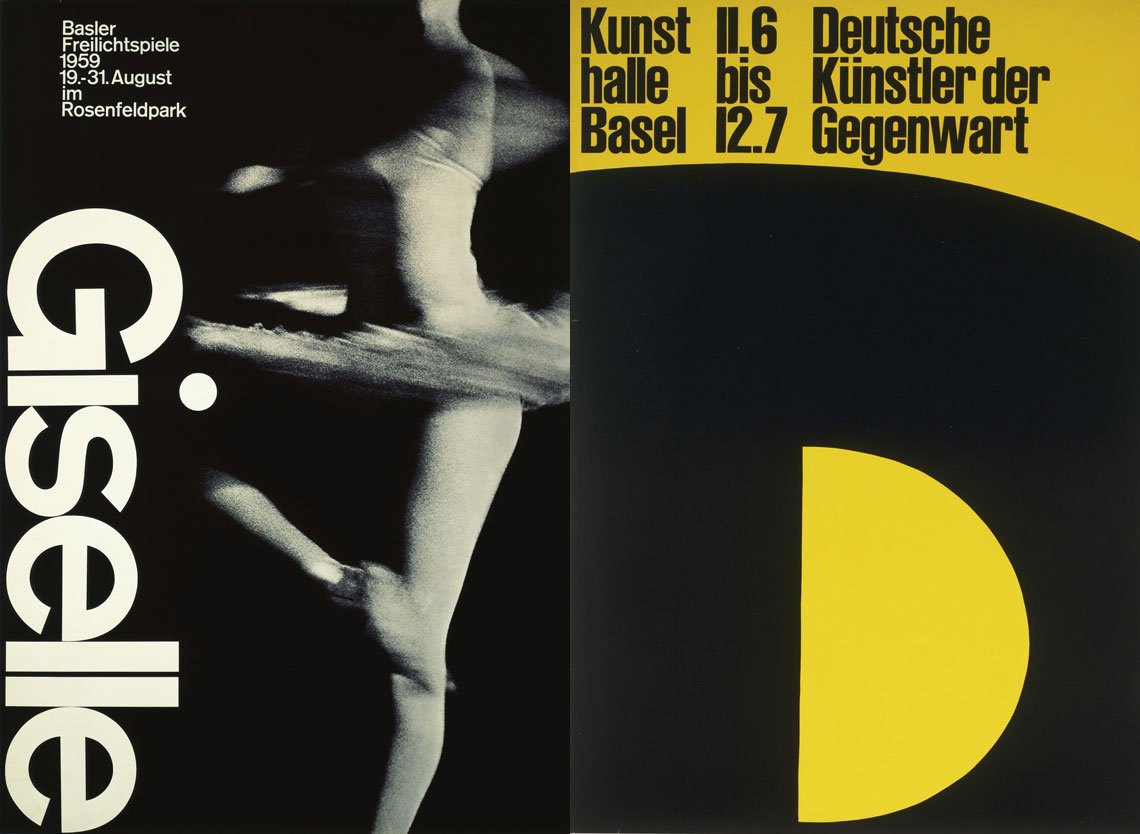
Wrapped into Helvetica, Swiss Design unveils more essentials than you expect from a legend. A model of artistic honesty, pure good taste — is it all that captures designers’ hearts?
Some time ago I was lucky to introduce Web Brutalism to you — my favorite design style, that I’m searching for everywhere. In whole, I love all trends that involve bold minimalism, engaging visual support that is not too rich in detail and reserved typography that makes the artwork scream. So once we’re done with the brutal design, comes the time for the Swiss style.
In the beginning there was Helvetica
Swiss movement is Helvetica first. One of the most legendary typefaces. So legendary, that it has been praised and portrayed by many authors already. Start with Helvetica documentary by Gary Hustwit, 50 Years of Helvetica exhibition in the Museum of Modern Art in New York City and endless rows of books and articles written and published. And what about logos? Webdesigner Depot has embraced 40 world-known logos featuring or based on Helvetica, and still, there are many more to add: Placebo, Zanussi, NYC Subway, Bayer.
Affectation Aside
Helvetica was strongly influenced by earlier created Berthold typefaces and for 60 years already represents Swiss graphic design — so reserved, clean and objective. However, Swiss design isn’t Helvetica as it may be easy to think.
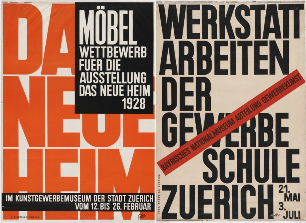
The phenomenon of Swiss design appeared far earlier, at the end of the 19th century. Swiss design schools with such mastermind as Ernst Keller emphasized on purism — an idea delivered without hacks, without ornaments, and without an opinion. These canons represent the actual mindset and the attitude towards the media of the Swiss. Like with Helvetica. Made with engaging vertical or horizontal terminations solely it fits long texts of a newspaper and attracts human attention when used in a logo or a title.
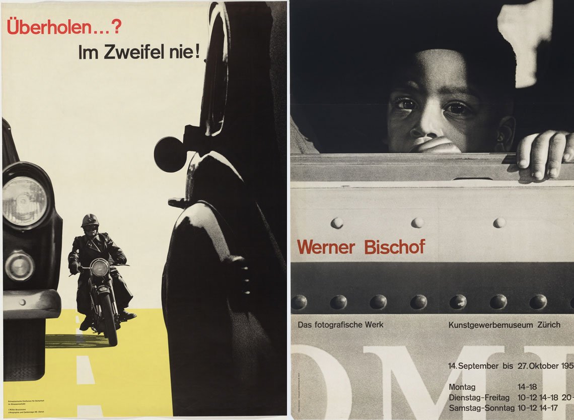
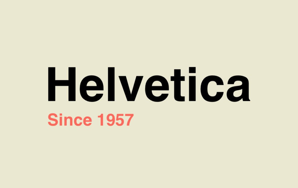
So I will not lie if I speak of ultimate openness of the Swiss poster design as well — they accordingly work to deliver facts, not opinion.
Grid as a model
Swiss design schools regard grid as a basic element for bringing information in the most organized, logical way. So if you are a newbie in the industry, you MUST check it out to see how this content framework works. It even helped my far-from-design-friends to understand what I meant when speaking about grids in UI. Grid systems in graphic design may be built vertically, horizontally, they may be curved, they may intersect. But the major point is that they stay visible and the layout looks harmonically.Text Matters
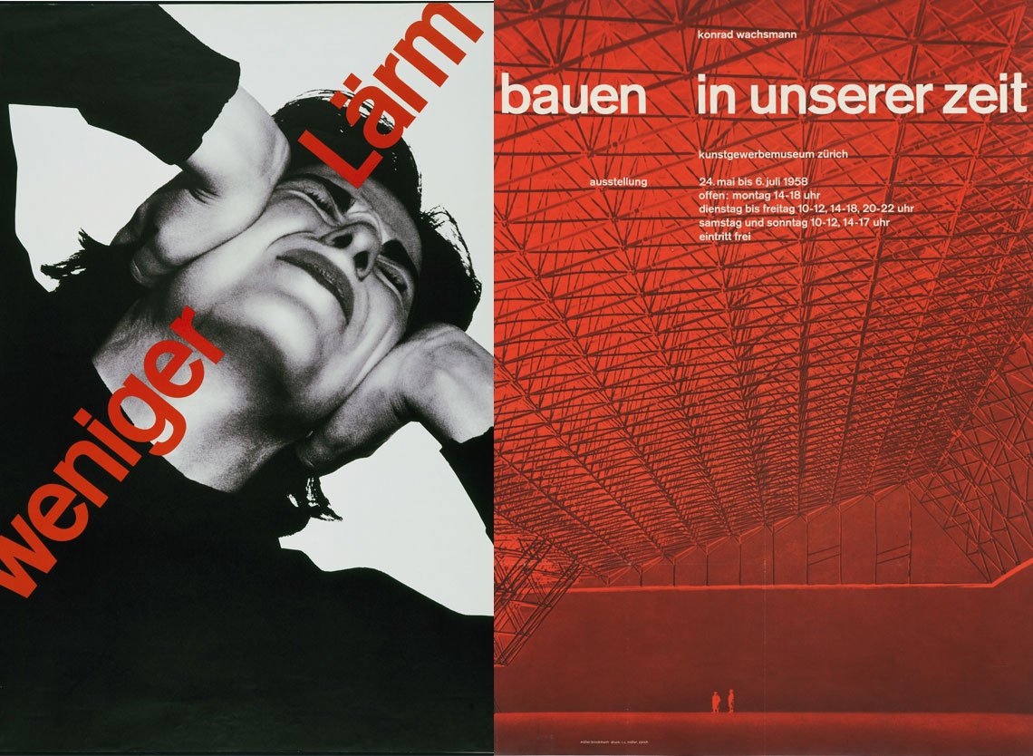
Journalism and Swiss style are almost a single thing, and they influenced each other a lot. And no, Helvetica isn’t everything, as many more other sans serif typefaces, that look convincing and ‘progressive’, are a perfect fit. However, I doubt you will find many works with serifs. They are considered as too formal and not legible enough.
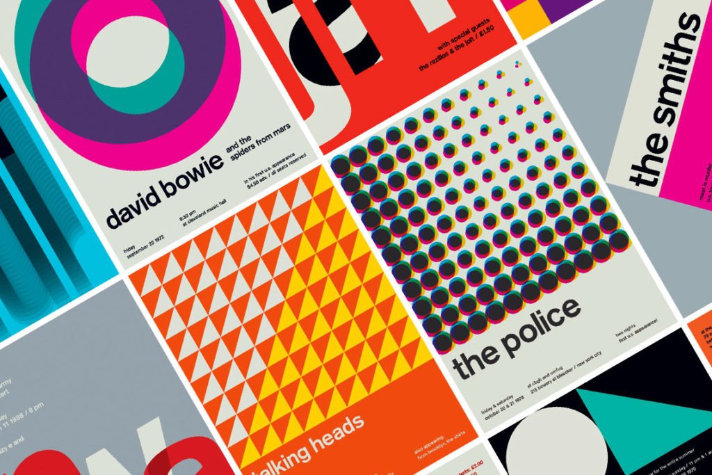
The designers are all into size and color experiments, matching monstrous and tiny letters for accents, bold and thing letters to express mood, monochrome and vivid palette to add vibrancy. Or to make you stop in front of a banner. That works well.
What I love most about such experiments is the use of white. It not only works as powerful emphasis but brings the matter of the whole artwork in a single element. Swiss design favors it, and you may try and see how it works with your audience. CV templates, posters, banners sticker — why don’t you help the community sink in the sense you’ve put into the typography?
Graphics, Not Ads
Images — photos and illustrations — are not to sell, they are to show and to tell a story. That’s why original Swiss design, even if it’s used in commercial, will not bore you with happy kids with chocolate of a popular brand. You may even hardly ever guess something is sold. But still, you won’t be able to pass, as the combination of a bold Swiss font, powerful color solution and images won’t leave you a single chance to stay indifferent. Collages with roughly cut out photos and bright geometric elements or symbols keep being attractive, and that’s another thing you should try out. Seems simple, but eye-grabbing imagery can always provide you with some spin-off.
There are some retro pieces and some great Swiss-inspired items I’ve listed already. However, if you’ve discovered the love to this style, check Rudolph de Harak, Jacqueline Casey, Armin Hofmann, Emil Ruder, they deliver tons of inspiration.
What I like most is that Swiss design can help you understand the basics and its comprehension pushes you to a new level, packing with essential skills you won’t do without — mastering and matching typeface weights, adding power to graphics and placing the right accents where you need it. Briefly, there are trends & movements to love to watch, but this is the one to master.

