No Result
View All Result
Subscribe
The Designest
  • Home
  • Design
  • Freebies
  • Toolbox
  • Tech
  • Tutorials
  • Inspiration
  • Digital Art
  • Home
  • Design
  • Freebies
  • Toolbox
  • Tech
  • Tutorials
  • Inspiration
  • Digital Art
No Result
View All Result
The Designest
No Result
View All Result
Home Design

The Origins of Jumping Cat in Puma Logo

What does Puma logo symbolise and what Adidas brand has to do with it?

Milena Abrosimova by Milena Abrosimova
February 21, 2020
in Design
0
Share on FacebookShare on Twitter

The beginning of this story about the Puma logo traces back to Dassler brothers — talented sport shoes manufacturers, one of whom launched Adidas brand and the other one put all his efforts into Puma. Many decades later the Puma logo has developed into a recognizable mark of time-tested high-quality shoes, fitting professional and lifestyle needs.

Sport shoes brands are interconnected more than you think: the obvious marketing rivalry hides quite surprising rationale behind all the competition. And trust me, this story is something people write fiction novels about. Before going on about the Puma logo design concept and background, I feel like you’d be interested to know the man behind the brand.

First There Was “RUDA”

In the previous article, featuring the evolution of the Adidas logo, I have told you about Dassler brothers. In brief, there were two talented minds, dedicated themselves to making shoes for athletes, increasing the quality of their performance. They founded the “Dassler Brothers Shoe Factory” in their hometown Herzogenaurach, Germany. Due to some disagreement (the reasons unknown), Dassler brothers split up and each of them founded his own brand.
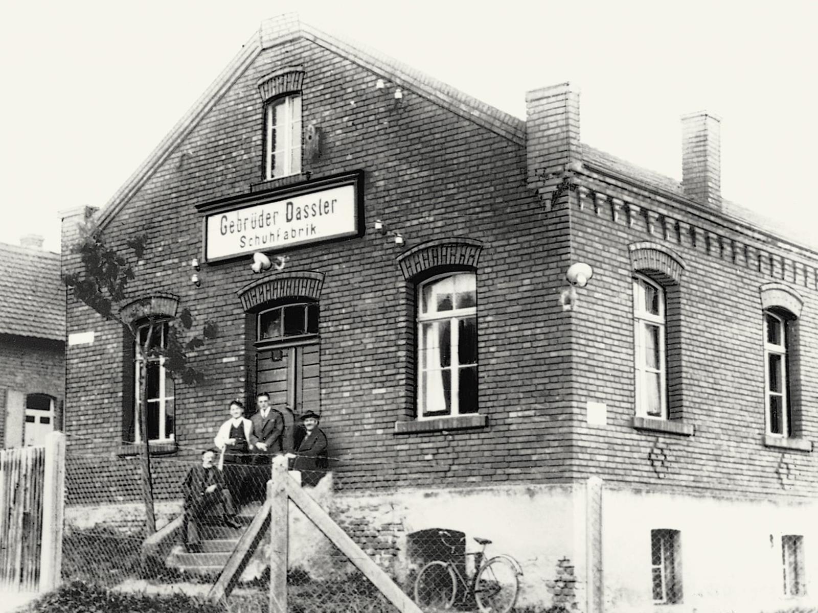
Dassler Brothers Shoe Factory | via puma.com

In 1948 Rudolf created “Sportschuhfabrik Rudolf Dassler” — RUDA. It took a couple of months to change his mind and turn the company’s name into PUMA. Irrespective of the name, in 1948 Puma logo only had the letter “D” for Dassler and a puma jumping through it. Really terse and to the point. Later on, this cat logo gained its framing and a modest caption underneath.

In 1951 Puma logo turned into a six-sided and two-layered image with the same “D”, jumping puma in the center, and the word Puma in a sans-serif typeface. There was a part in between with Rudolf Dassler Shuhfabrik around the border.

What Does Puma Logo Symbolise?

Puma logo
Puma Logo

Rudolf Dassler decided to pick this animal for his branding for a good reason. The focal point for this idea was to represent Puma’s characteristics: strength, speed, endurance, and agility. All the qualities any sportsman should have to achieve success! It was an inspiring symbol for athletes, wearing Puma for their competitions. The whole company’s image was meant to be regarded as a coherent representation of the brand’s spirit and goals.

Puma Logo: Formstrip

In 1958 Puma’s trademark was the formstrip, coming from the heel of the shoe to its soles on the sides. This form used to stabilize the shoe but the purely pragmatic reason has turned into a stylish feature of modern Puma shoes. I still see a running track here in these stripes instead of some convenience-related invention. The Formstrip became the non-official Puma logo and lasted till 1968 when it was changed completely back to jumping Puma.

Who Designed the Puma Logo?

Have you seen the first Puma logo version? Its primitive form was developed in 1968 — the cat logo actually started looking like a distinctive cat. In 1970 Nuremberg cartoonist Lutz Backes created a new Puma logo, the one you see today. It’s minimalistic, recognizable, and iconic.
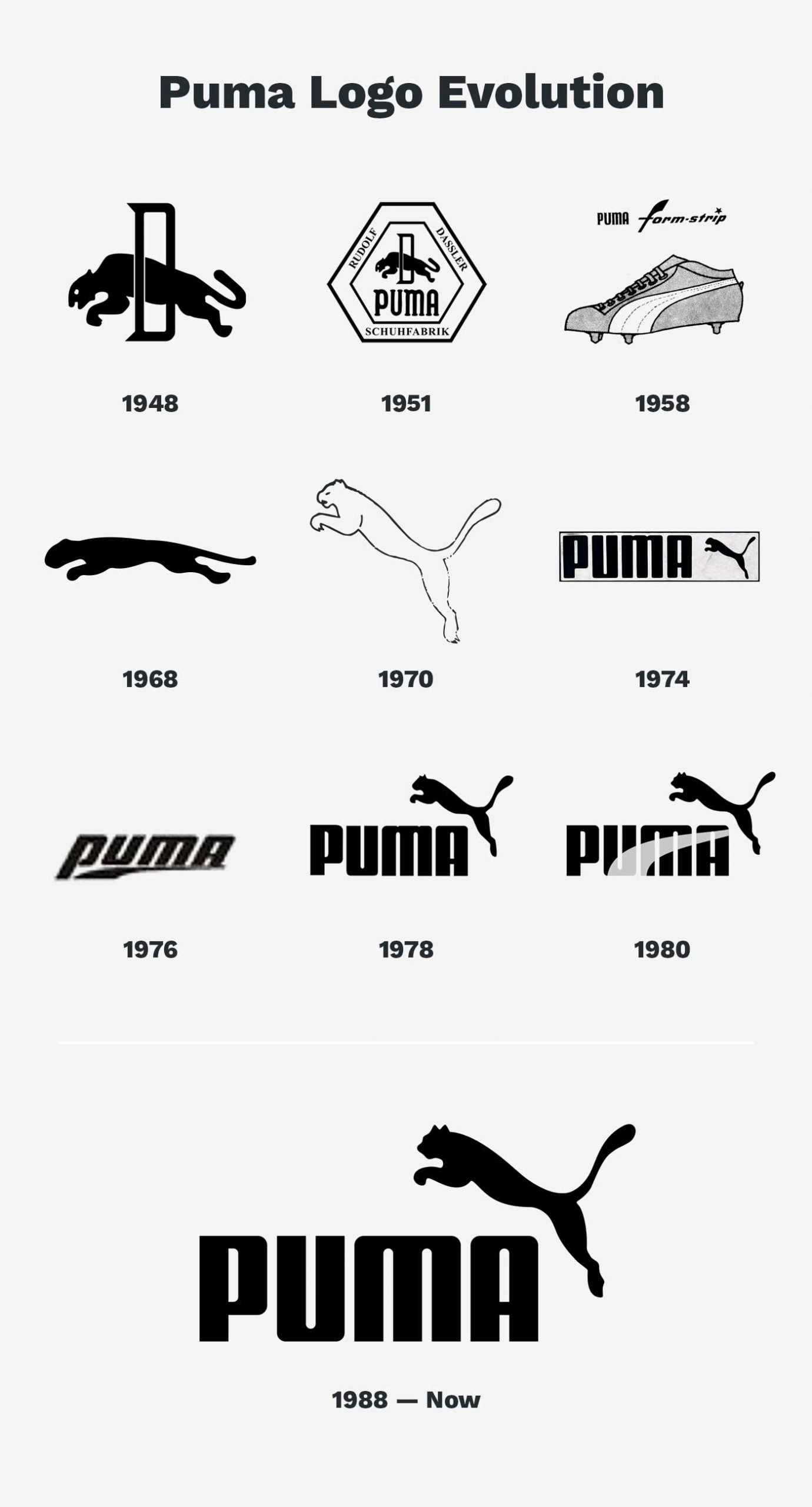
Puma Logo Evolution
Puma Logo Evolution

The Font Moved up the Puma Logo

It would be too plain and empty seeing just the cat logo without any other complementing features. It was decided to add the inscription to logotype and set the last accent. The typeface looks a lot like the one Rudolf Dassler implemented in this first Puma logo design — sharp lines with pointy angles. Over the years, these characteristics have gradually seized, resulting in the font we see today: it’s solid and a bit softer.​

Puma logo color font

These days the Puma logo had so many appearances with different colors but conserved the concept of a jumping cat logo since the 1950s. And the idea hasn’t gone out of trend 70 years later. Driven by the specific imagery the creator had in mind about his shoes design, Puma keeps being associated both with a brilliant solution for sports professionals and fashion maniacs.

Tags: BrandingHistoryLogoPumaRedesign
Previous Post

How to Write a Project Proposal: Tips & Helpful Resources

Next Post

16 Rose Gold Textures to Fall in Love with

Milena Abrosimova

Milena Abrosimova

A huge design geek, discovering the industry through the prism of modern values and social media communication.

Related Posts

Best Drawing Software in 2022 For Your Creativity

by Milena Abrosimova
June 29, 2022
9

We’ve collected the best free art programs and paid software for you to always have a wide choice of creative...

45+ Best Handwriting Fonts

by Alina Yakovleva
May 24, 2022
2

Soft curves, bold lines, charming decor — that's why handwritten fonts are so hard to resist. And there is no...

130 Eye-Catching Color Combinations For Design Enthusiasts

by The Designest Staff
April 27, 2022
2

An endless flow of color inspiration in every scheme and image!

11 Most Renowned Ukrainian Digital Companies and Design Studios 

by The Designest Staff
April 22, 2022
0

All of the most significant services and design companies from Ukraine you should surely know about!

Social Media for Designers: Instagram & Pinterest

by Alina Yakovleva
March 24, 2022
0

If you want to succeed in graphic design or digital art, mastering social media is a must for you. And...

Apple Logo History and Brand Evolution

by Milena Abrosimova
March 8, 2022
0

Simplicity is the ultimate sophistication: Apple’s logo transformation over the years.

Next Post

16 Rose Gold Textures to Fall in Love with

Leave a Reply Cancel reply

Your email address will not be published. Required fields are marked *

Popular Posts

  • 60+ Best Photoshop Text Styles & Effects

  • 20 Best Places To Sell Your Digital Design Online

  • 35+ Best Cap Mockup Templates

  • 35+ Best Halftone Brushes

  • 40+ Best Metal Fonts

Envato Elements
with Envato Elements membership

Categories

  • Design (72)
  • Digital Art (27)
  • Freebies (71)
  • Inspiration (40)
  • Other (3)
  • Tech (17)
  • Toolbox (123)
  • Tutorials (50)
Youtube Facebook Instagram Dribbble Pinterest Twitter RSS

Subscribe

The Designest

Weekly Email Updates

We got tons of fascinating articles, videos and freebies for you every week!

SUBSCRIBE

Design Blog

  • Design
  • Digital Art
  • Freebies
  • Inspiration
  • Other
  • Tech
  • Toolbox
  • Tutorials

About Us

Welcome to The Designest — a professional design blog aimed to deliver fresh news & trends of the industry as well as the most essential courses & tutorials you must have been searching for.

Company

  • Advertise with Us
  • Contact Us
  • Cookie Policy
  • Privacy Policy
  • Terms and Conditions

© 2022 The Designest — Professional design blog aimed to deliver fresh news & trends of the industry

No Result
View All Result
  • Home
  • Design
  • Freebies
  • Toolbox
  • Tech
  • Tutorials
  • Inspiration
  • Digital Art

© 2022 The Designest — Professional design blog aimed to deliver fresh news & trends of the industry

Subscribe to Regular Updates
We got tons of fascinating articles, videos and
freebies for you every week.
This website uses cookies. By continuing to use this website you are giving consent to cookies being used. Visit our Privacy and Cookie Policy.