Introducing a brand to the masses is both a responsible and risky business, so this task should be taken even more seriously than any other usual graphic design job. There’s no doubt you’ve already developed an eye for what’s trendy and favorable on the market, and it wouldn’t hurt to investigate this matter a little closer to deliver the logo design, providing brand recognition.
Creativity is a free flight of imagination through ideas, portrayals, inventions and emotions — any external force does not limit it. In theory. The paradox of a creative project is that the free spirit powering it falls under certain restrictions regarding composition, font and color choice, flexibility, and many other categories, building up a formula of an excellent logo.
Do you know the reasons why such famous examples of logos as Pepsi, Puma and even Batman logo became noticeable and recognizable? Sure, the evolution has taken its long way from the first raw outlines (when there were no different types of logo like marks, combination logos and etc), to what we see know about these business companies. However it’s undeniable fact, that the fresher versions were established according to the new practices, polished and tailored to the modern demands.
Speaking of guidelines, there’s a straightforward initial step in shaping your logo symbol: deciding on the type of logo designs you seek. The choice can be dictated by certain specifics of your business and the target audience, emotions your product or service provokes, the situations your items can be used and more. It’s better when the brand carries a symbolic meaning, something shedding a light on the personality, generating that magnetism. Different types of logos can be divided into categories based on the dominance of imagery and typography, so there are image-based, name-based and combined logo designs (pictorial mark, combination mark, lettermark logo, abstract logo, mascot logo, wordmark logos, emblem logos). Let’s start with the visuals and go with the abstract mark.
1. Abstract Mark Logos
Despite the fact a logotype should transfer a clear message, sometimes a powerful idea wrapped in a well-developed concept successfully troubleshoots any fuss. It’s, basically, what an abstract logo is about — a conceptional icon or geometric form, serving as a representation of the brand, company in an abstract mark. Look at such famous examples of abstract mark logos as BP, Pepsi, Adidas, Microsoft or AirBnB, picking the abstract disguise to score on the market. So coming up with this type of logo shouldn’t be any trouble as the whole design elaboration process is purely metaphorical with an abstract logo. Designing an abstract logo means fitting all the information into one relatively vague image, maybe giving a small hint by its form what the name of a company is. Working with abstract logos would be easier if you had to create just a puzzling image, right?



This strategy has a downside to it nevertheless: you might end up with a bad design image that doesn’t reflect the essence clear enough, and instead of shedding some light on the brand, it would bury the perception in misunderstanding. In fact, carrying out an abstract logo is a subtle, sophisticated process when you play with the emotions your abstract logo triggers, symbolic meanings, and additional connotations it provokes. Be careful with finding a perfect balance between an abstract mark essence, that has to be precise and obvious at the same time.
2. Mascot Logos
Many companies are working with families, kids, teenagers as a target audience, addressing them via mascot logos. Various animate and inanimate creatures, given some peculiar characteristics and a colorful, memorable appearance, come as another type of logo, shortening the distance between the brand and the audience it’s destined to amaze. These mascot images breathe with jolliness and invite you to check out the brand or company they represent. And there’s no way this character won’t strike you right in the heart! Even with such a cheerful mood and a rather sweet attitude, mascot logos contain a complex background technical side, which is not that jolly.



Unfortunately, you can’t just pick a cute puppy and call dibs on this mascot because you’re crazy about animals. I mean, it’s apparently possible, but a real menace is to get the feeling that lovely doggies are a stretch for, let’s say, your table selling company. When delivering a proper reflection on a topic of maintaining a mascot logo, the end decision should be concentrated in a heartfelt welcoming being, able to deliver the meaning of a brand/company in simple imagery, accessible to everyone. Here comes another pitfall: you can forget about mascots when aiming for some terse and serious tone for a brand as the mismatch would be puzzling and tragic for a company’s reputation. That’s how it is for mascot logos. But again, there’s no surprise if you’ve approached the question of picking a logotype consciously.
The props are given to cafes, restaurants and food industry brands operating in the market through the use of mascots. It takes just one glance at them for your saliva production to start, remember KFC, Pringles or Quaker!
3. Pictorial Mark/Brand Mark Logos
It’s like an abstract logo, but way more distinct — here’s how one can describe a pictorial mark or brand mark logo. It’s an easily recognizable symbol with “talking” forms or an allusive image, telling about a company’s name/motto, able to launch the associations instantly. The peculiarity of a brand mark is the absence of any transparent names, visions and anything to the point. As simplified and comprehensible the brand mark logo is, as better it serves even without a business name.



Be aware of the possible outcome while using one of these brilliant pictorial mark logo means. Suppose your symbol is not done flawlessly, according to the canonic idea of pictorial marks (the representative and reduced nature, to speak directly). In that case, you’re not going to receive the desired effect it gives your brand, as a logotype risks to be swept away by the wave of other more successful design solutions. It’s a general rule, you might think, but here’s something, making this thought about this type of logo crucial. For an abstract illustration or image, standing for some company or business name, it should take tons of time, marketing presence, and a gazillion of positive impressions by the brand to ignite the minimalistic logo attribution. So if you’re not a firm company yet and can’t afford any risks, don’t step on this thin ice. You should probably use a wordmark logo!
4. Wordmark Logos
Take a business name and write it with a chosen unique font of your preference, and you’ll have a wordmark logo. In the past, the wordmark logos were reigning extensively as it’s just so simple to have a company’s name working as a logotype. There’s no need to look up to the outdated design tendencies and visions from old business cards; besides, there’s plenty of reasons to opt for this logo design (cautions included).
If you were wise, prudent at daybreak of your company’s establishment and came up with a concise and lucid brand name, it will contribute to up-and-coming identity. Being at the start of your marketing journey, setting up a company name as a logo design resonates with obvious benefits: the audience will have a vivid understanding of who you are, what’s your deal and why the precious time can be spent on your offer. In addition, this wordmark logotype has an adaptable appearance on various physical items, products, banners, leaflets, presentations and as watermarks.


It seems like messing these types of logos up is an actual riddle, but in practice, the compositional problems are the order of things when you dive into the topic unprepared. Some unkempt, overly complex typefaces used to create a wordmark logo are an eyesore, repulsive, and the ones you’re eager to forget like a bad dream. Explore your brand’s imagery, the sphere you belong to, what trends are inherent in it, what mood is suitable to be displayed, and you’ll hit the bull’s eye with that type of logo design.
5. Letterform/Lettermark/Monogram Logos
There are so many names for this type of lettermark logo featuring acronyms, consisting of capitalized letters and indicating a company name constituents. Acronyms make the life of brands with wordy names much more manageable. And on the other side, it bears even a greater number of hypothetical design solutions to embody for logotypes and identity. JBL, EA, WB, HBO, GAP — capacious names but probably too corporate and depersonalized to hear, so underestimating the visual reinforcement is not even discussed. Lettermark types of logos are multipurpose!
When the characters step in to create a lettermark logo, the turn comes for some typography to take the lead and switch the focus to finding the most suitable fonts. You want to be neither plain and insipid with your letterform logo nor too flashy, bordering on incoherent — the aim is to highlight, not disguise. Besides, the bulkier, the more forked a logo design is, the less adaptive it becomes. Volumes of typographic families, their pairing practices, stylistic and functional compatibility — the sea of information you’ll dive into will be enormous, but the catch with lettermark logos worths it.


Even if you pack a company name into an acronym as a lettermark logo and the chain of letters is still too long, how about using a monogram logo? The task acquires another level of difficulty atop as there’s no image or marks to rely on when you create brand lettermark logos. Still, maybe you’ll find it more challenging, aka fascinating, to create a polished, memorable, one in a million monogram, ready to compete with a famous McDonald’s “M”?
6. Emblem Logo
Think of your school’s crest (or the one you saw in “Harry Potter”) and try to give as many epithets as possible. Bet the list will contain something like aristocracy, traditional, reserved, classy, sophisticated — and these are exactly the words applicable to an emblem logo. This type of logo design features a font inside an icon/symbol, resembling a badge, insignia or crest.
It’s barely possible to avoid feeling a certain degree of inferiority when seeing the old emblems in museums or historical vicinities — back in the day, crests were not only carrying a pearl of wisdom, culture of previous generations but used to show off in front of other families or households, let’s be real about that. How is the concept seen nowadays though?

It goes without saying that the modern vision of emblem logos has reinvented the historical appearance of their predecessors, saving the principal motif. These are usually complex, layered compositions, looking rather terse and severe, impressing with their might. An effect like this is achieved through adopting dozens of details, elements and objects, increasing the significance of emblem logos. Building a brand identity connected with studying politics, government agencies, social services, auto and moto industry, or just representing a company with decades of historical heritage works out brilliantly with an emblem logo.
What obstacles await fellow graphic designers in this specific workflow with these types of logos? The advantages risk transforming into inconvenient drawbacks: a myriad of details won’t seem a perfect compositional harmony but a terrifying artist’s nightmare. Picture integrating a miniature logo design version somewhere, making it incomprehensible. If you’re not sure about the triumph of this project, don’t play with fire — better enjoy the chic of logo design examples.
7. Combination Mark
The name speaks for itself — combination marks comprise different types of logo design versions, enumerated above. Mix and match them together depending on the need, the brand’s specifics, target audience and your personal sense of beauty. Treat it as your personal jigsaw puzzle, when the elements make a more significant sense only when they’re put together to form a greater picture. It feels like the most easy-going way to design a logo so far! The main criteria — including both text and imagery in one piece when dealing with combination mark logos.


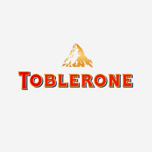

Bringing up the pros about turning to a combination mark should start with a point referring to the strong visual aid, consolidating a connection between the iconic logo emergence and the company’s name. Second, the elements are interchangeable, meaning that to leave a logo without lettering or image wouldn’t deprive the design of its zest. To wrap it up, the audience surely memorizes your brand with its name constantly flashing! Put the combination mark in work and enjoy the versatile, flexible type of design, getting integrated into any setting easily. Let the diversity be harmonic, and no element should speak louder than the other ones.
All the minimalism-lovers won’t be excited to test a combination mark out as the design implies an array of elements, characters, colors and objects, completely excluding the combination of some minimalistic design. Good thing you’ve already studied all the other types of logo designs to have a chance for a choice!
Making up your mind about the type of logo is only a part of the deal as nobody canceled the common visual, compositional, and stylistic regulations (if you’ve created a responsive logo, consider half of the task successfully completed). In addition to the already-described layer of theoretical information, I’d like to share a personal piece of advice. Have a little research of your own when going shopping. Pick a category of goods and browse through it, paying attention to the types of logos these business corporations have, what themes and colors prevail, the serifs, sans, decorative typefaces implemented. And most importantly, leave a special column in your table for marking the emotions you experience: it’ll become a nice bonus for forging your own taste and style. That’s how you investigate types of logo designs!
Irrespective of your final decision on delivering a striking logo symbol design after whirling around in brainstorms, remember to lean mainly on a brand’s philosophy, competitors’ choice, and audience preferences, and your logo is great. You’ll totally earn acclaim with the result and hear everyone chattering about your stunning logotype!

