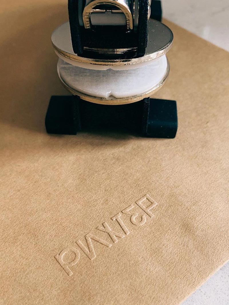
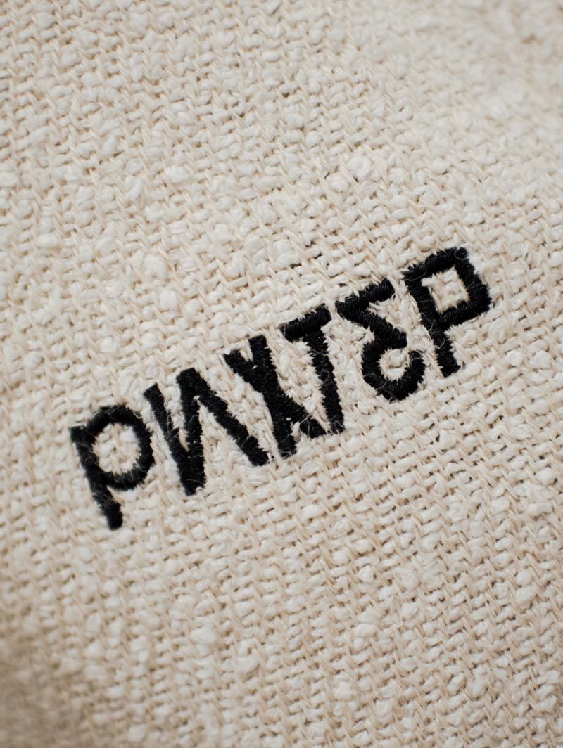
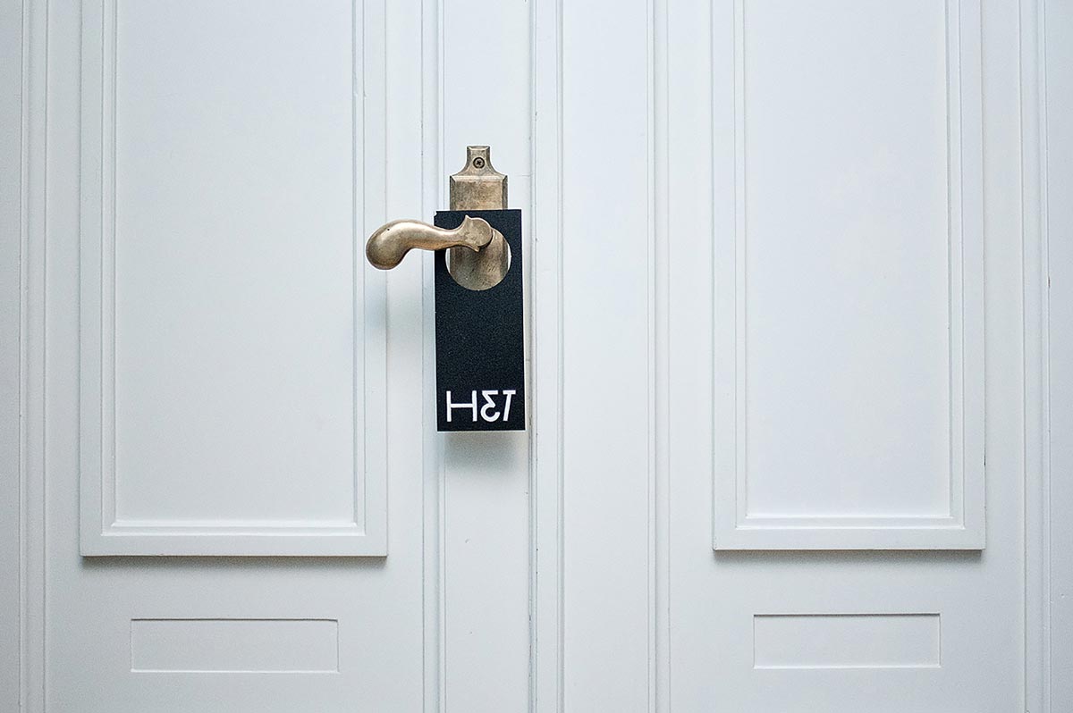
It’s something wild, dubious and yet so fresh! Bipolar Grotesque is the experimental typography project and a part of visual identity for Richter hotel, bringing the fame to the place by being the reverberation of the past and current epochs.
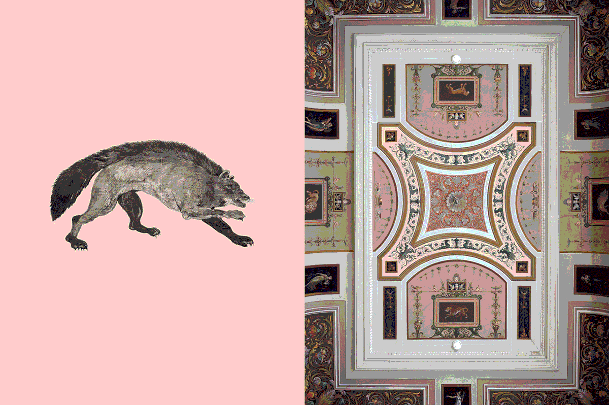
What happens when the good old meets the flashing new? Confrontation, collapse, calamity? Two completely reverse and born in unequal conditions, these parts of time perception rarely get along in a fundamentally new way. I said “rarely” instead of “never” because what you’re about to see is precisely the exception to the rule.
The Island of Antiquity and Home for Creative Souls
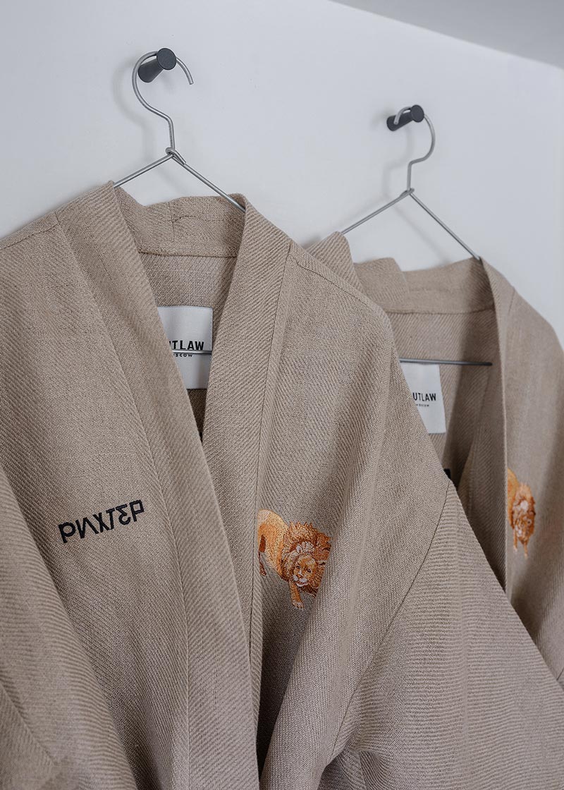
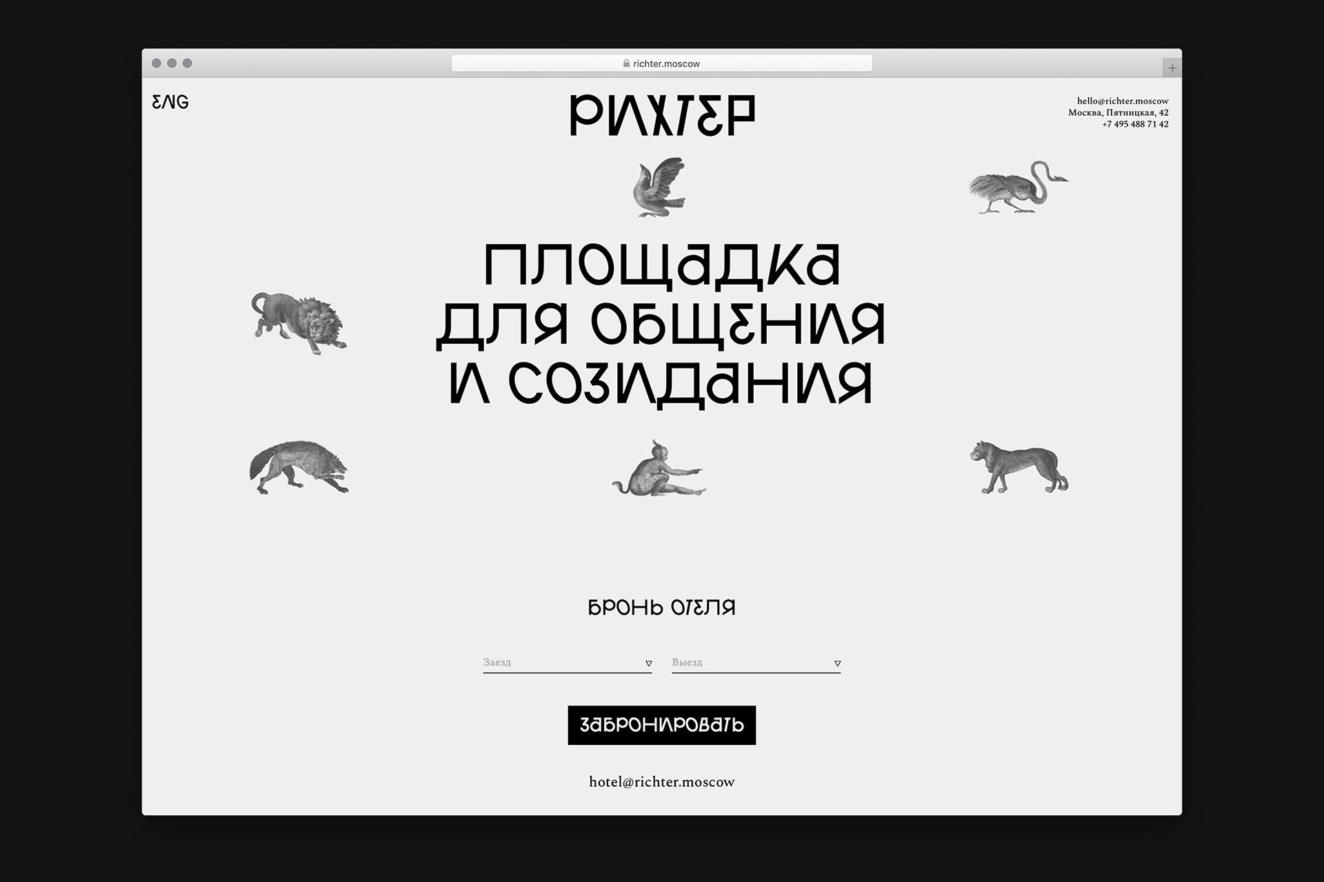
Introducing to you Richter (Рихтер) — the 5-star design hotel, situated in Moscow. The building looks anything but not a hotel: it’s an old mansion built in a style very typical for the mid-19th-century architecture. It belonged to a Russian restorer and architect, Fyodor Richter. Such a resonating spot of antiquity in the city of today with modern cars parked on asphalt roads.
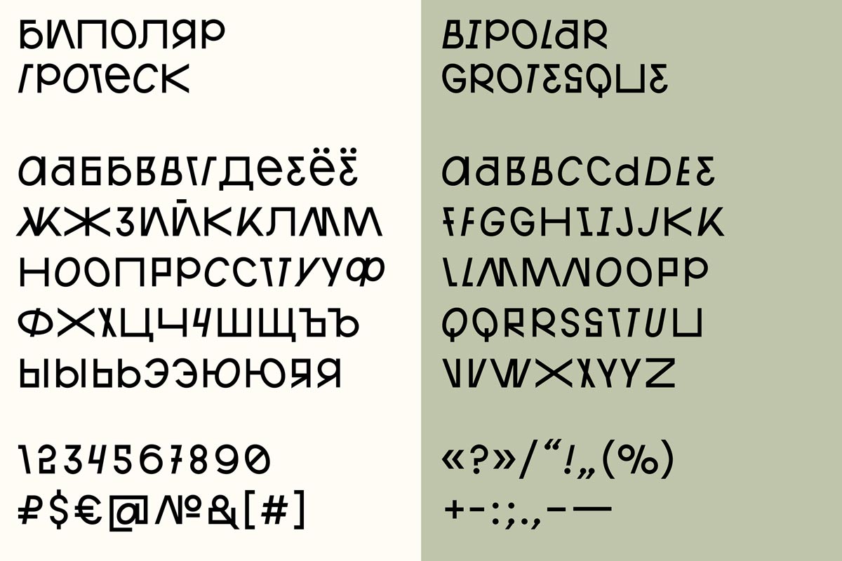
Typography Art of Bipolar Grotesque Font
Typography Art of Bipolar Grotesque Font
Nowadays, Richter House represents a whole platform for all the art-tempted people: musicians, entrepreneurs, designers, and writers, who want to get inspired and create their new projects, surrounded by aesthetics. The building united more than just a hotel under its roof, there is also a bar, art gallery, restaurant, library, and garden.
The main idea was to revive the old mansion with the spirit of contemporary thinking, which was just partly achievable with the same old architecture and old interior murals echoing in the modern renovation. What really polished the house concept was the visual identity by Esh Gruppa and their custom-made font, called Bipolar Grotesque.
People Called It Abracadabra
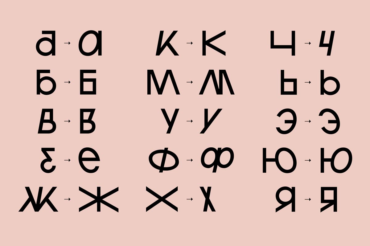
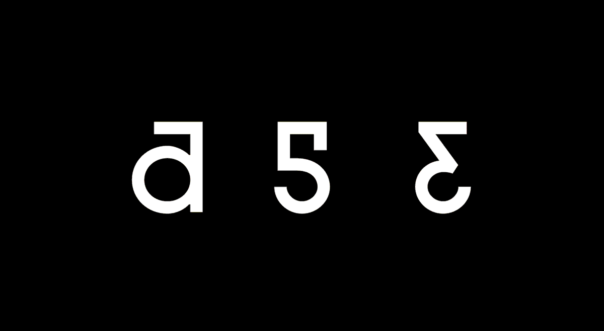
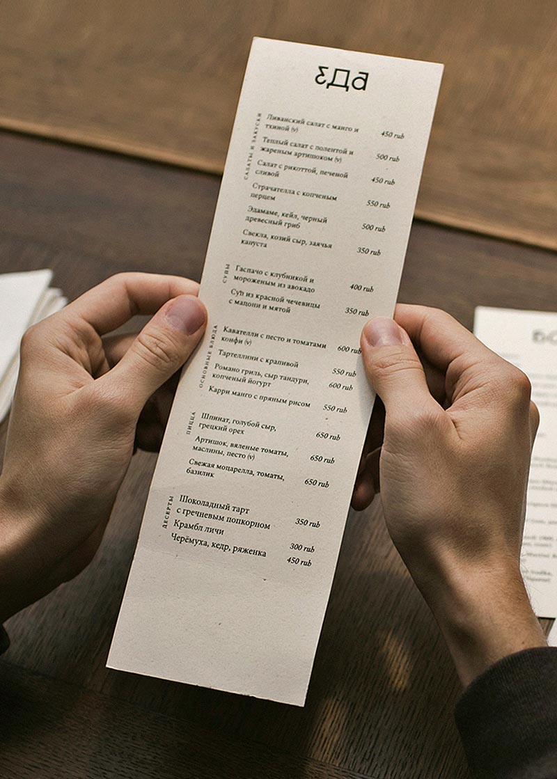
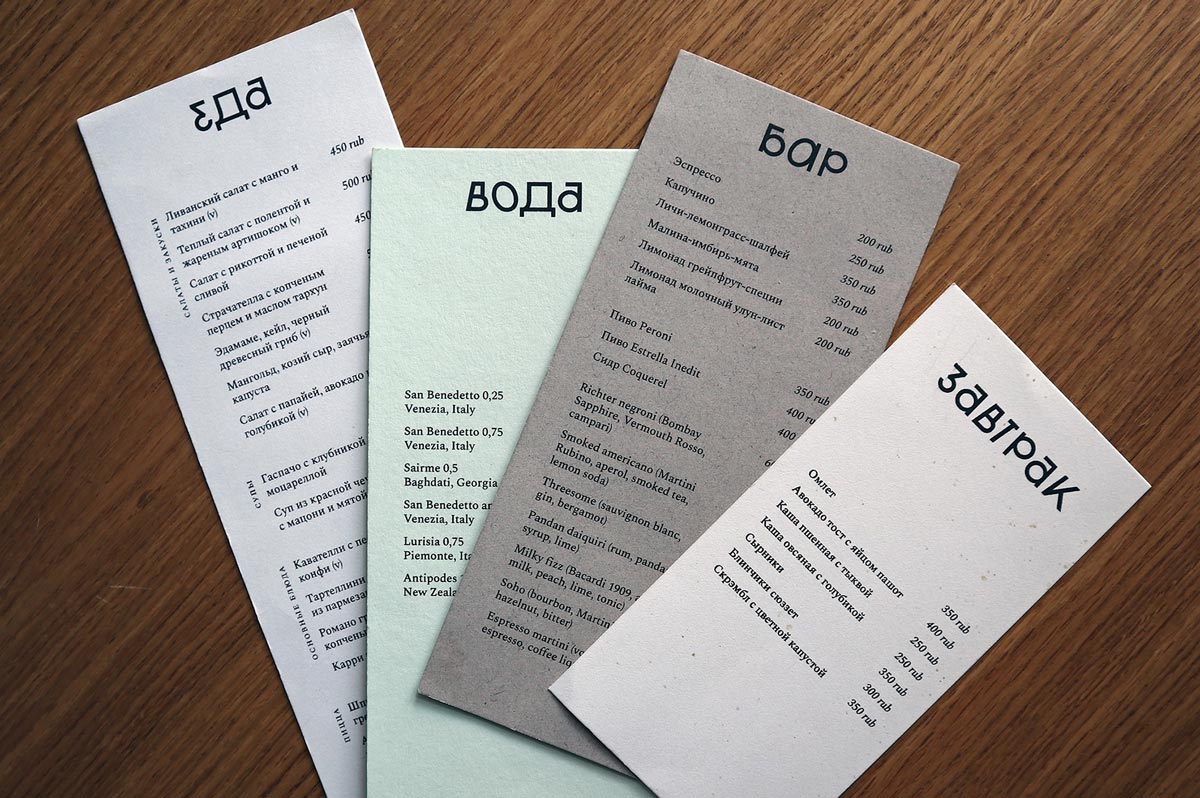
The Bipolar Grotesque font is something your eyes should get ready for. This experimental typography has Cyrillic and Latin alphabet developed, where every letter opposed to an alternative to allow flexible typographic combinations. Variative slopes and width, round and boxy strokes in one character is a thing you refer to as “scary but I can’t stop staring at it”. The designers have mirrored and flipped some characters, which adds artistic ambiguity on top: S can be easily transformed into 5, E into 3.
Typography Art of Bipolar Grotesque Font
Typography Art of Bipolar Grotesque Font
Typography Art of Bipolar Grotesque Font
There was no initial idea to grant the hotel its own font: rummaging through hundreds of ready-made variants, the decision was made to expand the design goal for the size of a whole typographic unity. It was stated by the client that the visual identity shouldn’t be a regular luxurious 5-star style, wallowing in sophistication but something more bold and unexpected.
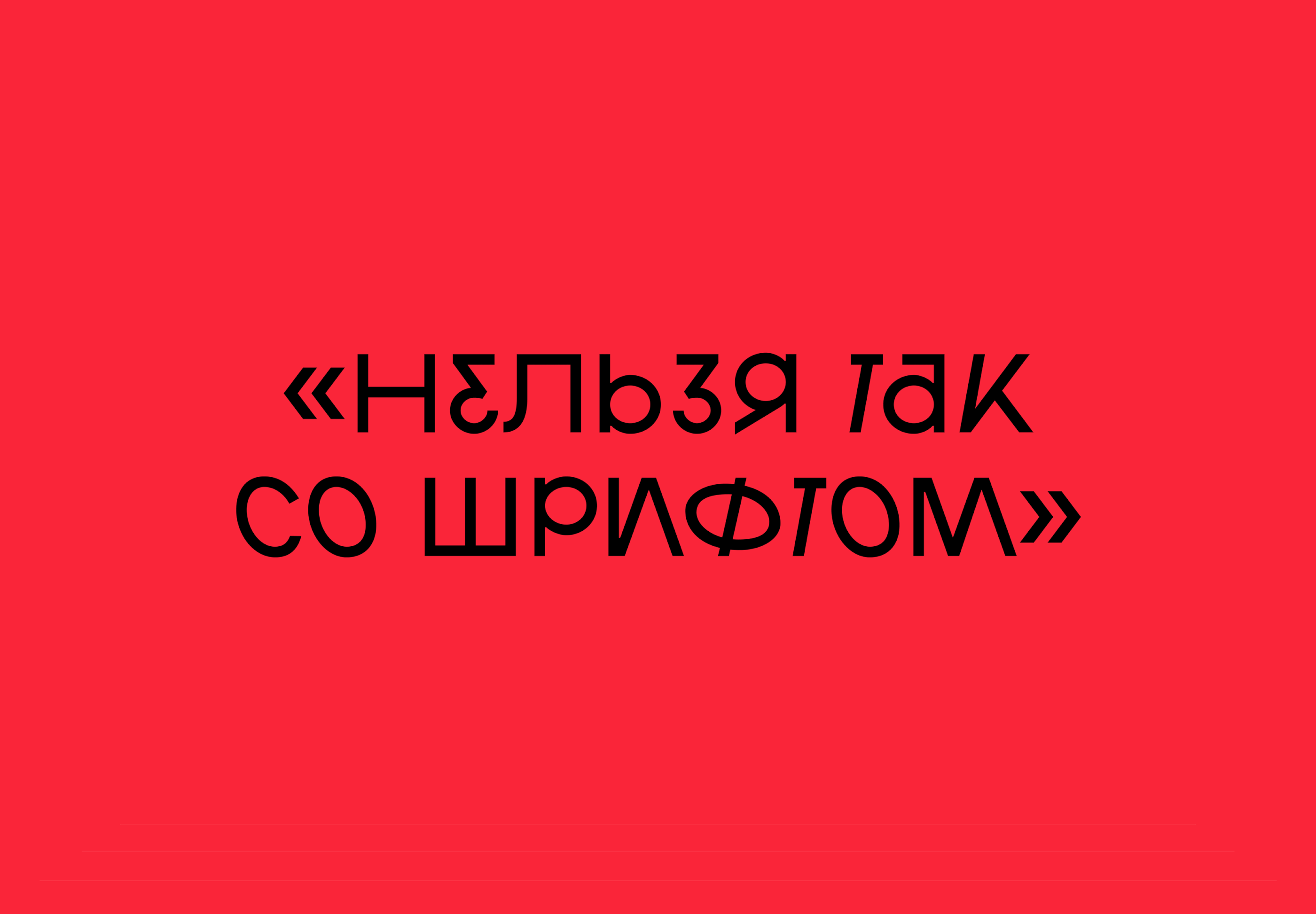
The public opinion didn’t take long to get expressed. Many users on Facebook left different comments about the font, which were, eventually, included in the presentation graphics.
Typography Art of Bipolar Grotesque Font
Typography Art of Bipolar Grotesque Font
Typography Art of Bipolar Grotesque Font
Typography Art of Bipolar Grotesque Font
Typography Art of Bipolar Grotesque Font
“Abracadabra”, “you can’t do that to the font”, “if you read the font while being boozed, the letters look very even and clear”. It’s exactly what the aim was: to create something dubious and rebel, making people talk about it.
I adore the experimental typography and all sorts of craziness in design. Yes, Bipolar Grotesque might be hard to read at first, but when you dig a bit deeper than putting the “bizarre font” label, you get to understand this font better. Then all the frantic strokes make much more sense.