The story about the Apple logo is as rich as the brand itself: each stage of the development is captured in logotype versions, transferring the company’s ups and downs. But how did it all go from the first original Apple logo with a drawn Isaac Newton to a minimalistic apple icon? It’s quite a story you definitely would want to hear!
For decades Apple company has been holding the leading positions in the world of computer software and consumer electronics. The innovative products and online services, released by Apple are known to the majority of users as well as the famous logotype. But what’s hidden behind the minimalistic apple outline?
It’s the inspiring story of friends, who decided to fulfill their dream by starting a personal computer project in a garage, which then became one of the world’s best tech company. Founded in 1976 by Steve Wozniak and Steve Jobs, the tech company has gone through a lot: from budget issues to constant changes of the executives, playing hopscotch with the company’s destiny. All Apple logos over the years are like symbols of innovative ideas, witnessing the succession of brilliant inventions and updates, changing the course of the technology industry.

What does the Apple logo mean?
In brief, the current Apple logo was affected by at least two important things associated with the company’s establishment comprising both scientific and romantic symbolism. The first one is the direct association with one of the brightest (and highly significant) periods in life of Steve Jobs when he dropped the college and went to Oregon to work at an apple orchard farm commune.
Besides, the apple fruit is the straight symbol of Isaac Newton’s brilliant discovery everyone has learned from school. Just like an apple fell on the scientist’s head, the law of gravity came home to him when Isaac was peacefully resting under the apple tree. The significance of this event put the beginning of scientific discoveries as we know them nowadays, it was as revolutionary as the creation of the first Apple computer.
Apple Is Not Only A Fruit Anymore
Apple logo design history starts with its name being established, around which the whole brand identity is built. When Steve Jobs and Steve Wozniak were deciding on the company’s name, they went through many “boring and pompous” variants before Jobs suggested something from his early years. When Steve left college in 1974, he hit the road to Oregon, where he joined the apple farm (orchard commune) and lived a peaceful life for some time. Steve Wozniak wrote about it in his memoir:

The First Attempt to Design Apple Logo
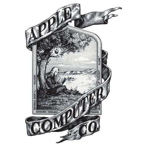
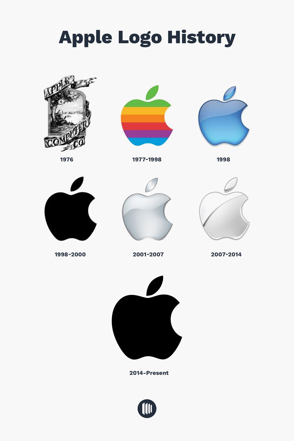
In 1977 one of the company’s co-founders, Ronald Wayne, illustrated the first apple logo design. It was an actual illustration, which you see in history books, depicting some meaningful moments in black and white. This version was far from perfection, especially in terms of branding design, which, of course, couldn’t represent the innovative Apple company on the market. Such a logotype like this could be decorating a craft beer can or restaurant menu pages but not technology-related products. Fortunately, that variant lasted less than a year.
What was Apple’s first logo?
The company’s first apple logo was not quite a reflection of the brand’s essence and far from versatile in terms of graphic design, composition, and style, to be fair. It literally depicted the moment when the law of gravity was invented. The first logo included Isaac Newton sitting under an apple tree. What cluttered the old Newton logo more was a frame with a quote by the romantic English poet William Wordsworth, saying, “Newton… a mind forever voyaging through strange seas of thought.” Thankfully, this illustration was not met well by Steve Jobs, so this Apple’s logo design existed for a short time and was later replaced by a new logo carried out by a professional graphic designer.
Reaching Out For The Brand Identity
Steve Jobs saw Newton’s image as old-fashioned and inconvenient: resizing the shape would make it impossible to distinguish the logotype placed on computers, flyers, or print advertisements. Steve Jobs wanted a more appropriate logo, fresh yet straightforward: to transfer the innovative motif of the Apple computer co and be impressive at the same time. Understandable demands for the business owner, commissioning a corporate identity design.
The full-scale presentation of the first Apple’s computer Apple II (the previous test version Apple I was not fully ready for an official release) at West Coast Computer Fair in 1977 was meant to be the moment of revealing the computer company brand itself, and the crew couldn’t risk it with some raw branding design. With advice from Mike Markkula (one of the company’s partners and investors), accompanied by the hired publicity firm, and armed with his sense of beauty, Steve Jobs contacted Rob Janoff to make an original apple logo design. The Apple’s brand logotype was designed in two weeks.
Janoff developed the world-renowned, eye-catching logo, guided by the imagery of apple fruit, working with the shape and details, reducing them to what we know today as the official “bitten apple logo.” In one of his interviews, Rob Janoff told that the actual process of inventing the logo took one week: he was buying apples, putting them in a bowl, and redrawing over and over again to get that desirable shape, that was eventually granted that bitten apple form.
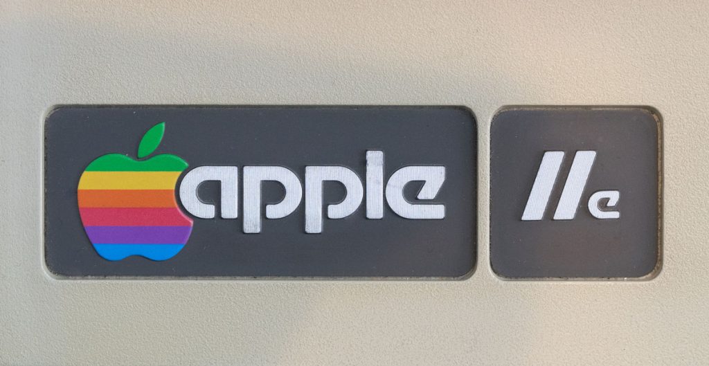
The 1977 version of the Apple logo evolution was covered with rainbow spectrum stripes, which triggered many discussions later on about the LGBT reference and secret messages the rainbow Apple logo conveyed. However, the rainbow flag was proclaimed a symbol of the LGBT community a year later, in 1978, so the wonderful urban legend about rainbow stripes of Apple’s logo doesn’t stand a chance.
The rainbow colorful logo had more computer meaning than anything else: Apple II computer supported color display imagery, which was the indisputable advantage over the monochrome monitors. No unique colors order for the rainbow version was originally implemented, except for Jobs’s wish to place green at the top simply because the tree leaves are green and usually at the top.
Why is there a bite in the Apple logo?
According to Janoff, the reason for choosing this bitten apple logo was to prevent people from confusing the overall shape of the apple with some other fruit or vegetable like cherry tomato, having a similar form. Besides, Rob Janoff has found out a bit later that his genius choice of a logo detail was the lucky coincidence with computer terminology he had produced. “Bite” sounds the same as “byte” — the smallest unit of digital information, the basis of computing.
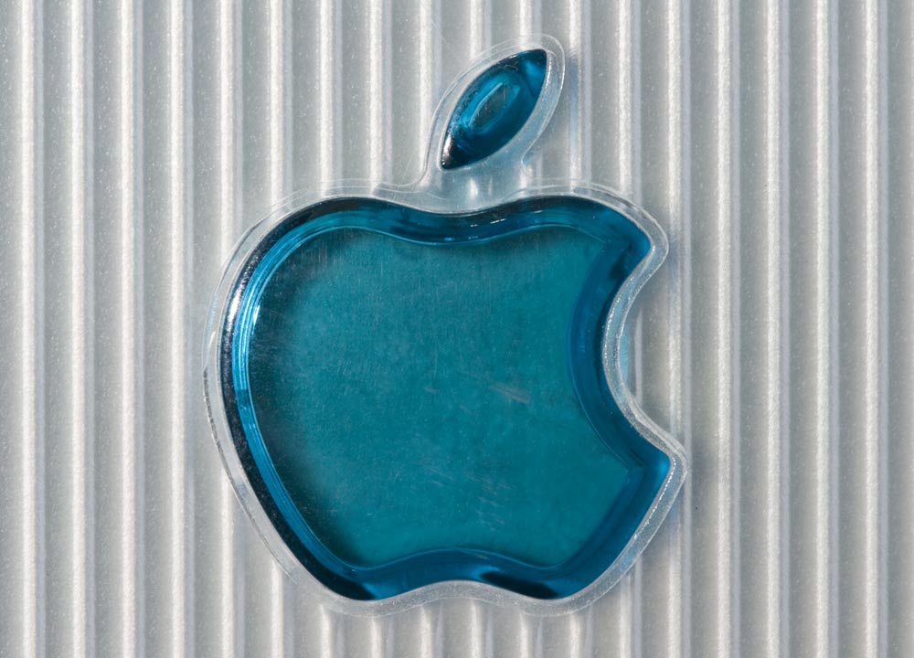
Translucent and Monochrome Apple Logos in 1998
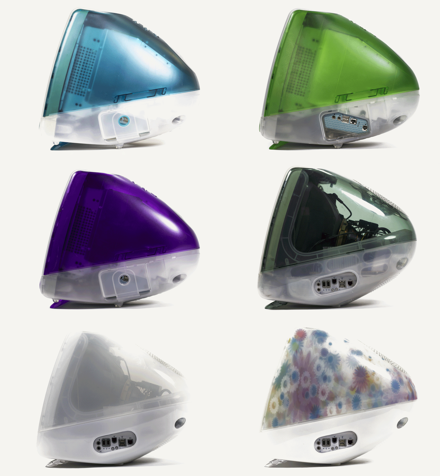
Apple Logo Evolution in 2001-2007
Frequently Asked Questions

